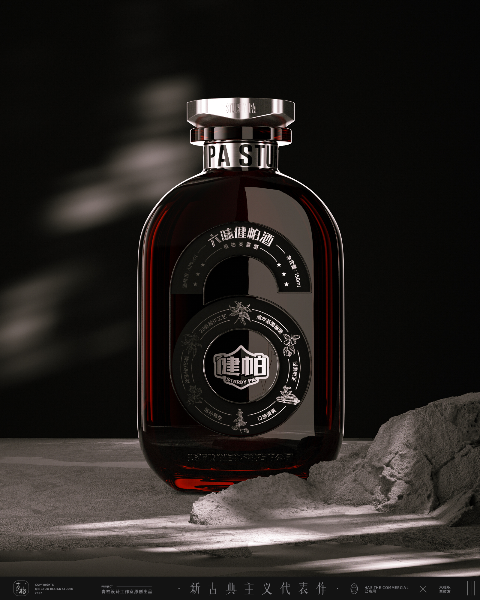
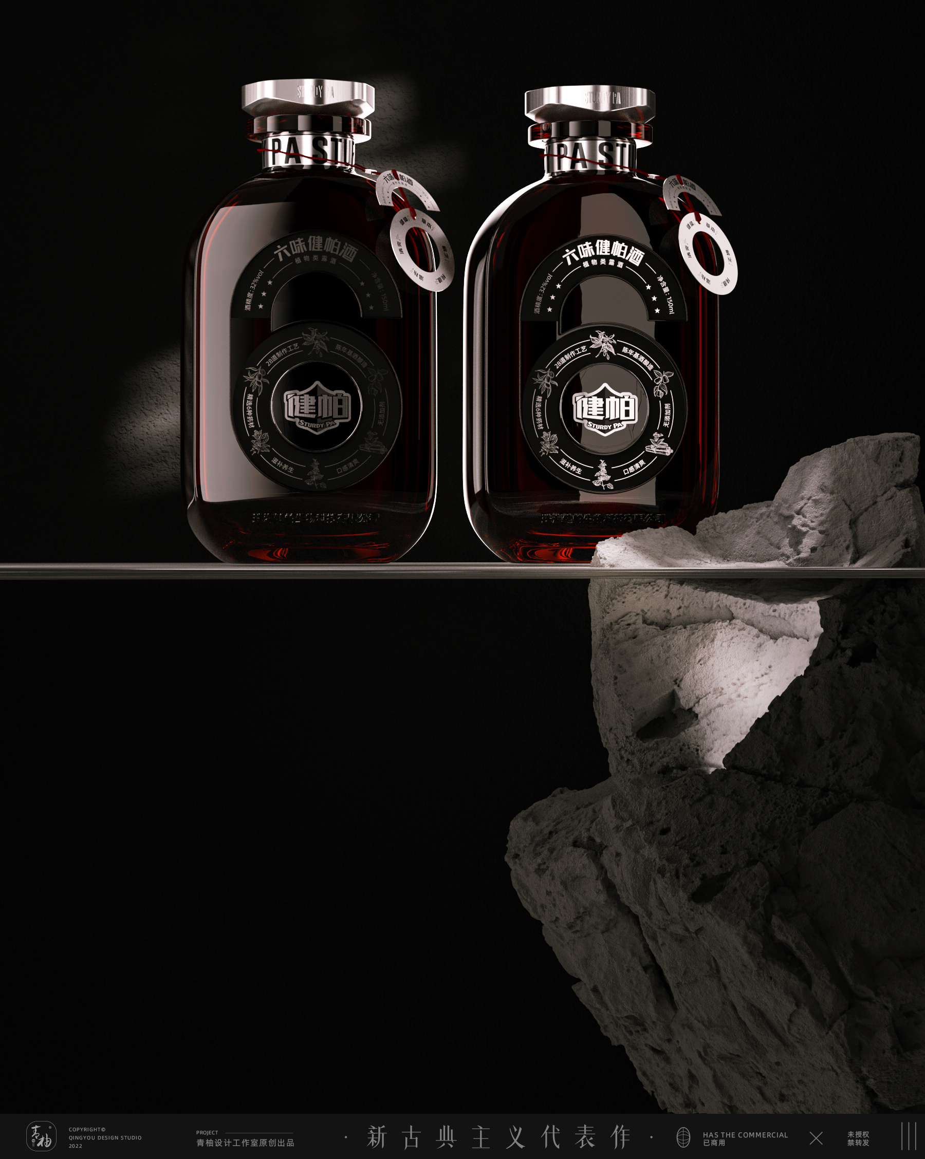
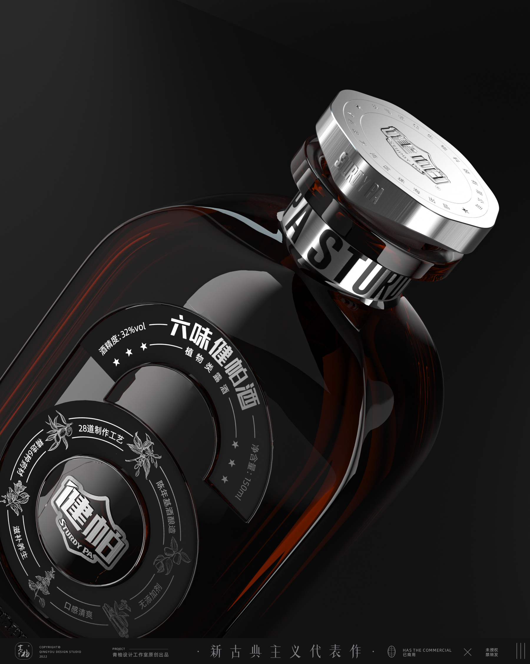
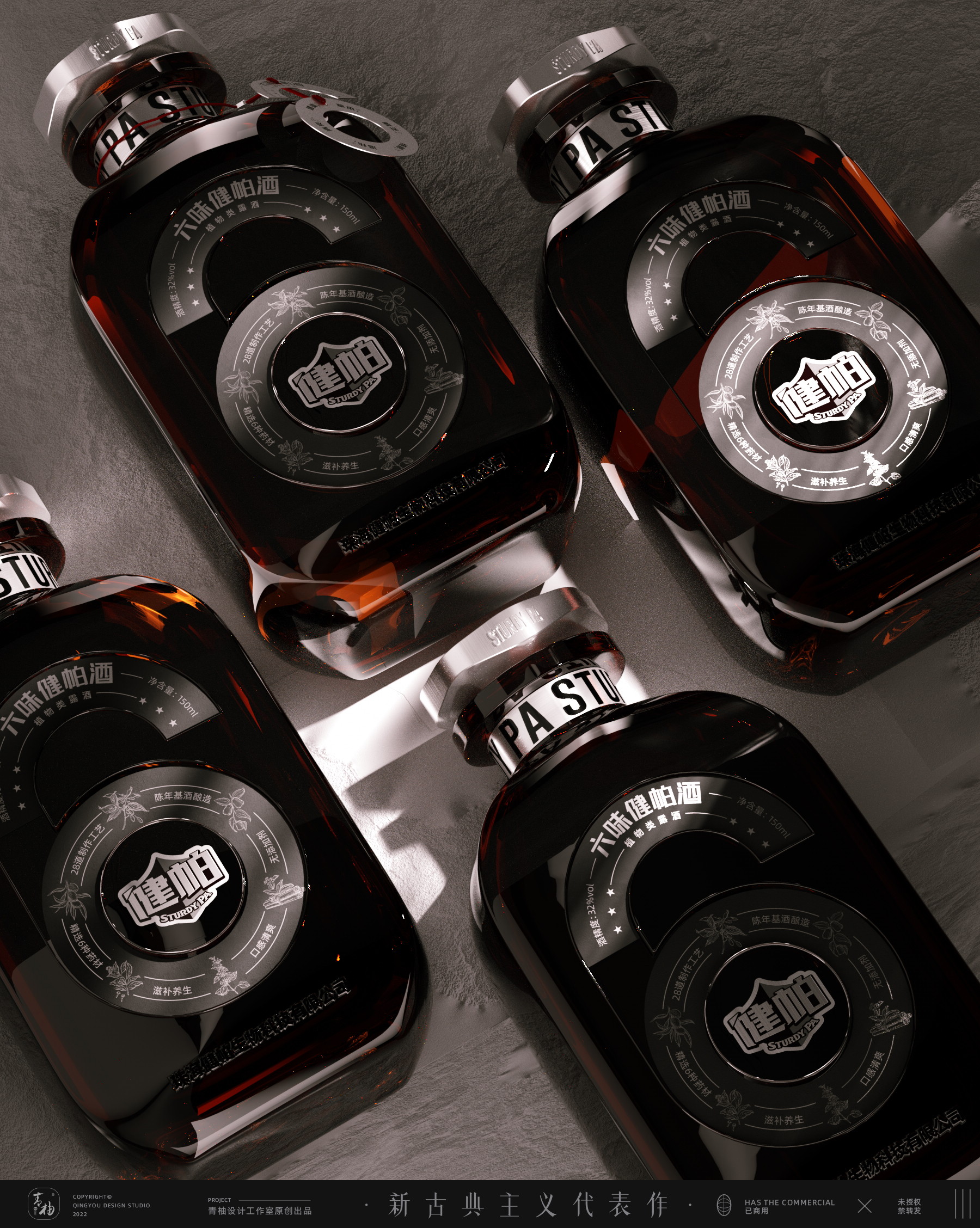
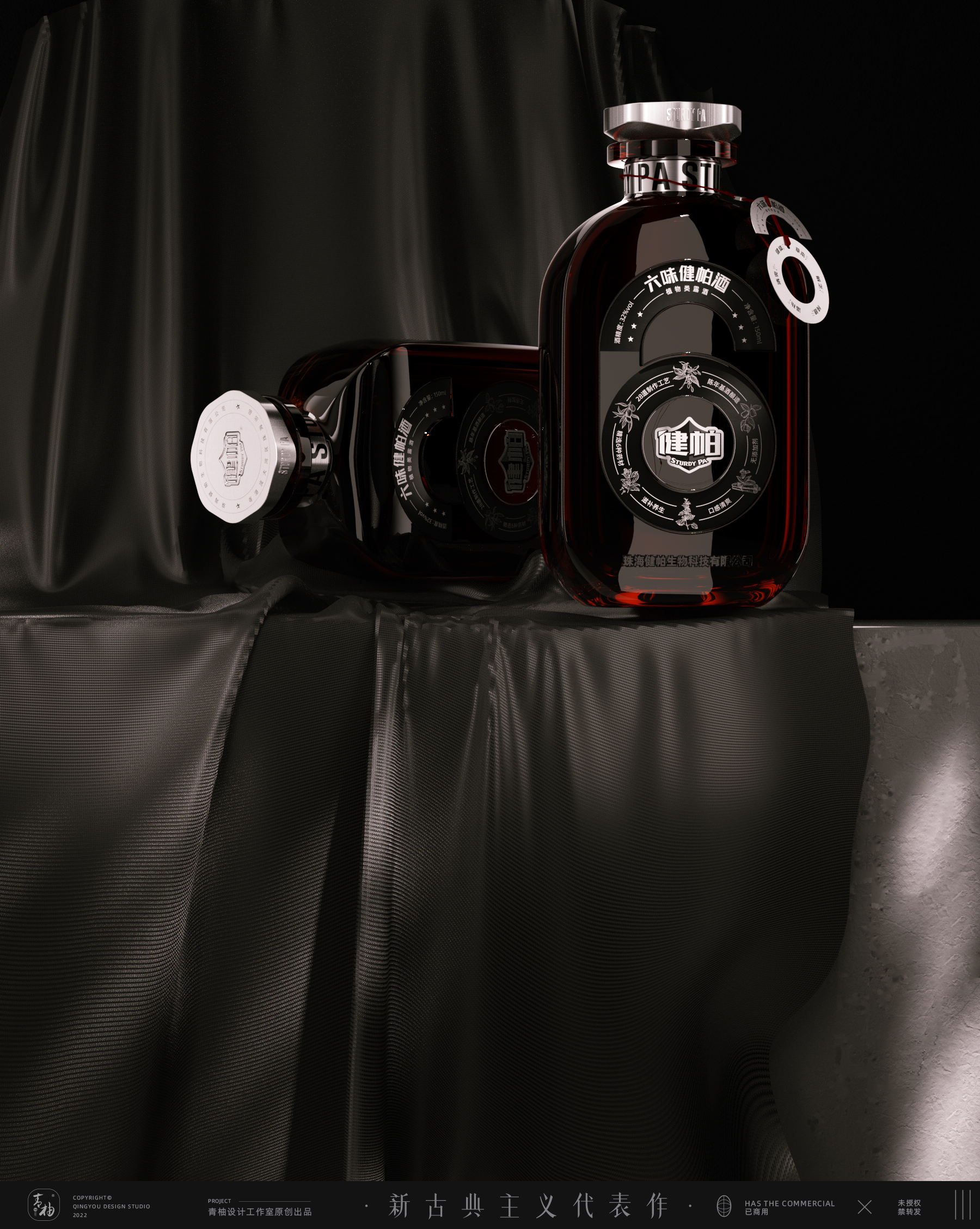
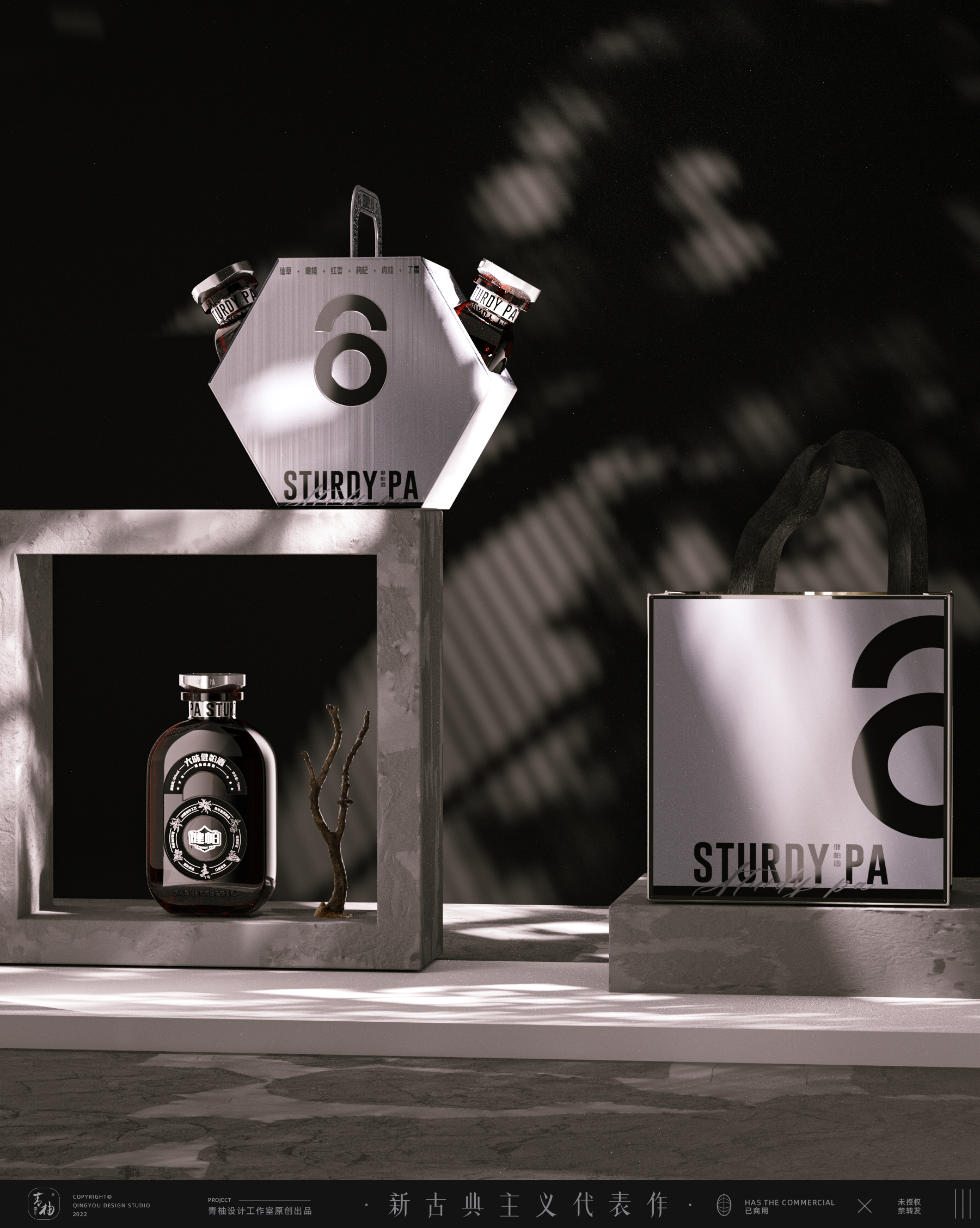
Refining the 6-character symbol to expand the overall design: the bottle type is upgraded to the outer circle, the inner circle is round, the side is round, the small arc is rounded, and the handfeel is unique at the same time, and the hard core is male aesthetic.
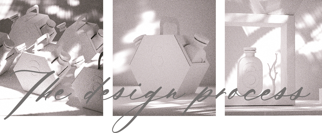
The label is embedded, and the lid is printed with the super symbol "6" sunken bottle body for hanging design, which has a strong shelf effect.
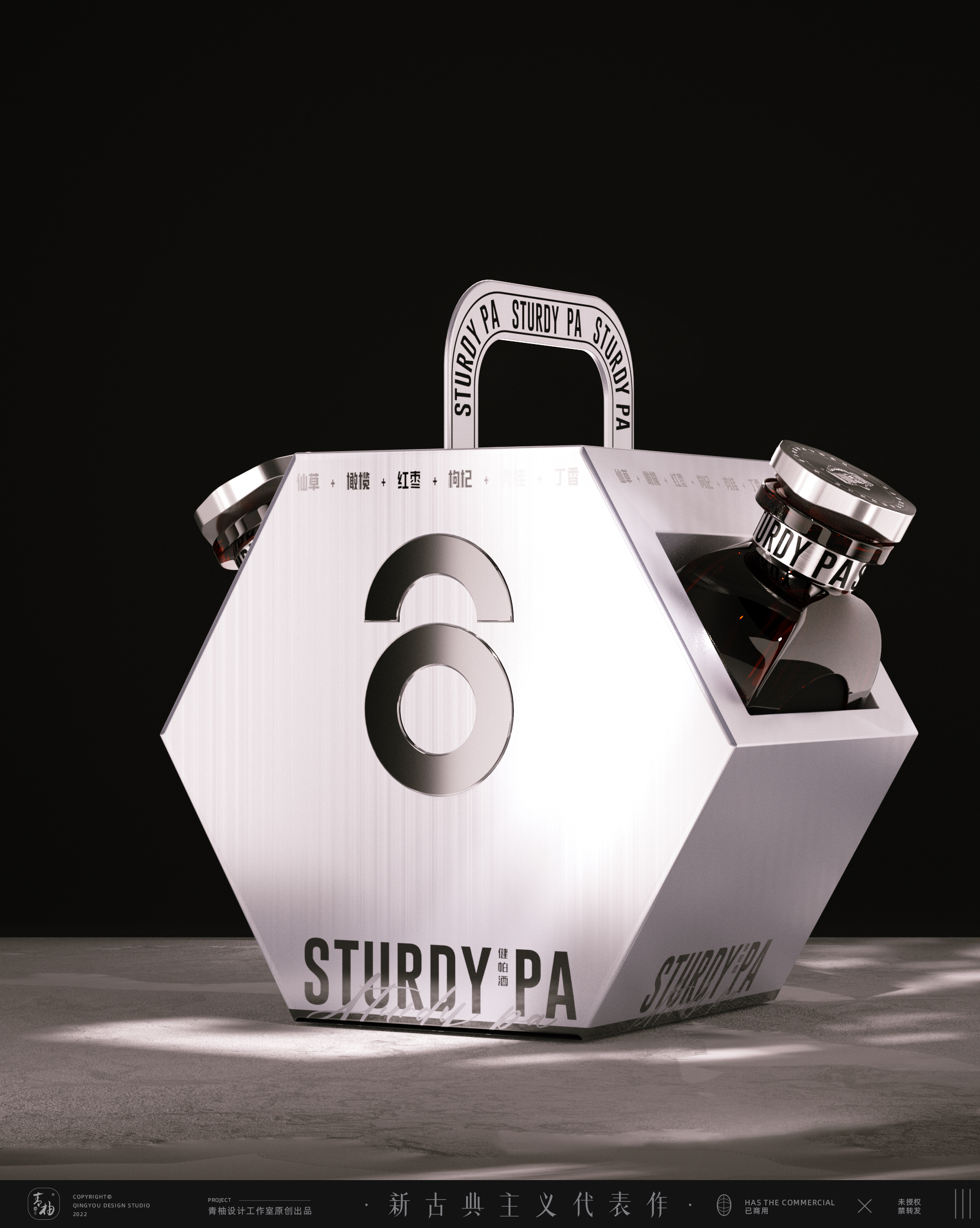
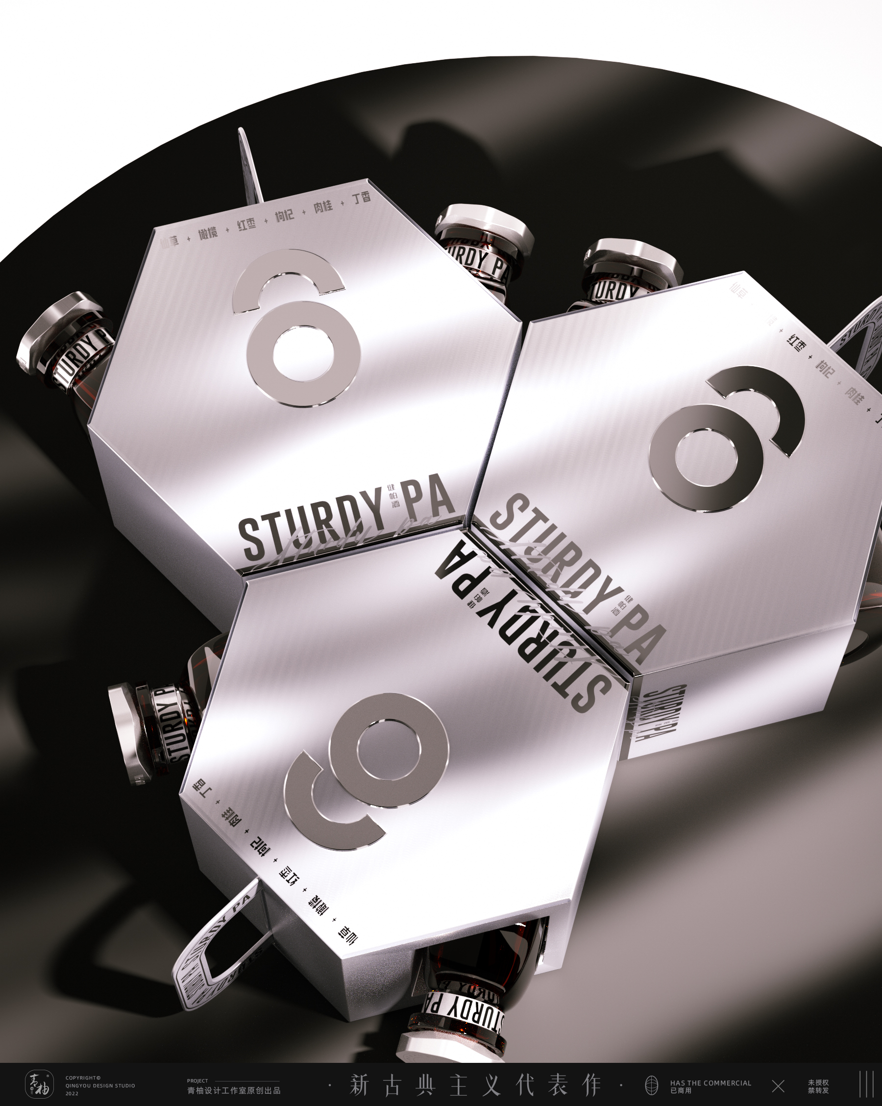
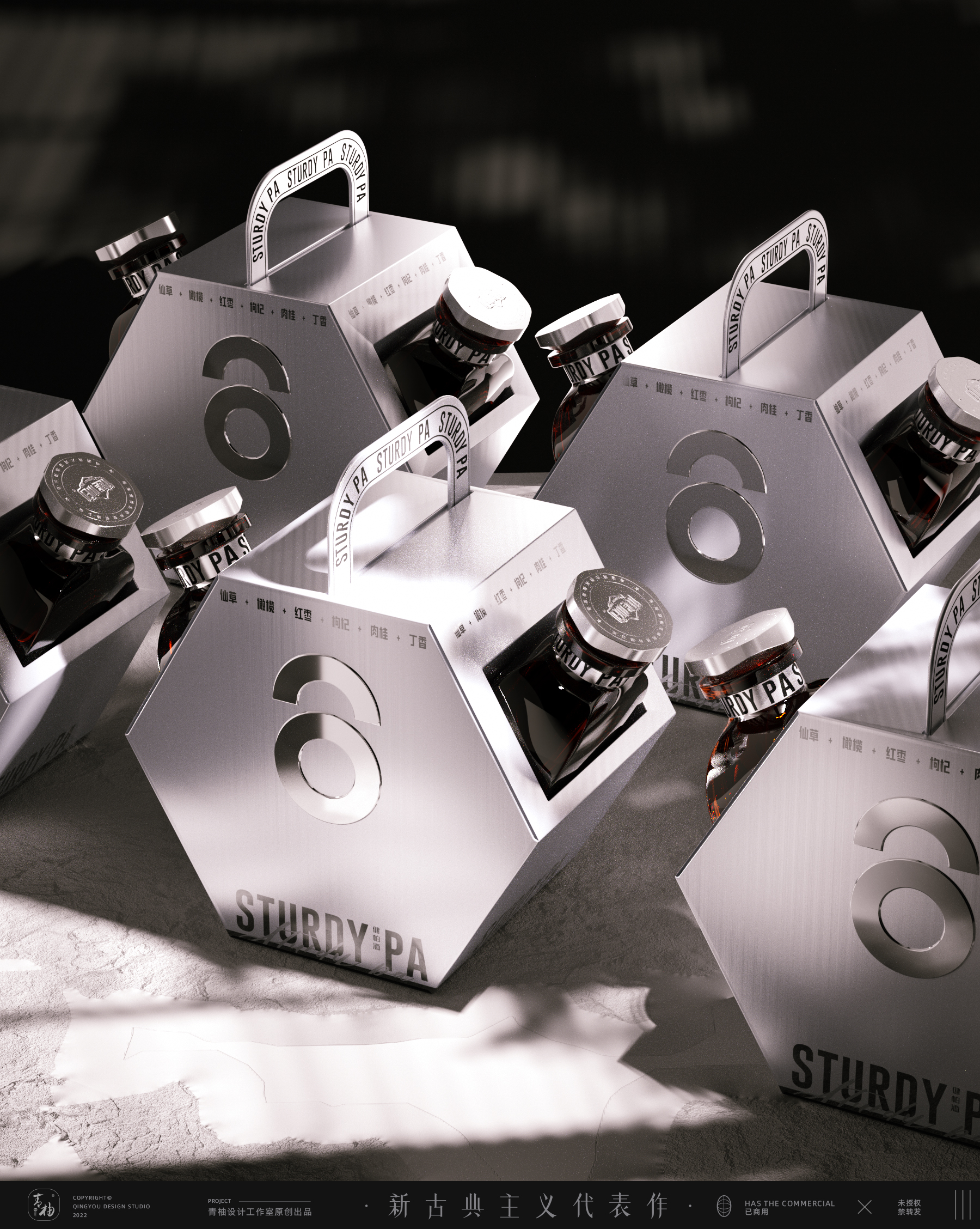
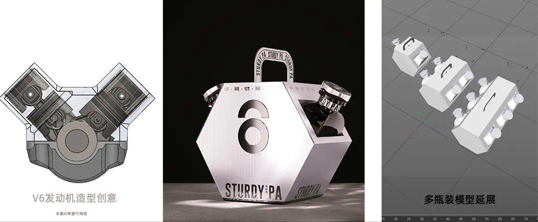
The shape of the gift box is creative with the left and right structure of the engine, and the hexagonal shape echoes the super symbol of Liuwei Jiampa wine. The overall visual design is clean and neat, and the tone and bottle are highly unified.
Name of Work: Upgrade of Liuwei Jiampa Wine Packaging (Packaging Design Bottle Design Gift Box Design)
Design team, green pomelo design
The copyright of this work belongs to 造物起异. No use is allowed without explicit permission from owner.

New user?Create an account
Log In Reset your password.
Account existed?Log In
Read and agree to the User Agreement Terms of Use.

Please enter your email to reset your password
Tough guy temperament
This name is so domineering.
It feels good.
It's really textured.