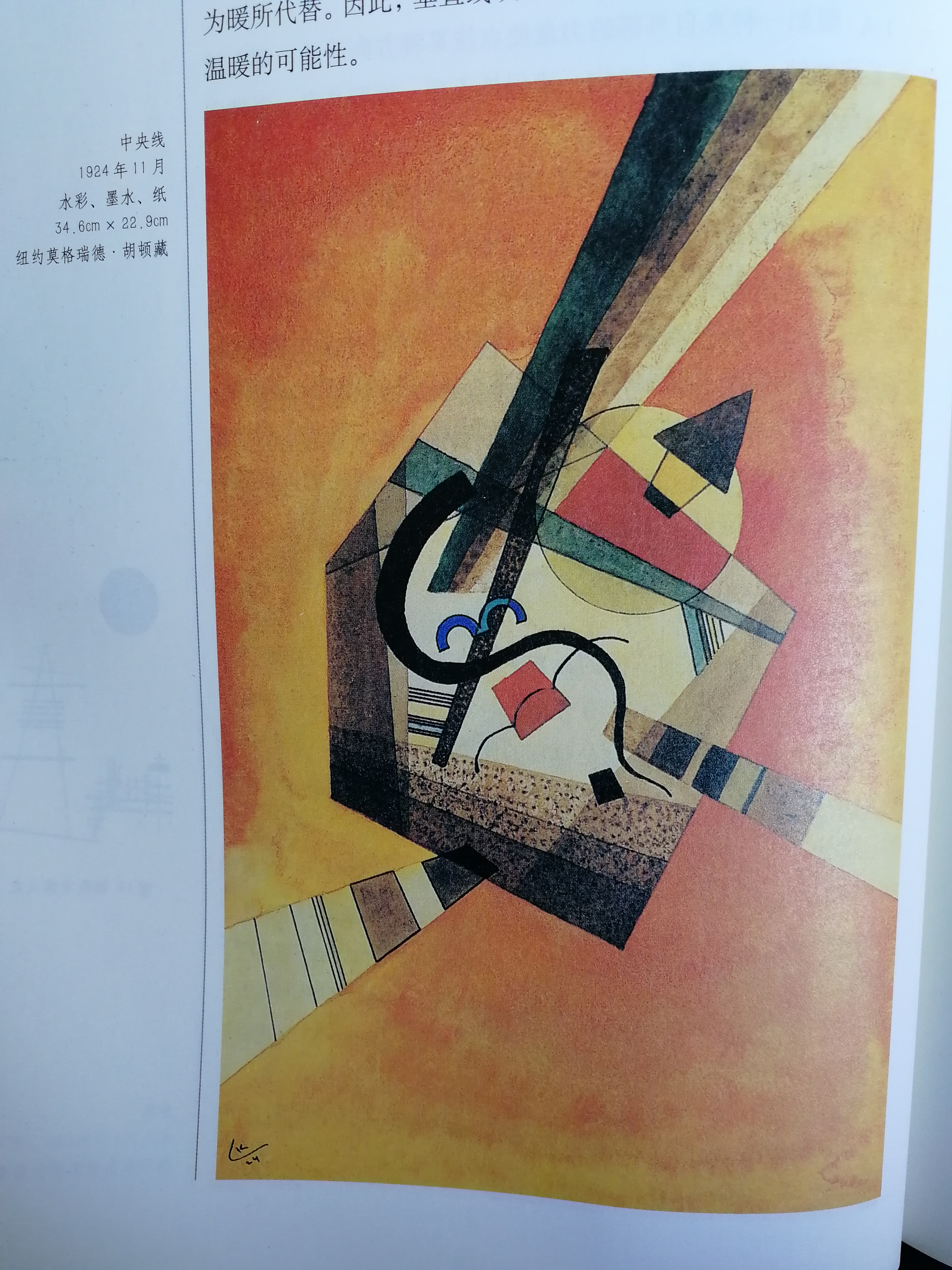
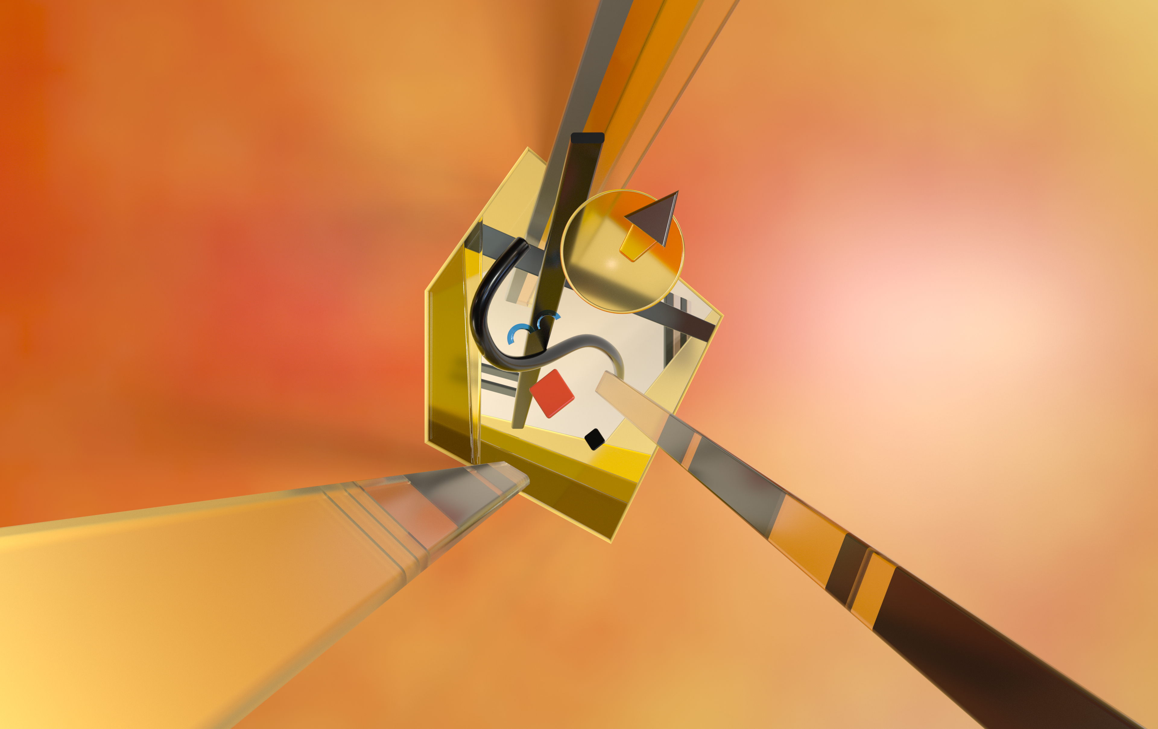
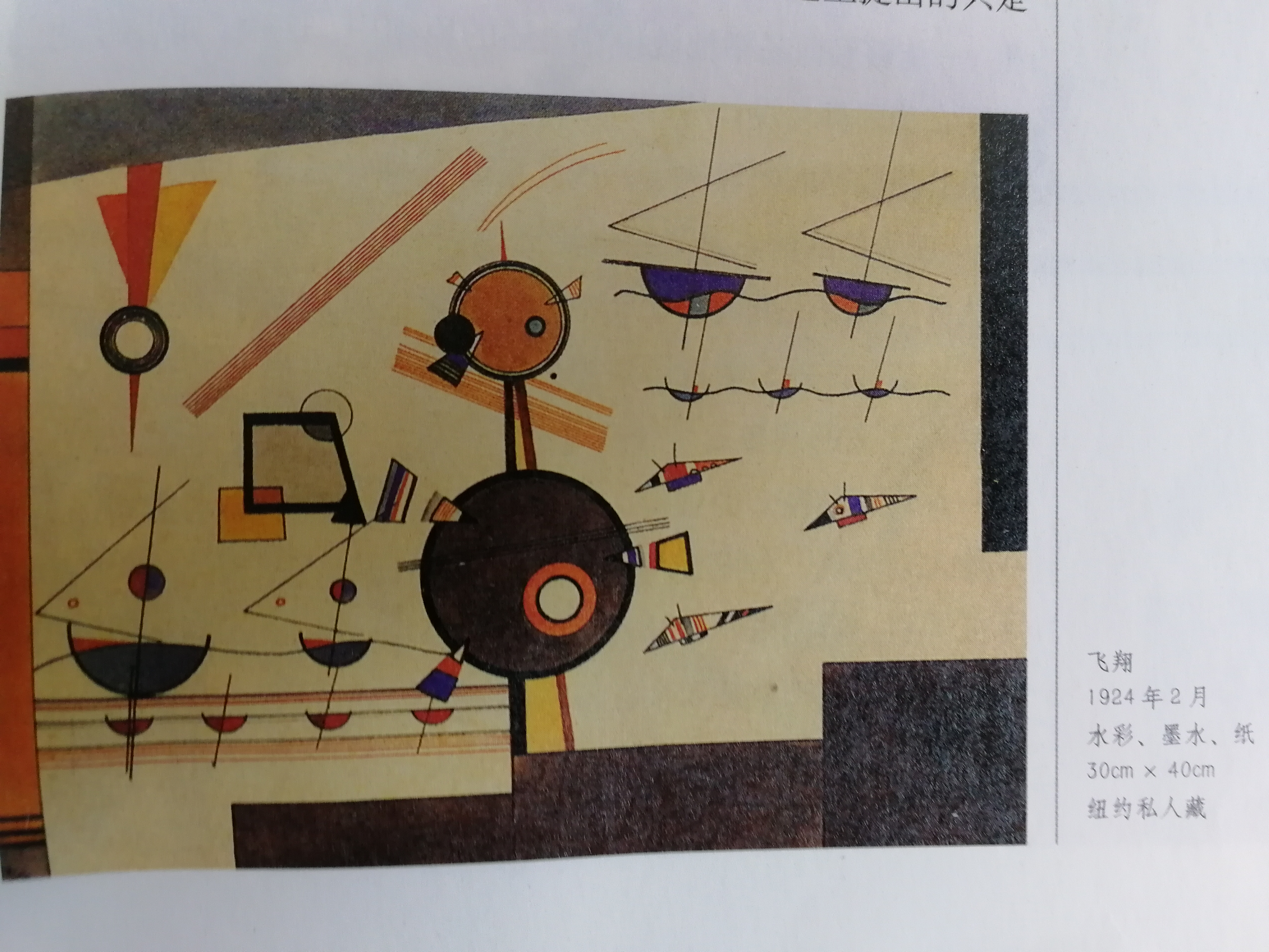
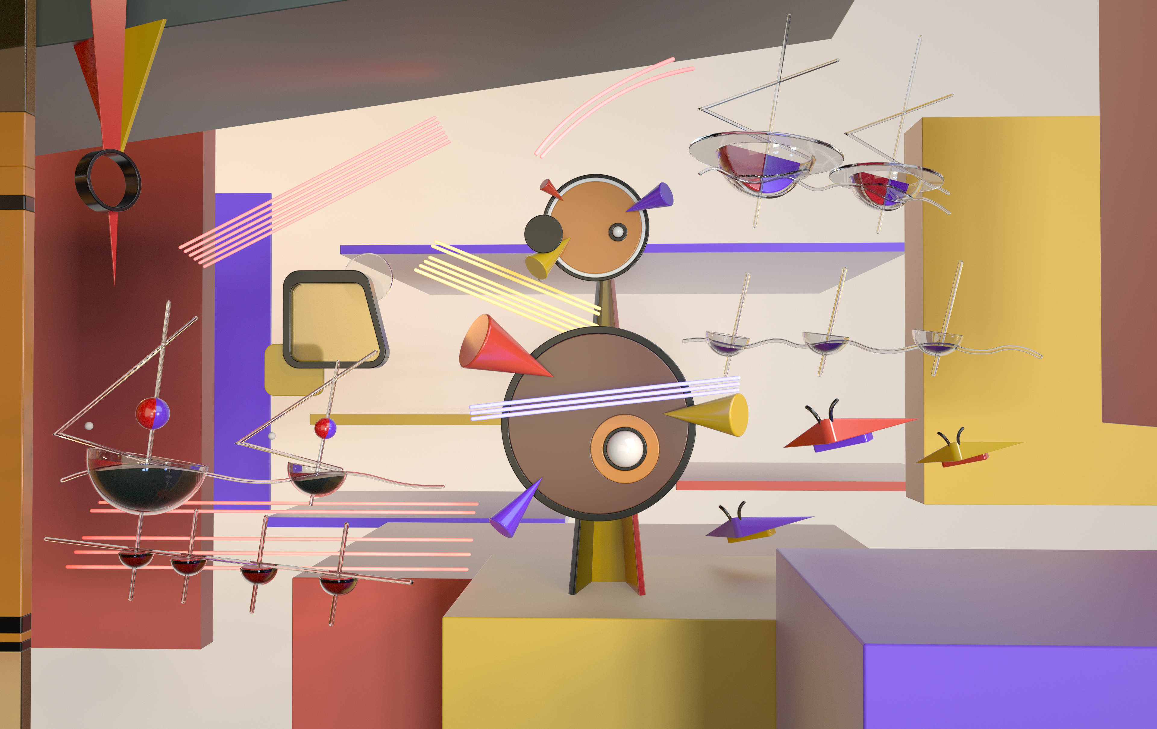
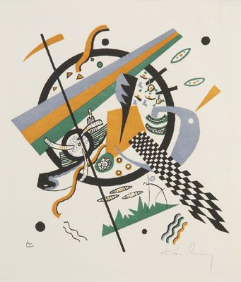
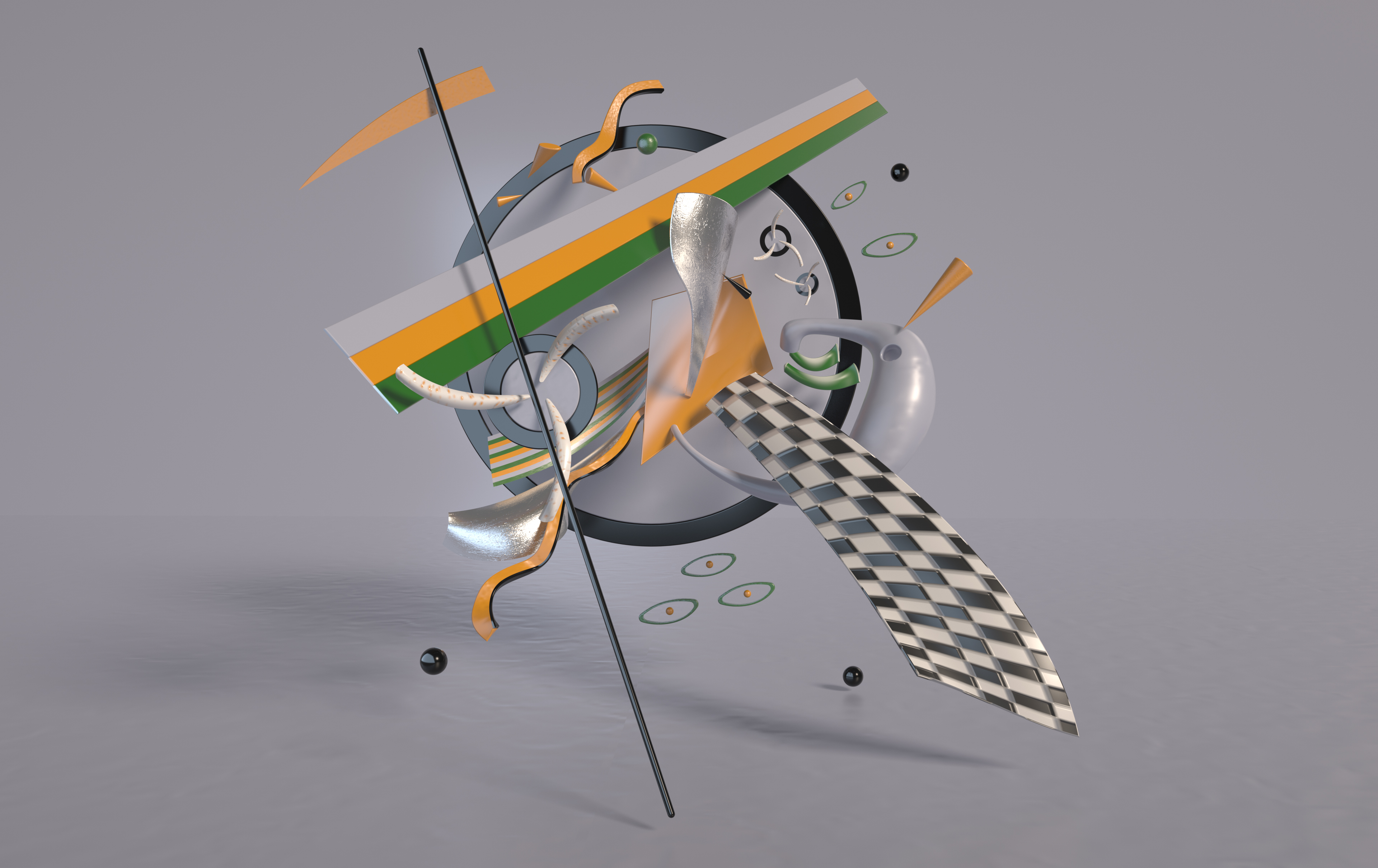
Starting in August, C4D wanted to speed up the software by completing some effects. Seeing that there was a book "Kandinsky on Points, Line and Surface" at home, I thought it was better to make the artist's paintings into 3D three-dimensional effects. After finishing three paintings, I began to think that I might as well imitate the artist's creative style to make my own original, so I had the final effect diagram (an exhibition stand), and the effect was, however, it is 18000 miles away from Kandinsky's artistic style. The reason for the failure is not enough to understand his works, and there is too little contact so there is too little understanding. Another point of dissatisfaction is that the exhibition stand cannot express the specific style, which can only make the overall color environment and material relatively coordinated. At first, I thought for a long time about how to combine artistic style with real objects, but I never wanted to understand, therefore, the neutral field is floating in the process of doing it. I want to go to this style for a while, but I feel that it does not match the target style for a while.
It is still difficult to control the specific creative style and details. This is a difficult problem that I have not been able to solve so far. I hope all the great gods can put forward valuable opinions and wish me growth.
The copyright of this work belongs to Rain. No use is allowed without explicit permission from owner.

New user?Create an account
Log In Reset your password.
Account existed?Log In
Read and agree to the User Agreement Terms of Use.

Please enter your email to reset your password
Comment Board (0)
Empty comment