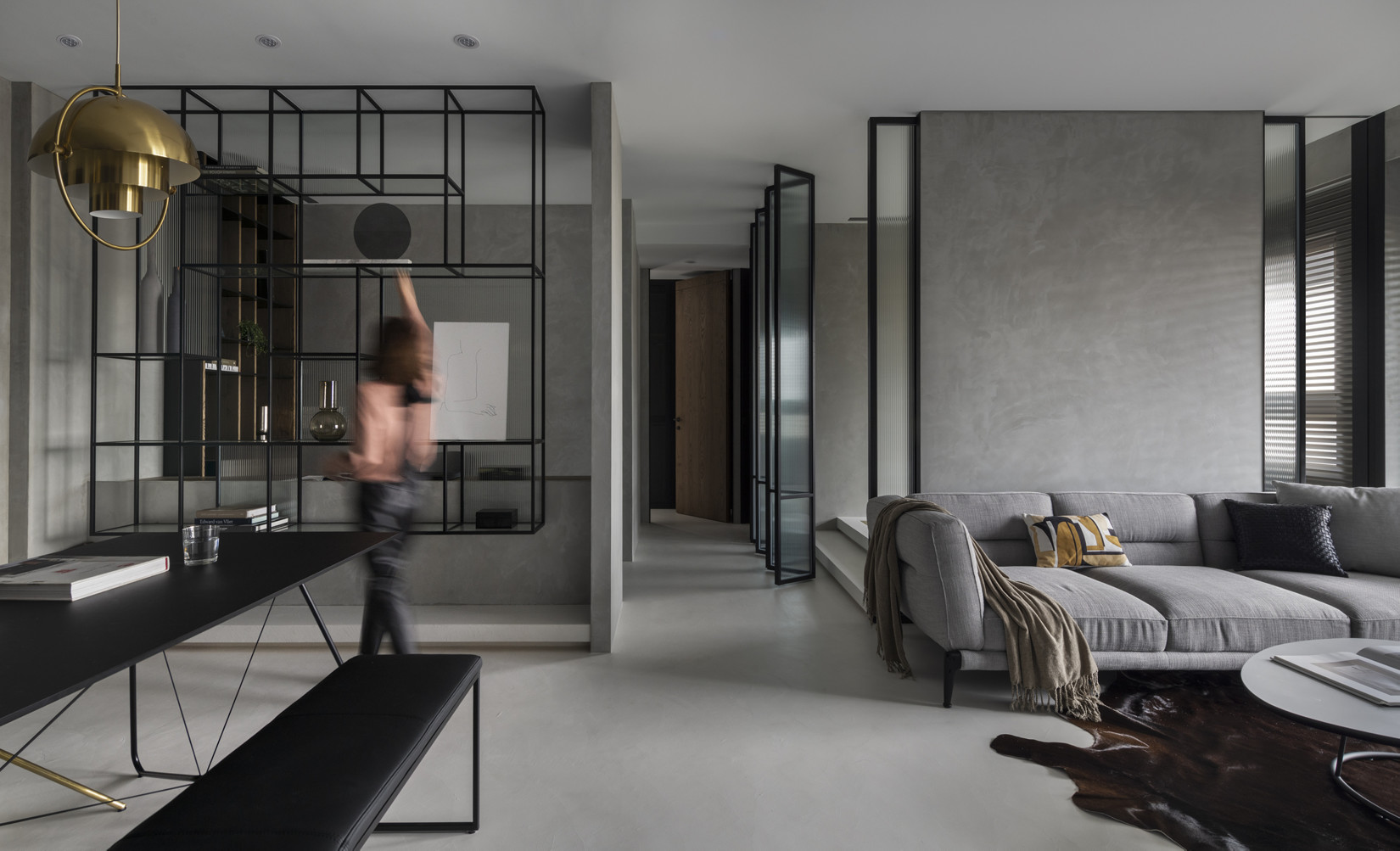
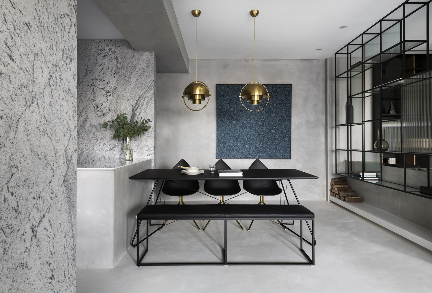
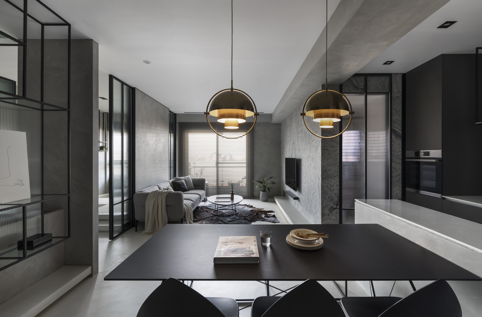
Pointing to the most subtle axis and dimension in the space design, it becomes a cycle without end and beginning when the walking, living, lying and sitting in the room. First defined, then eliminated, therefore, the living room is a living space. Turn, pause, paragraph, as the division of space, straight and horizontal lines are curved and expanded, pushing and pulling up layers of media; each wall is arranged in an array, pierced with a hollow iron cabinet and translucent glass movable sliding door, so that the wall is not only the main cutting surface of the overall space, but also slightly differentiated and light. Furniture is a post station that ferries with living activities; out of the porch, the dining table is closely connected with the kitchen, corresponding to the position of the hanging display cabinet, and the line of sight can penetrate the hollow cabinet and pull away to the study. Turning into the living room space, it is open and bright. The main wall of the TV continues the surface material of the porch and the kitchen room by listening to the waterfall texture stone. It turns straight to the horizontal surface and senses the depth of the facade, bringing the space into the three-dimensional dimension. The hand-brushed wall surface corresponding to the back wall of the sofa is gleaming and connected to the main color of the space: gray scale. The black, gray and white color system is finely adjusted to the millimeter scale, so that the space shows a gradual rhyme dye in an orderly chromaticity, and when the sun shines, strong or weak, the color scale is more clear and varied. In the meantime, dark black iron pieces, wood skin color, gold, cold glass color, paintings, green planting embellishment, spread cloth, so that the unfolded heaven and earth wall, gray space, added a light lead point, quiet and excellent and bright as bi, each suitable for its place. Between the points, lines and planes, the light is allowed to enter the room, and the pattern configuration follows the light. The darkest corner can also be awakened by the light. The material processing is also derived from the rhythm of light, such as: suspended display cabinets and The configuration of the low wall and the white bottom table surface makes a beautiful ratio of the mass relationship between the wall and the frame. Through the staggered changes of light and shadow, the material mass is softened. The harmony room is arranged next to the long and narrow study, behind the back wall of the sofa (hollowed out on both sides), and between the walkways. It is a semi-open space. Special movable folding doors are set to integrate the walkways with the harmony room and dilute the walkway space to increase liveliness.


Country
Taiwan
Year
2019
Client
personal
Affiliation
And design HOHO DESIGN
Designer
Jane Jiayi K CHIEN
The copyright of this work belongs to K-DESIGN AWARD. No use is allowed without explicit permission from owner.

New user?Create an account
Log In Reset your password.
Account existed?Log In
Read and agree to the User Agreement Terms of Use.

Please enter your email to reset your password
Comment Board (0)
Empty comment