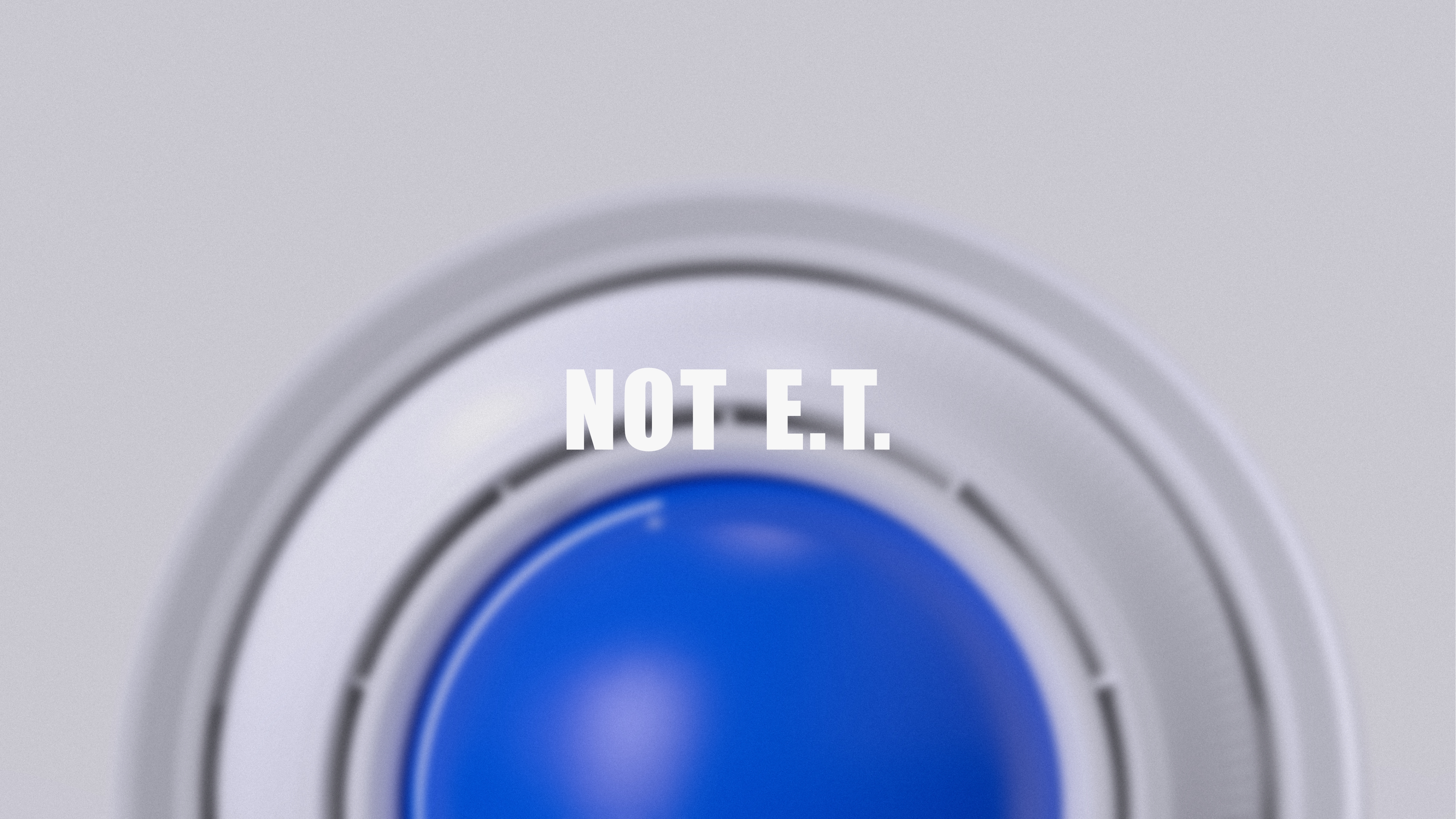
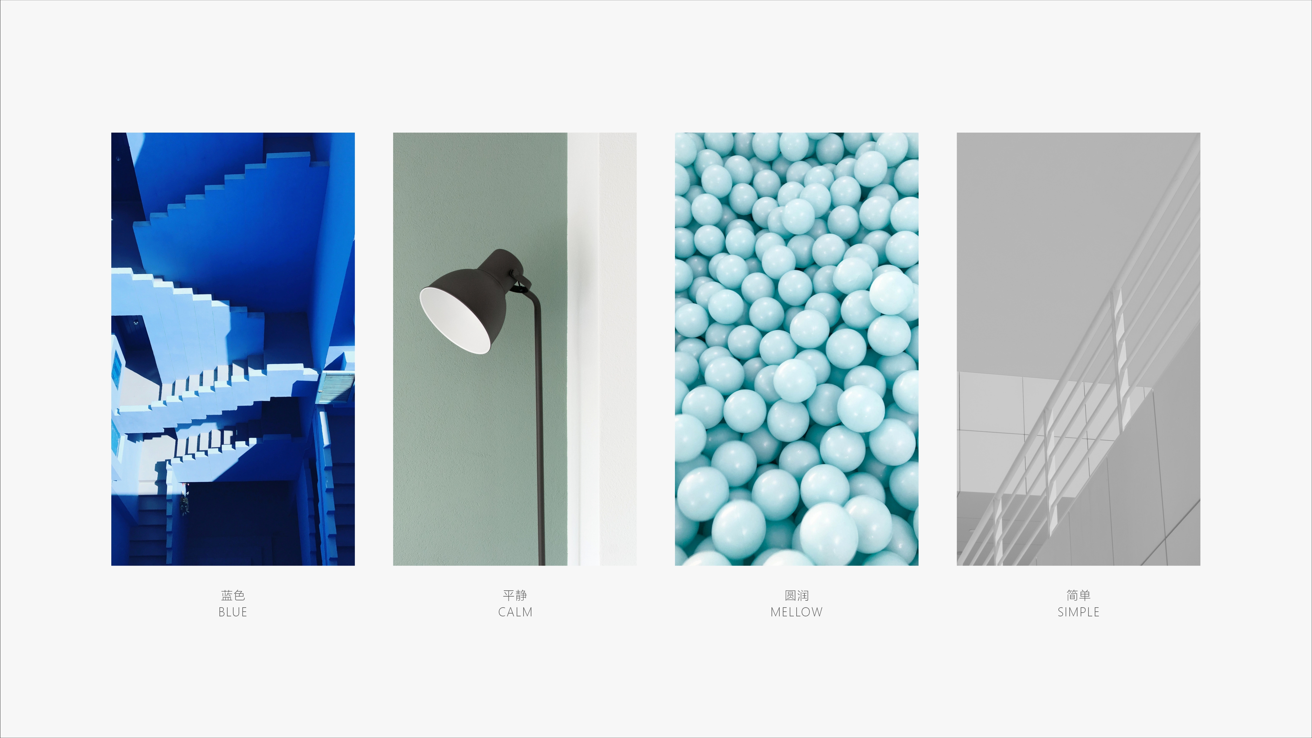
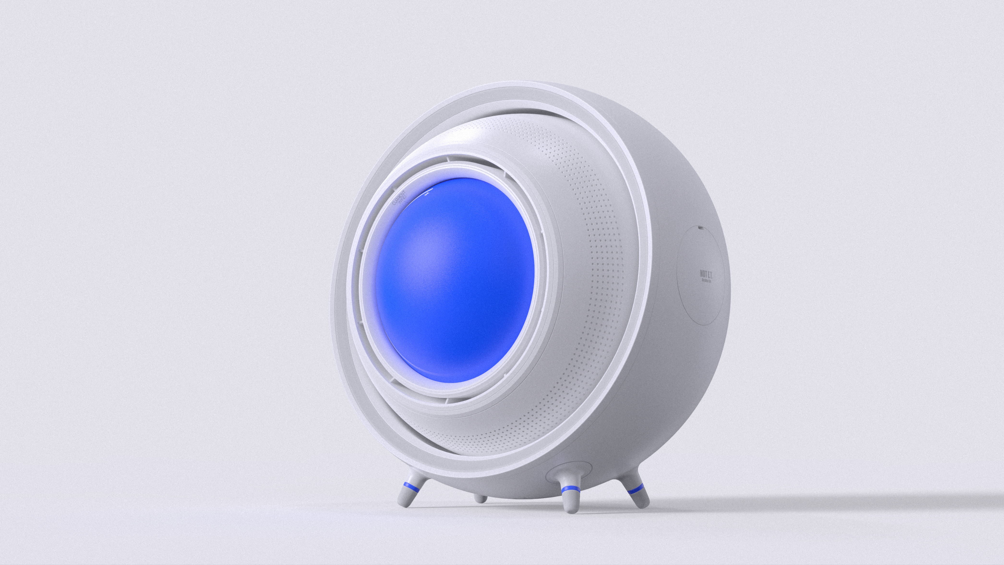
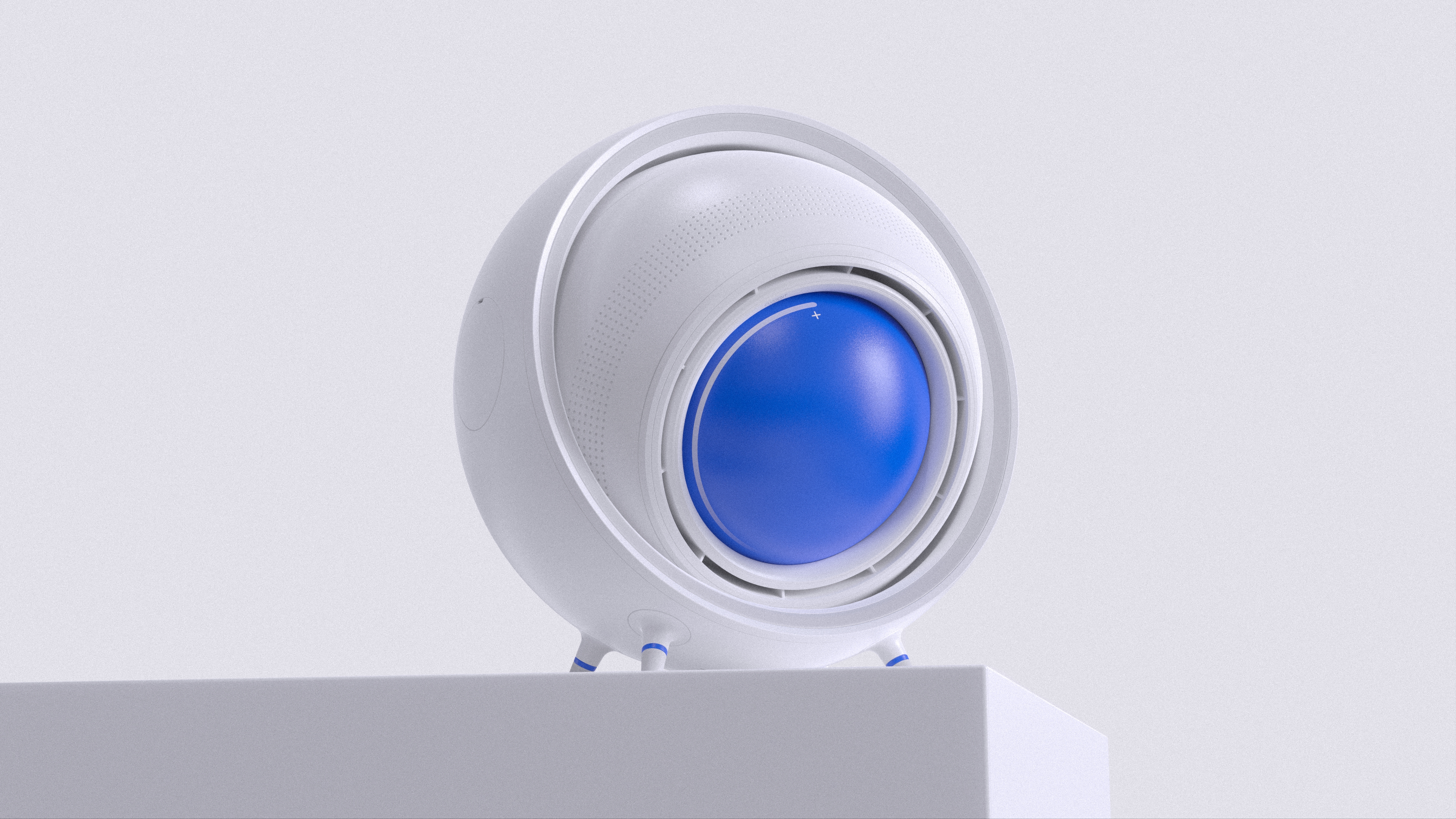
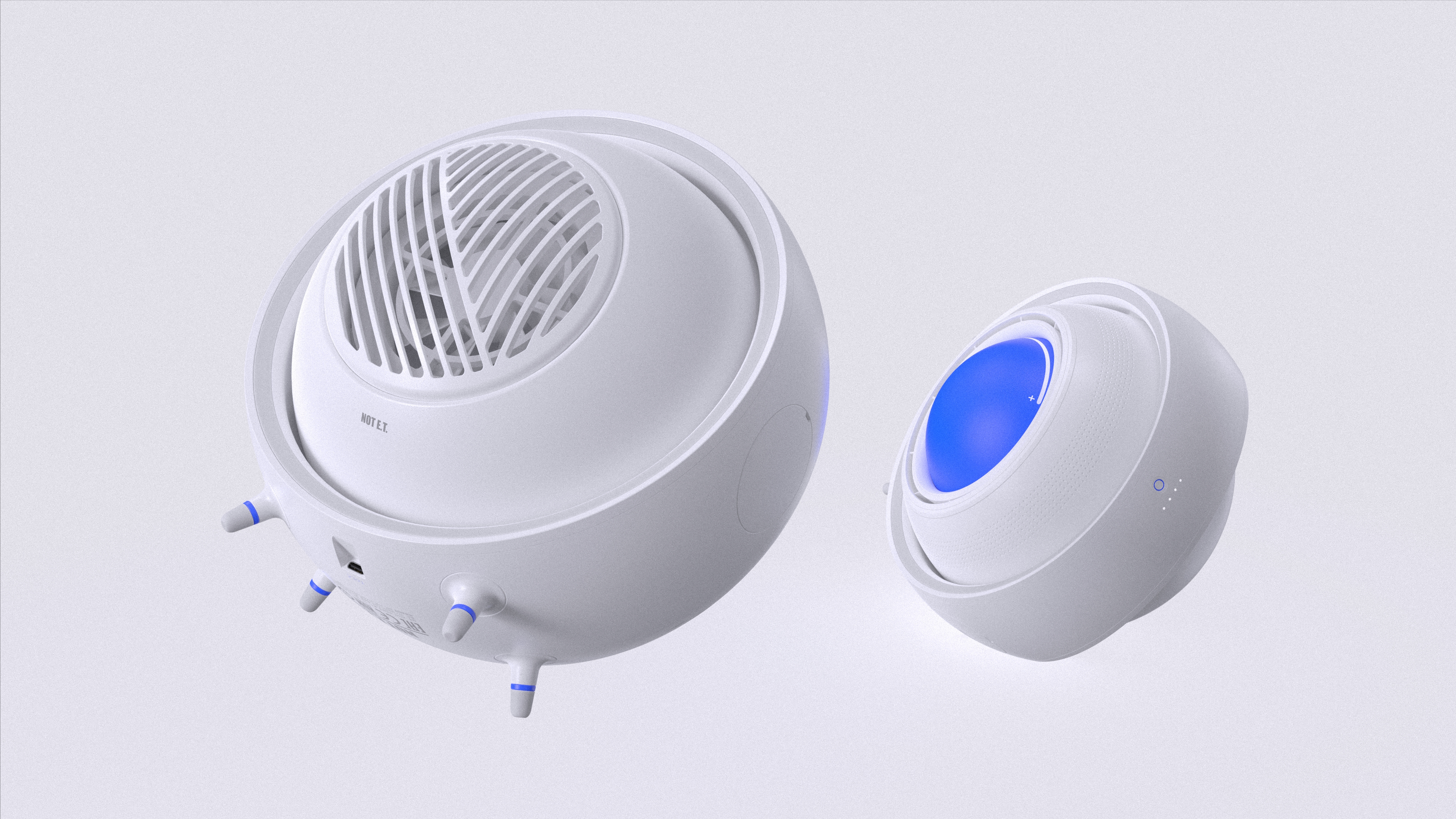
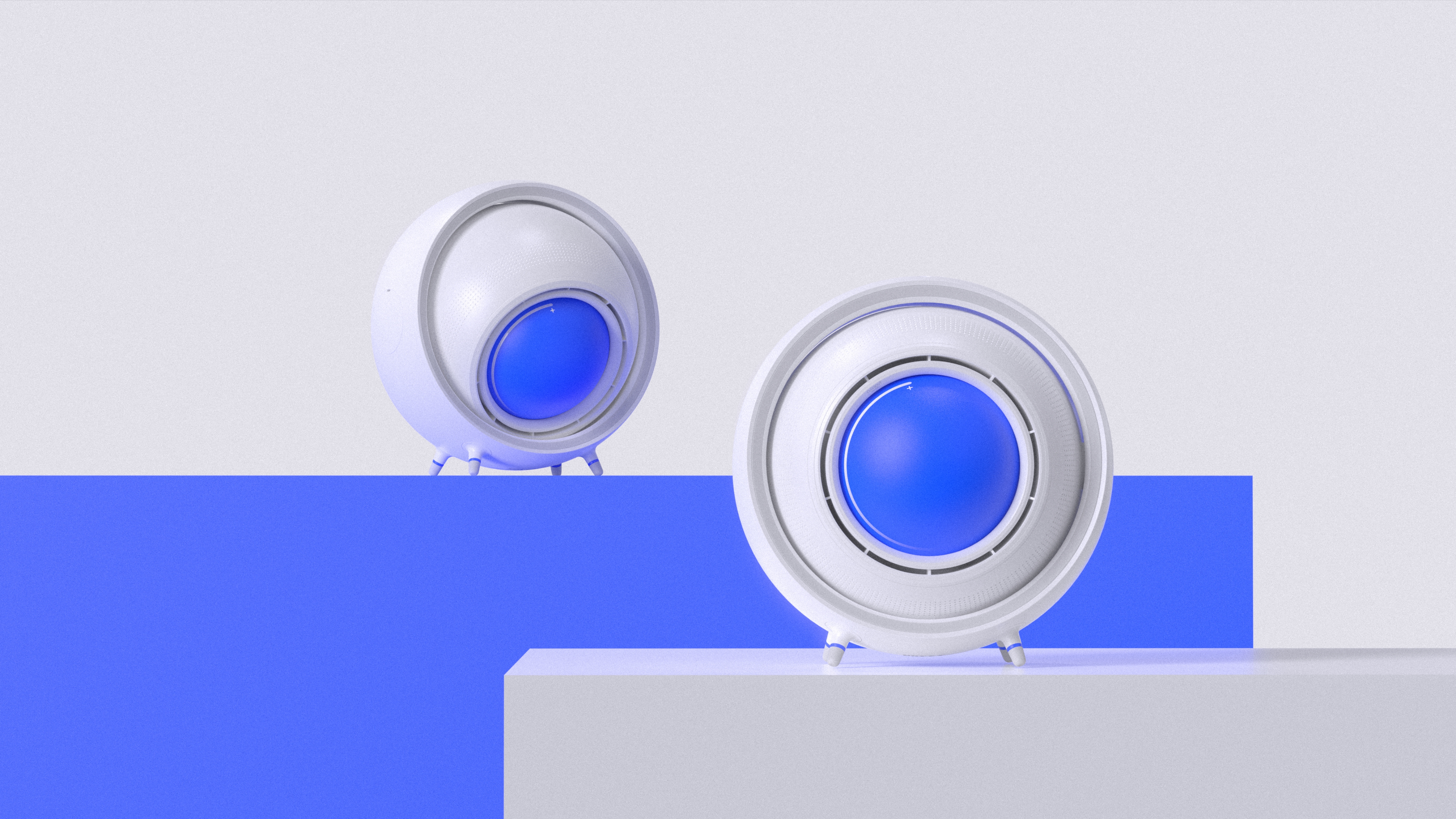
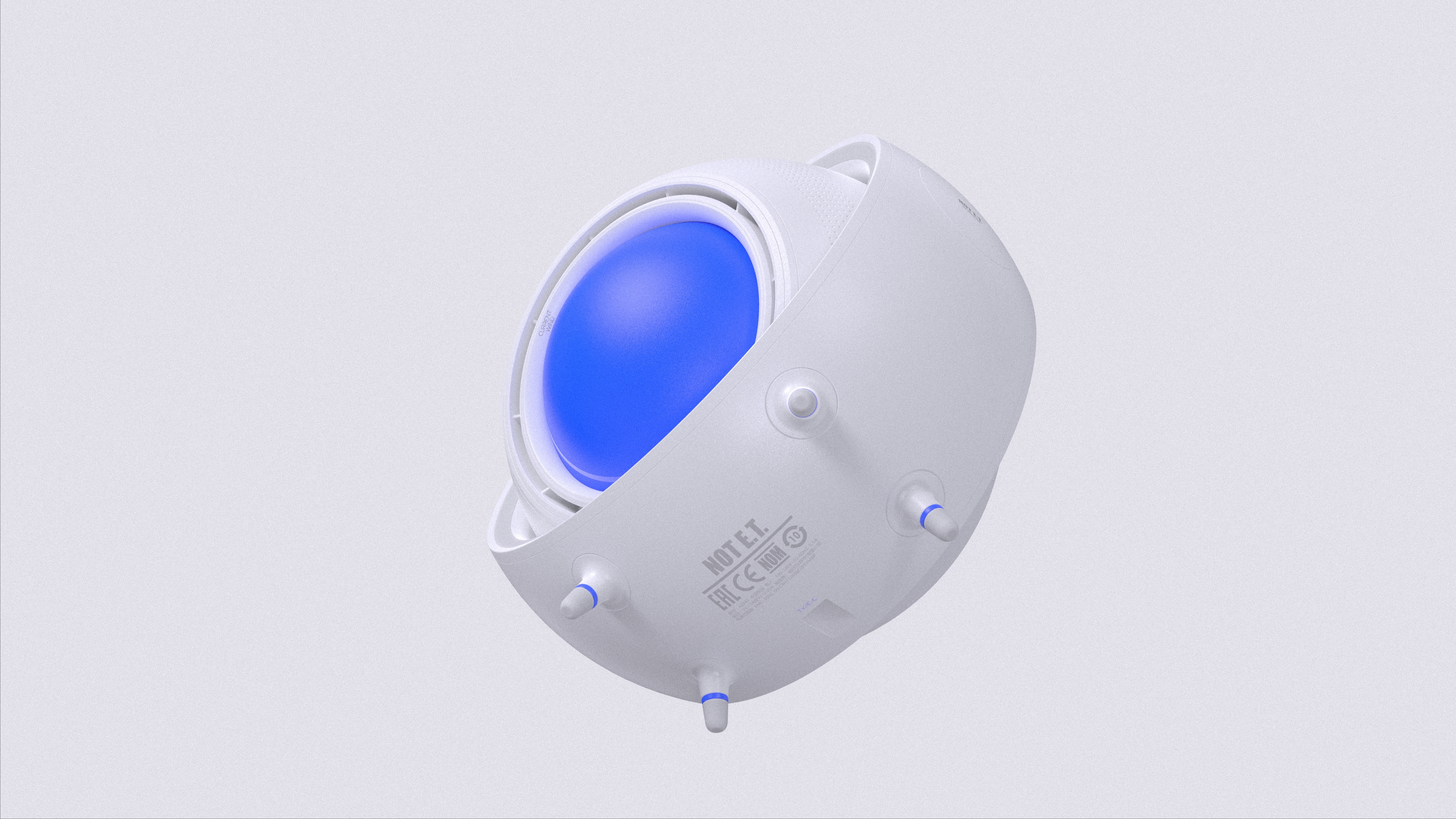
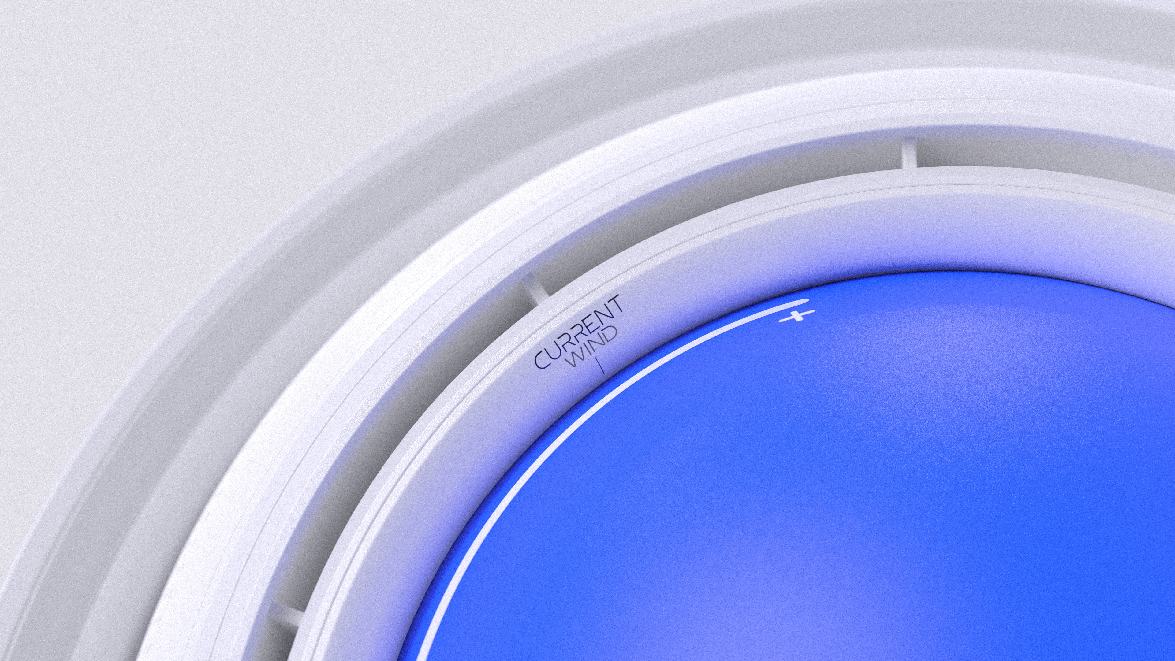
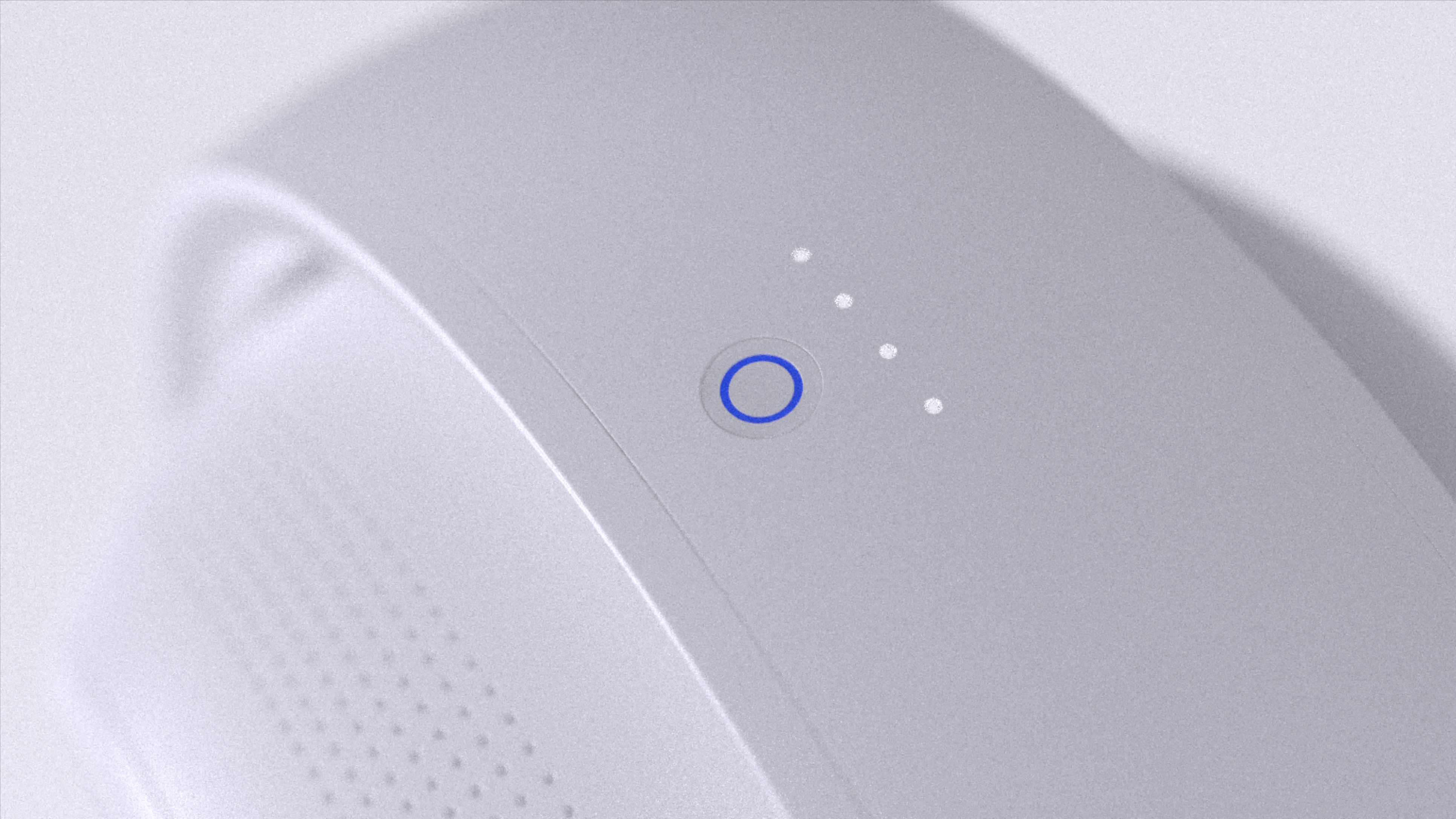
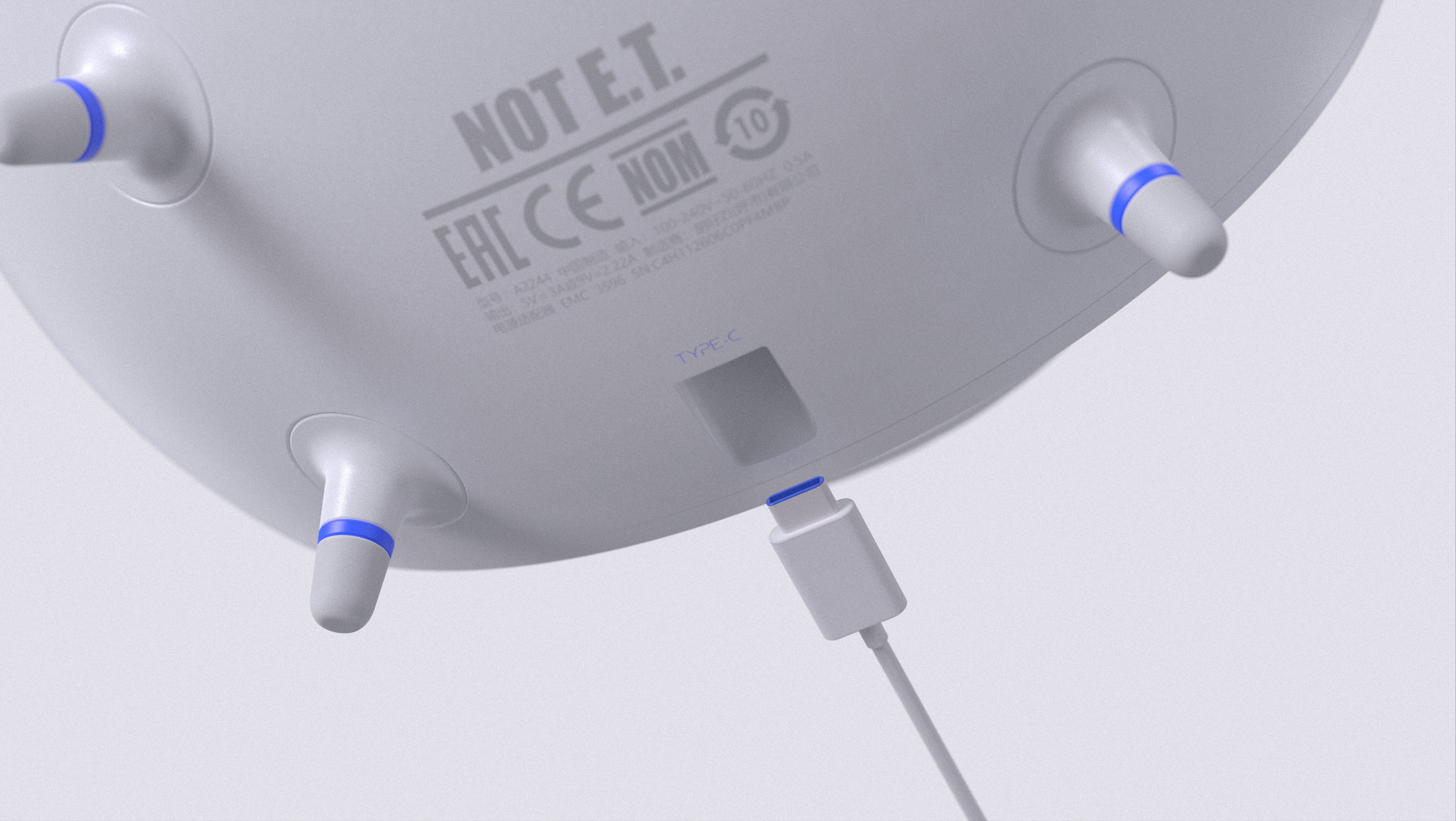
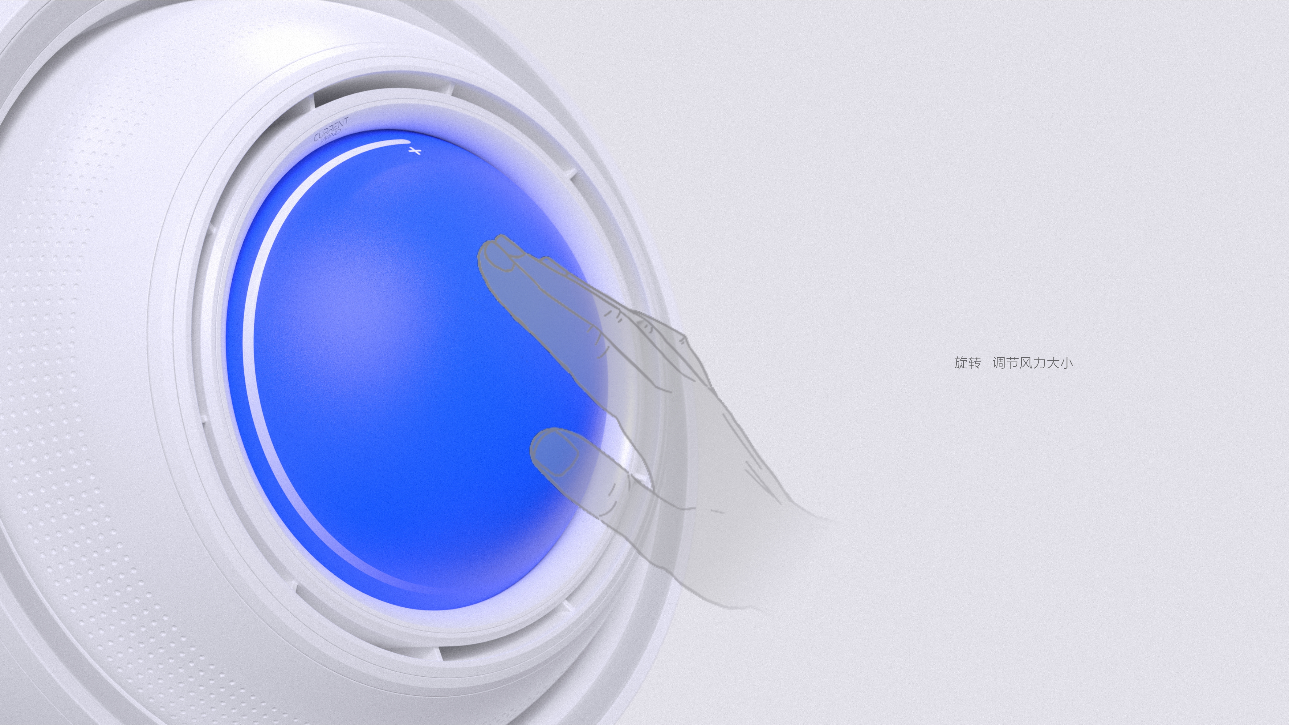
NOT E.T. is designed based on the eyes, with a simple shape, with white as the main color and Klein blue as the auxiliary color. Student homework, please comment on it!!!!

The copyright of this work belongs to Clerk. Wei. No use is allowed without explicit permission from owner.

New user?Create an account
Log In Reset your password.
Account existed?Log In
Read and agree to the User Agreement Terms of Use.

Please enter your email to reset your password
What does Big Brother use to render this texture?
Thank you
Bionic design requires a very high degree of control. The key lies in refining the original god, which is too concrete and difficult to fall into the conventional style! Too abstract to express the beauty you originally wanted to express! Modeling and color matching can be considered from the aspect of affinity. Design is to convey pleasure!
Looking forward to the new work of the big guy
In fact, the middle of the pupil of David's plaster statue can be hollowed out. You can make the air outlet bigger. Even if the situation upstairs says "the air outlet is too small", the function can also be mentioned. When you make the publicity picture, you can also make the eye part of David's plaster statue as a background foil product. The inspiration is not only from human eyes, but also from the artistic feeling of David's plaster statue, which, there is a feeling of marble (ha, ha, ha, ha, forcing Lai Lai to give some advice and listen to it. The most important thing is to have your own ideas.) Come on
The wind effect may not be as good as you think. The air outlet is too small, 80 points for modeling and 40 points for function.
Eyeball wind? Ha ha ha
It's quite good, but it's better not to be so concrete. A big rotating eye bead is really interesting but also a little uncomfortable.
666666
Quite Q's shape
Like a camera
Is it too small
Praise