Looking forward to professional guidance. Thank you very much


The copyright of this work belongs to 188****5200. No use is allowed without explicit permission from owner.

New user?Create an account
Log In Reset your password.
Account existed?Log In
Read and agree to the User Agreement Terms of Use.

Please enter your email to reset your password
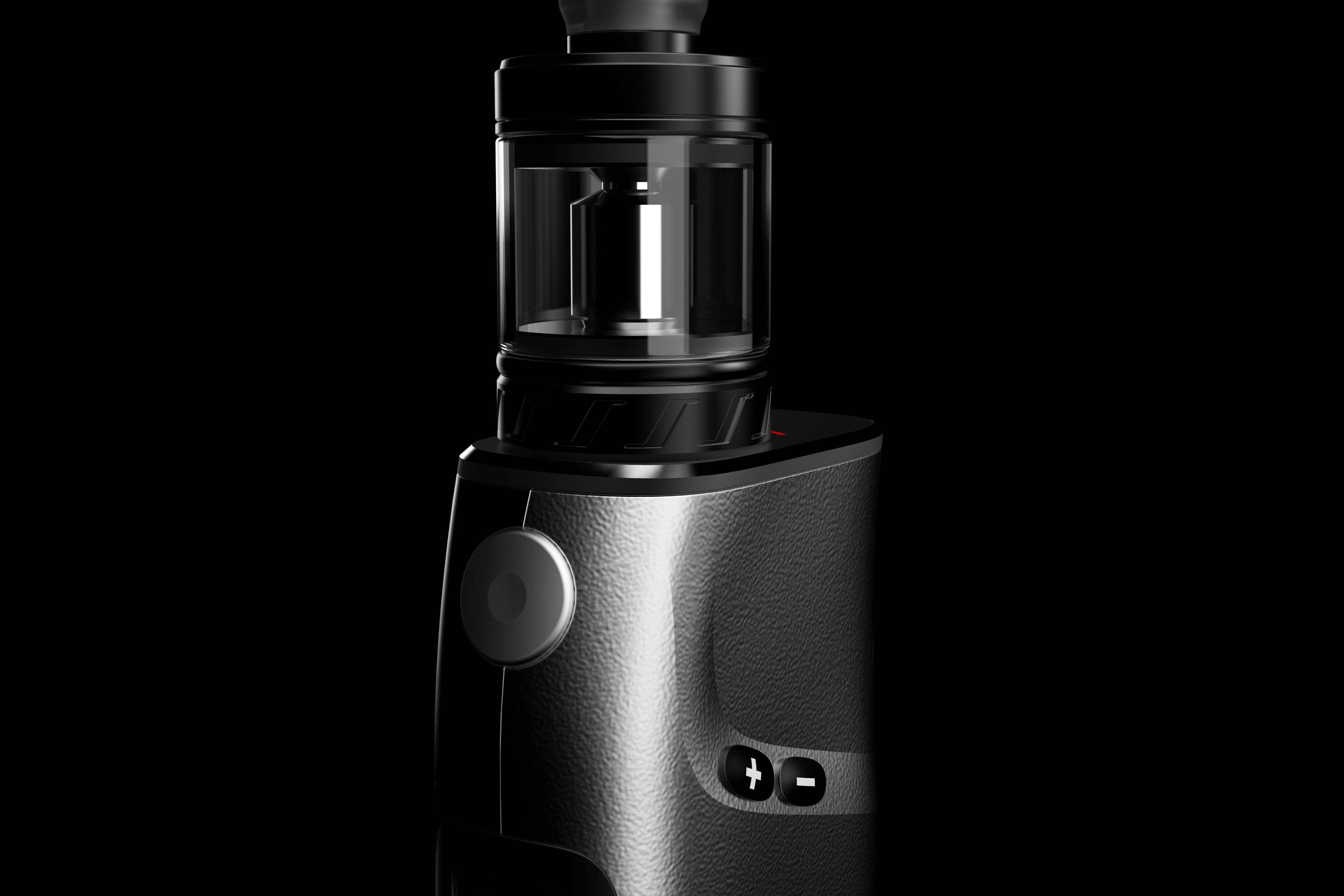
I always feel that your black and silver parting lines are cut casually side.
The side button does not hold and does not conform to the European and American handheld.
Home page, keys on the side. Whether the blind operation conforms to the ergonomics needs to be verified by the hand board. Second, the key is on the side, and a board needs to be added, which will increase the thickness and cost of the product.
The pressure regulating button can be on one side with the screen, which is a reasonable state. The operation is more customary, and the risk of being spit out is also reduced. It is also a cloth board. The space utilization is more reasonable, so that the size of the whole box is well controlled. If you put it on the side, your box will be thicker, so you don't know the hand feeling.
The pressure regulating key is better on one side of the main key
Not bad
Please advise how the effect of the first cigarette is rendered?
The rendering effect is very good ~