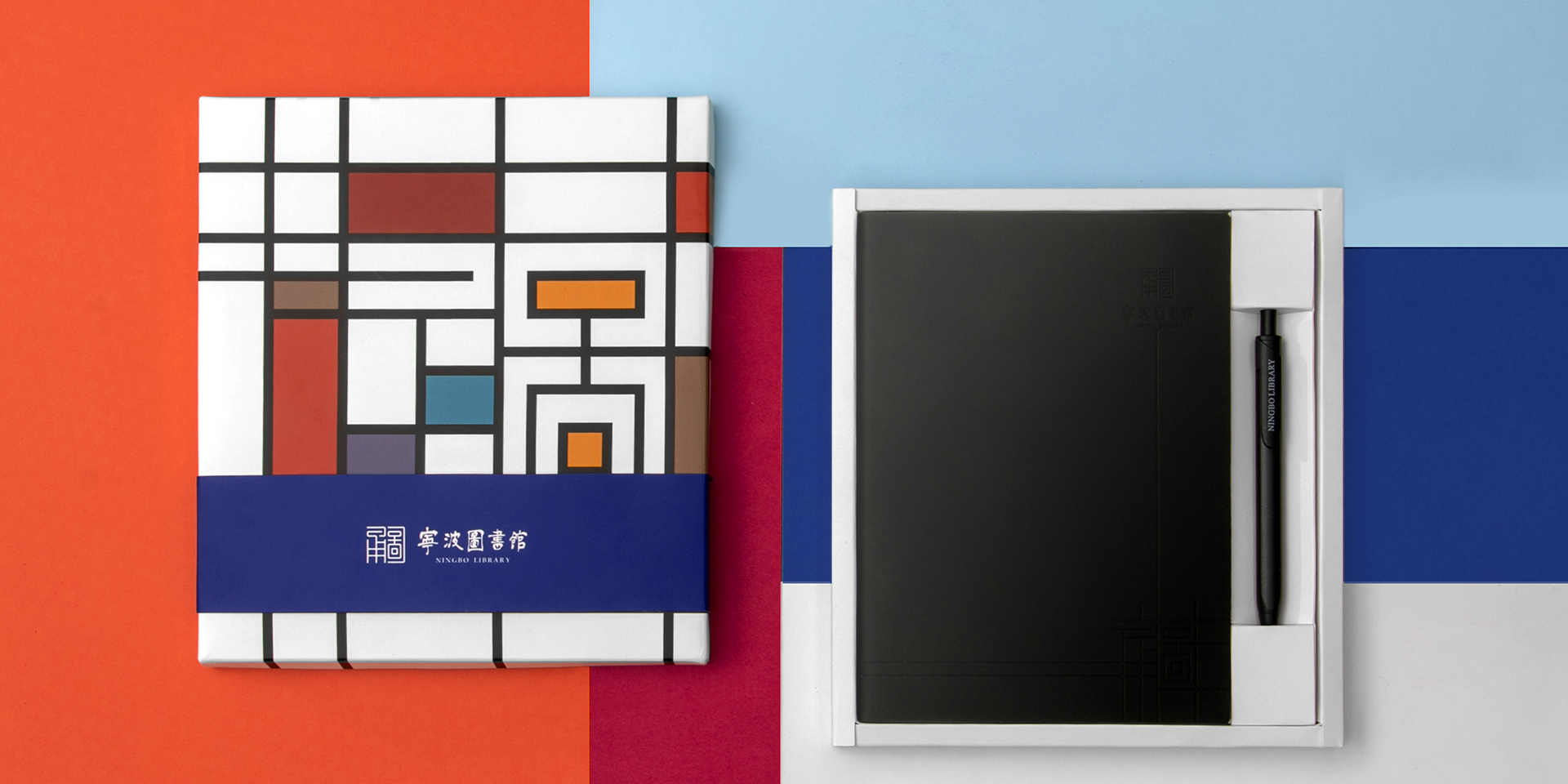
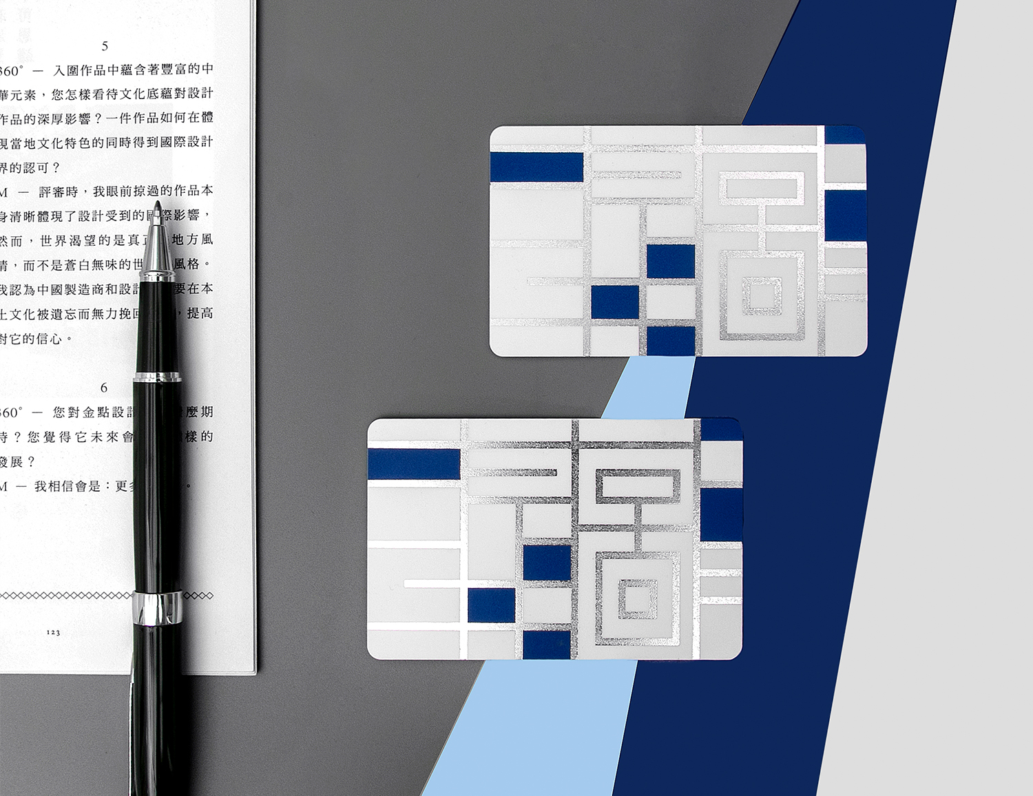
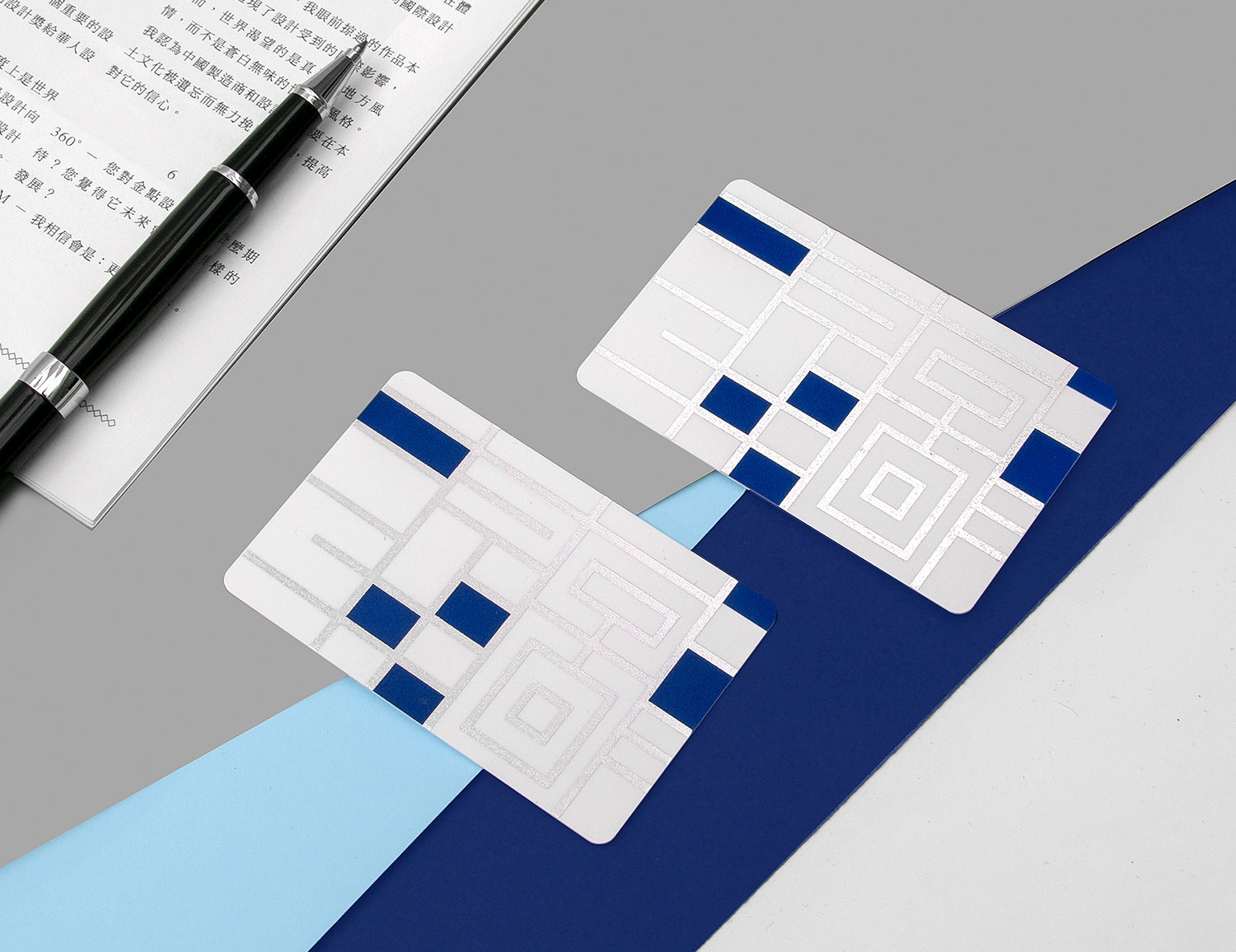
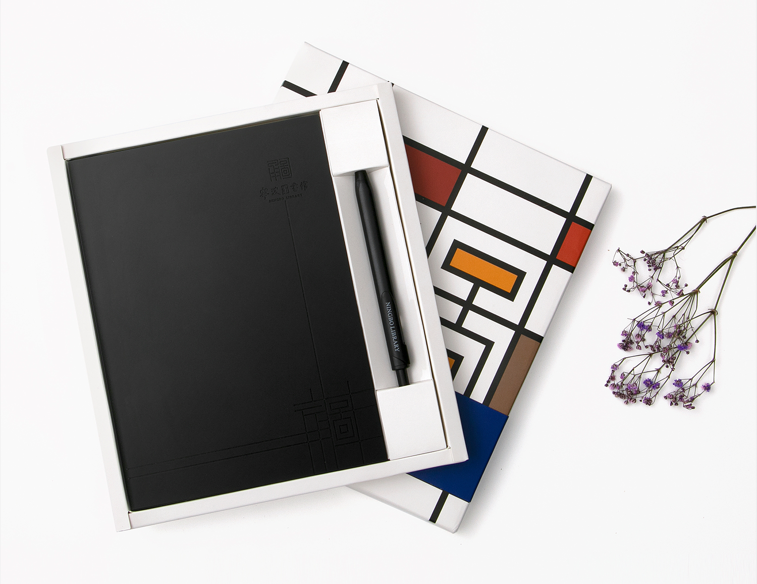
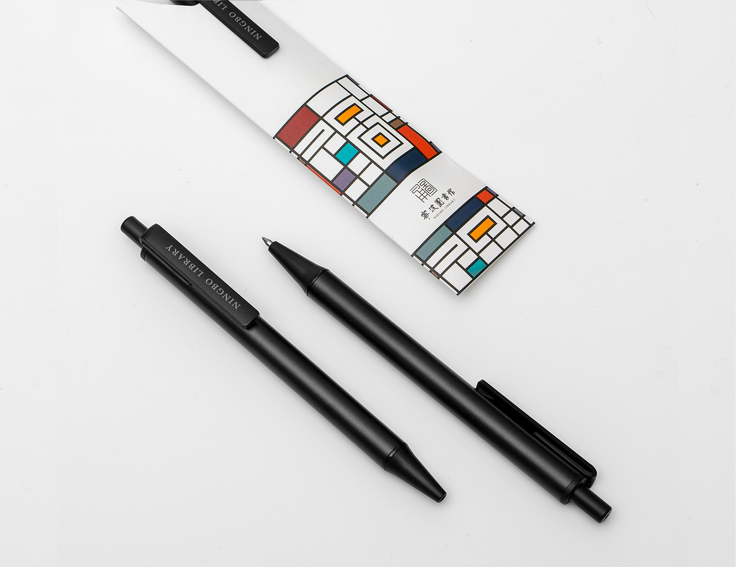
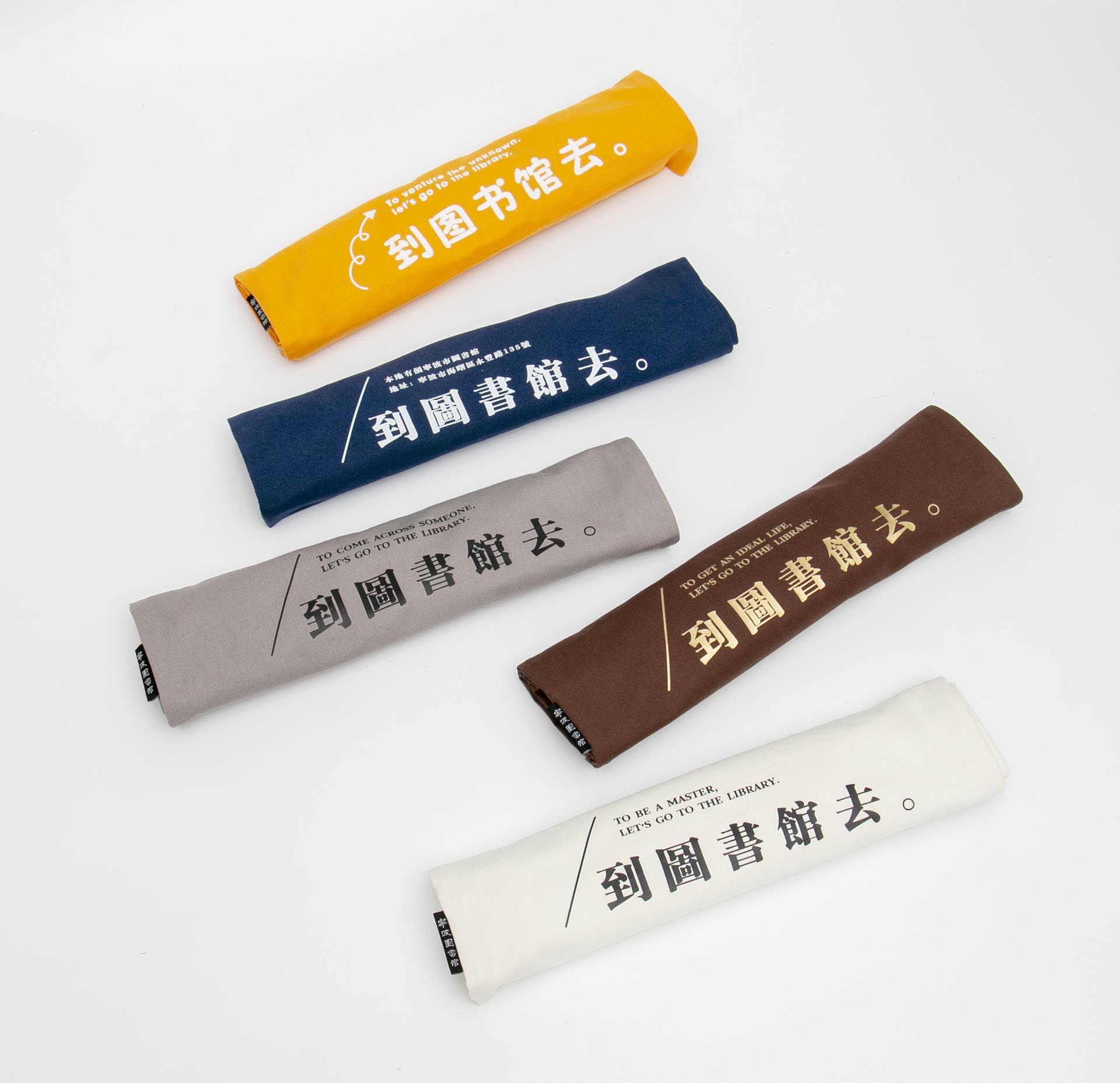
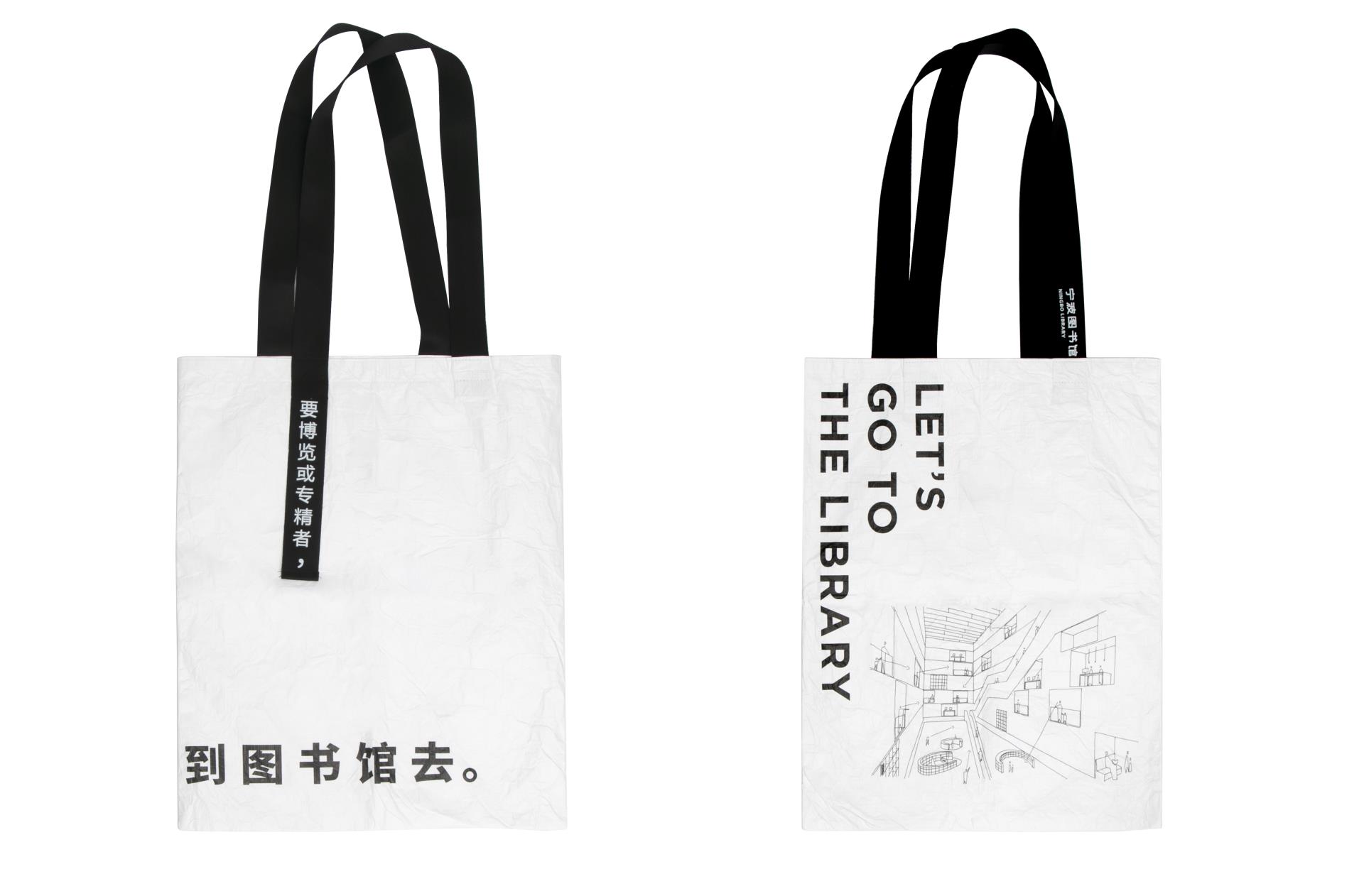
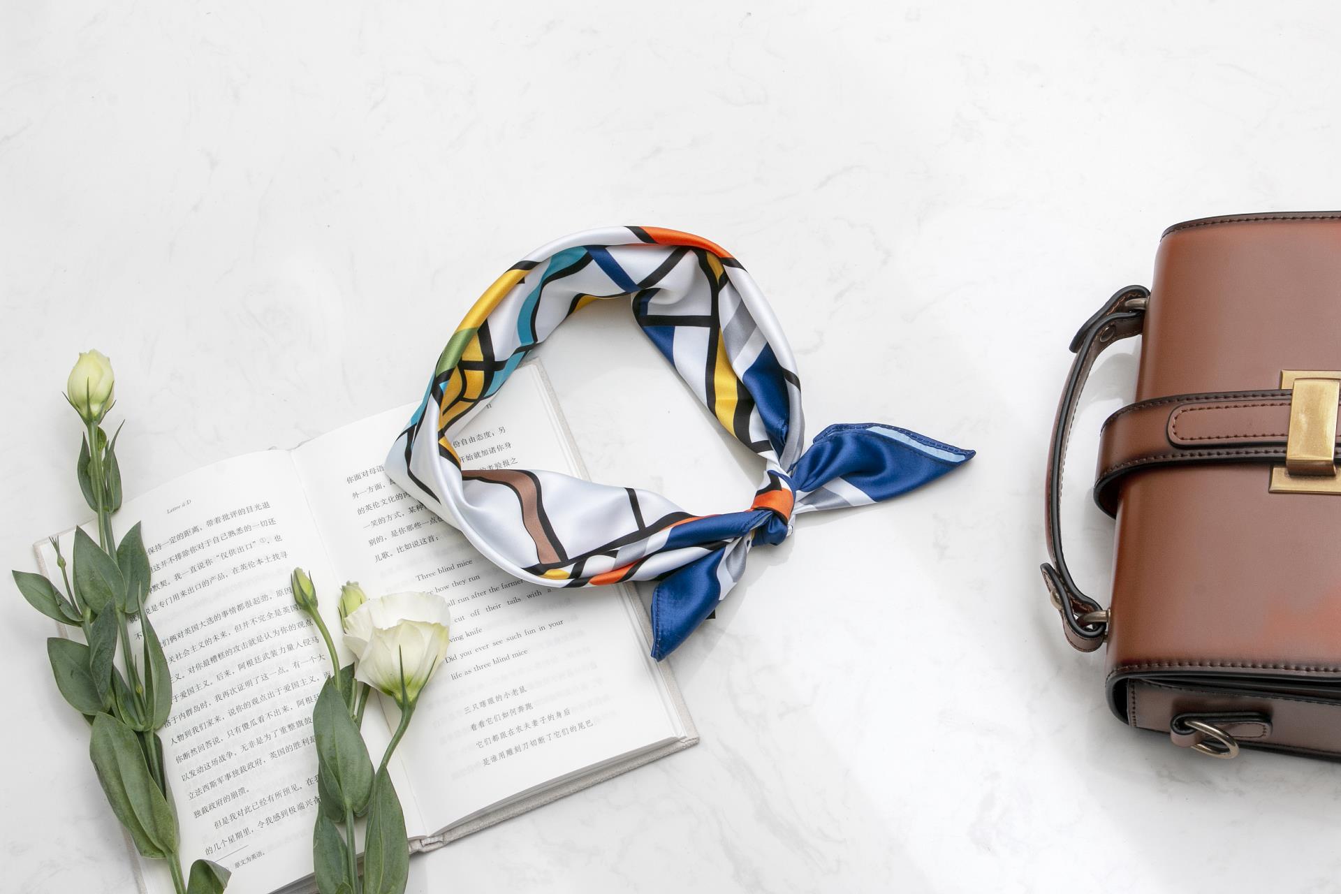
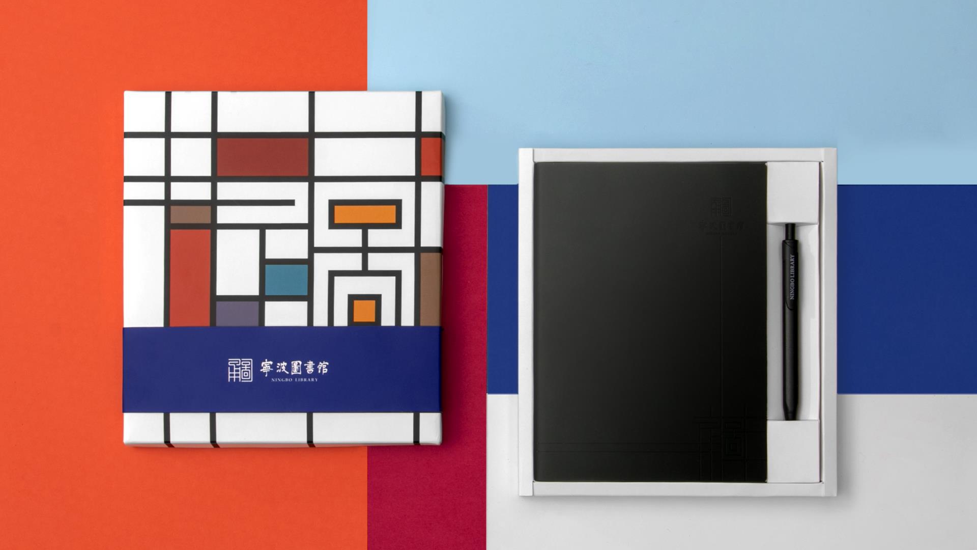
The image logo of Ningbo Library is mainly blue and gray, and the overall style combines traditional implication and modern style. The whole part of the logo is that the word "Yong Tu" is deformed by the "seal method", and the other part is the calligraphy font of "Ningbo Library". The designer uses modern techniques to restore the original appearance of Mr. Ren Jiyu's font to the greatest extent, making it more balanced and stable, which can be regarded...



The copyright of this work belongs to Dany. No use is allowed without explicit permission from owner.

New user?Create an account
Log In Reset your password.
Account existed?Log In
Read and agree to the User Agreement Terms of Use.

Please enter your email to reset your password
Isn't that Dutch style?
666
not bad
have characteristics
like it very much