Partial annulment collection from 2022 to 2023.
Boring to talk, talk.


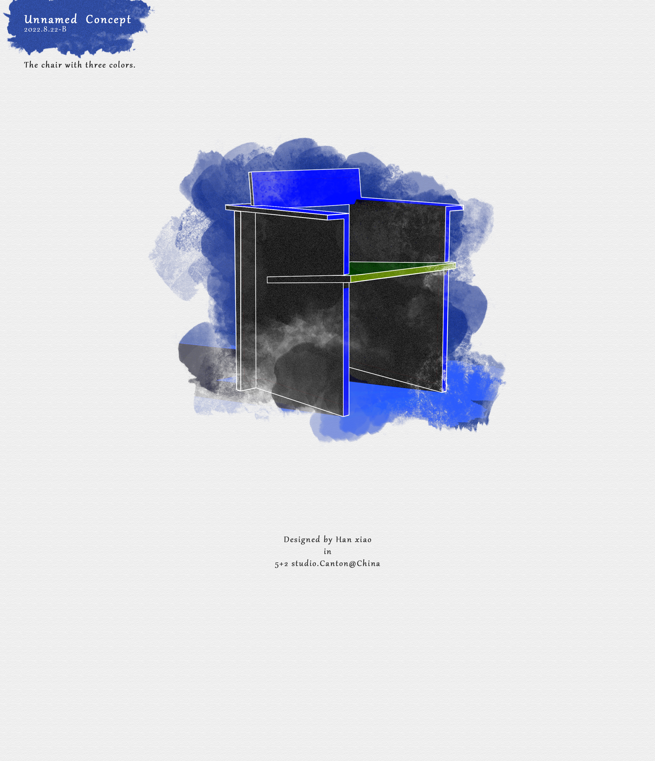
001.
A simple design that can be achieved.
Simple shape, material wood, tenon joint structure.
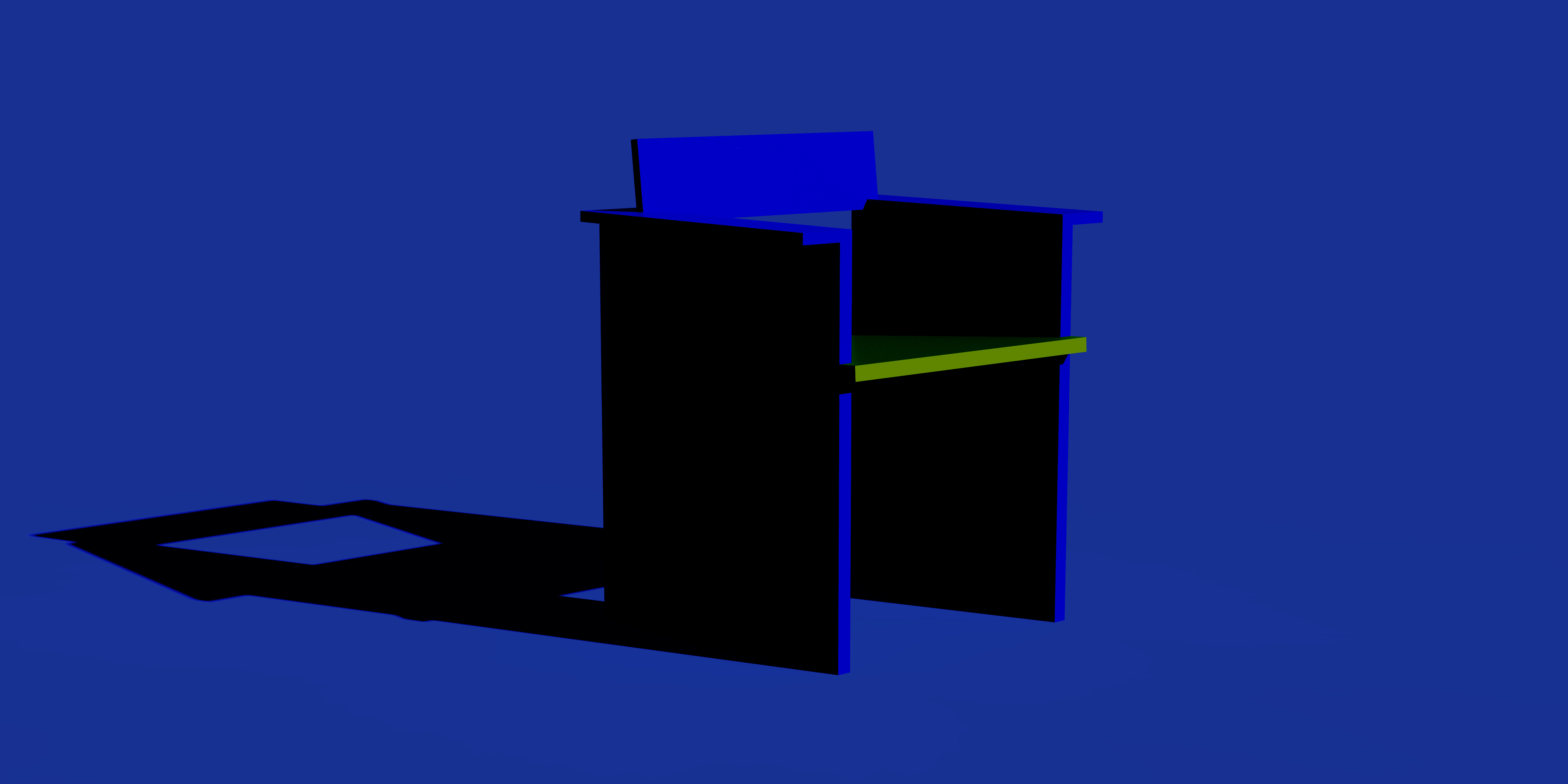
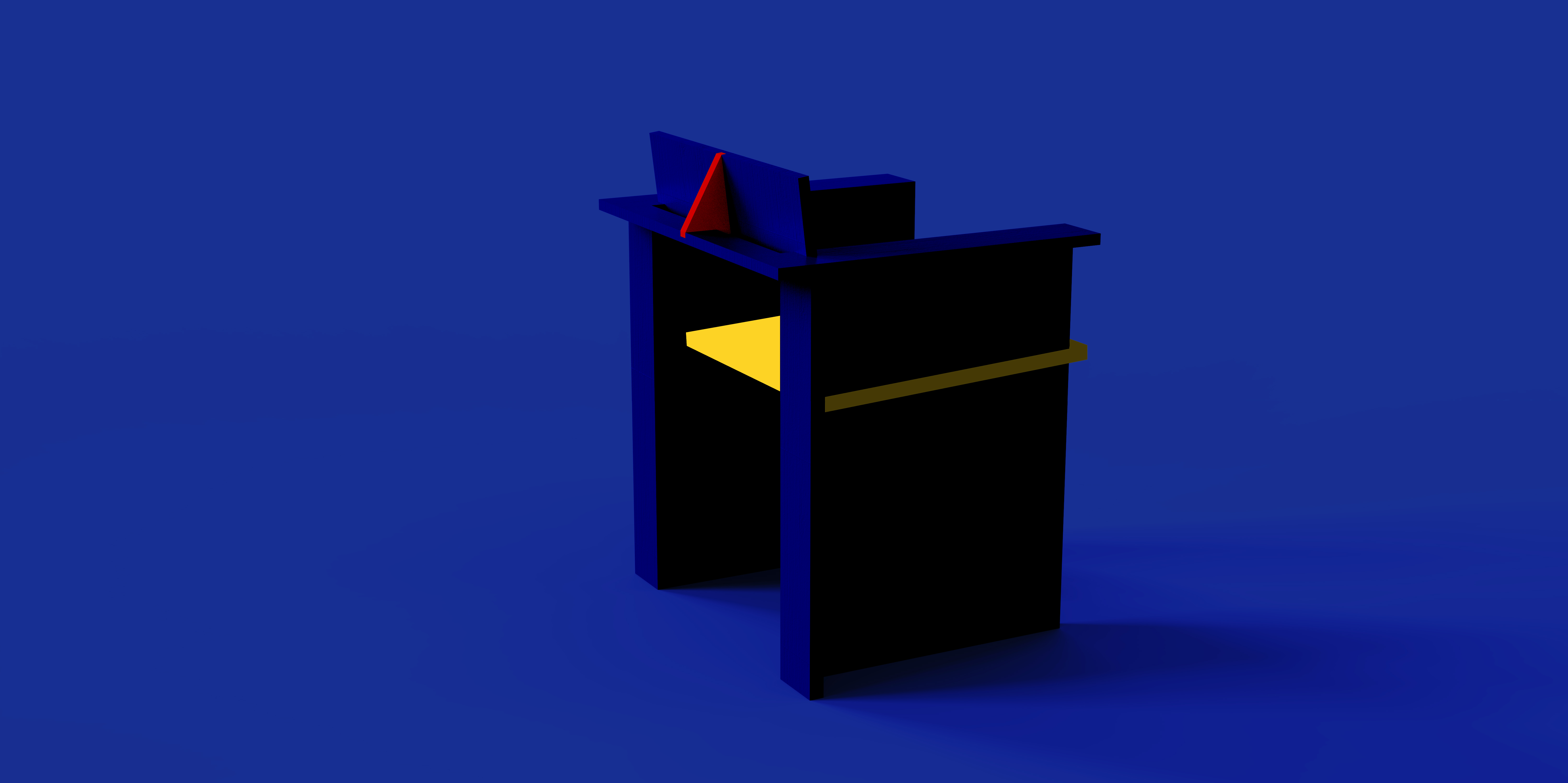
The three primary colors of red, yellow and blue are matched with the traditional Chinese style chair.
The specific design process has not been remembered, it is estimated that Mondrian was consulted.
The same previously published work "Unnamed Concept 7.22-A" is an annulment under the same project, and the abandonment date is August 22, 2022. After that, there is no need to continue to supplement detailed renderings and structural drawings.
A vulgar structure schematic animation is to see it off before entering the factory.

002.
The X? chair is one of my more regrets.
The reason is not to repeat, in short, it has also entered the factory.
The original intention of the design is: an interesting chair with a certain degree of freedom and color value.
It can't be more personal than the "safe" products that are common on the market. It should be a bold experiment to explore some of the scenarios we can apply in our daily lives, even if there are some shortcomings that are worth it.
At the same time, it is difficult to compromise that basic functionality should be retained as much as possible.
Obviously, this plan has not been able to achieve eight-sided exquisite.
To a large extent, it has become a kind of play, more inclined to art, rather than a comfortable and mass-produced functional product that can make people sit.
Maybe it's good in the showroom.
Although I like it very much, I am sorry that it has not made its debut for the time being.
Let's go to the factory.
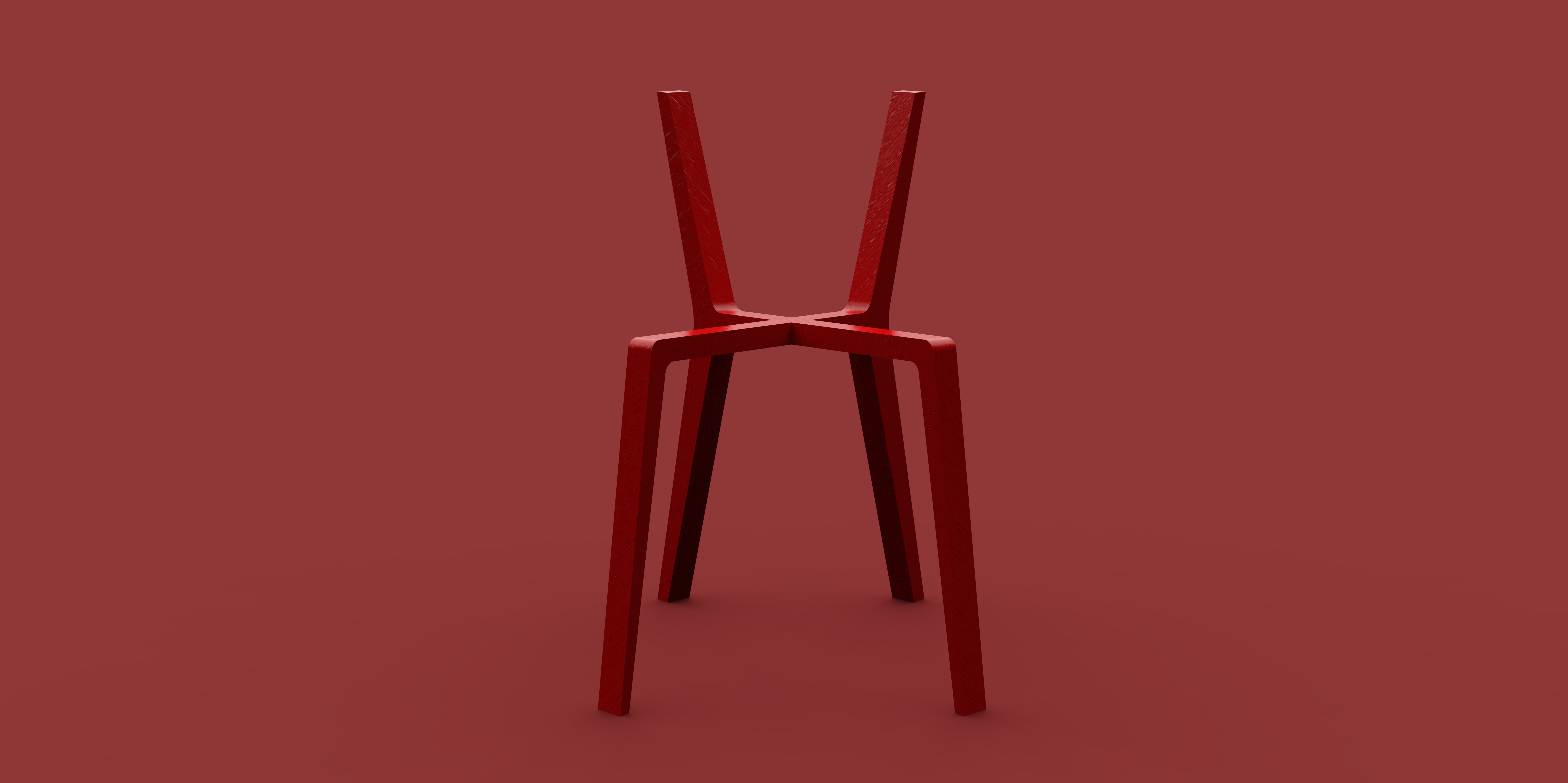
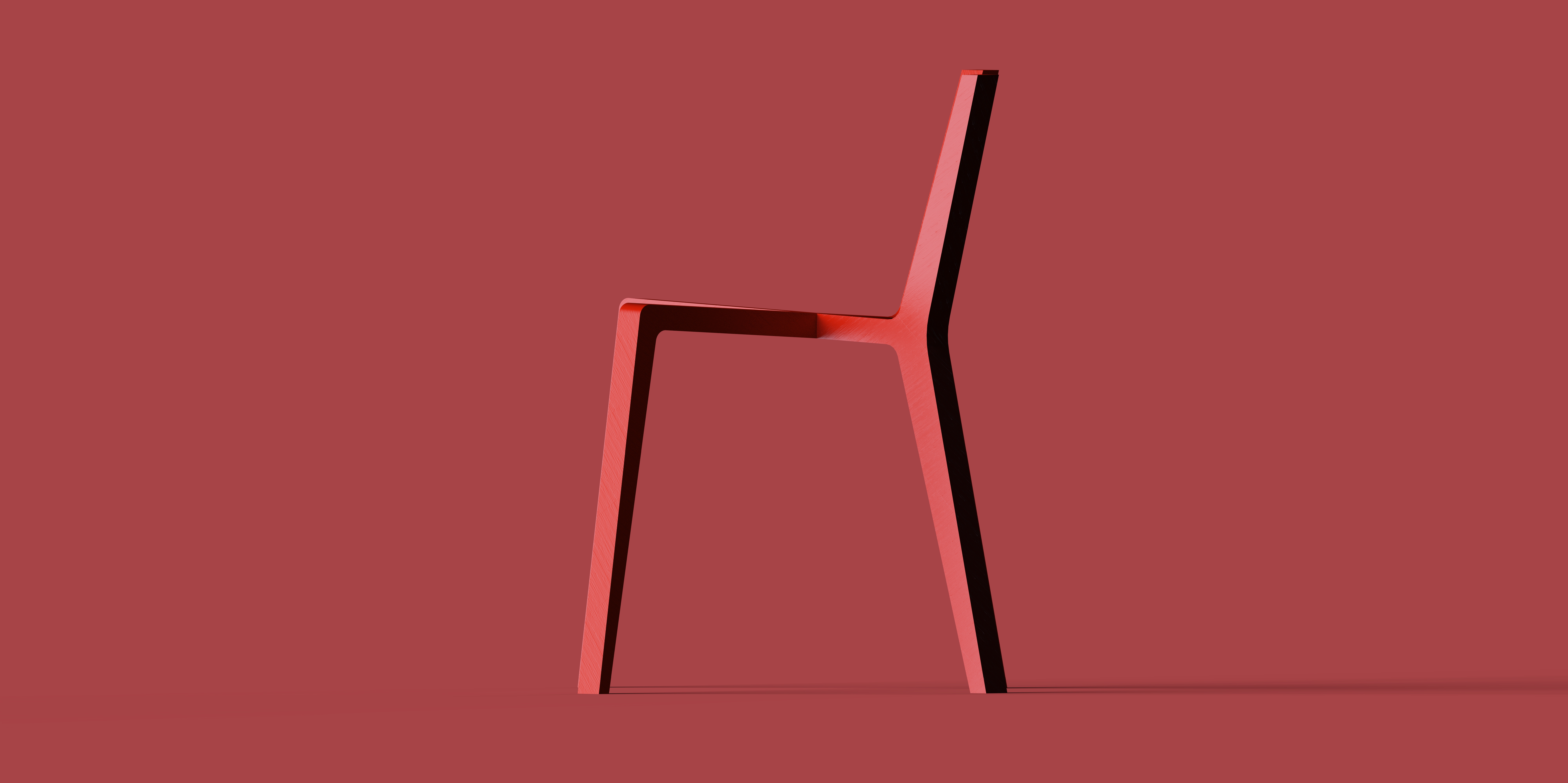
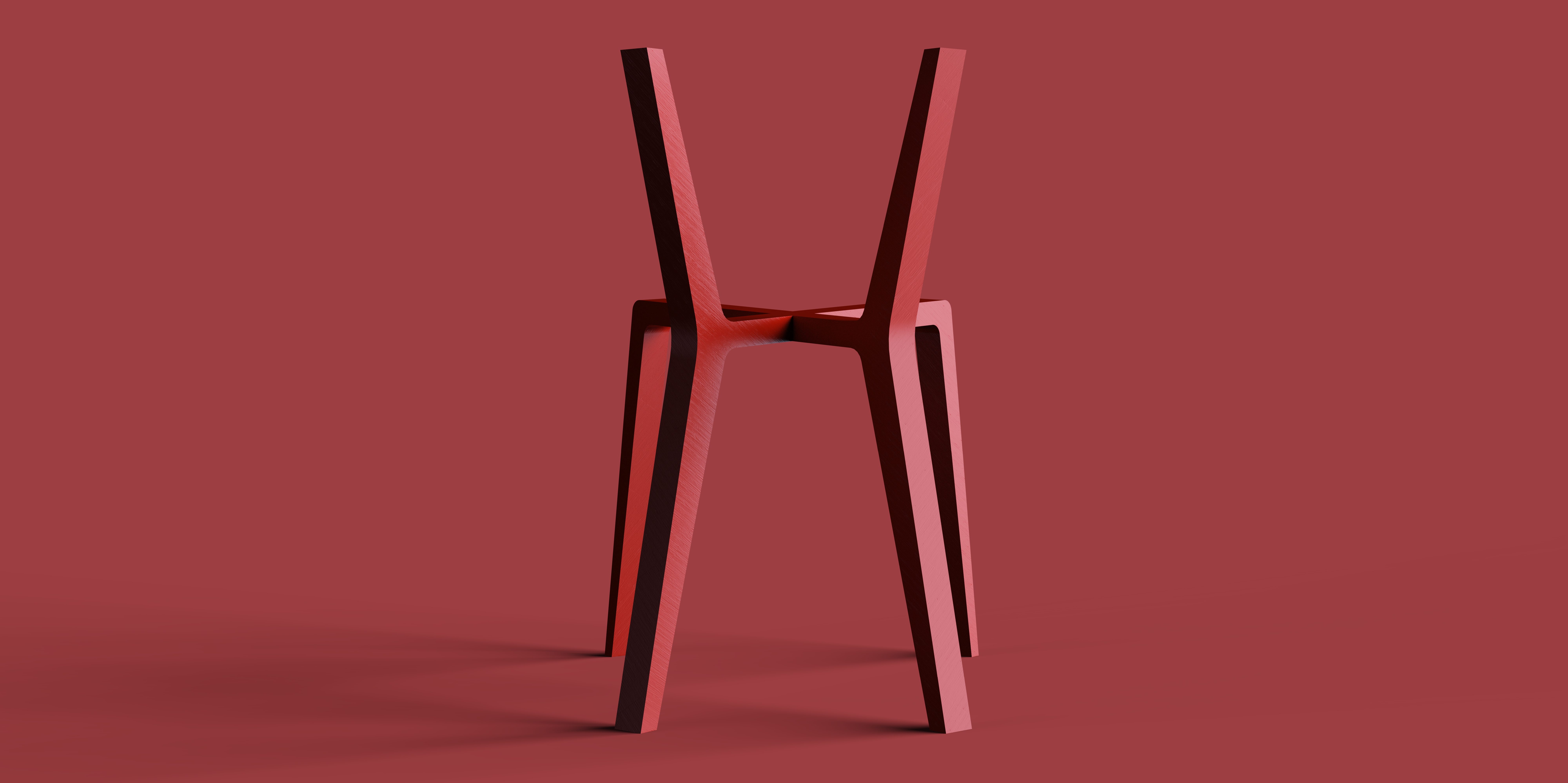
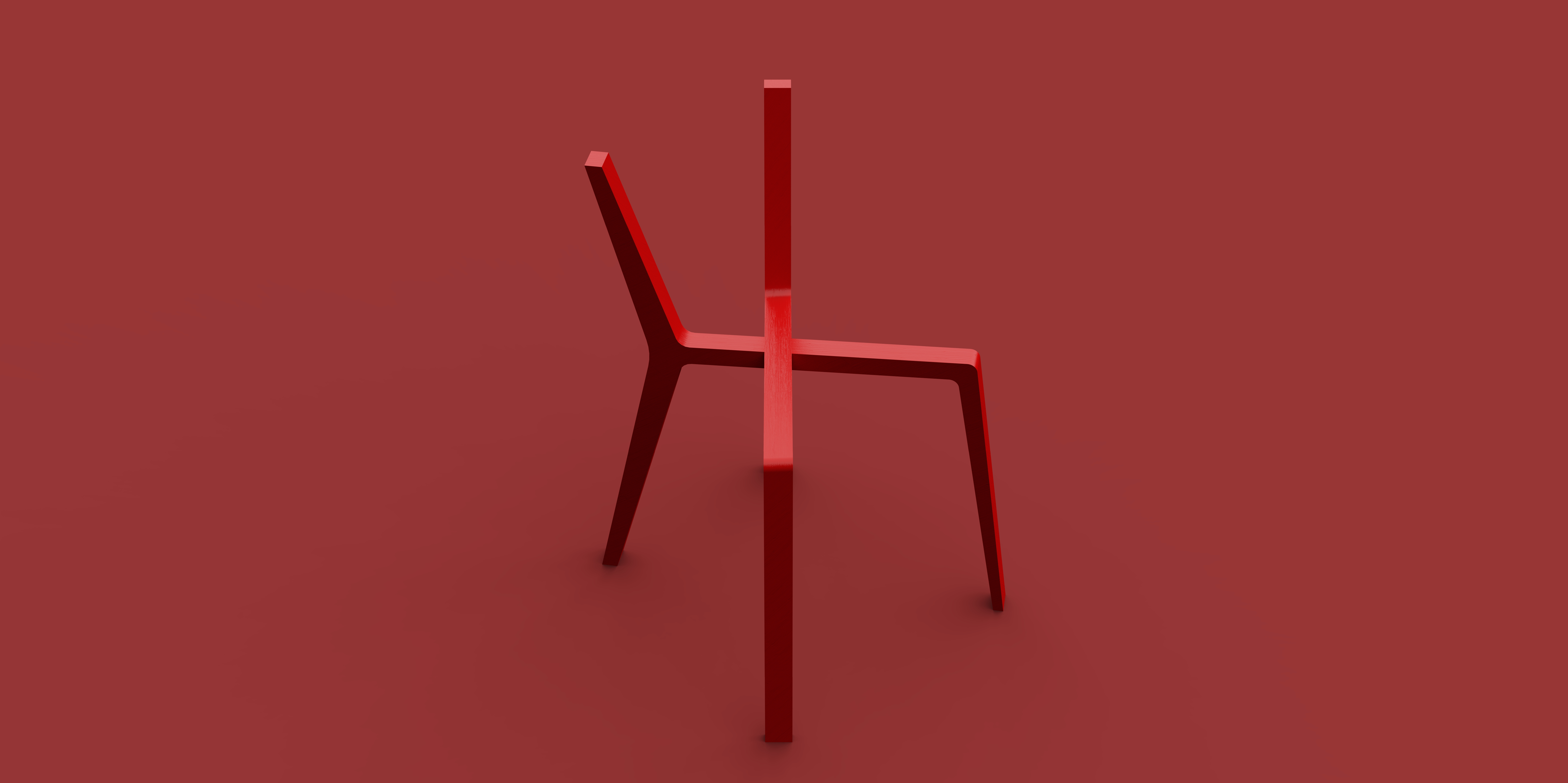
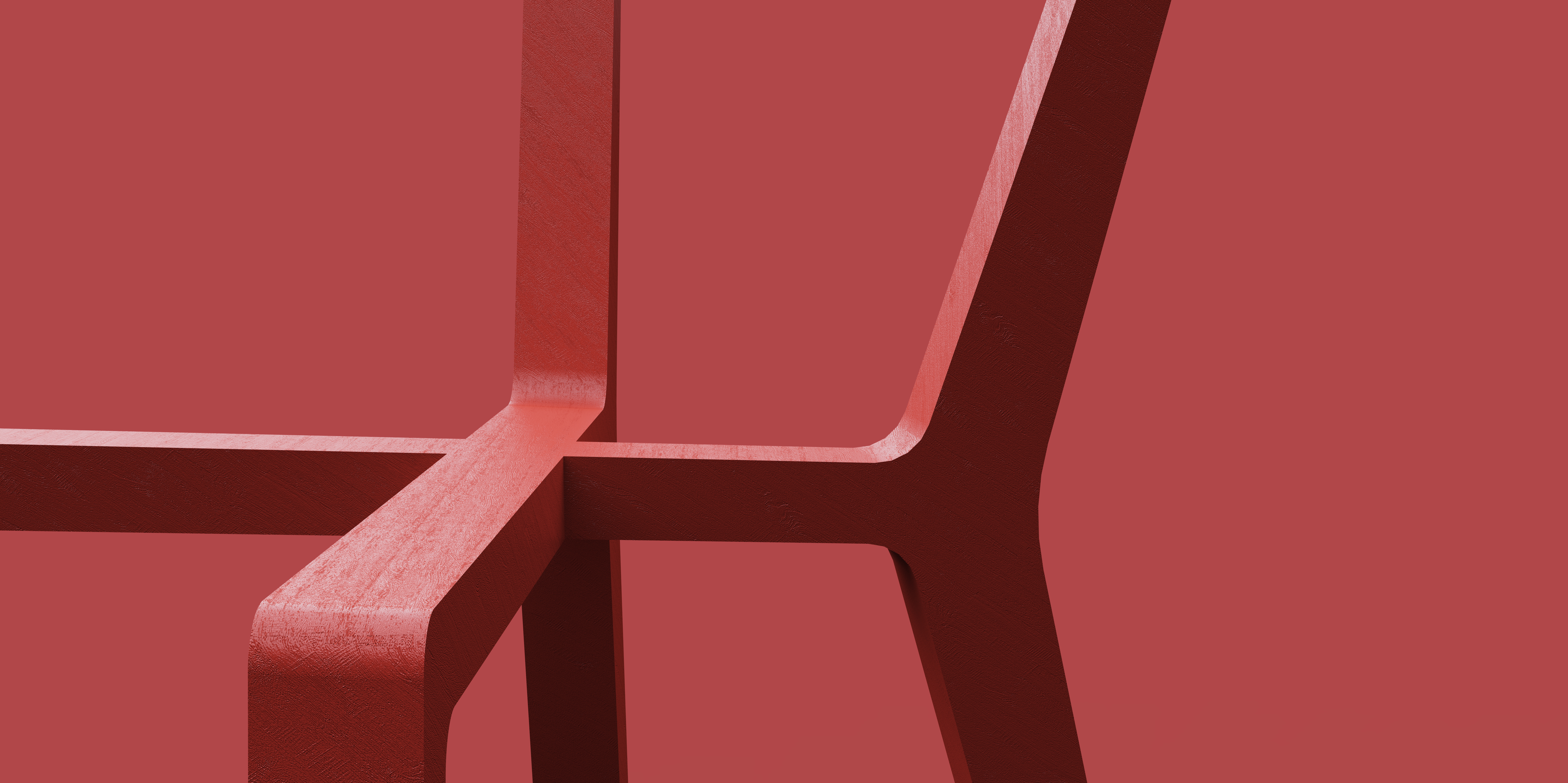

"X?" is named for its freely customizable and matching seat styling.
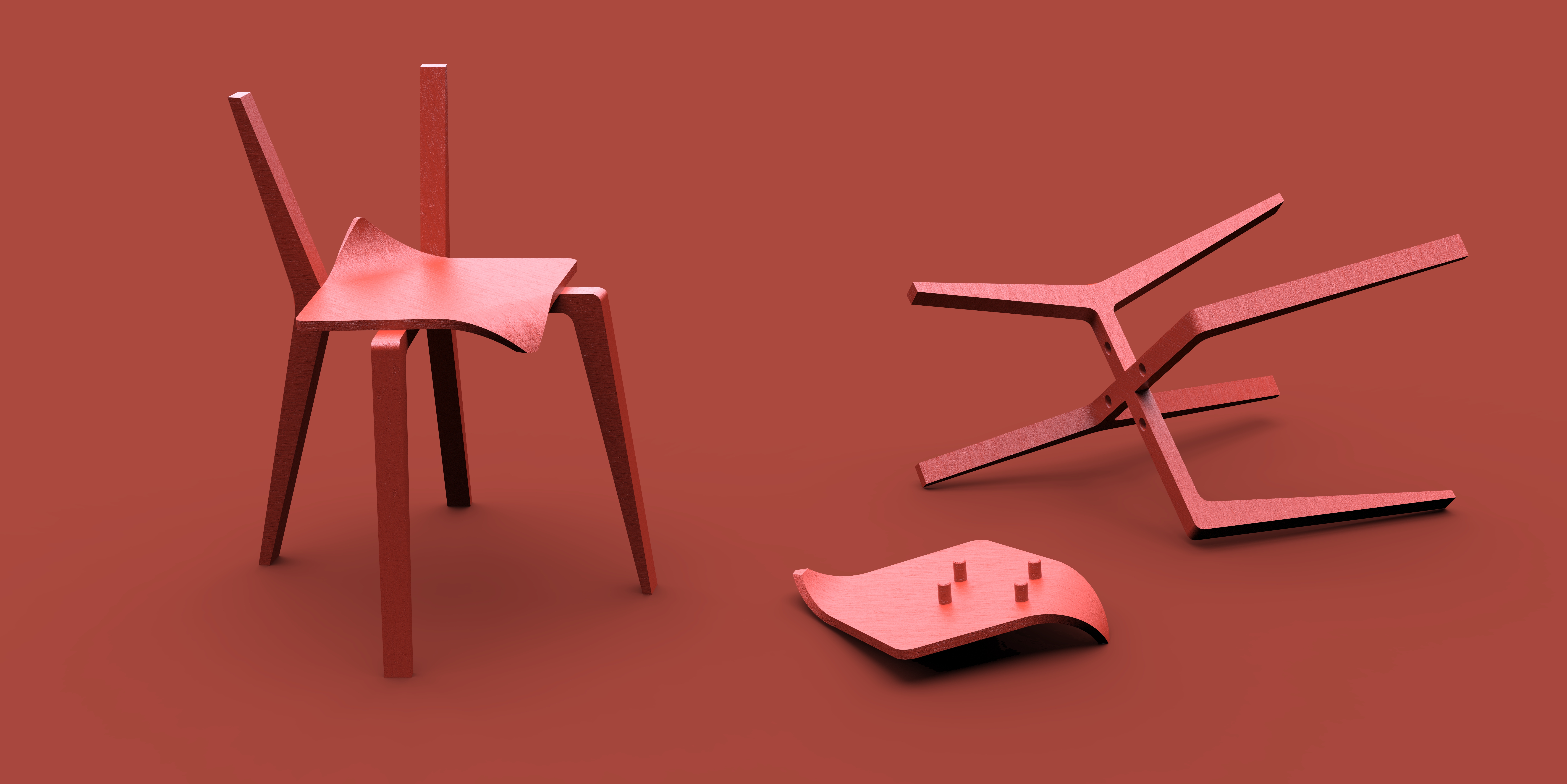
The original idea is: two identical "h" type wood processing products, with a simple structure to form an X shape.
Considering the problems caused by the modeling, the intersection center point of the two parts is slightly backward, so that the structural angle of the second half after the splicing is smaller.
At the same time, the center of gravity is tilted back and the seat is tilted up 3 degrees.
The whole product can be disassembled, convenient transportation.
The original idea is: two identical "h" type wood processing products, with a simple structure to form an X shape.
Considering the problems caused by the modeling, the intersection center point of the two parts is slightly backward, so that the bearing point is moved backward, so that the structural angle of the second half after splicing is smaller.
But obviously, the problem that this design may bring is: how can the force be guaranteed when looking at the wooden sticks that are not very thick and the fixed structure that is not connected between the legs of the chair?
No guarantee, because it's an annulment.
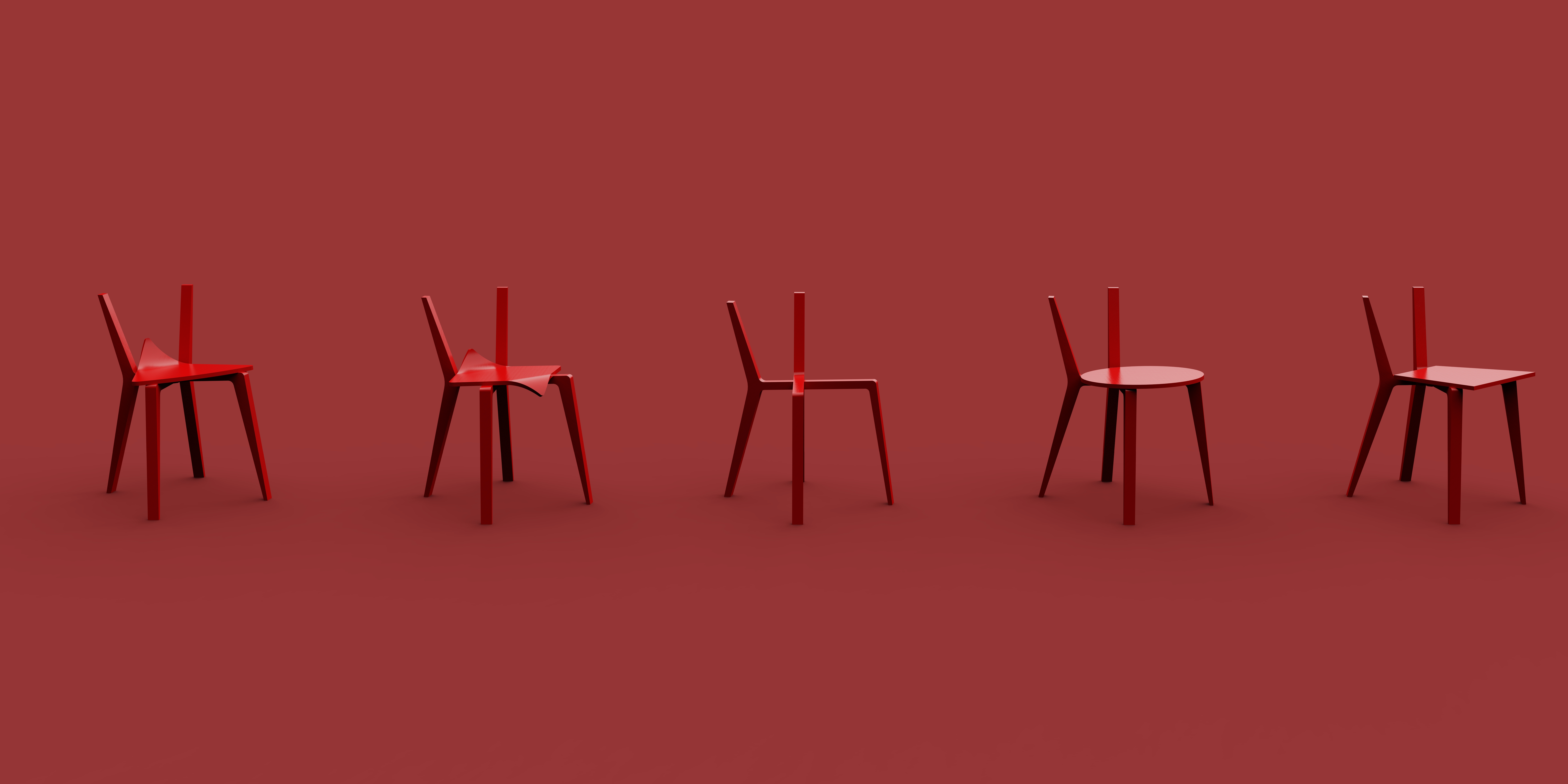
The specific structural design has actually been conceived, but it has already decided the fate of entering the factory, so I have not revised the plan to make up the structure.
The renderings shown are also several different modified versions, with the first drawing being the last modified version. How to put the two H-shaped woods together without adding them is actually very simple, as shown in the following figure.


003.
"Three missing one" chair.
This is a very raw and complicated case for me.
Not the middle road collapse, but a direct stillbirth.
Because of the twists and turns of a large-scale project in the studio, some fancy concepts were left behind.
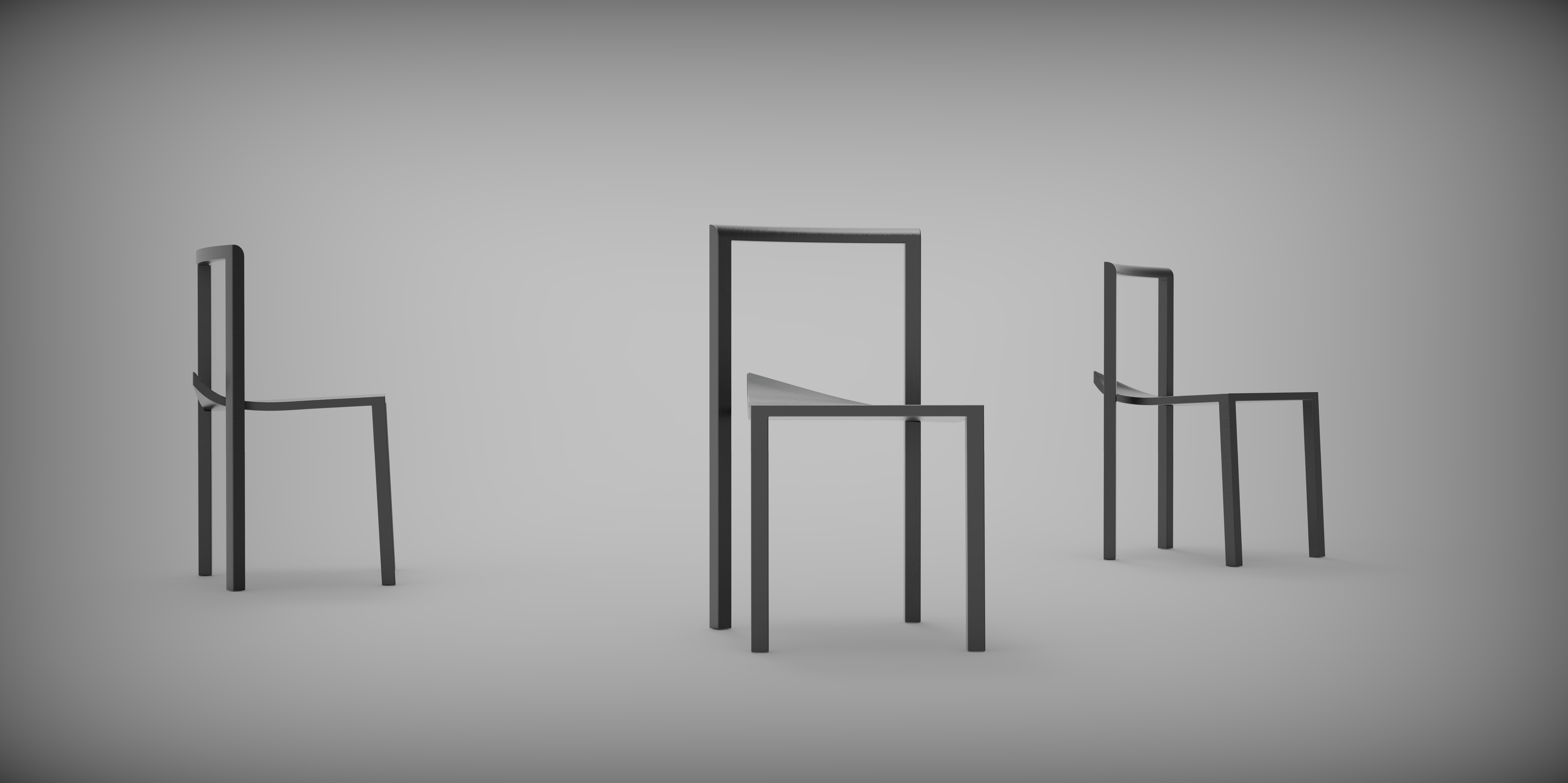
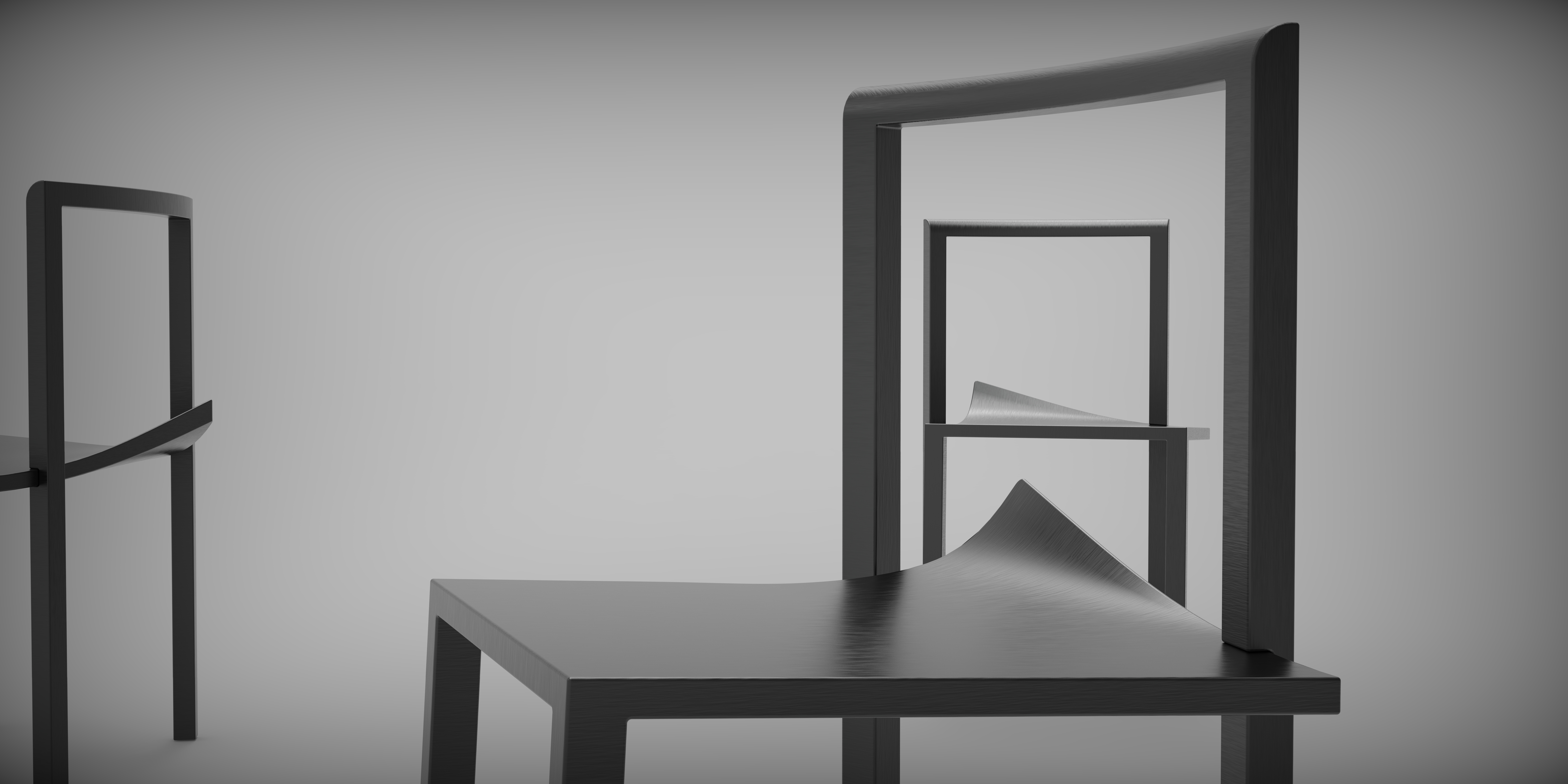
One of the concepts is that a chair is crooked, the seat of the seat and the legs of the chair are not properly connected, but the strength of the structure and material is theoretically sufficient to support the use.
So, in the shelved project, I extracted this design and made two chairs.

Because the effect of the first version of the plan is still good, and the structure can be dug deep, I immediately felt that there was something wrong.

Can't wait to fool the structure first, as soon as possible to the whole concept of the general effect diagram, ready to talk to the boss.
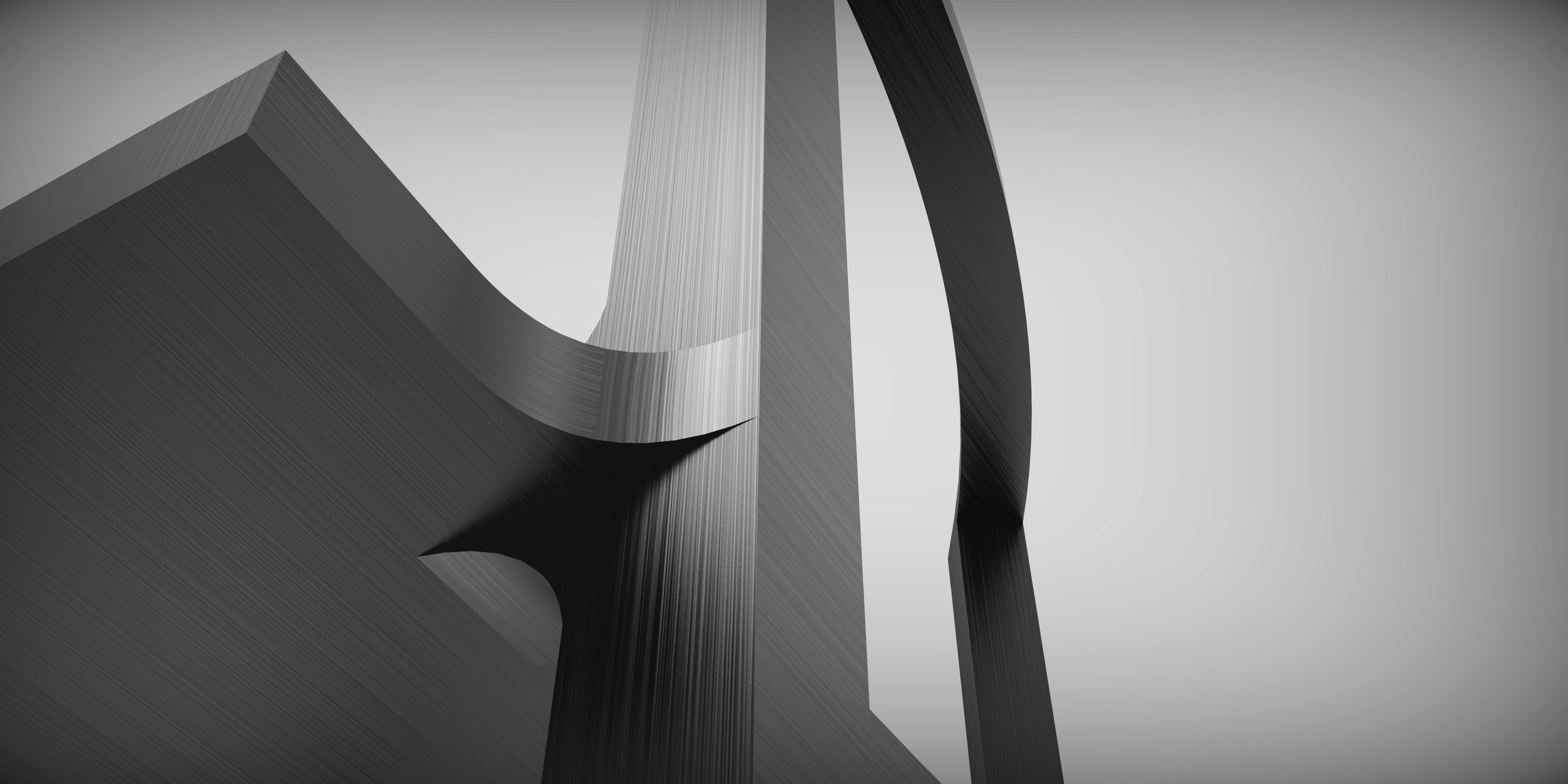
The origin of "three missing one", Gu Yi Siyi.
Under this design, only three chair legs and seat are directly connected and directly load-bearing, so there are requirements for materials and structures.
My original idea was to use metal as the skeleton first, and then cover the outer layer with a layer of wood. Even without cladding wood chips, direct bare metal is also possible.
The backrest of the model is made into a 30-degree bend angle, providing a low-volume single armrest function.

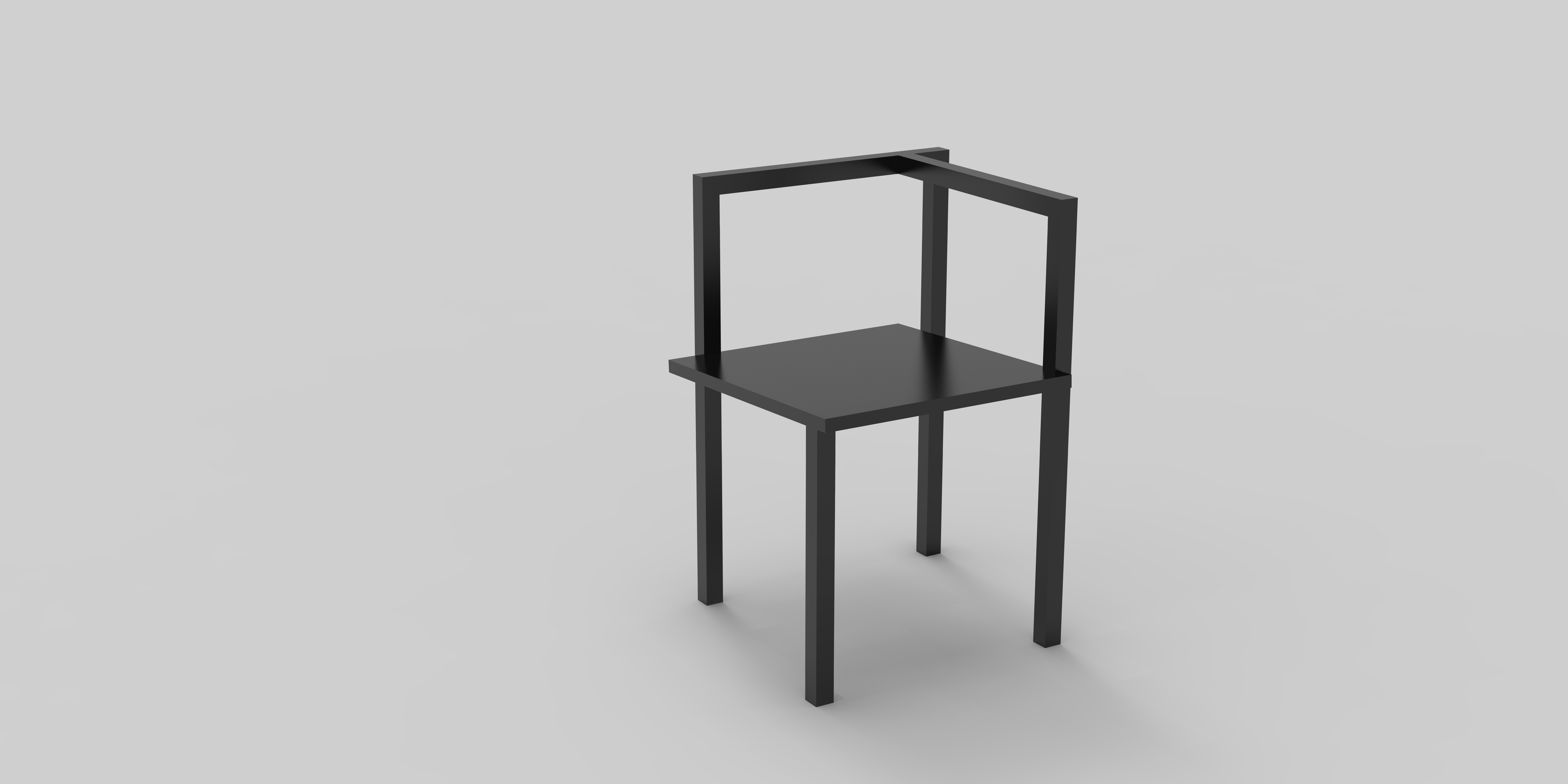
The B section takes the Chinese chair route and directly provides a stable single armrest structure.
Structurally, section B is a little more stable than section A.


Like "X?", I have expectations and enthusiasm for this design.
It took a few days to extract ideas from the old project, model and effect maps, and then immediately ran to the workshop to consult the master.
The old master said, this structure, wood can't hold up.
Can only see, can not sit.
So I asked if I could make a metal skeleton and then cover the board.
The master thought for a moment.
No problem, we can do it.

I went back excitedly on the same day and prepared to bring detailed drawings to talk about model making next time. I couldn't wait to sign the contract immediately.
However, a few days after returning, I suddenly found it on the Internet--
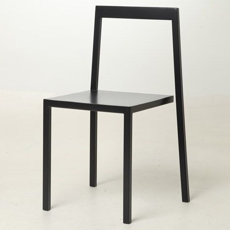
Chair 3/4 by Sandro Lominashvilli
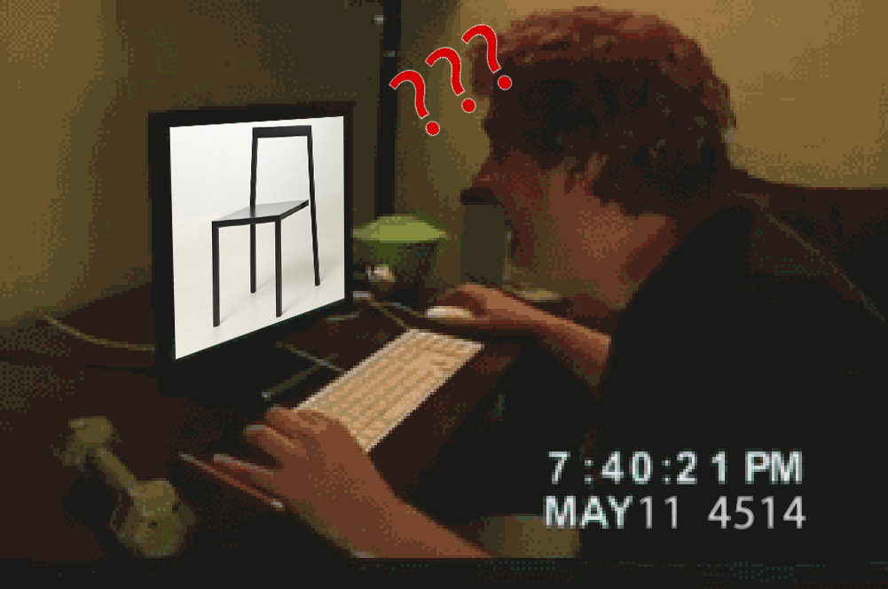
What?

"My intention was to create a chair by breaking rules and standards," Sandro Lominashvili told Dezeen.

......
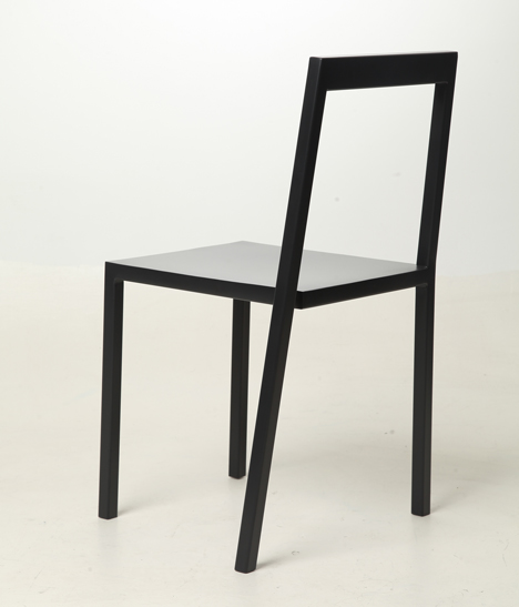
While the chair may look unstable because of its disconnected outline, the angled leg balances the object to prevent it from falling over when sat on.
"Some people find it a bit difficult to sit on the chair for the first time, they think it might not be able to withstand their weight and collapse," Lominashvili said.
--www.dezeen.com
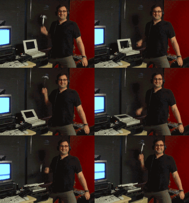
"Three missing one",
Fast into the factory.

004.
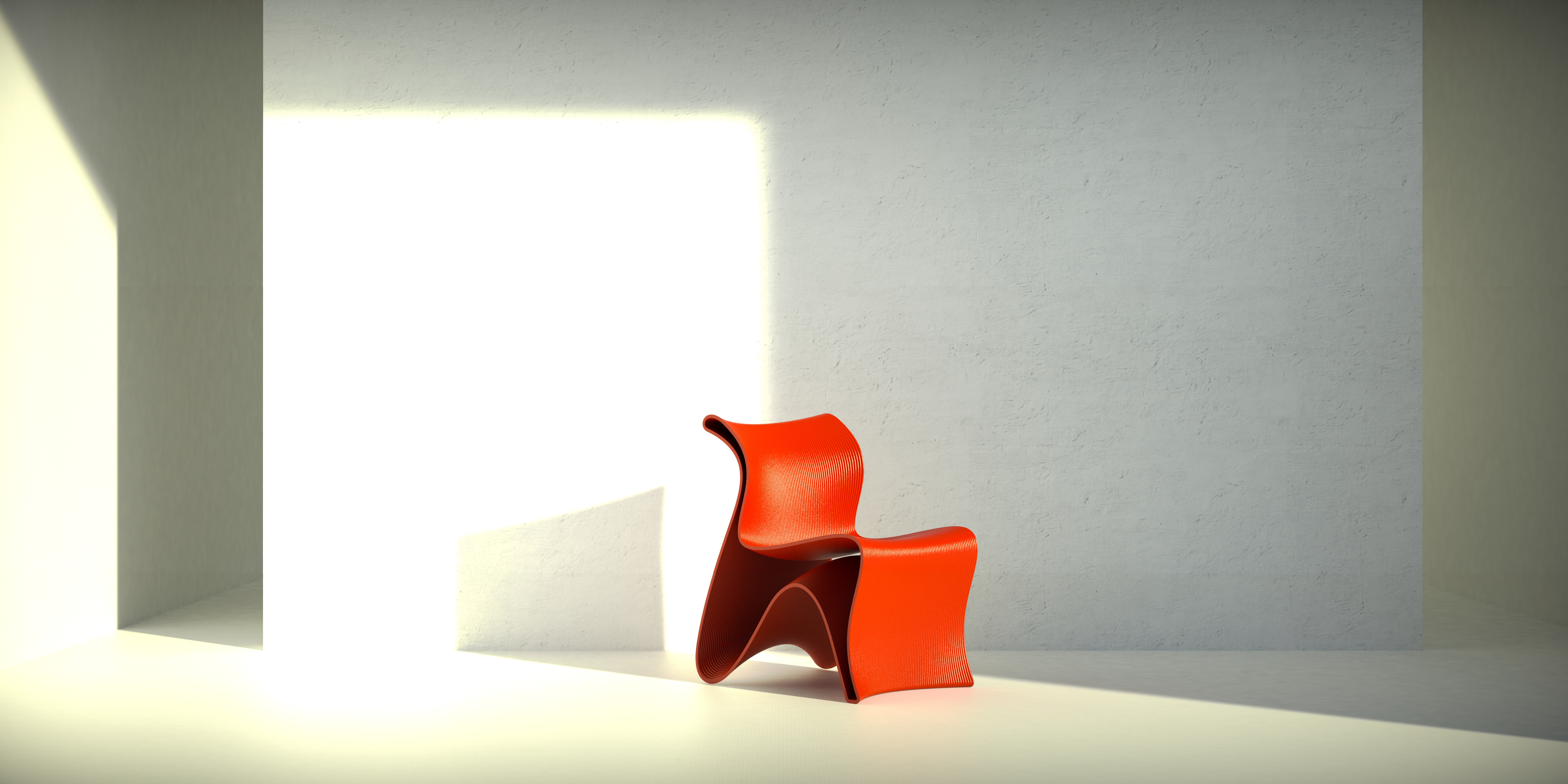
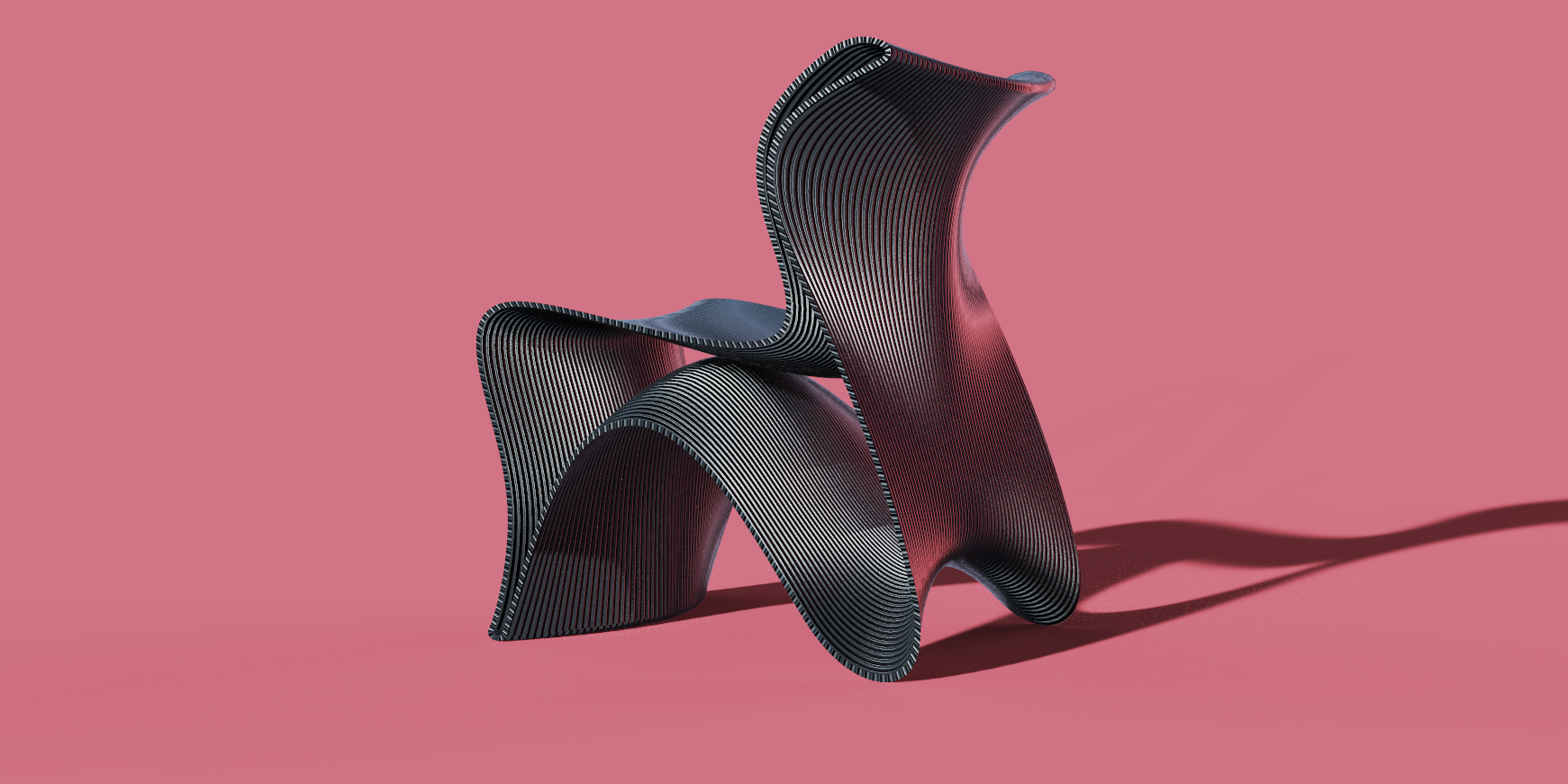
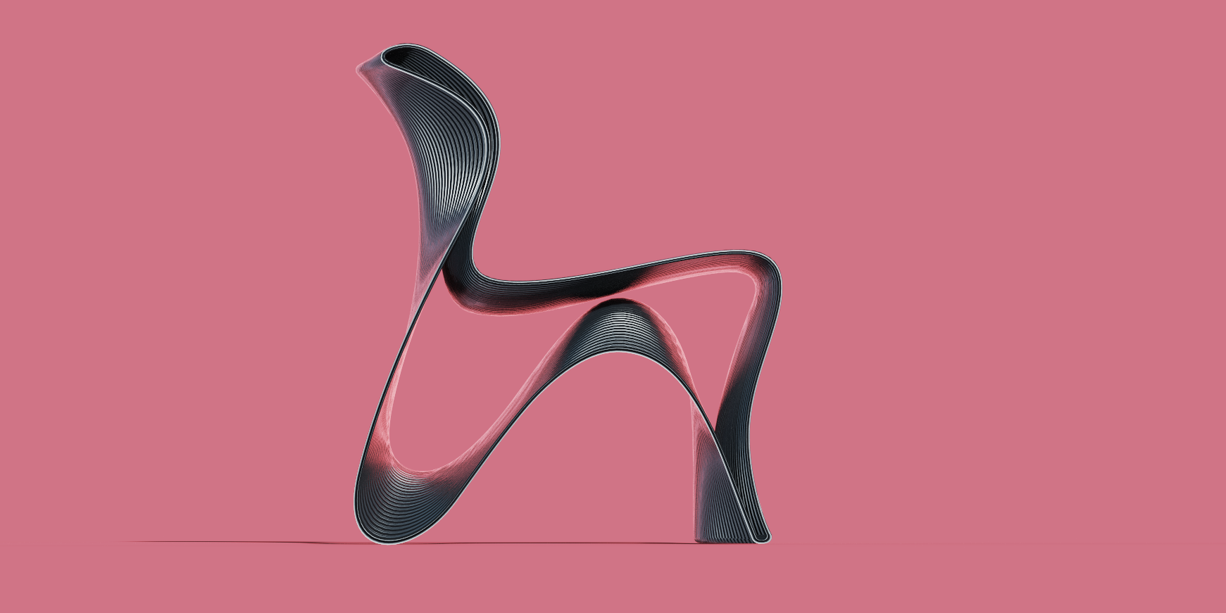
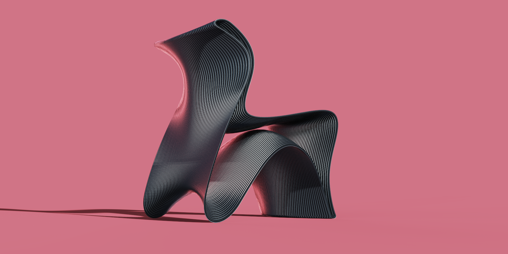
"Wave", also known as "ripple chair".
In a software animation test that has been released some time ago, there is an exit.
Inspired by the shape of the waves. Using 3D printing and FDM, the document is printed from the side, and consumables are stacked layer by layer. It is required to use a nozzle above 8mm to achieve obvious stripes after consumables are extruded. Consumables are optional, such as PE or other composite ABS, wood PLA, etc.
The naturally formed layer pattern and the concave-convex structure of the product form the support of the consumables to achieve the expected load-bearing effect.
The product can be used immediately after landing, and the material strength depends on the parameters set during printing. In the early preset, I chose PE consumables +8mm nozzle, filling rate above 40%, wall thickness and other data to be decided by factory engineers.
A large 3D printing company that the company cooperates with has its own R & D team in developing and recycling waste plastics and coffee grounds to make printing consumables, which are then used to print furniture. At that time, I wanted to use this scheme to cooperate in the recycling of materials and consumables-the concept related to the ocean and a chair made of recycled waste materials. Can it bring people some thoughts about environmental protection?
At present, there is no landing planning and external investment, so it is naturally put into the crematorium by me.
alas.
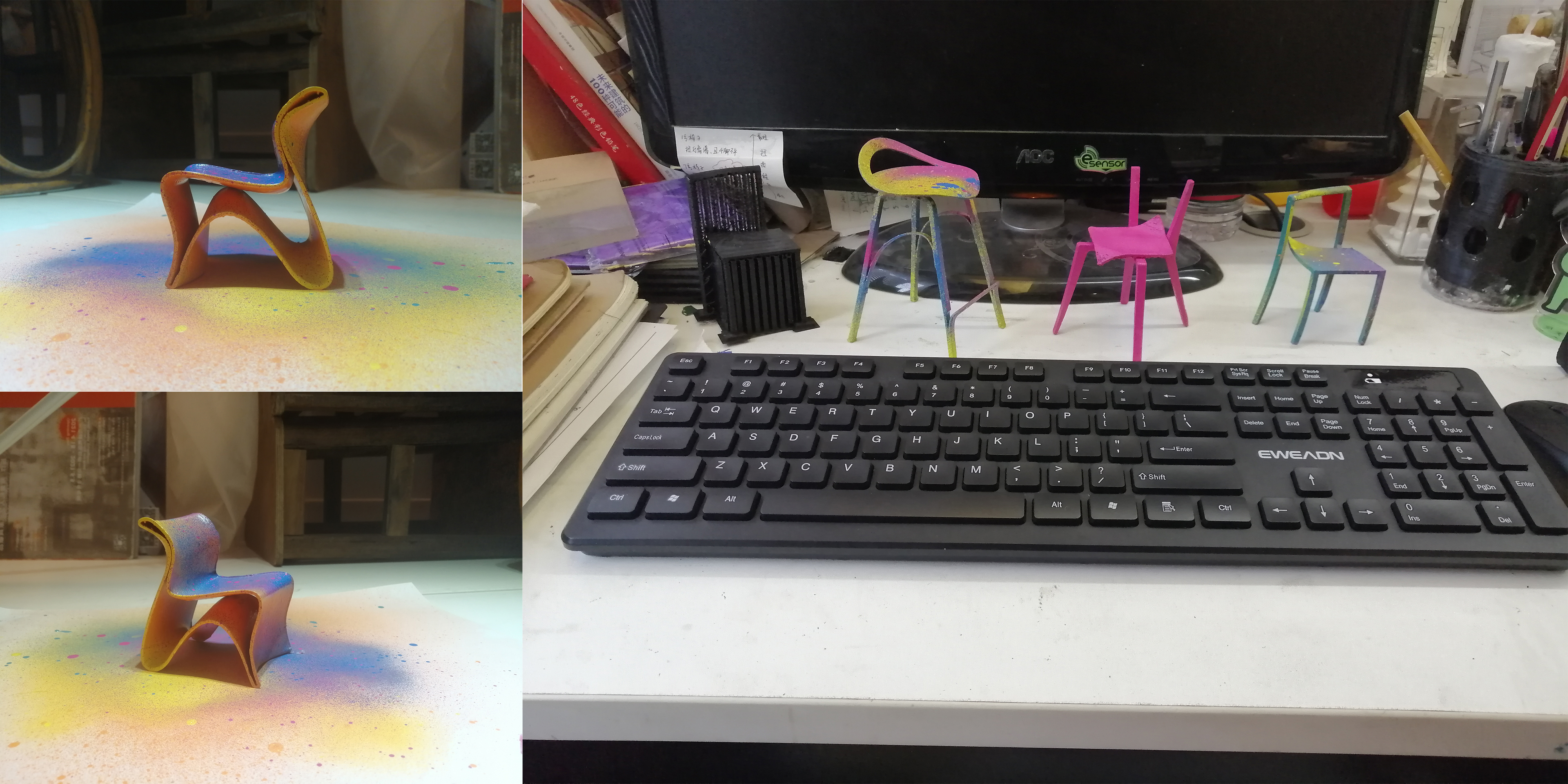

Code word very tired......
There are also some works and concepts that are not completed enough and will not be put on the table for the time being.
Finally, I introduce a team's annulment case. The product prototype and concept come from my former colleague Hu Gong.

004.
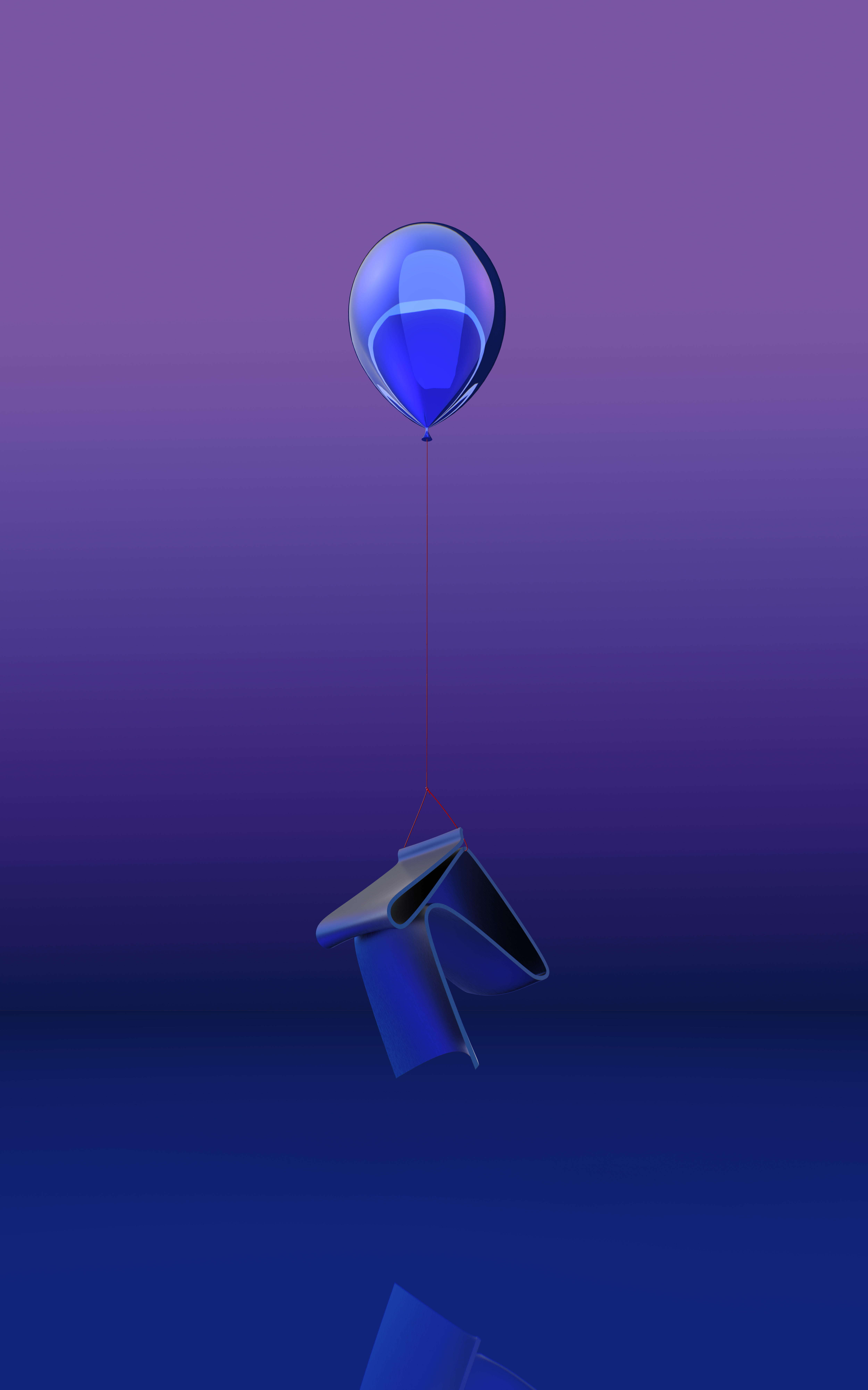
"glyph series-self" stool
This is one of a series of concepts by former colleague Hu Gong. The background of the project is a period when the studio is addicted to 3D printing.
The whole series takes several Chinese characters or numbers with very few strokes as the main points, and is abstracted according to the glyphs and designed as stools, chairs, coat racks and coffee tables respectively, so as to form a set of furniture and household items.
And several products/fonts in the glyph series can be linked together to form a five-character poem-at least that's how the plan was conceived at the beginning.
Later, like me, I also entered my colleague's recycling factory.
However, I borrowed my colleague's model to test the software and made several pictures. The presentation also received her consent.
Personally, I am more interested in some concepts under the Hu Gong series, especially a coat rack, which has great potential. I hope to see her perfect and land this product in the future.
On second thought, one of my coat racks hasn't fallen down yet.

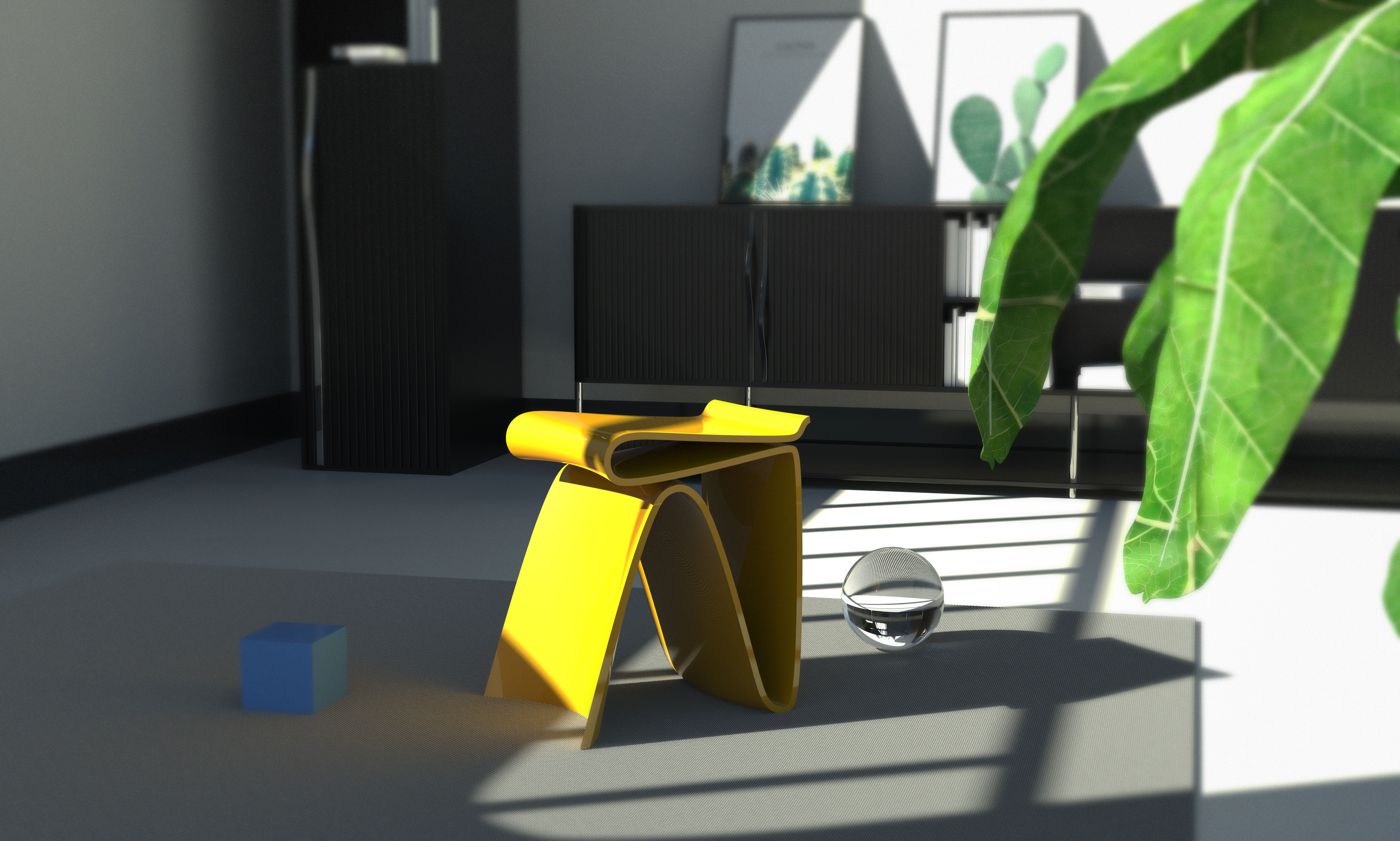
The latter two diagrams are more casual when designing the scene, mainly to test the different plotting effects of several software.
The wine cabinet and TV cabinet behind it came from an abandoned project in 2019.
At first glance, it seems a bit overwhelming.
But he is also a difficult brother in the factory.
Look for a long time, don't say...
It's pretty pleasing to the eye.
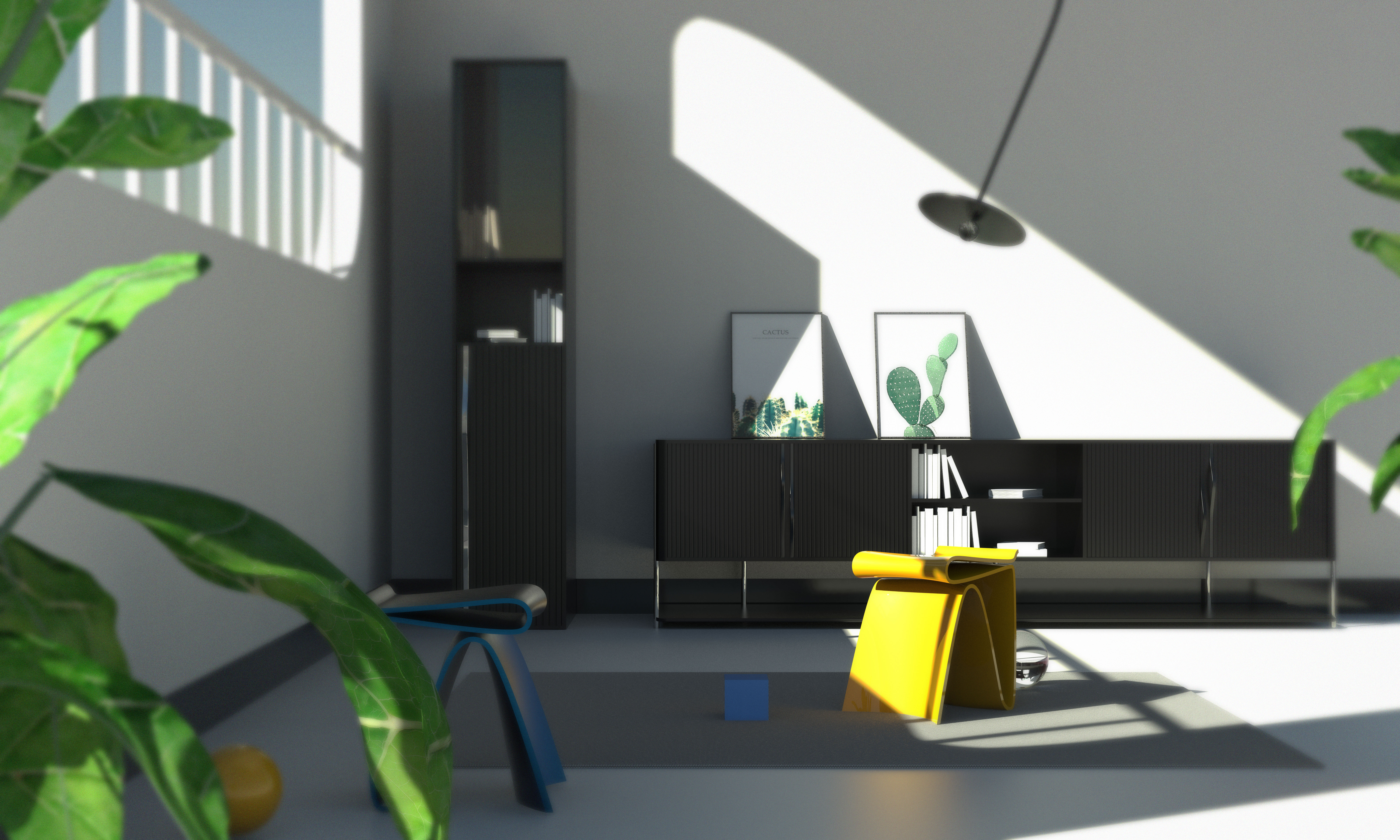

Originally, I was going to make this issue into a long article.
Talk about the pits you have stepped on in the past few years and share some useful knowledge and experience.
Finally wanted to think, the quantity is a bit too big
I am not a big boss either. I have done limited things and talked about experience only in these industries.
Don't pretend to be unable to force it, it makes people laugh and generous.
It is better to simply talk and wrangle and bask in the waste products by the way.
Above
I wish all colleagues can have amazing hair volume, strong liver and kidney, and do not have to stay up late and work overtime.
Meeting adssto

New user?Create an account
Log In Reset your password.
Account existed?Log In
Read and agree to the User Agreement Terms of Use.

Please enter your email to reset your password
It is really not very good-looking, there is a reason for the abolition of the case.
Good ~
Personalized Furniture Design
Come on, young man.
Interesting