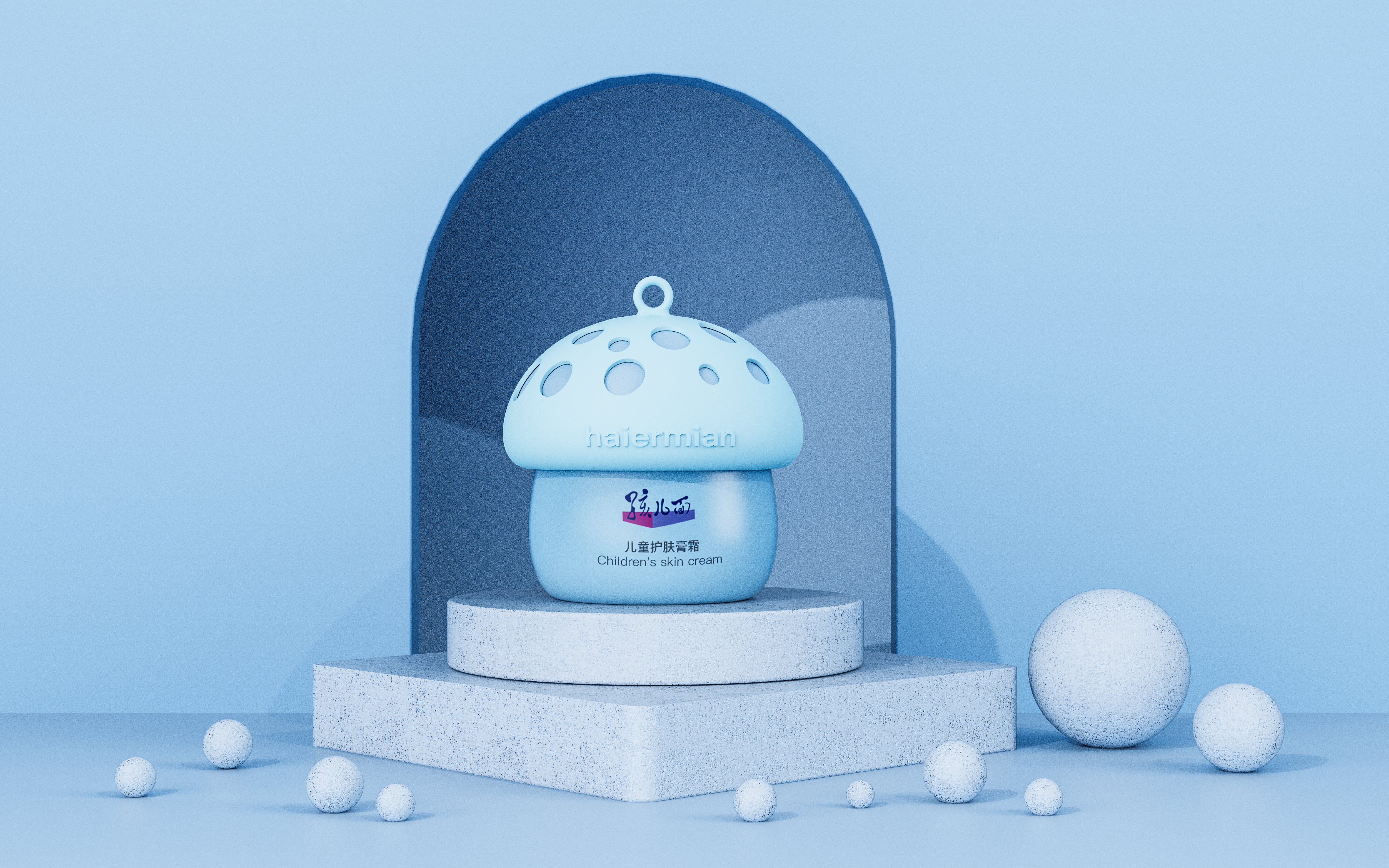
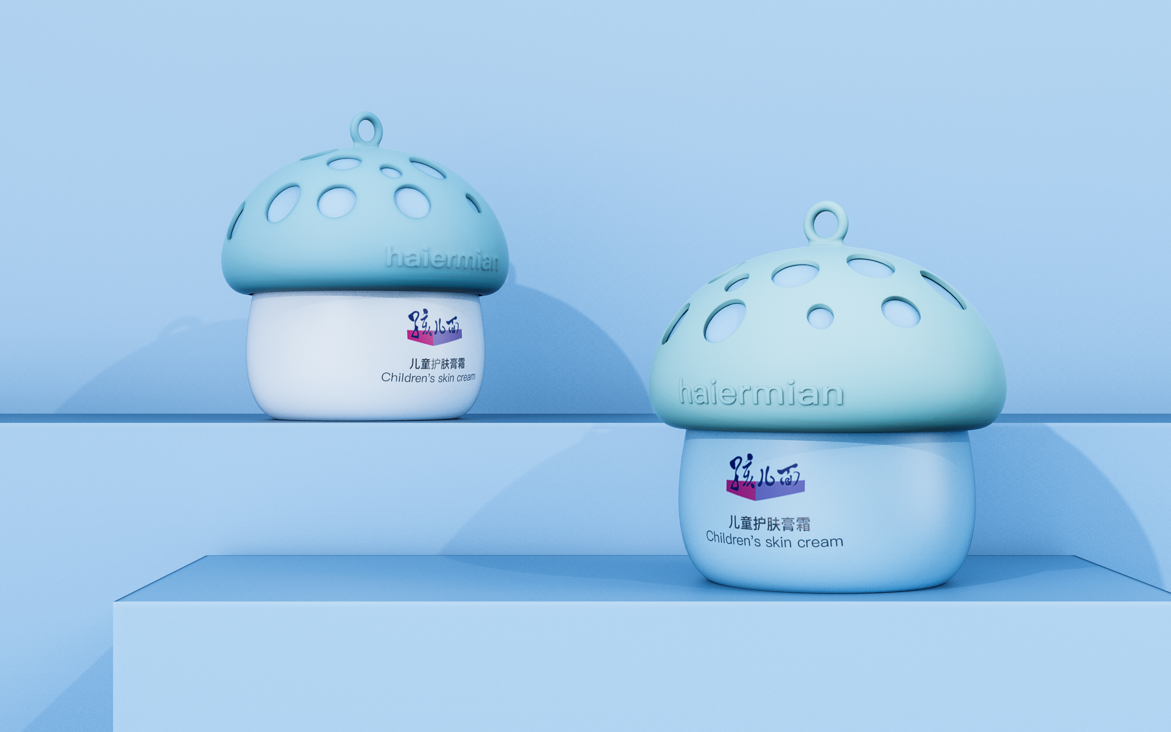
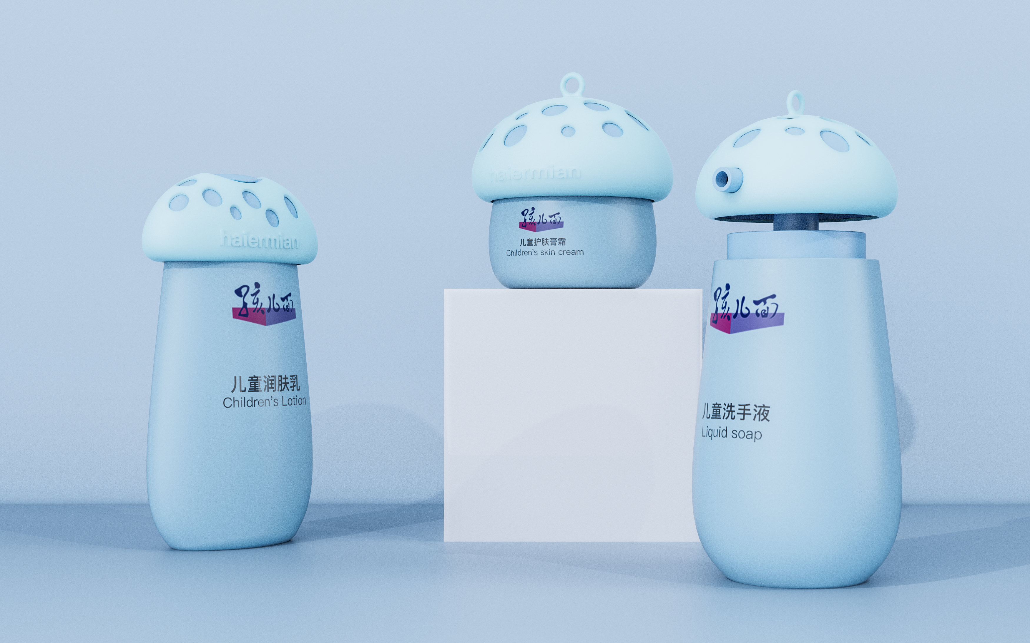
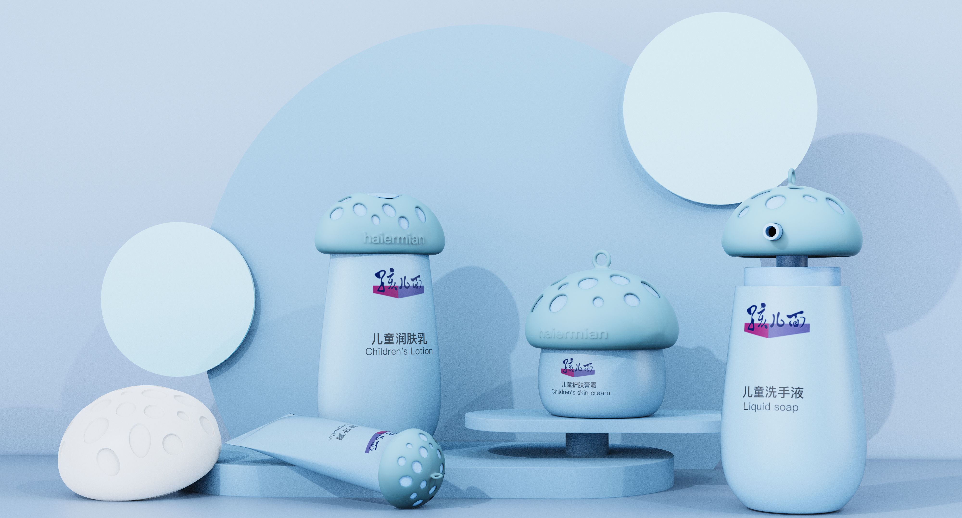
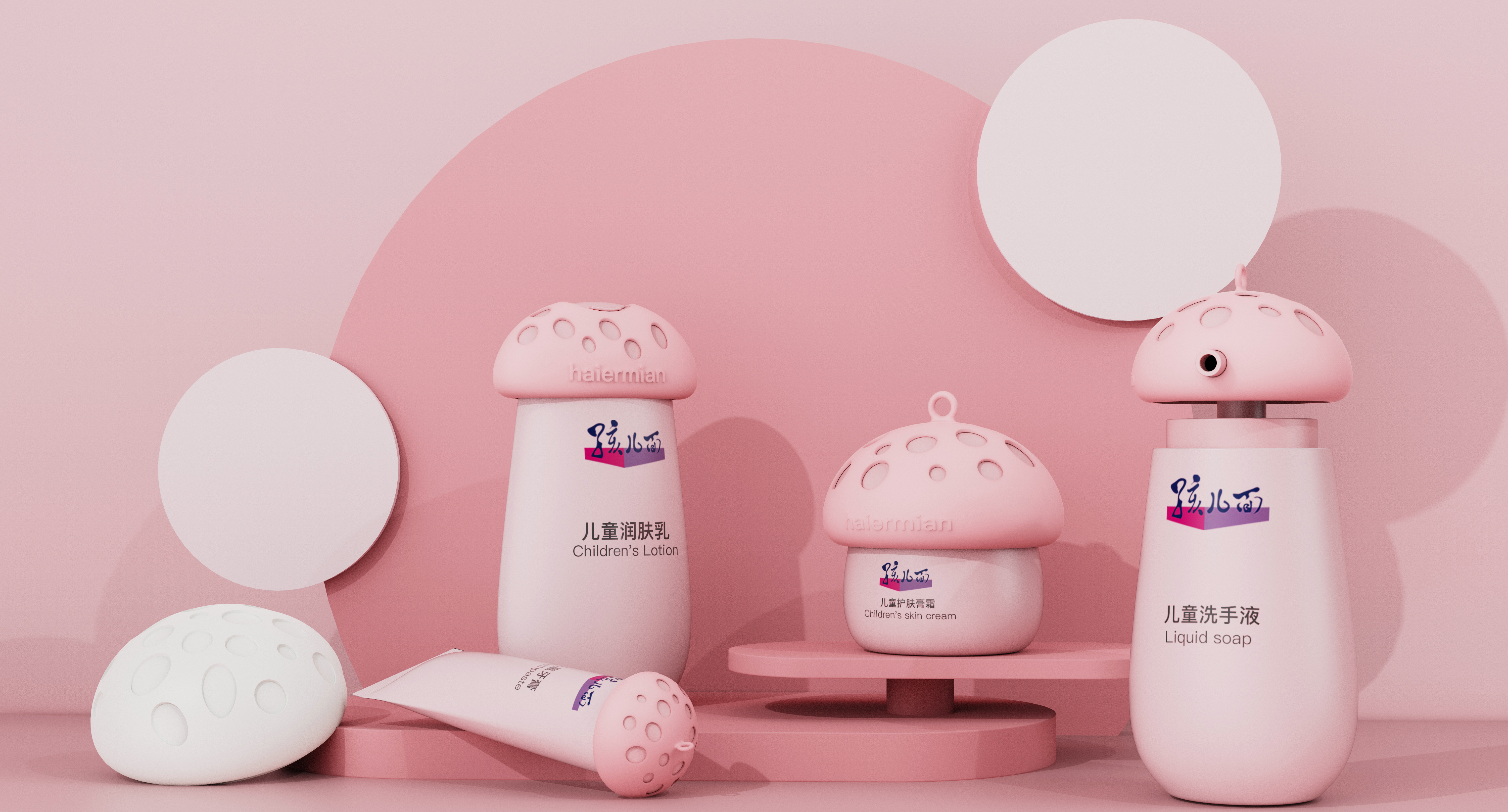
Children's facial skin care products should be the memory of many friends when they were young. The previous mushroom shape was relatively concrete. The customer wanted to keep the mushroom element to make the visual sense of the product more in line with the current aesthetic. At that time, he thought of the guide design made by Kenzai Hara for Japan's Umeda Hospital, and used the logo that can be cleaned to show the cleanliness. Therefore, I want to use the same technique to show the soft and skin-friendly comfort of skin care products through the appearance of the product and let users perceive it. Therefore, I use the soft perception of silicone to make a package, which shows the shape of mushrooms through hollowing out. It can also play a role in preventing children from moving and breaking skin care products. I hope users can bring some soft perception when they see and open it.



The copyright of this work belongs to 陈腾飞. No use is allowed without explicit permission from owner.

New user?Create an account
Log In Reset your password.
Account existed?Log In
Read and agree to the User Agreement Terms of Use.

Please enter your email to reset your password
The curved surface feels very comfortable.
When I was a child, I used this
Like ~ ~
nice ~
If you see it, you can't help but start
This design, love, love