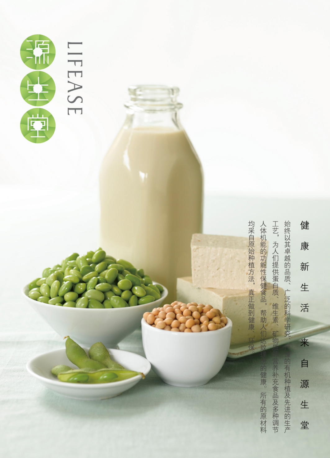
In the design process, we need to use visual language to explain the health concept of LIFEASE brand and establish a recognizable brand image. We take the tender green leaf buds as the basic element to give people a fresh and healthy visual experience. Then the center surrounds to form a circle, which is arranged in a vertical column with the words "source", "sheng" and "tang", representing the concept of two, two, three, invisible and endless life, which is reflected in the advocacy of the LIFEASE. People's diet level continues to improve. The overall brand image is fashionable and simple, and the application on all packaging, handbags and posters is clean and elegant, which is conducive to bringing more young consumers who pay attention to the quality of life to the brand.


Year
2016
Affiliation
Willer Design
Designer
Ma Hao, Li Shaochen
The copyright of this work belongs to K-DESIGN AWARD. No use is allowed without explicit permission from owner.

New user?Create an account
Log In Reset your password.
Account existed?Log In
Read and agree to the User Agreement Terms of Use.

Please enter your email to reset your password
Comment Board (0)
Empty comment