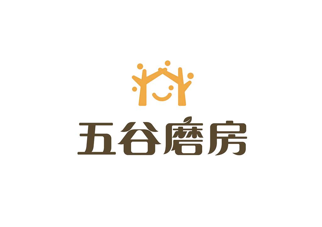
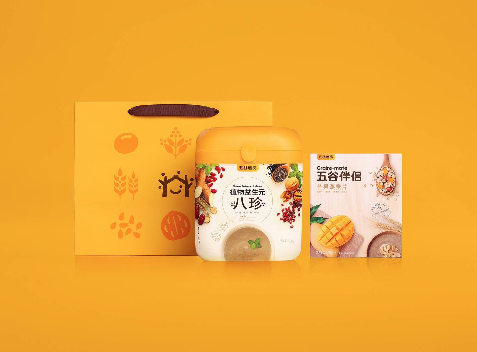
The brand-new logo adopts the combination of graphic marks and Chinese characters. The overall design of Logo is simple and full of affinity. The brand image design consists of five grains and two trees connected by branches around the symbol of smile, just like parents holding hands to build a happy home for their families, conveying the brand vision of care and care, and also implying the continuous growth of the enterprise and the "people-oriented" business philosophy.
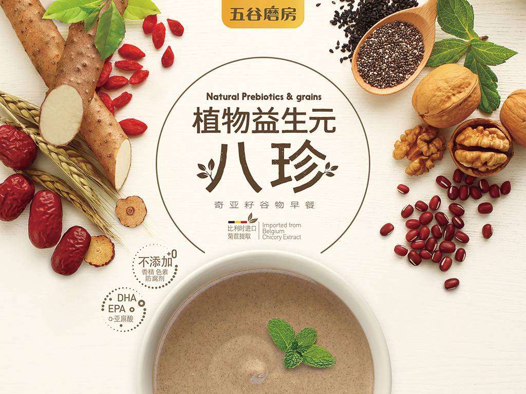
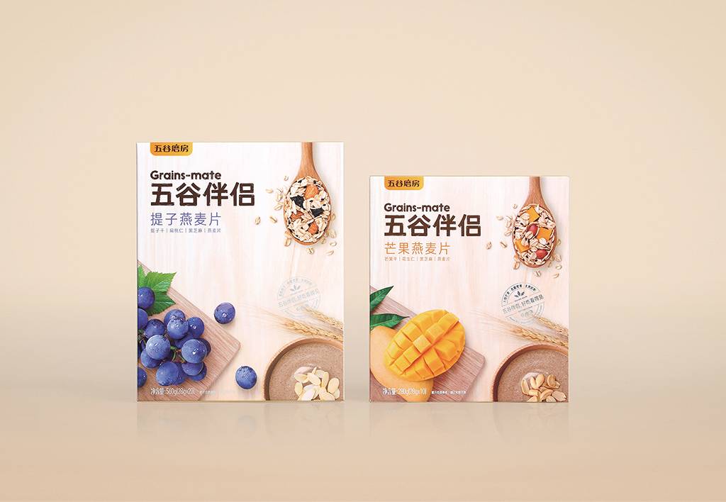
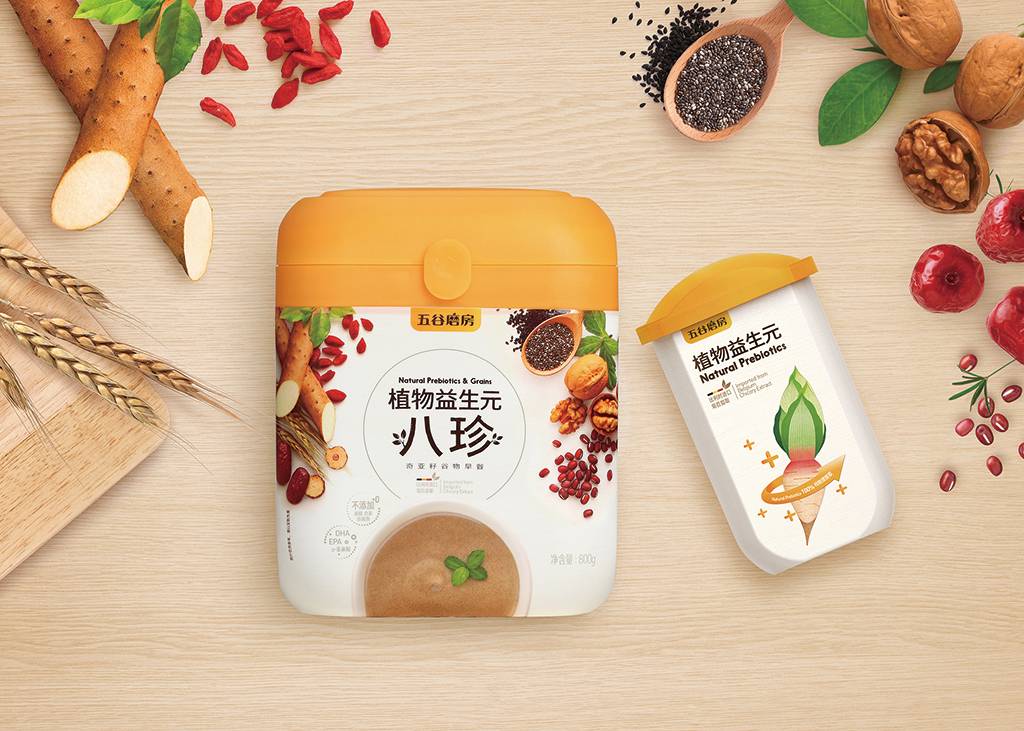
The packaging picture uses healthy and natural grain raw materials and is matched with green and ecological color combinations to make the overall vision of the packaging fresh and natural,
To see more good designs, please come in: http://www.successfuldesign.org
The copyright of this work belongs to 成功设计平台. No use is allowed without explicit permission from owner.

New user?Create an account
Log In Reset your password.
Account existed?Log In
Read and agree to the User Agreement Terms of Use.

Please enter your email to reset your password
Not bad.
I like this little box.
It's pretty.