Unconsciously approaching graduation, the closer you get to society, the more powerless you become. Design is often a compromise and a reality.
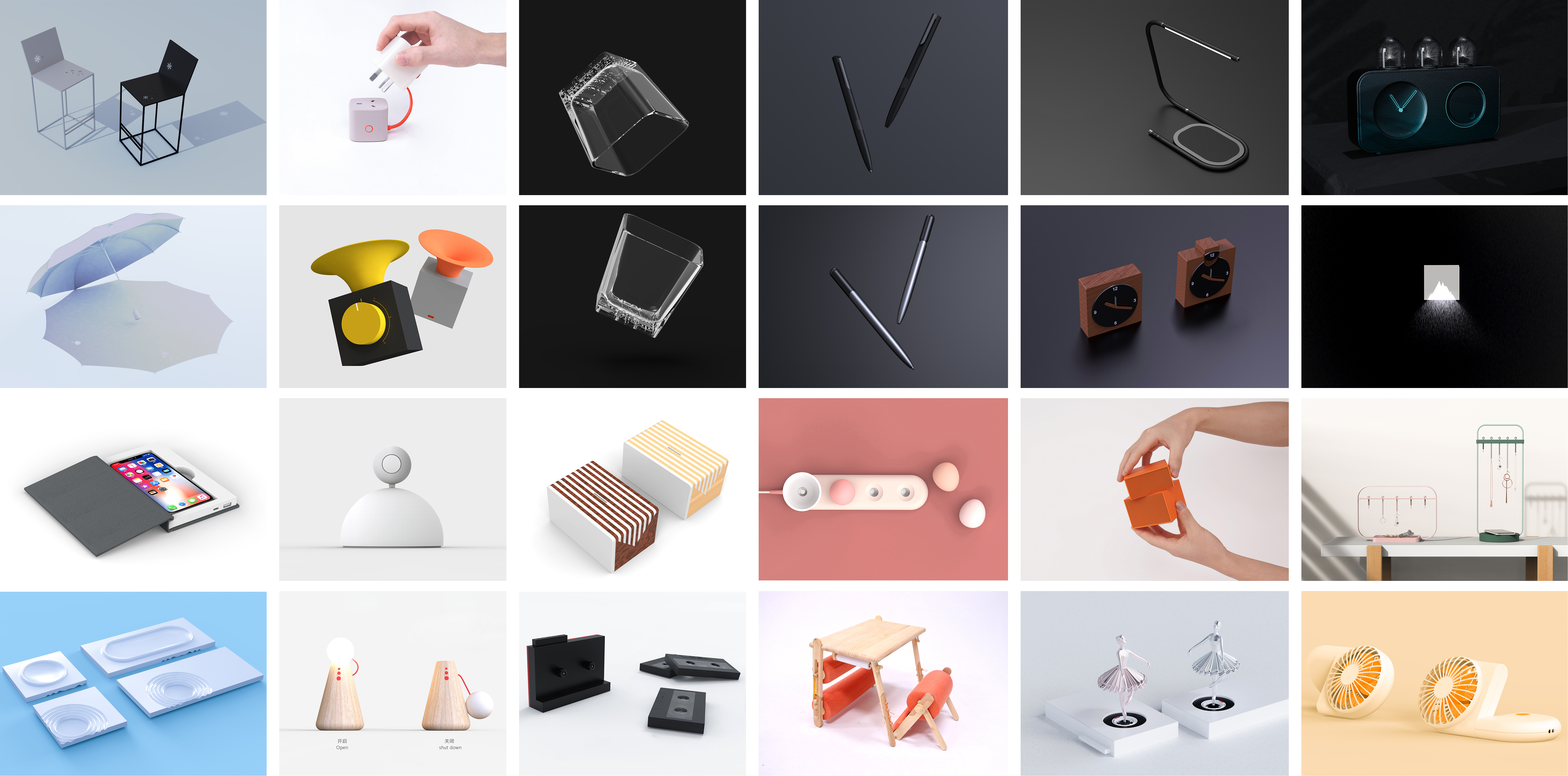
I visit various websites every day. Apart from finding many excellent design cases and learning design methods, I also see many, many previous texts (similar ideas and products). I even saw one idea that I won three times in the same award. Designers from different countries won it. The more I read, the more vague my definition of plagiarism will be, there are also many people who have asked me the definition of plagiarism. At first, I was very brave enough to force a few words. Now, as a law-blind (I will learn later), I want to write some of my doubts and ask your predecessors for advice.
When I first came into contact with design, I was an idealist. I thought design was creation. Later, I gradually felt that design was explanation, and then I kept looking for explanation,
From life (because when I was a child, I always liked to paste kites with old newspapers or finished paper (poor force), there is: kites are love letters to the sky, which are not delivered when I was young. With "Love Letters to the Sky");
From the poem (sunny day, there is rain, encounter, also deliberately, fall on your umbrella, splash on my shoulder raindrops. With "Snowflakes in the Sunshine" Note: Without this poem, I wrote it.);
From a sentence (because I don't know who shouted in class: I fuck. In class, I couldn't help but ask my soul: who is the fuck who... So, there is "Plug Night Light").
Constantly looking for angles of explanation. I often come up with an idea that I am very happy with. Google found that foreign designers had already explained it decades ago. Can I explain it again? Of course. So we will often vaguely see which one looks like and which one looks like this one. But what kind of feeling is vaguely similar?
I once met a mentor who said that there was no need to dwell on it. It was boring to dwell on this and that all day long. I also think it makes sense, but when I can't define myself clearly, I am also afraid of crossing the red line. Therefore, when my works have previous texts, I will put them out for comparison. The prejudice in people's hearts is a mountain. When it tries hard to find the previous texts, it has already confirmed the facts. All explanations are sophistry. Instead of hiding, why not release the previous texts generously. The design is not necessarily innovation, but also improvement. Therefore, the previous texts are actually not so terrible.
Let's talk about my doubts. I'm just talking nonsense. If I think of it, I'll be wrong if I understand it wrong. Let's have a good time.
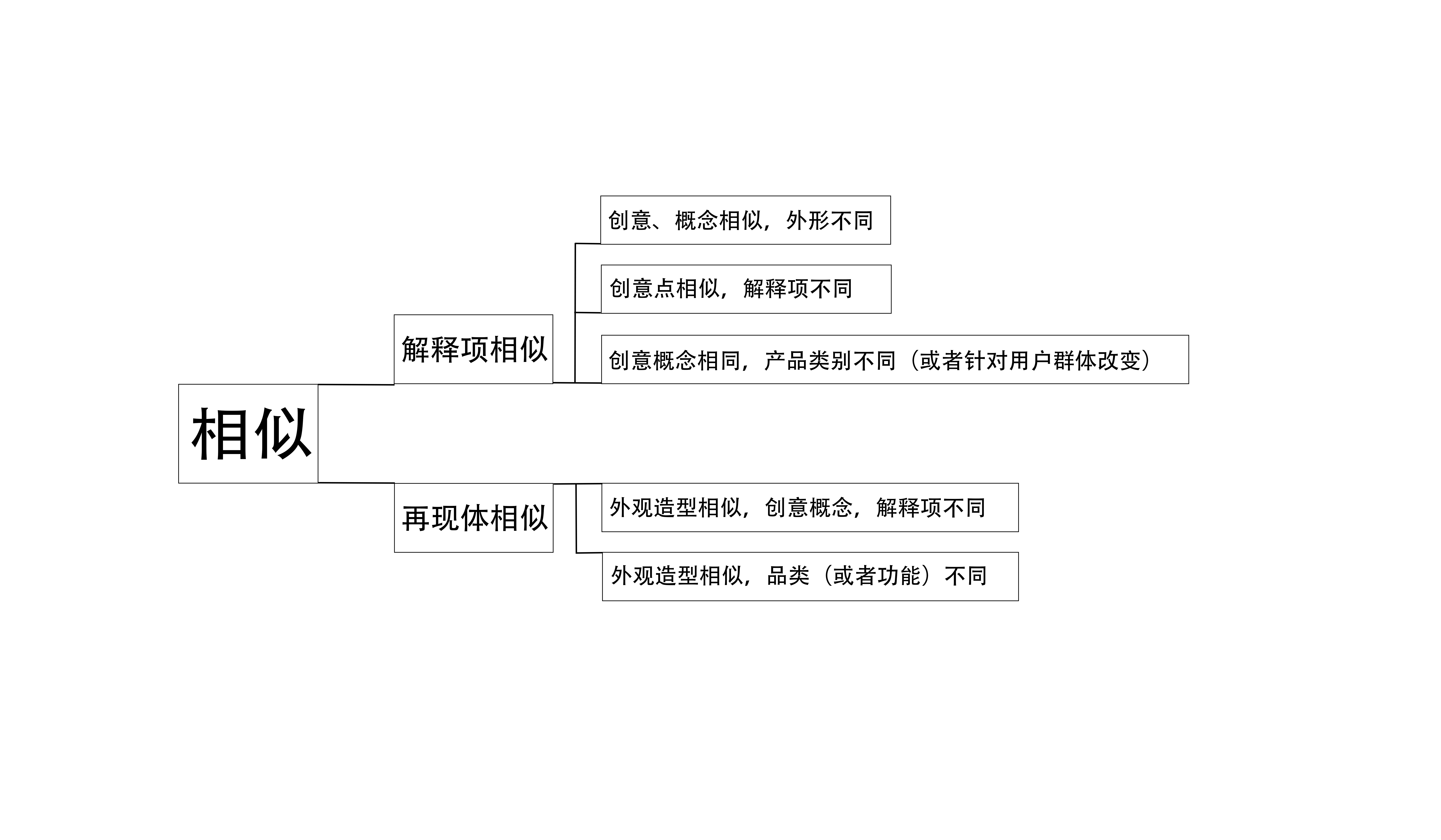
I will divide the similarity of design works into two types (one is similar in concept, similar in explanation and similar in creative points; The other is similar in appearance, that is, similar in reproduction. This kind of lamp is often sprayed very miserably, and many of the balance lamps are copied. Before Puxiang, there was a TOP work that was very noisy because of the similarity of the shape.) The generation of creativity and the derivation of thinking require justification. People often explain many things from the same angle. For example, my tutor often said that the grass I drew is the same as excrement. I took one look at my sketch and felt the same way! Does that mean that my mentor and I have the same standard for sketches? No, that only means that my mentor and I have the same perception of shit. It's smelly, ugly, bad, stains, garbage... It's a bit too much to evaluate my sketch, but let's put out my sketch. Lion shit is better than bear shit. Close the door and put the picture.
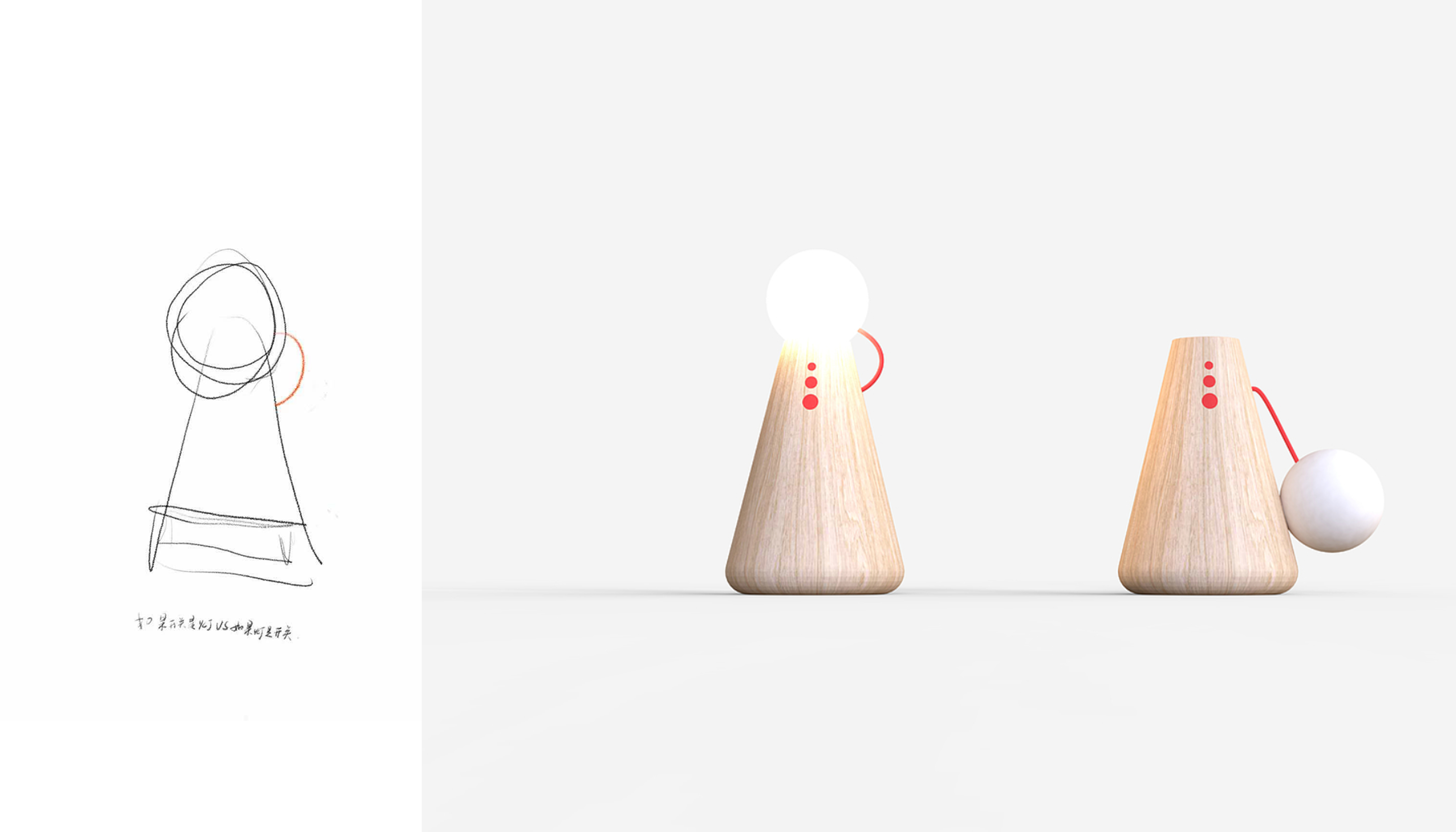
Right, everyone has the same perception of excrement.
However, some people in this work also say that there is a shadow of a balanced lamp. I am very strange. Maybe you can see a sentence at the bottom of the original sketch: if the switch is the light VS if the light is the switch.
This is my design point. I shake between the two. There is another one. If the switch is the light, send that one out when you have time.
So I don't agree with my statement about shadow. If you have to say shadow, I think there is a shadow of the plug nightlight, or it should be said that the plug nightlight has its shadow, because the idea of the doll nightlight is before the plug nightlight. But in fact, there is no connection between them, and the intentions are not the same.
To analyze my understanding of the similarity above, here is a picture. The following cases do not represent the author's point of view. If the works used are offensive, the author is stupid and wants to get hot. If he only learns to communicate, he will try his best to give his own example and delete the infringement contact. Drink two hall Erguotou written, do not bear any legal responsibility.
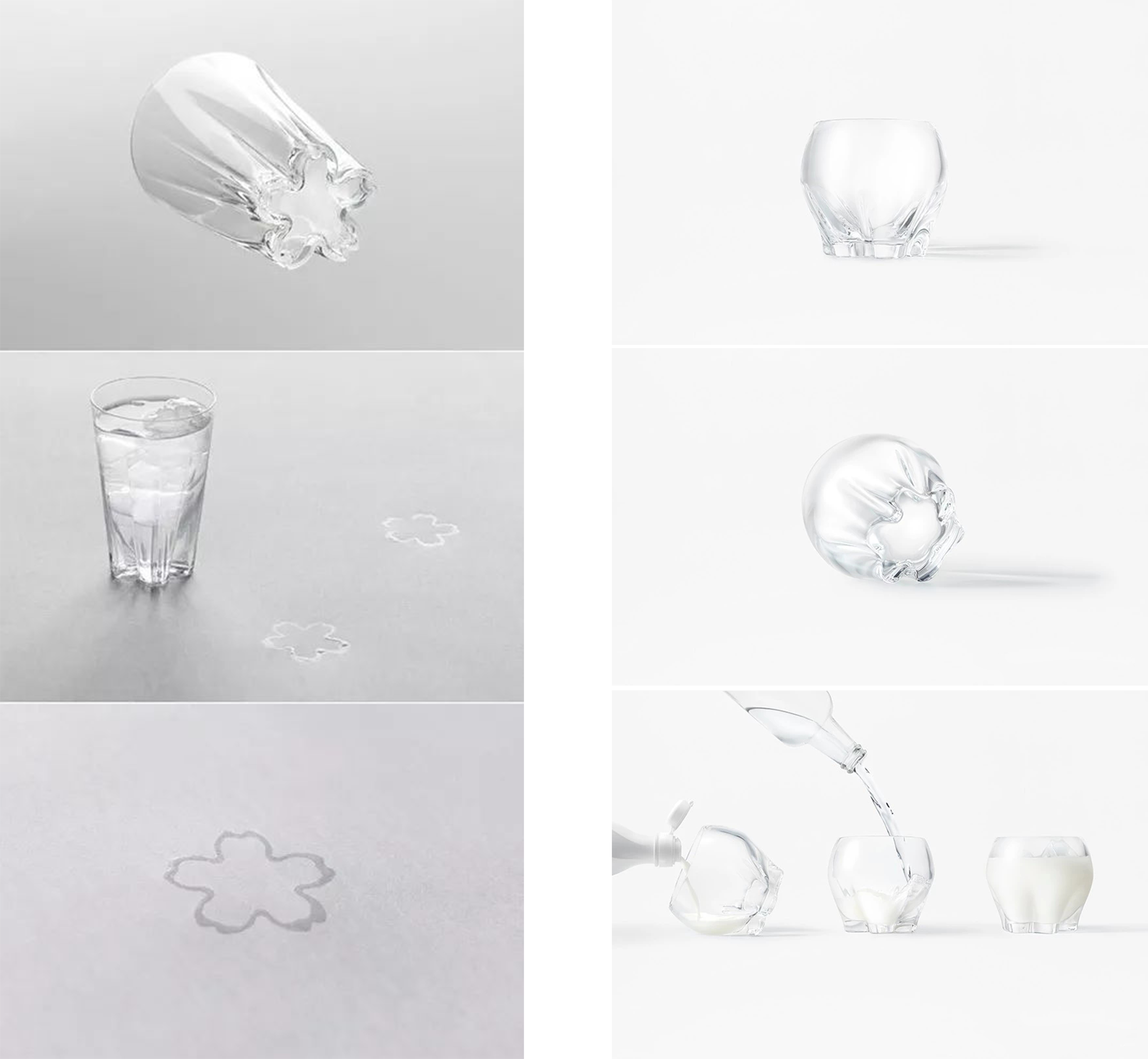
I feel that product design is a kind of refreshing disposable product. I will be amazed when I see an interesting interactive product for the first time. I am used to it twice. It is rarely like art paintings or books. It can bring freshness to users every time. Some excellent ideas are often used to make users attracted to buy it when they see it. When they buy it back and put it at home, it was already a cigarette afterwards, and my heart was not surprised. Therefore, when a work has the previous text, the sense of surprise will be weaker (for example, when I first saw the explanation of the traces of water in the Hiroshi Tsuboi Sakura Cup, I would marvel at it, and then I saw Sato Da's mixing cup, I would not feel so surprised. I don't know whether the fold edge of the mixing cup is explained as cherry blossom, because this is not the main expression of this work, but because the cherry blossom cup will make me pay attention to the shape of the bottom of the cup and bring the front text, this image is undoubtedly very beautiful, but in fact, this frill design is subordinate to the function and is specially designed for a very popular beverage in Japan, it allows users to easily mix liquids together.) Of course, I prefer the bottom of the cherry blossom cup, because this can make a symbol that is only beautiful have practical functional significance.
Let me take care of it myself. The first point is to explain the similarity of items, similar creative concepts, and the differentiation of reproduction bodies.
I think this method is used quite a lot. Of course, there is no relationship between the actual products. It is more personal and some previous texts that affect my judgment. There is no connection between these works.
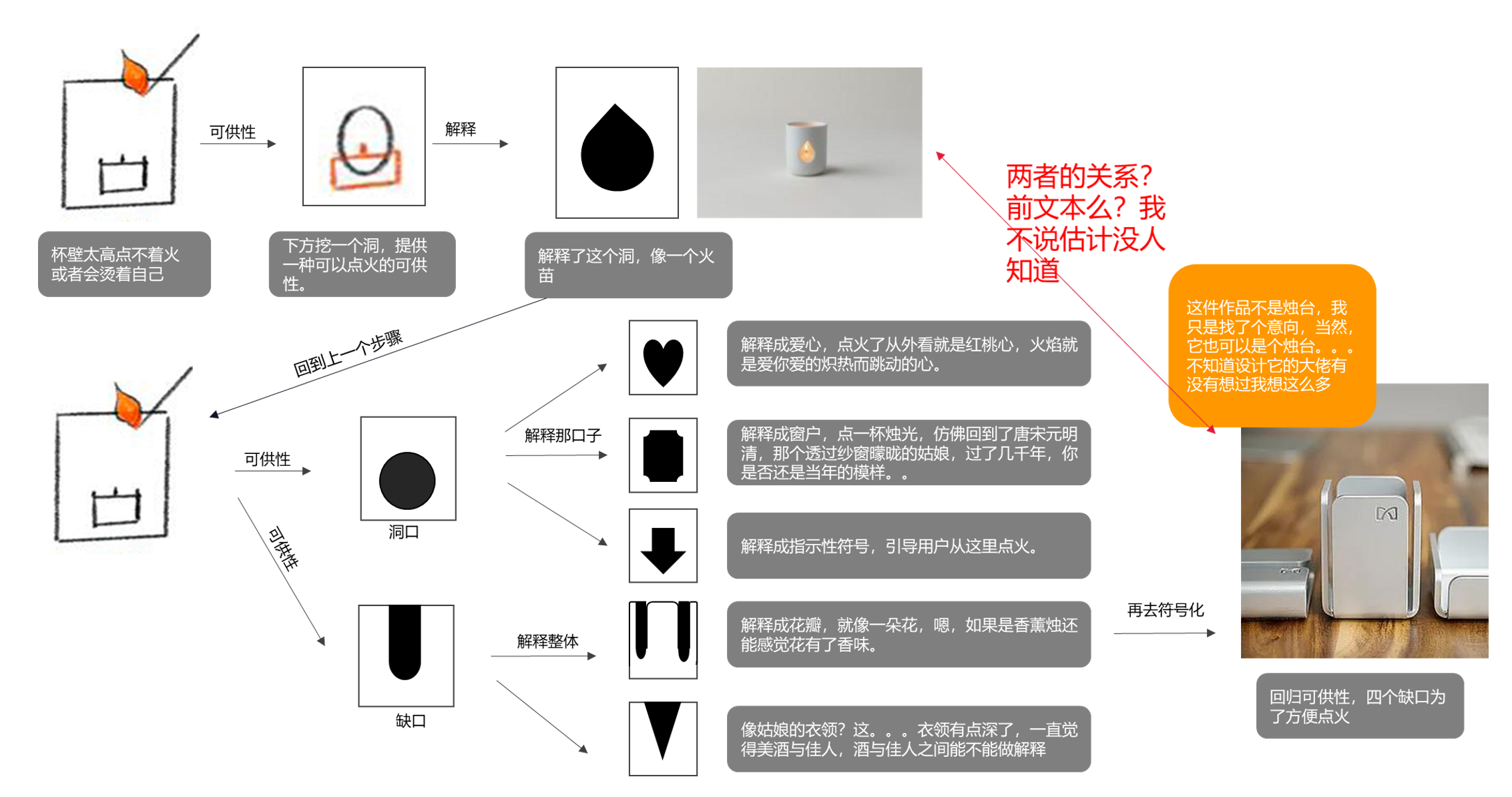
Tell me about the evolution of similar creative points and different shapes above. Because the wind needs to be blocked, there is a cup wall, and the cup is too high to ignite. Therefore, starting from this point, the designer opened a mouth and explained it with the symbol of the flame (now I think this explanation has an indication function, as if it were a hole scalded by ignition, which will guide the user's behavior and tell the user to ignite from here.)
Returning to the previous step, starting from this point, reset the shape of the gap, a kind of explanation like the above, like love, like a window (although there are different interpretation meanings, the similarity is still too high), Re-interpret the gap, retain the availability of ignition, explain the whole, the appearance of the shape changes, and the purpose of availability remains unchanged, the whole product and symbol explanation (the shape changes greatly, it is difficult to see the front text on the shape), push forward like flowers, like collars (cup waist is thinner?), at this time, there may be a little bit of the previous text. When you de-symbolize the reinterpreted symbols, the similarity is very low.

The similarity of creativity is different from the explanation item. This time the previous text is my own, maybe others can't avoid it. I think it's a rational view. It's my own lack of cognitive ability and poor theory (half tone, a lot of mistakes here), and I have the courage to bear it. The duration and age of the incident are relatively long, but in Senior high school, I am also very good at Chinese and history, and my memory is relatively good. The Chinese teacher changed three times and my representative in this subject did not change. Therefore, I can still say that at that time, a teacher mentioned a design scheme about tea bag bookmarks. The bookmarks were made into real tea bags. The most touching sentence was: the taste of the book was made from the tea bag. I have been thinking about this sentence, thinking that on the contrary, bookmarks are tasteless, while books are tasteless, such as the thickness of history books and the youth of love letters. We can always use adjectives to describe them, and the bookmarks have been sandwiched in the pages for a long time, as if they have the taste of books, so I wrote down a sentence in my notebook: the taste of bookmarks is made of books.
Later, I didn't dare to mention it. I talked with Hui. He said you could mention it. So when I was on stage to talk about the plan, I asked the teacher my opinion. The teacher shook his head and said, "No, let's talk about the next plan.
Then the idea has been falling in the notebook, piled up with my thick two sketches.
Later, until last year, when there was a special time, I planned to build a plan every day. I chose the design of the tea bag bookmark, and then I sent it casually. The next day, I woke up and said that my classmates had already done it. If I did it again, it would involve plagiarism and let me delete it. (In fact, at that time, I knew that my classmates had already done the plan, but my cognition at that time thought that the two explanations were different, so I didn't think too much, but in fact there was a strong previous text. The partners in the group reminded me, and I quickly deleted it and apologized to my classmates.)
When it comes to the difference between the two schemes, it may be just a word game. The scheme is similar in creativity, and the reproductions are all bookmarks. The former uses real taste and form, and the taste of the explanation book is made in tea bags.
As for the taste of bookmarks, I think books have their own taste. Each book has its own unique taste. The taste of bookmarks is made by books. And each flower has the flower language of each flower, can the flower language and the taste of the book explain each other. Therefore, a part of the cover of the book is cut as a bookmark, and the pattern of flowers related to the content of the book is printed on the back cover of the book by magnetic attraction, so that the book and the bookmarks carried in the book can explain each other.
Speaking of which, having said so much, you may find that no matter how you explain it, it will actually contain the previous text, and it is very strong. In the words of the monitor, maybe the explanation items I want to express are different, but in the end, both the reappearance and the explanation items are a bit similar. So the explanation is all in vain. How can it be regarded as a breakthrough? I talked to a few boring people about this topic some time ago. There are two interesting sentences: 1. Design needs to have its meaning of redoing. 2. "The predecessors have done it" is the inertia of thinking.
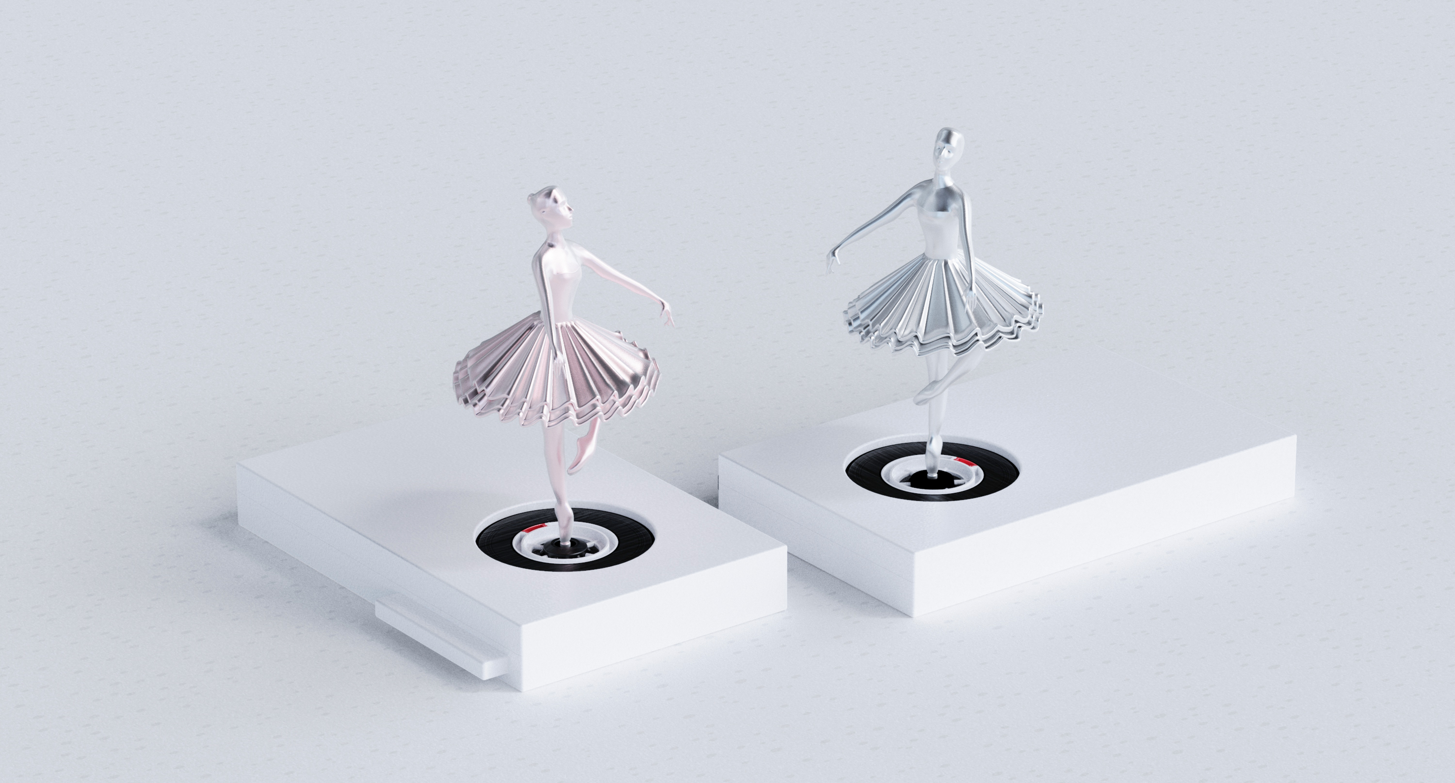
The picture and text have nothing to do with it, so I'm too lazy to look for it.
On the third point, creative concepts are similar and product categories are different. There is no doubt that it is the most common way on the market. It is difficult to define the same idea in different product categories. It is always a bit stiff to use a literary word called Rong Geng.
Here also returns to the above sentence, design needs to have the meaning of redoing, whether the borrowed ideas can form a new explanation with the product and the use environment, and this explanation is very natural.

The above mentioned is very easy to understand, but I have doubts about the similarity of the reproduction body. When we design products, we always look for intention maps, and these intention maps will greatly affect our conception of modeling. When looking for intention maps, we will find a concrete carrier for the sensory level things expected in our mind, and when we find a specific carrier, it will inevitably be affected by the shape of the carrier.
A set of furniture made by my classmates two days ago is very similar to a piece of furniture. My roommates said that it would constitute plagiarism. I think that in the field of furniture, the differences of many products will be very subtle, and the personality will gradually become common, and then new ones will appear. personality.
Of course, the similarity of the reproduction body will also bring about the pre-text, and my doubts are also here. When the coding of a product is small enough, can the innovation of a code become a commonality and innovate on this basis?
At the same time, I also give an example of mine. Some people think that plagiarism will be suspected, while others think that it is not. The core point is that a code in the same place is similar in form. I don't think it constitutes plagiarism. I also use that sentence to explain: design has its meaning of redoing.
And I think it makes sense.
Although this design is not a very good design, I think it is very subtle, and I like its thinking process very much. Let's talk about this work that triggered the thinking of this diary, that is, the similarity of the reproduction body, and the creativity of the product is different from the explanation item.
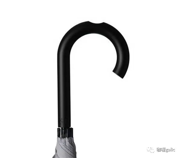
In my junior year, a classmate analyzed Naoto Fukasawa's umbrella in a course. In analyzing it, a new availability was added to serve the user's behavior. I found that the use of its added function of hanging things was opposite to the function of the product itself, which was adapted to two environments respectively. When holding an umbrella, the availability of the hanging things provided cannot be used. When using the function of hanging things, the blocking function cannot be used. The two functions are opposite to each other and can be applied to the use environment respectively, which is explained by the use environment.
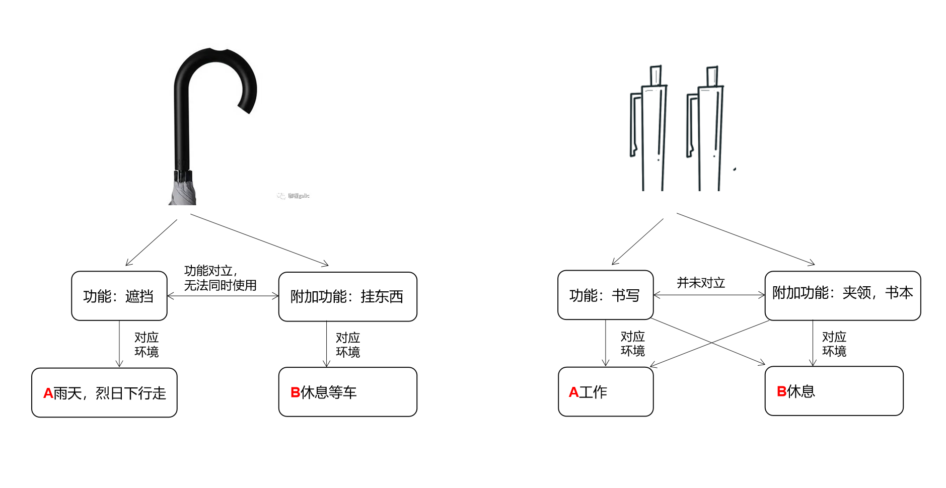
At that time, I thought this kind of feeling was quite interesting. I thought that the additional function of something should be opposite to the main function, but there was no opposition in real life. So I looked for the product and found the pen. The original function of the pen was used for writing. As an additional function of the pen, the pen holder provided the availability of being clamped in the collar, notebook, etc. However, these two functions correspond to two different behaviors and environments. When writing, the function of the pen holder is not used. When using the function of the pen holder, the function of writing is not used. The two behaviors are opposite and mutually converted. However, the function of the pen holder in the existing products always exists. When the two functions of writing and writing are in the same environment, the use process will produce interference, as a result, when the pen holder function is used, the writing function does not disappear, and it is easy to cause behaviors such as wrong scratches of clothes and pages.
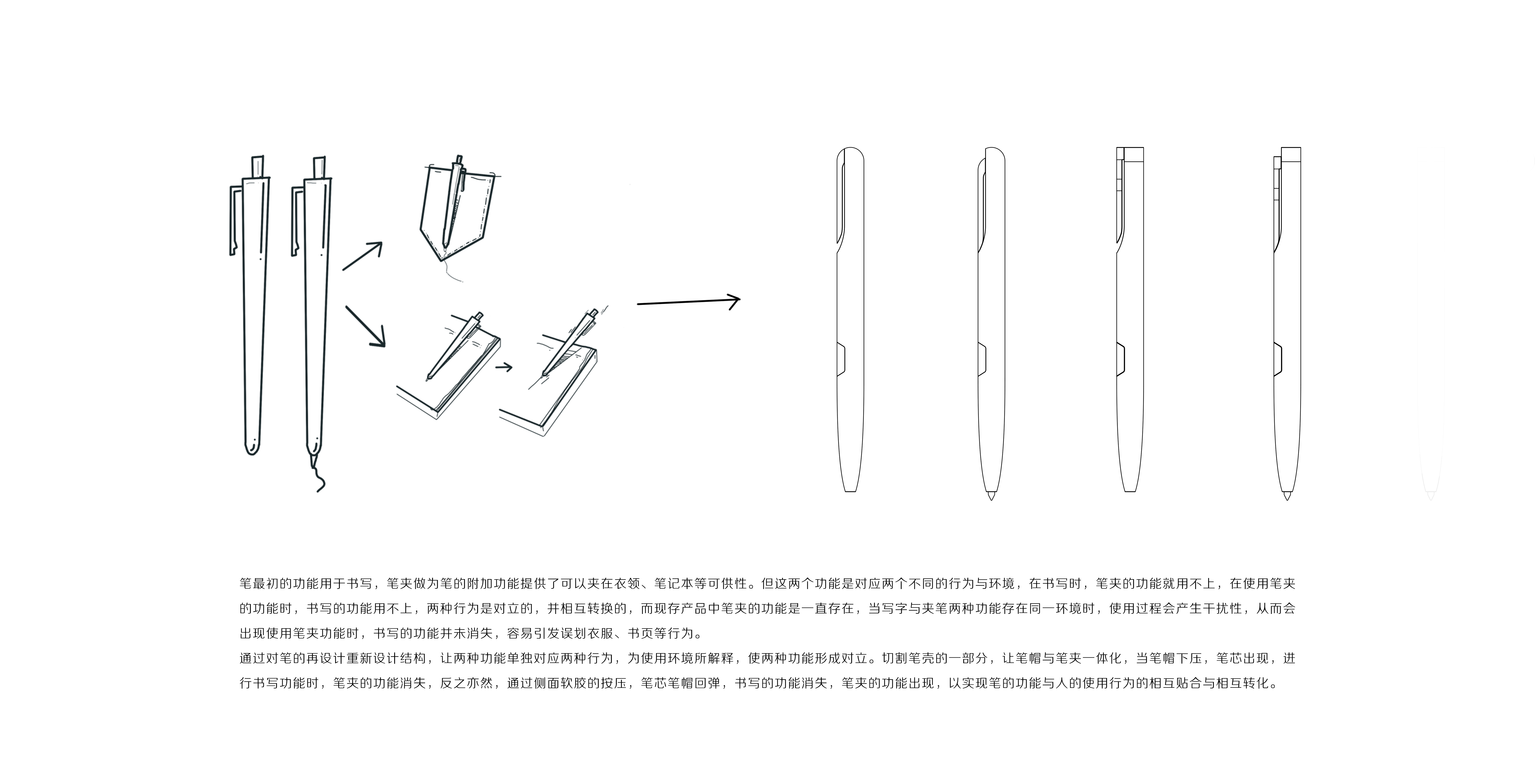
How can the two functions of writing and pen holder form opposition and be explained by the environment?
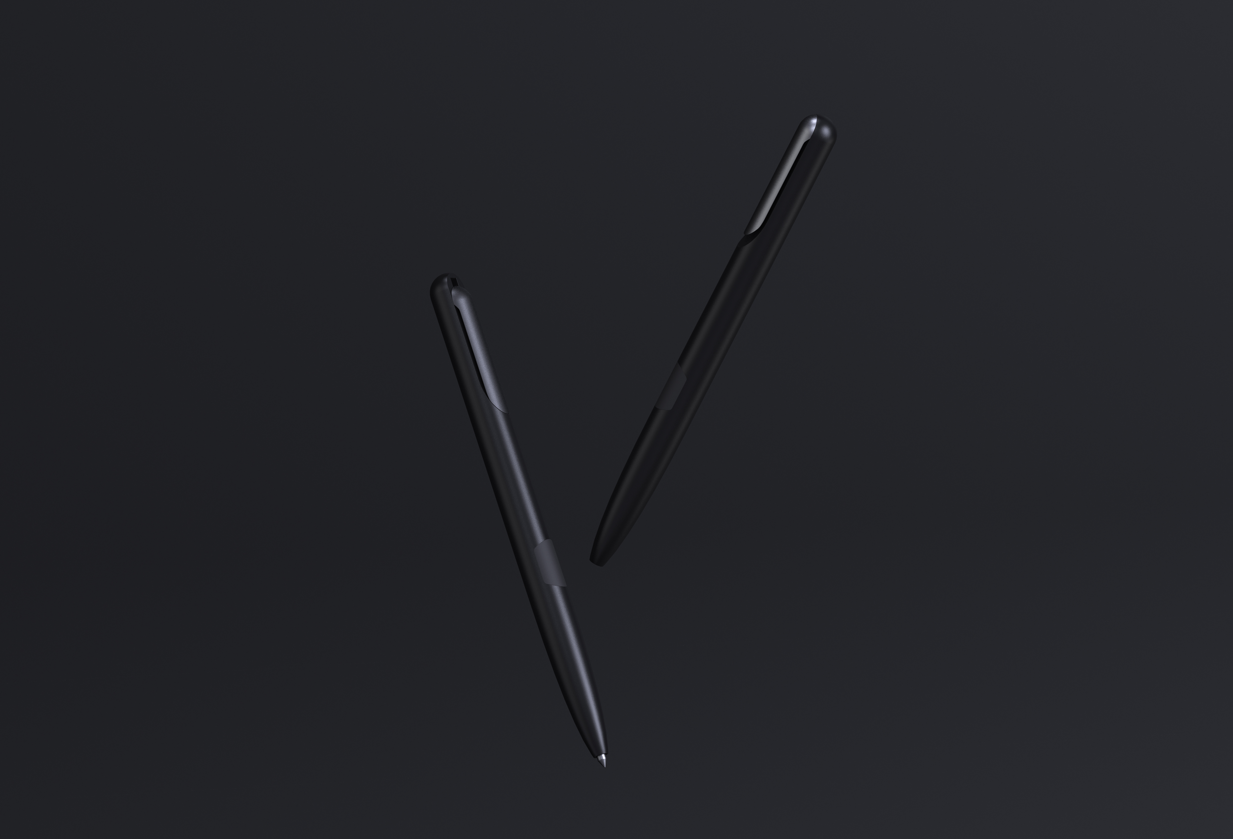
I have thought about many ways. In the process of thinking, one classmate sent me a pen from Sato University and one classmate sent me a pen from Naoto Fukasawa. I can't deny that I have seen it all, but I actually think my creativity and explanation are not the same as them. I redesigned the structure through the redesign of the pen, so that the two functions correspond to the two behaviors separately, which is explained by the use environment, so that the two functions form opposition. Cut a part of the pen case to integrate the pen cap and the pen holder. When the pen cap is pressed down and the refill appears, the function of the pen holder disappears when the writing function is performed, and vice versa. Through the pressing of soft glue on the side, the pen cap of the refill rebounds, the writing function disappears, and the function of the pen holder appears, so as to realize the mutual fit and transformation of the pen function and human use behavior.
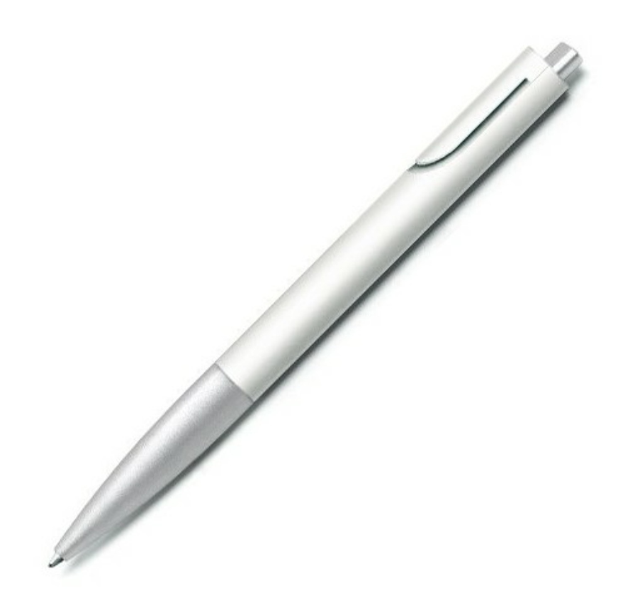
I can't deny that I have seen the work of Master Naoto Fukasawa (I can't deny it, after all, my idol), so this work will definitely have the previous text, and the intention of this design is that the creativity is innovative, borrowing the form of cutting pen cap, and forming the functional opposition with side pressing to adapt to the use environment. Of course, there are many ways to realize the opposite of this function. In fact, I have thought about more than one, but I think it is the most direct.
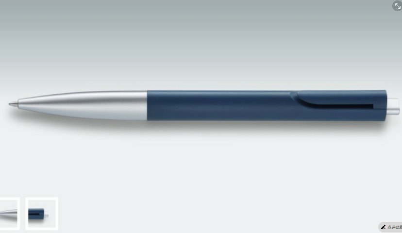
In addition, the less the composition code of a product, the more difficult it is to think about innovation in terms of availability. As an individual, the innovation of a product will eventually become common. Just as there may be no pen holder at the beginning, if an innovation cannot be used, its meaning will stop there. We can only see further by standing on the shoulders of giants. If Master Naoto Fukasawa creatively designed the way to cut the cap (explain here, I think Master Naoto Fukasawa's cutting of pen caps is a form of innovation and does not have specific functions. However, because he chose to use a triangular pen body to prevent the pen from rolling), later people can no longer use it. The meaning of product innovation will always start from scratch.
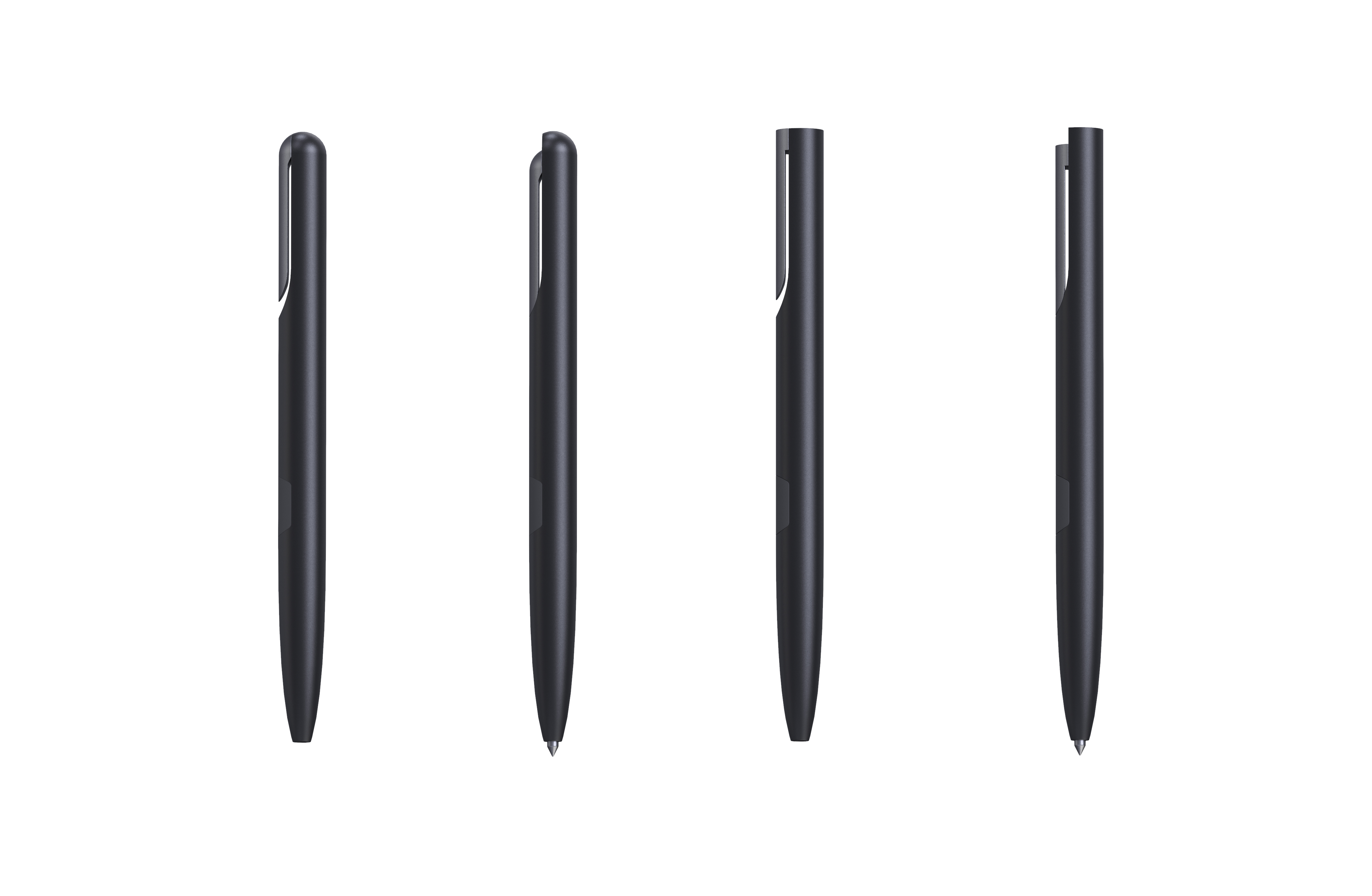
So I finally borrowed the form of cutting the pen body to form a functional opposition. Some people say that if I had seen the Shen Ze pen before it was designed, I was suspected of plagiarism, because the reproduction was borrowed in a similar form. I don't quite agree. I can't deny that I have seen master Naoto Fukasawa's pen and borrowed the form of cutting pen cap. However, cutting pen caps has never been the intended fixed point of my design, but only one way for me to realize the conversion of two functions.
In fact, to remove the controversy, this pen can be explained on the basis of the current availability. I finished the part that can be cut off by the pen holder and designed as a lying Forbidden City cat (isn't it all like this), but I think if so, it will interfere with my intention.
Of course, the above are just some of my personal opinions at sixes and sevens. In fact, my mind is also at sixes and sevens. I hope you can discuss and share your views, so that I can also clarify my thoughts and thank you for your advice.
I will graduate from college in more than ten days. I have been studying at sixes and sevens for four years. I haven't finished writing this paper and used it as a journal. I think I have a liver...
The copyright of this work belongs to 等认领. No use is allowed without explicit permission from owner.

New user?Create an account
Log In Reset your password.
Account existed?Log In
Read and agree to the User Agreement Terms of Use.

Please enter your email to reset your password
I haven't used my brain to think about anything for a long time after reading it during working hours. I still need to think about it. if I don't use it, I should waste my brain
2. I don't think the umbrella is related to the pen. To put it directly, I don't think the umbrella is a good design. The pen holder is opposite to the writing function, but its surface function is sandwiched somewhere, but its essential function is to meet the next writing, so he still serves the pen. But the umbrella hanging is only an additional function. I take the umbrella when I go out to protect me from the rain, but you let me hang things as a crutch and protect me from the rain.
I don't think your pen has plagiarism.
With so many ideas and understandings, it is already very powerful
I just came out for an internship, and I also felt that a lot of things need to be compromised. Sometimes I think it's a good idea, and my superiors don't understand it. I think I may need to strengthen my communication skills. For a project, I have to pass the manager and the director, also pass party a
At present, I am also about to graduate. I am very confused. I don't know why I feel very cold after reading Guangmei's works. It is not that Guangmei's works are not good. On the contrary, I feel that I like them very much and feel that such philosophical thinking will benefit me all my life. However, I always feel that this kind of thinking is very difficult for me, and it may be difficult to build a survival. I narrowly think that if the movie is more like a literary film, it has profound meaning, connotation and value, but the audience may not be broad. However, if the design of commercial films is more needed in the face of survival, various professional skills are needed.
In fact, if you say so, everyone knows the truth, but it is really difficult to choose from yourself. I am still struggling, may face graduation more painful hhhh
Designers cannot overemphasize personal will,
"The Chinese teacher changed three times and I didn't change the representative of this subject." The screenshot has been sent to the Chinese teacher
I like the reinterpretation of the pen very much. For the redivision of the two opposite functions, this is the result of "new thinking". My understanding of whether similar forms are plagiarized is whether the creation of new products has new meaning, solves new problems or redefines them. In addition, everyone's understanding is different, so it is good that the opinions they keep can be self-consistent.
You are so cool
I have doubts about the structure of this pen. I don't know what structure the building owner uses. If the traditional push-push structure is used, the end of the hook should have a margin instead of completely supporting the shell. If the pen is directly pressed out, the writing force is not guaranteed...
I actually finished watching the TOP work of Puxiang because of its similarity in shape. The initiator should be me. First of all, I said Love and peace. My junior university has these design consciousness to express admiration. When I was in college, I also had your idea. I think a good design is a good design. However, after social beating, I found that design is a process of weighing and competing. Now I compete with the feasibility of cost structure every day. Users are accustomed to market acceptance. I think designers should be a master of balance. Put everything together, make an average value, and the one with the best balance is definitely a good design! Just like the case of the candlestick, you give different explanations for different holes, but have you ever thought about how to measure which of these 8 holes is the best? How to keep his affective symbolization after you symbolize. In a nutshell, you optimize his functionality and convenience. Although the latter design is very interactive and convenient, it weakens his emotional and symbolic nature as a whole, so I said the design needs the optimal balance value! As for the degree of similarity in your design, it is not necessary, because there is a patent infringement law on appearance. However, for example, if Sato added a cup that can leave water marks with patterns on the product promotion point, then according to the Chinese patent law, there may be infringement. The patent law expressly stipulates that especially in similar products, I had the honor to cooperate with Pingjing existing projects before, next time tell him to sue Sato! (Joke) Finally, the significance of redoing is that I saw the third work and all the works on the front page. I feel that you are a little trapped in a pit. Almost all of them are creative in the same way, either by substituting or grafting, replacing this good design point with another product. There is no denying that you are a good cosmetic surgeon, but you are still far from the creator, you ask yourself if there are any ideas that have not been seen in the market. In fact, students should see these. The masters are old. Some of their designs are made according to the good habits of the people of their time. In addition to their parents, there are also a few who put pens in their clothes to go to the meeting. Therefore, it is useless for you to optimize the concept in some very old designs! Learn to design with master's eyes and observe life more! No matter what, do not deny that this age should be excellent, come on!
Does Naoto Fukasawa's umbrella ignore the function of crutches? This function does not oppose hanging objects. And even after the umbrella is opened, the handle can still hang objects.
Thinking Caused by Watching "Thinking Caused by a Work"
The customer said it was shit, and then he would look more and more like that shit. Then there is no and then there is