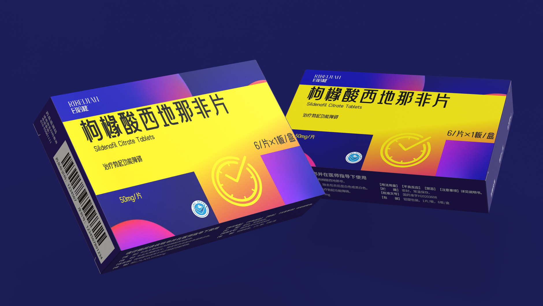
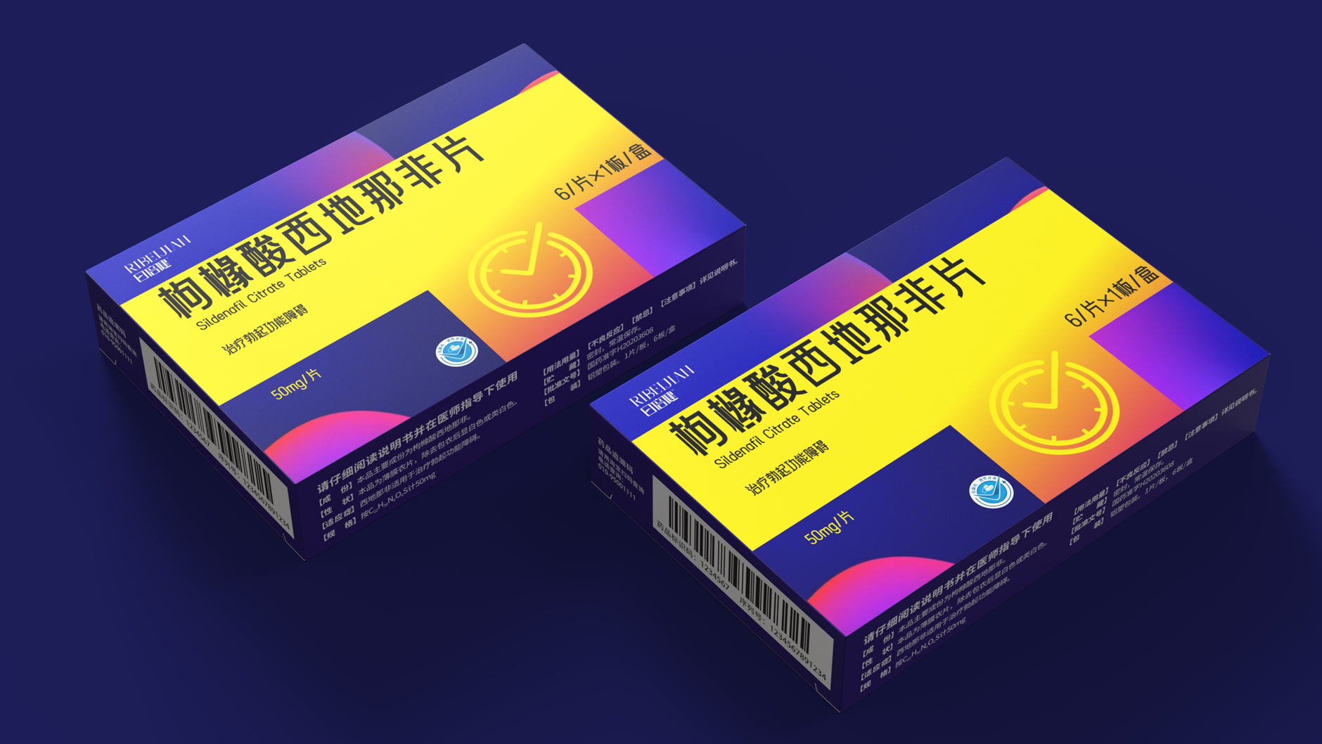
Decoding new language for prescription drug packaging, when "clock" meets "vitality color block"
Sildenafil Citrate Tablets
Use bright color blocks to match
Presents a stylish atmosphere of vitality
Blend into the clock element
Implicit in the efficacy of the packaging "enhanced delay"
The packaging abandons the traditional white and blue medicine box and uses high saturation contrast color blocks. This design is not only highly recognizable on the shelf, but also understands color psychology. The scientific nature, reliability and security of drug delivery are the cornerstones of prescription drugs. Vitality Orange: symbolizes energy, warmth and improvement, and is intuitively associated with the state of positive stimulation of body functions after taking medicine.
Look carefully, the color blocks on the packaging cleverly form an abstract "clock" outline! This design is really unique. It conveys its core implicitly and accurately, accurately controlling intimate moments and allowing good times to continue. I give full marks for this way of telling stories with design!
The copyright of this work belongs to 深圳智圆行方包装设计. No use is allowed without explicit permission from owner.
New user?Create an account
Log In Reset your password.
Account existed?Log In
Read and agree to the User Agreement Terms of Use.
Please enter your email to reset your password
good
This medicine is a big tonic
nice packaging