I graduated soon and want to find a job.


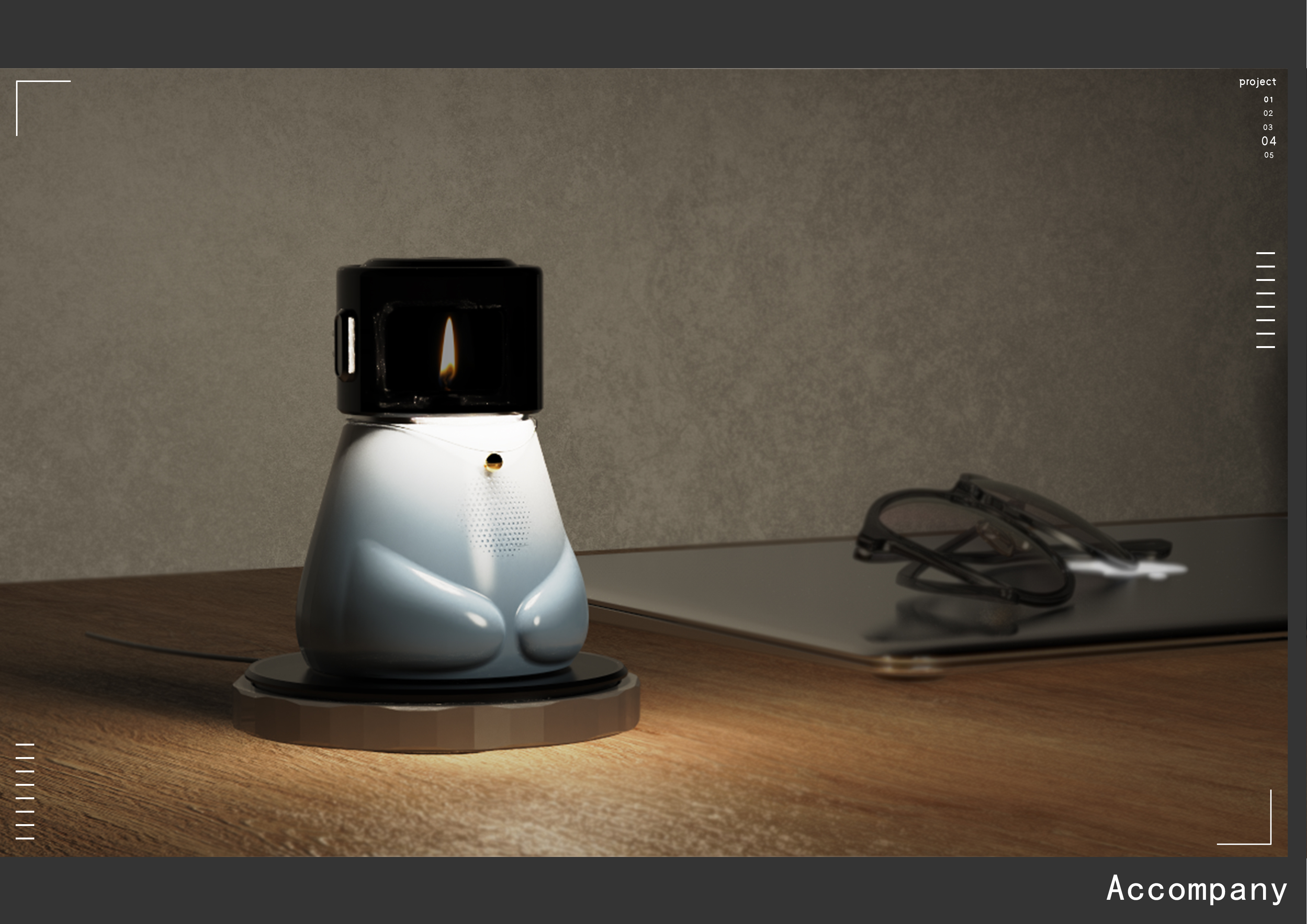
The copyright of this work belongs to 原地转圈. No use is allowed without explicit permission from owner.

New user?Create an account
Log In Reset your password.
Account existed?Log In
Read and agree to the User Agreement Terms of Use.
Please enter your email to reset your password


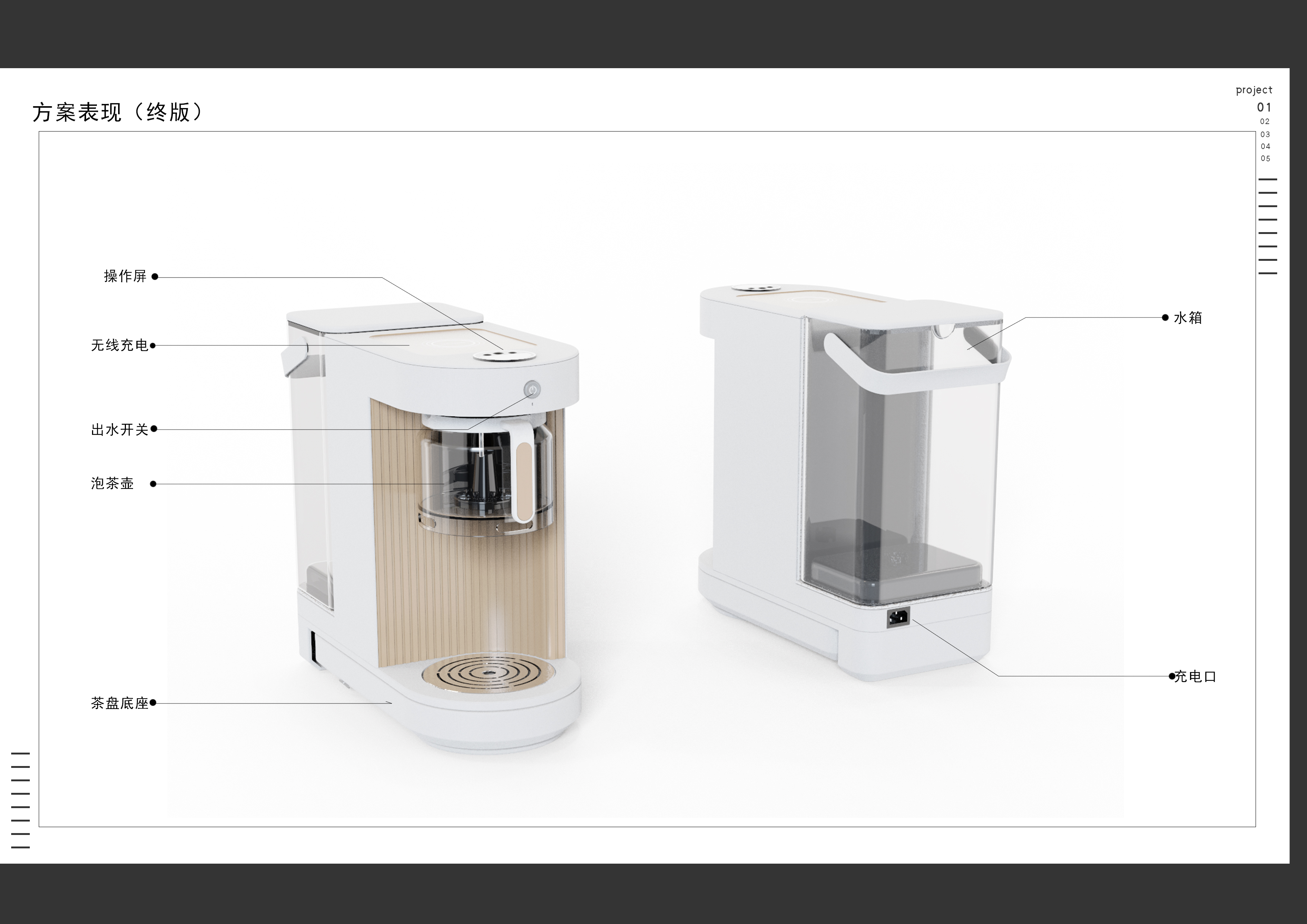
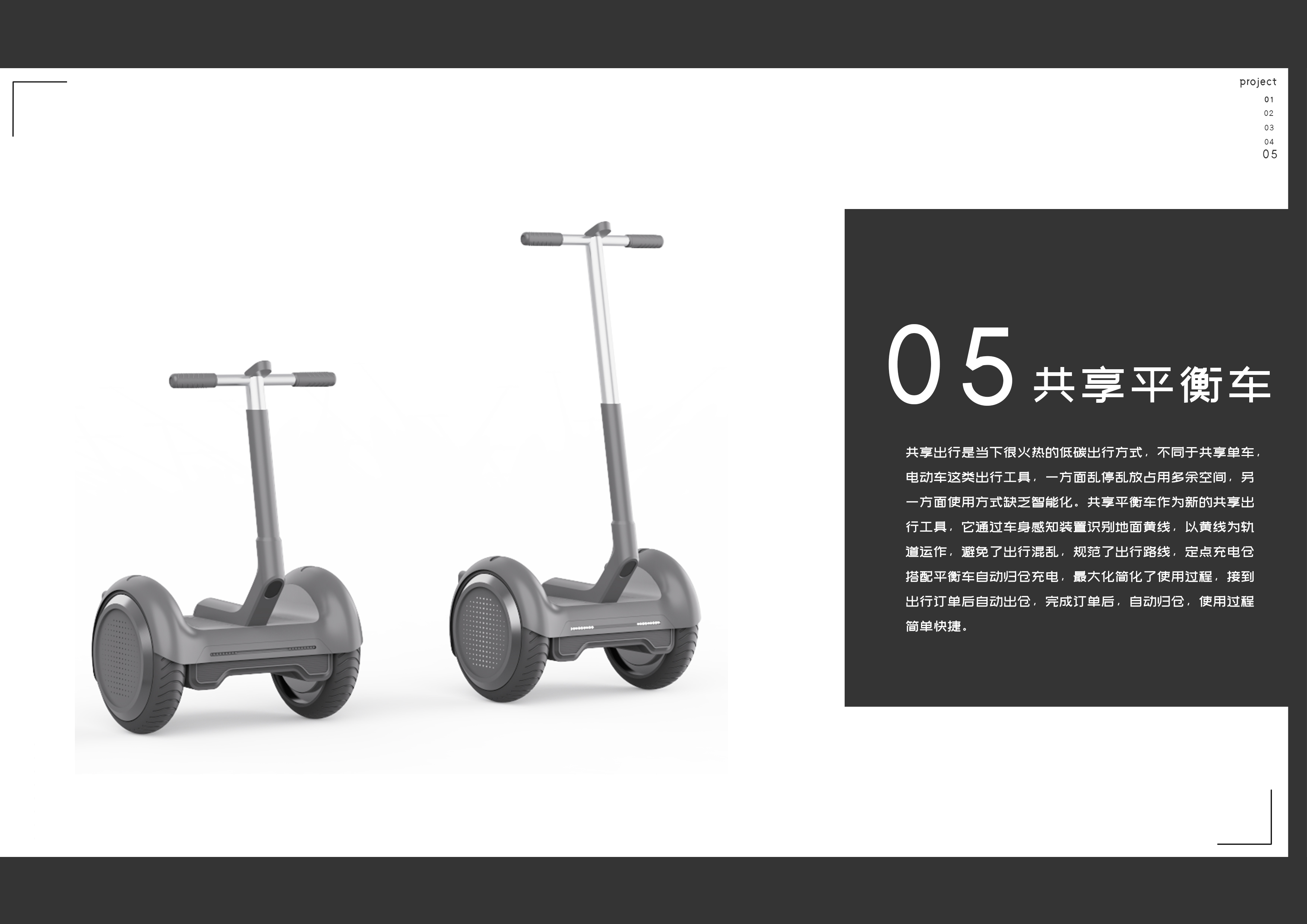
1 The tea tray scene feels problematic, and the cost will increase a lot in the future and it is not very flexible. It is better to match an independent tea tray. 2 It is neither closed nor portable, and is not as practical as the existing closed clothes dryer. Think about it can be changed into a wardrobe inside the dehumidification dryer (check Taobao pile, Ang) 3 luggage customer portrait is not very good, the average family will not use luggage as hangers, want to use luggage as hangers tenants will not add this part of the cost to buy luggage is a problem. 4 The back is not very understanding of the product, balance car so complete and advanced products should be put in front. 5 The design company relies on rendering X, and the requirements for going to the enterprise are not so high. It can be weighed whether to invest energy or not.
I think the product is very creative, very good
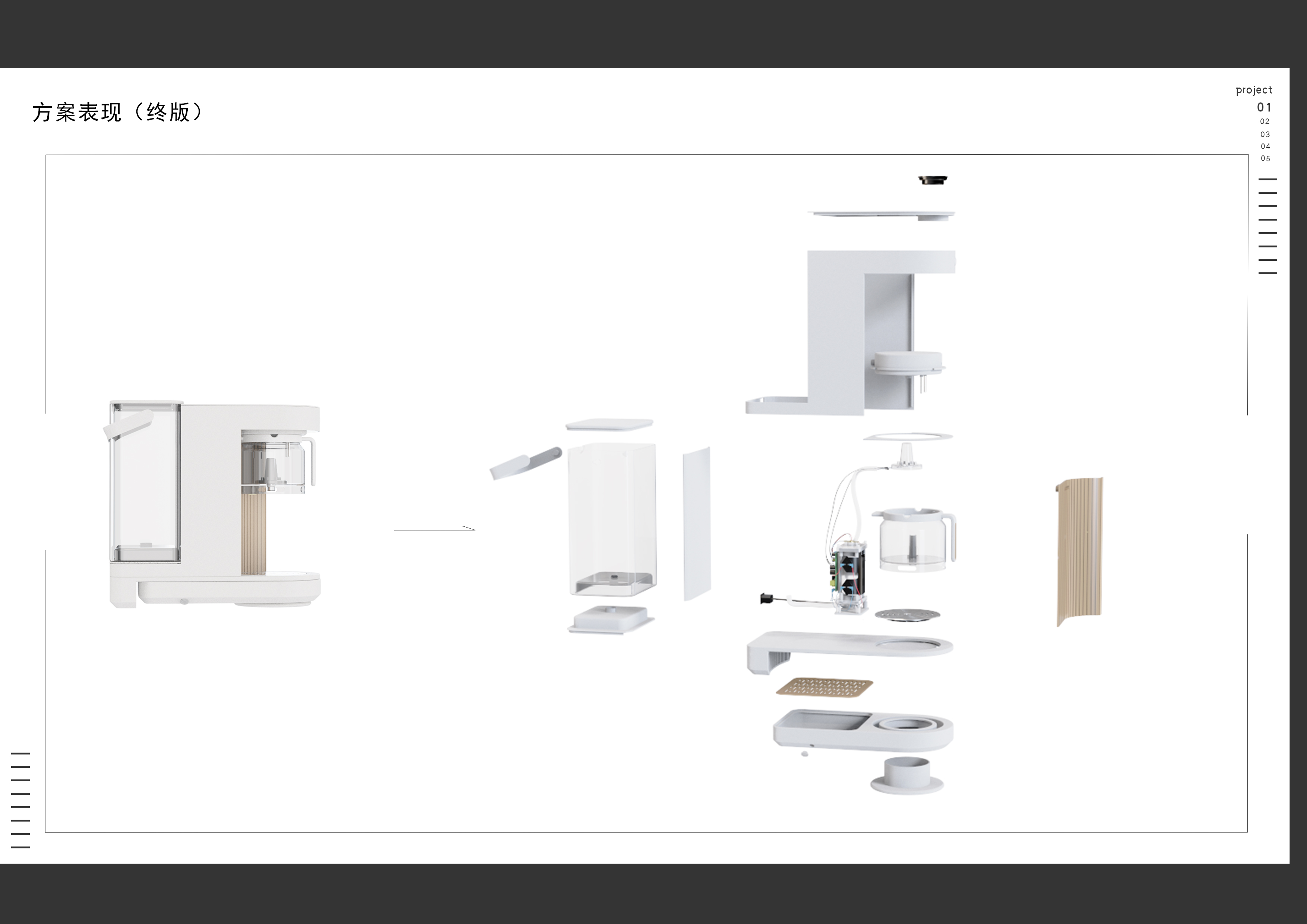
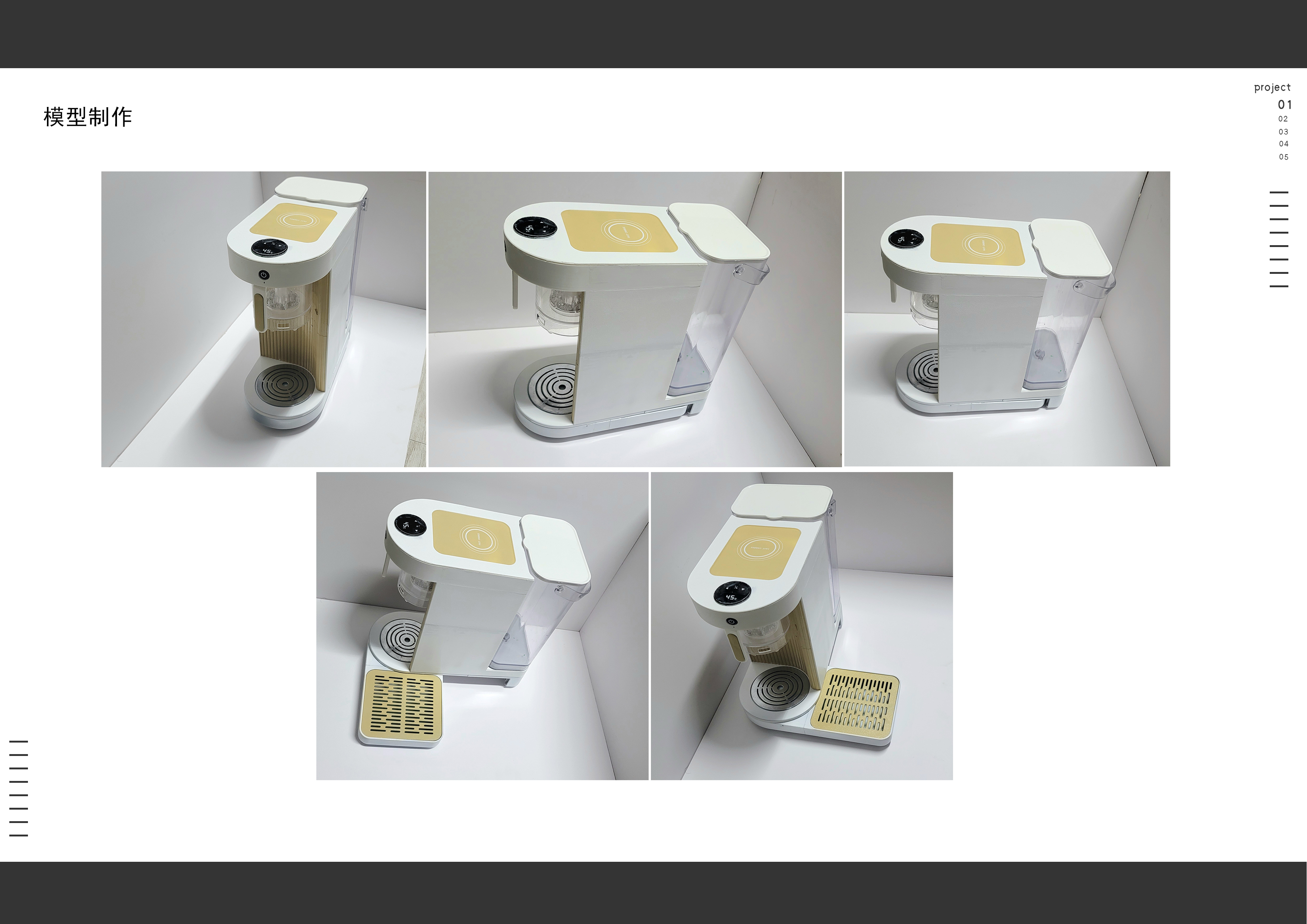
There are a few pictures in the back that are too fake. Let's improve the rendering level first.
Hello, are you interested in seeing our company? The official website in the work has contact information
The early work of the work is good, but the product has no characteristics and no aesthetic feeling.
I feel very strong
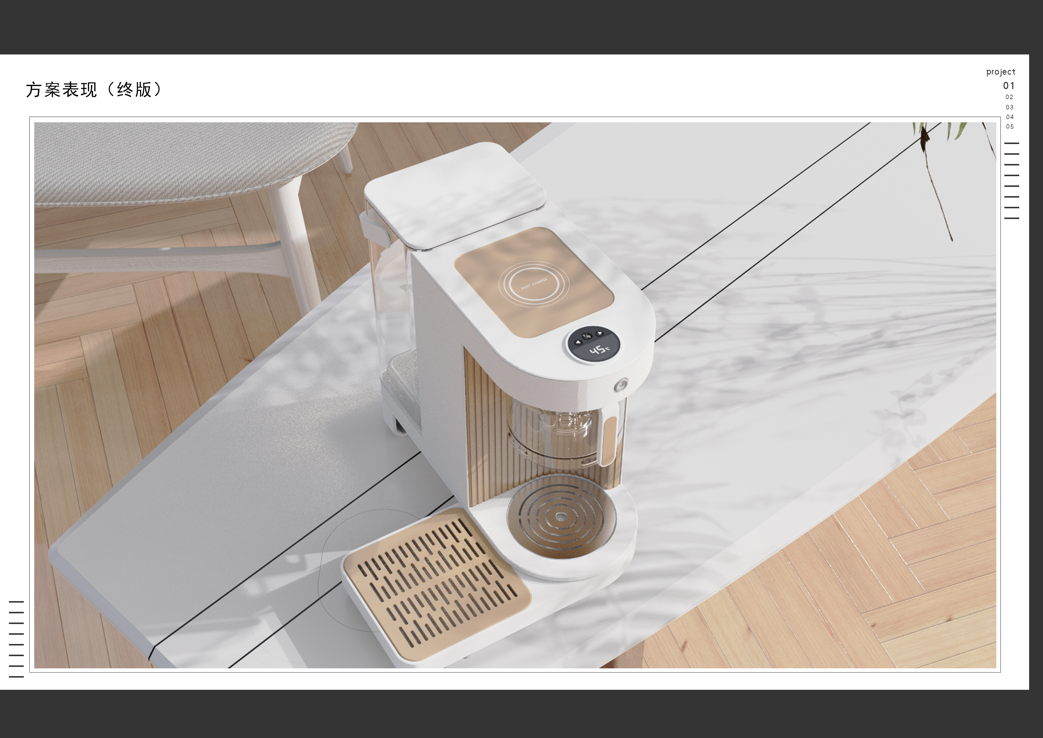
Don't have too many scene maps, one is enough, more white background maps show details, pick a few to render well, typesetting to find a reference for advanced points, mainly the problem of texture performance, light peace
There is something, but there is no guidance. Judging from the portfolio, it is more difficult to find a job in the future!. However, you can come to me if you have any ideas, which can help you improve, understand the requirements of good enterprises and interview. The direction of career planning.
It's too gray. Don't put all the low-quality works in order to make up the number.
Still, don't go
Come on.
Come on.
good design
Not bad
I feel that typesetting is a bit plain, the product is not very prominent, and the overall color is plain and elegant. I can use some other colors as embellishment colors, otherwise there is no memory point when I look at the whole.