Akimbo was born in the SO space of Shekou old Industrial Zone in Shenzhen. It originated from the founder's love for coffee culture and creativity. Whether it is coffee production or brand experience, it embodies the unique style of "strange idea 」.
As a design company that knows more about new consumption, Jia Guwen Creative has gained insight into the current new consumption trend, integrated and combed the core of the brand, and redesigned the visual expression of the brand for akimbo.
We hope that through the brand upgrade of akimbo, this coffee brand with "Jia Guwen creative gene" can be remembered through the visual differentiation of the brand in the new consumer era.

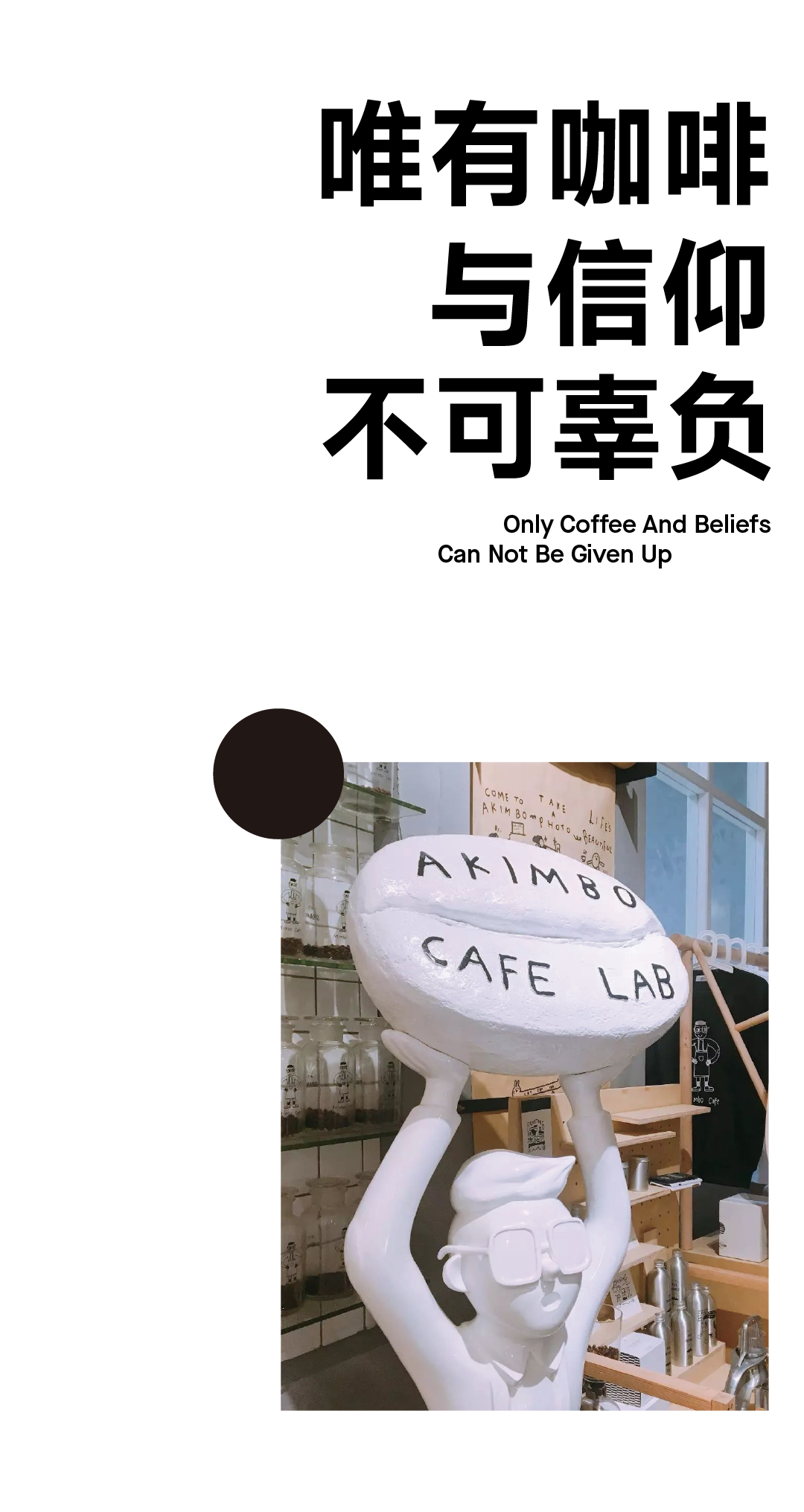
Akimbo, a coffee brand founded by Jia Guwen in 2016, has brought unlimited creativity and inspiration from the beginning of its birth.

Akimbo was born in the SO space of Shekou old Industrial Zone in Shenzhen. It originated from the founder's love for coffee culture and creativity. Whether it is coffee production or brand experience, it embodies the unique style of "strange idea 」.
The special geographical location, the spatial characteristics of handmade sense, the unimaginable illustrations and the unintentional content planning make akimbo a more interesting existence in a large number of fine coffees, making drinking coffee more relaxed and comfortable.
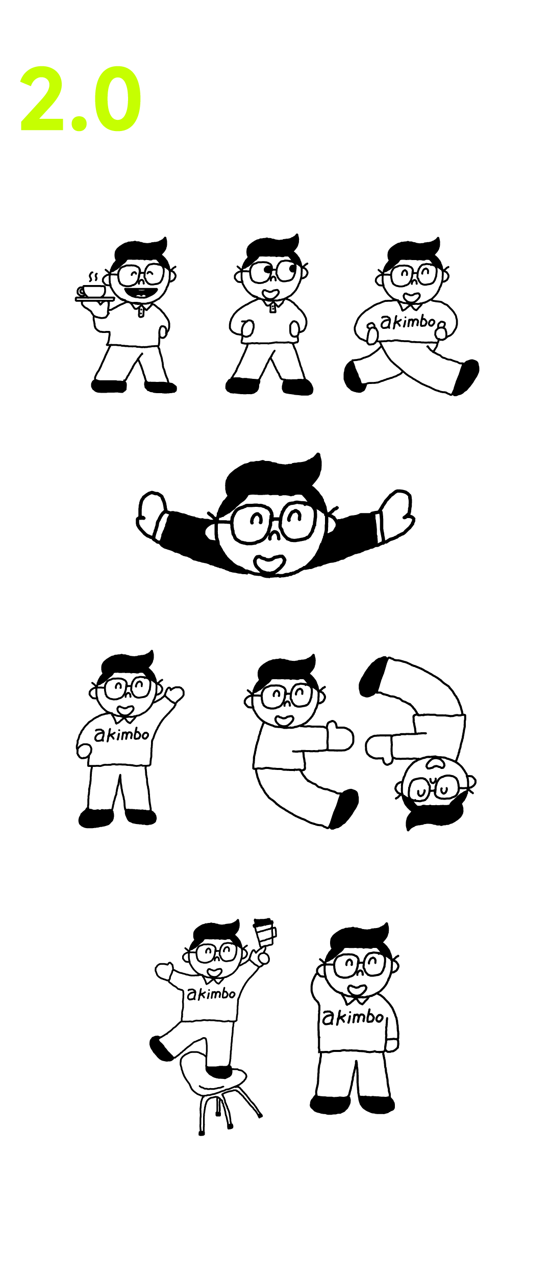
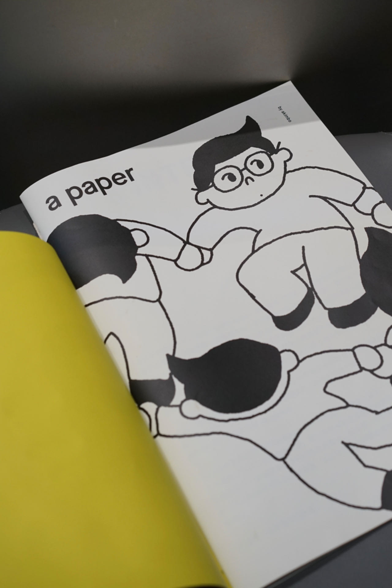
At the same time, as akimbo's messenger, brother akimbo stood at the door every day, rain or shine, welcoming every friend who came to akimbo with confidence.
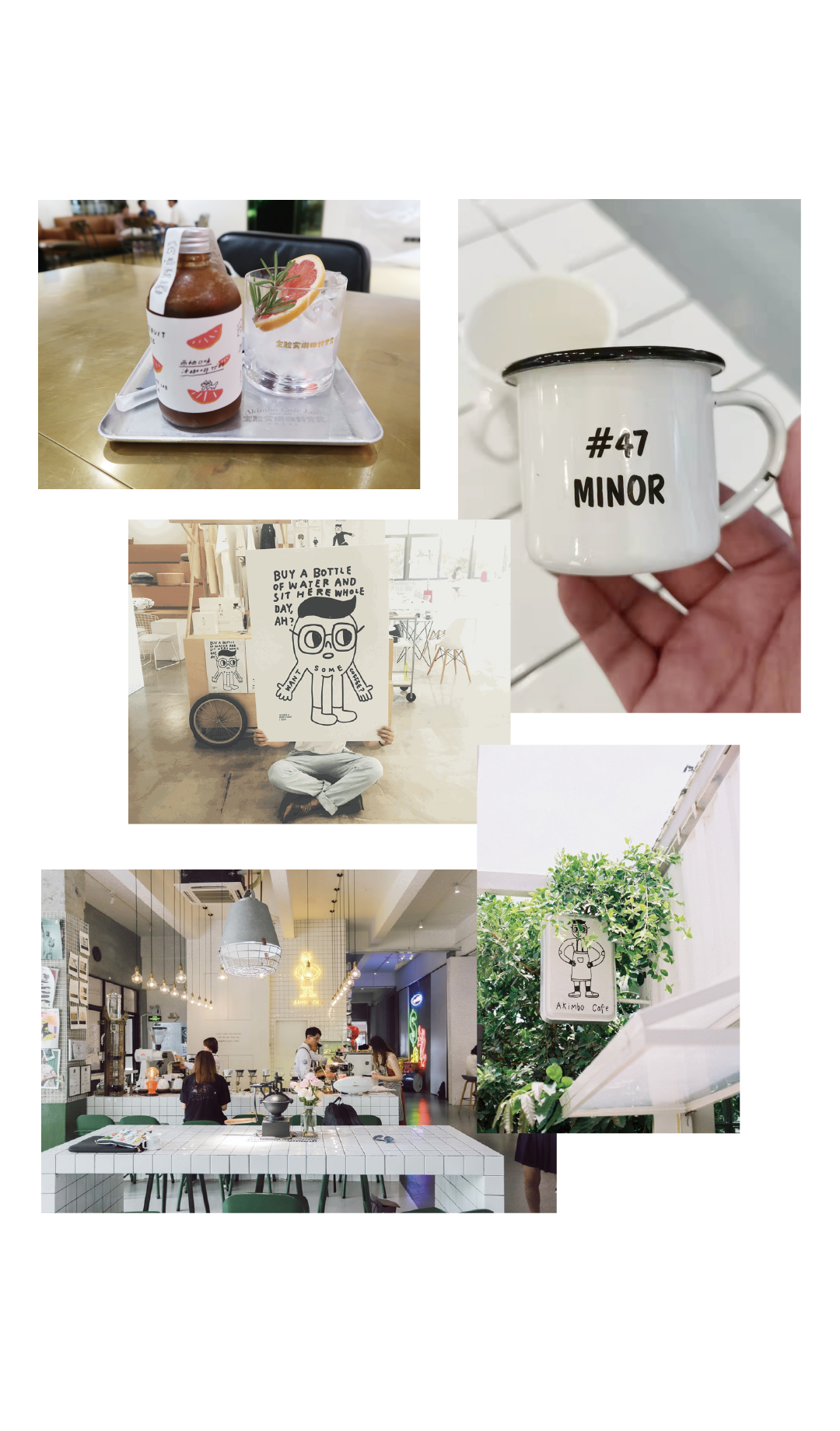
With the upgrading of commercial consumption mode, akimbo should not be limited to the setting of coffee shops, but should be more as a brand power to show.
At the same time, we found that the original brand elements are not completely applied to the communication, and the visual language lacks the "magnet" to contact with consumers. Therefore, a new visual system is urgently needed, which can not only carry the brand spirit of akimbo, but also be closer to consumers.
As a design company that knows more about new consumption, Jia Guwen Creative has gained insight into the current new consumption trend, integrated and combed the core of the brand, and redesigned the visual expression of the brand for akimbo.
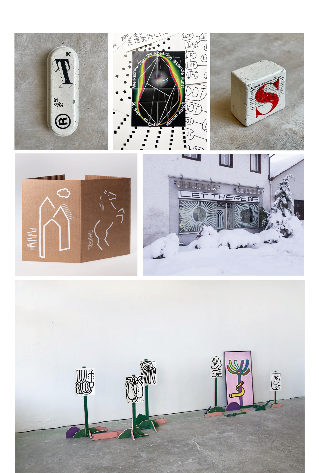
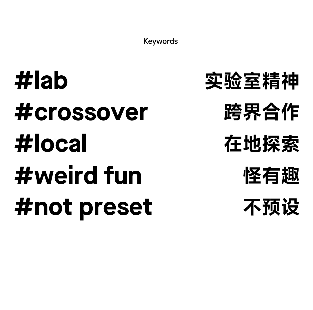
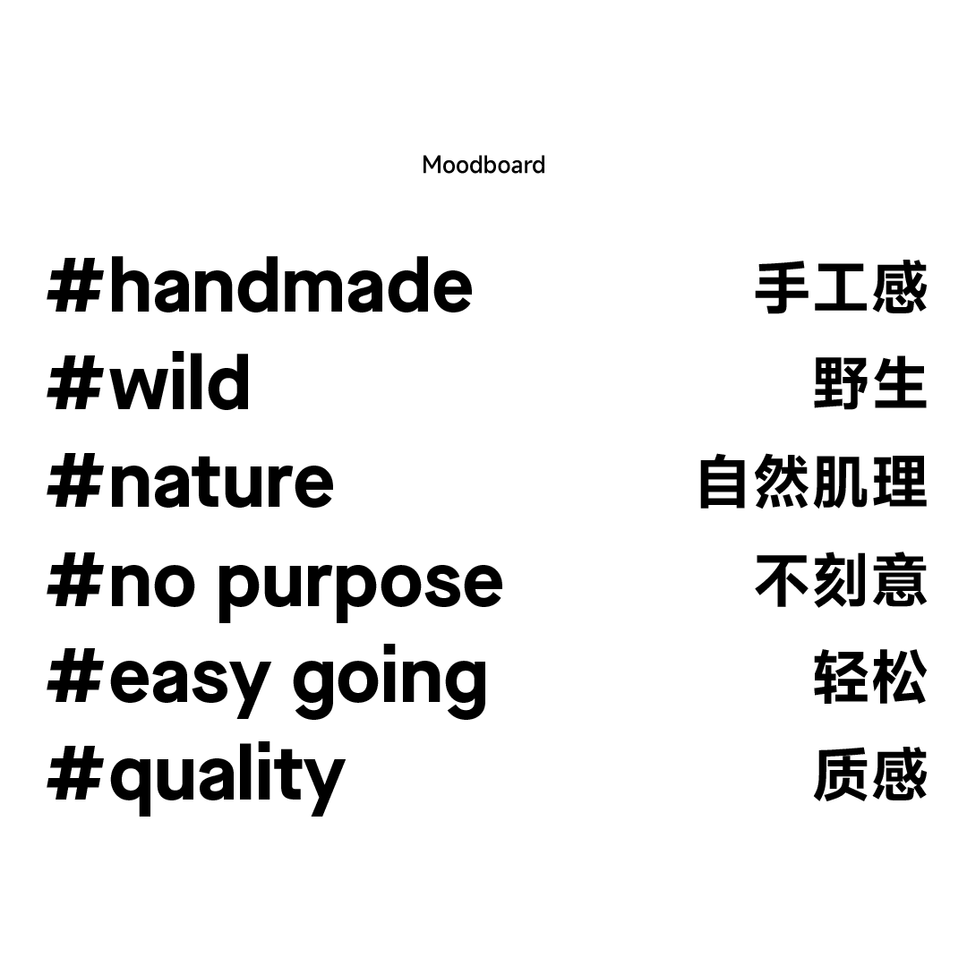

Through the mood board and keyword insight, we have refined the brand concept with more spirit of the times.
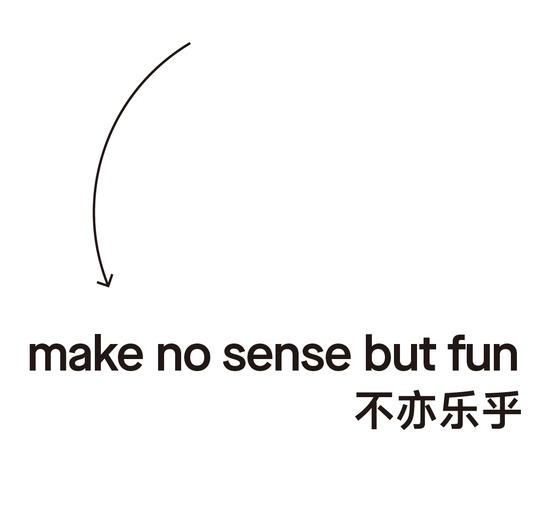
Make no sense but fun is our understanding of coffee brand in the context of the new era, and as a new brand spirit, it falls on the brand renewal.
In 2023, akimbo will continue to explore different cities with curiosity about unique culture and vivid strange ideas, and connect with more people!


The literal translation of "akimbo" is akimbo, and the logo image objectively describes the fact that a person with akimbo is akimbo, so we are thinking of objectively describing one thing, which may become a logic of akimbo brand vision.
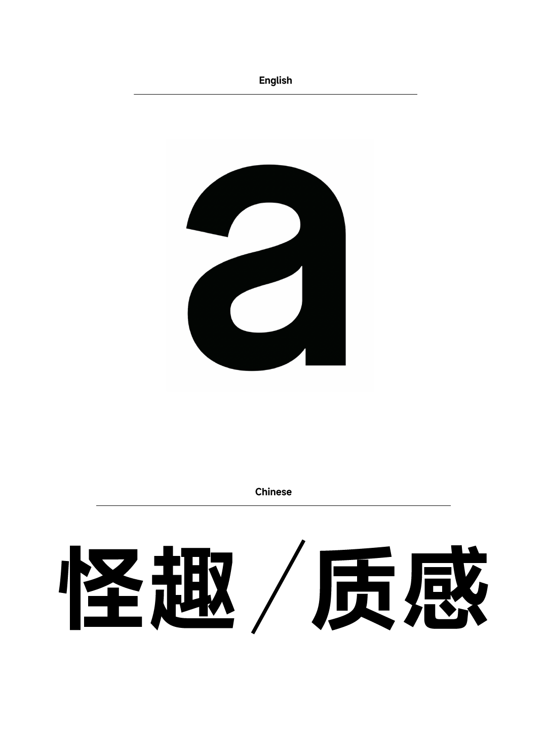

"a" is the first letter of akimbo and also the article. We tried to combine it with different item names to get a naming system, which is also the idea of this upgrade;
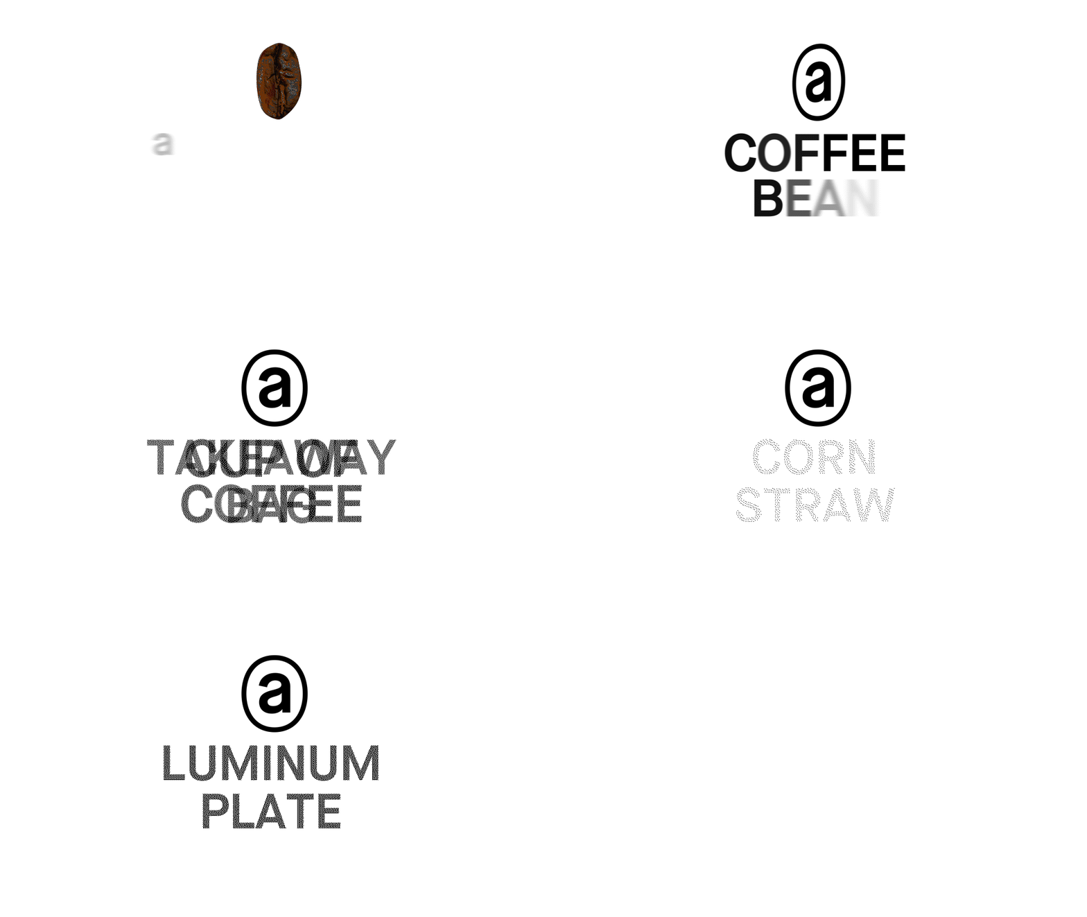
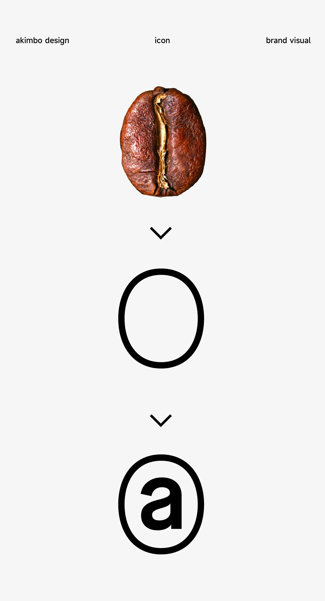
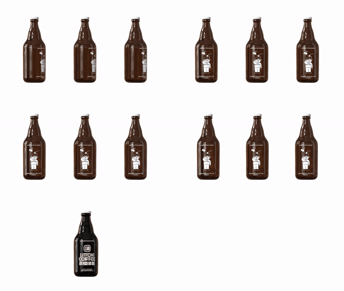
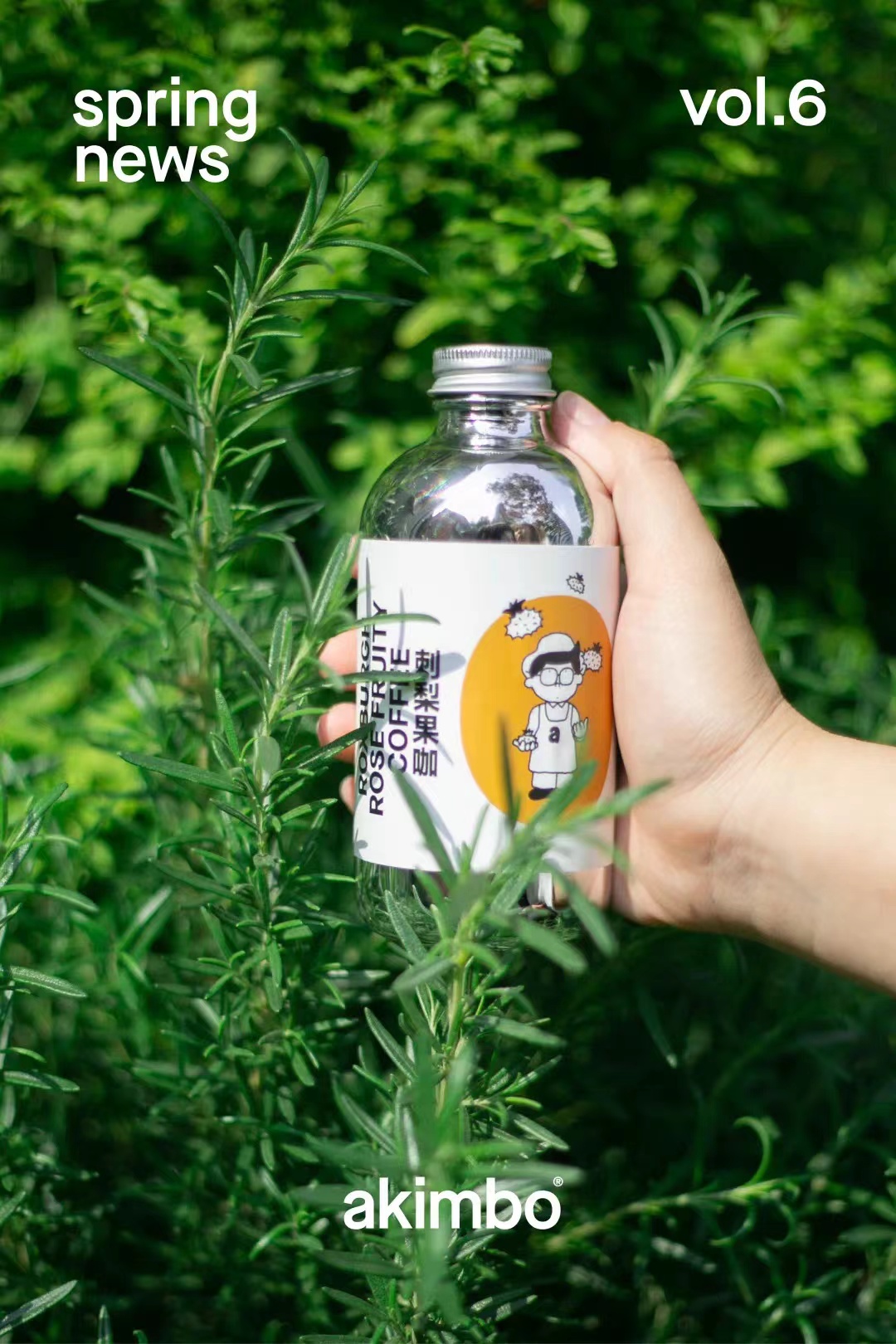
To find out the highest value of the brand, we start with raw materials and combine akimbo's "a" with coffee beans to obtain a new brand identity that more clearly conveys who we are and the brand representatives we do.
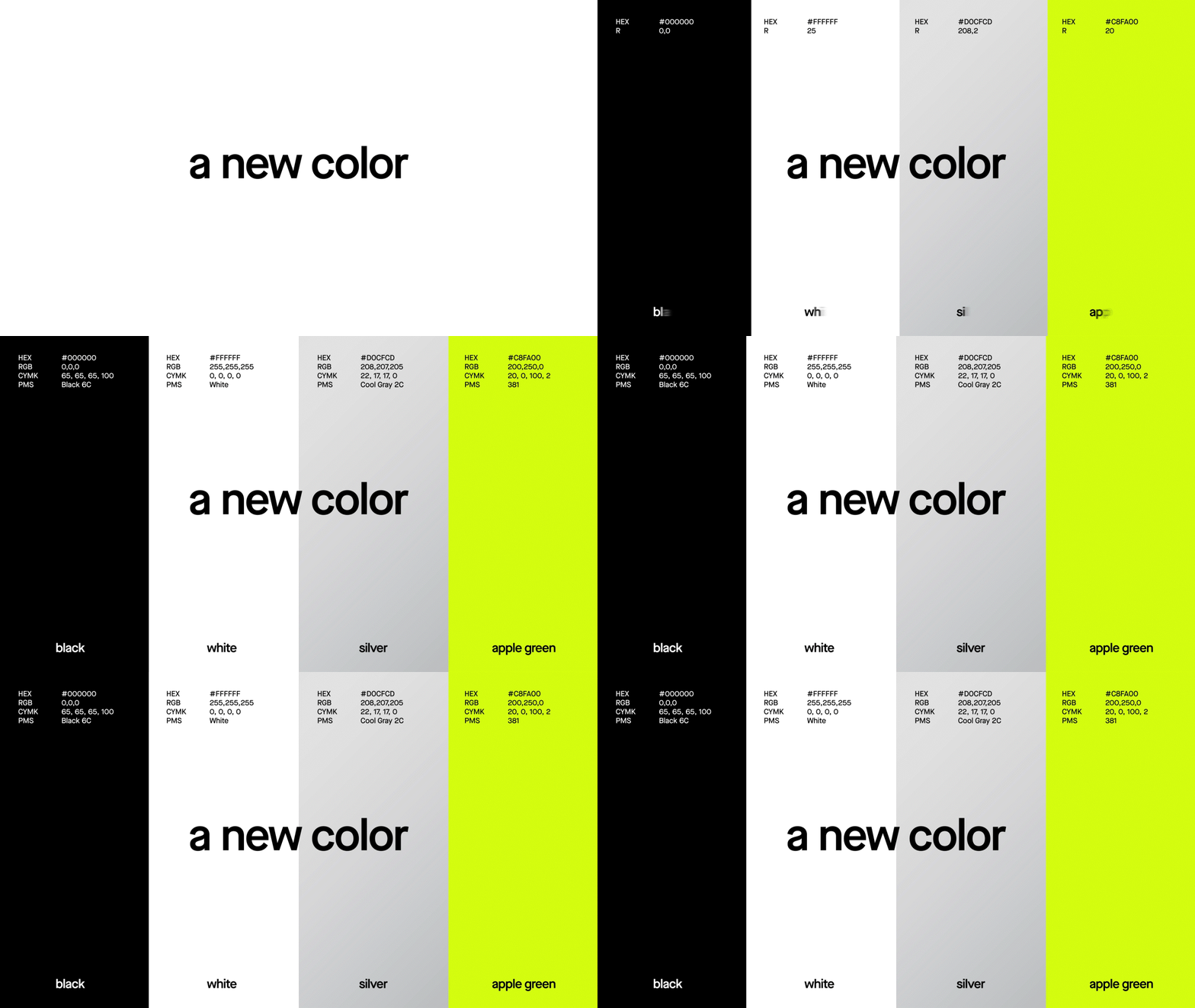
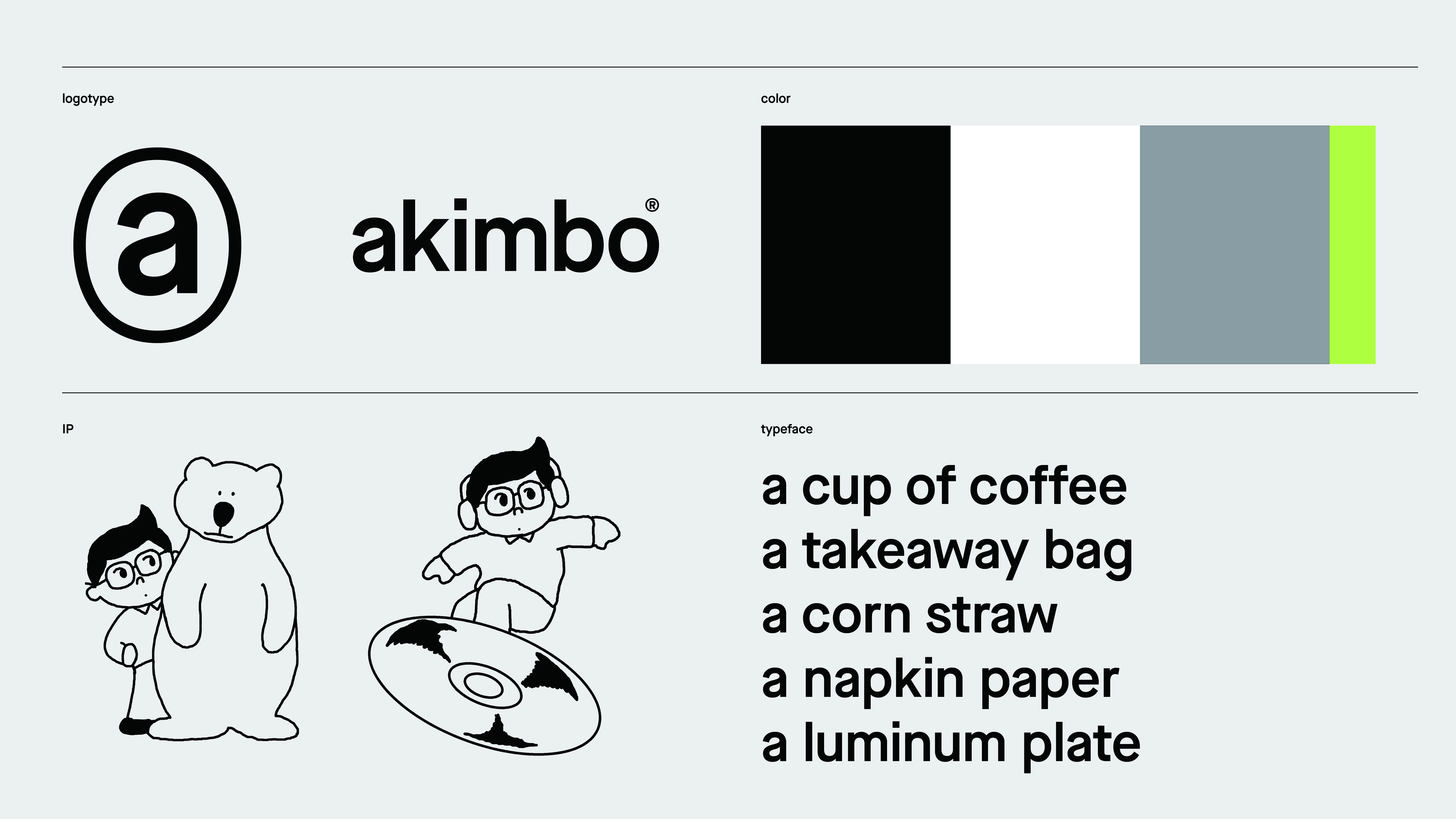
brand color assumes the function of eye-catching cognition, adding fresh green, silver texture and other high-brightness refreshing colors, improving the overall saturation of the brand, and conveying akimbo's brand proposition that it values flavor exploration and fun experience.
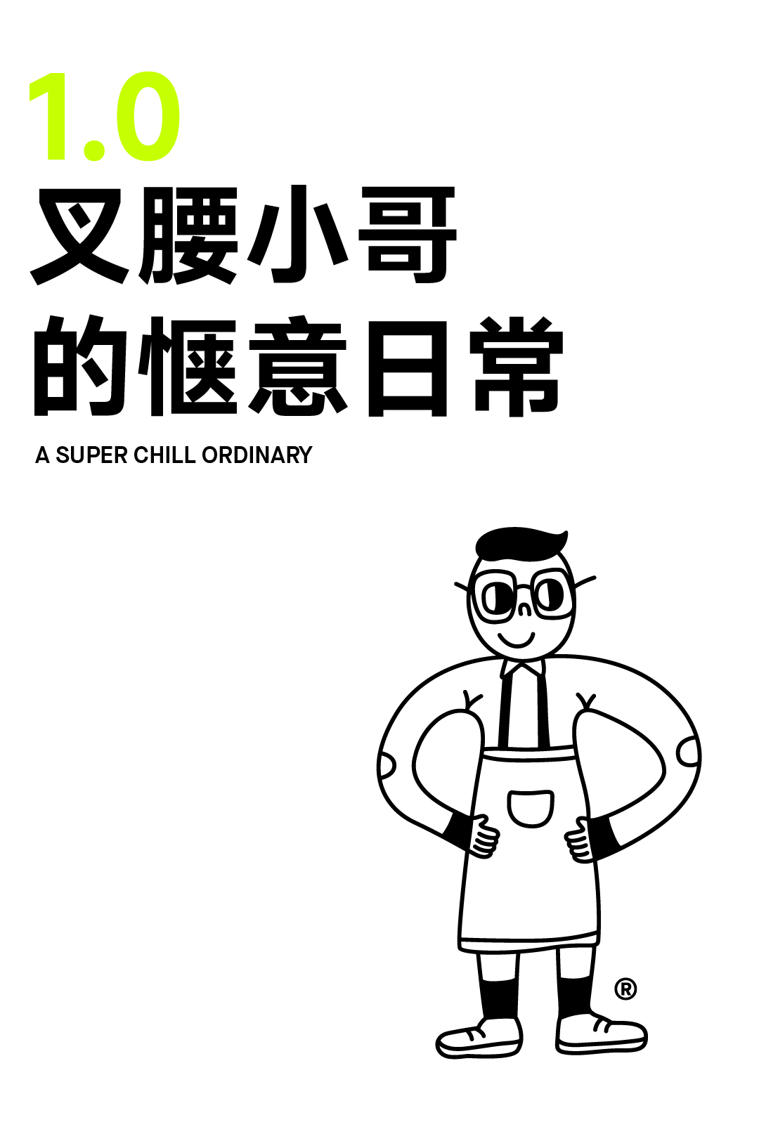
Akimbo always gives people a relaxed and comfortable feeling. Brother akimbo will also meet guests with more gestures to show his love for coffee and life.
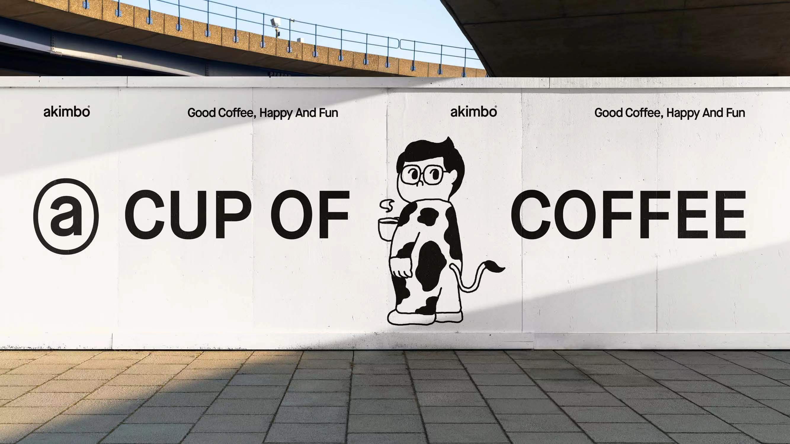
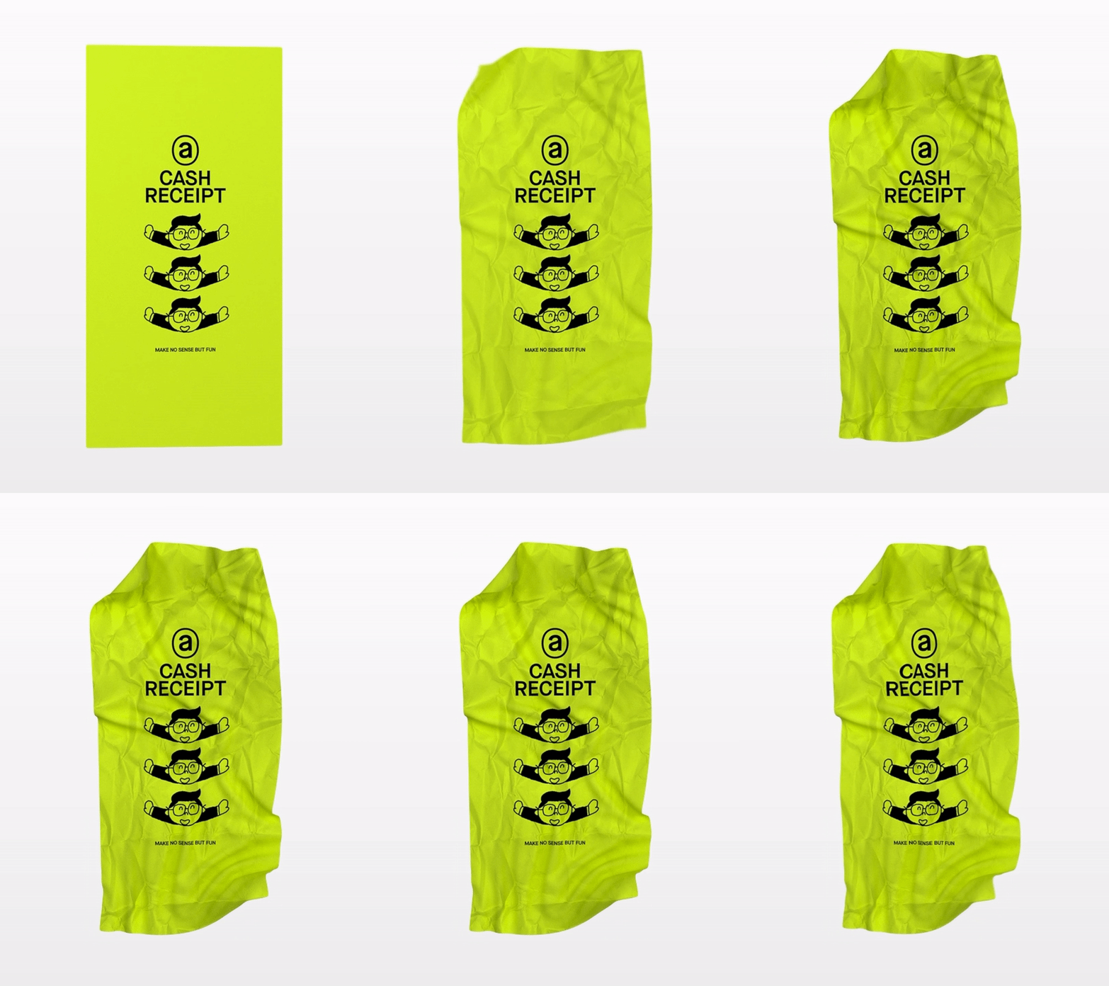
Based on this, we have created a series of illustration stories, with "akimbo little brother" as a link between akimbo and consumers to communicate with you.


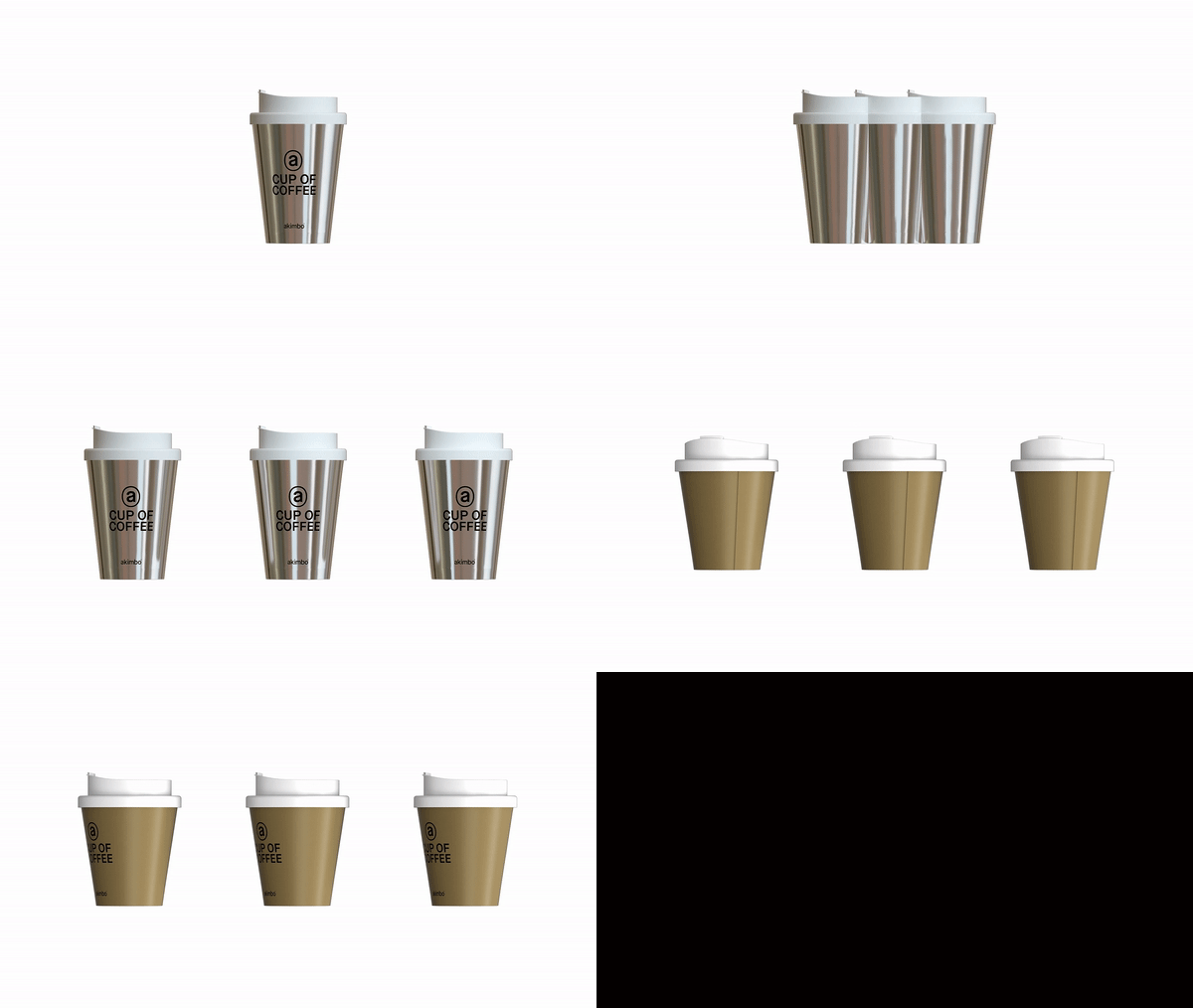


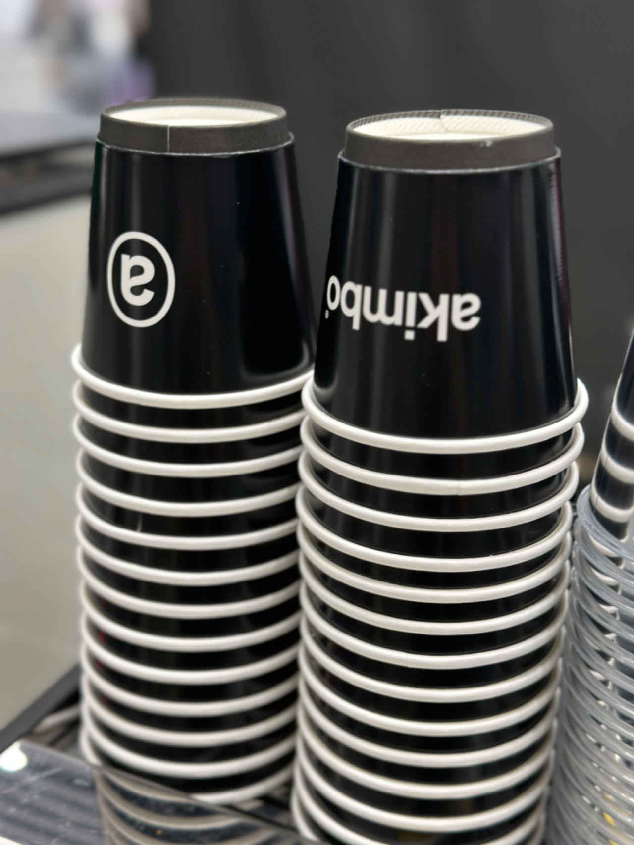
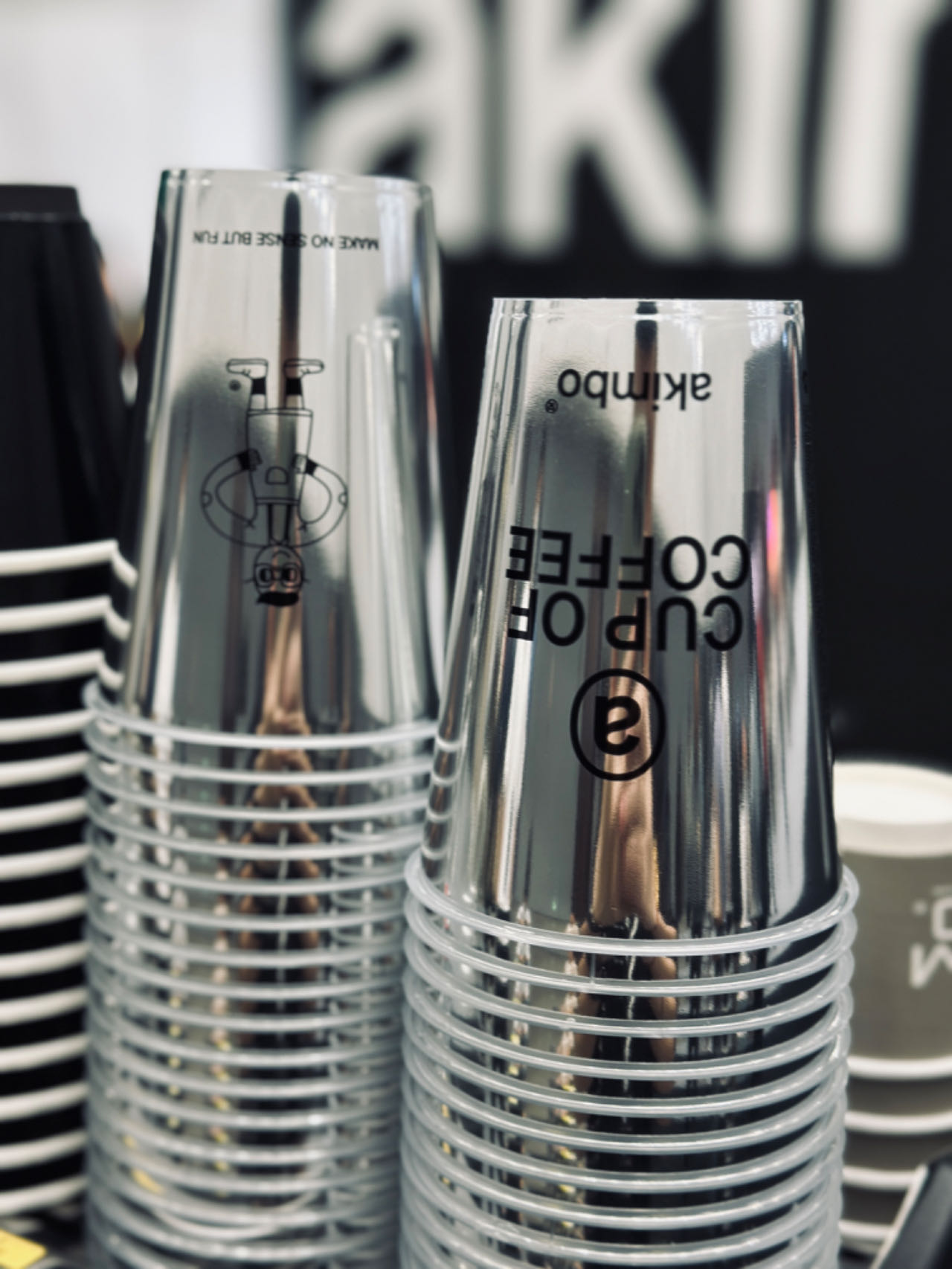

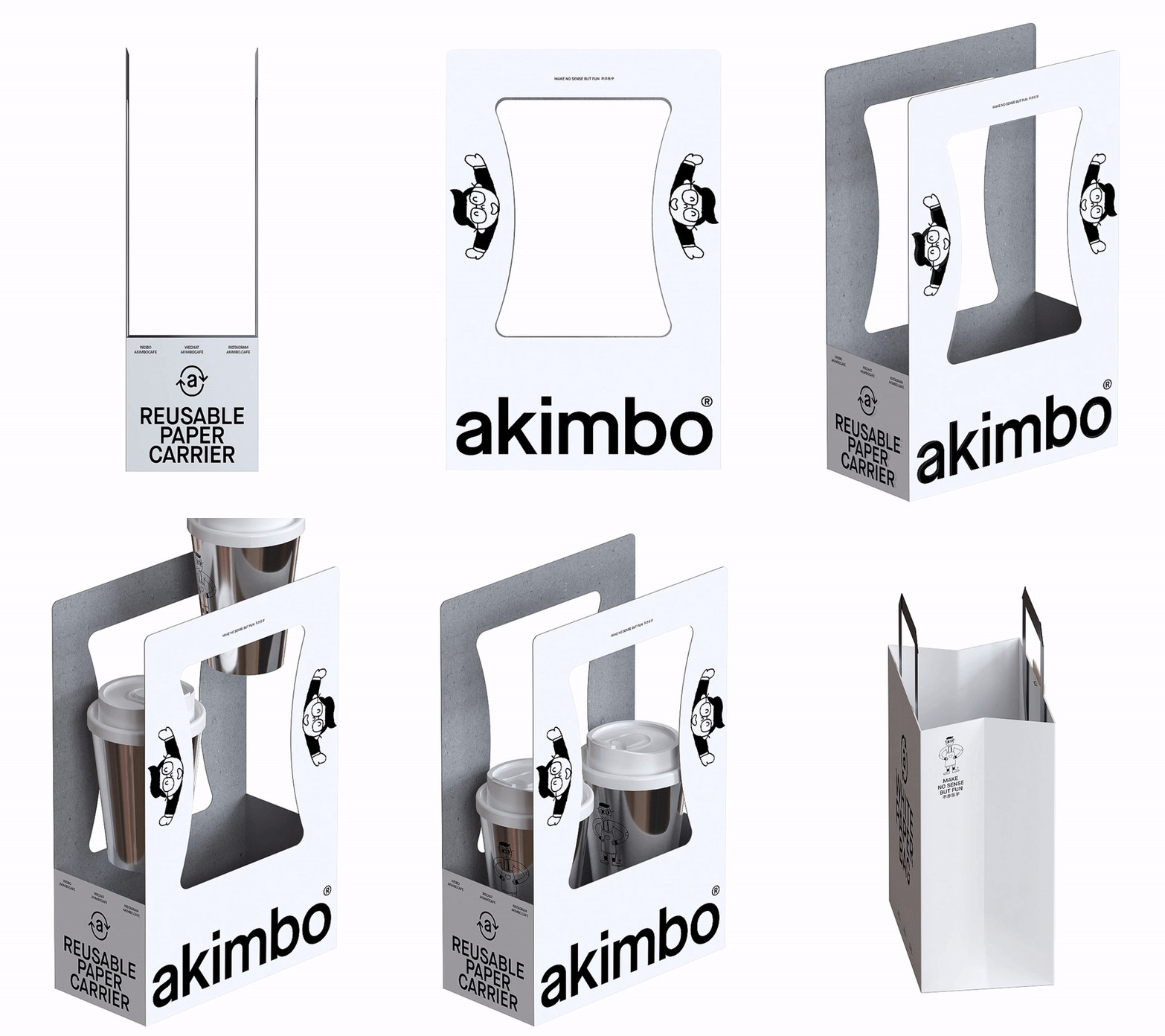
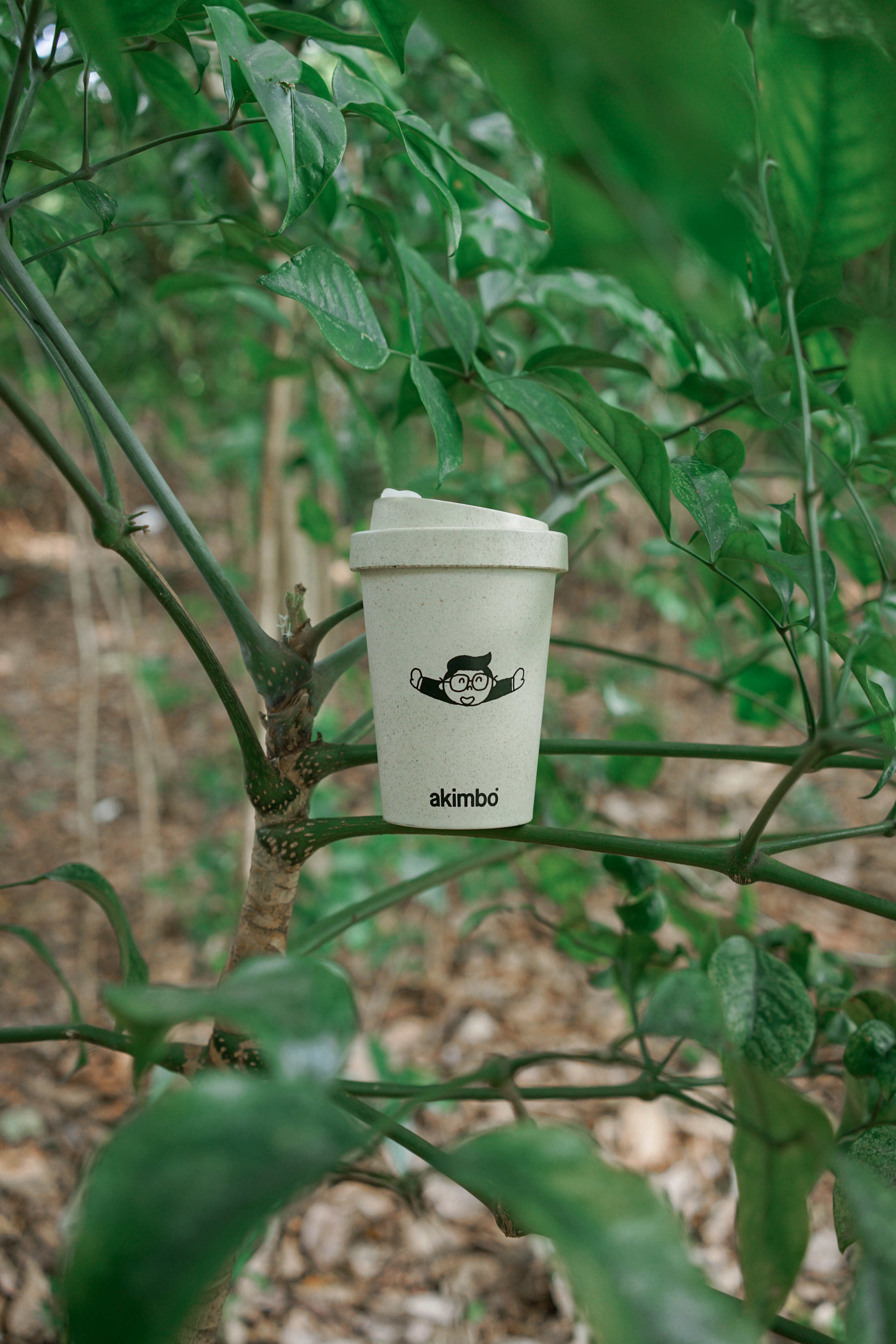
In enjoying the good coffee time, a large number of packaging waste accumulation formed a lot of social pressure.
The combination of the new logo of akimbo and the symbol of recycling shows more corporate social responsibility, puts the concept of environmental protection into the brand and product presentation, and calls on people to recycle and pay attention to environmental protection.
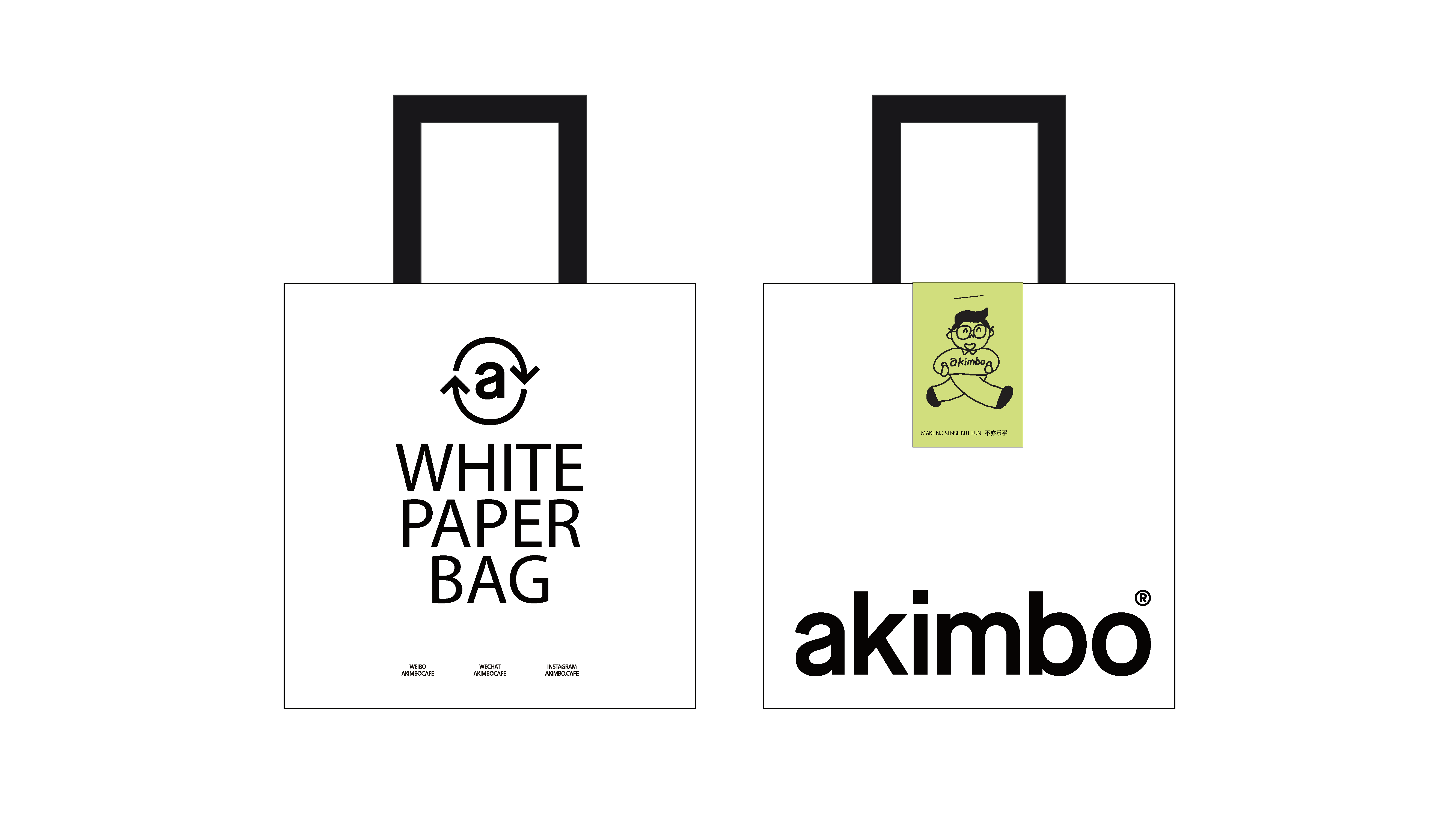
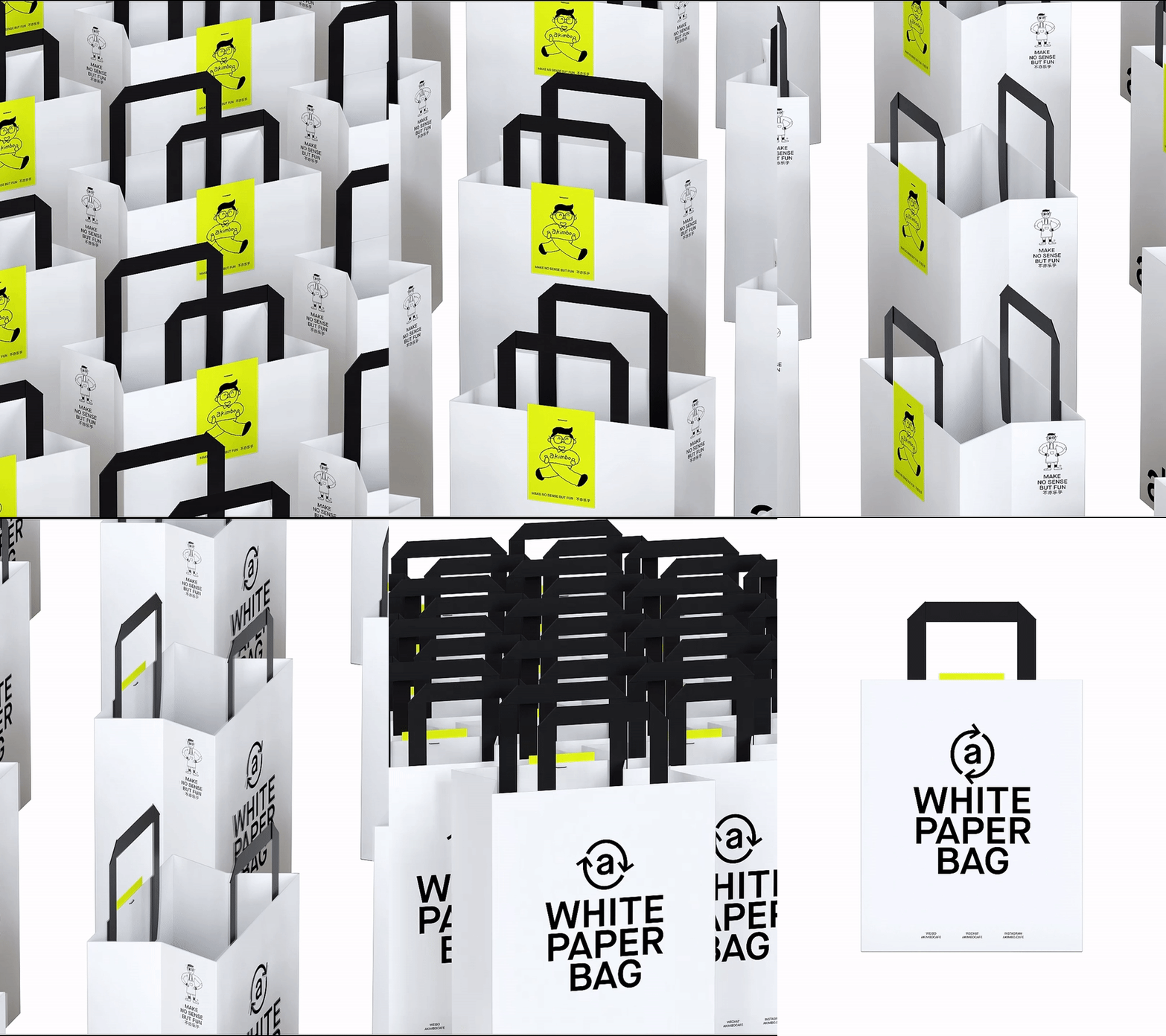
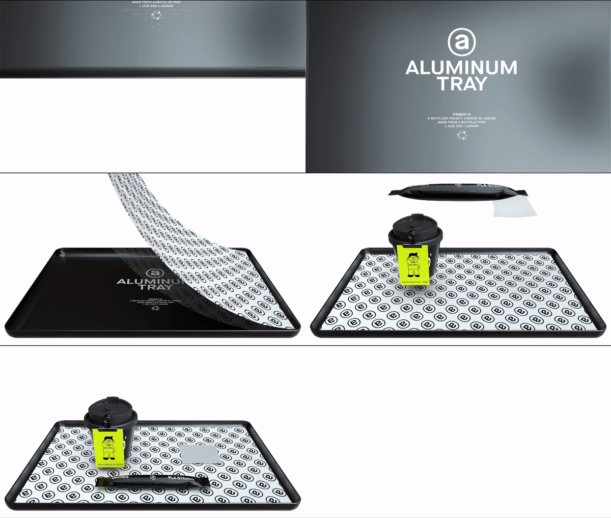
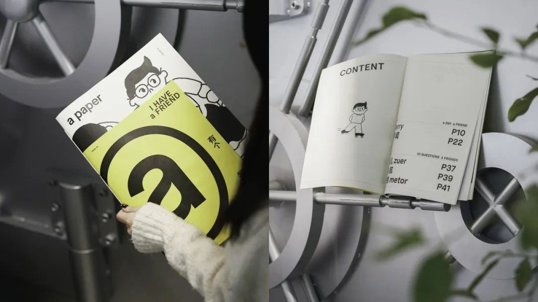


We hope that through the brand upgrade of akimbo, this coffee brand with "Jia Guwen creative gene" can be remembered through the visual differentiation of the brand in the new consumer era.
The copyright of this work belongs to 甲古文設計. No use is allowed without explicit permission from owner.

New user?Create an account
Log In Reset your password.
Account existed?Log In
Read and agree to the User Agreement Terms of Use.

Please enter your email to reset your password
GOOD
666
very good
Thinking is very special
It's quite special