I shared a work of 2016. At that time, I just changed my job and entered a new design environment and new categories. The completion of this project gave me great encouragement.
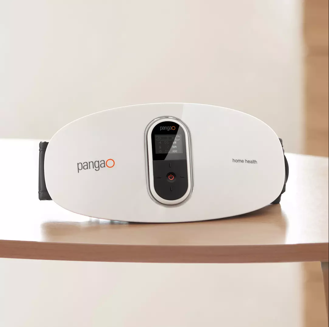
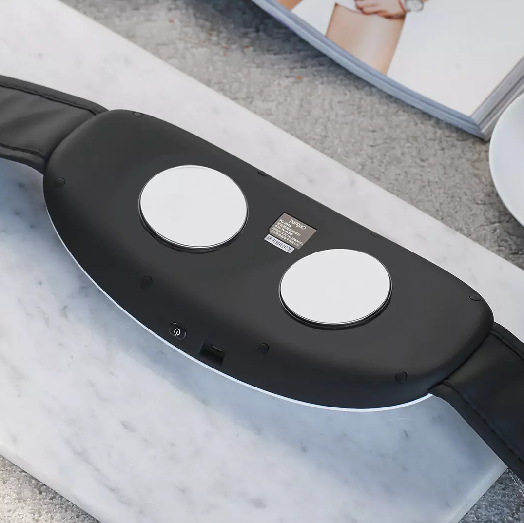
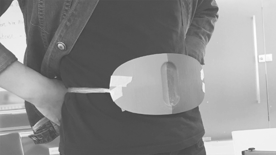
Back five years ago, the waist and abdomen massage products were still bloated and varied in shape. My idea was to make a simple and visually extremely light design.
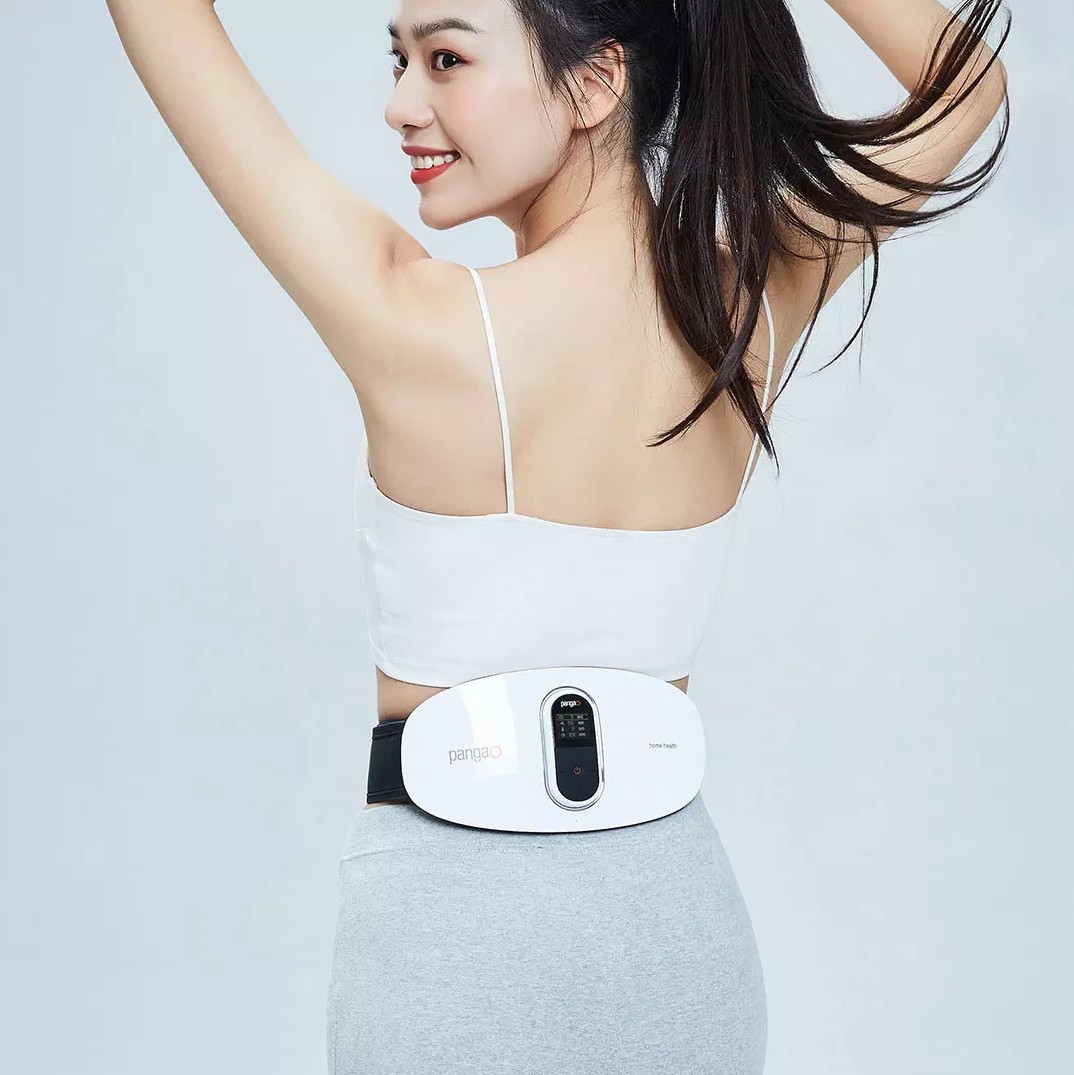
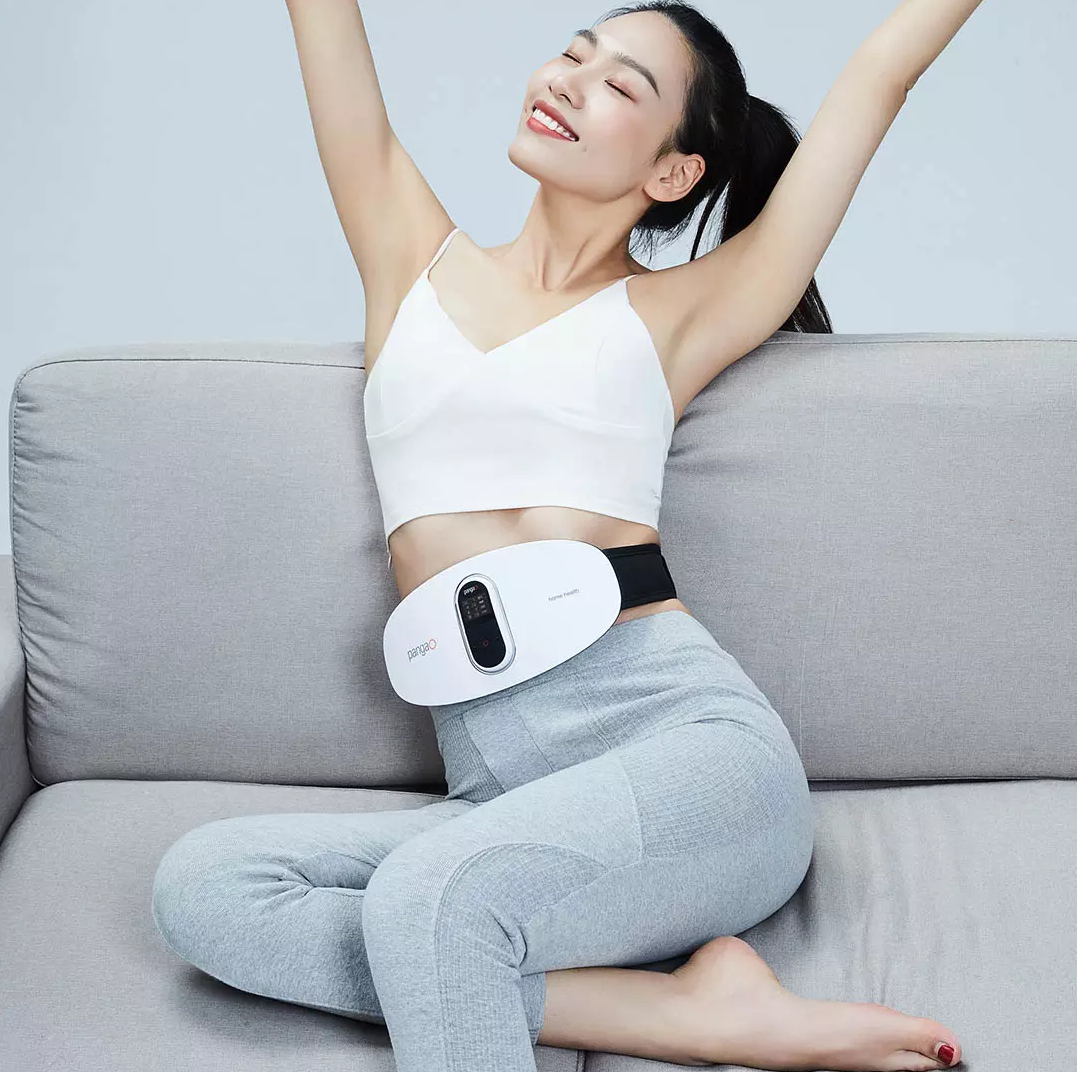
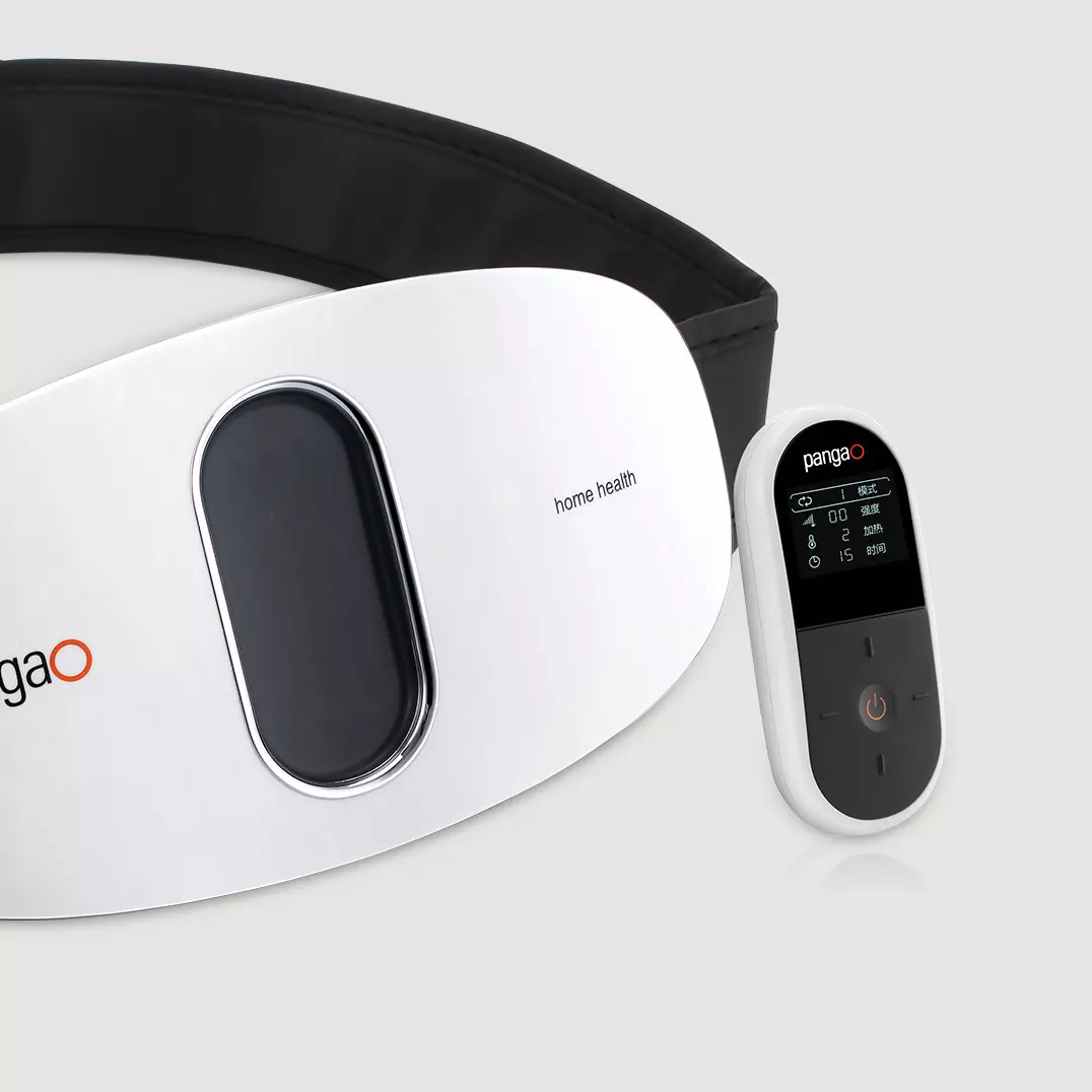
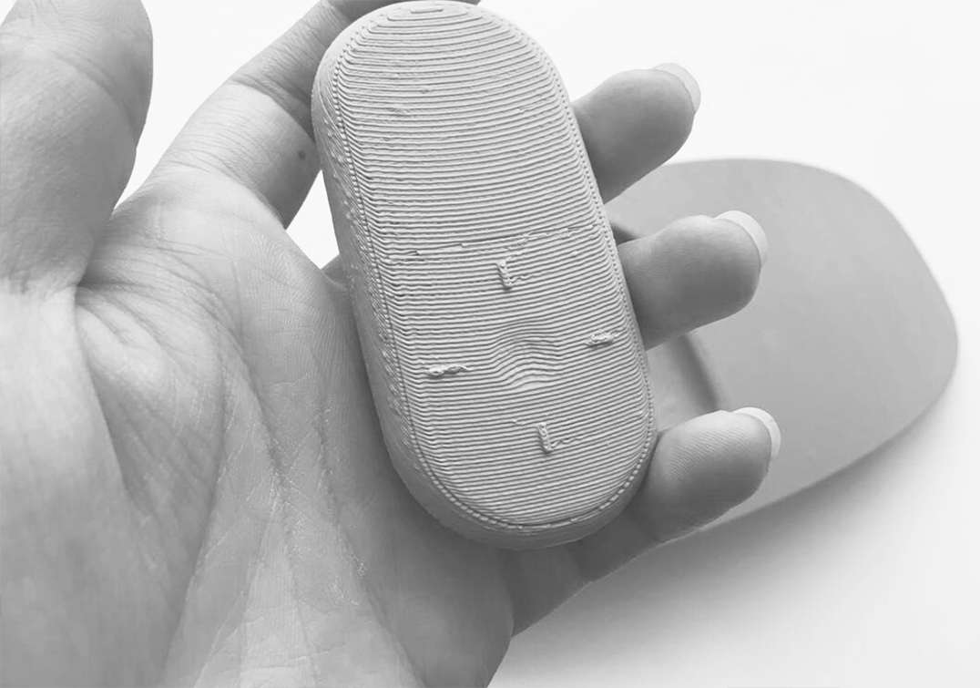
Therefore, a little idea was made from the shape and color respectively. The back shell made a big round corner to eliminate the naked eye's judgment on the thickness, and dark color was selected to eliminate it visually. In the first version of the design, the position of the middle remote controller is the one where the belly button can be directly seen through the through hole. The purpose is also to increase the sense of ventilation and be lighter visually. The back was originally designed with some texture, which was removed considering the dirt that was easy to hide when cleaning. The window part of the remote control is designed with a small transition gradient and negative display to eliminate the obvious boundary of the screen, but the final product cannot be realized.
Perhaps the design has received some good market feedback, so their family and other waist and abdomen products of sub-brands have also followed the same design language.
(Photo from the official photo of Climbing High)
The copyright of this work belongs to guoooo. No use is allowed without explicit permission from owner.

New user?Create an account
Log In Reset your password.
Account existed?Log In
Read and agree to the User Agreement Terms of Use.

Please enter your email to reset your password
The attached table can be eliminated
Great design
Family health care is not enough
Is that effective in losing weight?
How do the materials used in the last two pictures look like carton values
nice
The picture is somewhat paste.