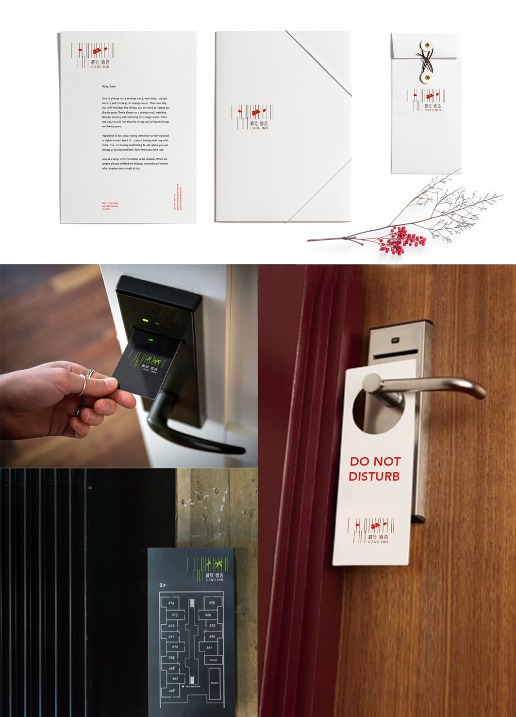
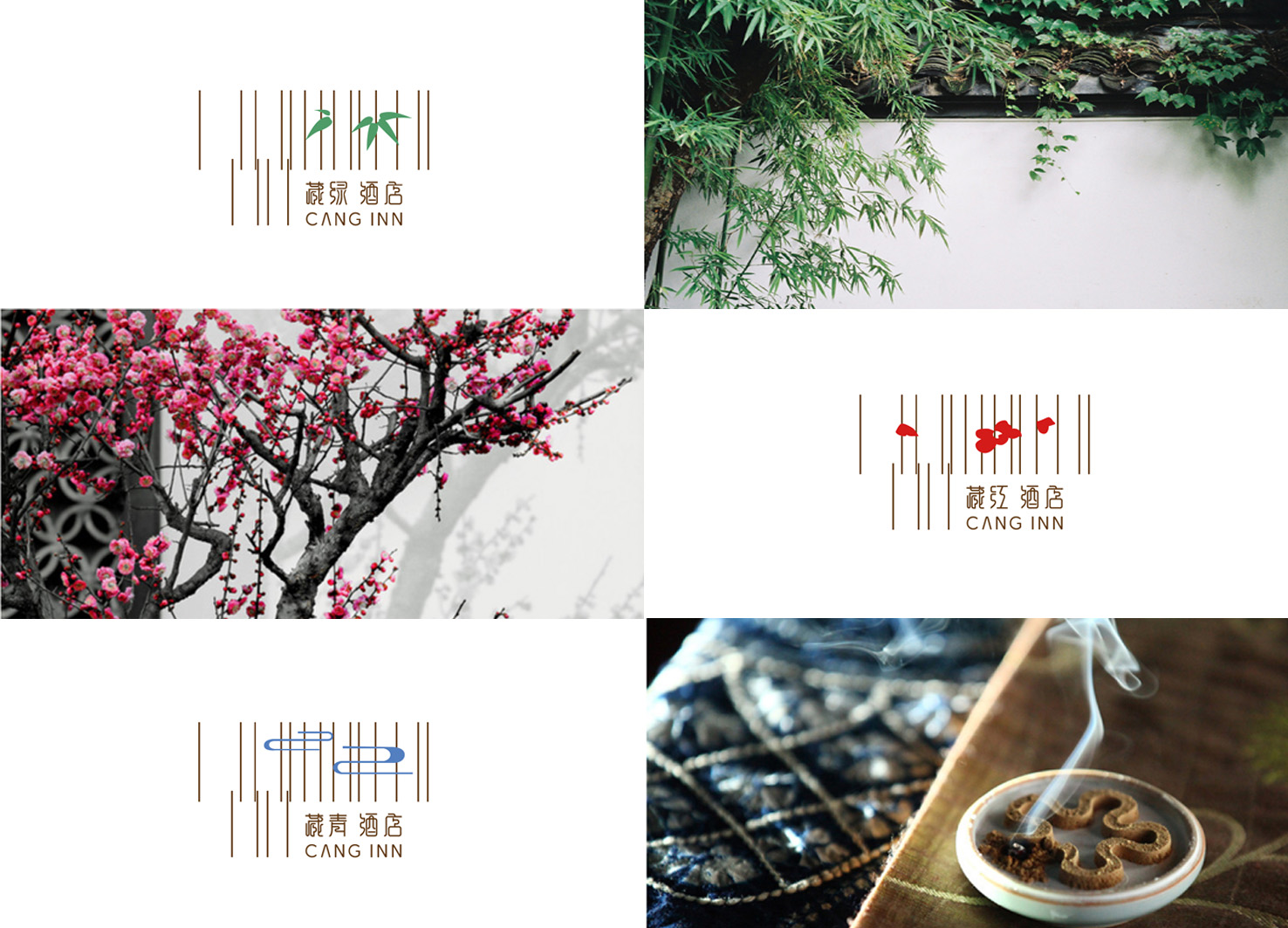
The inn is divided into three grades: "luxury, luxury, and comfort", named after "Tibetan Green", "Tibetan Green" and "Tibetan Red. "Tibetan" here means "collection" and "hidden", and the name is taken from ancient Chinese poetry. The "Tibetan" series has romantic oriental classicism feelings, and its design is positioned as the meaning of "quiet in the middle of the noise" and "a place to live in seclusion in the city. The logo design is an abstract architectural structure represented by a vertical line. The concise graphics emerging from such an abstract thin line are like extending from the window. In the logo of "Tibetan Green", the image design of "Water Pattern" is used. In the "Tibetan Green" logo, the image of "bamboo" is used for design. In the logo of "Tibetan Red", the image of "Plum Blossom" is used for design. The logo is full of oriental beauty, visual feeling is fashionable, and full of oriental Zen.


Country
China
Year
2017
Designer
Ming Mao, Dabin Yao
The copyright of this work belongs to K-DESIGN AWARD. No use is allowed without explicit permission from owner.

New user?Create an account
Log In Reset your password.
Account existed?Log In
Read and agree to the User Agreement Terms of Use.

Please enter your email to reset your password
Comment Board (0)
Empty comment