


The copyright of this work belongs to 修思工业设计. No use is allowed without explicit permission from owner.

New user?Create an account
Log In Reset your password.
Account existed?Log In
Read and agree to the User Agreement Terms of Use.
Please enter your email to reset your password


Need cooperation?
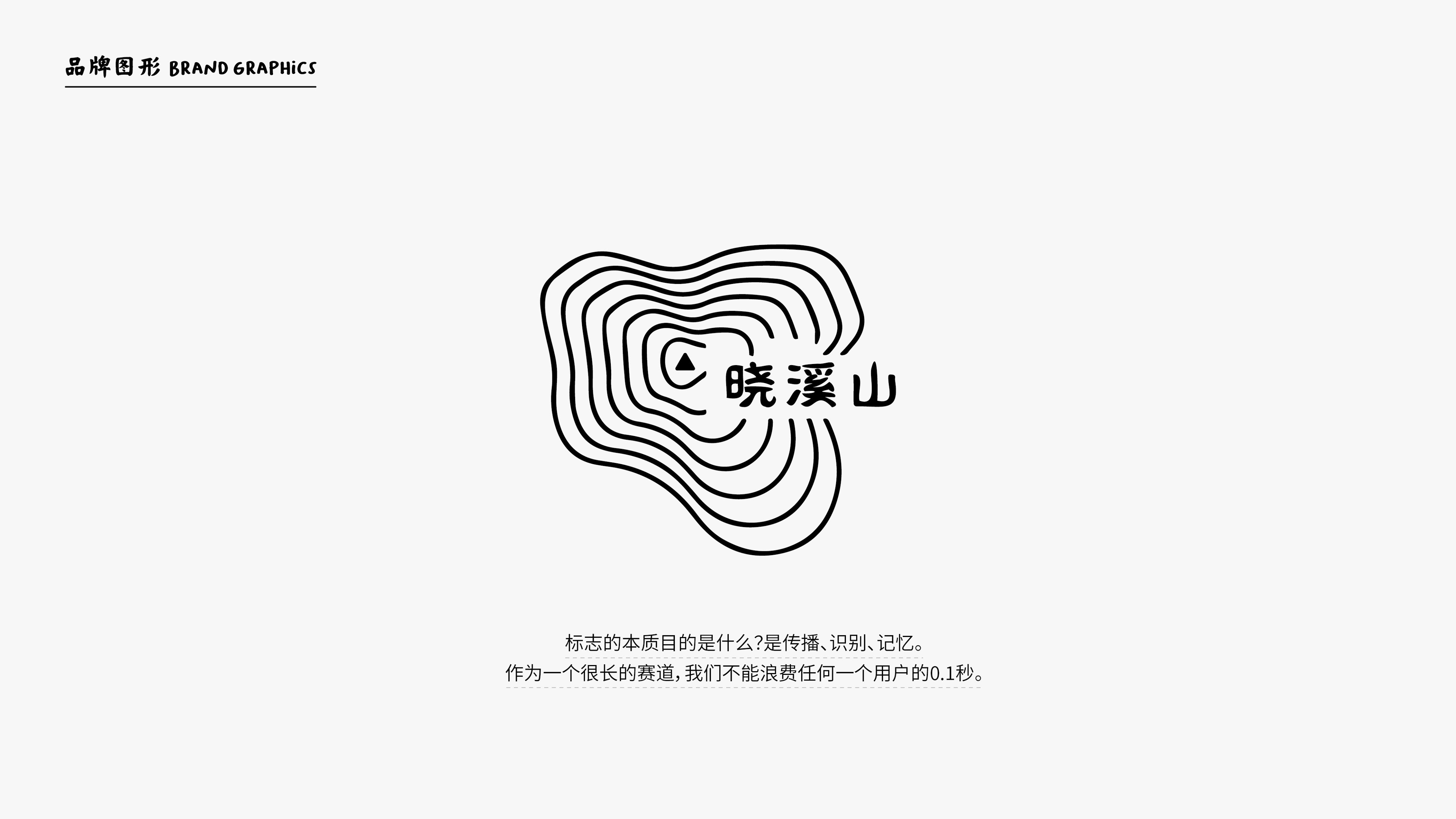
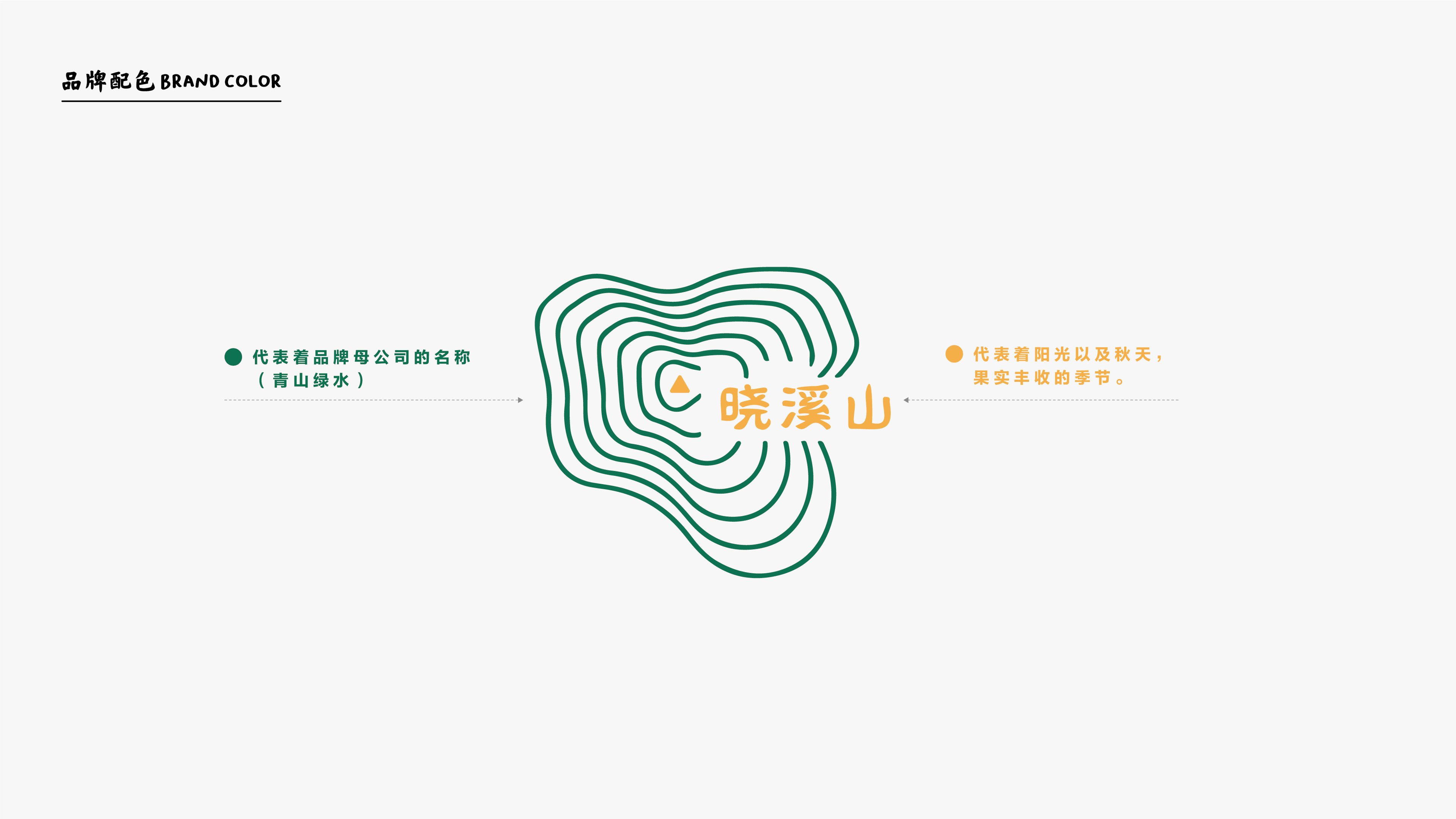
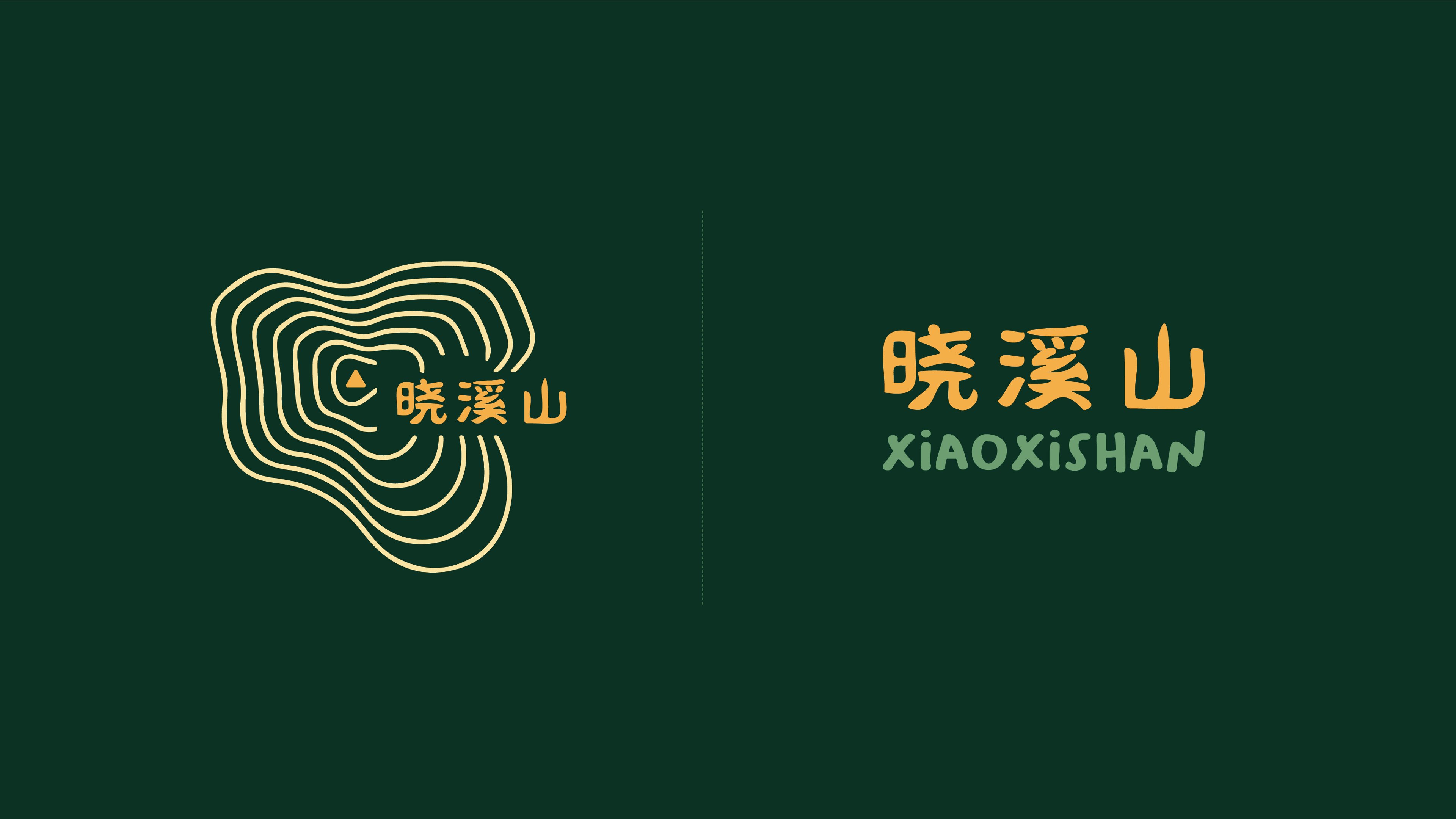
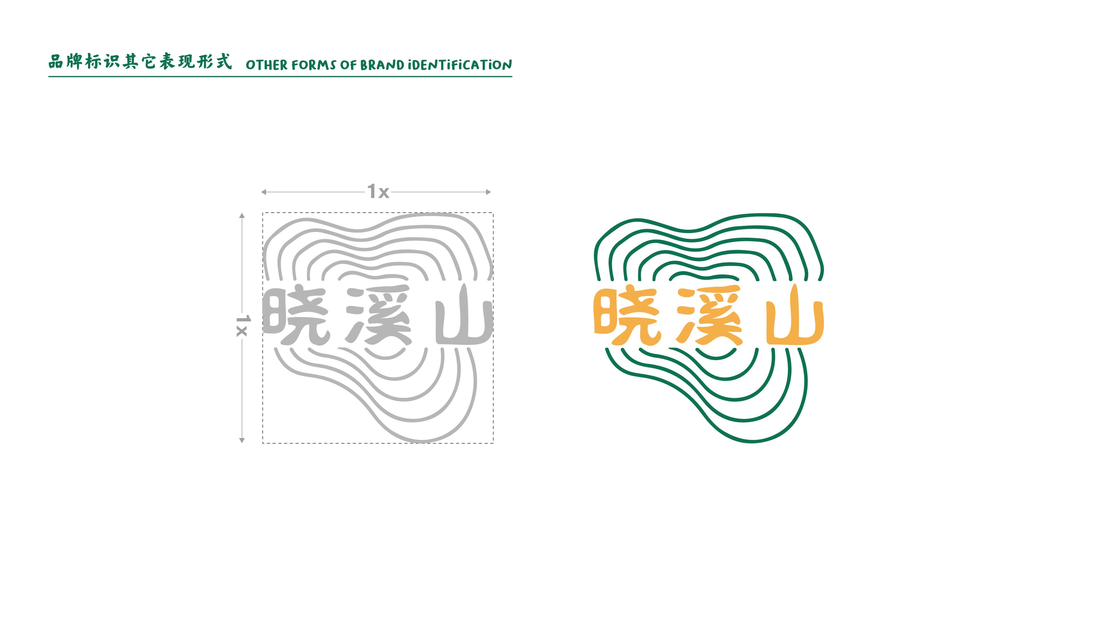
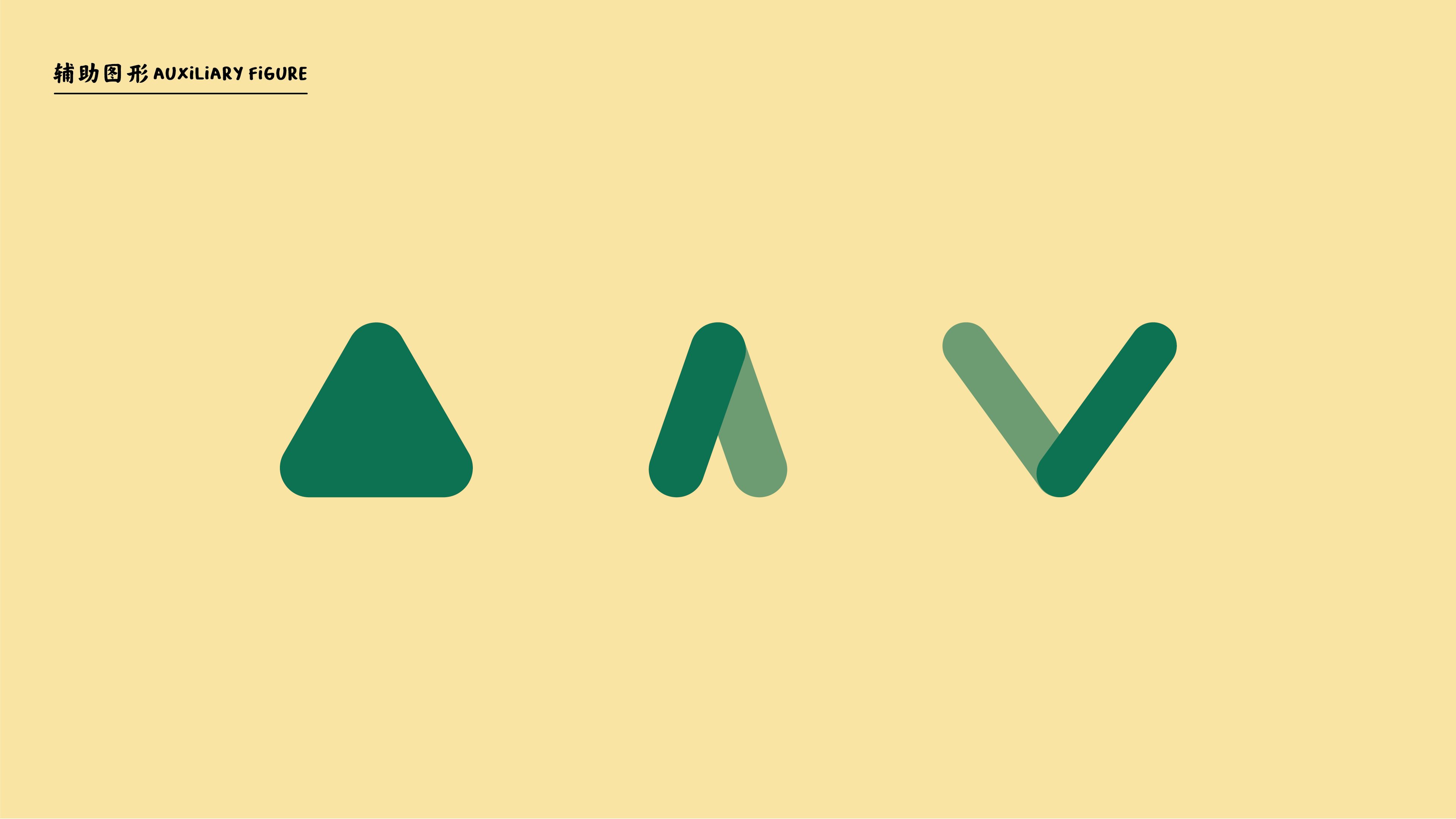
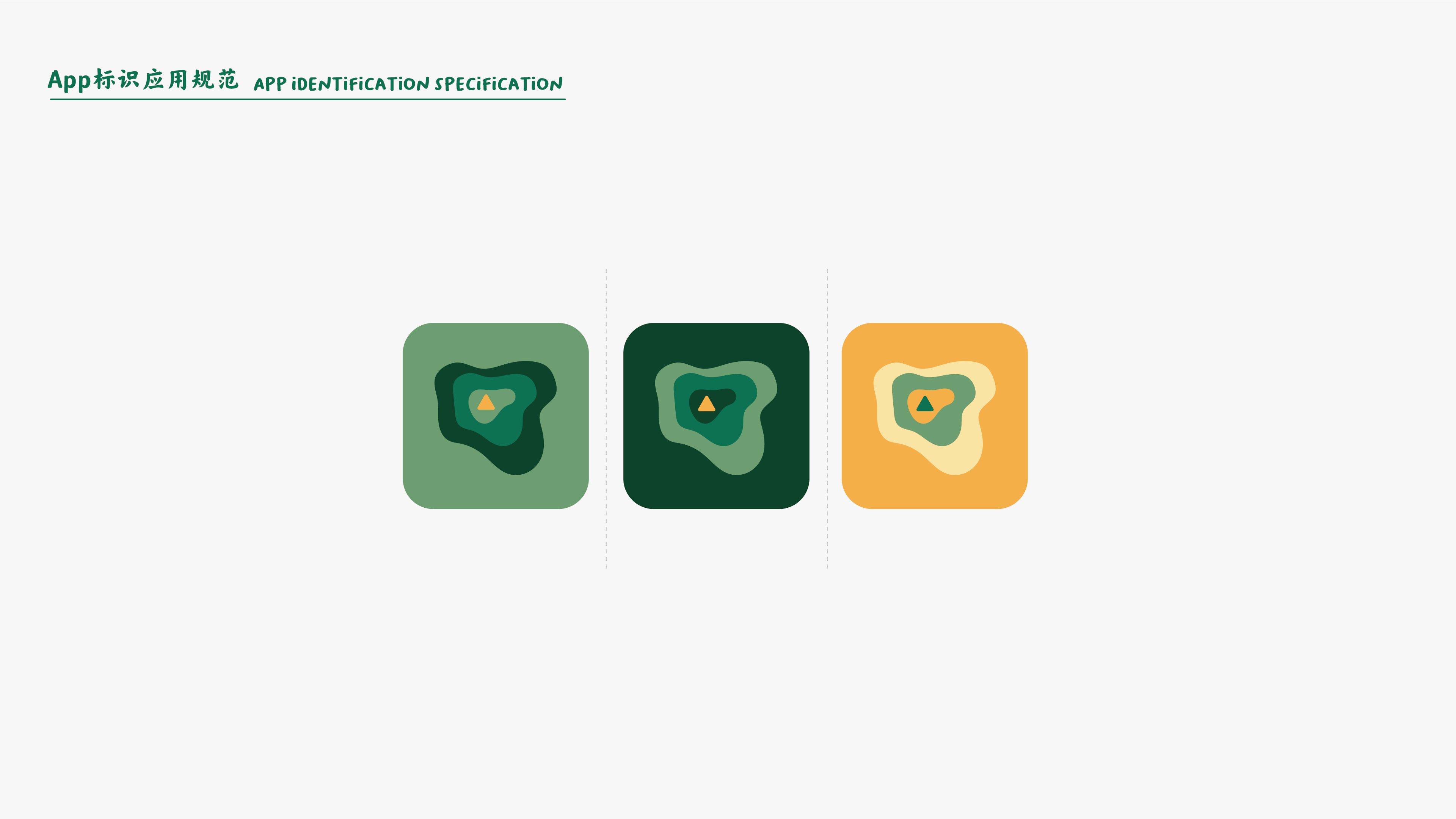
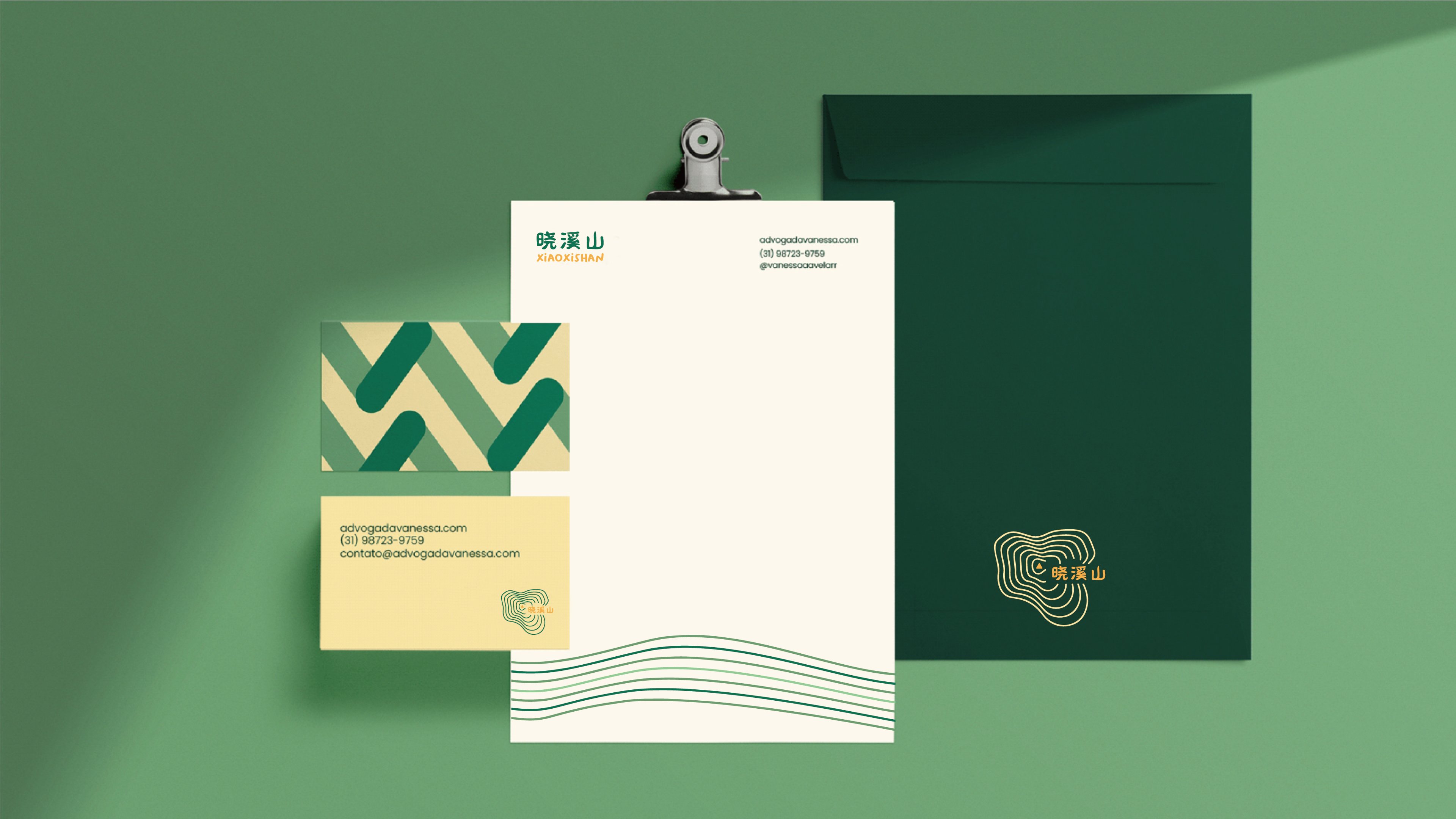
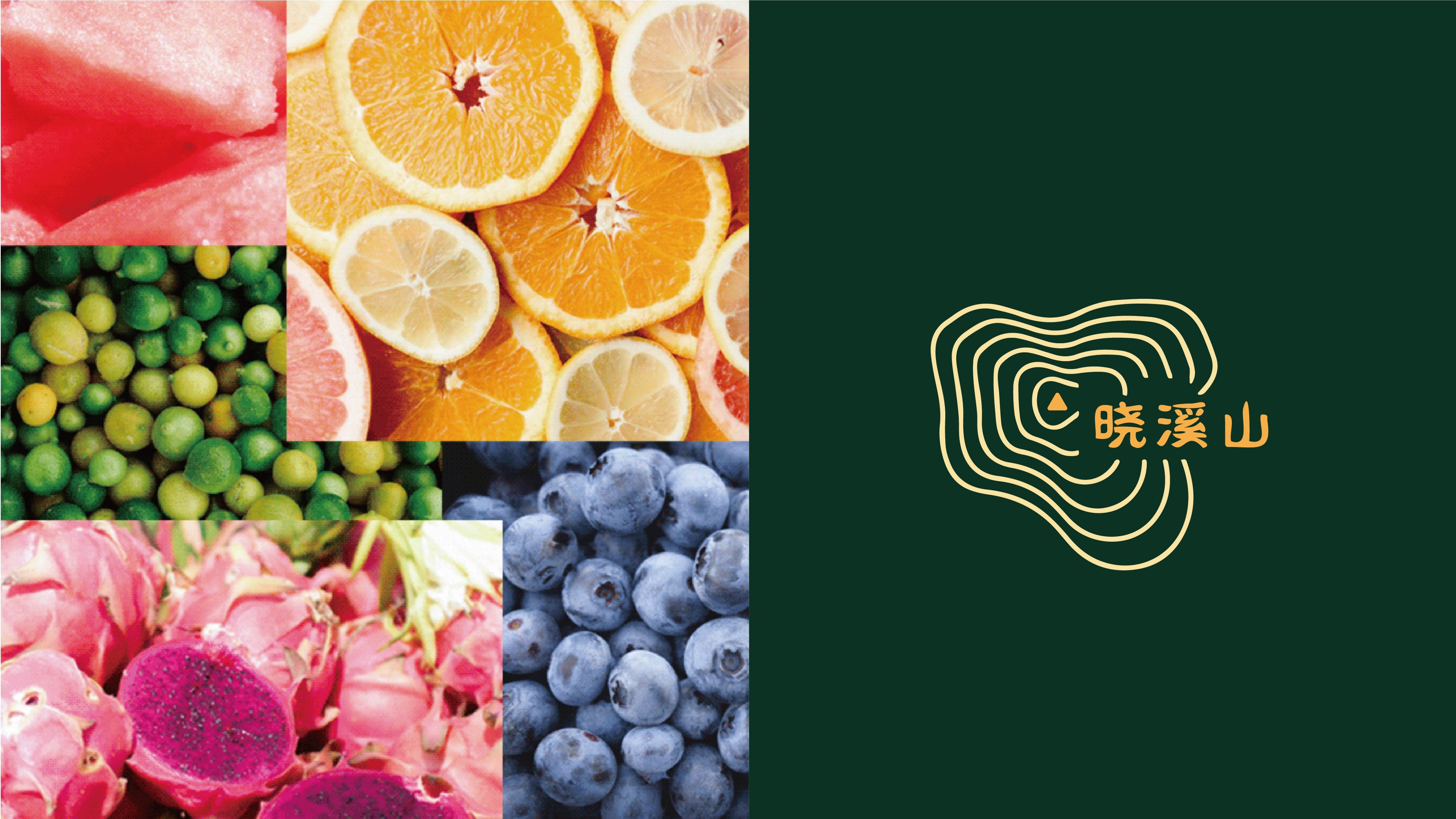
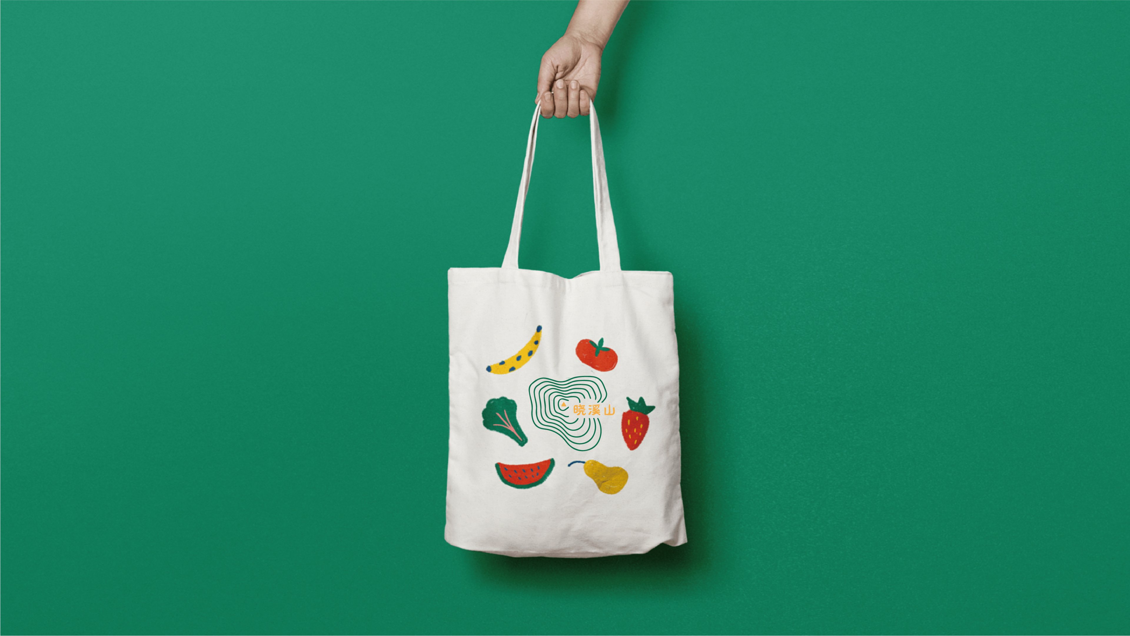
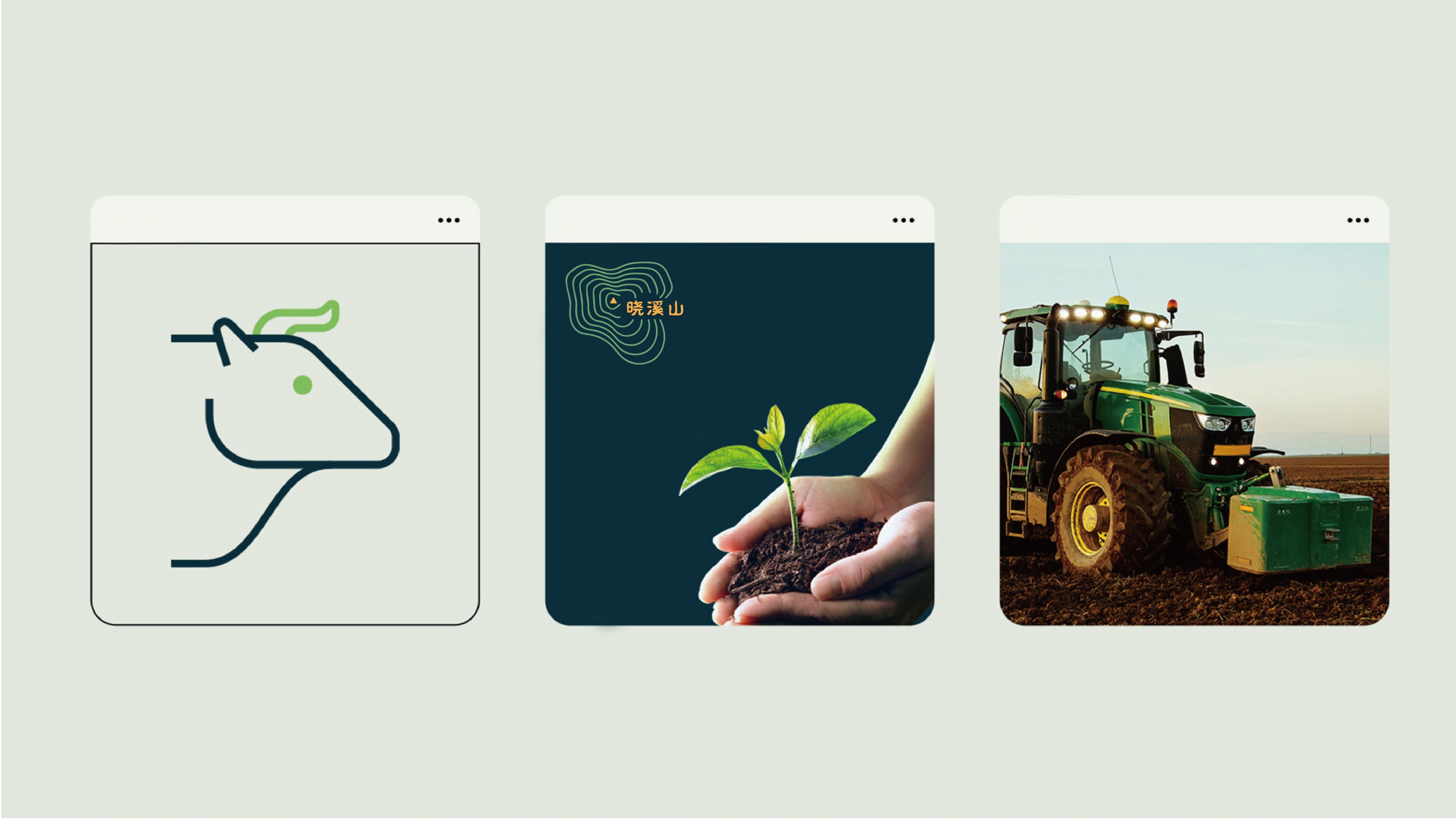
The contour lines of the main logo are too dense, it is easy to paste into pieces, and I feel dizzy when I look at them.... It would be better to simplify the effect like APP application example, and the overall idea is quite good.
quite characteristic
Professional
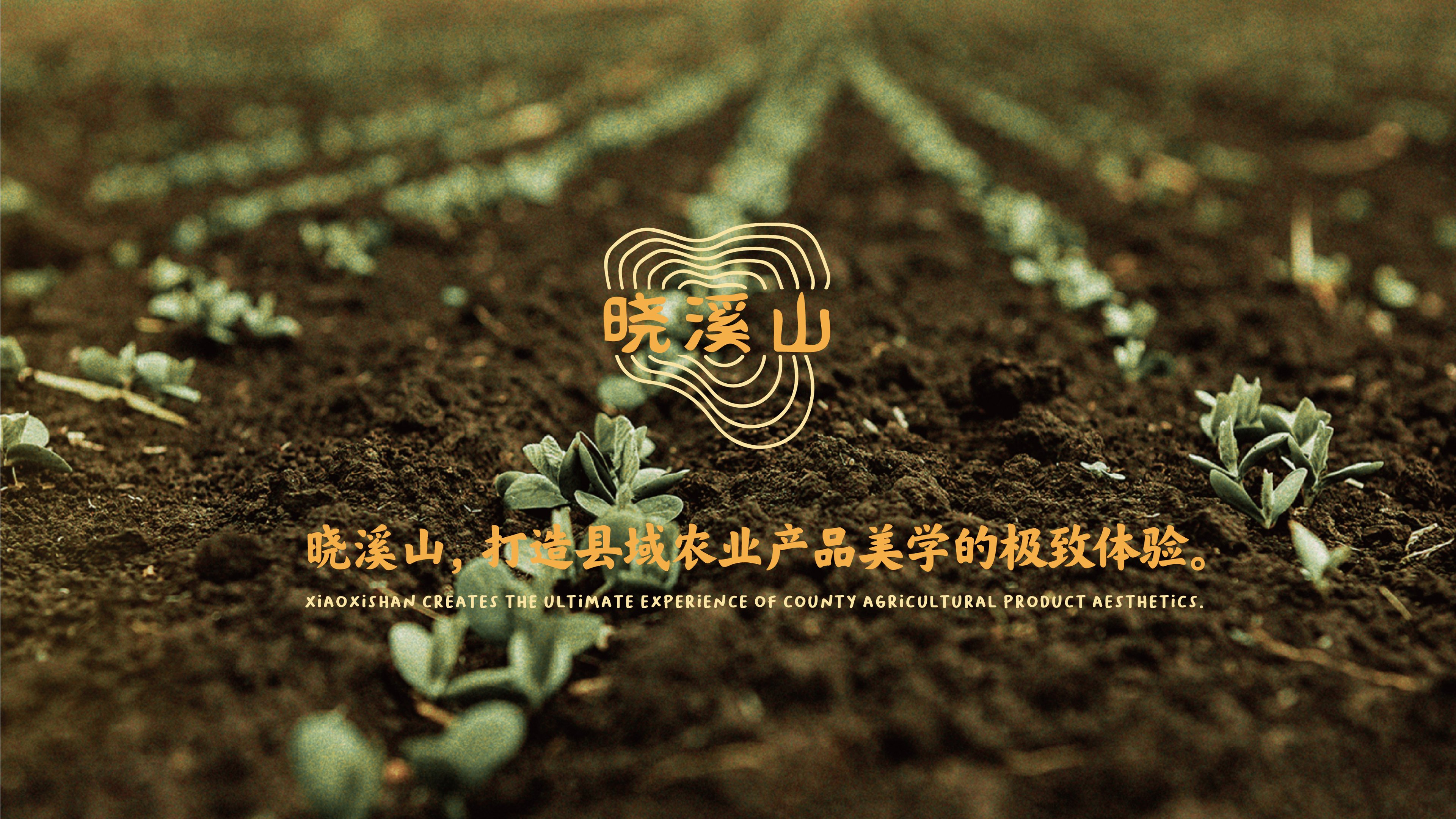
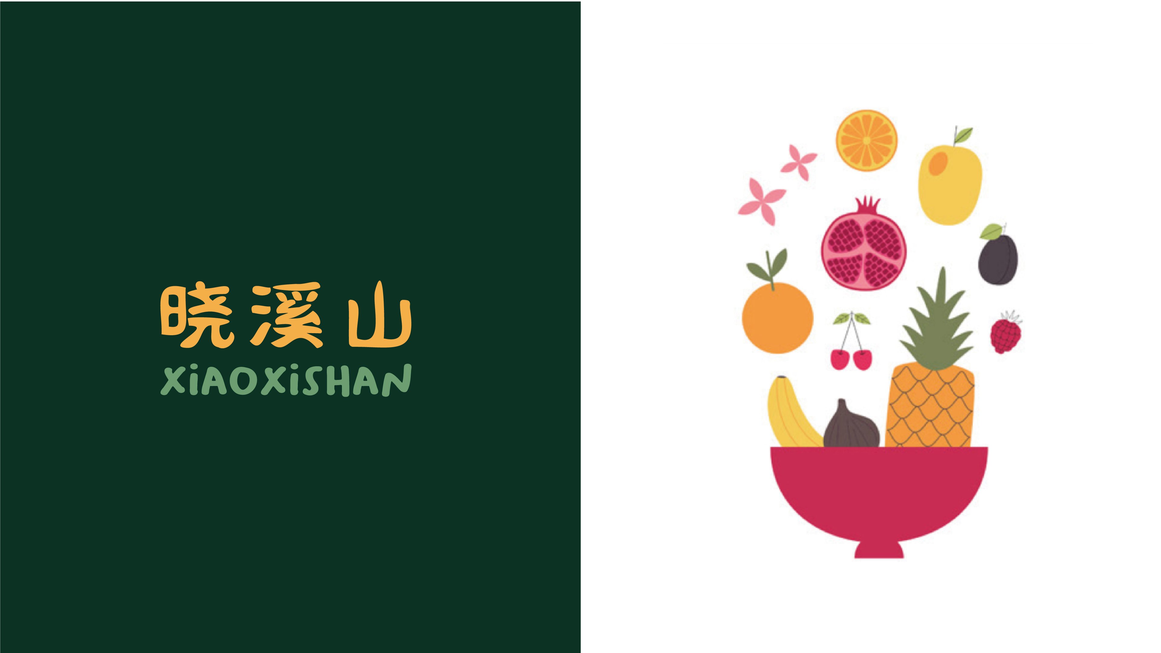
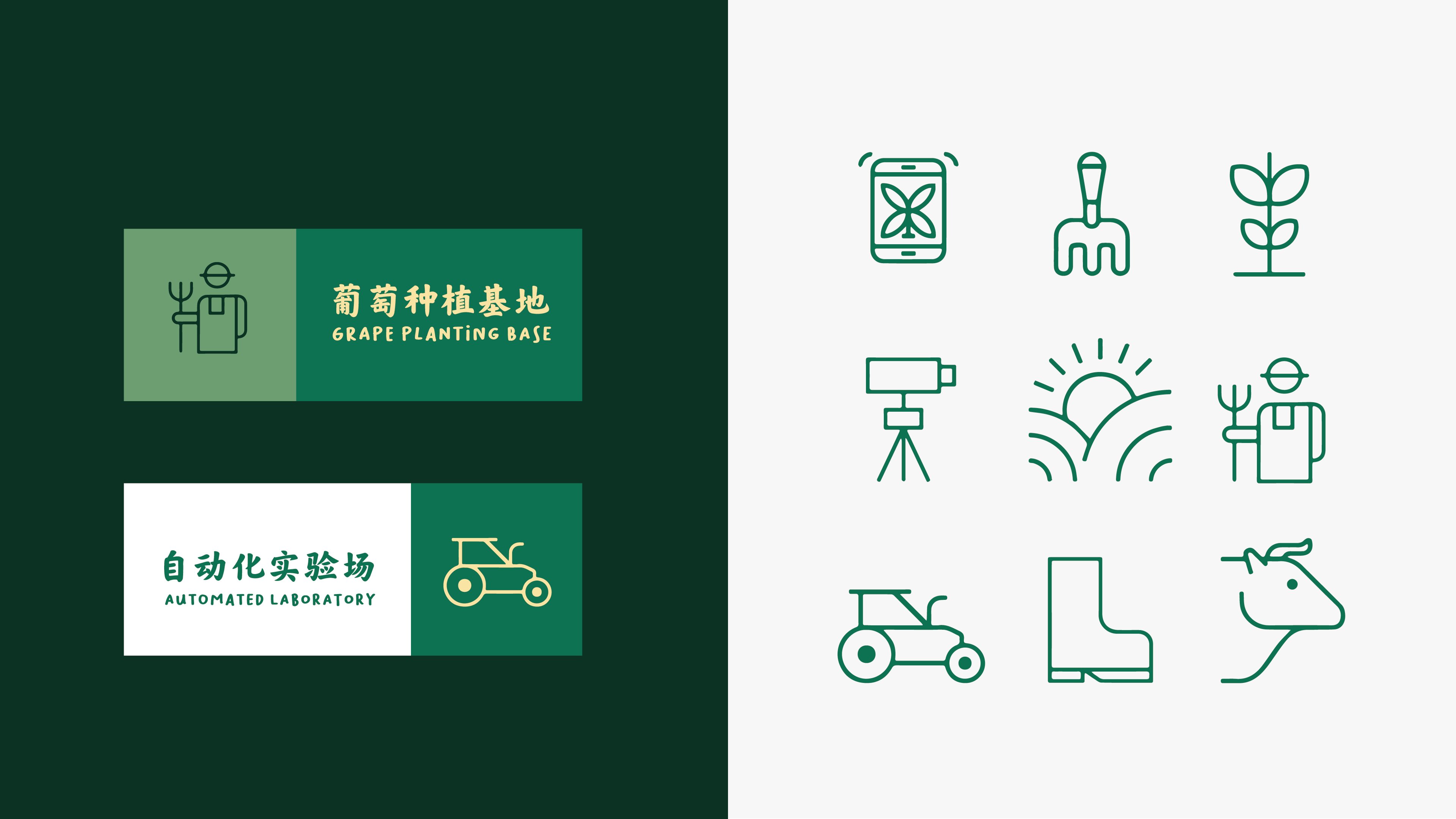
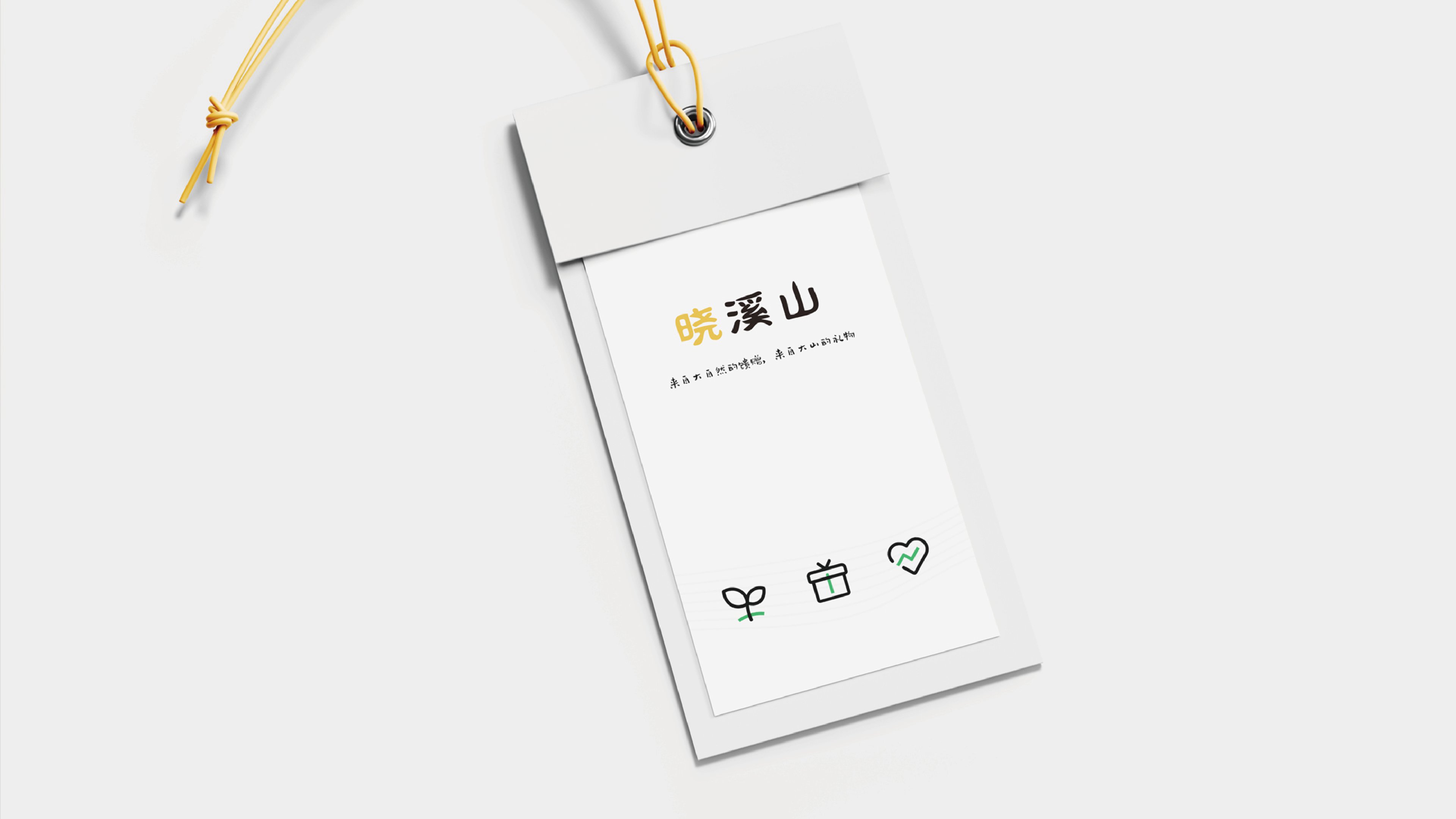
The positioning of a brand product of a rural industry to focus on agricultural and auxiliary crops is to be grounded. I only think that the so-called "advanced" shown in the picture is more like showing off skills and has nothing to do with the product and positioning.
666
It's quite a feeling.