The boss didn't choose this, sad... I still like what I make. Passing bosses give me some advice.
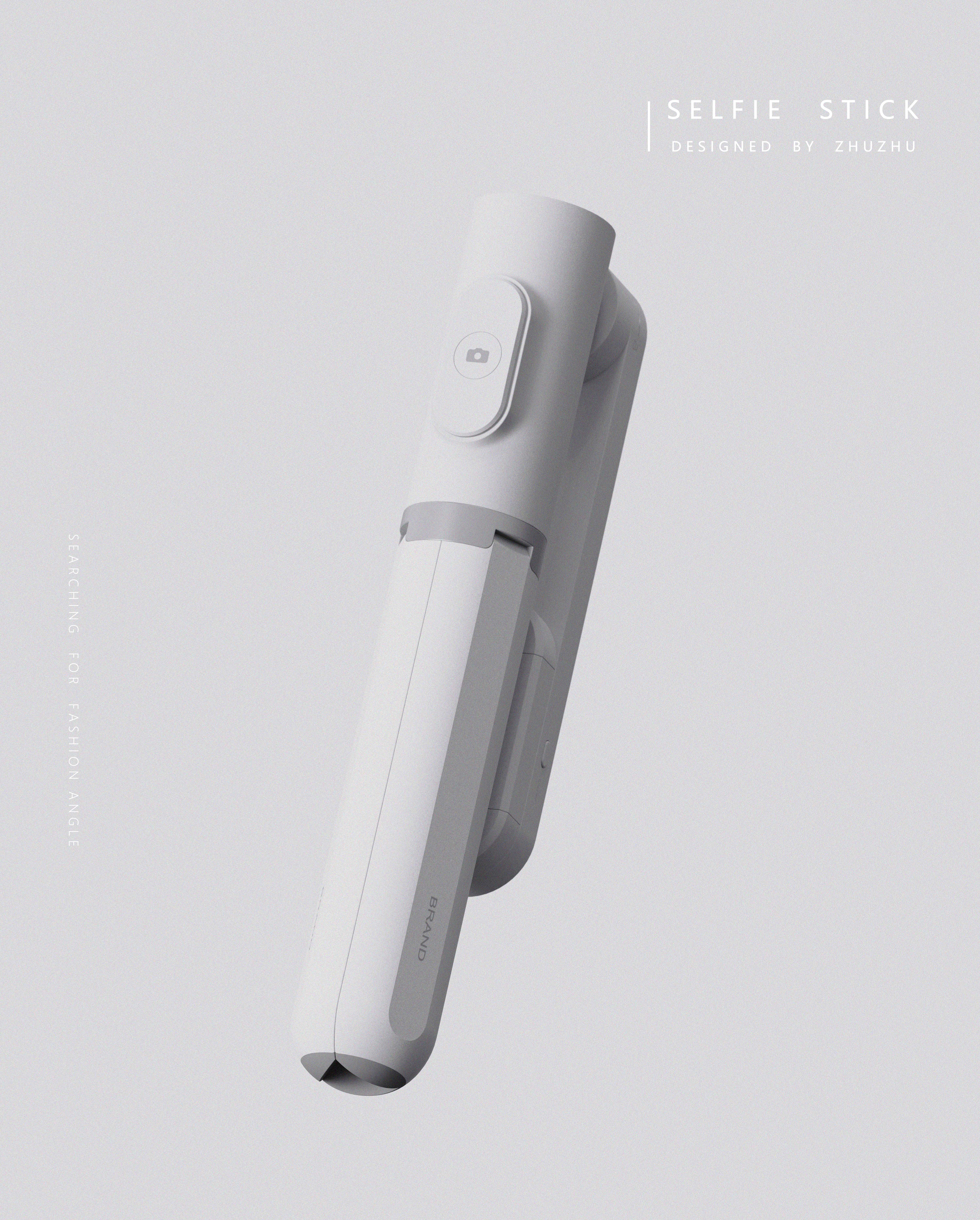
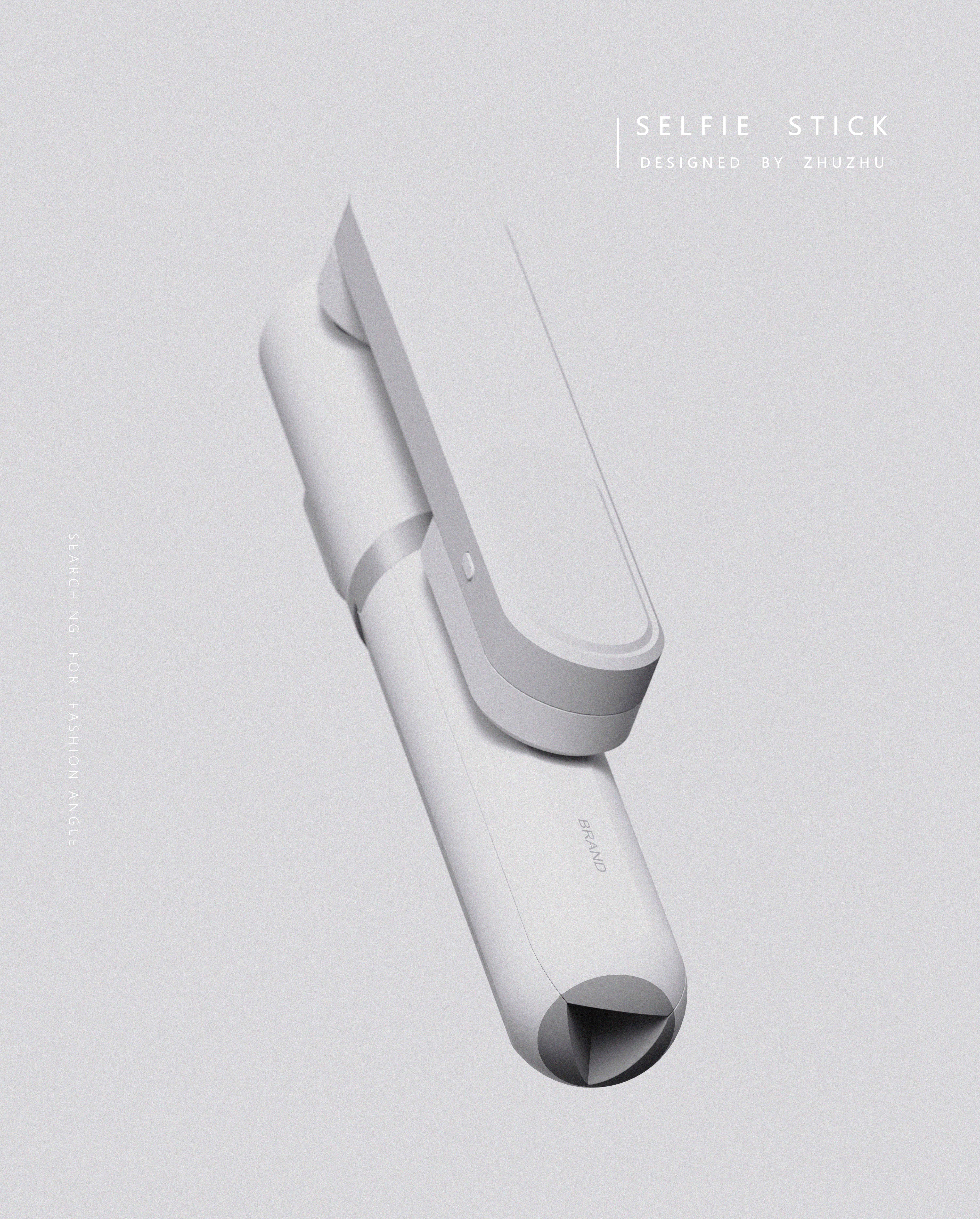
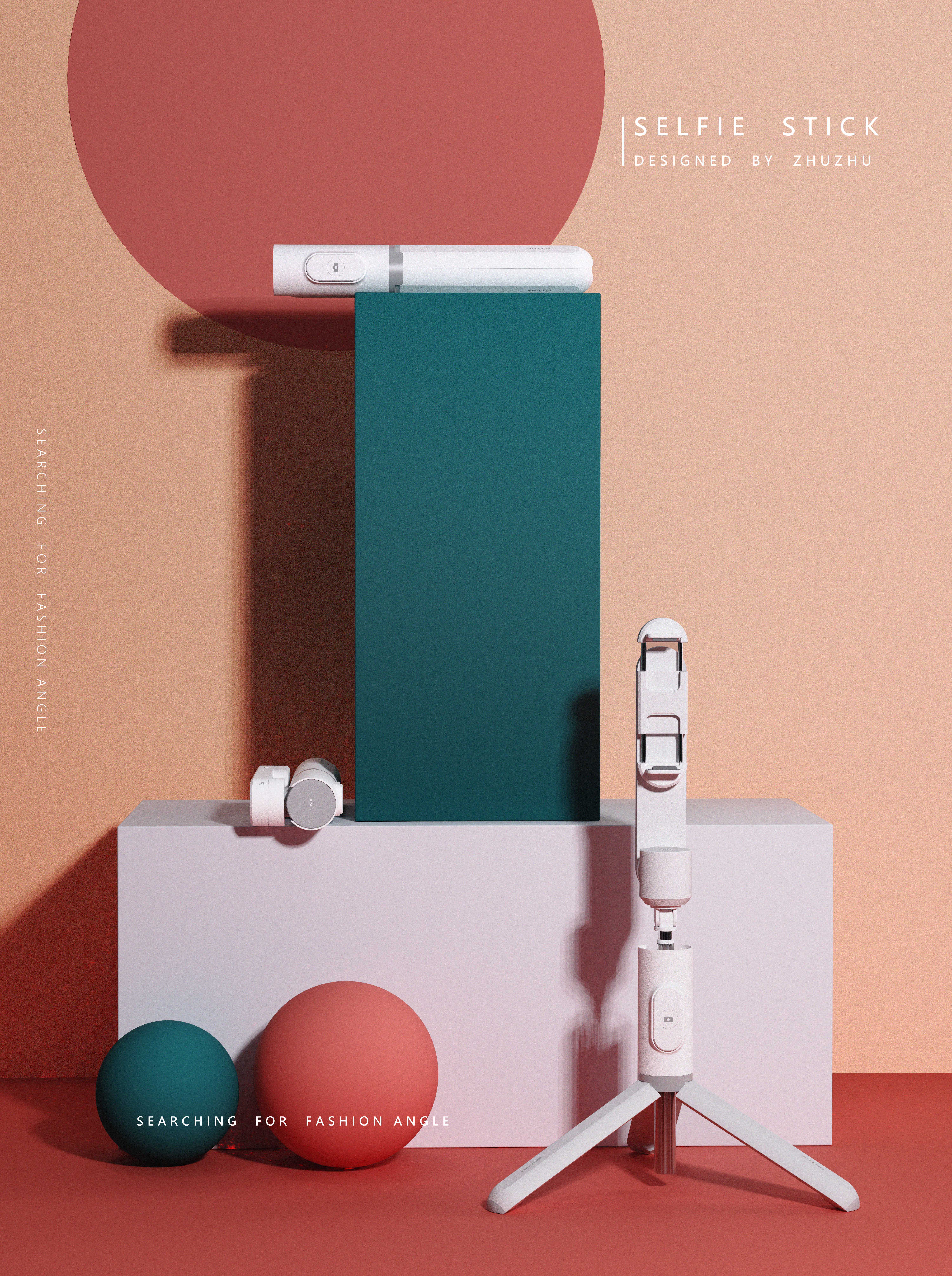
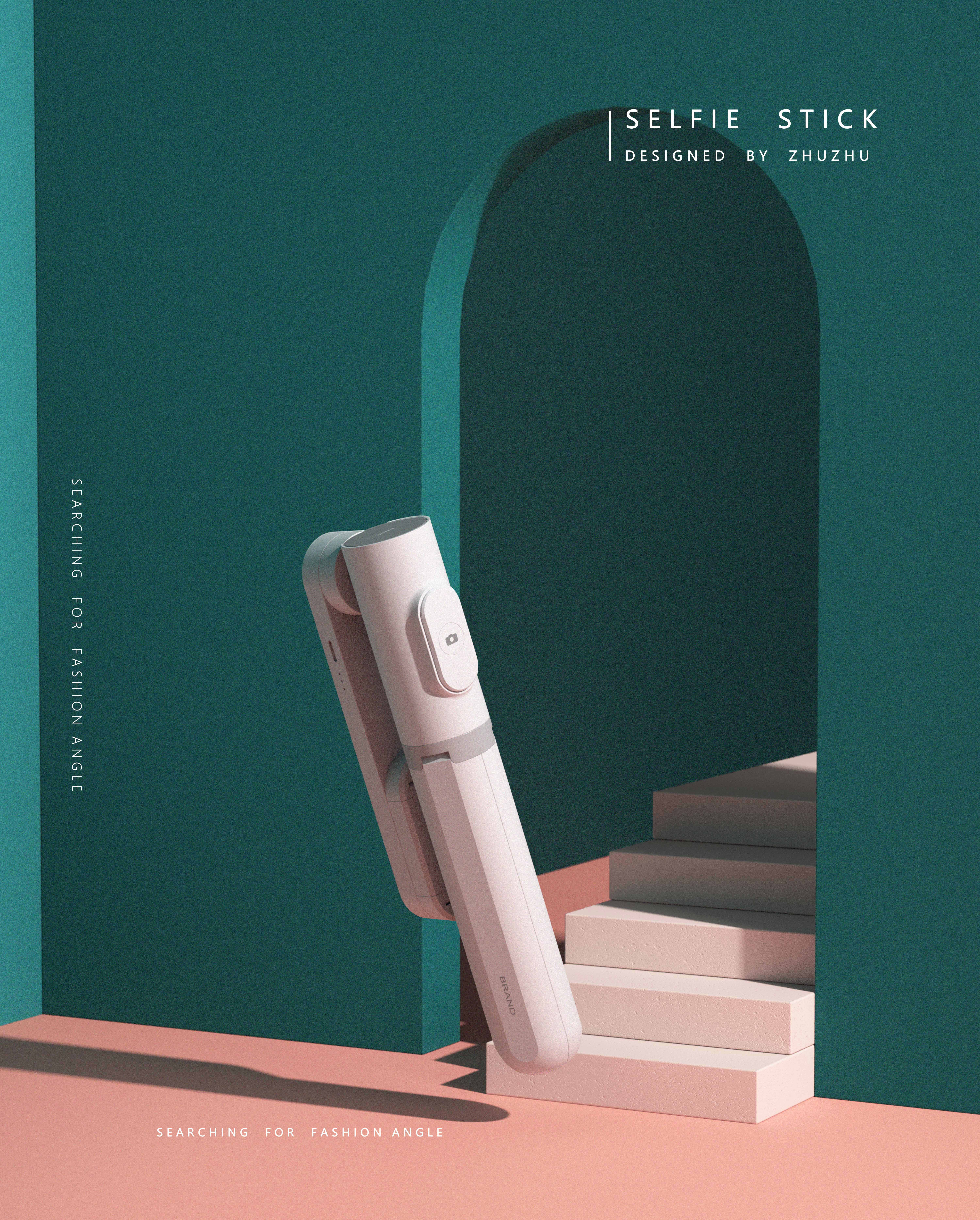
The copyright of this work belongs to 猪猪. No use is allowed without explicit permission from owner.

New user?Create an account
Log In Reset your password.
Account existed?Log In
Read and agree to the User Agreement Terms of Use.

Please enter your email to reset your password
good, how to contact
beautiful
Are you the one who invented this selfie stick and tripod? a very useful invention
The whole thing is good. Ow
This is very good, add a micro, design needs a lot can cooperate! 13588683958
I feel that it is very simple and greasy. I like it.
How to contact?
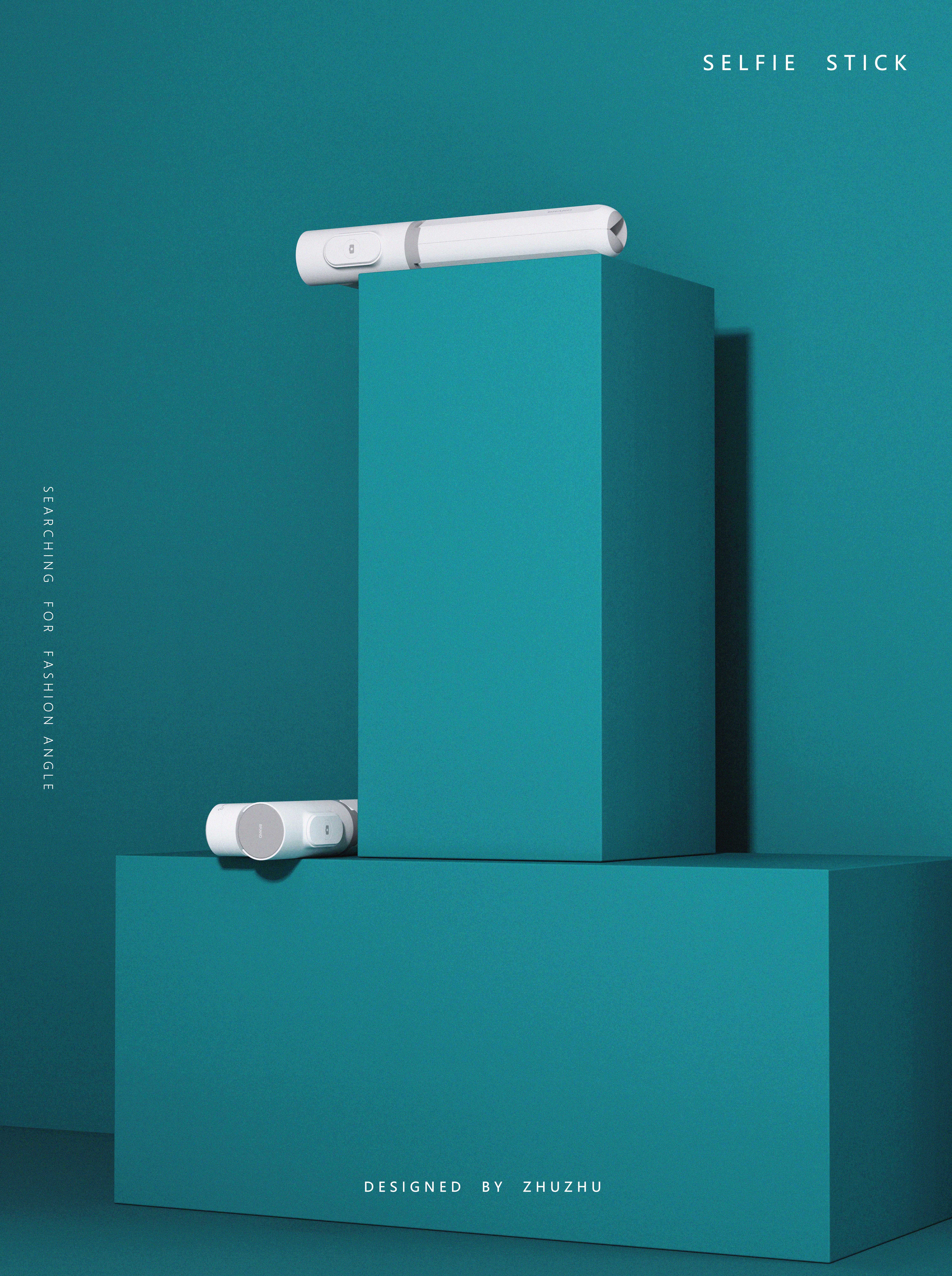
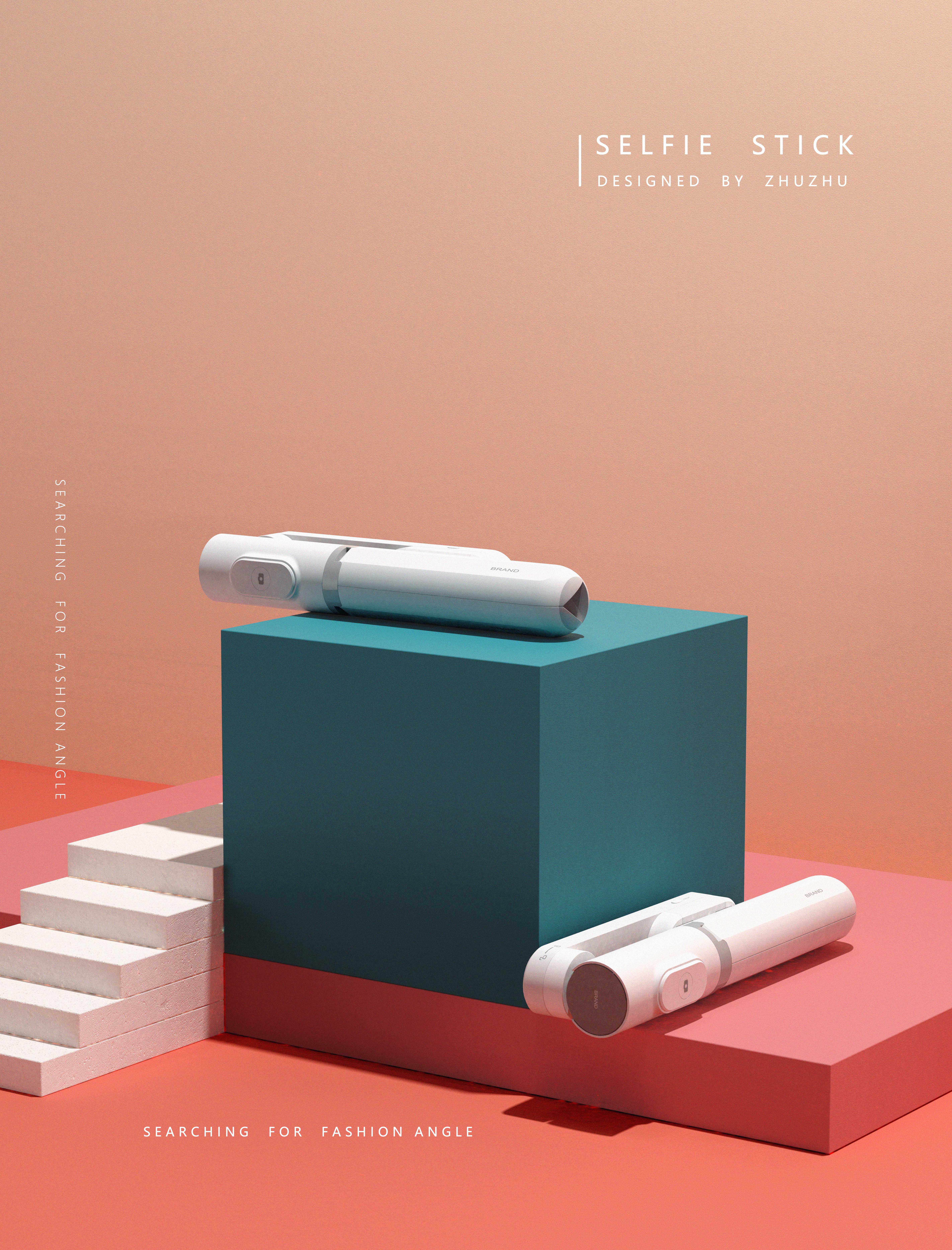
This should be a single-axis pan-tilt holder plus a selfie stick. If you see a charging port, you are advised to look at Zhiyun's new double-axis pan-tilt holder and learn his details. The folding mobile phone holder has a bad experience and may have a patent for rotating and folding.
First of all, I think it's great! Designers like this style very much, but Party A does not like it. They will feel that the texture of the material is not good and the product itself cannot jump out. This is one of them. The second is that it looks a bit multi-level, complicated and not pure enough. It may be because of these. This kind of problem is also quite fatal, which shows that you are only doing your own things and have not considered solving the problem for Party A.
It's super awesome. I like it very much.
I want to see the boss's choice of
Oh, no, you can't disclose
I have encountered one thing. Party A doesn't like this style of drawing, saying that it can't see the material like drawing... Later, I thought there was a problem,
(1) the reflection texture details of plastic material are not available, and your picture products are mixed into the background! The ashes are together. This noise addition reflects the use and intensity of a tone. I think I need to think about the light and shadow of product rendering! Most important. (2) Another problem is homogenization. Although we are influenced by various design aesthetics education and product trends, the proportion of functional design of products is now increasing. I think it is also influenced by products with design styles such as Apple and Xiaomi (speaking of which, we still have the feeling of Bauhaus style). A few days ago, I saw an interview with Mr. Wang Shouzhi and also talked about this problem, but many Party A have not received this kind of education, or those who have been nurtured by this kind of art education can't understand the feelings of ordinary consumers, and it is estimated that Party A has seen too many products, and the simple shape can't jump out of the sight. This design of yours will have a feeling of, hey, where have you seen it.
The most difficult point in design is here
Could it be the reason for being too rough?
I also like it ~
White looks good
Cocoa loves selfie stick