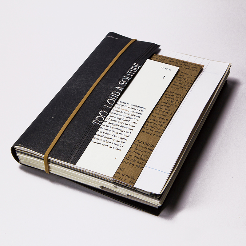
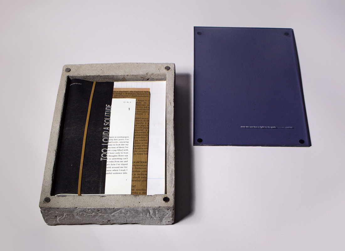
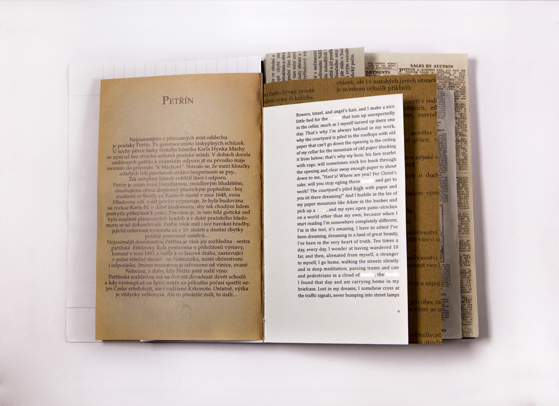
In a modern life, which is full of visual and auditory sensation, the younger generation has a lower acceptance of reading text-ba-sed books than previous generations. When I looked for inspiration for my project I found that those books or magazines, which had more visual elements, attracted people more. By contrast, those that had merely text or less graphic images were easier to be ignored. I feel it is a shame that a book with good content never has a chance to be opened and read. In recent years, some writers or designers have been trying to introduce visual elements into the text of fictions - such as photography, typography, illustration etc. And the phenomenon has proved that there are still some possibilities with unconventional novels. Therefore, I began to think that a book is composed of not only the cover and the pages but also the spine, fore-edge and the binding etc. It is a three-dimensional object and so, if all the elements that make up a book are taken into consideration when doing a book design for a novel, is it possible to achieve better results? The question leads me to conduct this project.


Year
2015
Designer
LITING WANG
The copyright of this work belongs to K-DESIGN AWARD. No use is allowed without explicit permission from owner.

New user?Create an account
Log In Reset your password.
Account existed?Log In
Read and agree to the User Agreement Terms of Use.

Please enter your email to reset your password
Comment Board (0)
Empty comment