Laojiekou is one of the best brands in e-commerce fried goods, and melon seeds and peanuts are the first in the search sales category of Taobao Tmall.
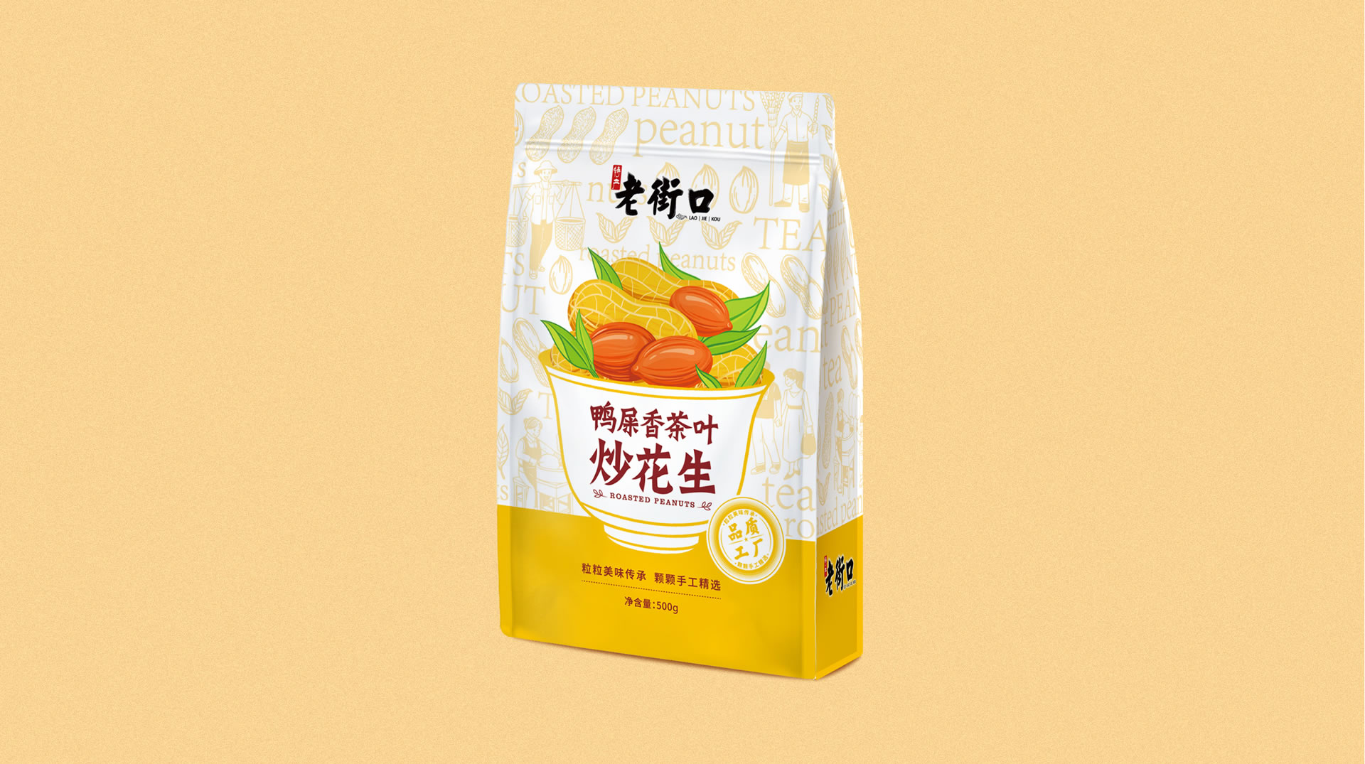
I want to make efforts on peanuts and innovate the taste of fried peanuts. Lao Jie kou Jia always keenly combined the tea star "duck excrement fragrance" and peanuts to name "duck excrement fragrance fried peanuts".
So, how should the packaging be designed so that the old flavor can be reborn?
There are "four treasures" in the selling packaging, and Sixi uses two treasures to plan and design the packaging for it.
1. Polish a core highlight
"Fried peanuts with duck excrement fragrance" is a brand-new product. Its unique feature lies in its taste innovation. Although the product has bright spots, the bright spot "duck excrement fragrance" is only well known in the tea field, and consumers know little about snacks, let alone buying!
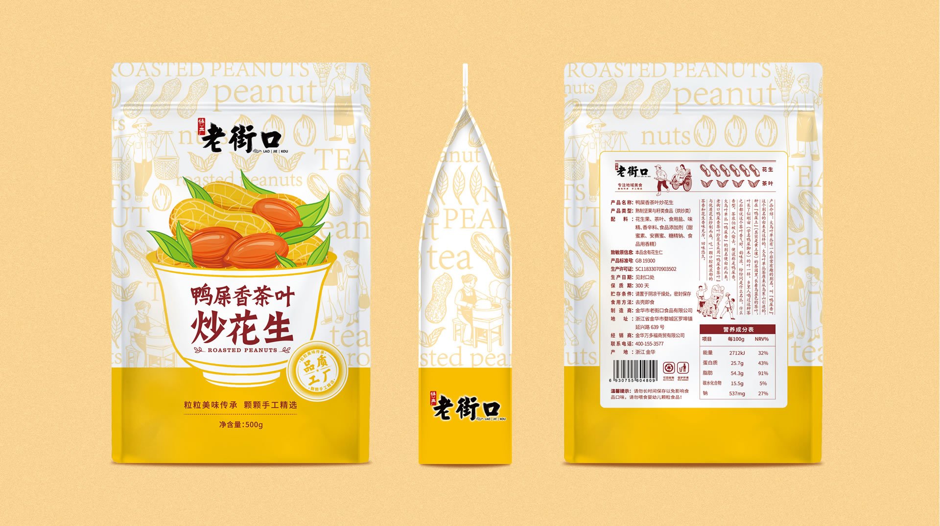
Sixi continues to polish the bright spots according to the working method of "one core bright spot. Based on the principle of "consumers understand in seconds", add the word "tea" to the product name, cleverly graft "duck excrement fragrant tea" and "peanut", and rename "duck excrement fragrant tea fried peanut".
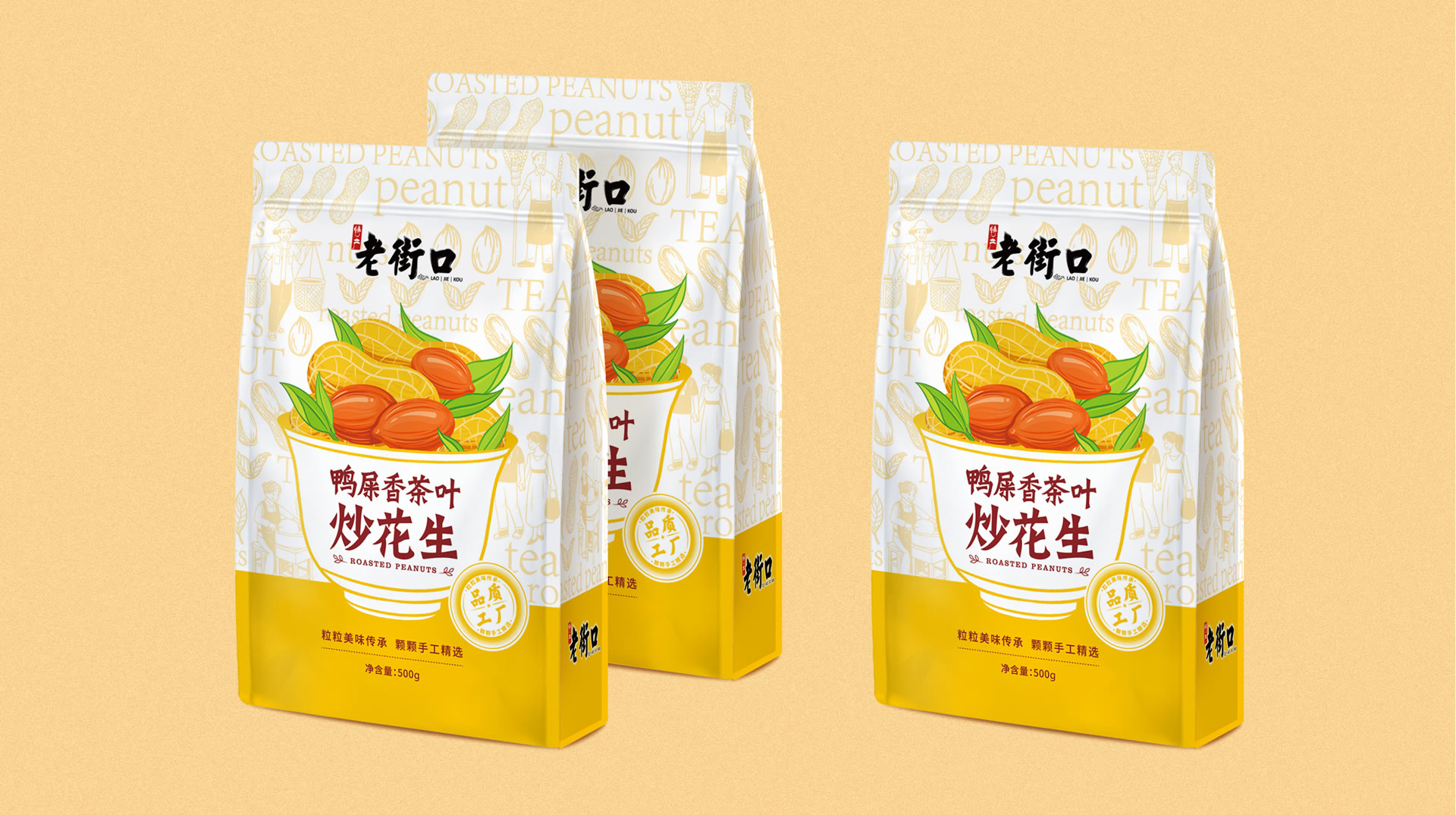
In the packaging highlights, "duck excrement fragrant tea" and "fried peanuts" are designed in two rows to highlight fried peanuts.
The root category is clear, the new taste is clear, and consumers understand it in seconds!
2. Design a set of visual assets
Highlight packaging is a strategic tool for sales and an asset carrier for brands. Based on the bright spot "duck excrement fragrant tea", how to design the visual system of product packaging?
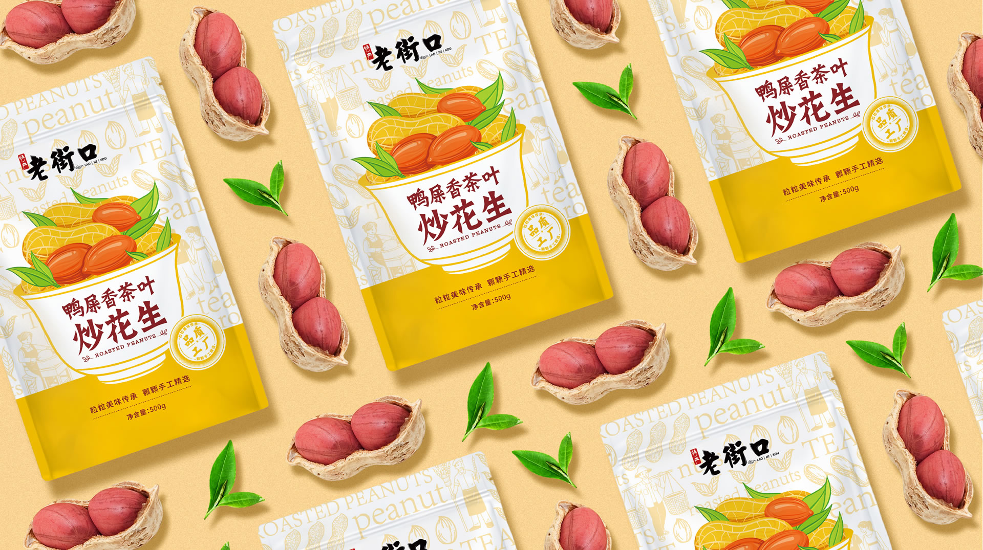
Around the bright spots, Sixi perfectly combines tea, peanuts and teacups to directly mobilize customers' awareness of tea, empower peanuts with tea, and increase the premium of peanuts.
After the "duck excrement fragrant tea fried peanuts" went on the market, it quickly became the net red in fried peanuts and became a new growth point for sales in Laojiekou.


The copyright of this work belongs to 四喜亮点包装策划. No use is allowed without explicit permission from owner.

New user?Create an account
Log In Reset your password.
Account existed?Log In
Read and agree to the User Agreement Terms of Use.

Please enter your email to reset your password
666666
This design is excellent
What the hell is duck shit
The duck excrement in the snack world is fragrant, ha ha
nice work!
Not bad