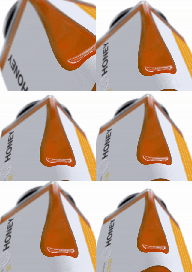
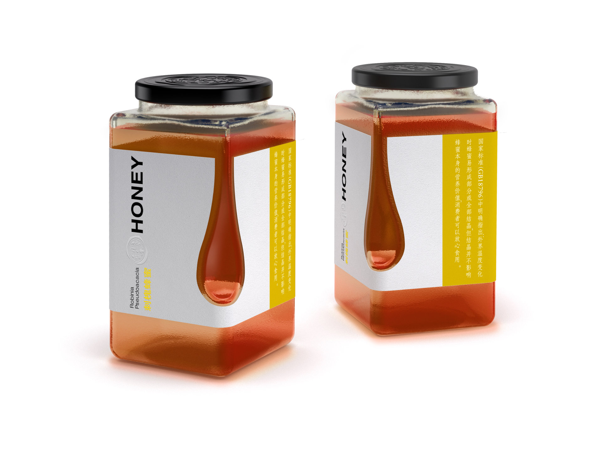
D2P creates a packaging design that emphasizes the color richness, texture and transparency of honey. The basis of the visualized solution is represented by a viscous droplet that drips slowly at the edge, which is turned upside down, adding an elusive element.
Our designs are included in the book "The Structural Art of Packaging" published in Hong Kong in 2014 and in the 2019 reprint. In 2015, it won the French Internet Community Design Award.
Customer Service: TRT
Creative organization: d2p Design Studio
Service Content: Product Design | Innovative Design | Conceptual Design | People-oriented Design | Market Research | Brand VI | Graphic Design | Interior Design | Design Strategy


The copyright of this work belongs to d2p Design. No use is allowed without explicit permission from owner.

New user?Create an account
Log In Reset your password.
Account existed?Log In
Read and agree to the User Agreement Terms of Use.

Please enter your email to reset your password
Keep in good health
big brand
very good