Hello everyone, I am Gu Xiaoyi, a professional beverage packaging design company editor! In view of the fact that the work has been stolen many times, first inform: once it is found that the source is not indicated at the beginning of the article, we will protect our rights through legal channels and expose your company's brand post to the whole network. Gu Yi provided Helen with the following services this time: overall packaging creativity, illustration design, milk beer can packaging design, product display effect rendering
Title: Helen Milk Beer
Customer Name: Shenzhen Helen Brand Management Co., Ltd.
Service Content: Packaging Design of Milk Beer
Service Team: Guyi Brand Packaging Design Department
Product price: 8.9 yuan/bottle
Sales scenario: Helen Si Bistro, Shangchao
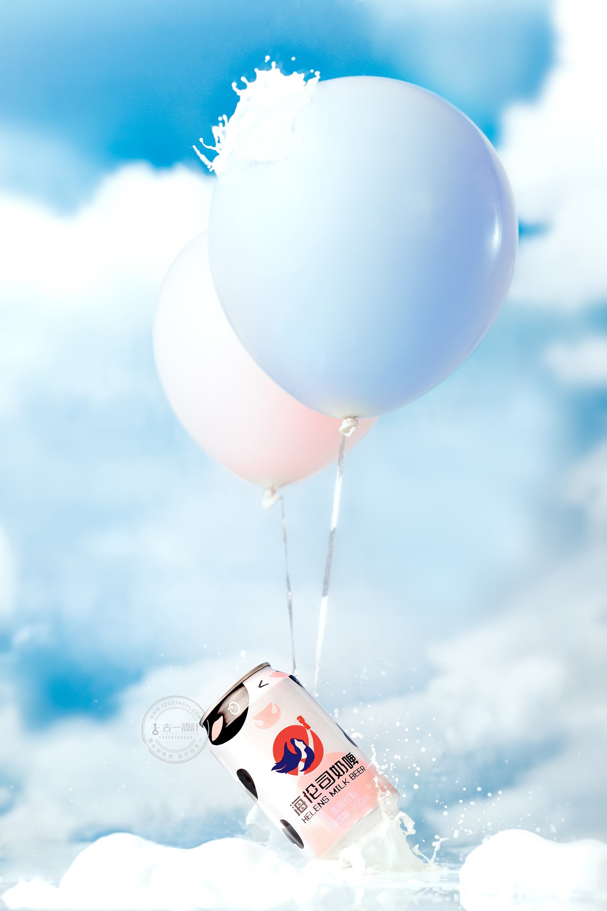
Target group: young people
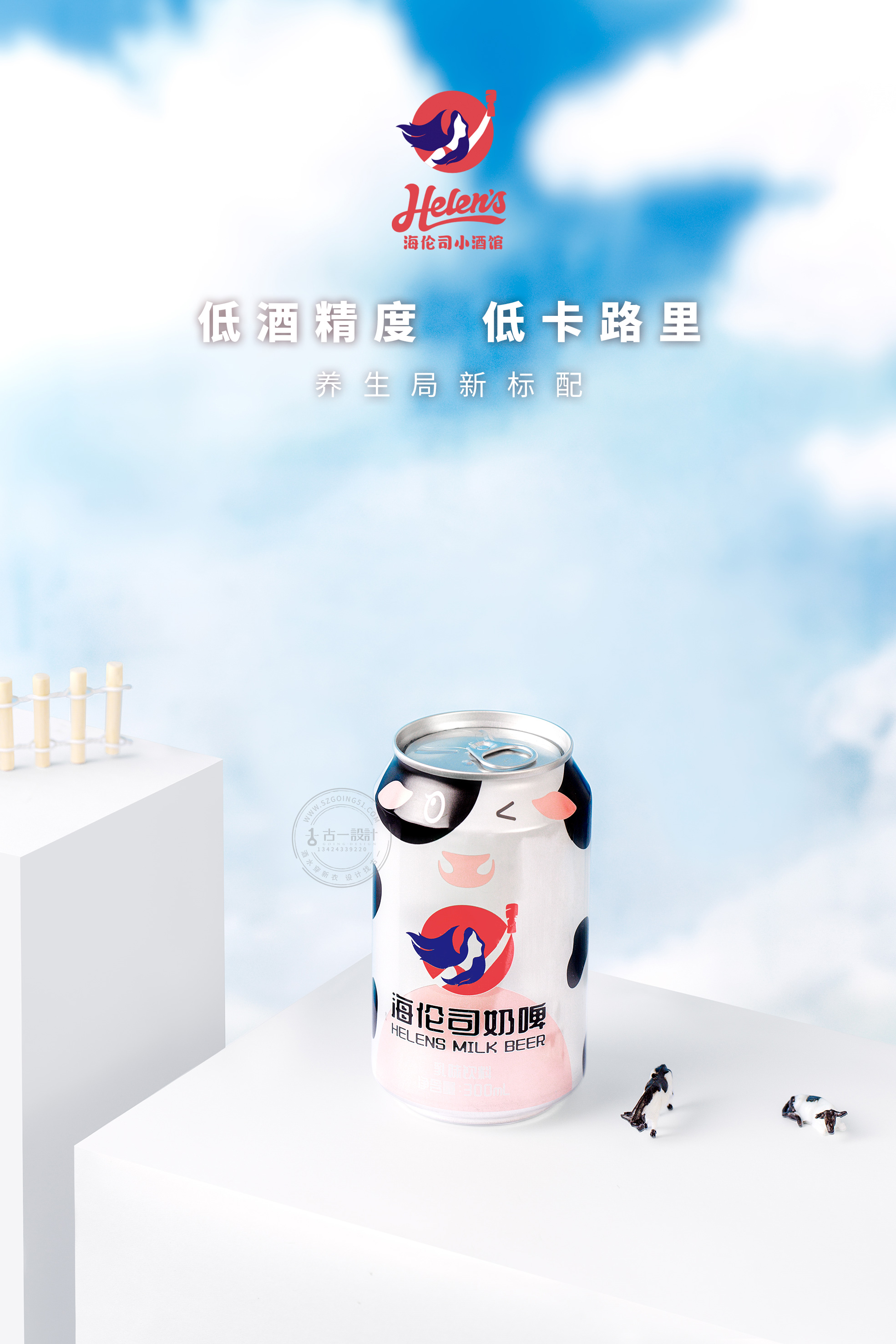
Product features: low alcohol content, low calories, delicate taste, rich nutrition
For such a brand-new product category as milk beer, there is an urgent problem: how to make consumers know and accept him quickly? Because only after knowing will other stories happen, and the importance of product packaging as the first contact medium for consumers can be imagined. In view of this situation, we have adopted a targeted solution in the direction of milk beer packaging design-taking young aesthetics as the keynote, and then enlarging the product attributes.
Maximizing product attributes
Consumers often buy goods only for a moment, and only products that give priority to consumers will have the opportunity to be purchased. Imagine: if you stand in front of the shelf and want to buy a bottle of milk beer, will the cans with milk elements attract your attention more? in popular terms, they look more like milk beer products. In fact, there is a strange appearance now: more and more product packaging is just for good-looking and good-looking, thus ignoring the attributes of the product itself. If the product has only a good-looking appearance but cannot let consumers know what product it is, you will lose many opportunities to be bought! Therefore, when designing the packaging, we need to consider: while attracting the attention of consumers, let consumers know what the product is at a glance through the outer packaging, that is, enlarge the attribute characteristics of the product on the outer packaging.

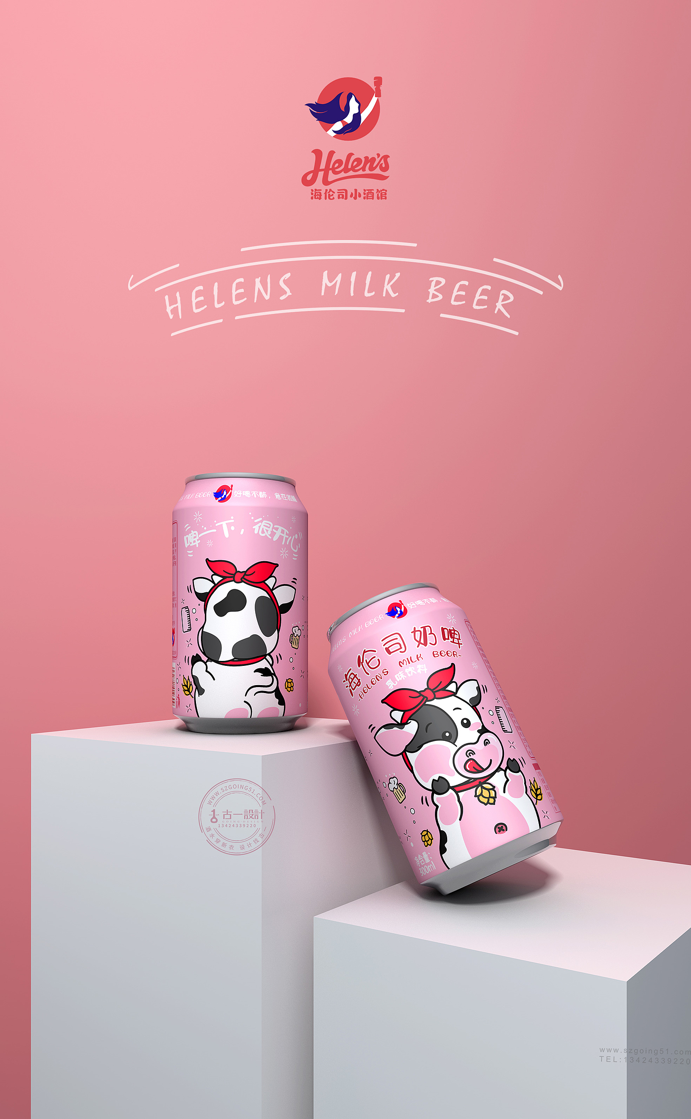
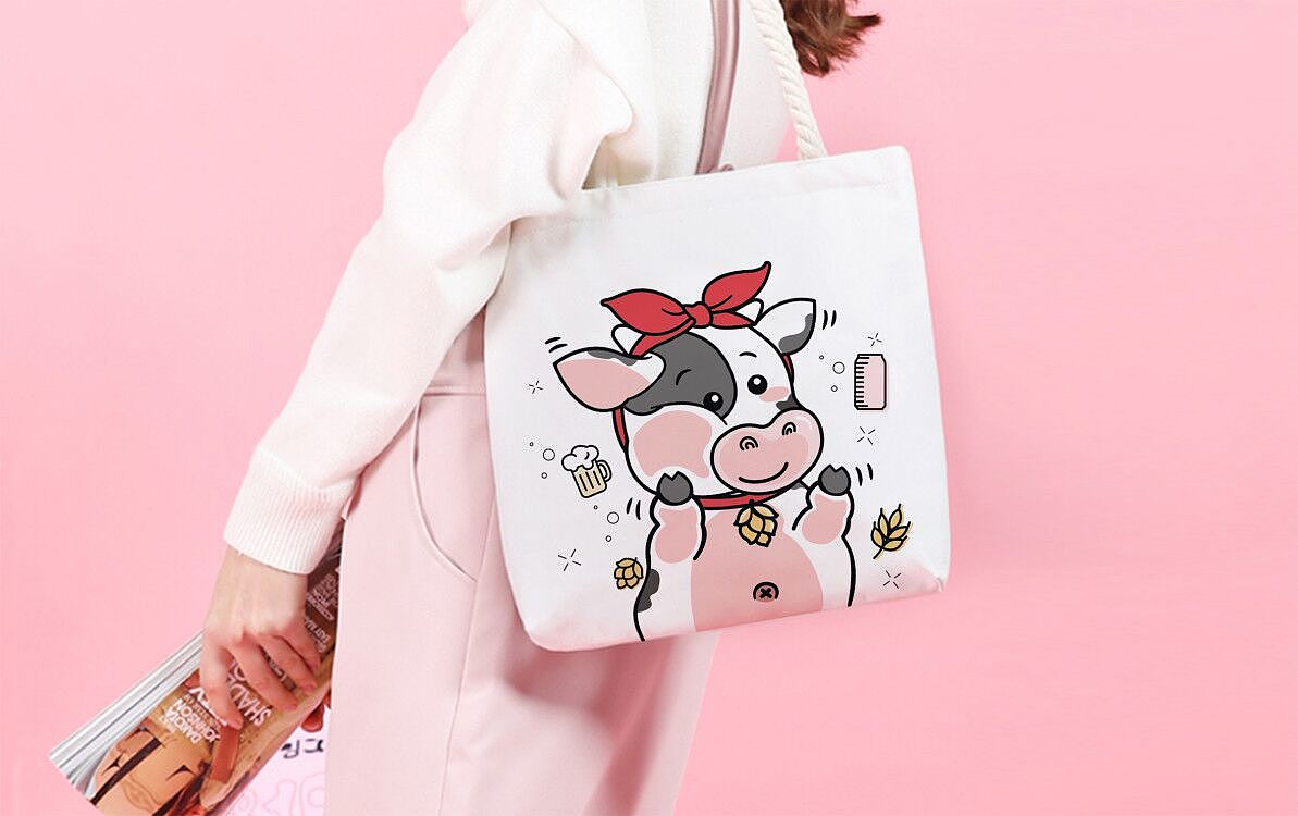
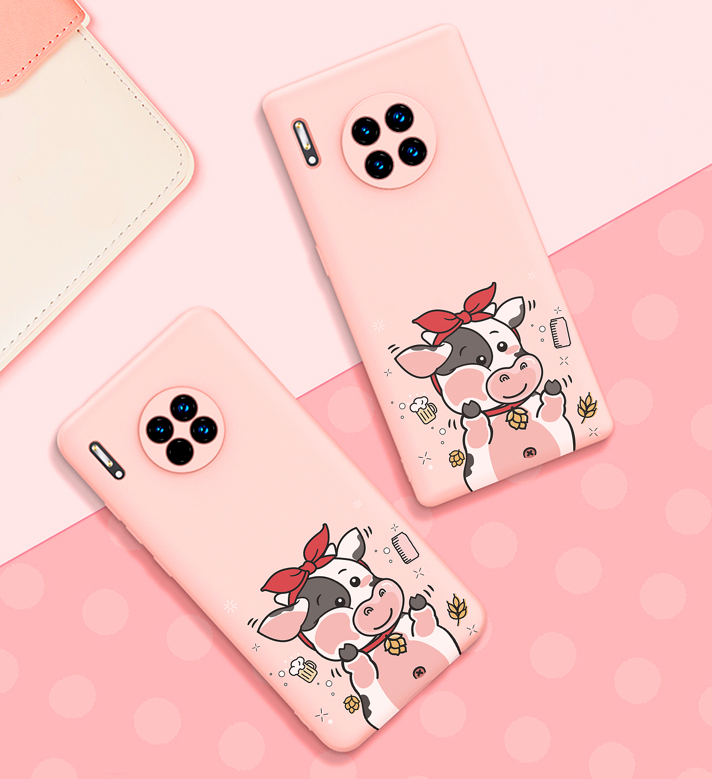
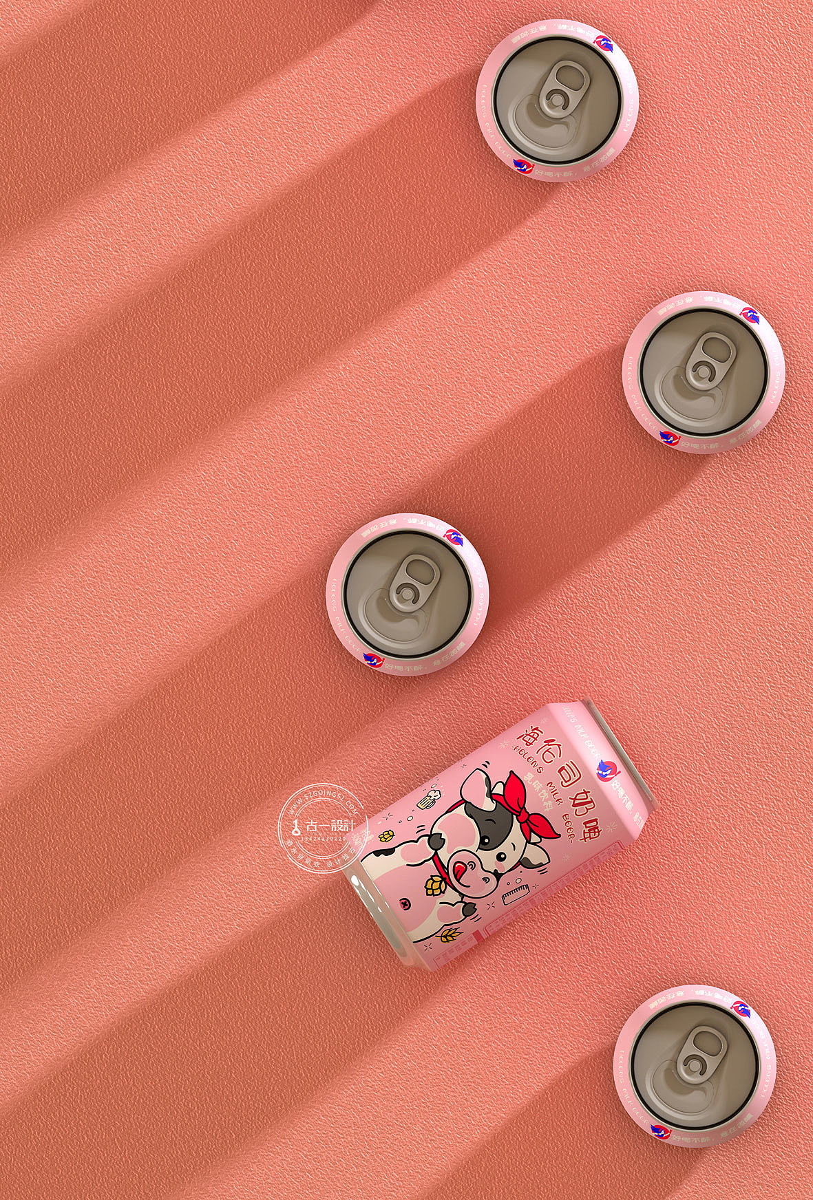
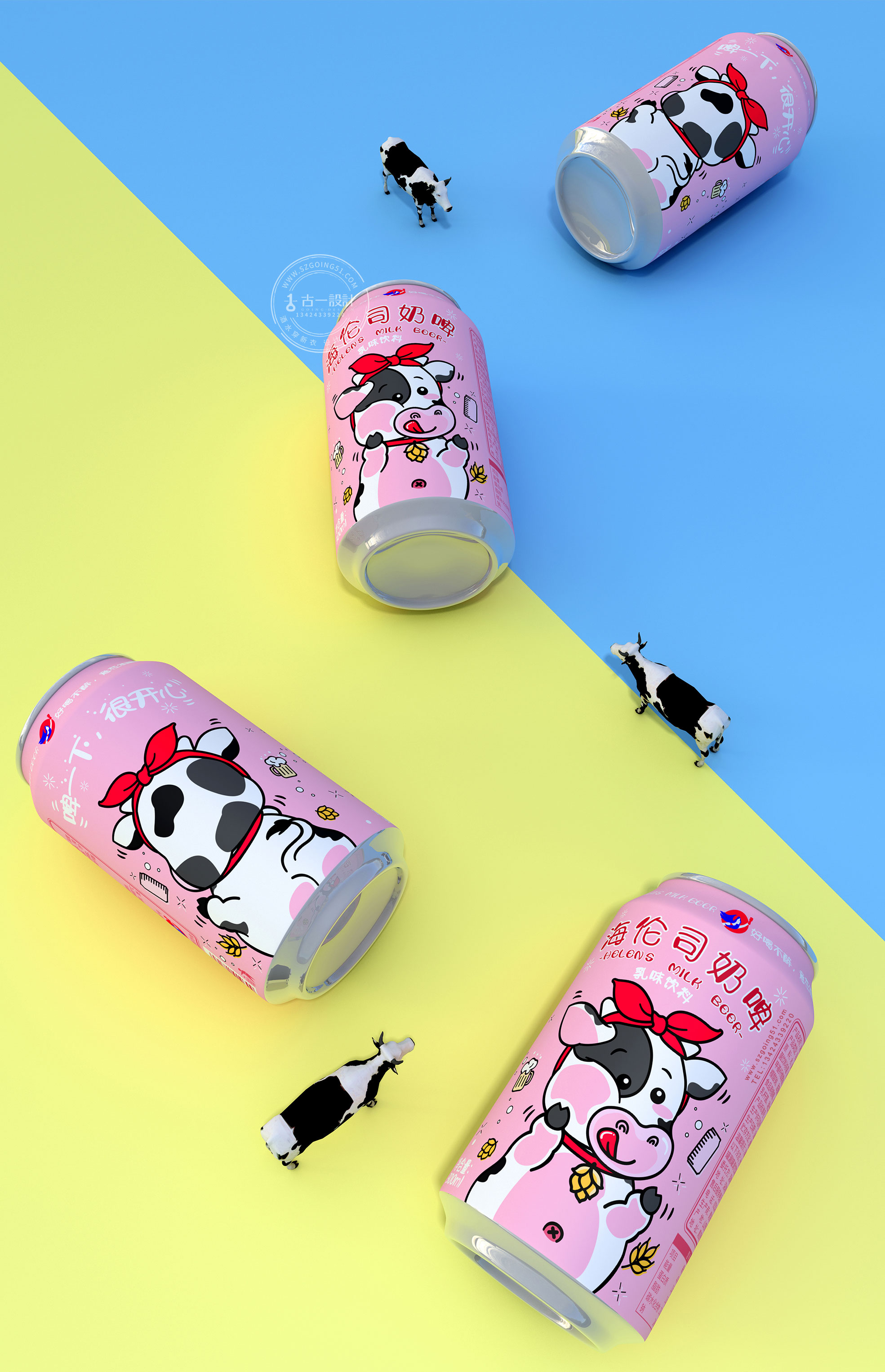
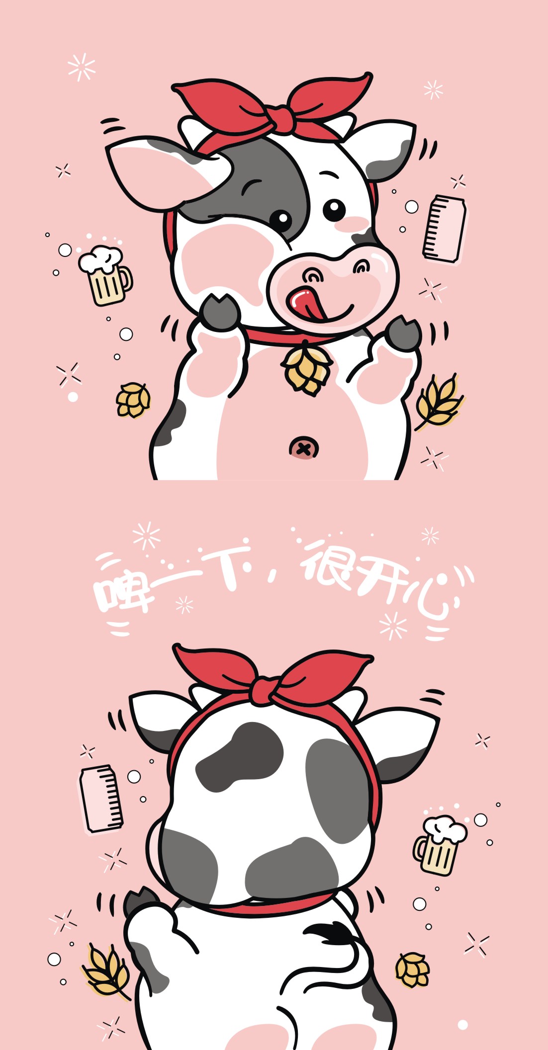
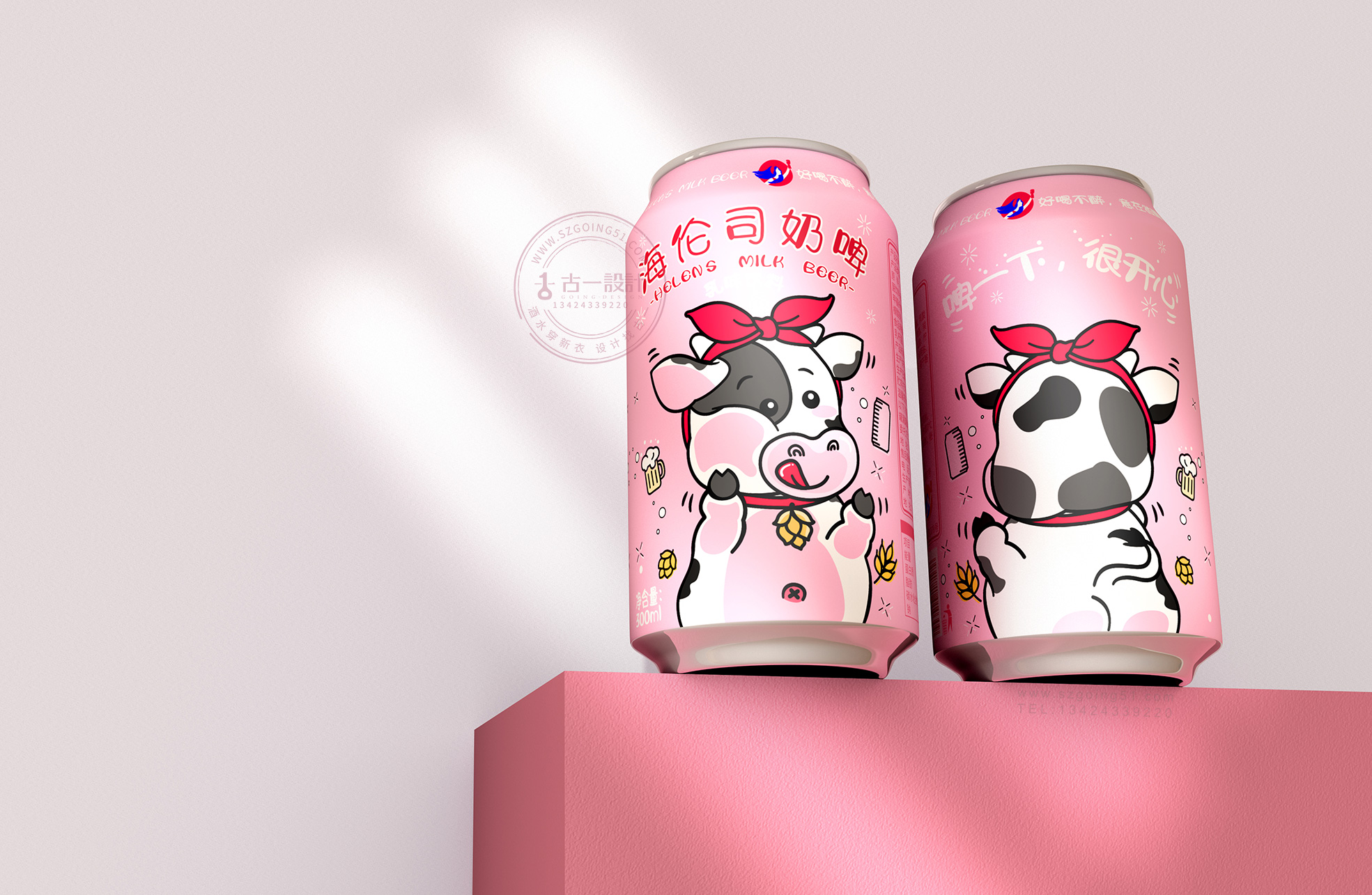
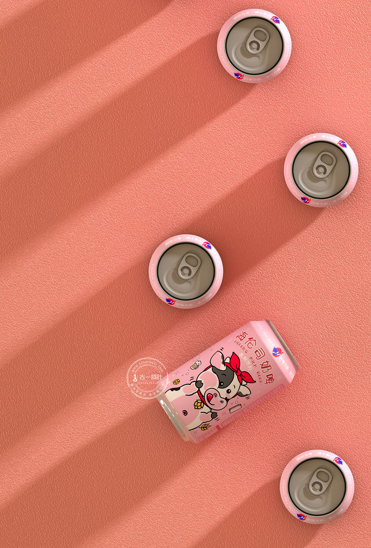
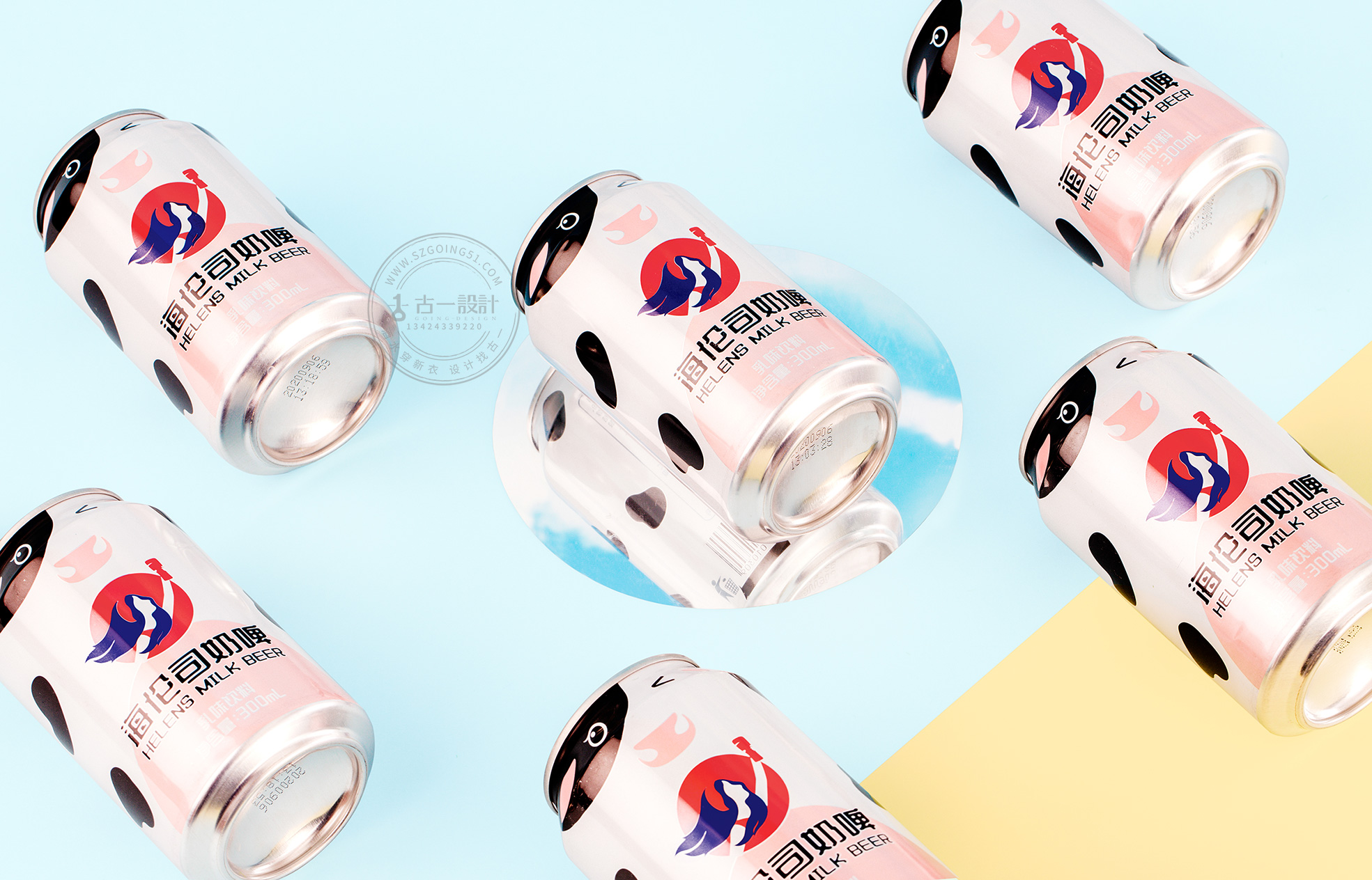
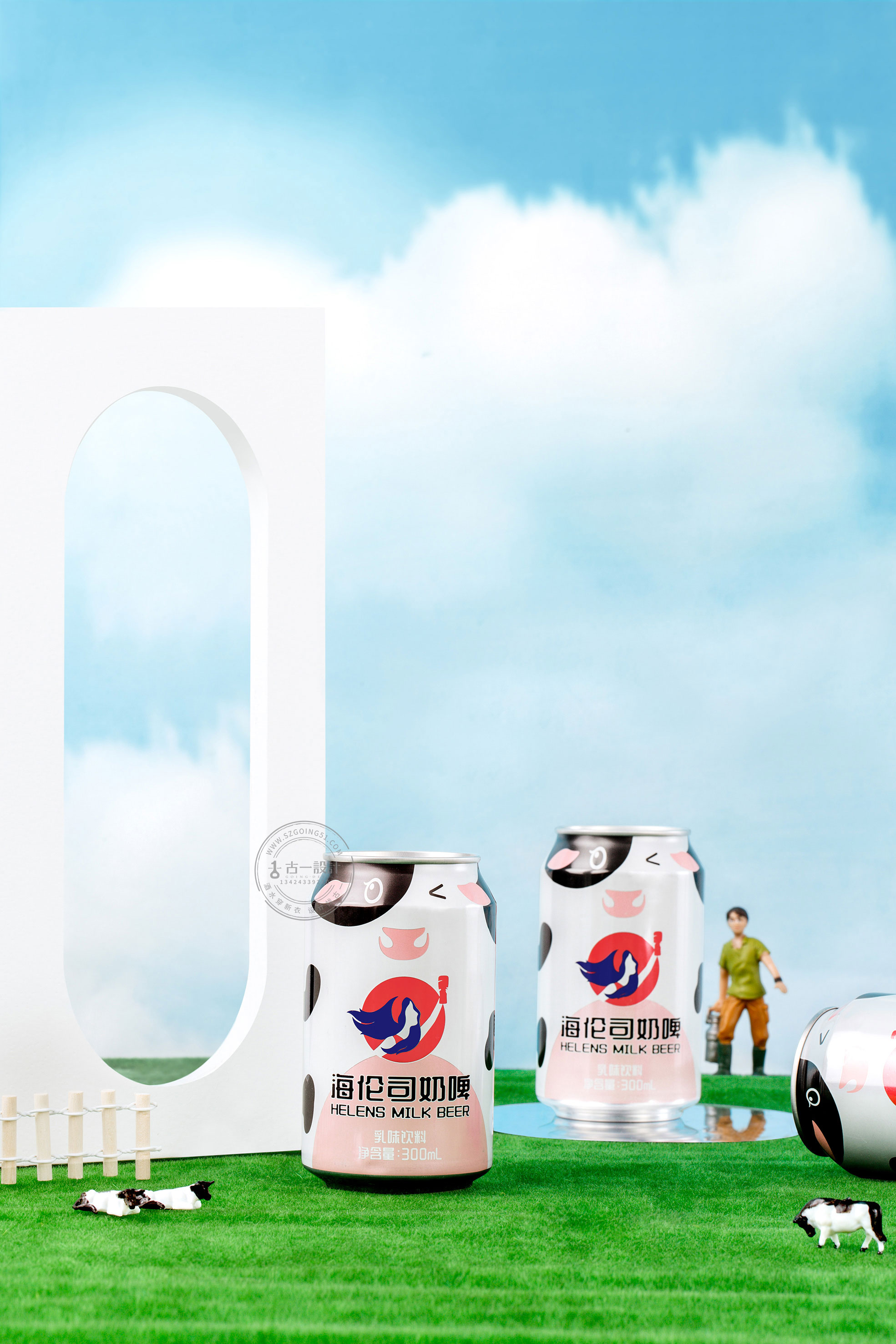
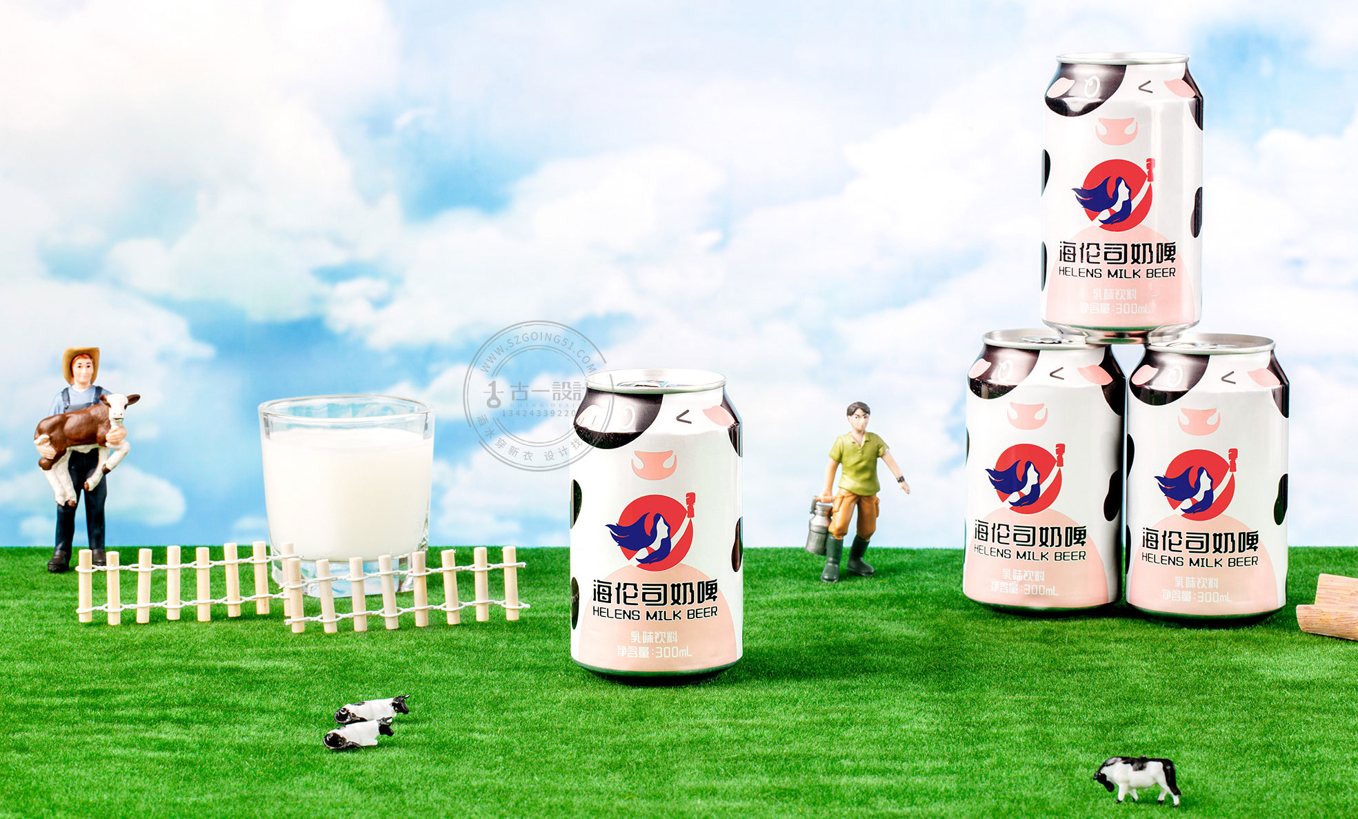
A small cow with a bow on its head.
Starting from the milk beer product itself, we use the small cow element as the main visual carrier, and inform consumers of the product type in the most straightforward way; through the hand-painted personified cartoon little cow image, we can get closer to the young people; graft the iconic bow on the head of Helen's logo goddess with the small cow to form a common memory point;
The main picture is a cute little cow looking at the milk beer in the cup, showing a kind of pity for people, but also showing the delicious and attractive effect of milk beer, which is very attractive to young people today.

The above is the result of our first proposal. The packaging design of a milk beer product around strengthening product attributes highlights the product itself through the most straightforward graphics and product names. This proposal was also unanimously approved by the other team members, but Helen's big boss felt that the style was too pink and tender and the picture was too complicated, hoping to further strengthen the brand name and simplify the picture.
Visual flattening
In view of the request put forward by the other party, in the second plan, we still take the maximization of product attributes as the main direction. The difference is to simplify the ip image of the previous cartoon cow and present the picture with a flat expression method. And the brand logo is presented on the package in the most straightforward form.


The first one is more in line with young people. Consumers will not pay close attention to it when choosing. At first glance, the second one only sees a logo that is not integrated into the picture. Although the second one is highly aesthetic, it deviates from the theme.
The former one looks so cheap, it will give people a kind of not worth the price, as a new category of consumers may not be very willing to try, the latter one is not bad, at least get rid of the previous one's low feeling.
Nice packing