At first, the customer only wanted to change the LOGO image and oil bottle appearance of some companies. However, after several contacts and on-the-spot investigation to the factory, it was found that only changing the image of one part of the company was not enough to change the essence of the enterprise. Therefore, after many researches and discussions, a complete set of image planning and transformation schemes from LOGO to product bottle type, corporate image, website construction and all graphic albums were finally determined, and finally reached a cooperation intention.
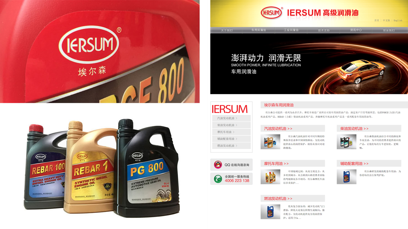
Elson is also a second-tier brand leader in the field of automotive oil. After more than 20 years of operation and development, the factory has also formed a certain scale. If you want to grow faster and achieve the position of the industry leader, it is time to break through the bottleneck of your own industry. The corporate image since its establishment in 1990 is old and old. It has also lost the vigor of the year, reflecting the symptoms of old age and infirmity. To change, it must be drastic.
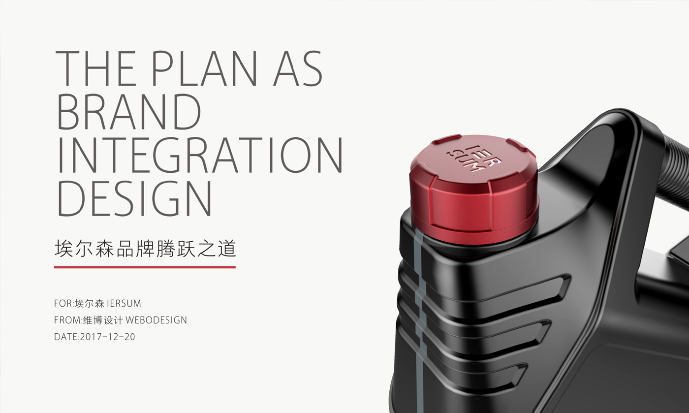
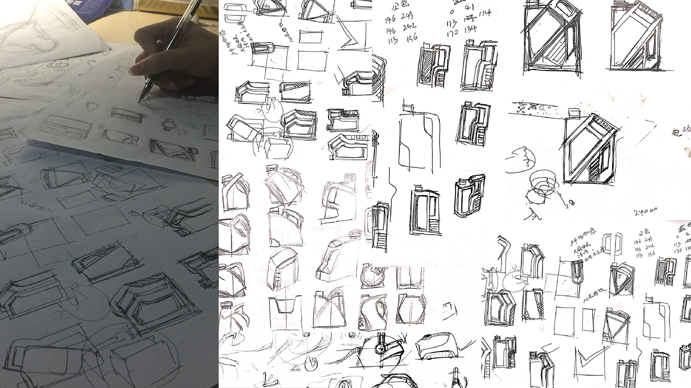
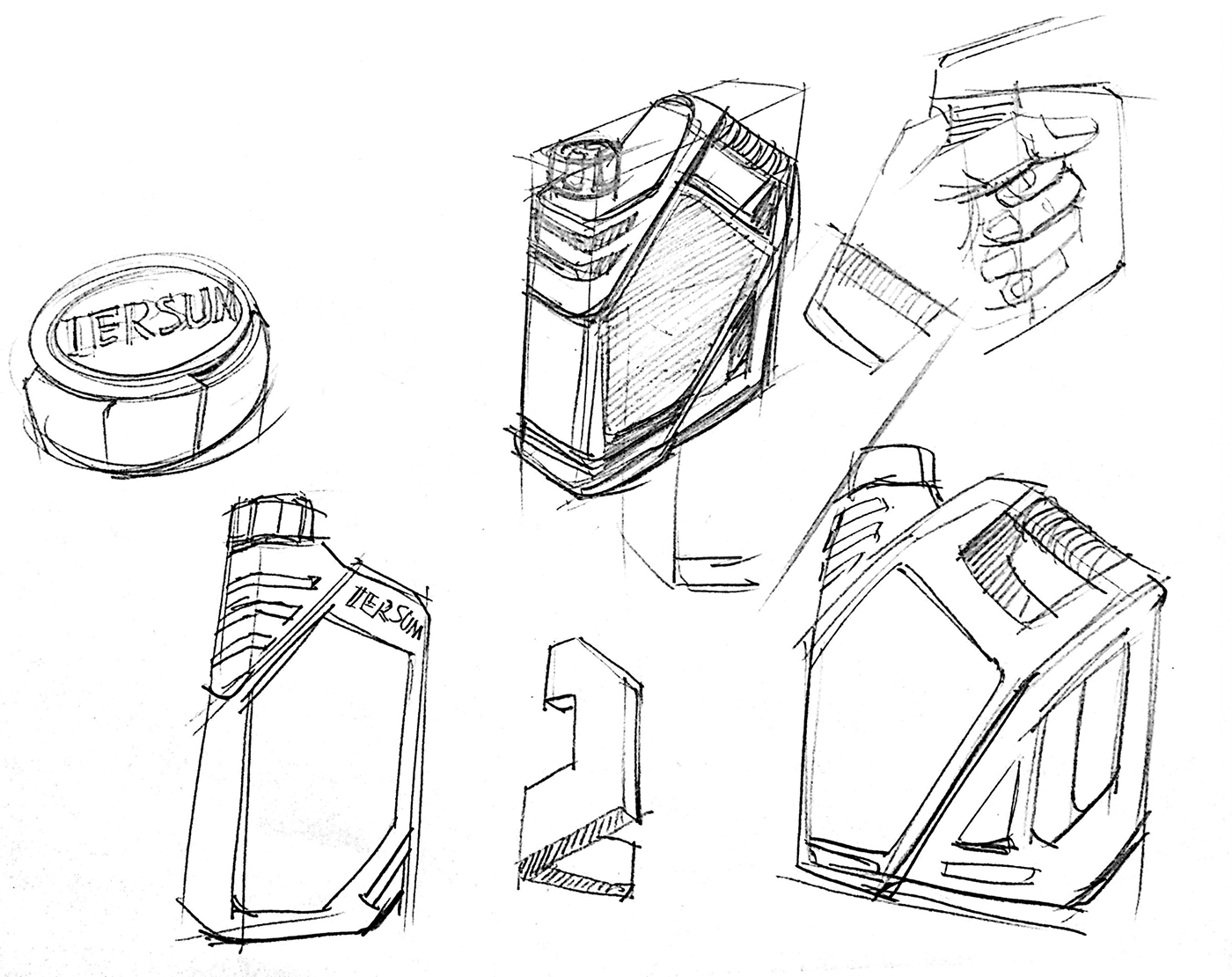
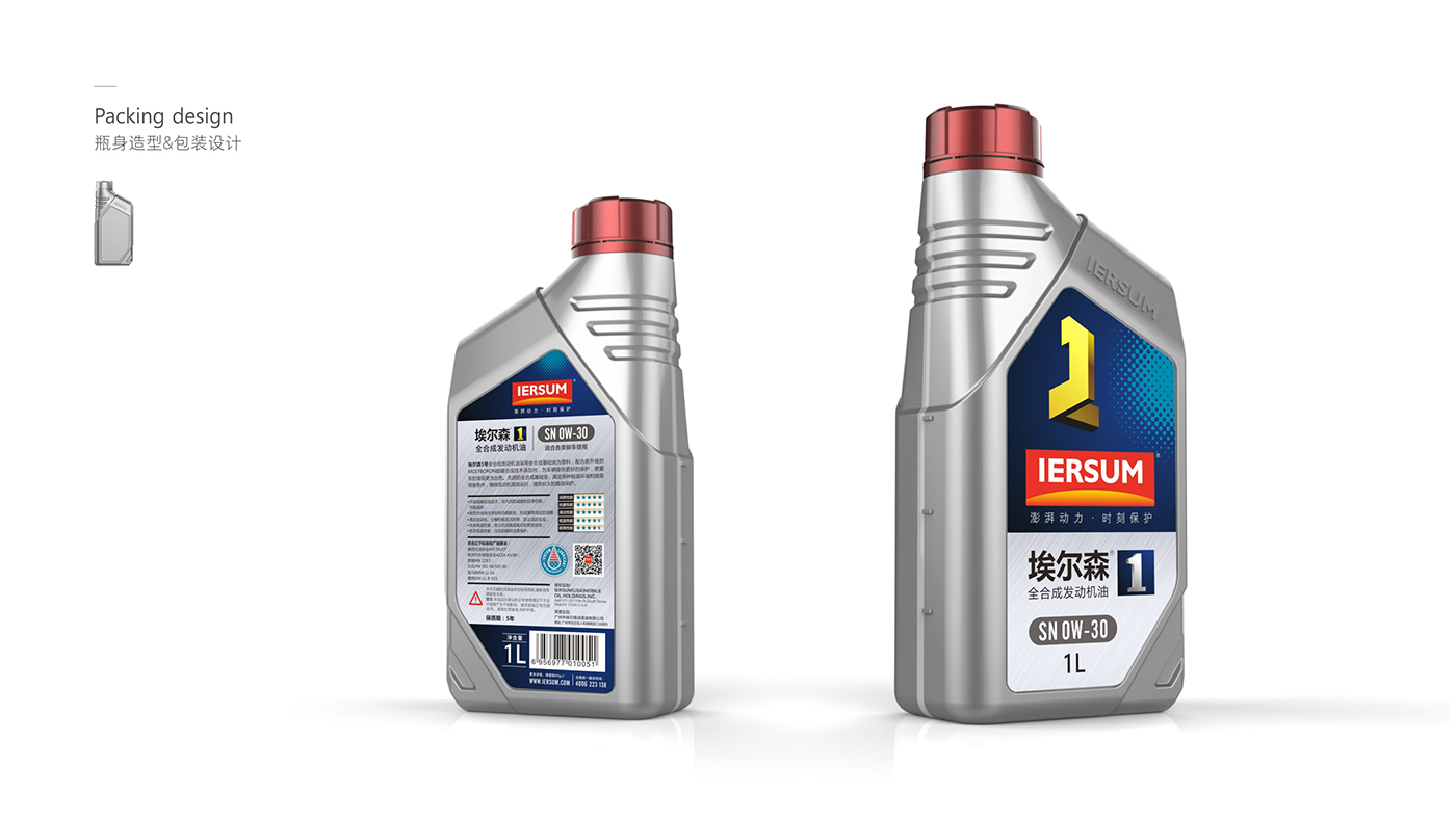
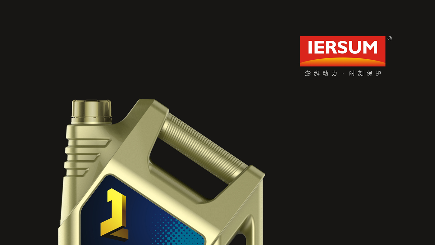
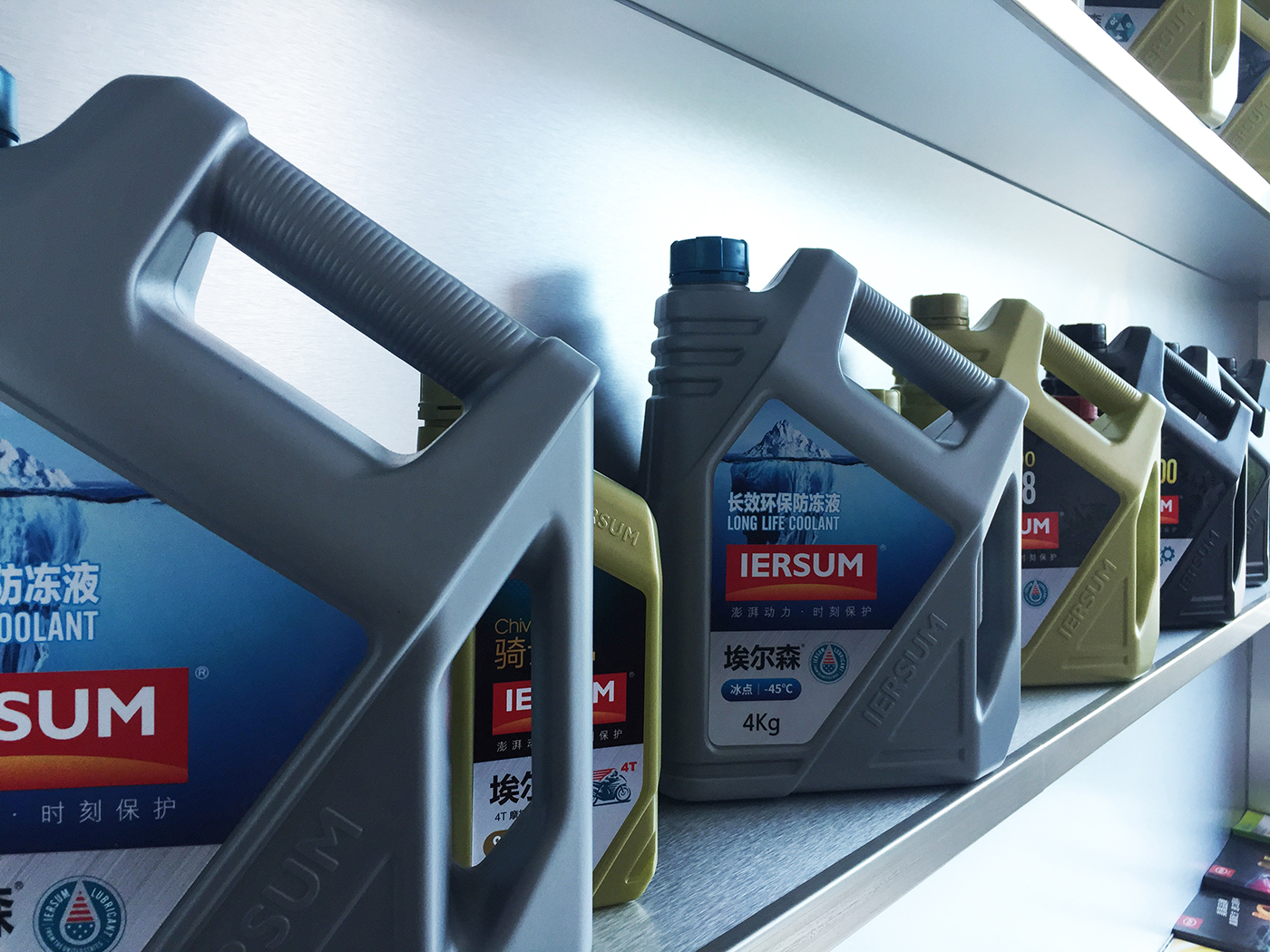
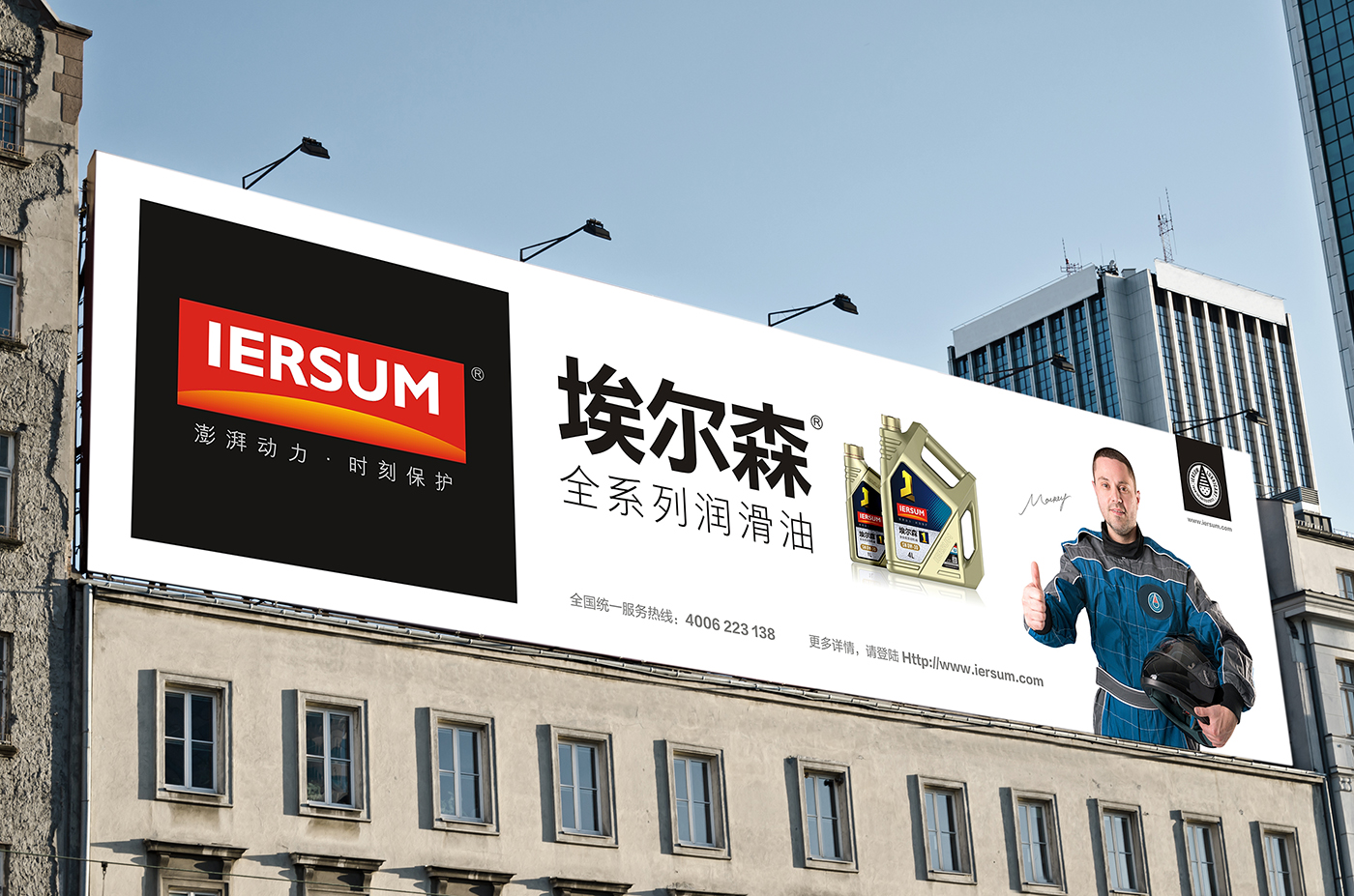
We first consider the two main categories of LOGO and bottle type. The original corporate LOGO is complicated, and the font is not beautiful enough, so it is difficult for users to have effective memory. Therefore, we have used a minimalist design direction. The font is thick, clear and distinguishable in bold and bold, stable and generous. The arc below symbolizes the rising sun, and red represents enthusiasm, implying that the energetic team of Elson brand provides considerate service to our customers on time every, it also means that the Elson brand is getting more and more popular. Bottle design is also one of our design priorities. The most intuitive contact with consumers is the oil bottle type, so the research on modeling and ergonomics is our top priority. After repeated deliberation by the Weibo design team and drawing a large number of design sketches, after the final screening and review, the initial proposal we provided three different style design directions for customers to choose from, and we finally selected the current finished product plan. We have summarized the multi-curve and complex shape of the old bottle, and it is difficult to distance itself from other brands in visual recognition, and it is not eye-catching on the shelf, making it difficult for consumers to choose. Using the current popular concise style trend, the newly designed bottle shape has a simple and tough appearance. The two inclined main lines of the large body extend a handle shape, which has a strong visual impact and is suddenly separated from the bottle shapes of other brands. The circular anti-skid design of the handle not only meets the functional needs of the handle, but also enriches the detailed design of the bottle. The design of the double handle is more convenient, quick and user-friendly when consumers operate oil pouring. Bottle sticker design can be replaced according to different categories and integrated with finishing. The bottle type is distinguished by three grades: gold, black and gray, which is easy to identify. On the basis of the 4-litre bottle, we have also extended a 1-litre vial design to make the visual image more unified. Consumers can identify Elson enterprises through bottle shape, so as to achieve mutual promotion.
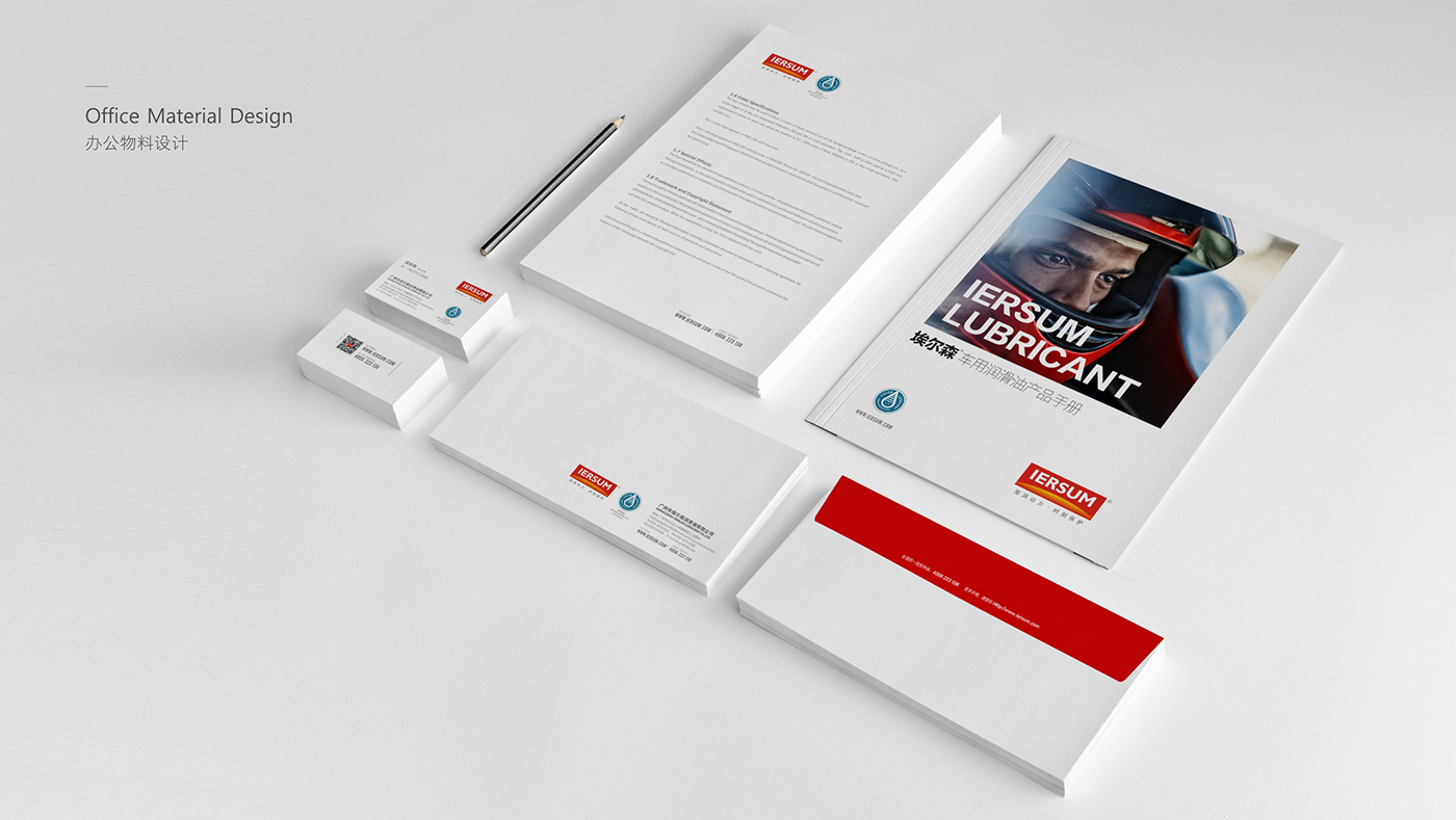
After the key transformation of LOGO and bottle type, the later categories of graphic picture album, website construction and WeChat public number construction have also been completed one after another. After more than half a year of design extension, a refreshing corporate image has finally emerged.






The copyright of this work belongs to 维博设计. No use is allowed without explicit permission from owner.

New user?Create an account
Log In Reset your password.
Account existed?Log In
Read and agree to the User Agreement Terms of Use.

Please enter your email to reset your password
Oh! My God, this is really a wonderful design.
Activate the brand through design to solve problems
Great job!