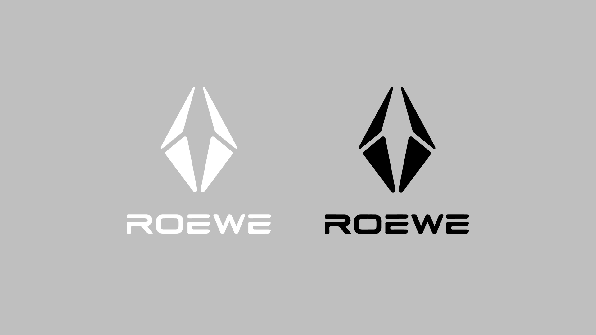
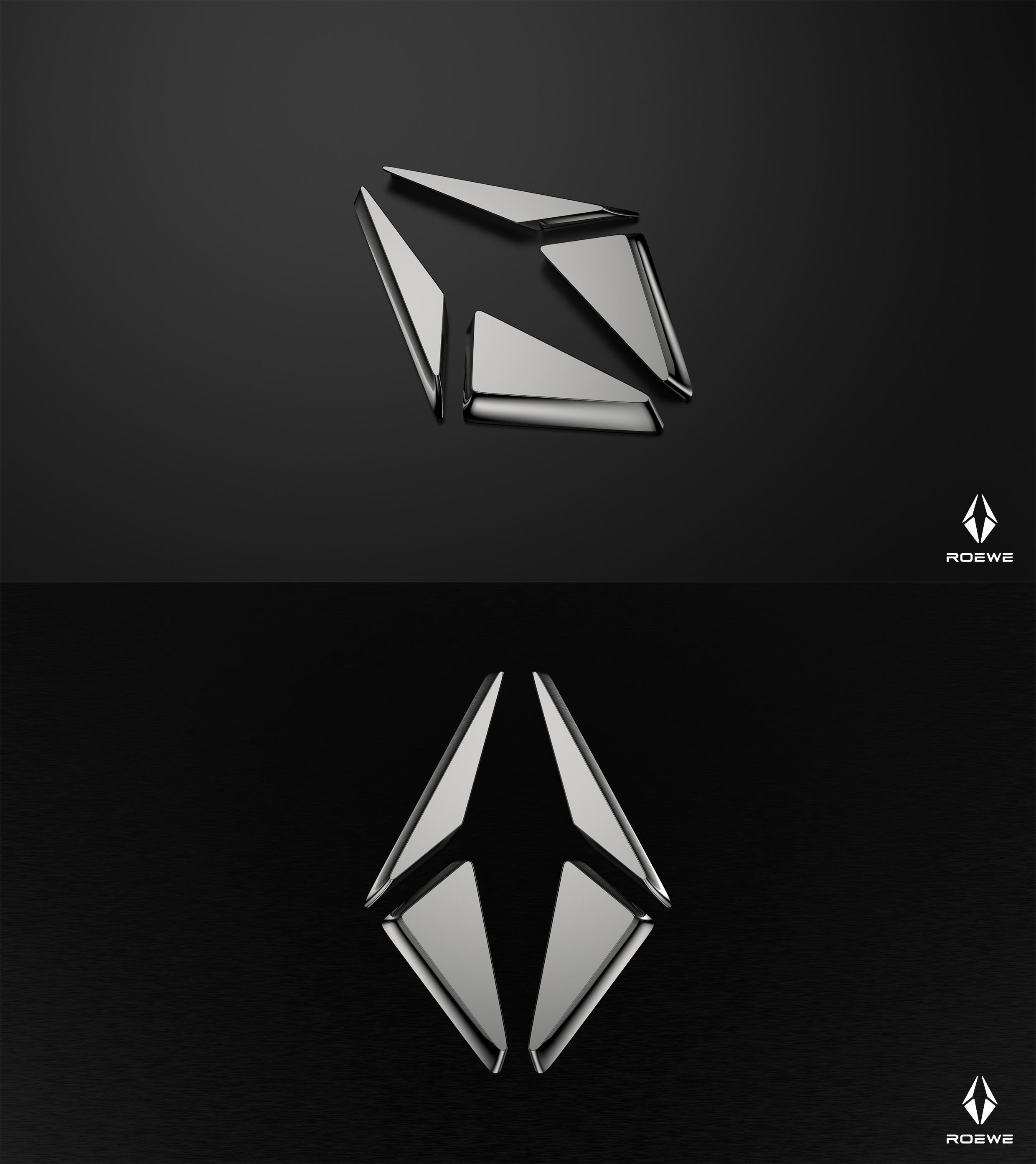
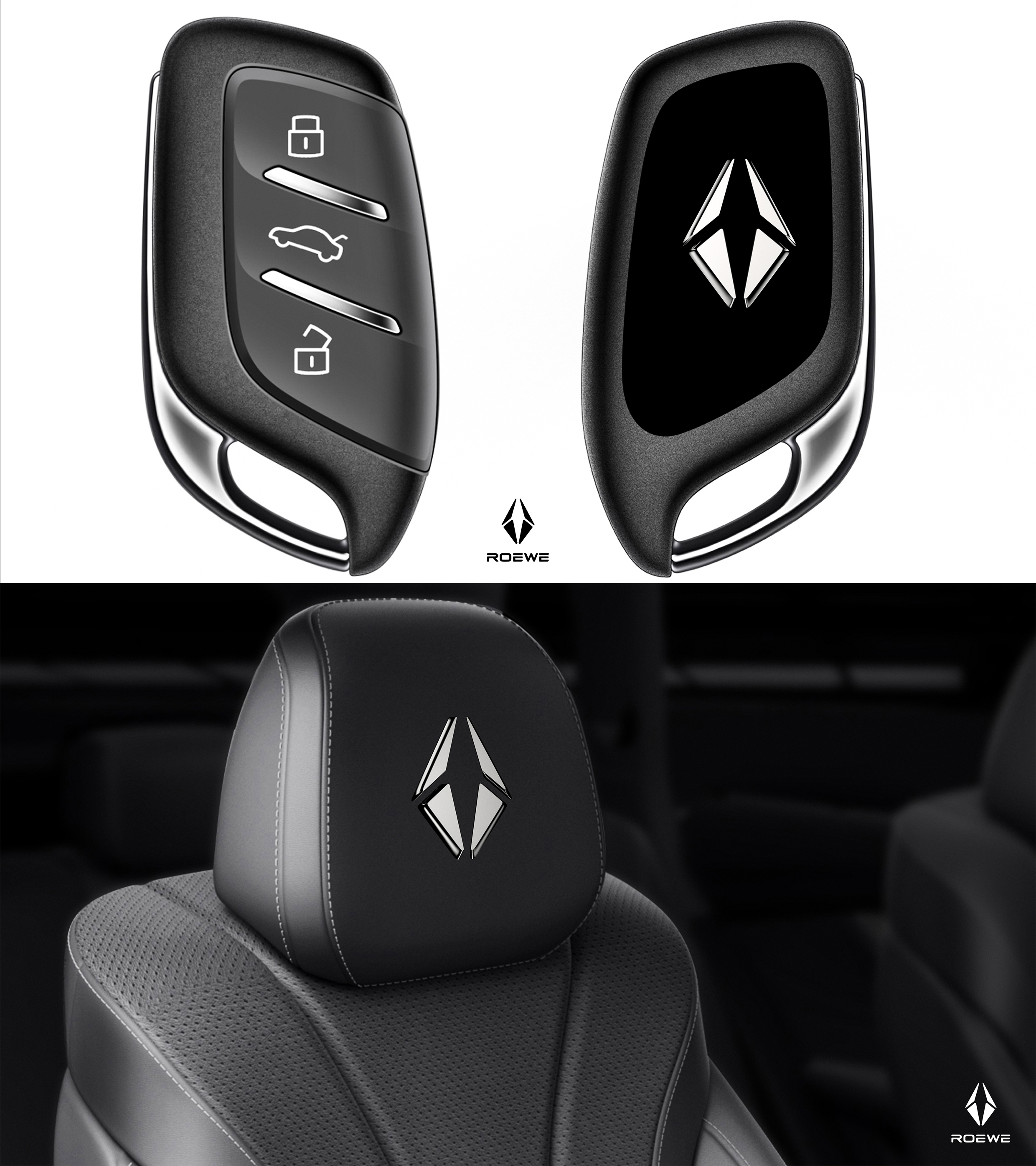
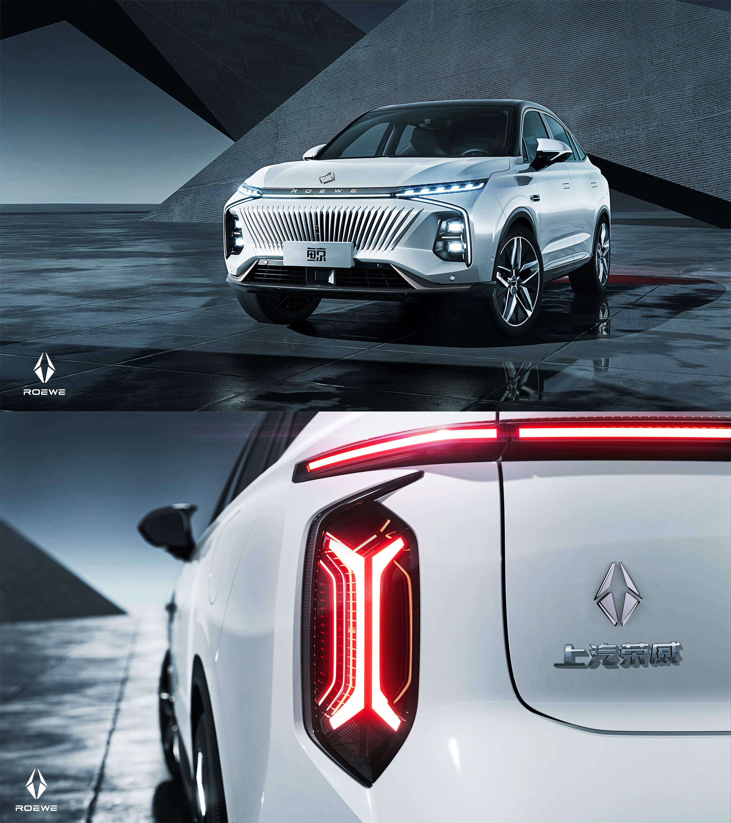
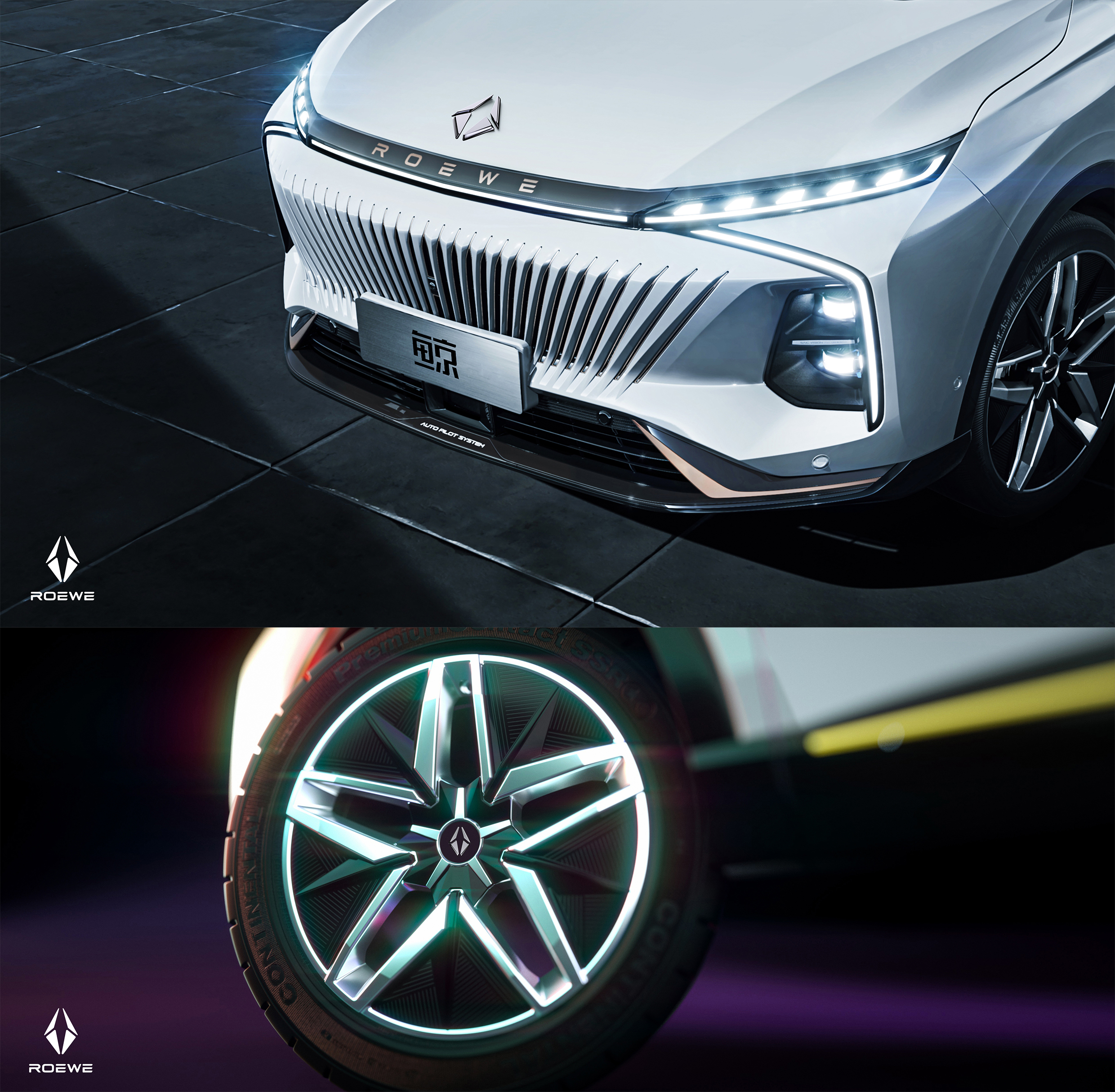
The LOGO combines the modeling style of SUV -- Rongwei Whale, and designs a LOGO that conforms to the design concept of "Whale". Rongwei's new SUV "Whale" means to carry life. As can be seen from the design language of LOGO, it can effectively ensure the safety and comfort of users just like the life held by both hands. The hollow part of the car logo is the shape of a whale, and the geometric shape is used for brand interpretation. It is angular, simple and fashionable, and full of personality. Can bring deep impression and lasting memory to users.
The copyright of this work belongs to 洋洋. No use is allowed without explicit permission from owner.

New user?Create an account
Log In Reset your password.
Account existed?Log In
Read and agree to the User Agreement Terms of Use.

Please enter your email to reset your password
I can see that I want to express the whale's intention, but it is relatively stiff. If it is estimated that it can still have better results in other fields.
The feeling of imposing it!
It's still ugly, the designer's level is not good!!!
The whale that is too abstract and negative is also very stiff and has no lasting appeal. First, it feels like an airplane is not very good on the front of the car. The winning charm and the front effect are still acceptable.
Thank you for your advice.
Logo appreciation is too subjective. Personally, I feel that this design is a bit rough, completing the impression of no whales
Video can be
Not bad!