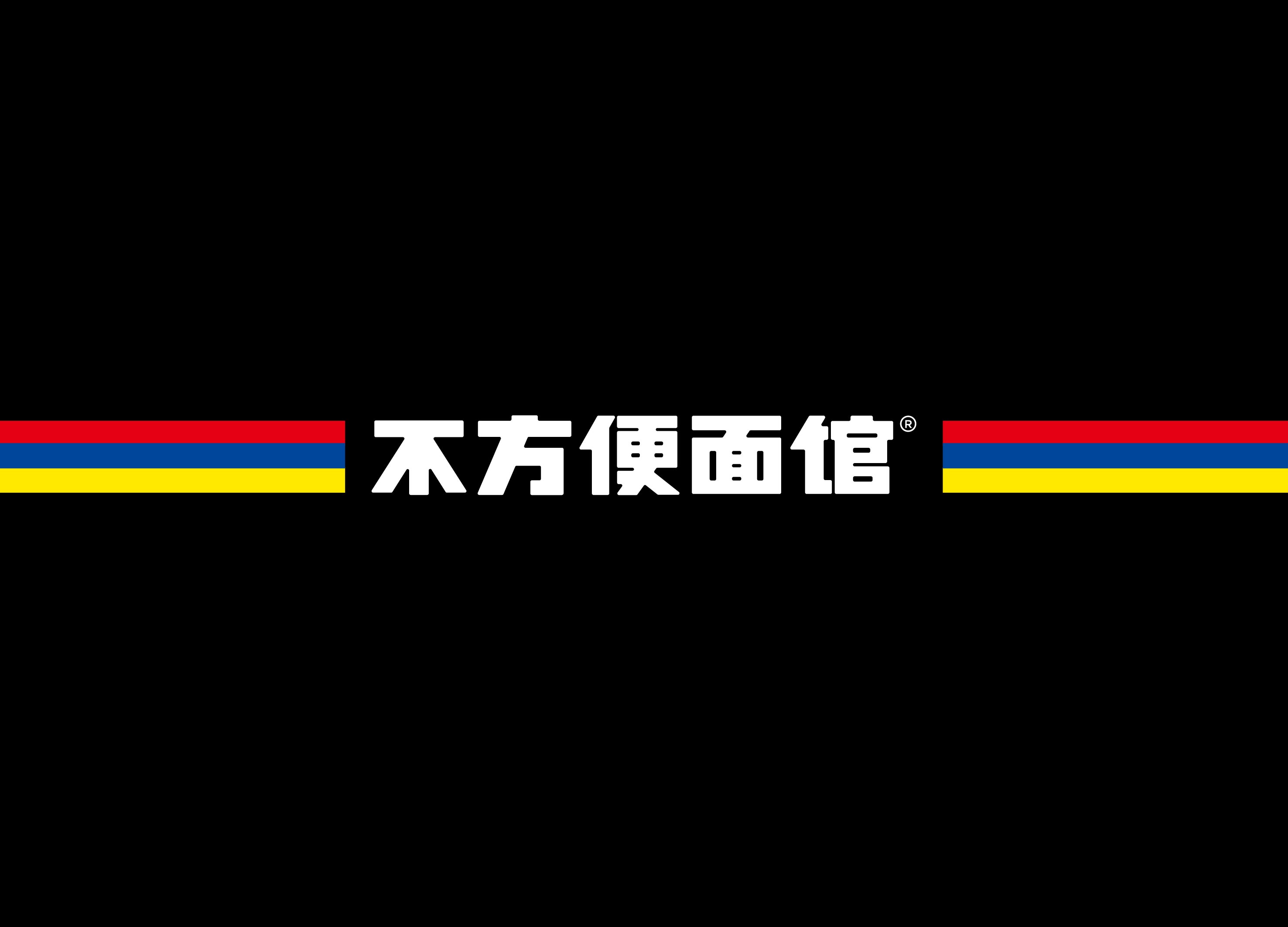
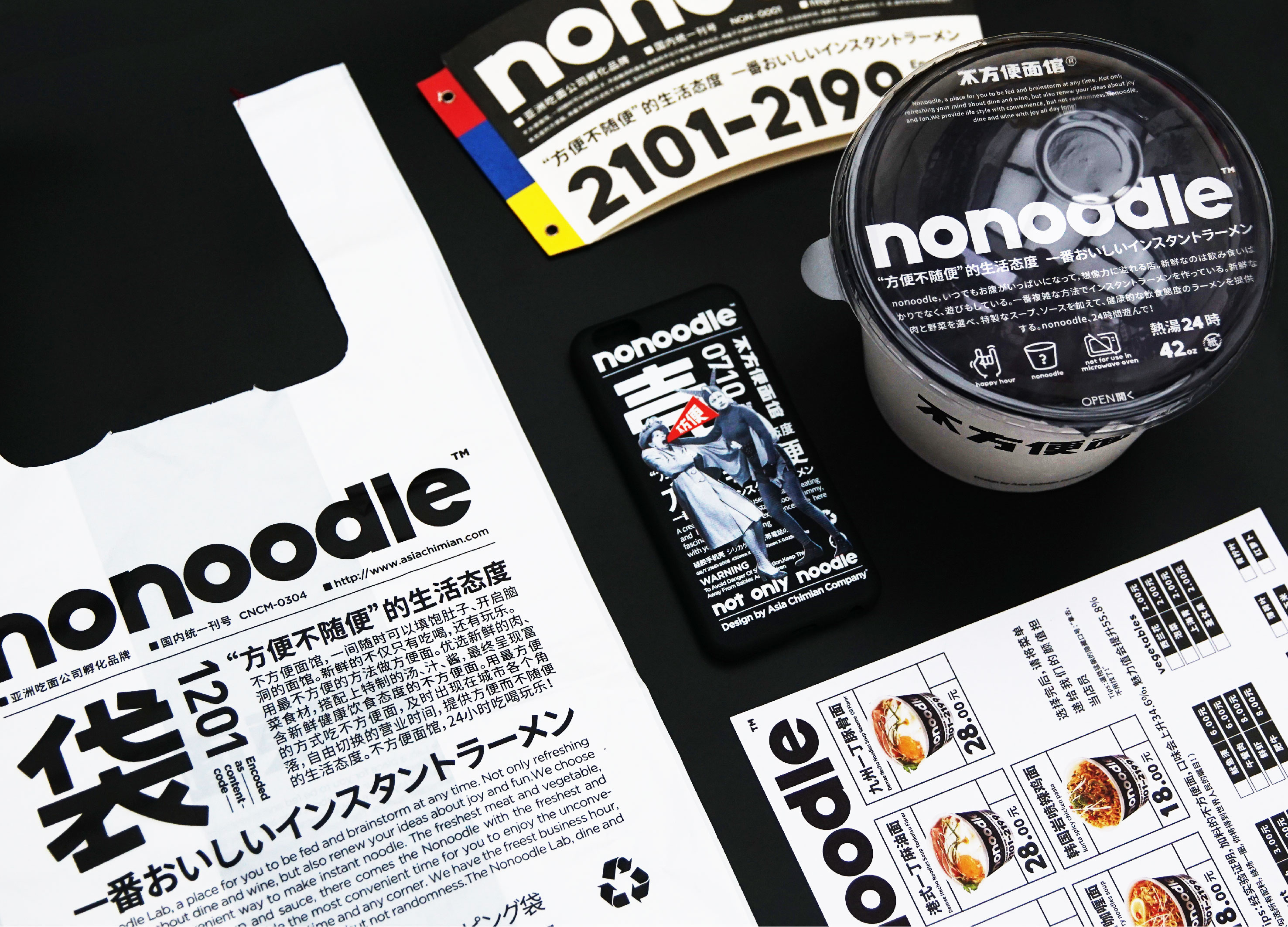
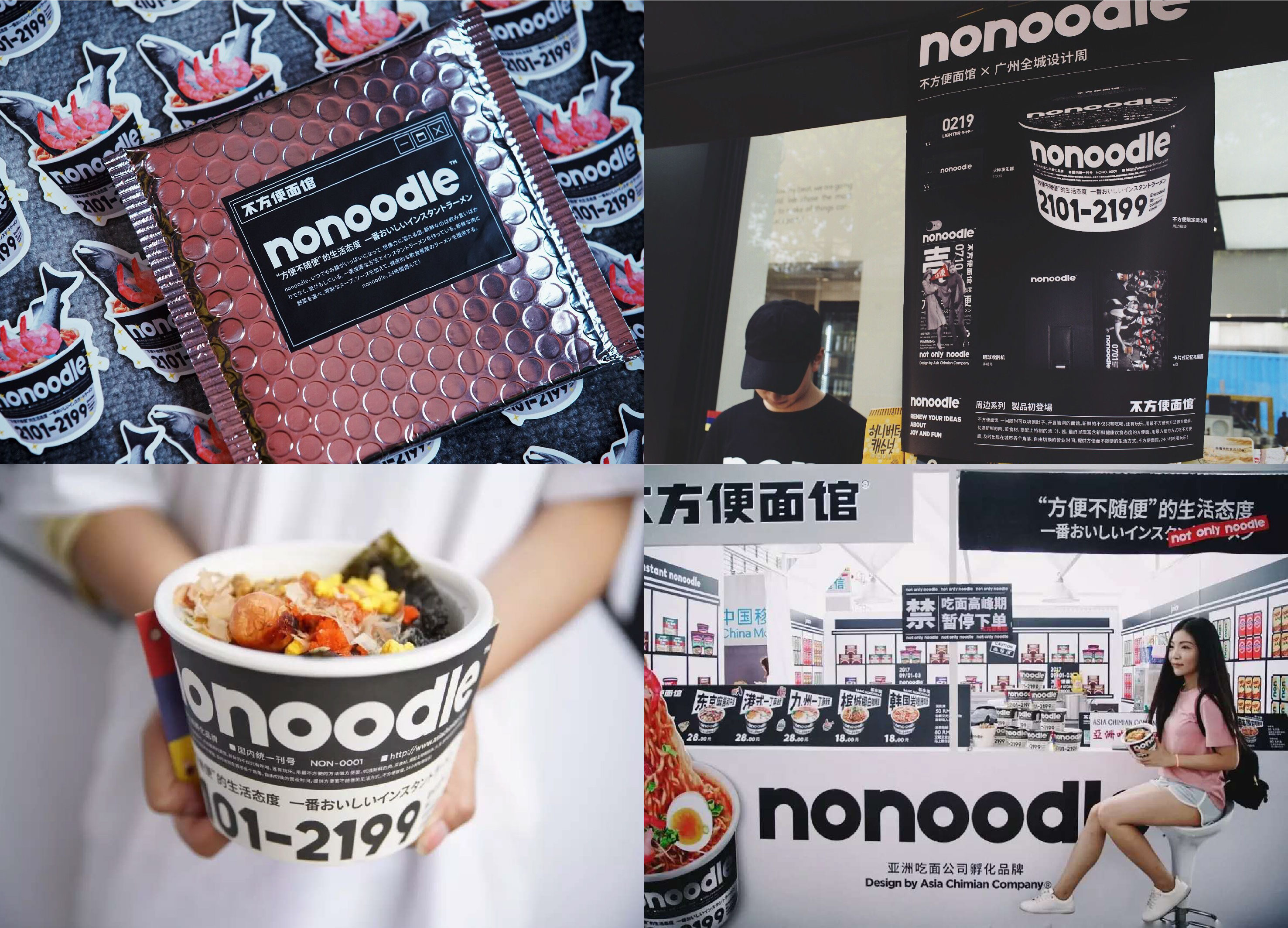
With consumption upgrading as the background and "face" as the carrier, we should face consumers directly, transform creativity into commercial value, and solve the rigid needs of life and social scenes for the "young people" in the city. At the same time, a new mode of "24-hour eating, drinking and playing" will be created, combining black and white ultra-modern fashion style to provide convenient high-quality catering, fashionable and fun life experience. It has attracted young people from all over the network and KOL, a big coffee from all walks of life, to clock in and visit the store, making the genes of eating, drinking and playing continue to stir up, and brand awareness has soared. Fashion young restaurant brands, font design must have a unique personality. The brand text of the inconvenient noodle shop is divided into Chinese "inconvenient noodle shop" and English "NONOODLE". The main color is black and white with strong contrast, which has visual impact. The signboard application and brand fonts are matched to represent the three primary colors of Asian noodle eating companies, with an ultra-modern trend. The brand identification with high degree of identification can be fully extended to the daily design materials, and the promotional materials and products that are inconvenient for noodle shops can be identified at a glance, thus conveying the brand information more efficiently and attracting more young people.


Country
China
Year
2019
Client
Asian noodle company
Affiliation
Asian noodle company
Designer
miao
The copyright of this work belongs to K-DESIGN AWARD. No use is allowed without explicit permission from owner.

New user?Create an account
Log In Reset your password.
Account existed?Log In
Read and agree to the User Agreement Terms of Use.

Please enter your email to reset your password
Comment Board (0)
Empty comment