This article is only a discussion of the general visual law of modeling, is only a personal opinion, and cannot be used as an accurate theoretical guide!
First put forward the conjecture:
From the perspective of human evolution itself, the pursuit of security is an instinct that no living thing can abandon.
In the long-term labor practice of the day after tomorrow, people slowly understand what kind of structure is easy to break off and what kind of structure is stable (there is a lot of room for divergence, aesthetic has class nature and knowledge group nature, and will be explained slowly in detail in the future)
For example, houses lacking beams, chairs, and a lock on the scaffolding has loosened,
When a snake bites him for ten years, he is afraid of brocade ropes. This refers to people's reflection on life. When a ladder collapses, people fall from it. Next time, they will be alert to whether a screw is loose or whether the ladder needs to be fixed.
So is it possible to visually intersect the graphics, whether it is positive or negative?

The following scaffold diagram is often taken as an example. The scaffold is stable because each steel pipe plays a bearing role and maintains the whole,
First of all, it is clear that the five senses of human beings co-evolve with the brain. Looking at the red fruit, it is soft in hand feeling, sweet in taste and fragrant in smell. Human beings are creatures that are good at summarizing. Therefore, what we see and touch are stored in the brain as information for future benefits and avoidance.
The skewed spine is unhealthy, and the eyes of others look crooked and unsightly.


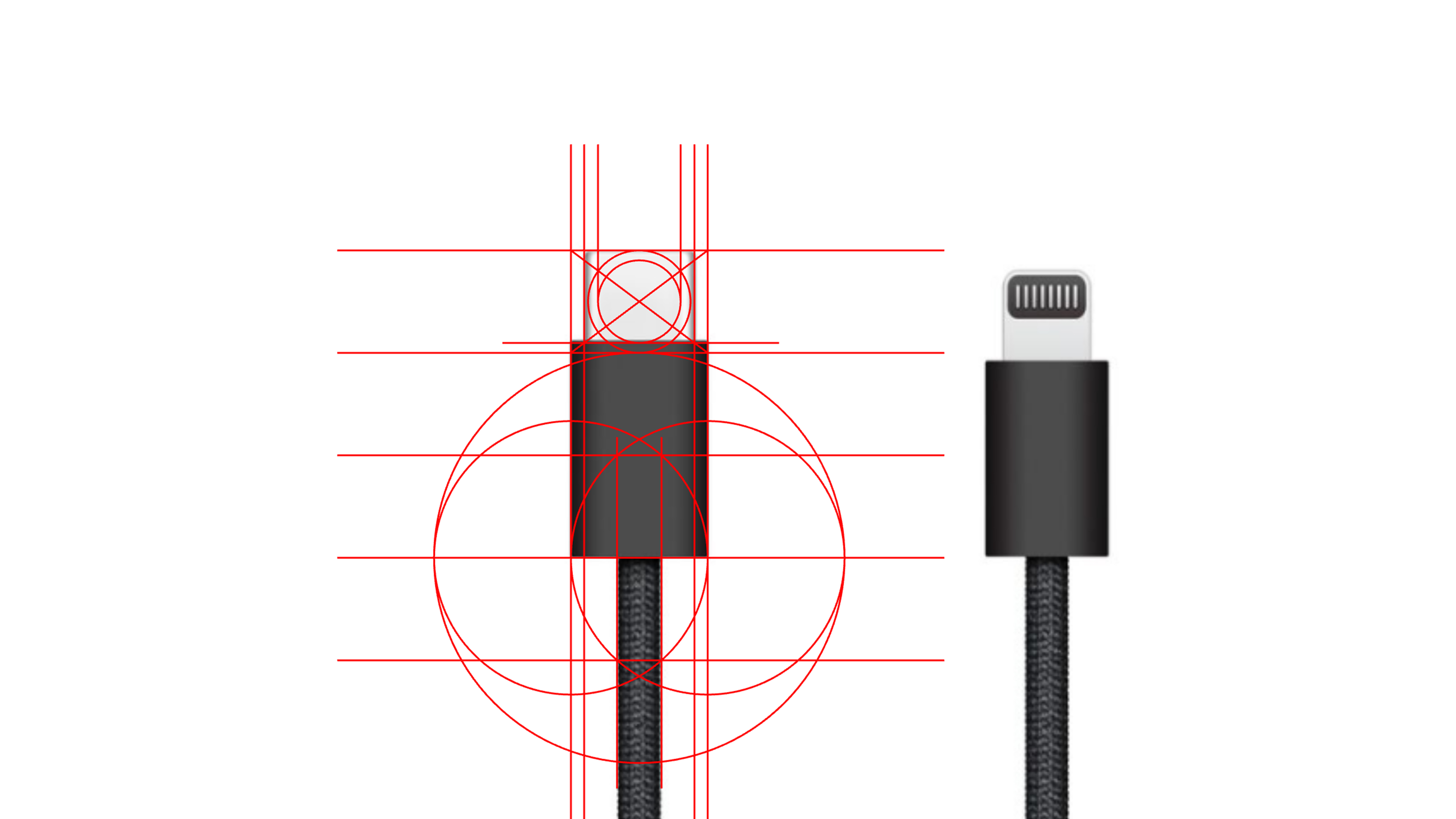
The following is the visual concept of Apple products:
(There may be over-interpretation in the picture, but generally I think we can be consistent.)
It can be clearly seen that Apple usually follows extreme materialism to guide design,
The extremes here are extremes that follow the way human vision/brain discerns objects, that is, extremely reasonable.
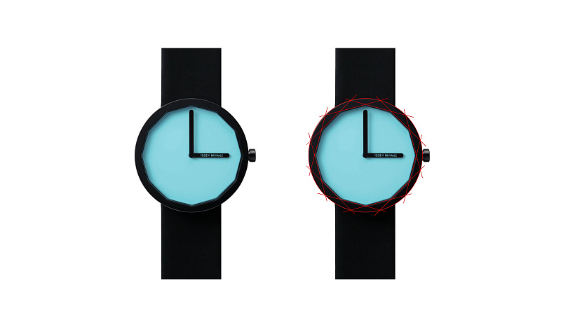
The single plane shape has caused the universality of a group of human beings.

The original Apple headset box can be said to be solid in terms of visual layout, and none of it is a waste pen:


The copyright of this work belongs to 陈宪. No use is allowed without explicit permission from owner.

New user?Create an account
Log In Reset your password.
Account existed?Log In
Read and agree to the User Agreement Terms of Use.

Please enter your email to reset your password
The analysis mentioned earlier is somewhat similar to the generalization principle, and the later segmentation study is very interesting. It feels like some of the contours of architectural design have something in common
The analysis is really good, comparable to textbook analysis of writers' works
Apple's first-generation headphones look at your circle drawing. It doesn't conform to the golden ratio. It won't come back.
The grades drawn with circles are different.
This is what I have been thinking about before, the influence (help) of graphic design (visual design) on product design. Excellent product designers are not bad at graphic (visual) level.
Niubi
Teaching and teaching
Circle circle circle circle, painting feel good cow force shape design
Chen Zong Niu Force
Design great god
It really has the meaning of reference. I feel that the painting style is a bit casual at ordinary times.
Thank you, it is enlightening , but it is also inappropriate to talk about the form without the function.
Although there is a problem, where is the meaning of this geometric division? In addition to dividing the lines, why is this so?
You know how to look
You can tell stories