This car waxer was one of the first design projects I led when I joined Beisi in 2022.
Insights and Definitions:
At that time, the products on the market were generally "silly, big and black", and the blunt design language brought users a higher psychological and use threshold.
My design strategy-from "estrangement" to "affinity" of the triple design decoding:
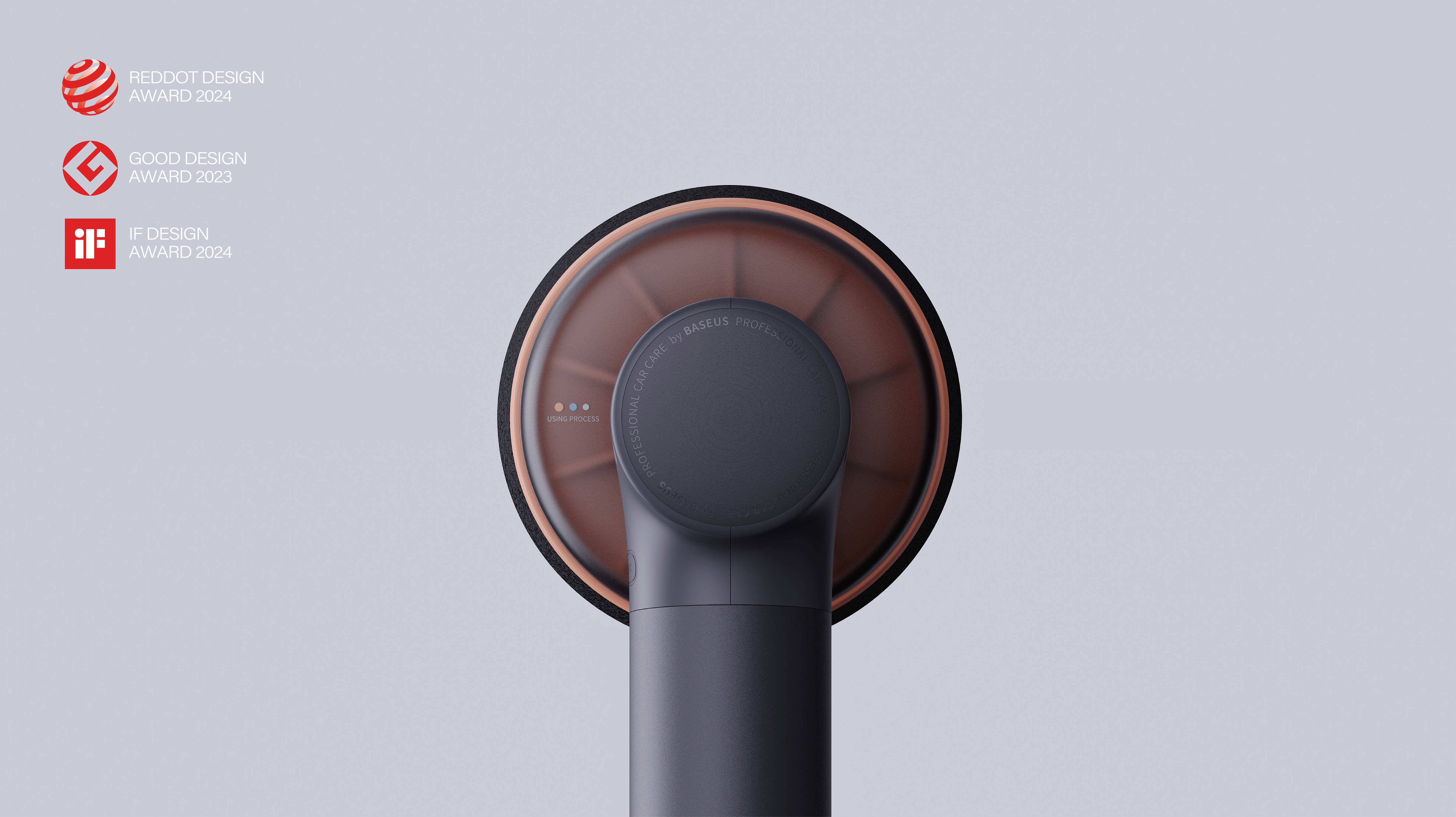
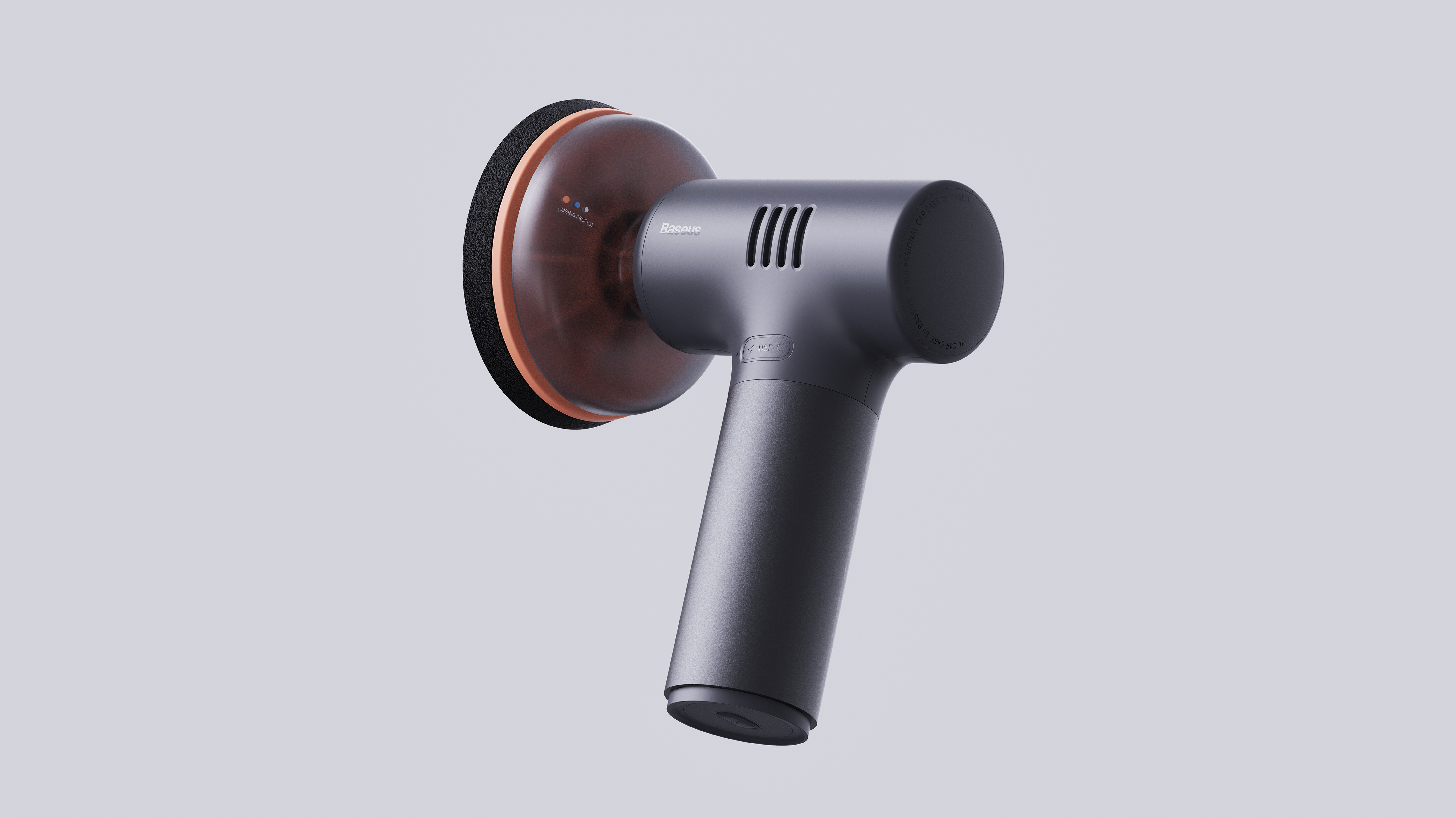
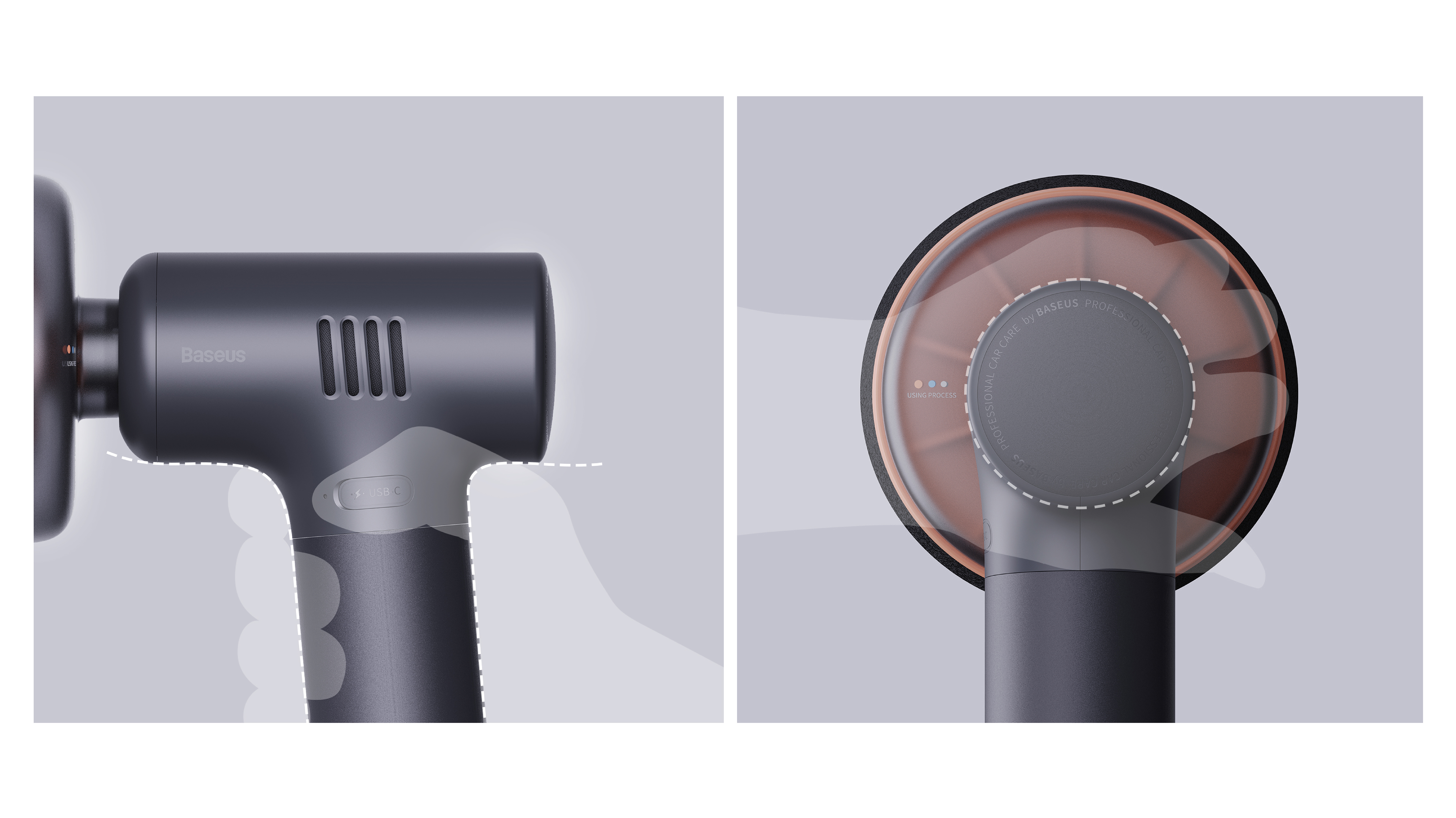
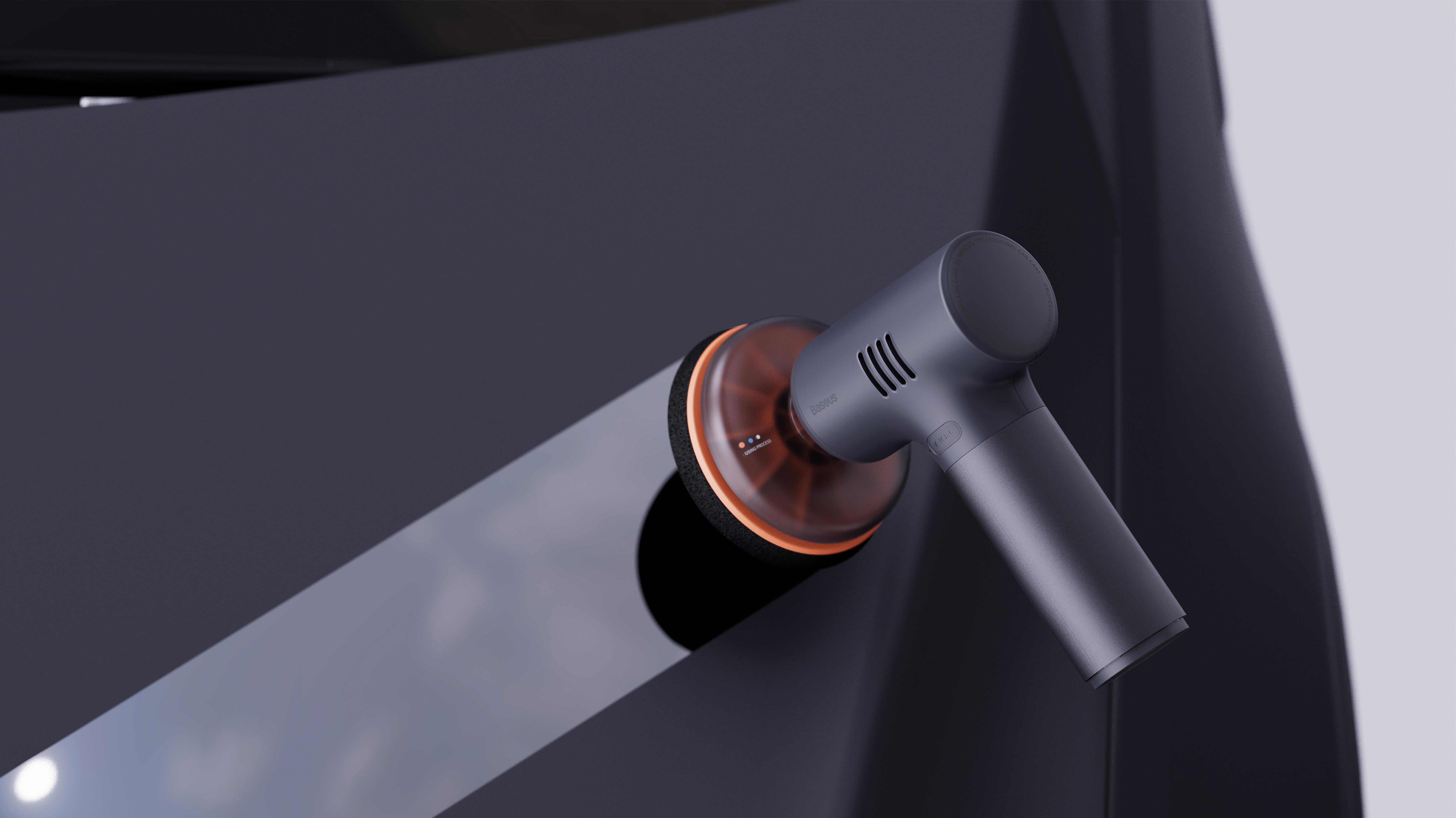
🟠Dispelling barriers with curves: We have completely abandoned the sharp design language and adopted the friendly and soft streamlined language. This is not only for visual elegance, but also a psychological hint. Every curve of the product is to convey the signal of "friendly" and "easy to use" to the user, reducing the psychological burden of the user before starting from the first sight.
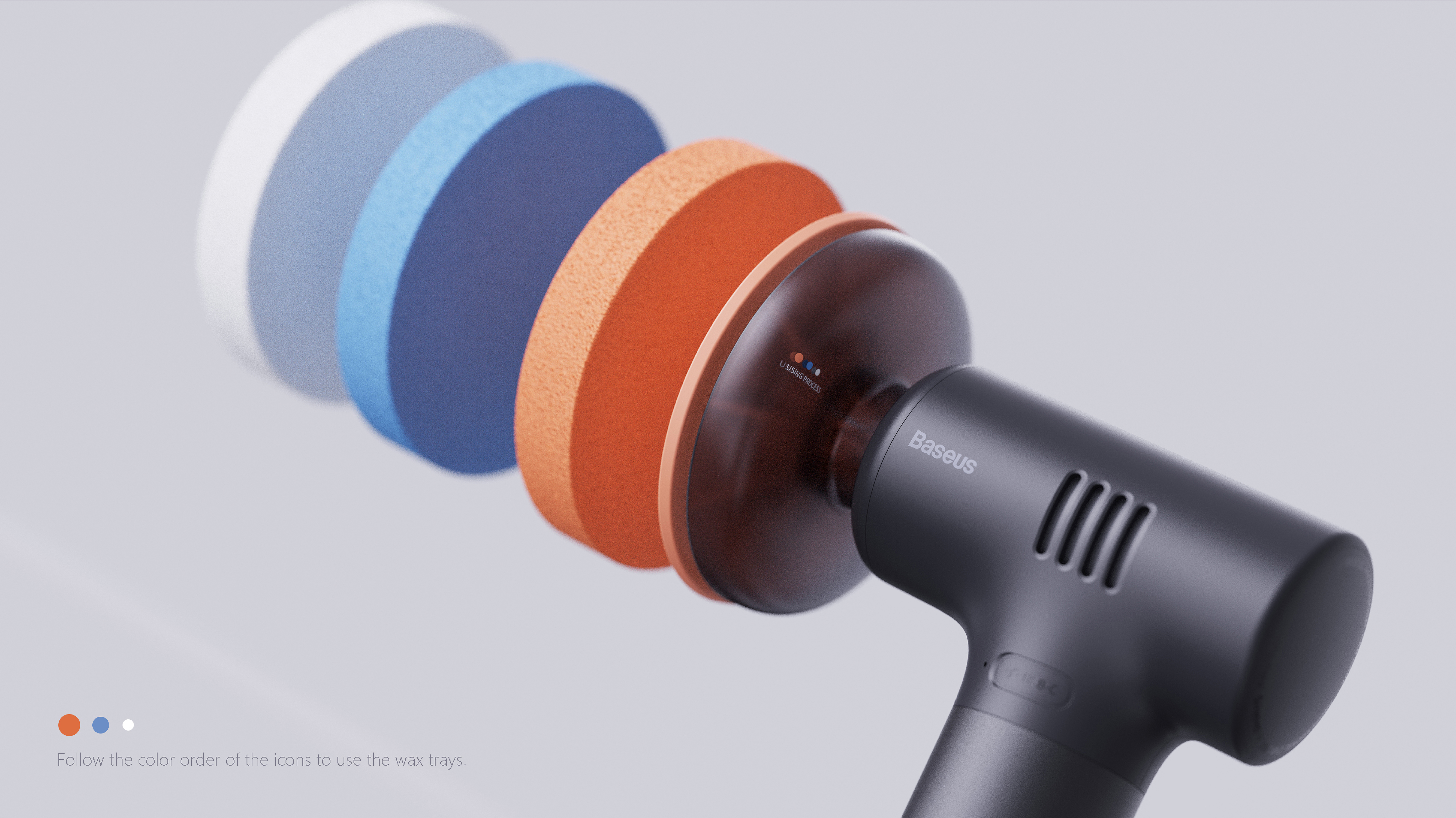
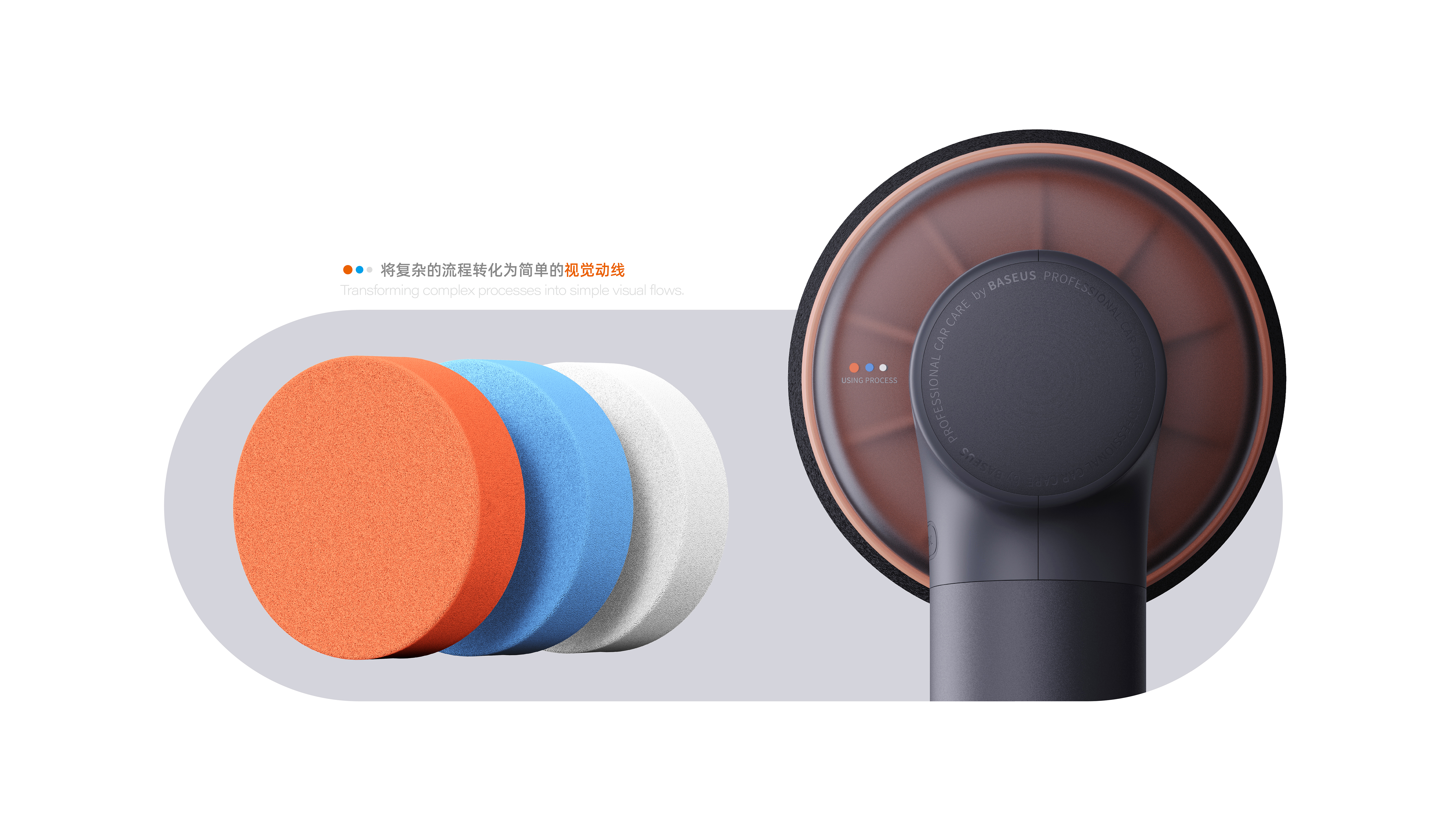
🔵Guide behavior with color: Facing potential operation confusion, I designed clear color icons at key contacts to intuitively guide users to complete waxing steps and transform complex processes into simple visual dynamics.
⚪️ Establish control with transparency: transparent protective cover design, so that the internal operation state is clear at a glance. This not only enhances the credibility of the product, its transparent texture itself has become the highlight of the product.
The copyright of this work belongs to Sean Zhang. No use is allowed without explicit permission from owner.

New user?Create an account
Log In Reset your password.
Account existed?Log In
Read and agree to the User Agreement Terms of Use.

Please enter your email to reset your password
GOOD JOB
good, good
It's the first time to see you, huh