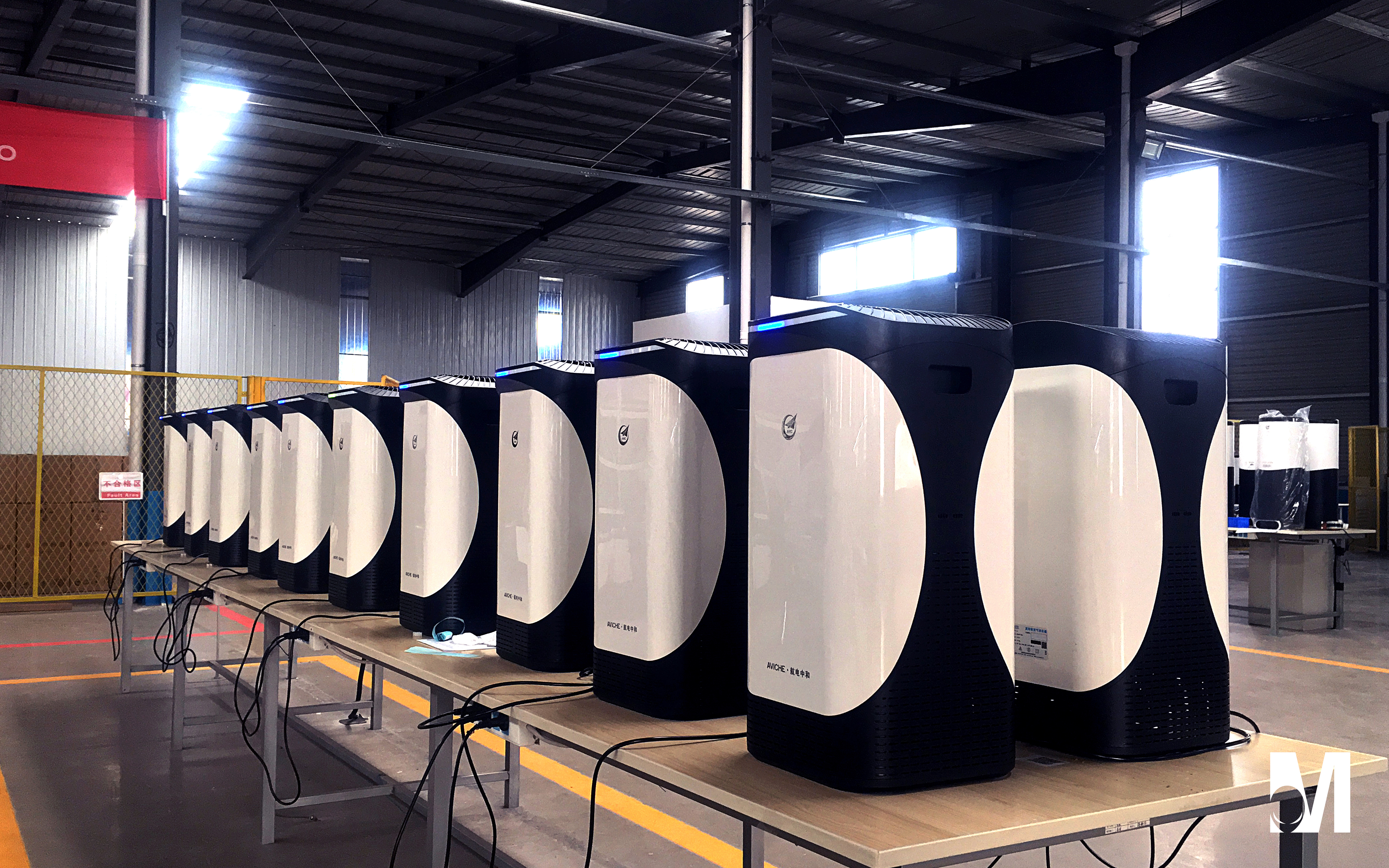
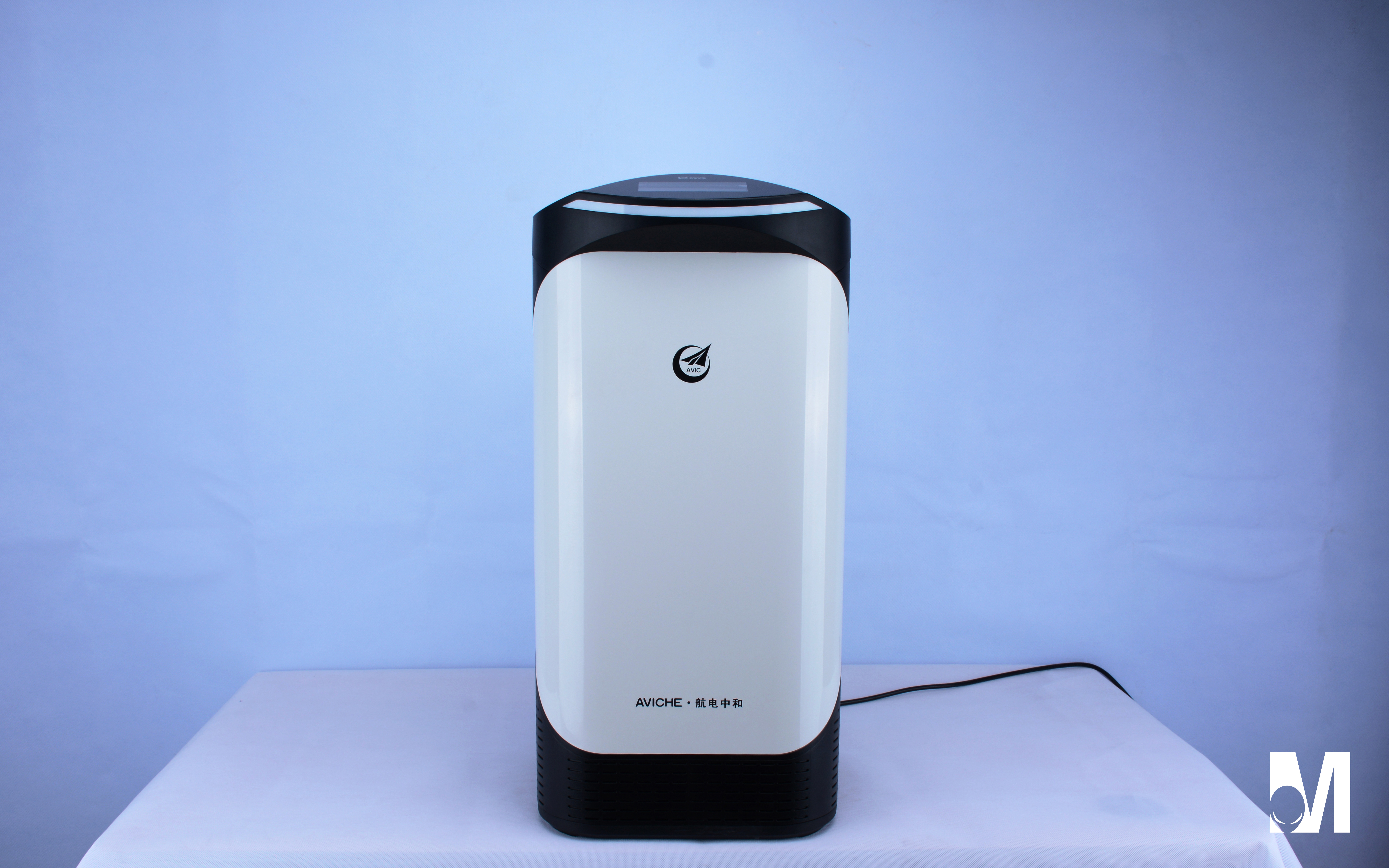
They all say this air purifier looks like a penguin.
2018-03-01
Home Appliance
6026
23
21
Follow
Message

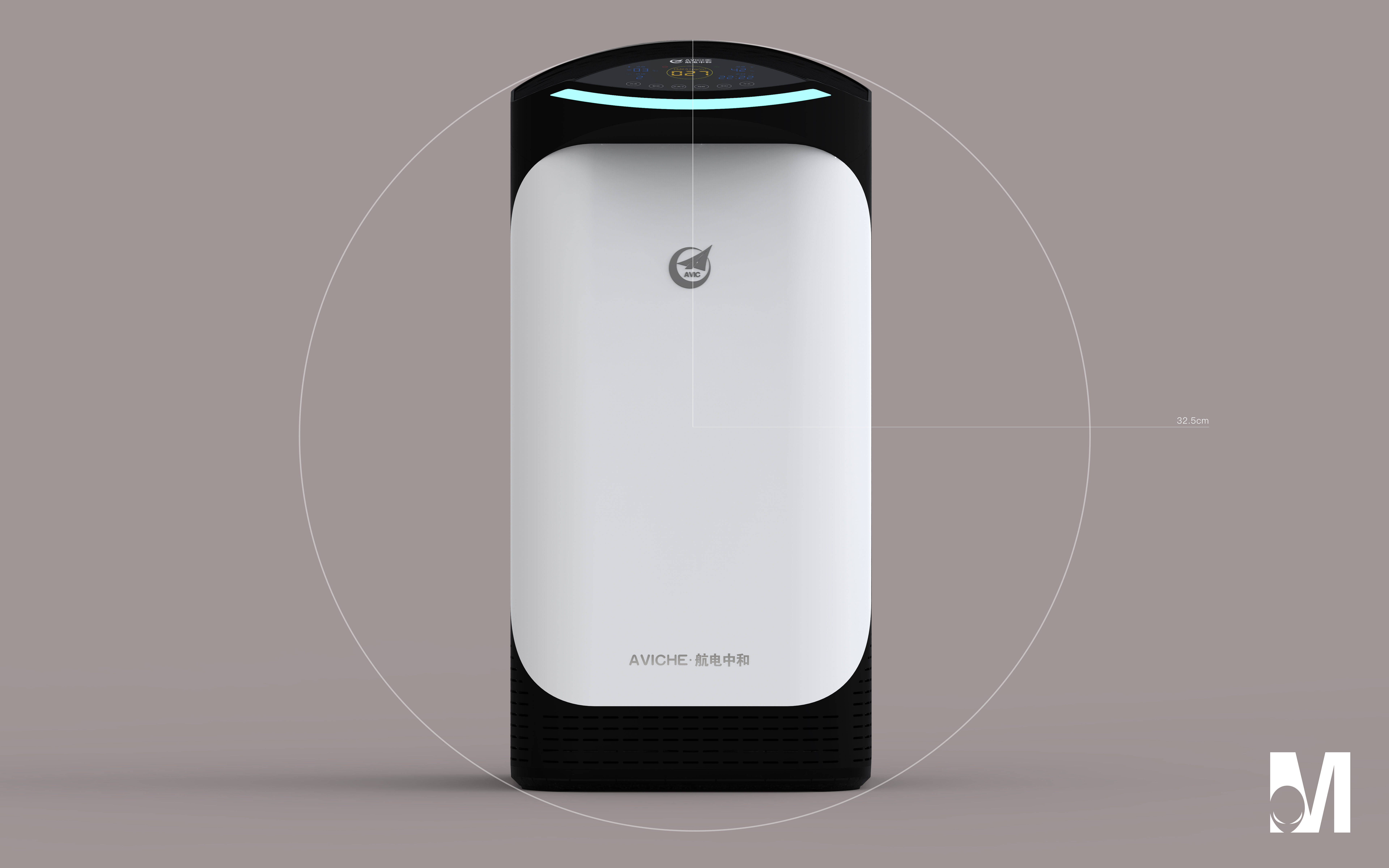
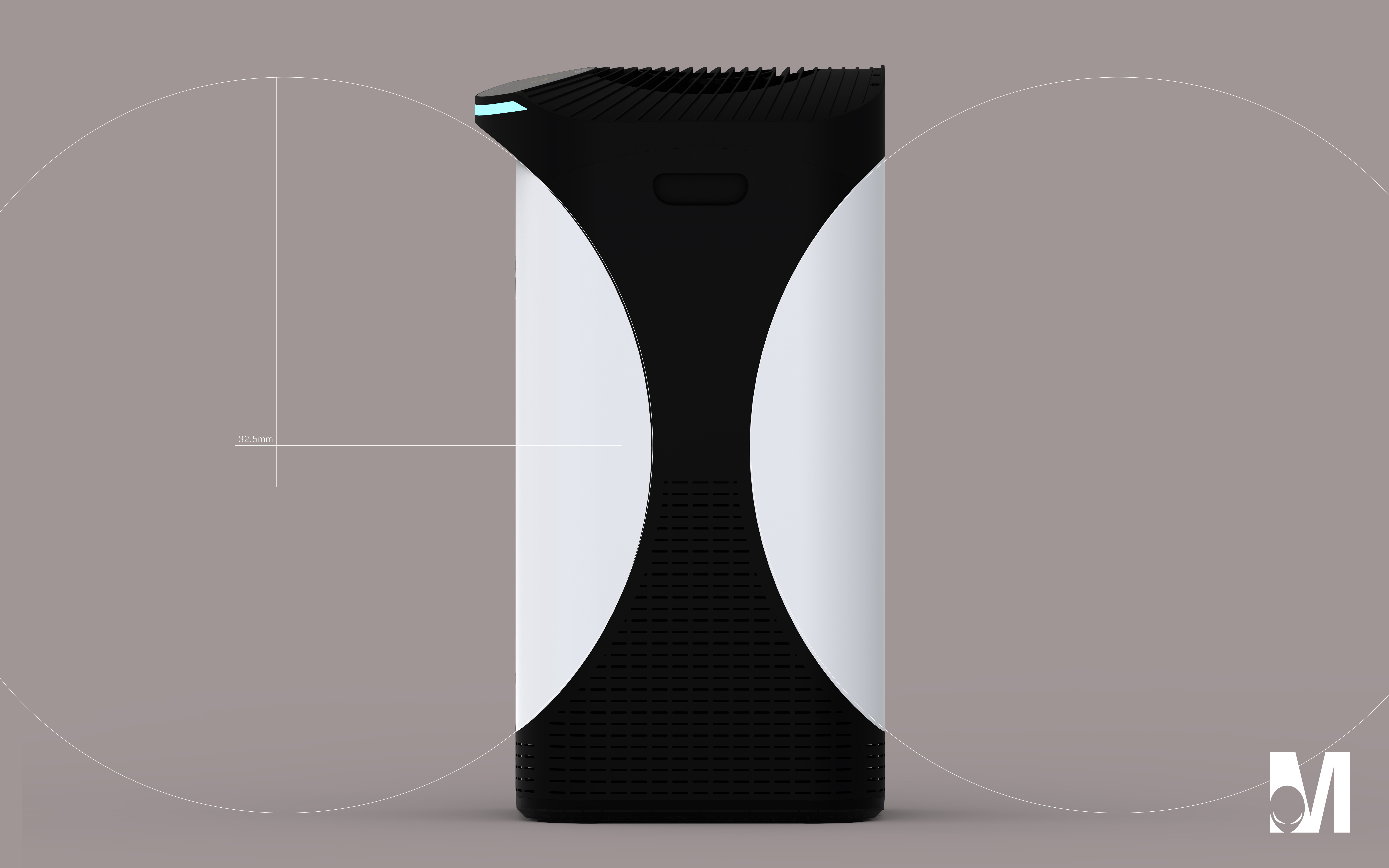
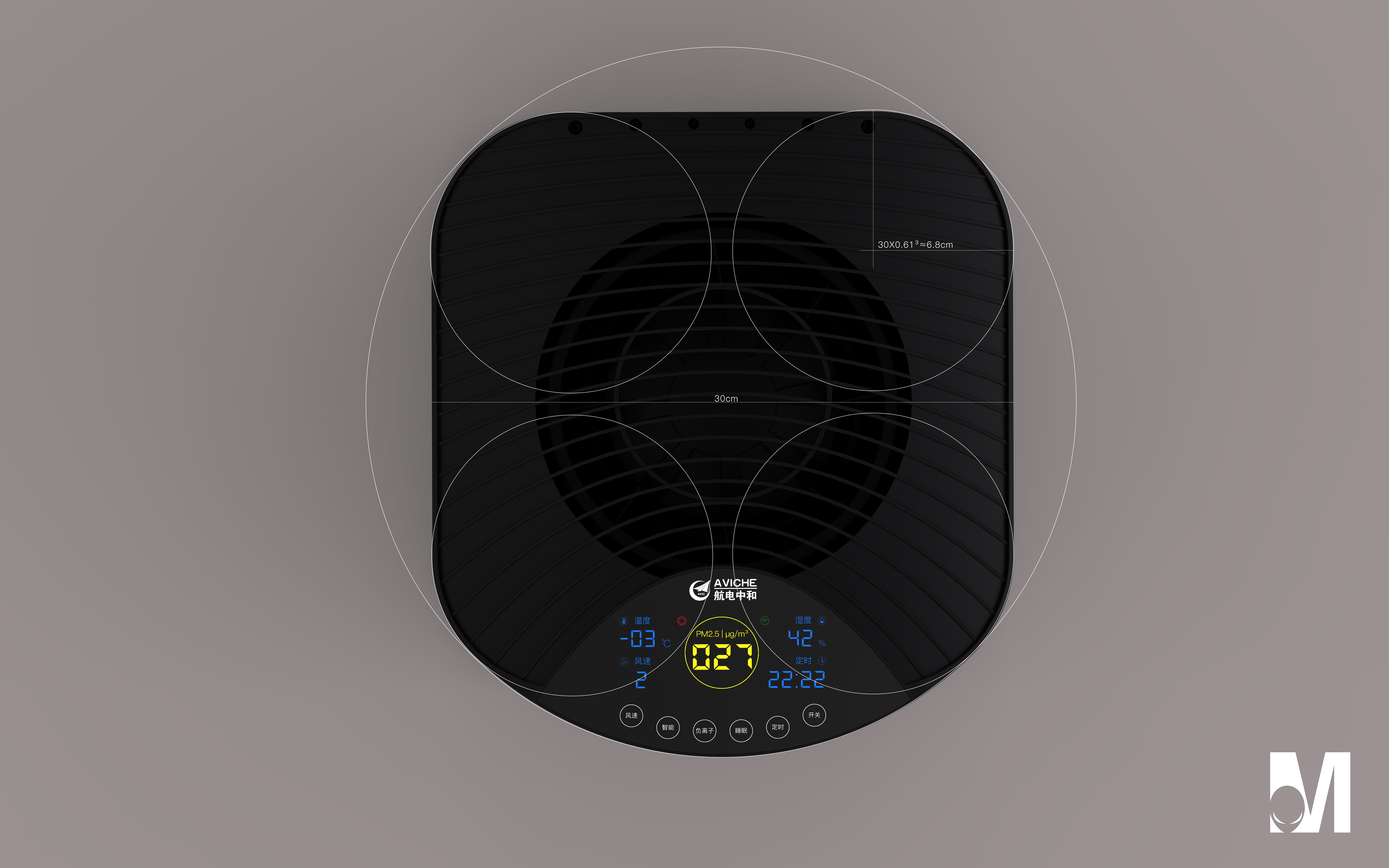
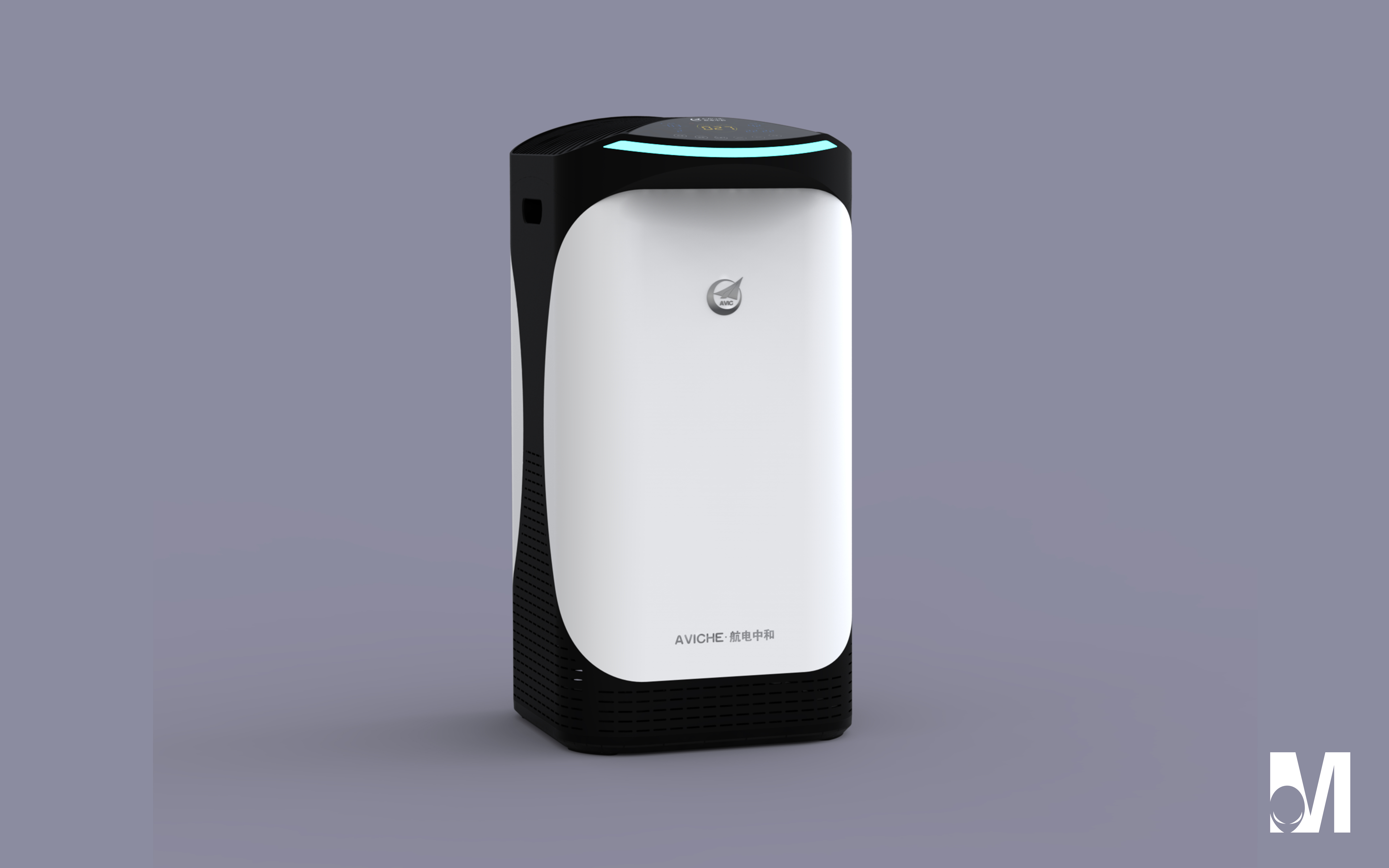
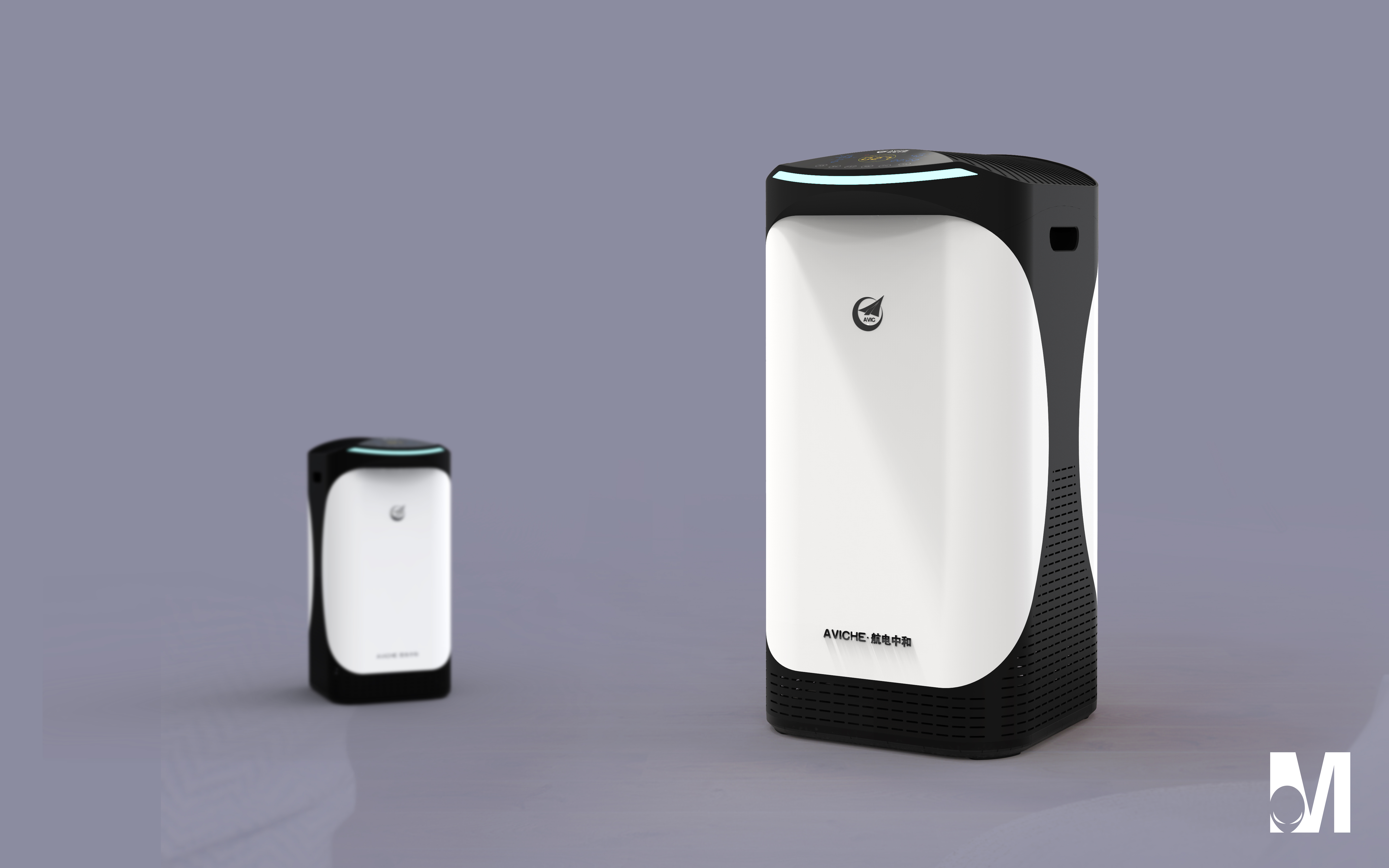
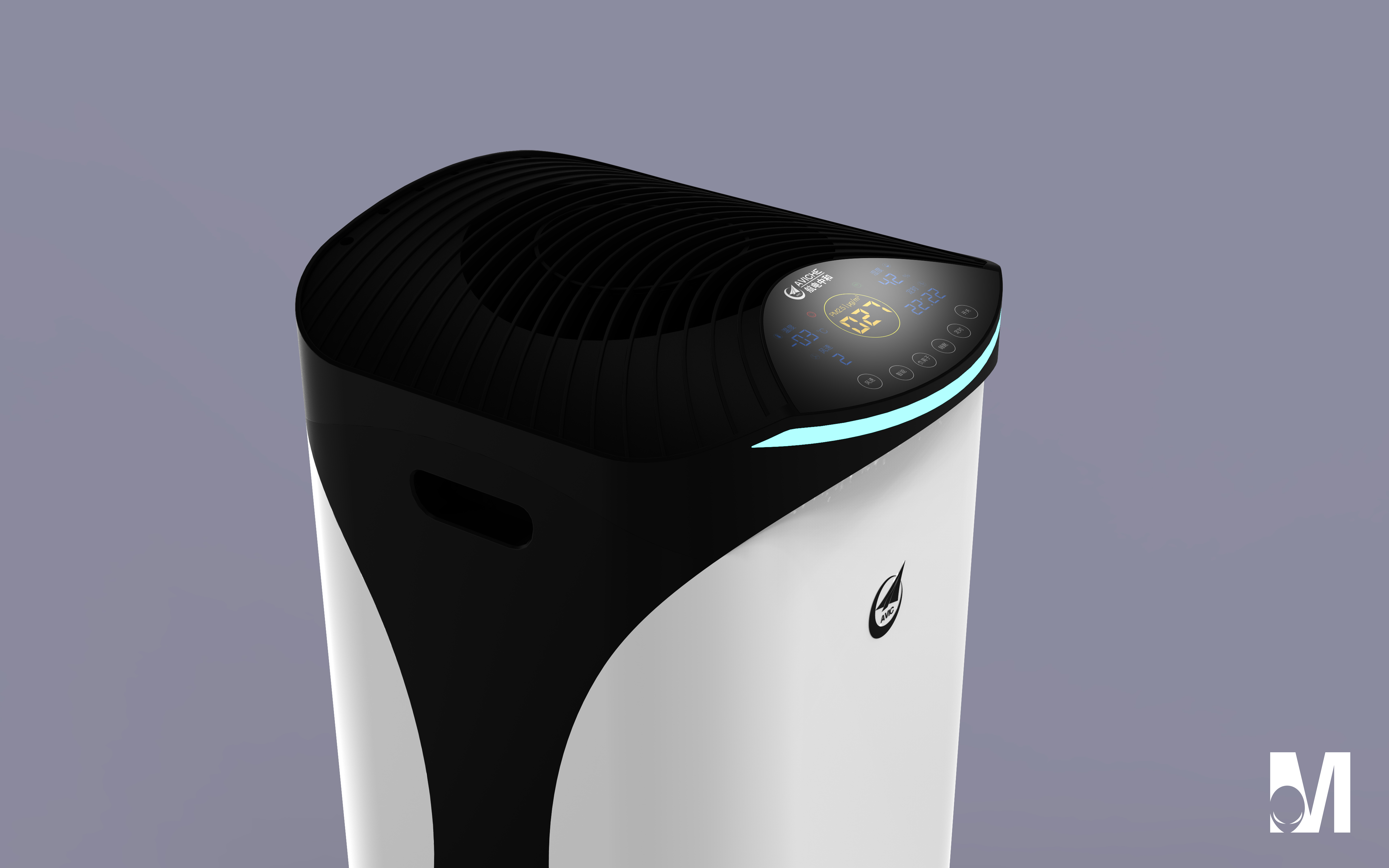
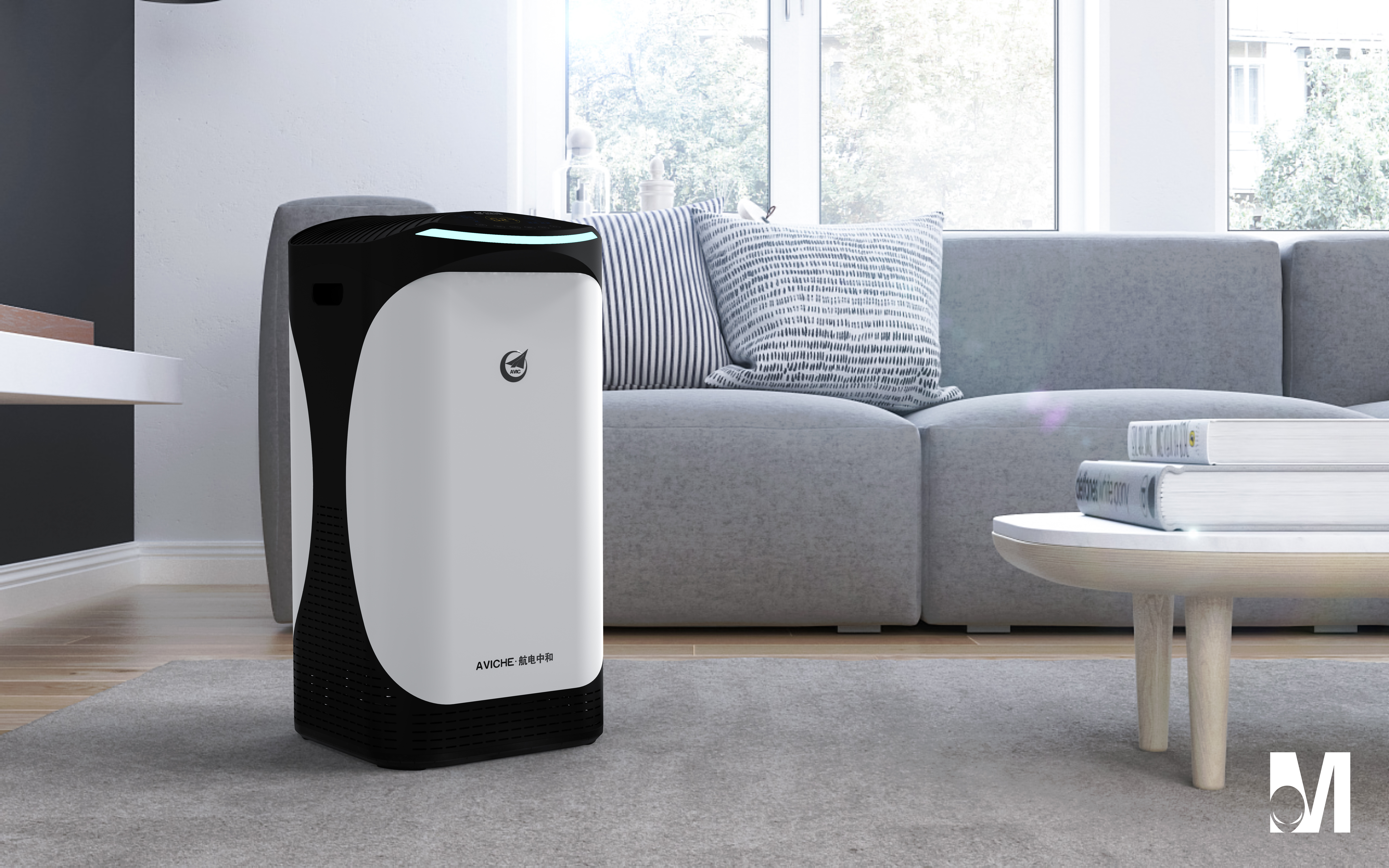
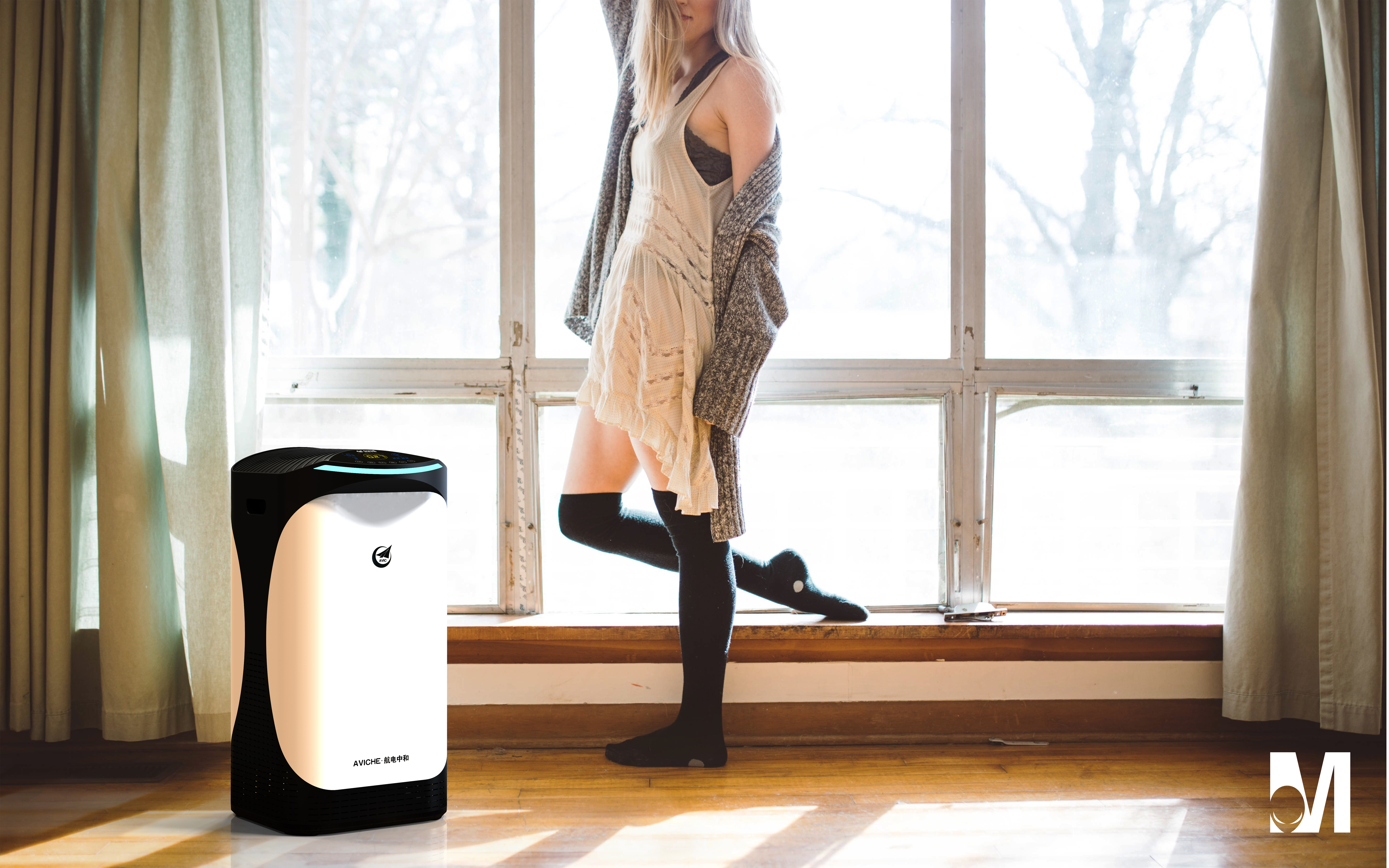


This ID feels like a structural design.
Black is too black
The real thing is better than the renderings
It is really not good-looking. If the students who just graduated ten years ago designed it, they can understand that such a design directly lowers the aesthetics of consumers...
If the overall shape is a little more rounded, it will be more like.
Not enough
Creativity is worthy of recognition, but it ignores the fact that this color matching and feeling are slightly abrupt at home, and household products still need to be integrated with the environment.
Cute 1
Very cute shape ~ broad love ~
Ha, ha, ha, it's quite similar, this model QQ
They are right, ha
That is, a piece of black and white match, uh