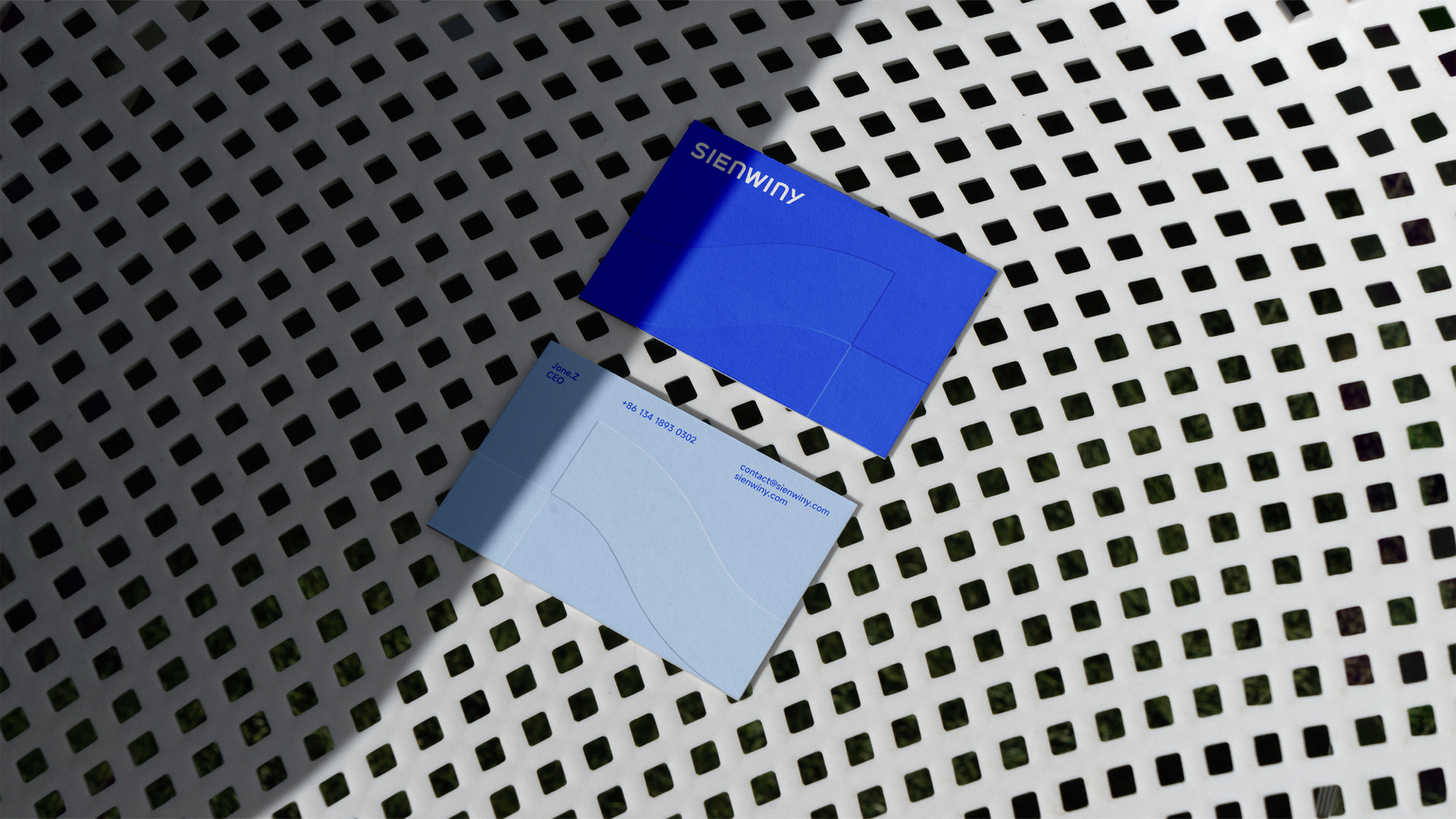
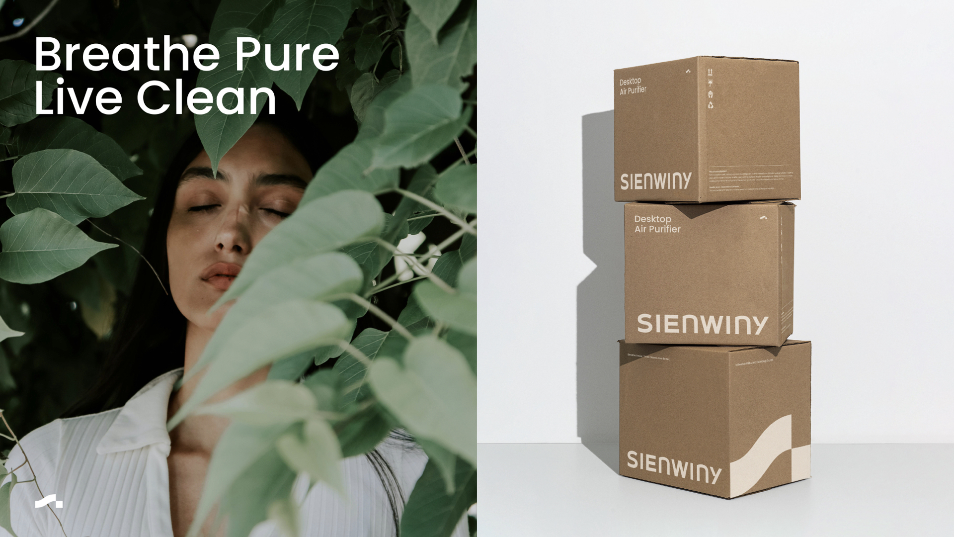
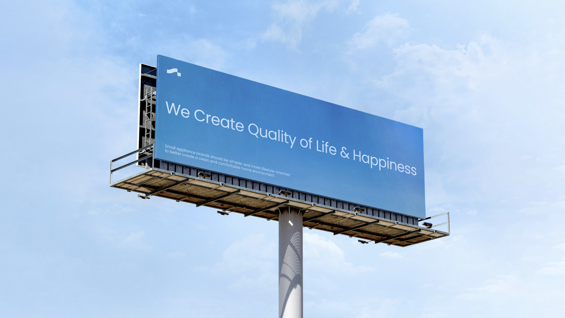
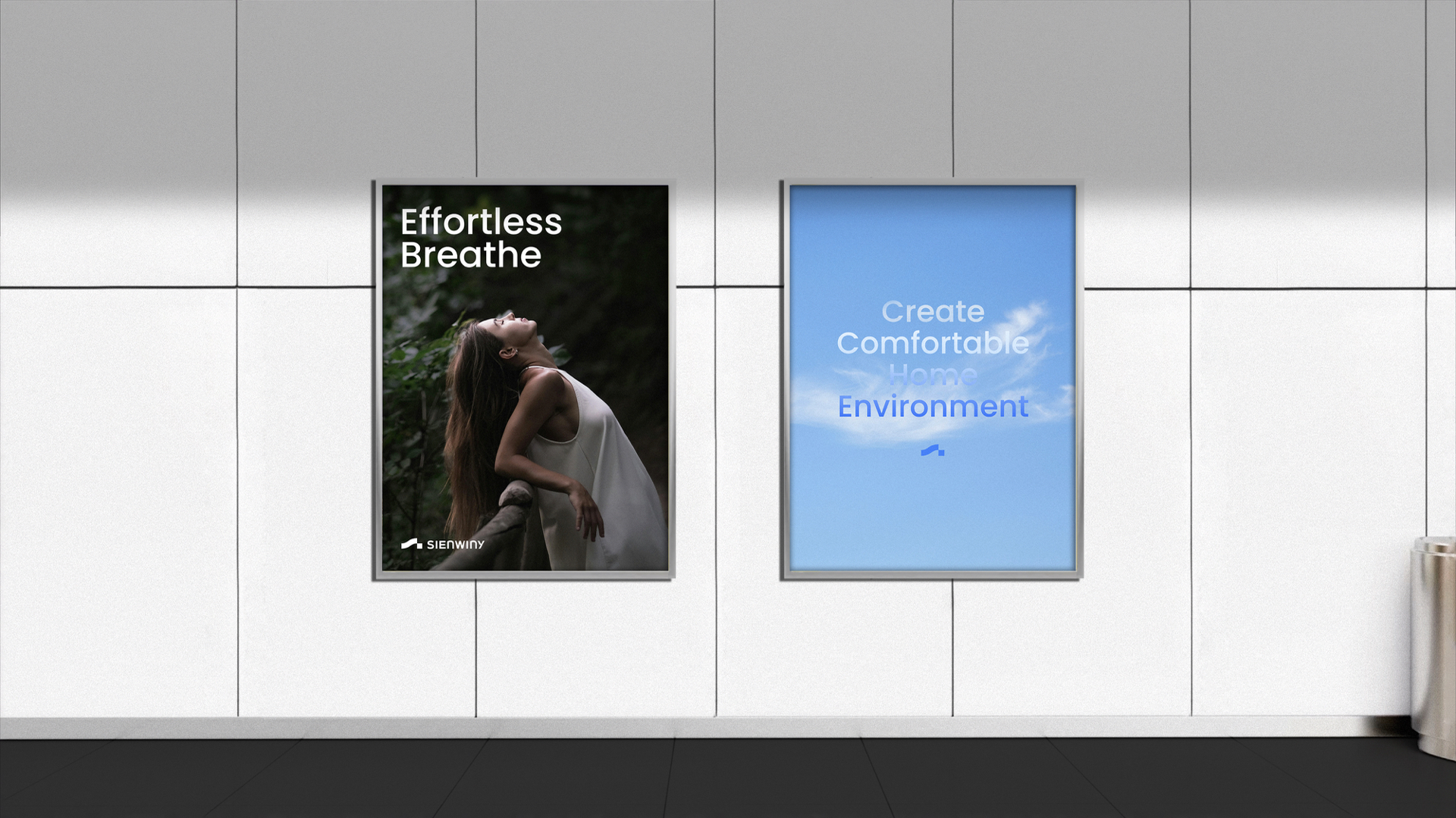
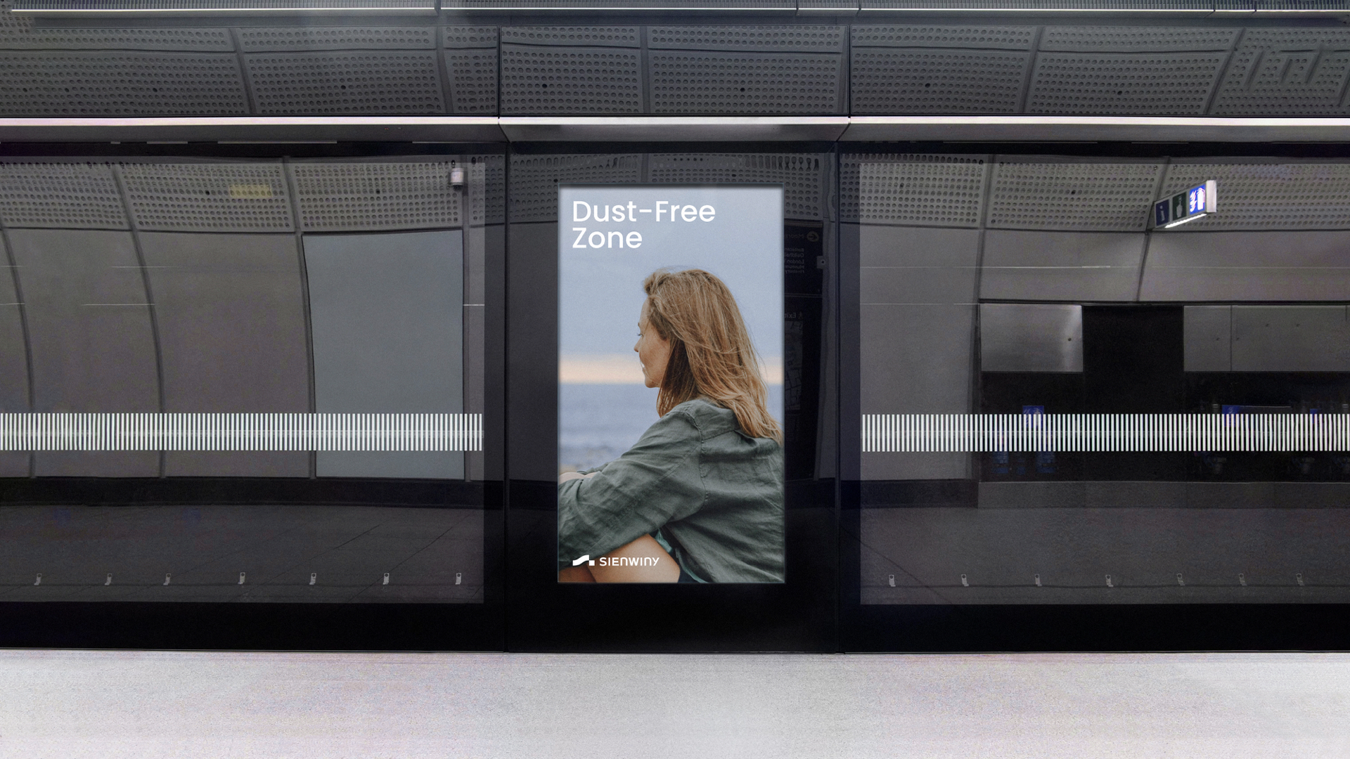
SIENWINY brand has always been deeply rooted in family needs, committed to creating a warm technology, with human care to improve the quality of life, in the subtle delivery of happiness texture.
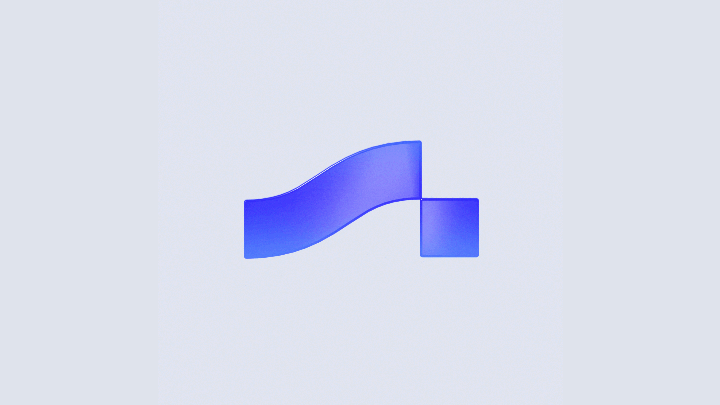
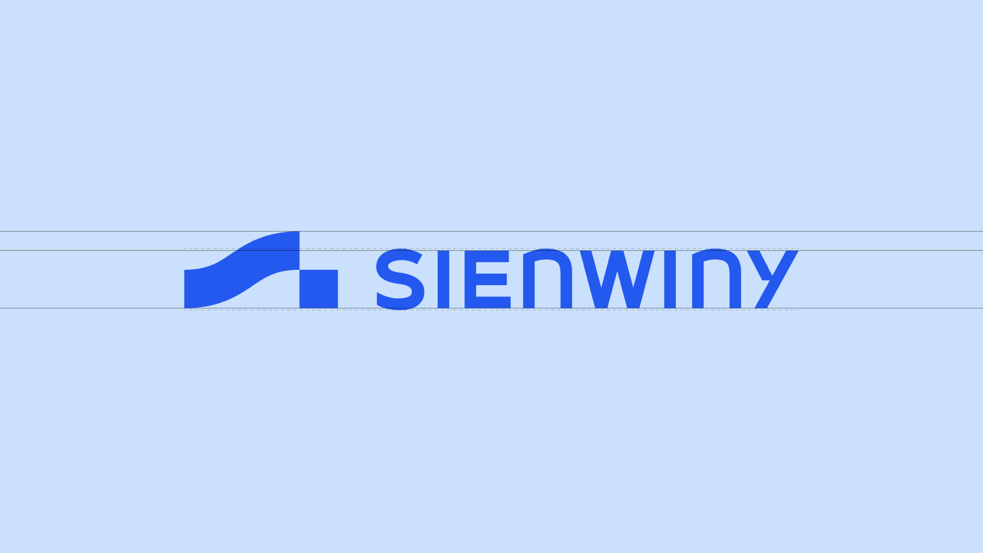
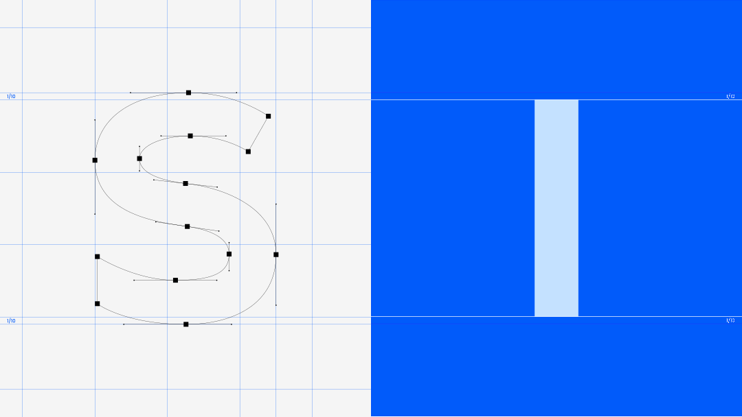
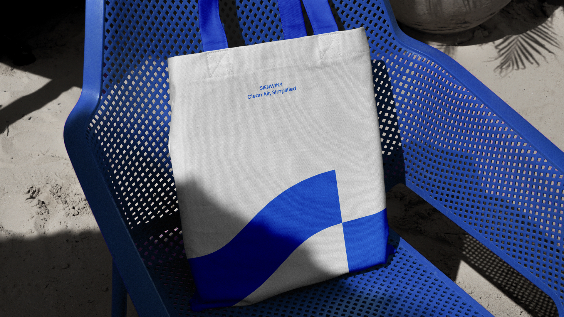
Based on the global vision, the brand conveys its brand concept covering all dimensions of life to the industry and consumers through the promotion strategy of the whole brand and chain of terminals. The standard logo graphic is the abstract design of the initial letter "S" of its name. This idea is cleverly reflected in the hidden cross coordinate line on the right side of the logo graphic.
We use the pronunciation of the brand name as the starting point and the name of the SIENWINY to echo the spatial meaning of "three-dimensional" and skillfully disassemble the brand name into four letters: "S", "E", "W" and "N, they point to the orientation coordinates closely related to the three-dimensional space-" East "(east)," South "(south)," West "(west)," North "(north). This design tells the story of SIENWINY brand, like a compass, as an intelligent and firm leader, constantly exploring on the road of innovation, weaving a brand narrative covering a broad life picture with a grid concept covering all directions in the southeast, northwest, and continuously exploring to define simple life technology.


The copyright of this work belongs to 后浪设计. No use is allowed without explicit permission from owner.

New user?Create an account
Log In Reset your password.
Account existed?Log In
Read and agree to the User Agreement Terms of Use.
Please enter your email to reset your password


Follow the master to learn
Perfect
quite individual, huh