Kang Baijia pharmaceutical chain new packaging revealed!
Who said that health care products packaging can not be beautiful and professional?
Pain point cut in:
"Still looking at the same,
Cold health care products packaging?
The Kang Bai family is really out of mind this time!"
Core Idea:
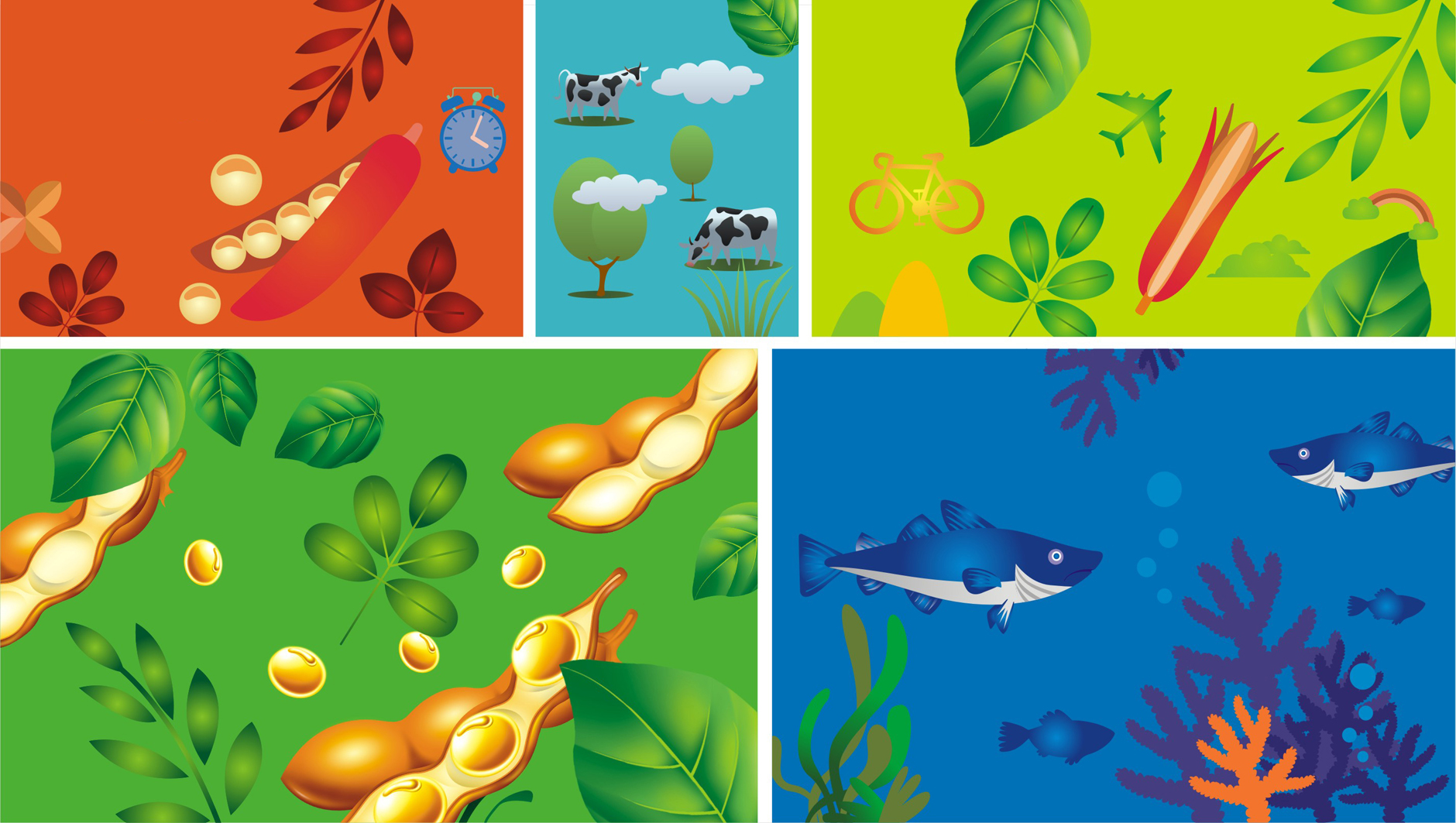
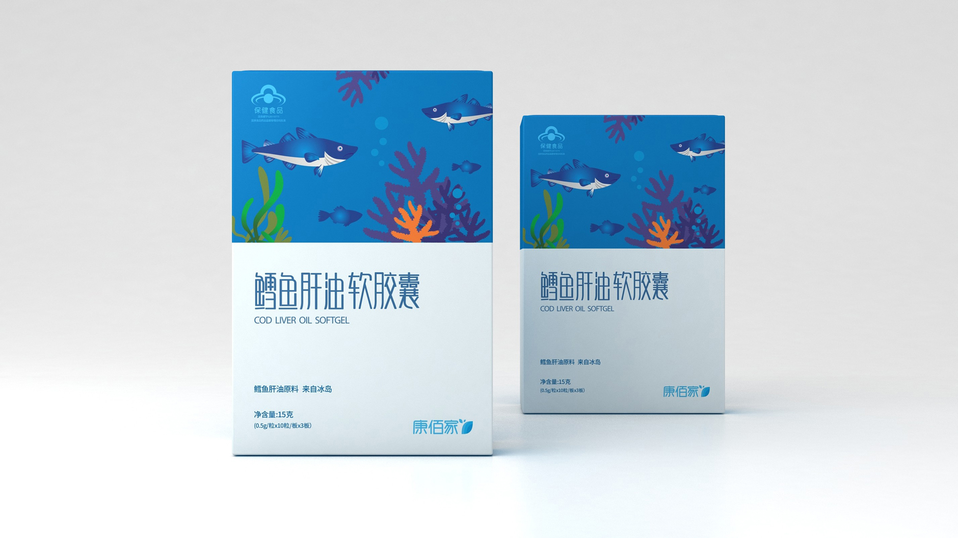
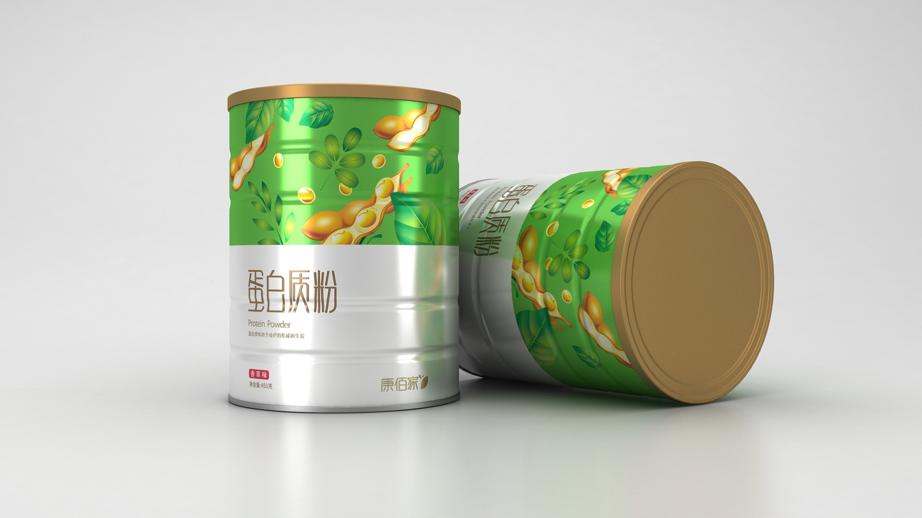
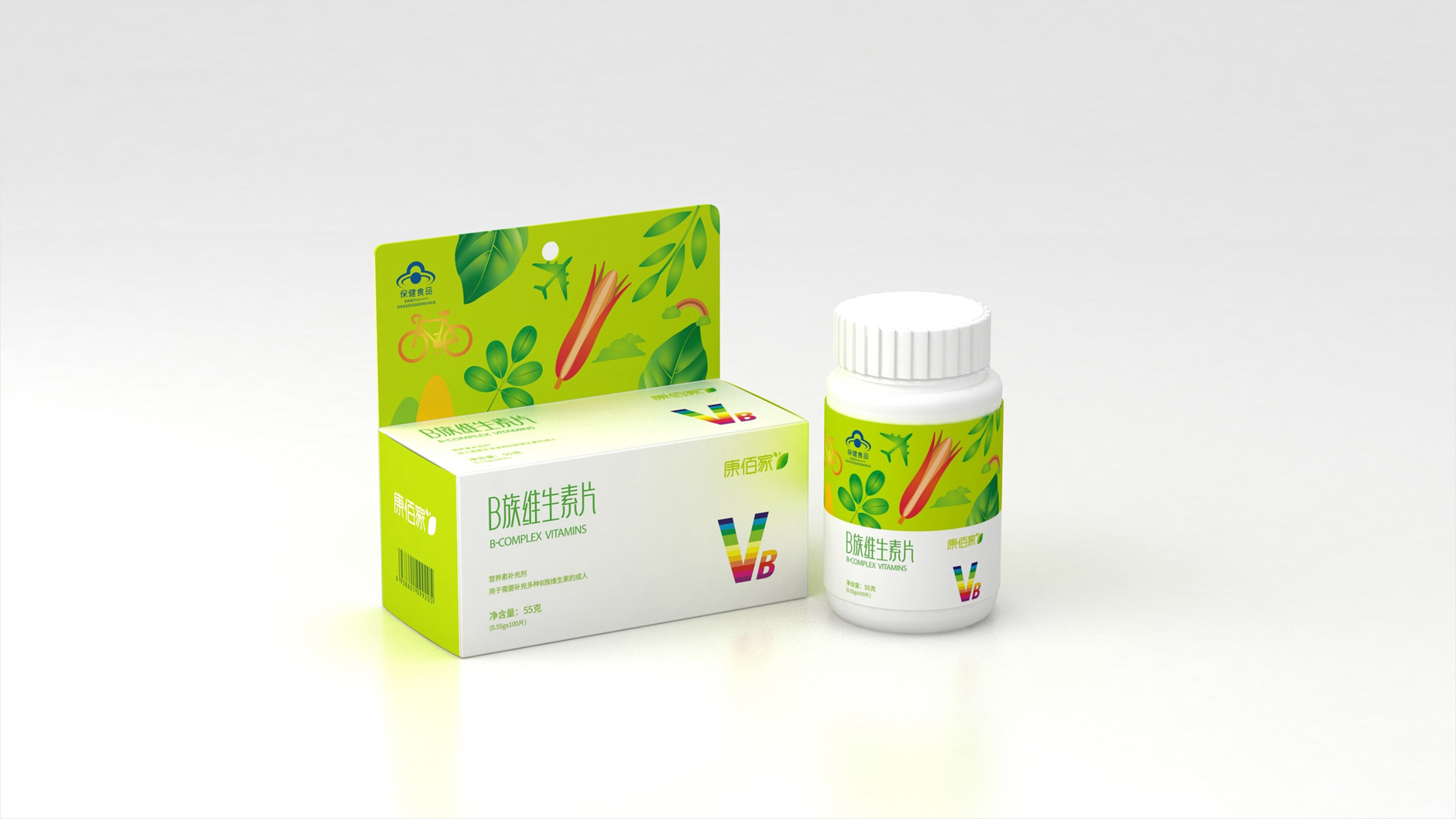
"From 'health, ecology, natural'
We created a 'breathing' package
Emphasize the strong correlation between brand positioning and packaging concept
Visual Unity:
Whether calcium tablets, vitamin C or probiotics
put together neatly, refreshing
show the collective beauty of the series packaging and
Unified design language (fonts, typography framework)
Solve visual confusion pain points
Affinity key:
The secret weapon is the healing department hand-painted illustration
Every stroke hides the vitality of nature. Is there any way to get closer in an instant?
Highlight the smart, intimate and natural feeling brought by hand-drawn illustrations


thumbs up
Packaging is a bit interesting.
Really, really good, huh