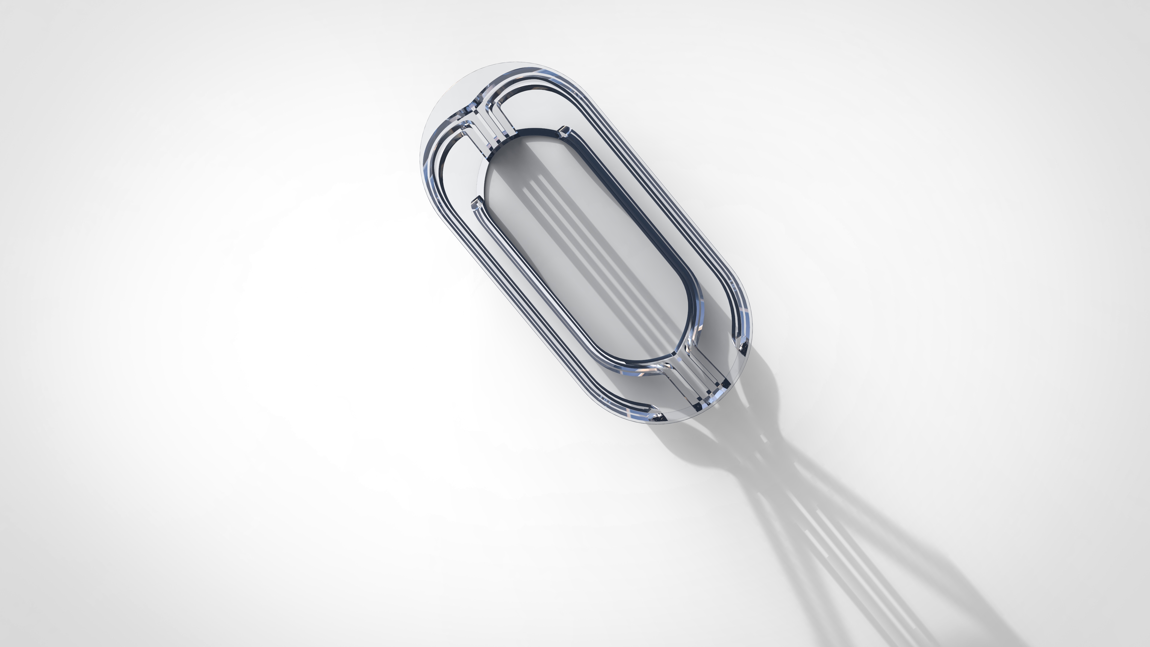
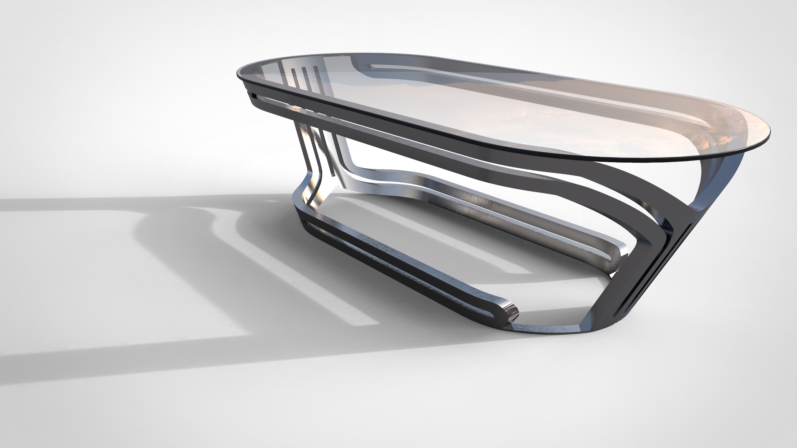
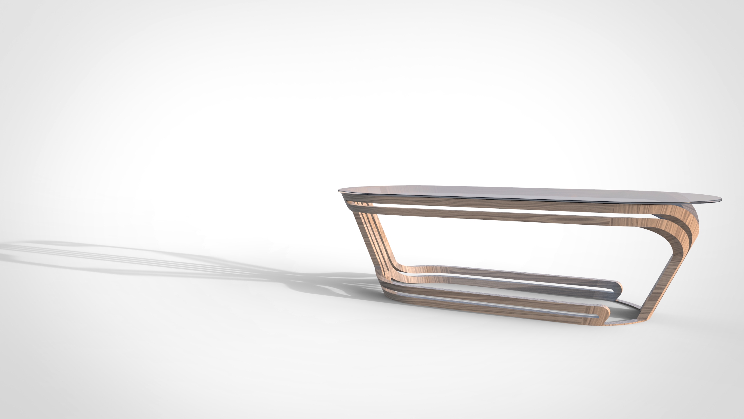
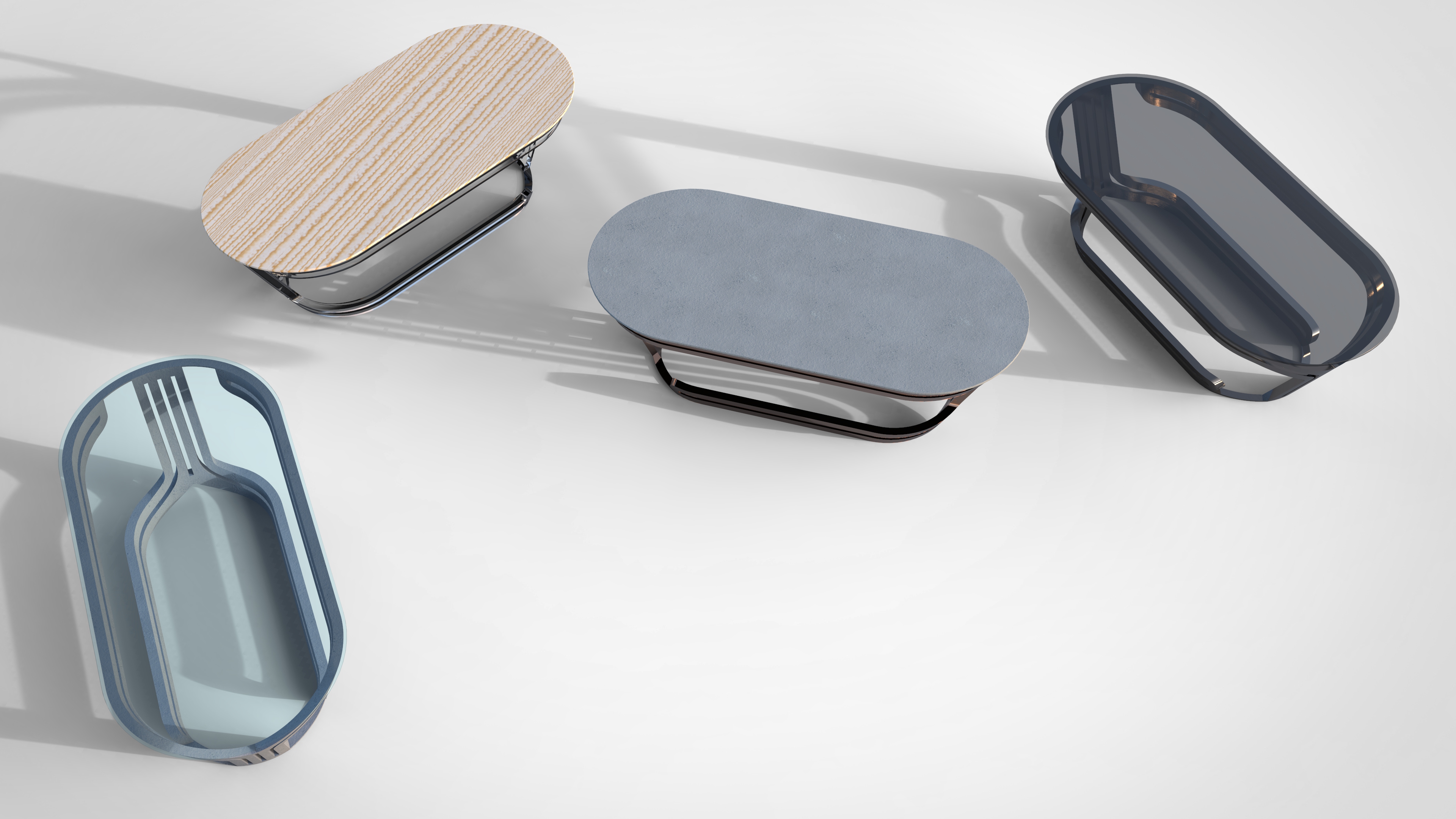
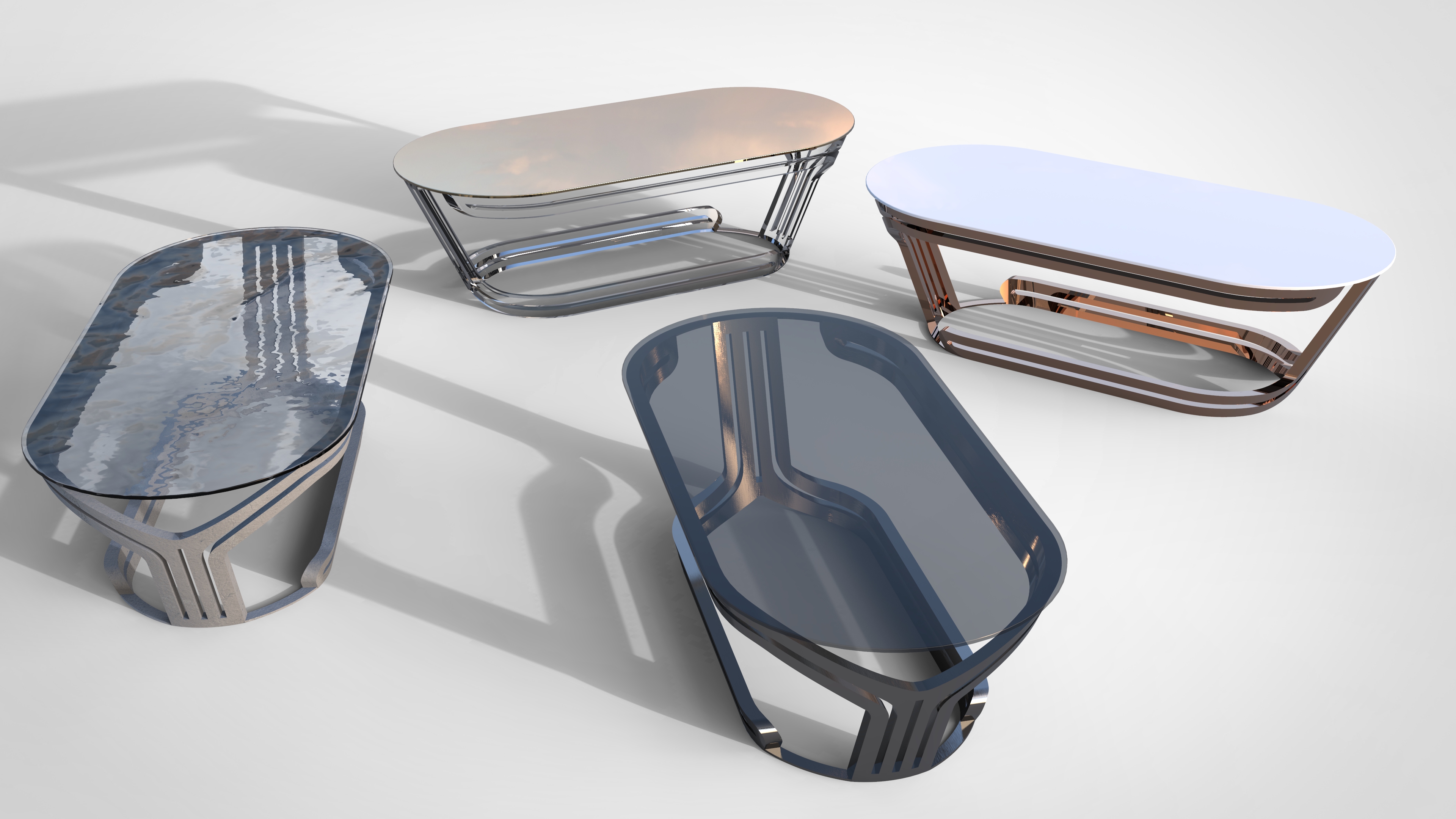
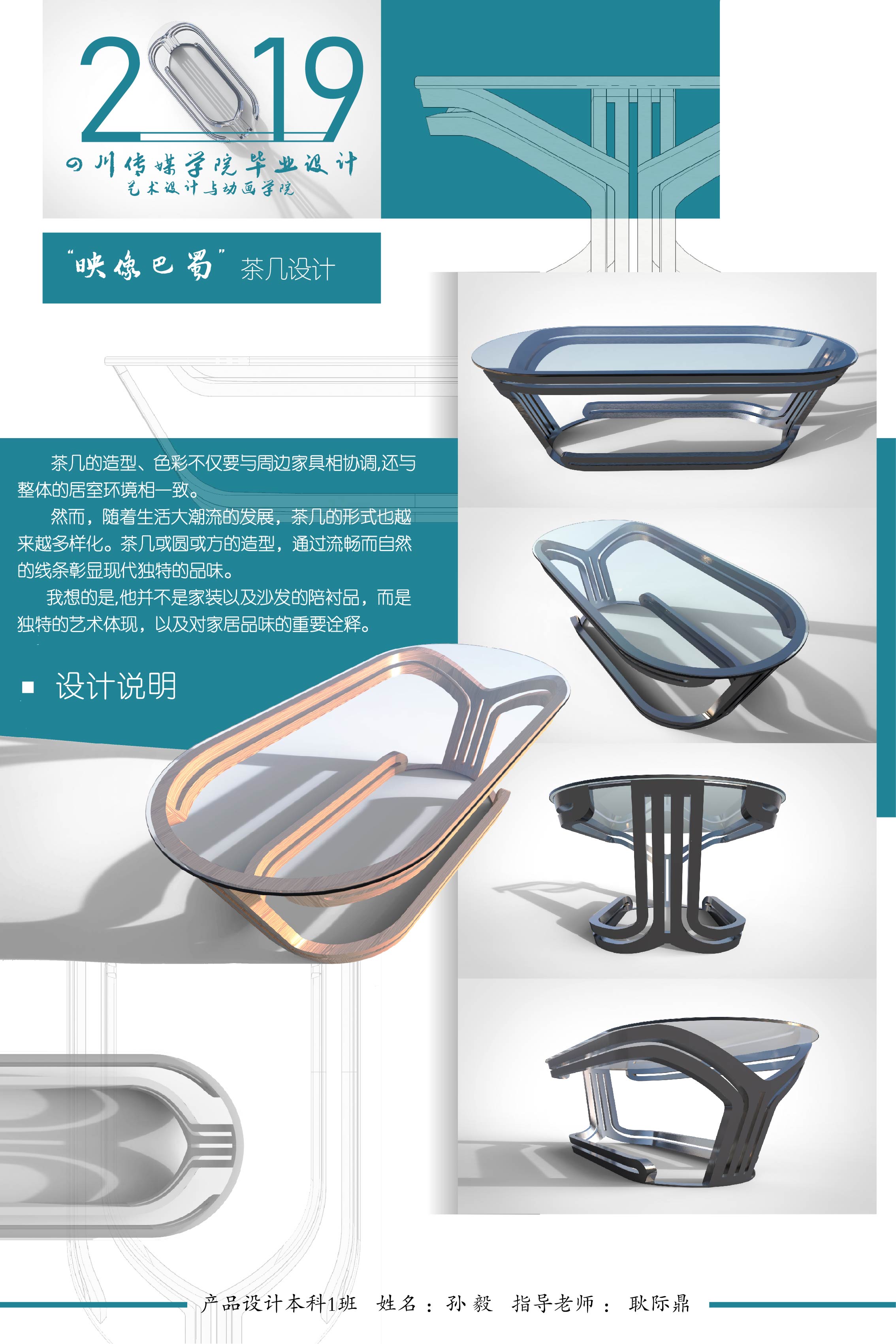
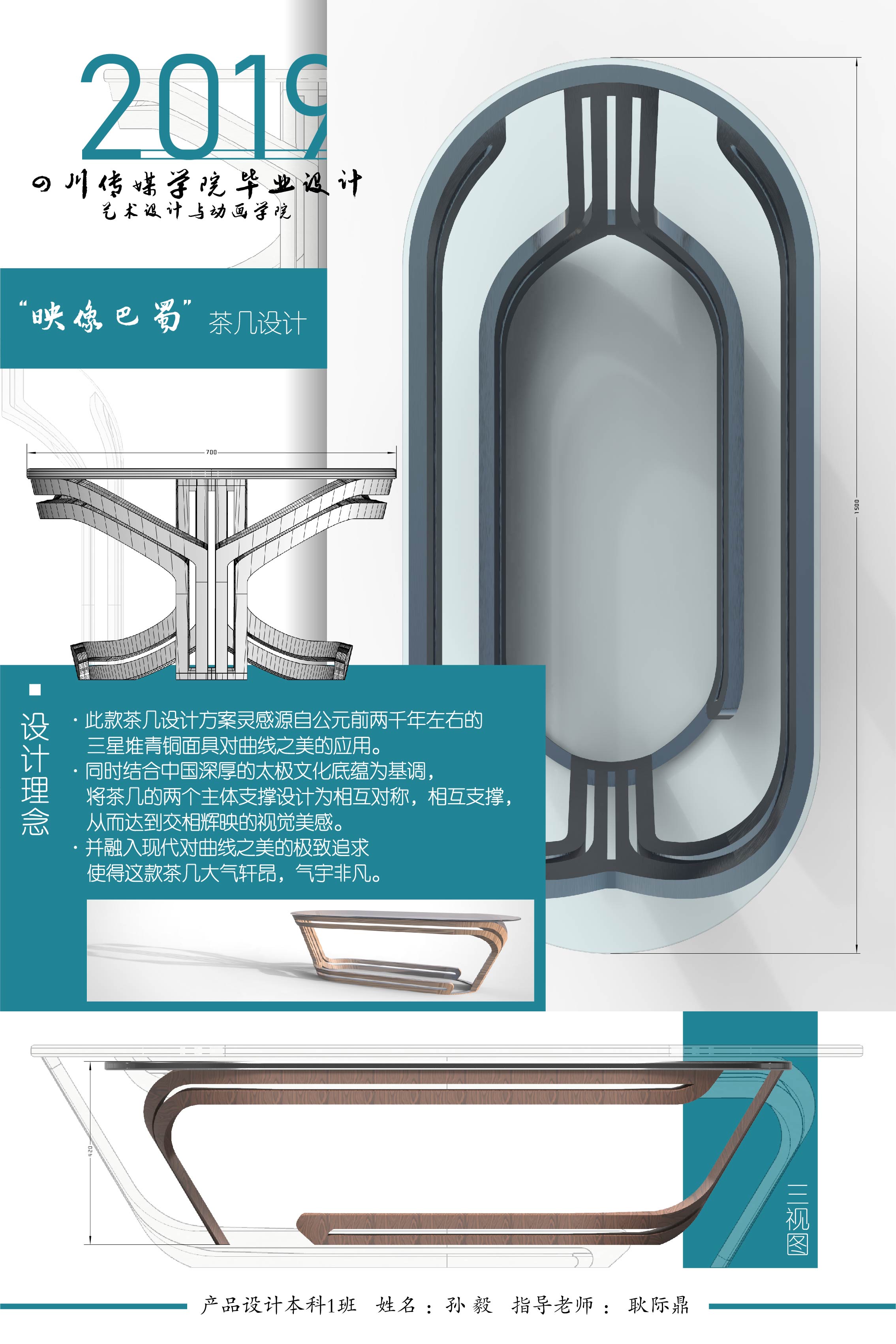
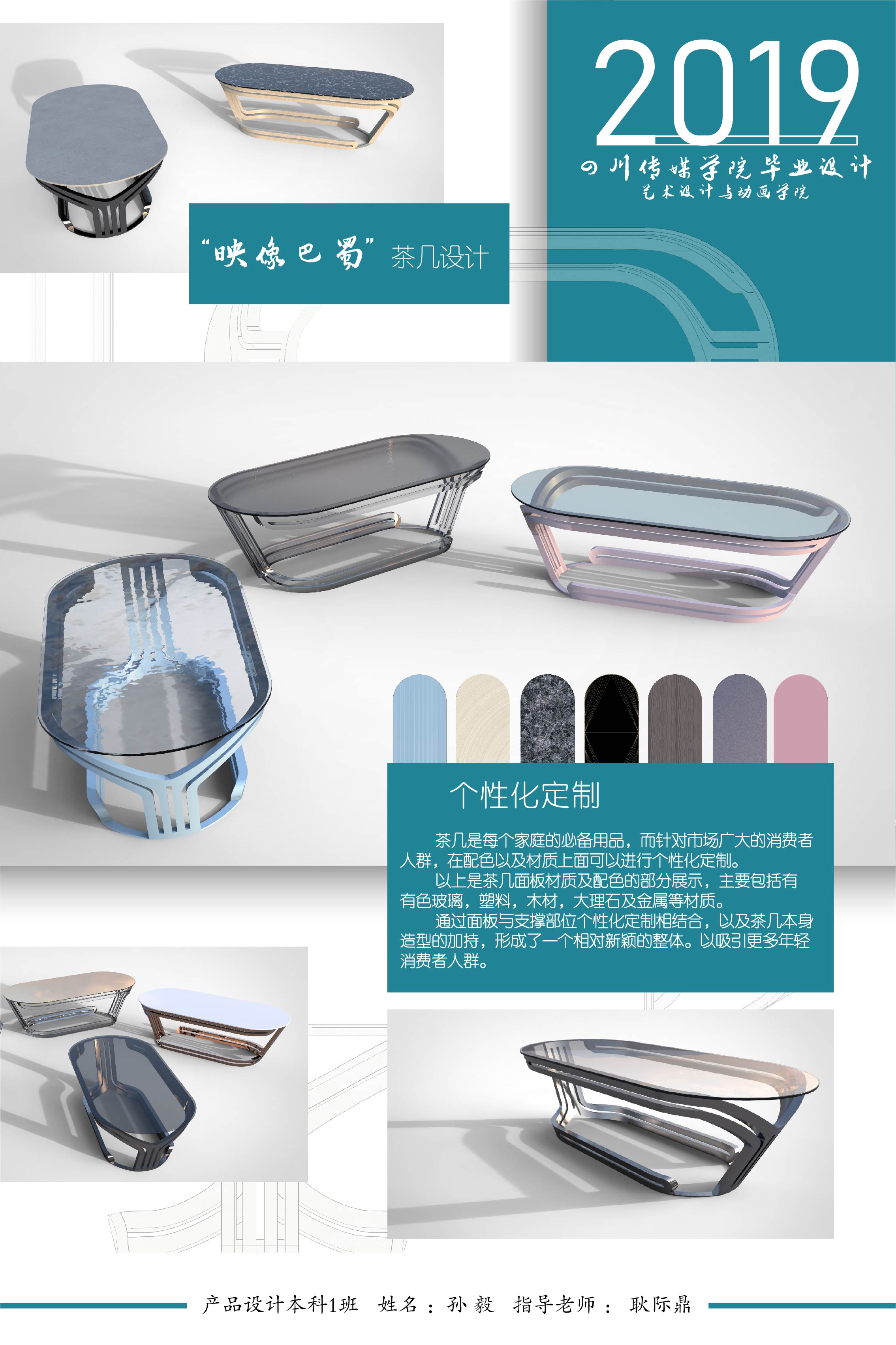
A tea table made by graduation design works, welcome your advice, thank you!
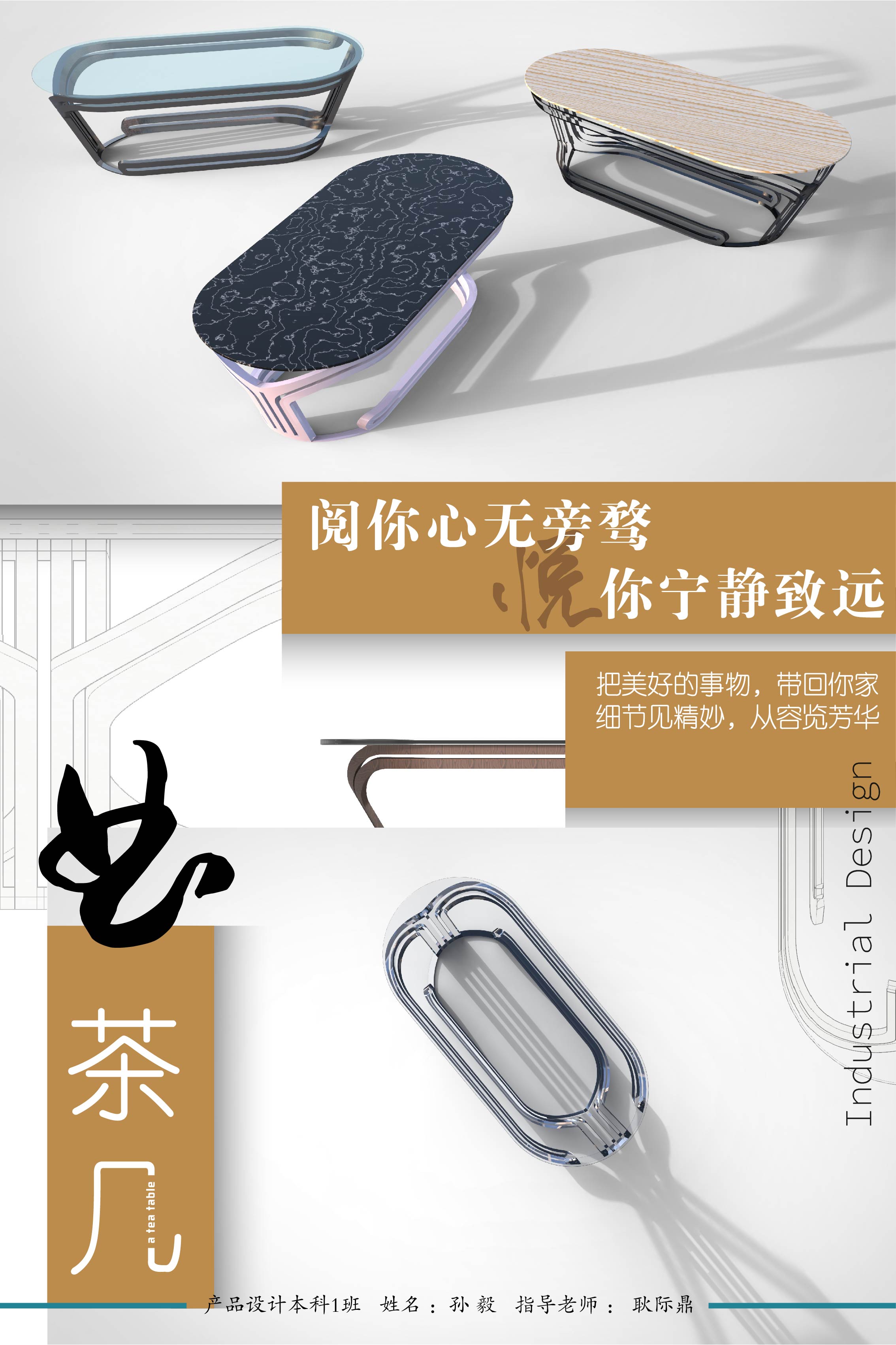
The copyright of this work belongs to E. No use is allowed without explicit permission from owner.

New user?Create an account
Log In Reset your password.
Account existed?Log In
Read and agree to the User Agreement Terms of Use.

Please enter your email to reset your password
I don't think it's strange to look good and practical.
At the very least, the chamfer should be inverted when rendering the performance, otherwise the effect will be very poor.
For a student, it's not bad. Come on, I wish you better and better on the design road.
Since you said your advice, I'll say it straight: first, I haven't learned the basic skills well, Keyshot rendering is not good, details, including lighting, are directly based on his existing ones, I can't play them, and the materials are directly applied. to be real, I have to adjust them myself, and the modeling is not clear. after all, your model is very simple. Second, typesetting. Have you used 7 kinds of fonts? Don't you think it's messy? There is also such a small proportion of products. Do you want people to read words or products? The angle of products is wrong. Design theory is useless. Third, it should be customized, but CMF did not do research and understanding, blind match.
Not bad
Good-looking design
Pretty temperament