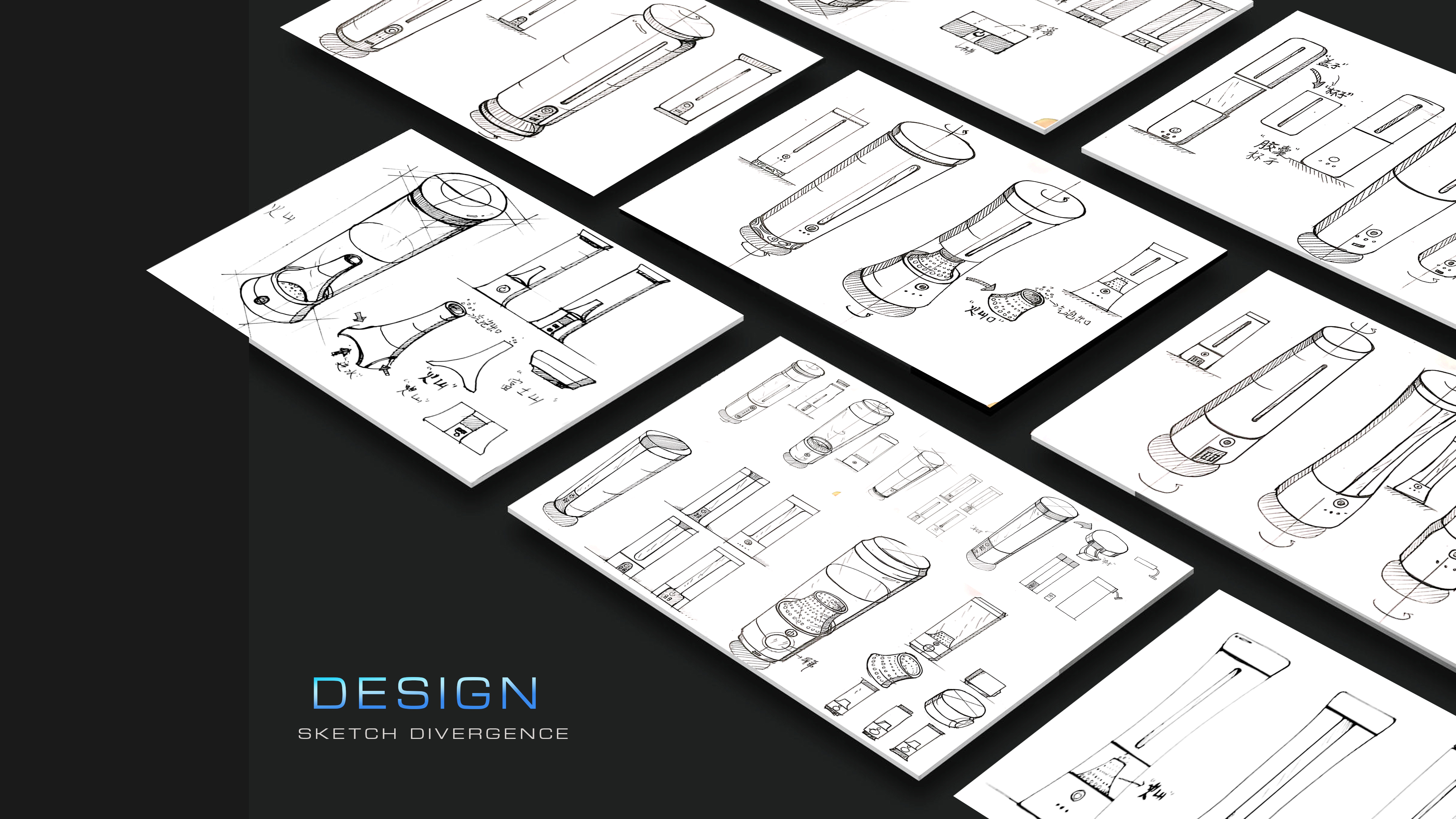
This project is a design done in a design company in the first year of graduation. The whole process is relatively comprehensive. From the most basic market research and analysis, the design direction is obtained. To hand-painted creative divergent design, finally in-depth sketch details, finally determine the direction to do 3d design, rendering, and finally to the whole process of proposal. The product derivative design after the final bid. It is a relatively complete design process.
The core point of the project is to extract people's core needs for water-safer and healthier. So as to show the characteristics of the product.
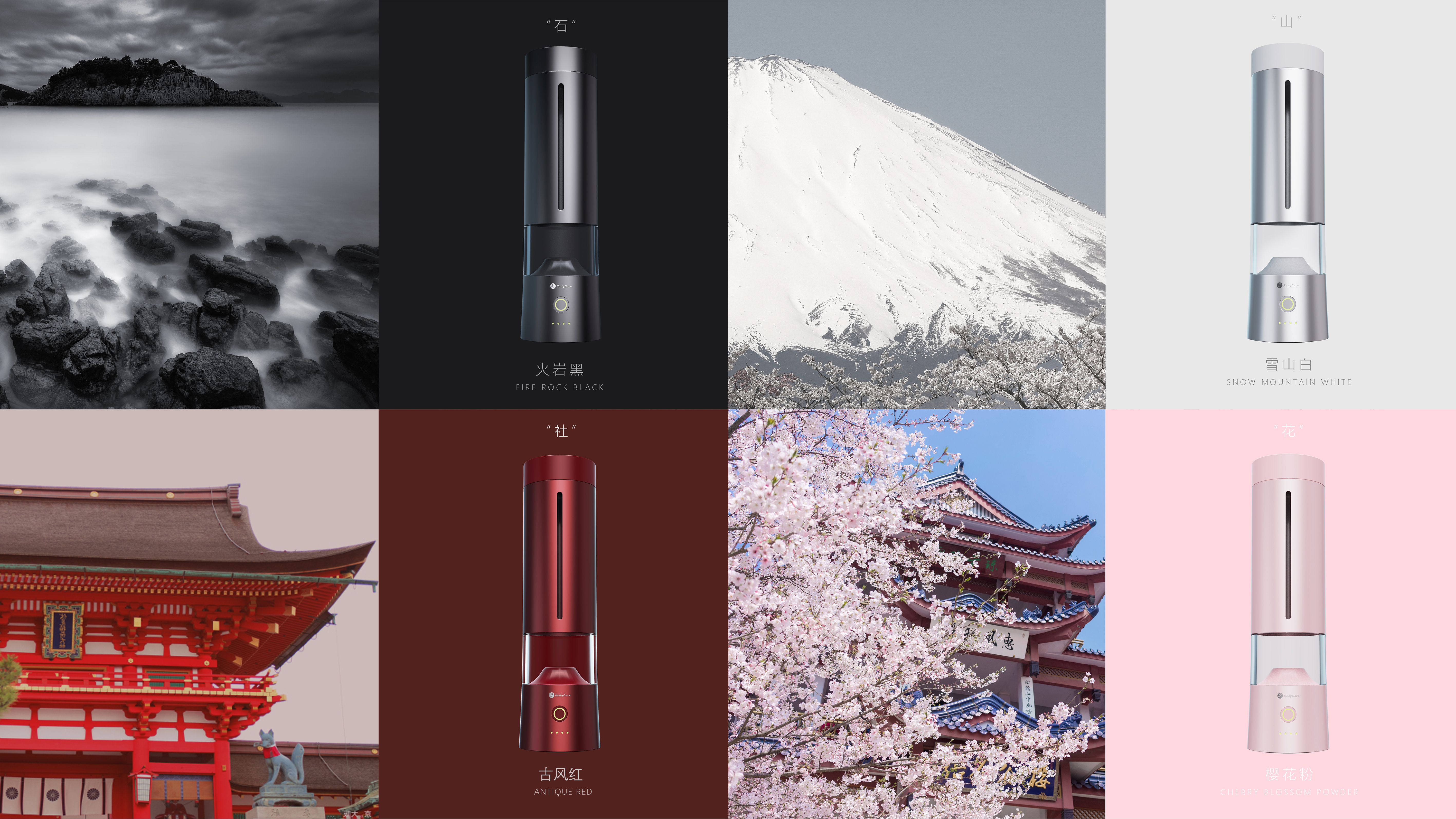
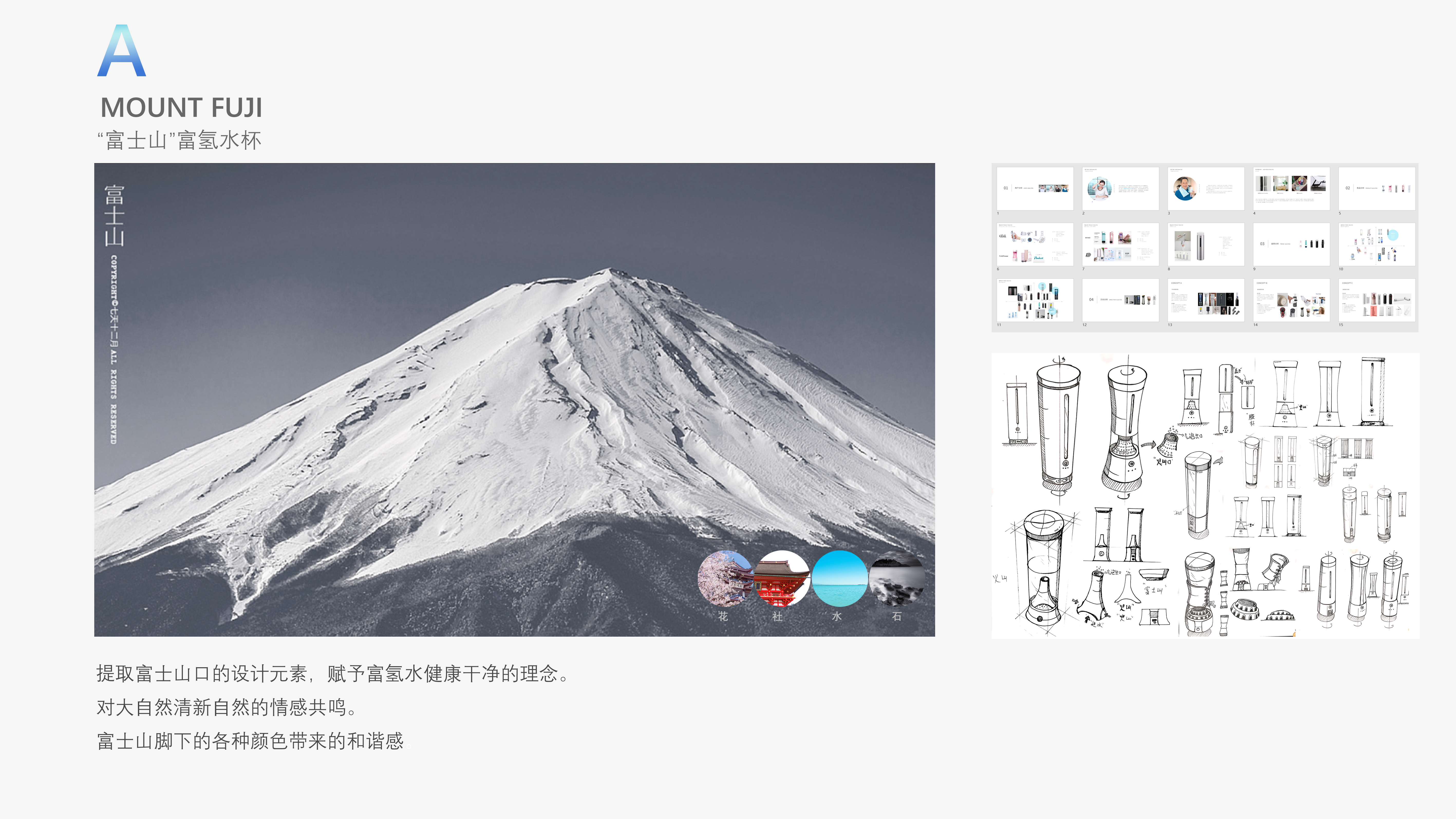
Take Mount Fuji as the starting point for its meaning of beauty and purity.
The design elements of Fuji Pass are extracted to endow hydrogen-rich water with a healthy and clean concept.
Emotional resonance with the fresh nature of nature.
The sense of harmony brought by the various colors at the foot of Mount Fuji.
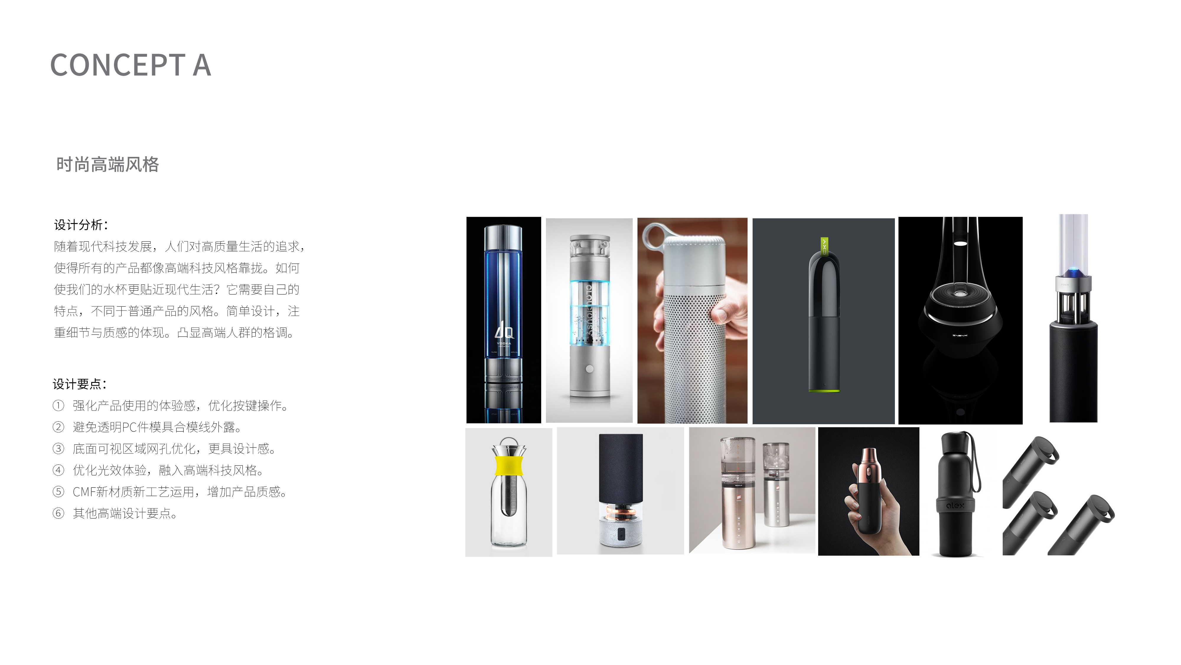
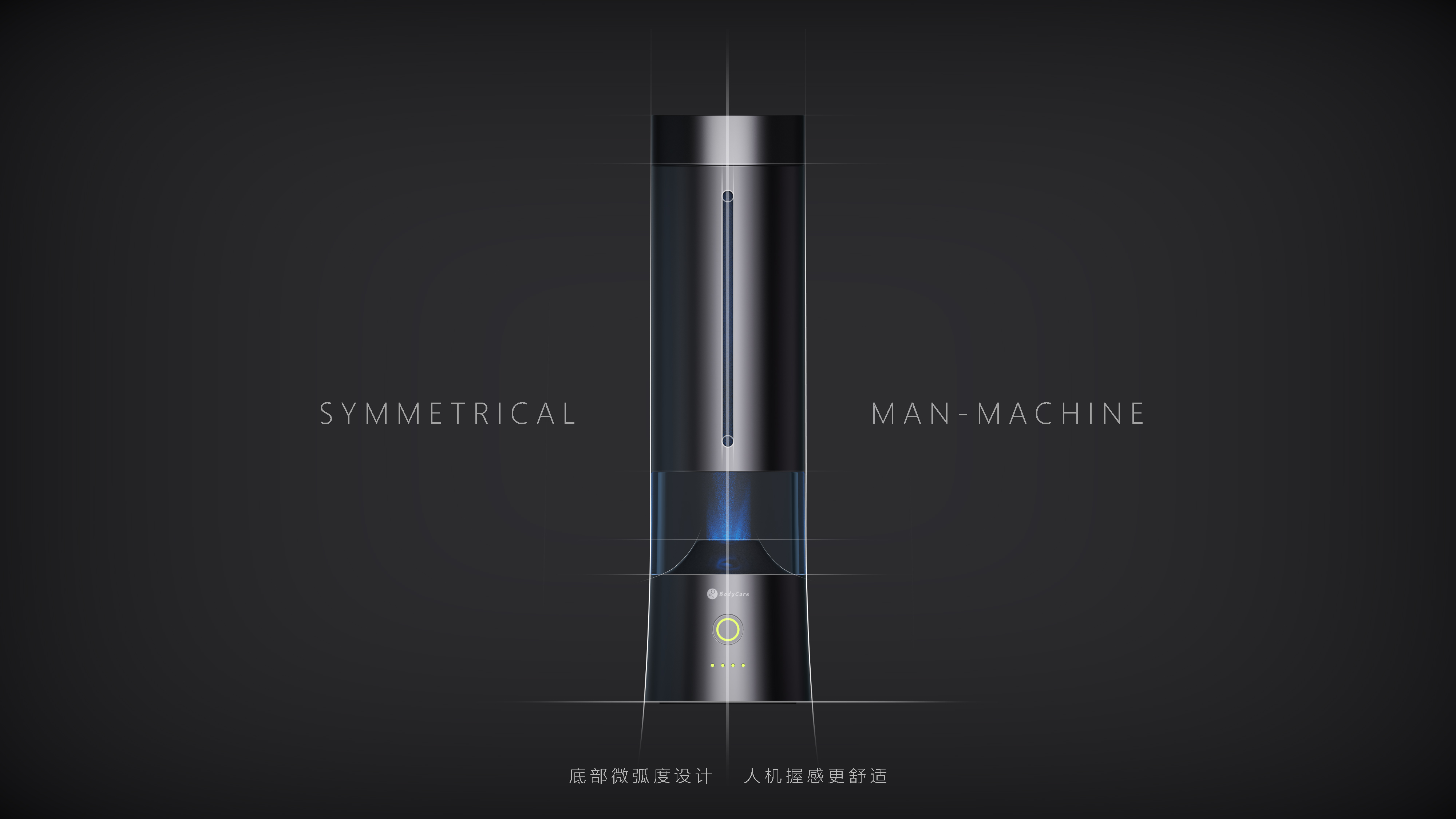
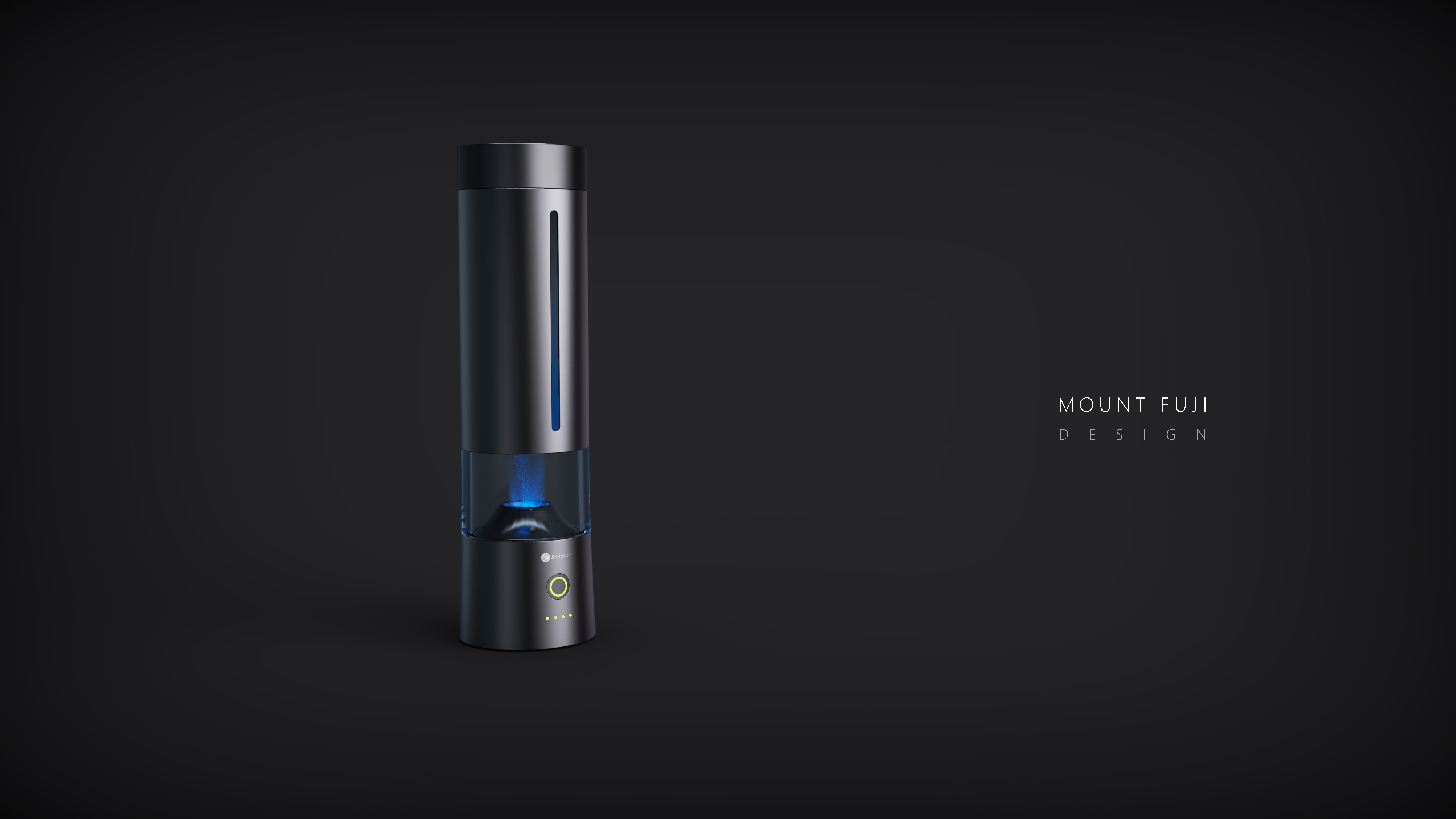
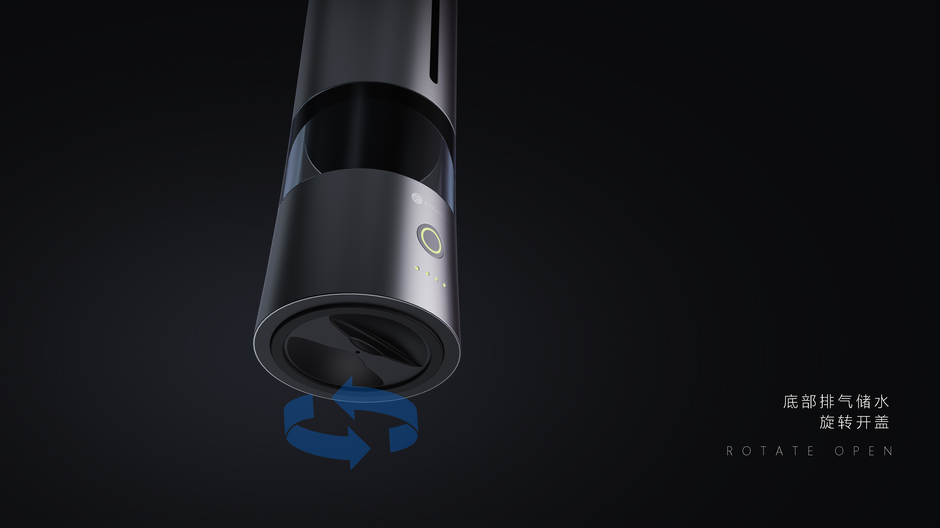
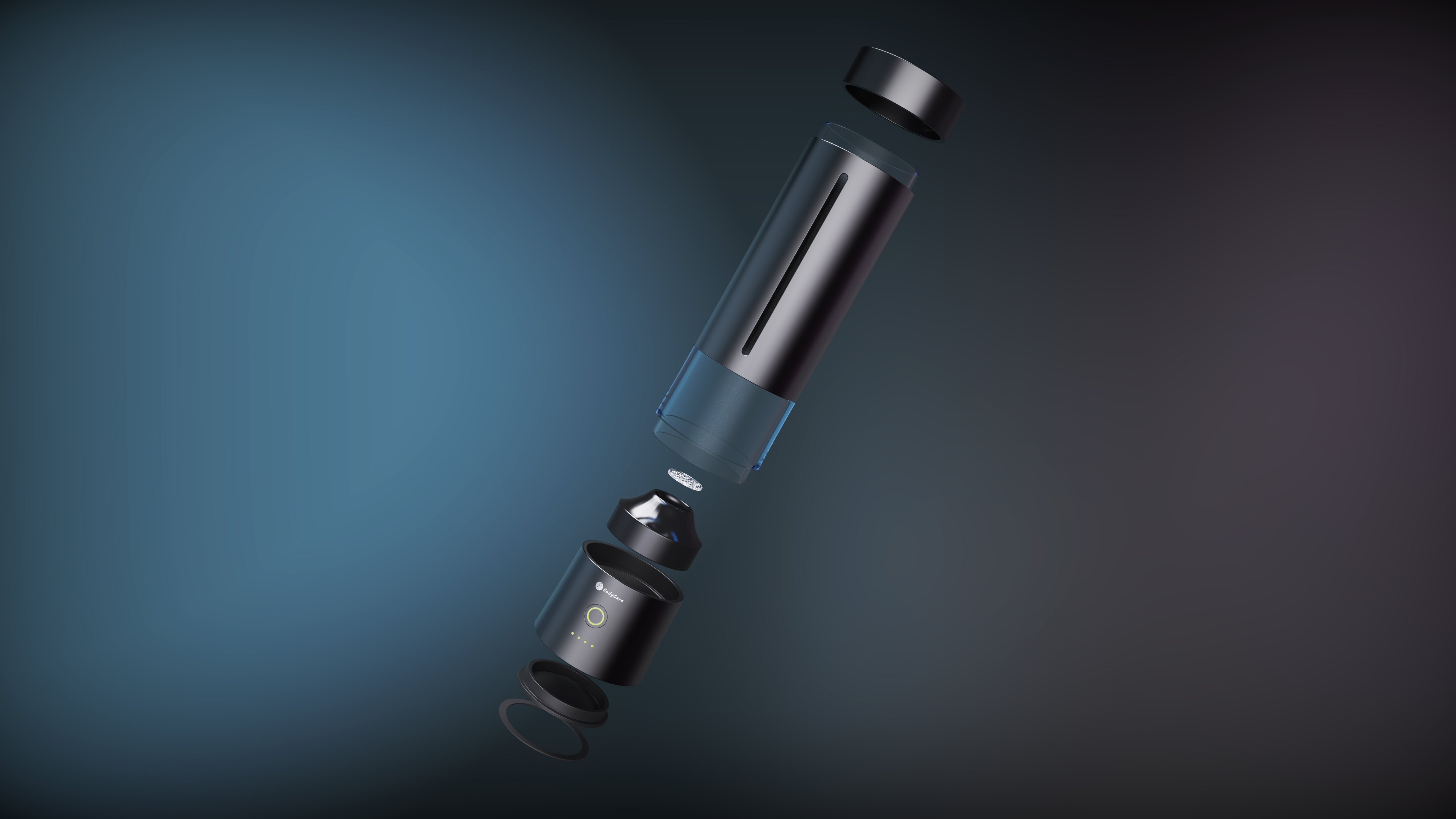
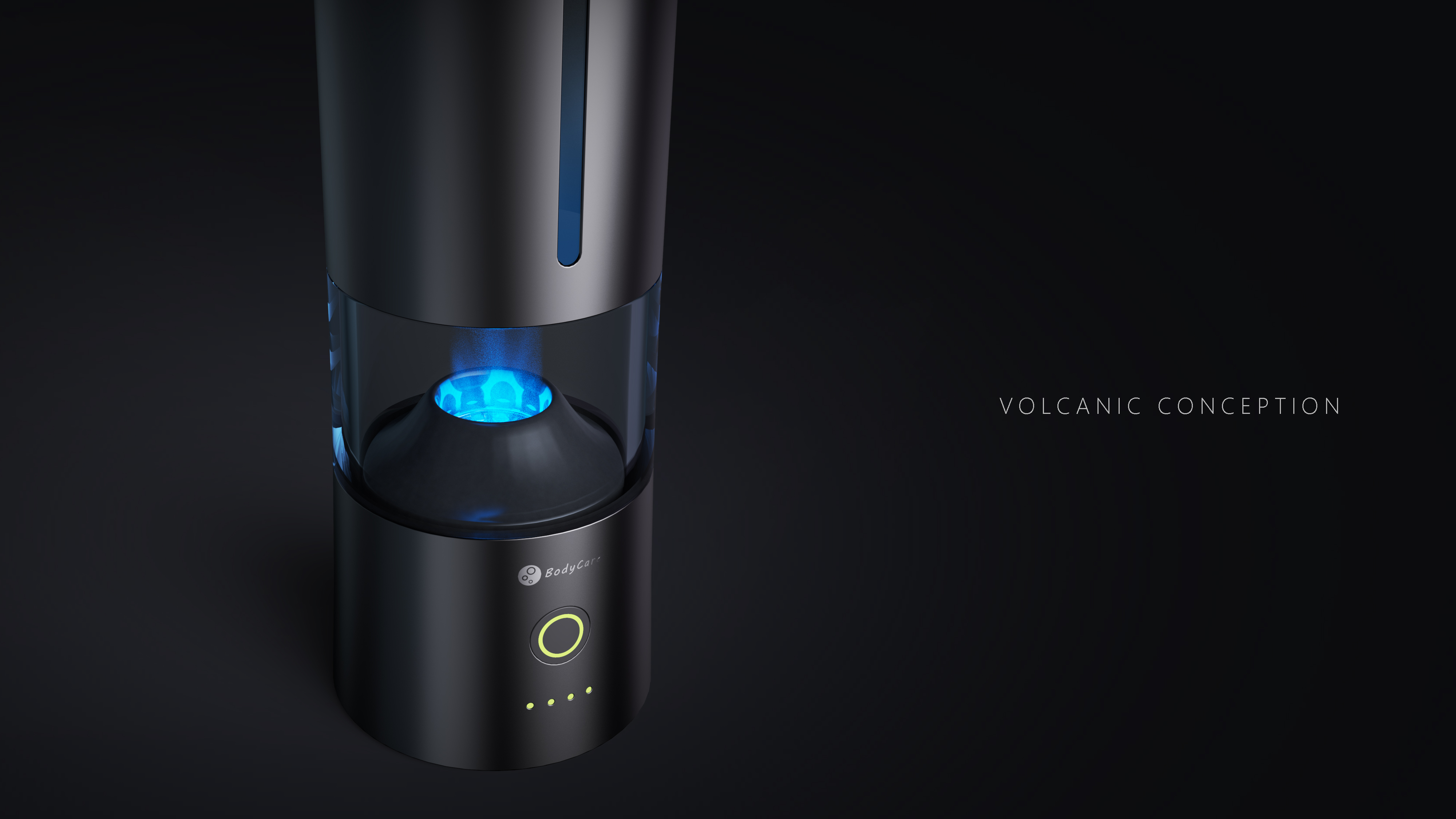
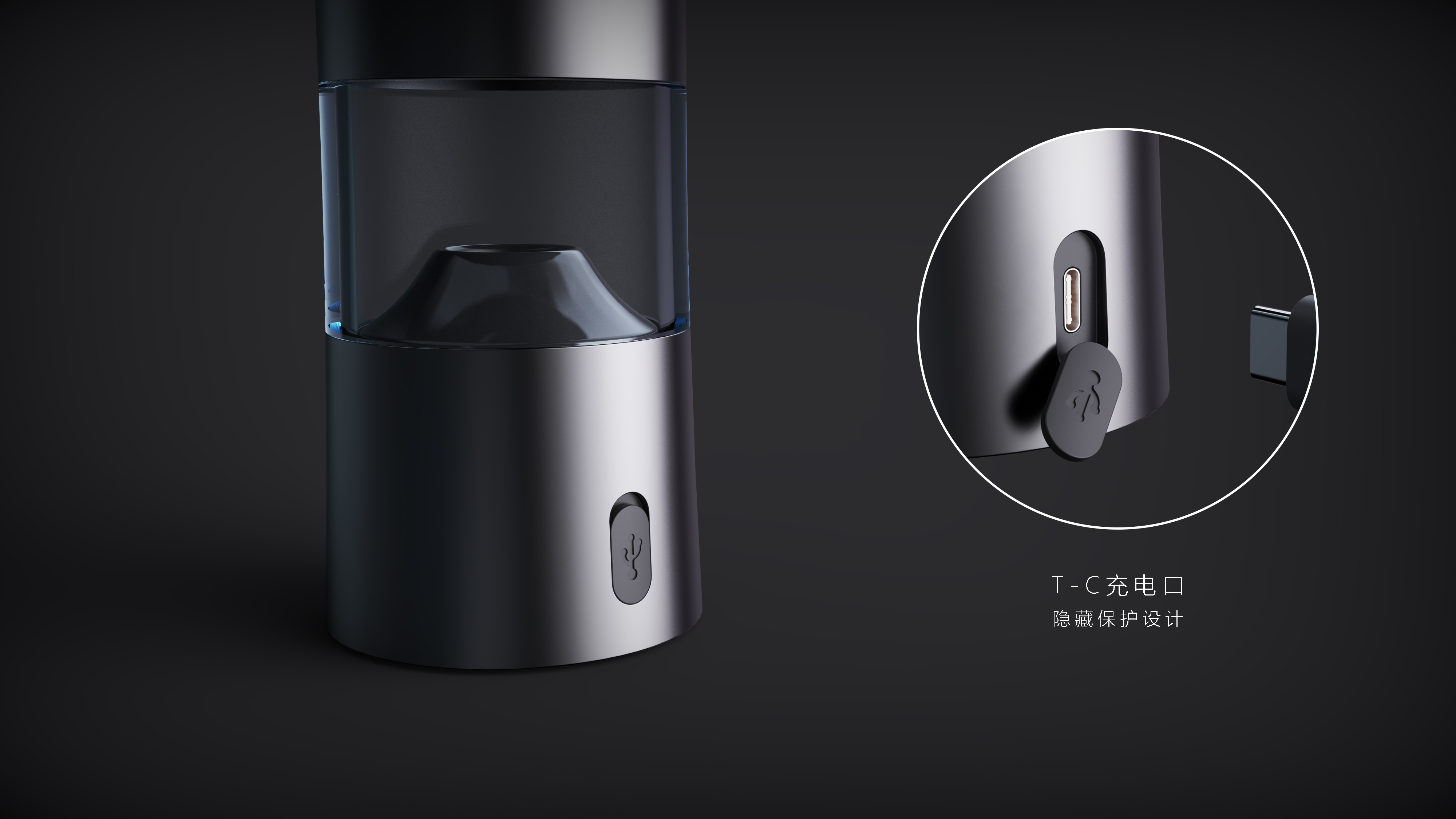
Blue highlights the atmosphere of lighting technology

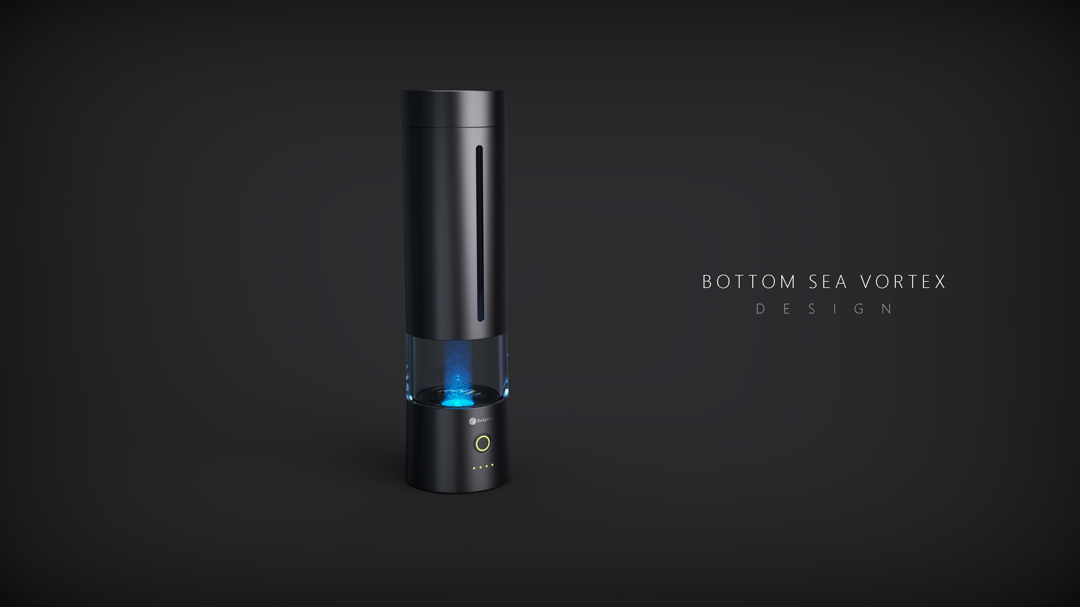
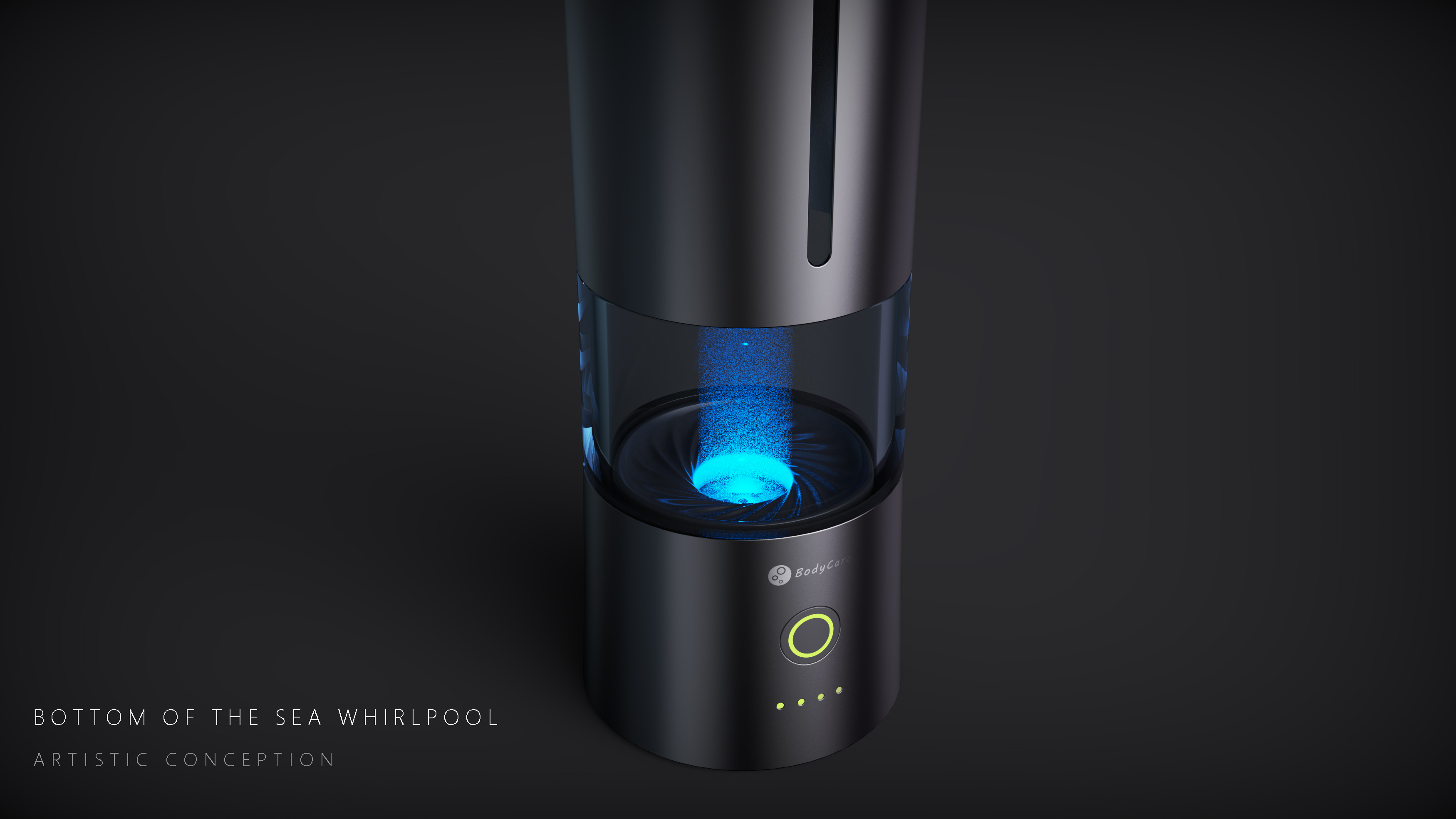
Derivative Style-Underwater Vortex


The copyright of this work belongs to Scriptures. No use is allowed without explicit permission from owner.

New user?Create an account
Log In Reset your password.
Account existed?Log In
Read and agree to the User Agreement Terms of Use.

Please enter your email to reset your password
Please change the shrine red to another name.
I think the red naming of the shrine is inappropriate. Whether it is for the Chinese or Japanese customers, even the elements near Mount Fuji are not only the shrine that can be named, and the shrine is not all red.
Oh, my God! So the design of fishing...
When I saw the word shrine, I knew you would definitely be scolded. No matter what, pay attention to the influence.
Silver Zhu, Su Fang, Scarlet and so on, so many beautiful words in the old saying, why use shrine red
Annoyed at the sight of the shrine red! Please revise it quickly.
Shrine red?
Very good
Nice design
I like this design very much.
Not bad
The details were also handled very well.
The cup is very nice