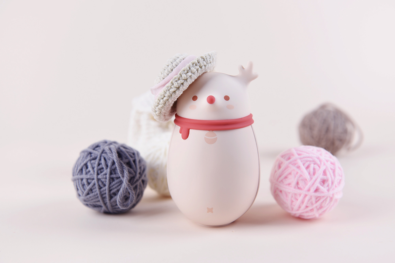
I haven't written for a long time. I can't keep the promise of Yuegeng. I wonder what I want to share with you this time. Looking back on 2018, I have handled more than ten projects one after another. Among them, the one that can trigger the topic is the deer hand warmers. Therefore, today, I will take it as a starting point and talk with you about the design experience and experience of "simple and lovely" style.
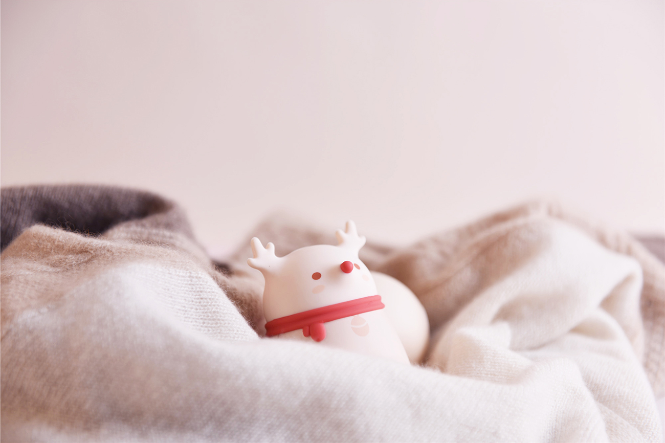
The mental journey of fawn hand warmers
The design process of fawn has not been smooth sailing, and it has also undergone several revisions and main element revisions. However, fortunately, the communication with Party A has been relatively smooth, and everyone can trust and understand each other on many issues. After the design is completed, Party A also consumes a lot of manpower and material resources in the process of coordinating production, publicity and sales. All this has finally created today's deer hand warmers.
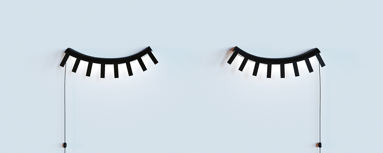
Igor Tsaruk, Marina Ahmadova, Tsaruk & Ahmadova design Sleeping Light eyelash bedside lamp, cleverly extracting the shape of closed eyes and eyelashes.
The appearance style of fawn can be defined as "little fresh", of course, I can also change to a word I like more "simple and lovely". The threshold for designing this style of product is very low. Anyone who opens a treasure and enters keywords can find hundreds of different brands producing such products. But if you look closely at the sales volume, you will find that there are very few good merchants that can really sell. The reason is that more than 90% brands or designers cannot perfectly control the "degree" and proportion of loveliness and simplicity. Just like the salt and sugar when cooking, put one more spoon and one less spoon, when to put it; How to change the amount of salt and sugar when the same dish is different. No matter where something goes wrong in these places, the product style will deviate, which will eventually lead to miss the target customer and affect the sales of the product.
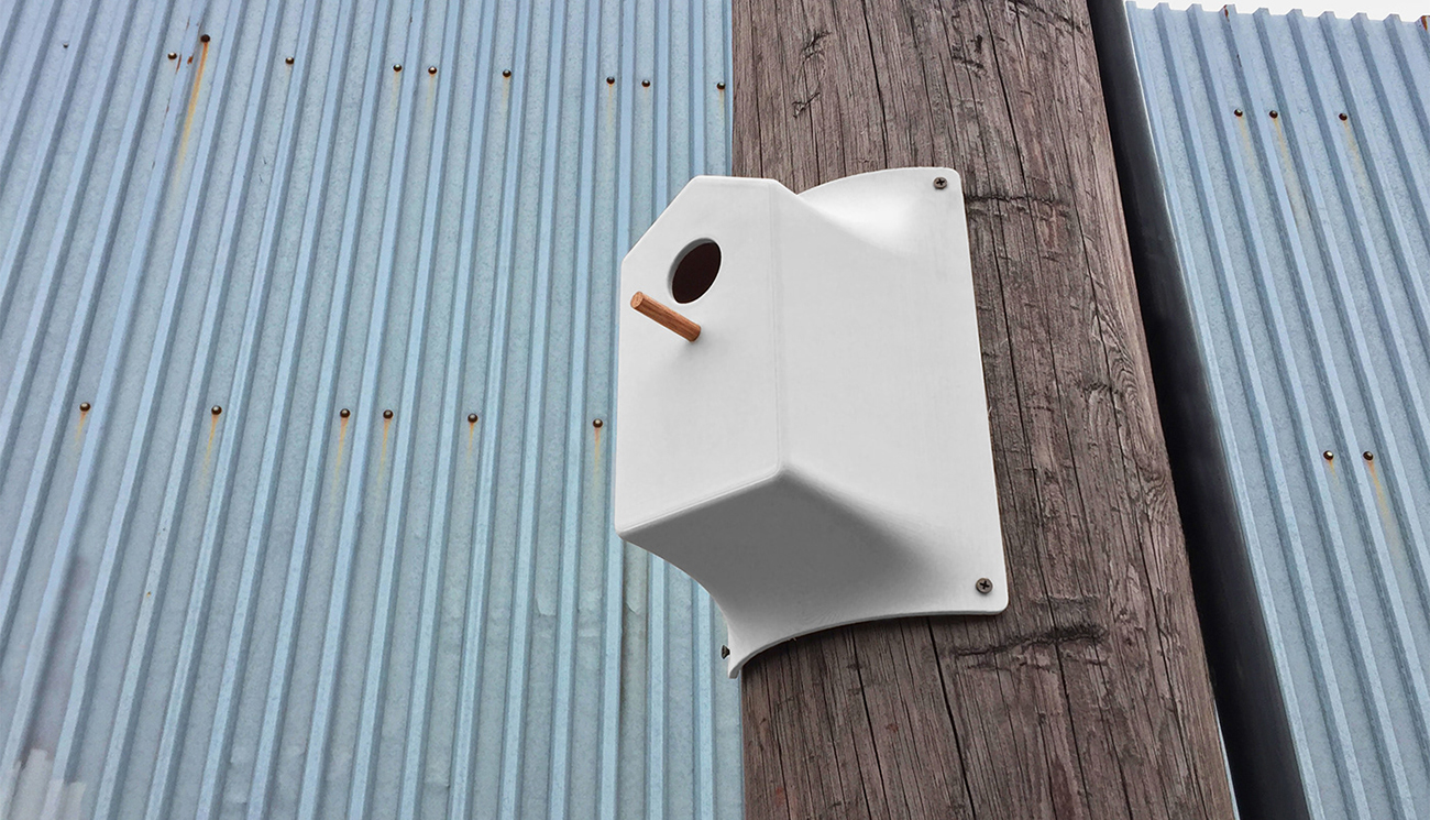
Nicholas Baker Flyer Birdhouse Bird House, the perfect combination of straight lines and curves creates a simple and lovely effect.
Are cute and childish the same thing?
Please help me design a product, the target audience is both male and female. The style should be lovely and pleasing, but not childish. This sentence is certainly no stranger to many designers who make daily necessities and small 3C products. "Can men accept the loveliness?" "Cute but not childish?" These difficult words are just like the "colorful black" that was crazily criticized back then, just like a boulder rolling down the hillside, a straight male designer of steel who can crush into pieces. How to analyze this kind of seemingly "feminine" but actually "neutral" products is not a simple knowledge.
In my opinion, loveliness is a commendatory term and childishness is a derogatory term. Excessive and disorderly loveliness is childish, which is actually a process of qualitative change caused by quantitative change. In the product field, stacking too many cute elements on a product without thinking will make its appearance quickly decline in the direction of simplicity → cute → childish → greasy.
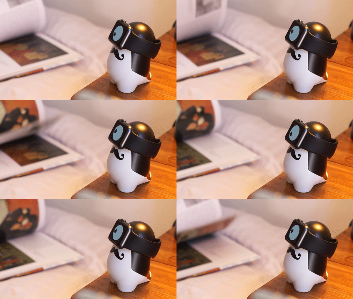
vivien MULLER WATCHme iwatch charging stand, abstractly extracting the profile of penguins with a lovely beard.
Do you really need all the facial features
The most conceivable way to make a product look "cute" is to print the expression of a small animal on the surface. Here I roughly divide expressions into five categories: eyes, nose, mouth, eyebrows, blush. In addition, there may be ears, horns, hats, etc., but since the latter three categories will be presented with the outer contours or independent parts of the product itself, they will not be discussed here.
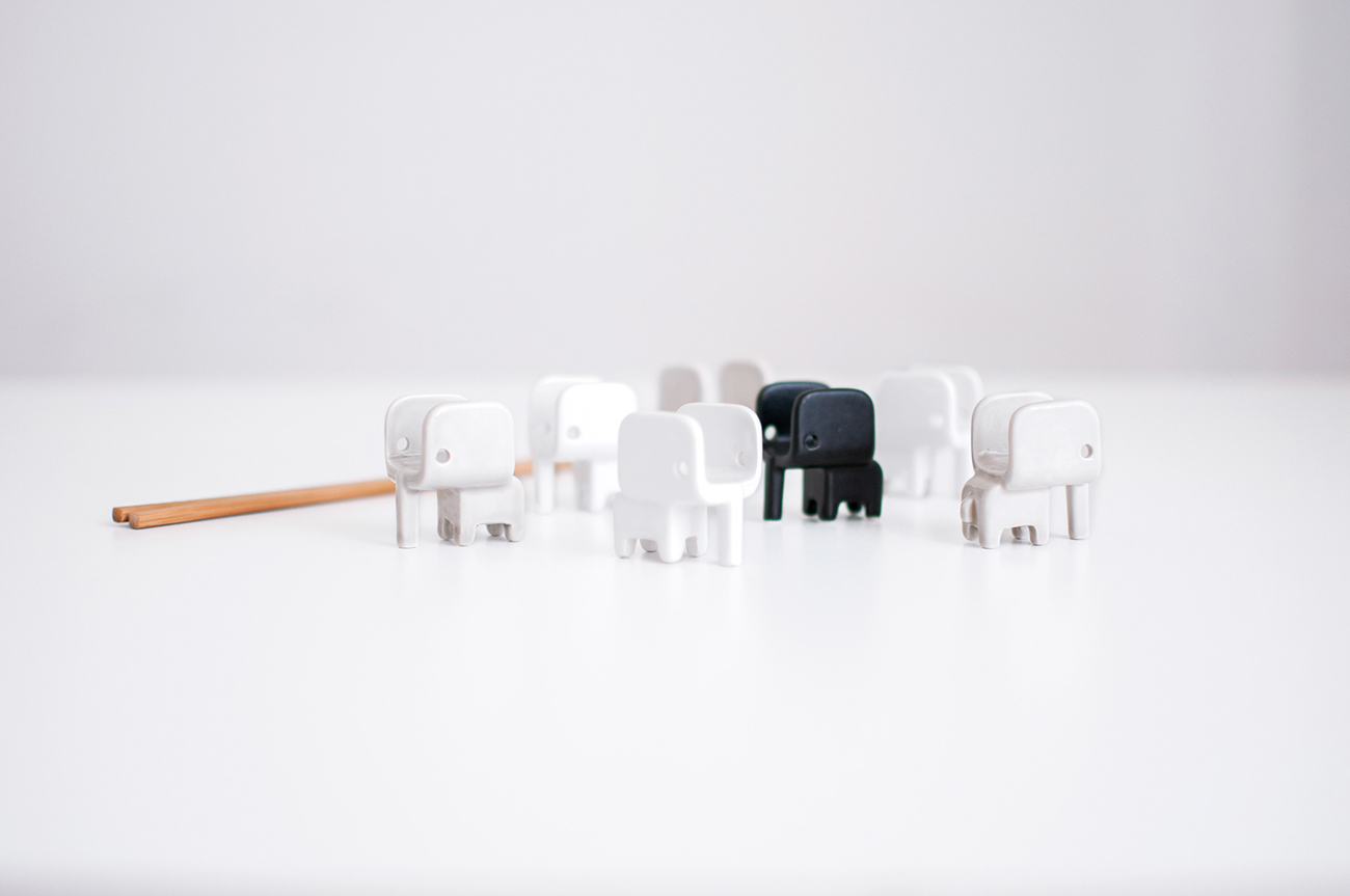
Manuel Frasson, Alice dal Verme, Fabio Verdell Elefantino the small elephant chopstick holder, which introduces rounded corners into the straight body to create a case of style change.
For a real-world advanced life, these elements are of course indispensable. Otherwise, the so-called valley of terror effect will form. But for the expression elements of the cartoon world, the more complete the product is to be presented on the surface of the "inch of land and inch of gold. In some cases, removing the mouth to keep the eyes, only the eyes or only the nose, or even no expression at all, is a great strategy. On the one hand, this can leave more space for users, just like a thousand hamlets in the heart of a thousand people. A thousand users will also have a thousand expressions of their own in their hearts. On the other hand, it can make the surface of the product cleaner. After all, the most important value of the product is to meet people's use needs. If the whitewash is too exaggerated, it will put the cart before the horse, making the overall perception "greasy".
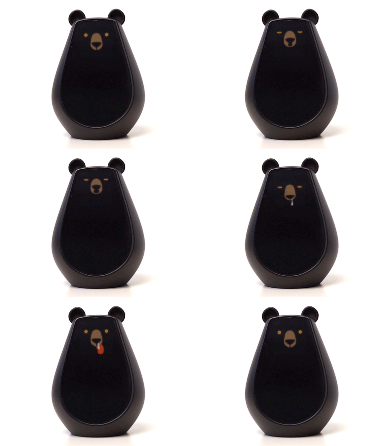
vivien MULLER Bearbot a bear intelligent robot, adding a large cut angle to the front of the round bear body to focus on human vision.
Matching of straight lines and curves
Under natural conditions, almost no object presents a perfect straight line or curve. The reason why nature makes us feel beautiful and harmonious is largely because the scenery in the field of vision can be relatively perfect in the matching ratio of straight lines and curves. Then the same problem falls on the product, how to achieve "soft and hard" is a test of the designer's personal ability. For example, adding a 10% straight line to the softening curve of the 90% can make the whole product instantly different. Because the human eyes and brain are used to looking for factors of "accidental disharmony" in things of "continuous harmony. On the contrary, adding a little rounded curve to the straight line can bring people a strong sense of detail refinement and introverted beauty, thus achieving the purpose of sublimating the product. This series of techniques are very common in Japanese minimalist design and BRAUN product design.
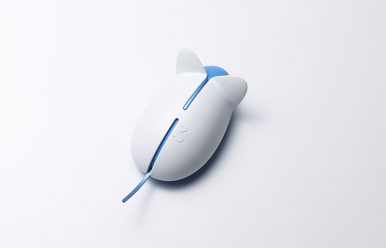
BKID co. Balance mouse mouse mouse cleverly captures the appearance characteristics of mice-ears and tail.
Condensing Details and Conceptual Integration
When we were young, kindergarten teachers often asked us to do imagination exercises, such as when we see clouds, we think of cotton candy, when we see leaves, we think of people's eyes, etc. A thin wooden stick may be a match, a chopstick or a pen. This kind of association is actually the process of condensing the characteristics of things by the human brain. In reality, if you want to design a product with the theme of "cat", then you can not only design the cat face pattern on the surface of the product, but also refine the contour shape of the cat in various postures, and even you can take the cat's quite recognizable tail shape and install it in a certain position of the product. The above three methods, whether alone or in combination, can achieve satisfactory results as long as they are arranged properly and reasonably.
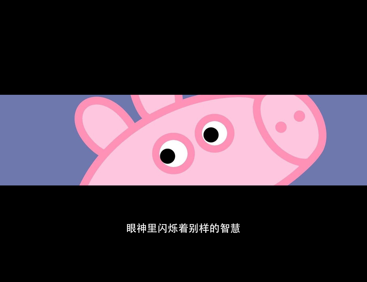
Why Piggy Page Is Fire
In the past two years, Piggy Page has become a big hit in the online world. Its popularity has crushed all cartoon IP images in the same period. It ranges from the earliest protagonist of the early education film, to the role of various magic emojis, to the symbol of "social man", and finally to the hardcore blower version of "What is Page" that became popular a few days ago ". Ultra-high topic traffic is always accompanied by unlimited business opportunities. Agee has seen business friends write long articles from the perspective of marketing and operation to analyze the incubation and development process of this IP more than once in the circle of friends. So what can we, as product designers, see from Piggy Page?
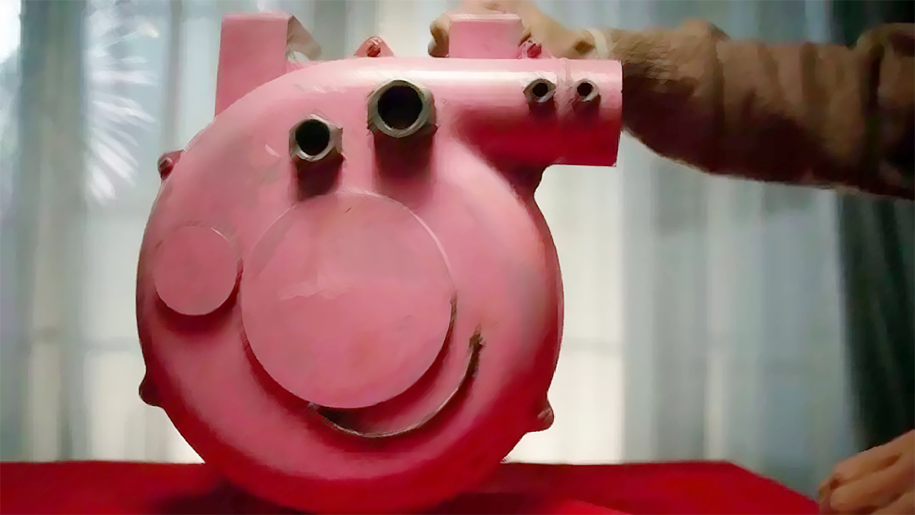
Page's 90% credit for being able to fire lies in his magic nose and face. We can look at this design from three perspectives. First of all, the characteristics of pigs are clear. Pink skin with two large nostrils can let the audience know that they are seeing a pig (the design intention is clear). Second, flattening. Most IP images are divided into front and side when showing facial features, but Page does not use them. His face is a flat three-dimensional shape, as if he is looking at you with the front face and the side face at the same time, isn't it magic? (Using few and simple elements to highlight the design features) Third, the whole nose is like a whistle. The line proportion is properly matched, looks lovely, clean and concise, which makes people remember everything. (Proper design fusion, reasonable collocation of curves and straight lines)
Finally, tell everyone a secret. In fact, how to test whether a product known as "simple and lovely" is really successful is actually very simple. All you have to do is ask the straight steel men around you if they think it is cute and acceptable.


The copyright of this work belongs to 挠头阿吉丨龚允吉. No use is allowed without explicit permission from owner.

New user?Create an account
Log In Reset your password.
Account existed?Log In
Read and agree to the User Agreement Terms of Use.

Please enter your email to reset your password
The front is very recognized, the last page, he can fire, I think more is curious, curious psychology is more than cute.
Is the boss a little brother or a little sister?
Most of the cute girls in the eyes of straight steel men will not like (such as the gift my boyfriend gave me)
The last point is absolutely right. In the eyes of straight men, only very cute can be cute. Generally cute is strange.
Very beneficial
Great, thorough analysis, many times you may know this point, but the analysis is not thorough.
Thanks for sharing, I have been taught
Take it out and taste it again every once in a while.
Very useful ~~
It is worth learning and very useful!
Very good!
Thank you for sharing
Benefit a lot!
It's great