www.dragontan.com


The copyright of this work belongs to 1% DEGIGN STUDIO. No use is allowed without explicit permission from owner.

New user?Create an account
Log In Reset your password.
Account existed?Log In
Read and agree to the User Agreement Terms of Use.

Please enter your email to reset your password
Not enough detail scrutiny, not enough visual features. Learn about Dyson.
1
Copy of our company's products from previous years
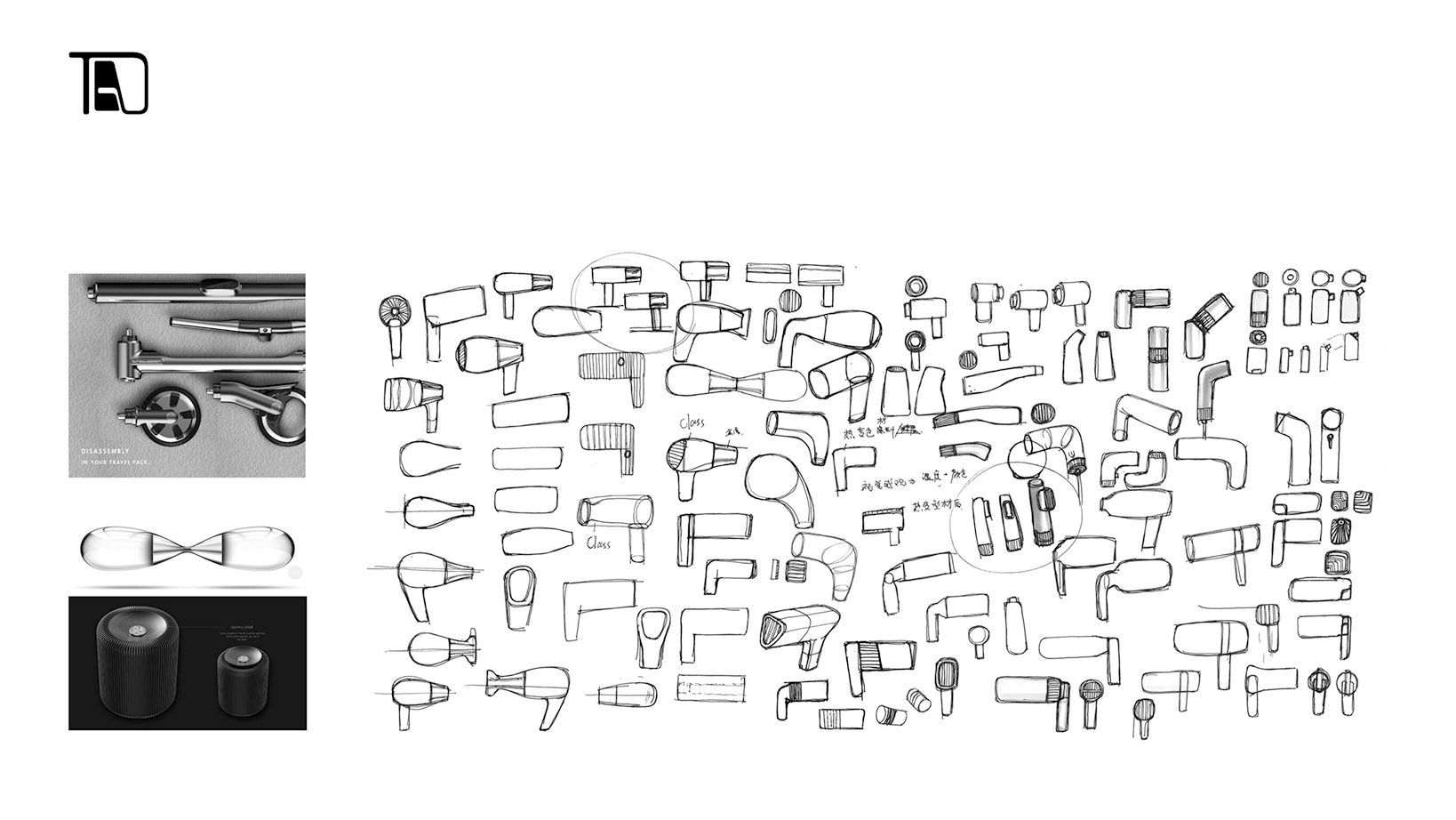
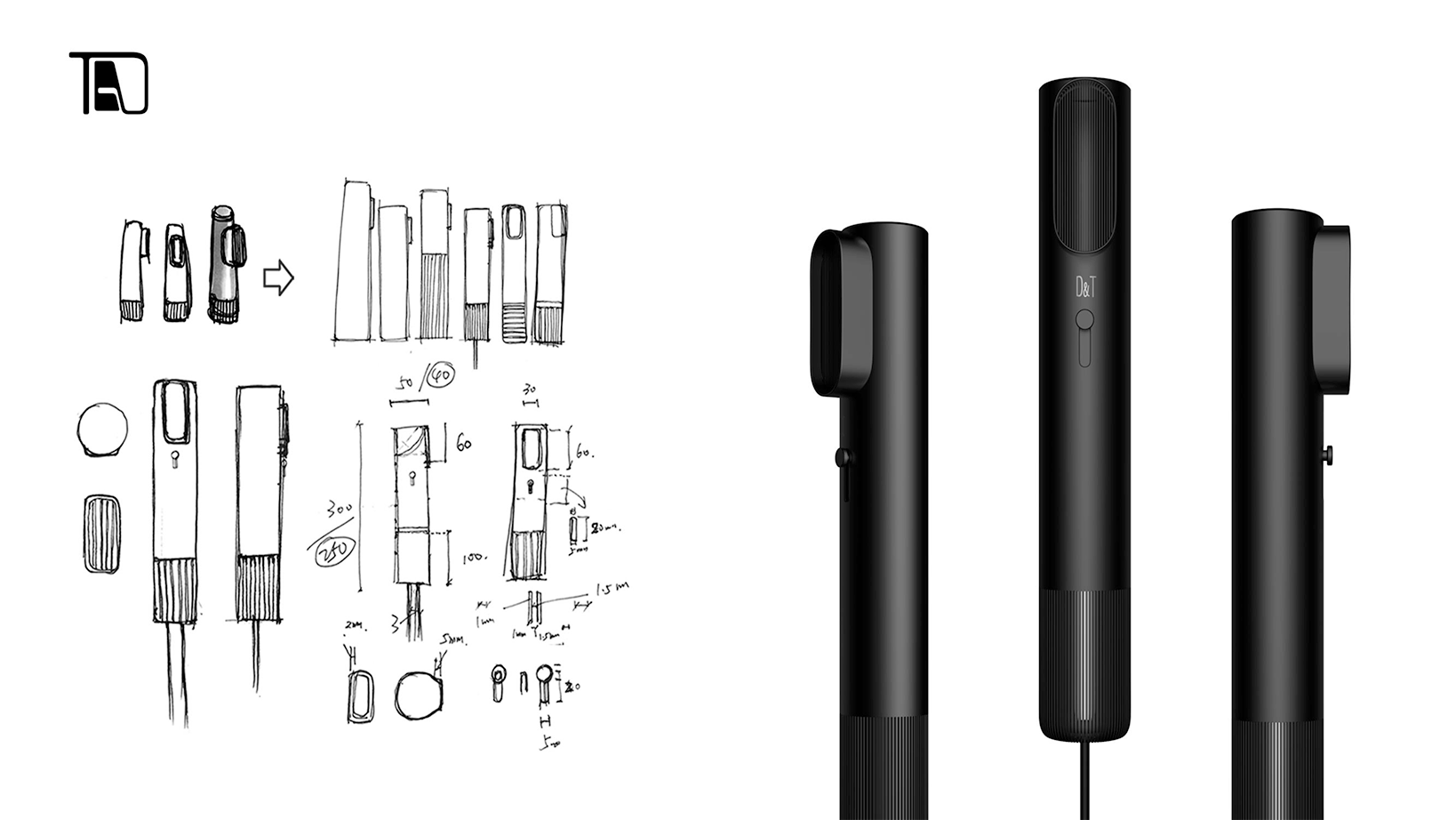
Good ha, then I said ha, the most important thing is that the product is not used clearly enough. The overall proportion feels a bit long. I don't know if you are due to stacking and structural reasons. If it is a simple style, although the simple style looks simple, in fact, if you look carefully, you will find many surprises. Most of the time, things that feel good are constantly rejected by people nearby, and then come out to compare things with the first draft and the second draft, and then find that things are getting better and better. Sometimes, some Party A really makes what we do better and better.
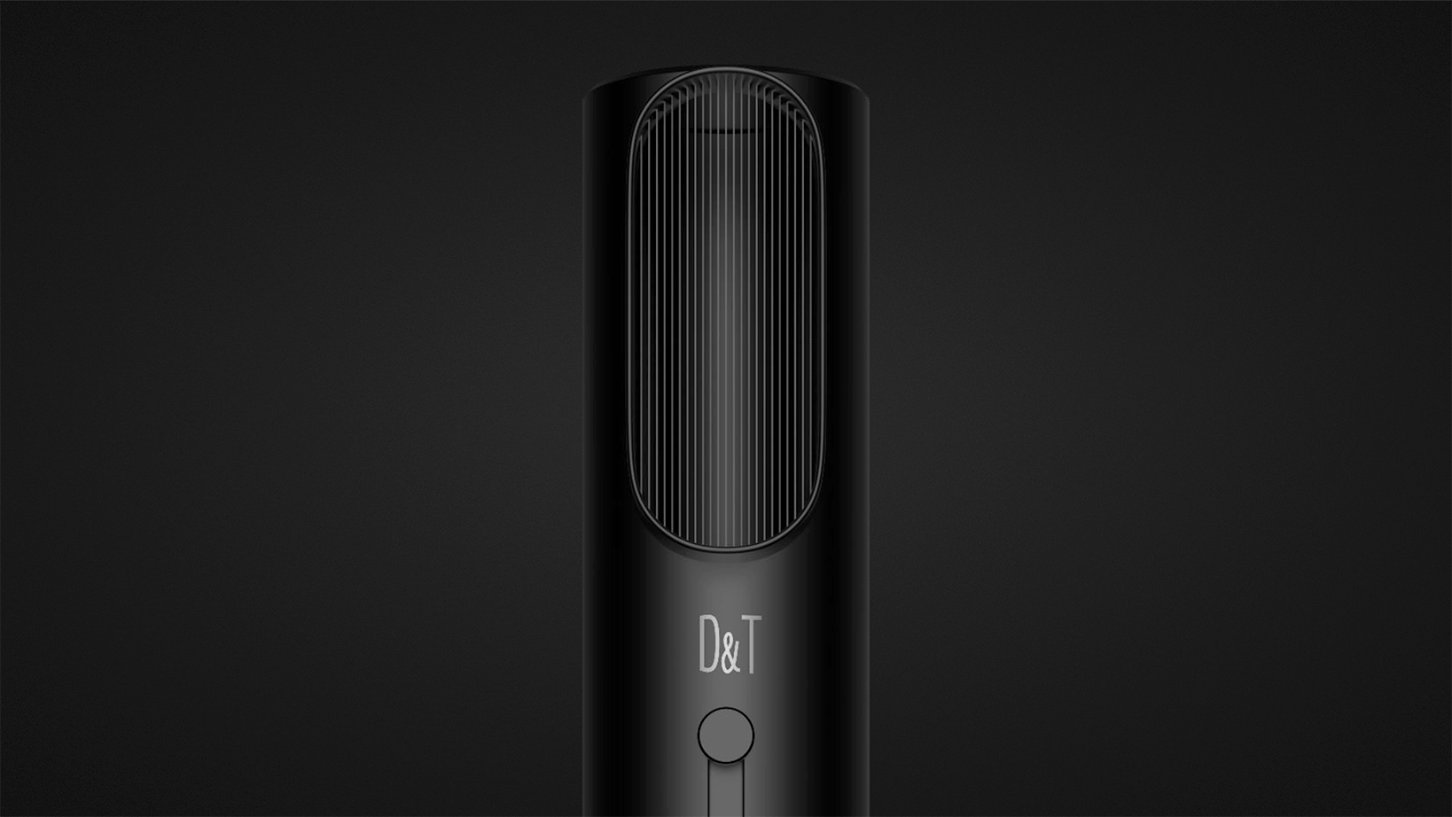
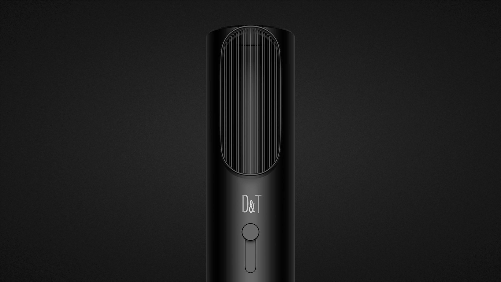
We can see that the details and proportions are really good.
Don't you involve technology patents? Is Dyson's hair dryer the same? It's just that the appearance is different, isn't it!
Consider man-machine
The shape is good, but can it really work? Or is it really easy to use?
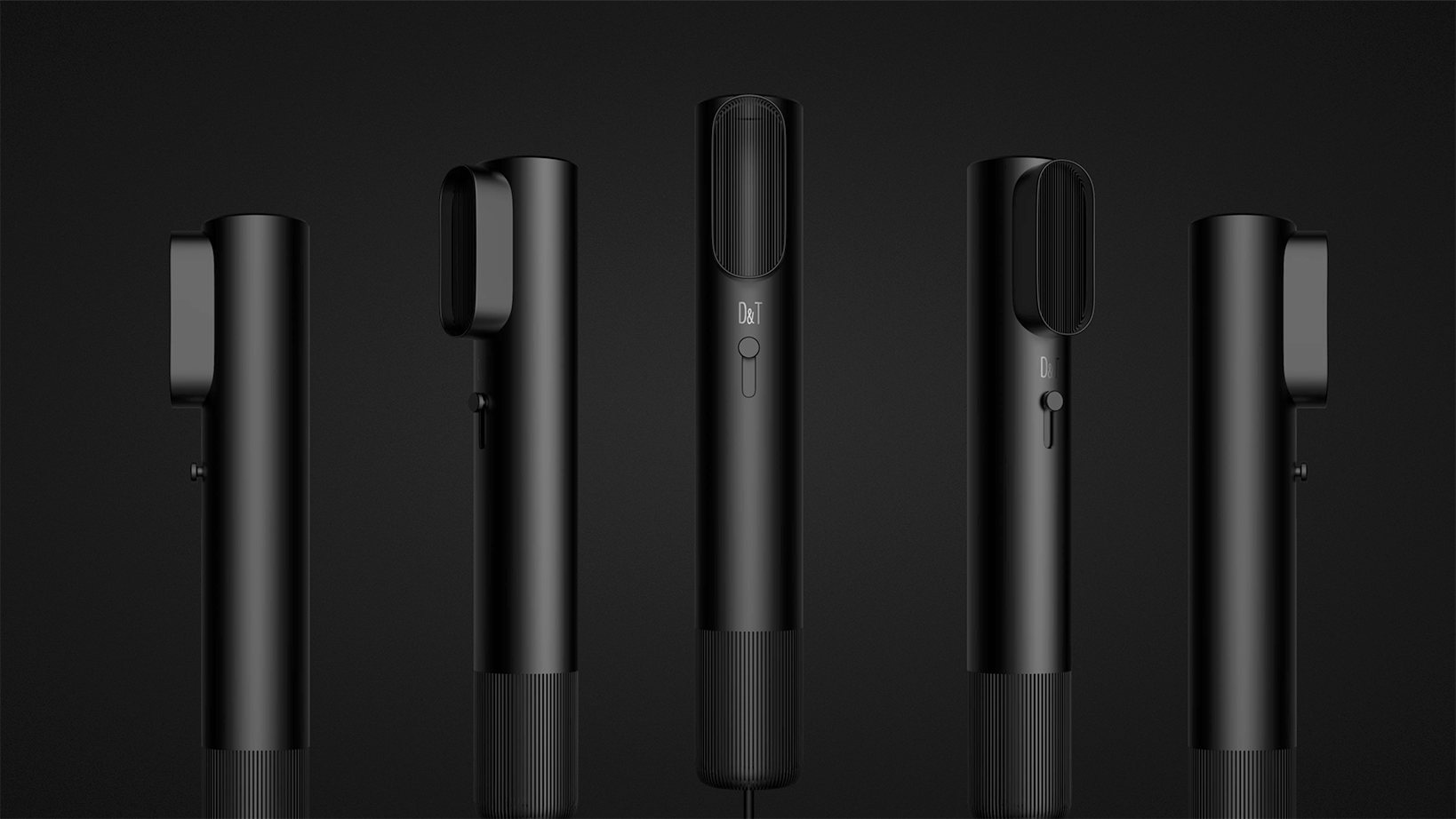
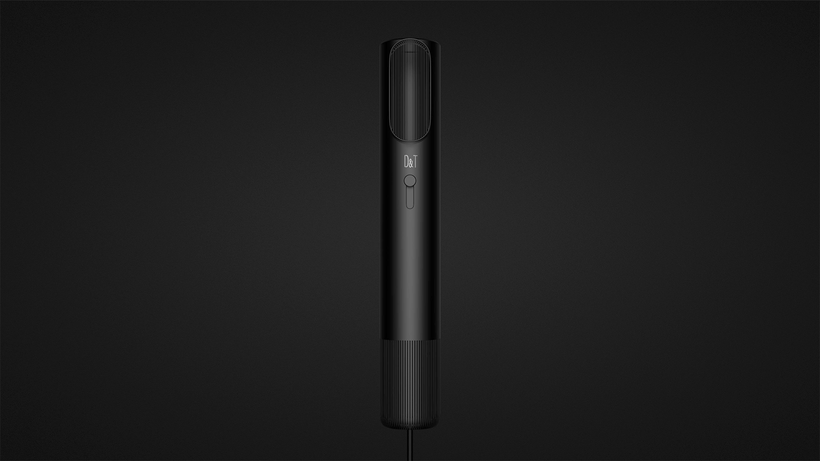
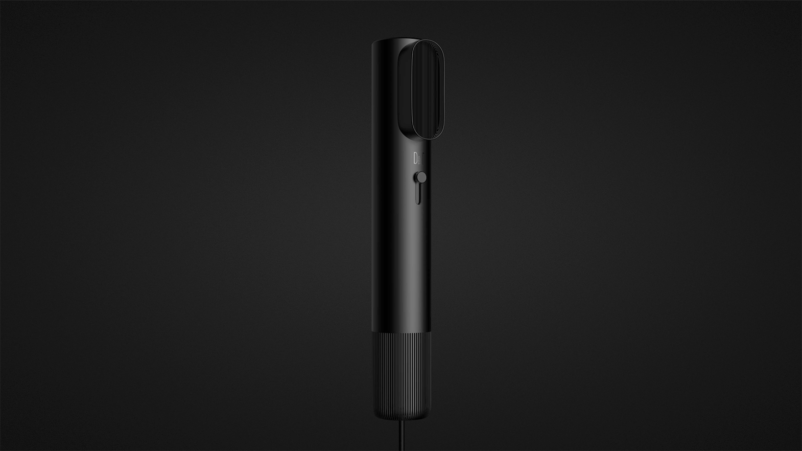
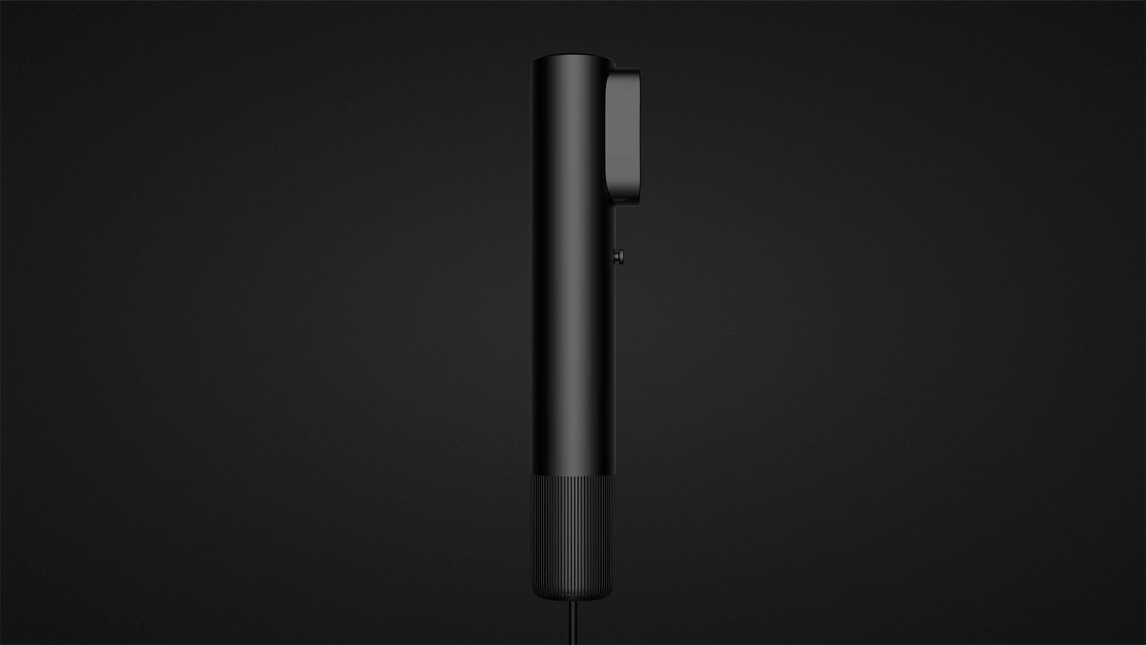
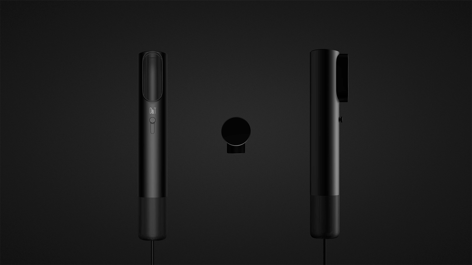
The front view back light is not strong enough to see the outline clearly. The whole is still very durable, but there are few parting lines up and down. Yan is in charge, but he feels that it is not in line with man-machine.
Everyone is welcome to point out the shortcomings and communicate more.
The picture collapsed, and it will be like this when uploaded from the mobile phone.
The halo is a bit too much.
Delicate black
Not bad
Good black