OCD 2022 BRAND DESIGN
Project background
"Hong Kong No.1" is a high-end independent sub-brand of Chenguang Dairy. In the context of the post-epidemic, in the face of the domestic dairy trust crisis and the growing health needs of consumers, Chenguang Dairy, as a traditional regional dairy company, has an urgent need to integrate and optimize its dairy and non-dairy leisure drinks.
---------------------------------------
Jia Guwen's creative team conducted in-depth insights through all-round high-end milk industry scanning and consumer research, and carefully evaluated the assets that need to be inherited for brand upgrade, thus formulating a systematic brand upgrade strategy plan for Hong Kong No.1.
Customer Service: Chenguang Dairy Co., Ltd.
Service Team: OCD Jiagu Wen Creativity
Main creators: Liu Wen, Dong Junyi, Hu Shuangyong, Zhong Jianqiang, Wang Siya, Wen Ruijing
Service Content: Brand Strategy | Market and Consumer Analysis | Product Matrix Sorting | Brand Visual Image Upgrade | Packaging Design

As a high-end positioning product of Chenguang Dairy, "No.1 for Hong Kong", OCD Jiagu Wen's creativity helps No.1 for Hong Kong to go out of the road of personalization, differentiation and independence. Activate the high-end independent sub-brand of Chenguang Dairy, deepen the awareness of the exclusive brand of Hong Kong One, and create high-end dairy standards in the Bay Area. In order to realize the strategic layout of one high and many strong brands/products, the key first step is to realize the firm positioning of high-end dairy products for Hong Kong No.1, give priority to independent upgrading of brands, and establish the value distinction between Chenguang high-end dairy products and mass dairy products.
In the deep cultivation of the Bay Area culture, the standard of supply to Hong Kong is the high standard of good milk in the Greater Bay Area. Based on the analysis of consumer cognition, except for the needs of special groups, most of them are equated with "high quality milk protein" and "high calcium" and quality.
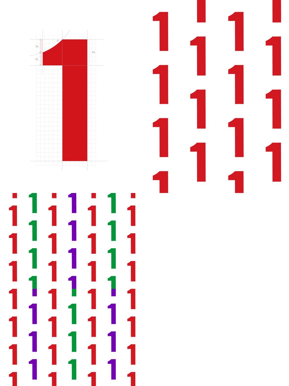
Super Symbol: One (1)
"1" is an international common number and a natural brand symbol, which expresses the ambition of Chinese dairy products to be a world-class dairy brand. It represents the courage and determination of Hong Kong No.1 to ride the wind and waves, forge ahead courageously, surpass itself and pursue excellence. At the same time, it also contains the unlimited potential and expectations of the new brand positioning-"the next moment, more legendary.
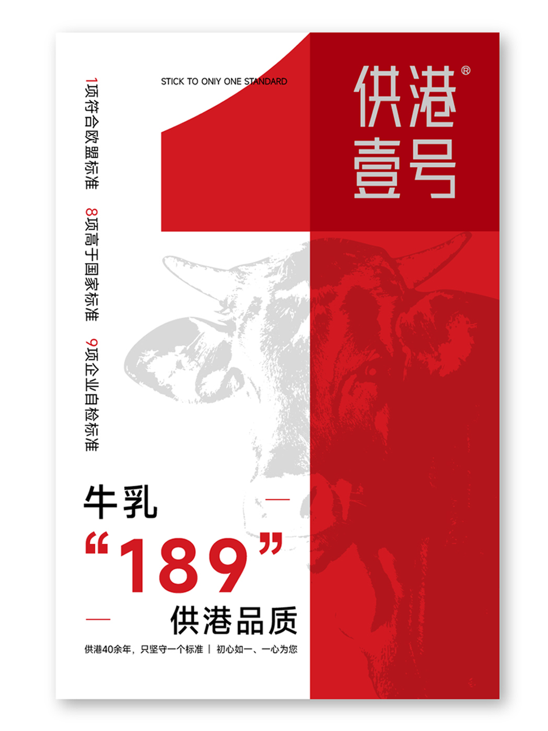
Standard Digital Occupancy: "189" Standard Information Communication
At the same time, "1" represents that enterprises have always adhered to 189 standards (1 meeting EU standards, 8 higher than national standards, and 9 enterprise self-inspection standards) to be a good quality gatekeeper for every drop of good milk, so as to enhance consumers' trust and memory mark for the high quality supplied to Hong Kong.
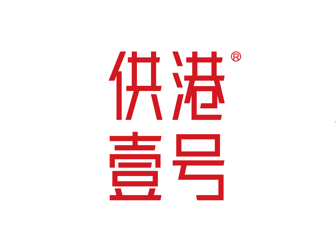
Brand logo upgrade
In the upgrade of brand logo, Jia Guwen's creativity follows the positioning of high-quality attributes, adhering to the design concept of "simplicity is light, details are luxury", and adopts sans serif unified font to enhance logo recognition, with overall slim and regular, both youthful and powerful.
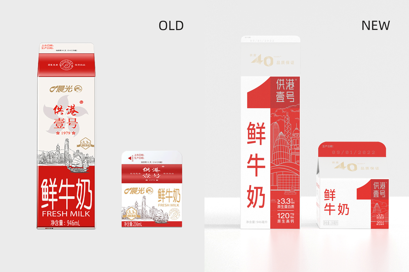
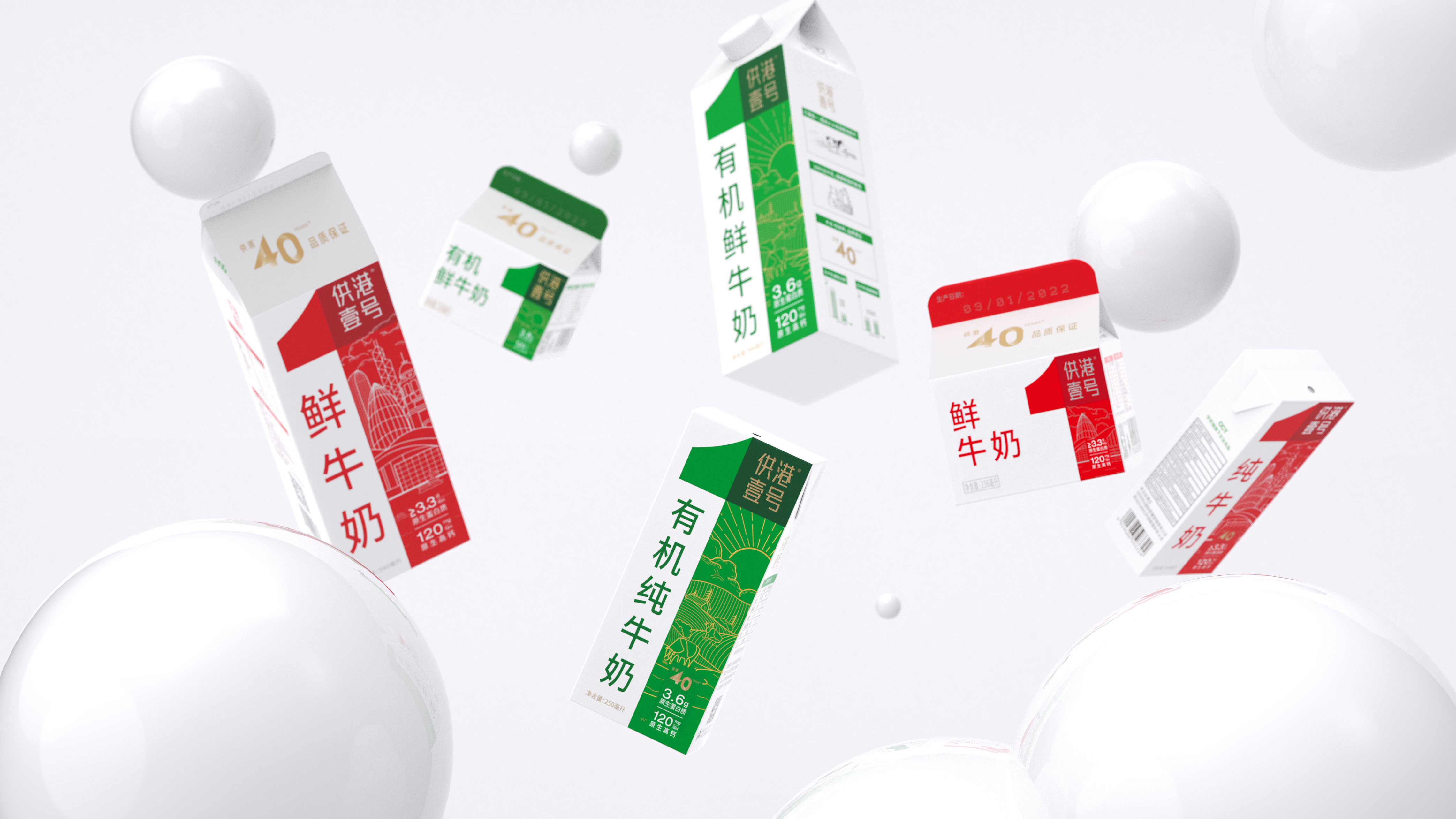
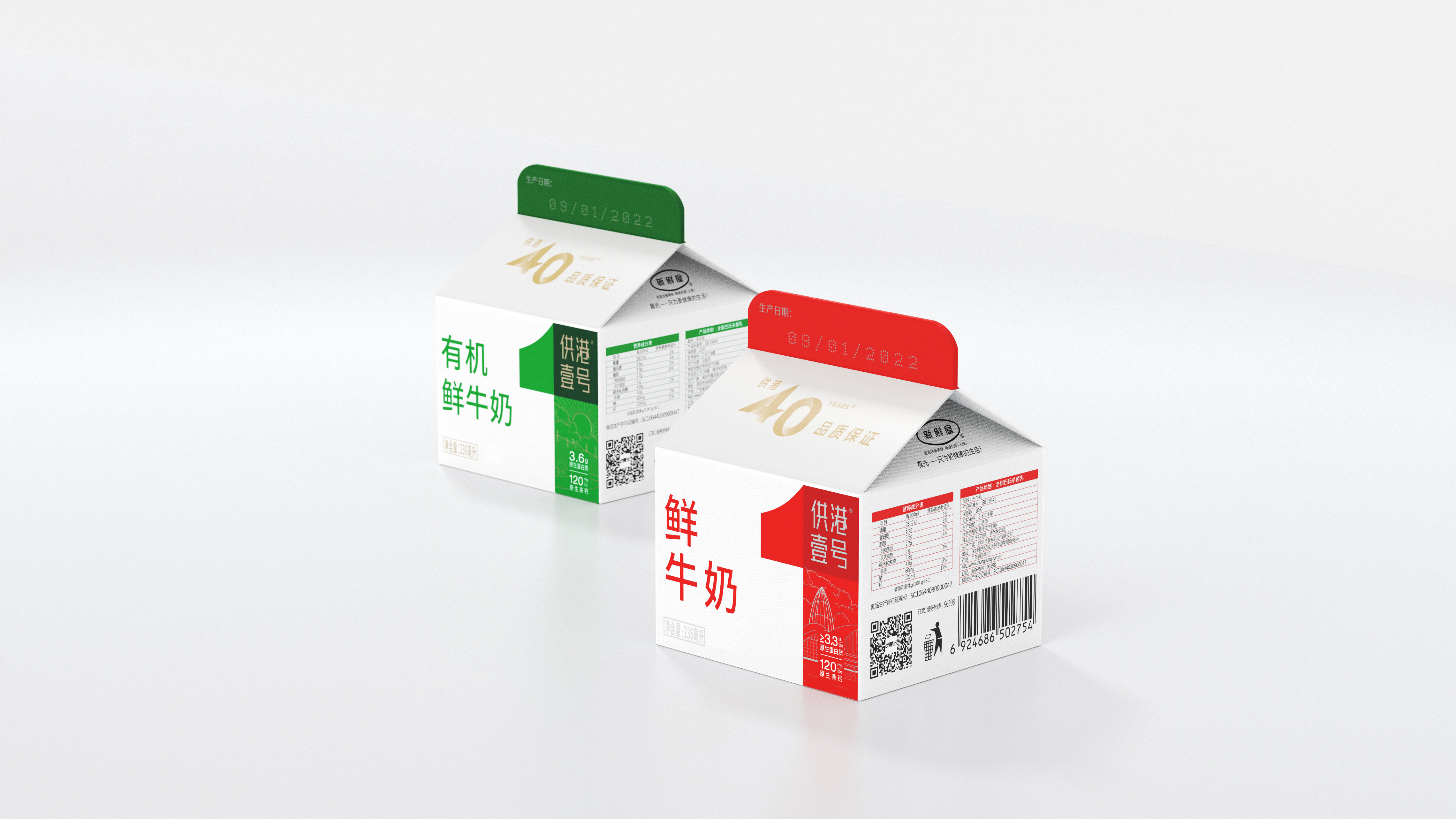
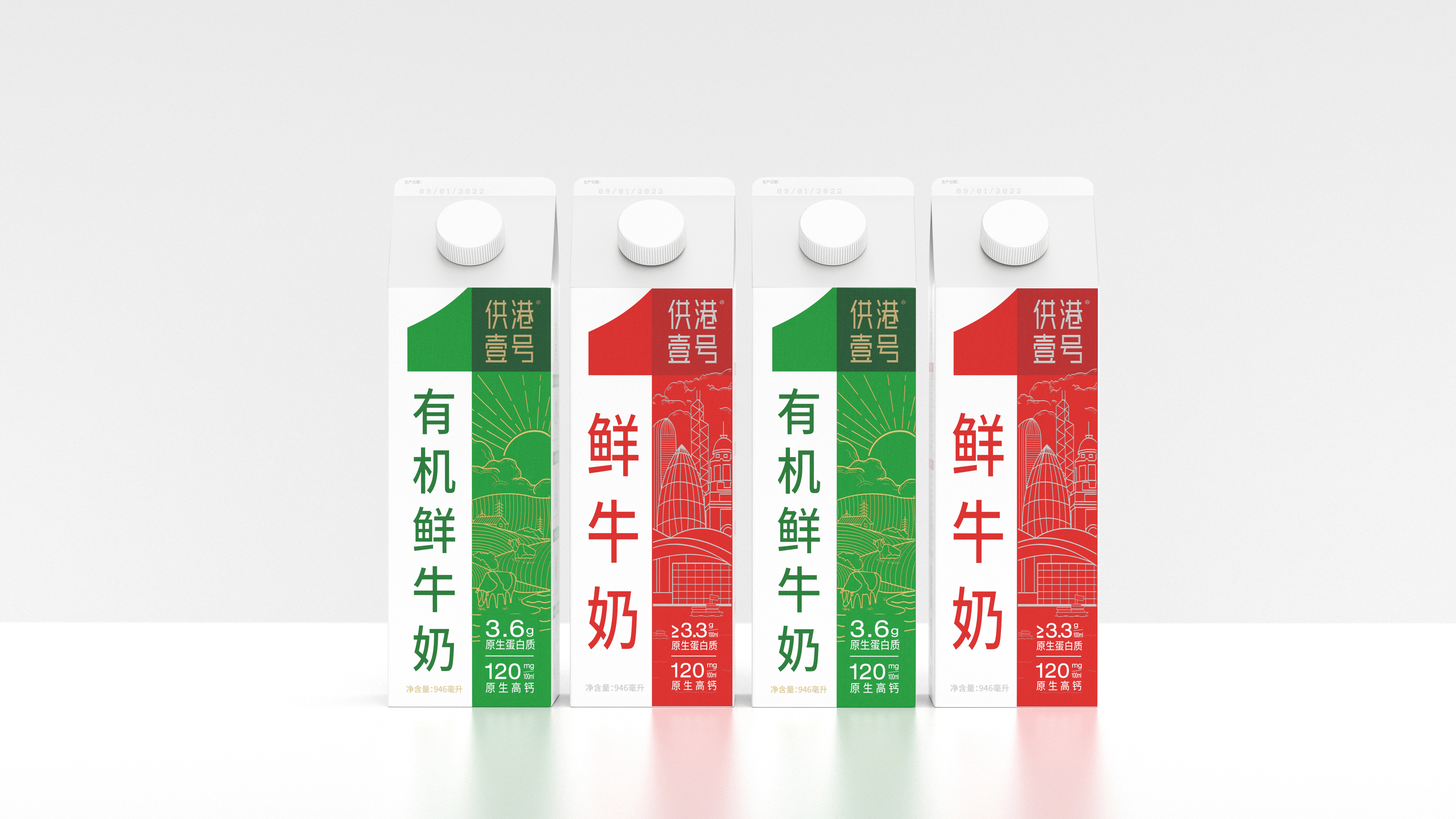
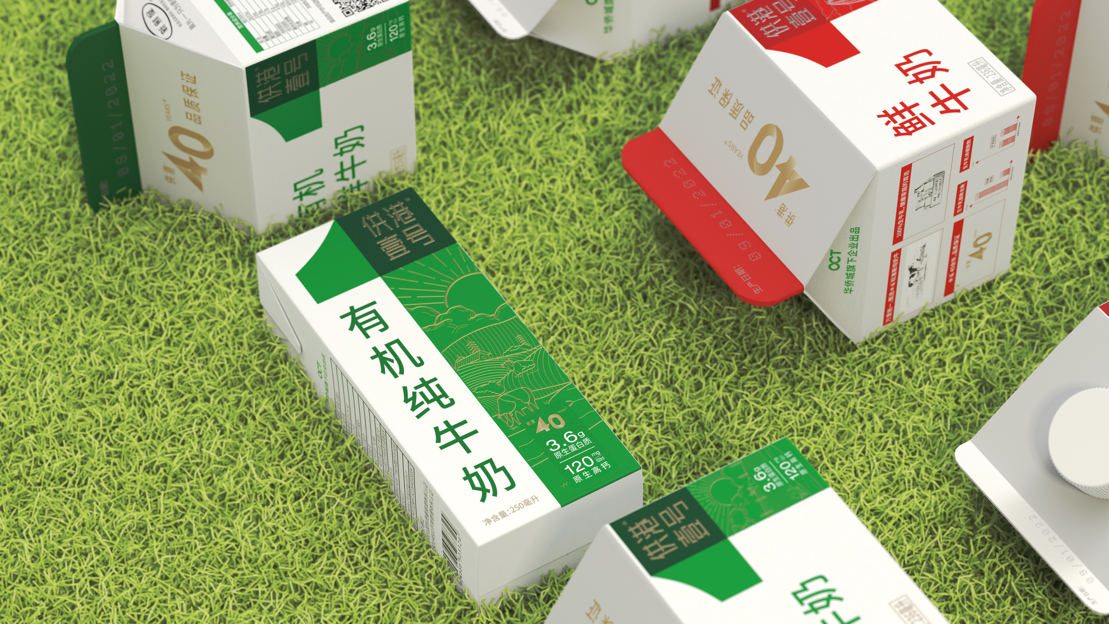
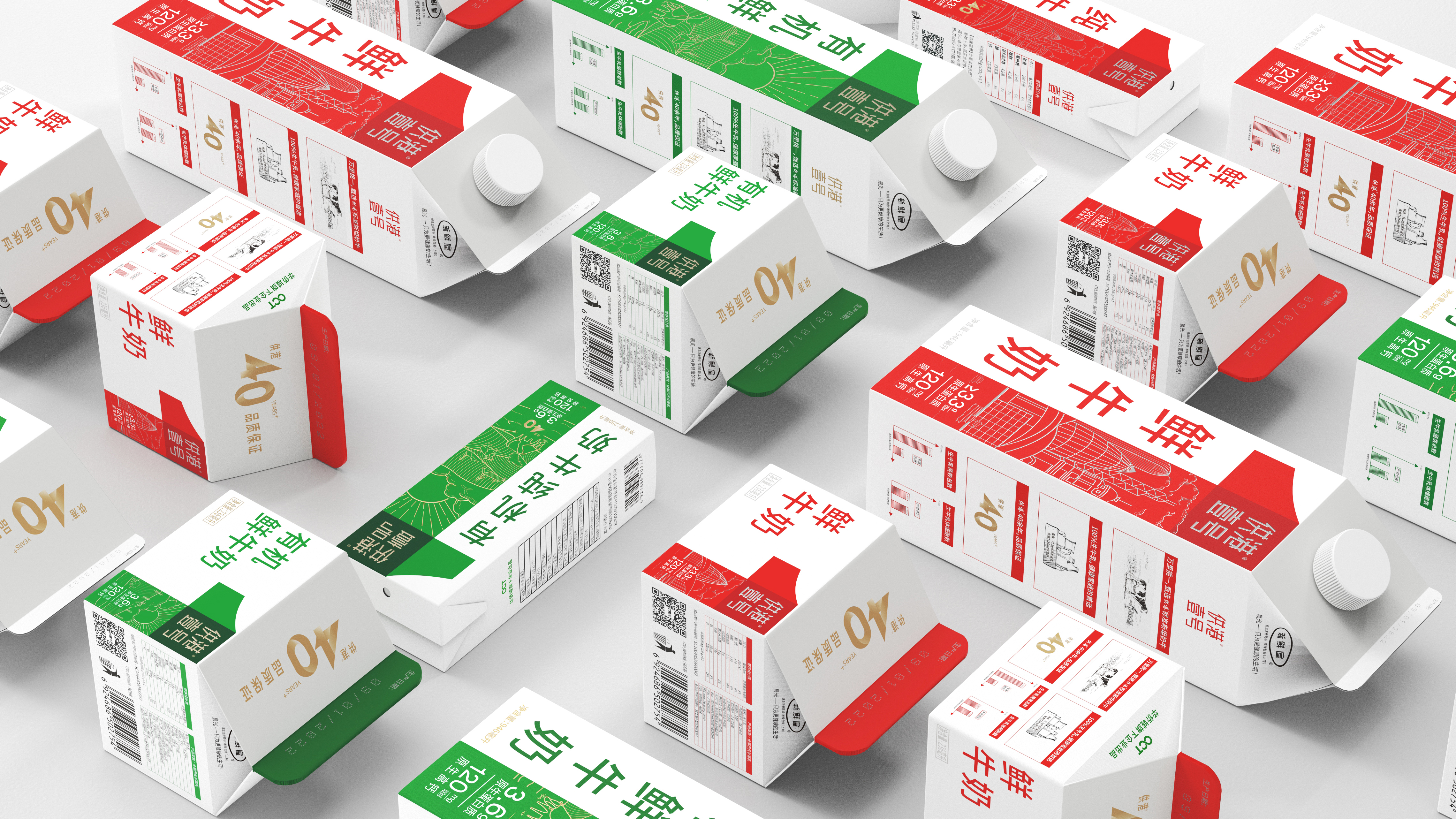
The products before the No.1 supply to Hong Kong take the large-area red package as the main memory point, while the newly upgraded package retains the red tone, highlighting the display of the super symbol "1", presenting both artistic and practical design, and showing more affinity, modernity and internationalization as a whole.
The basic color of the super symbol "1" is red, which symbolizes hope, victory, bravery, warmth, enthusiasm, quality, and hard work. Following the color of "Miracle China", it shows that Hong Kong No.1 does not forget its original intention and will continue to provide better quality legendary milk for Chinese people.
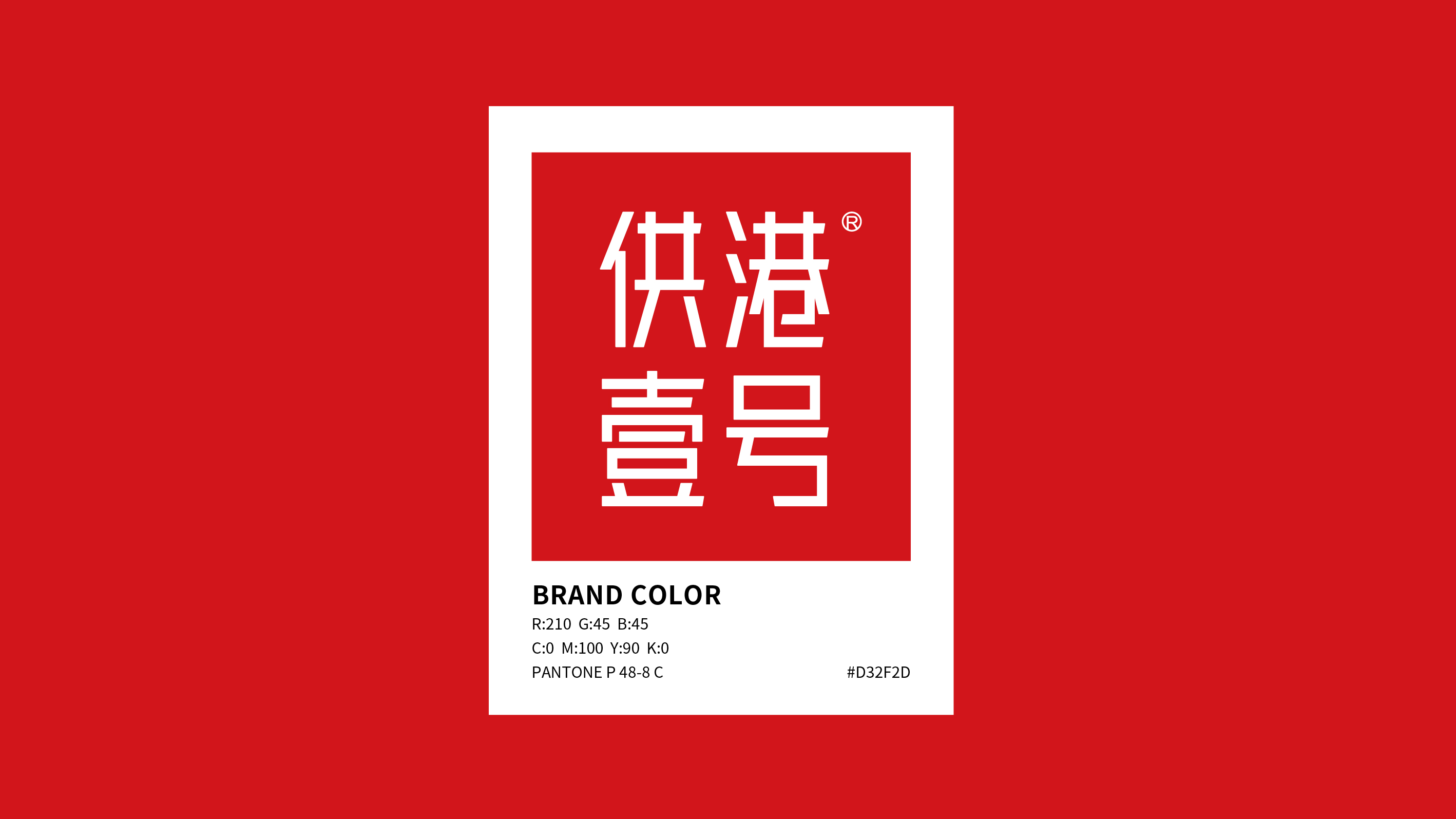
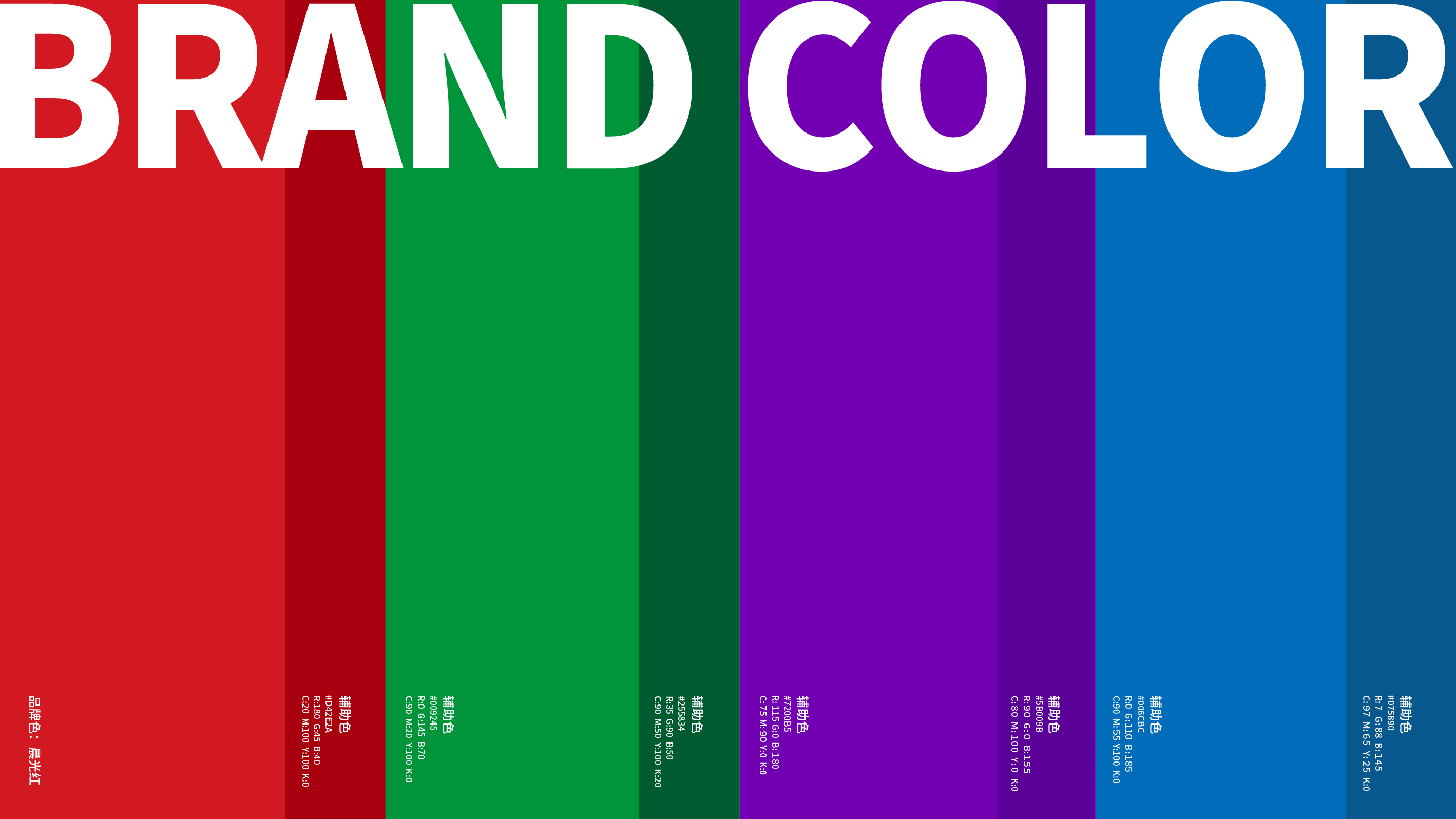
Taking the brightness and saturation of Chinese red as the color capture standard, the construction of the No.1 brand color library for Hong Kong is not only strong in recognition, but also can meet the use requirements of various sub-products.
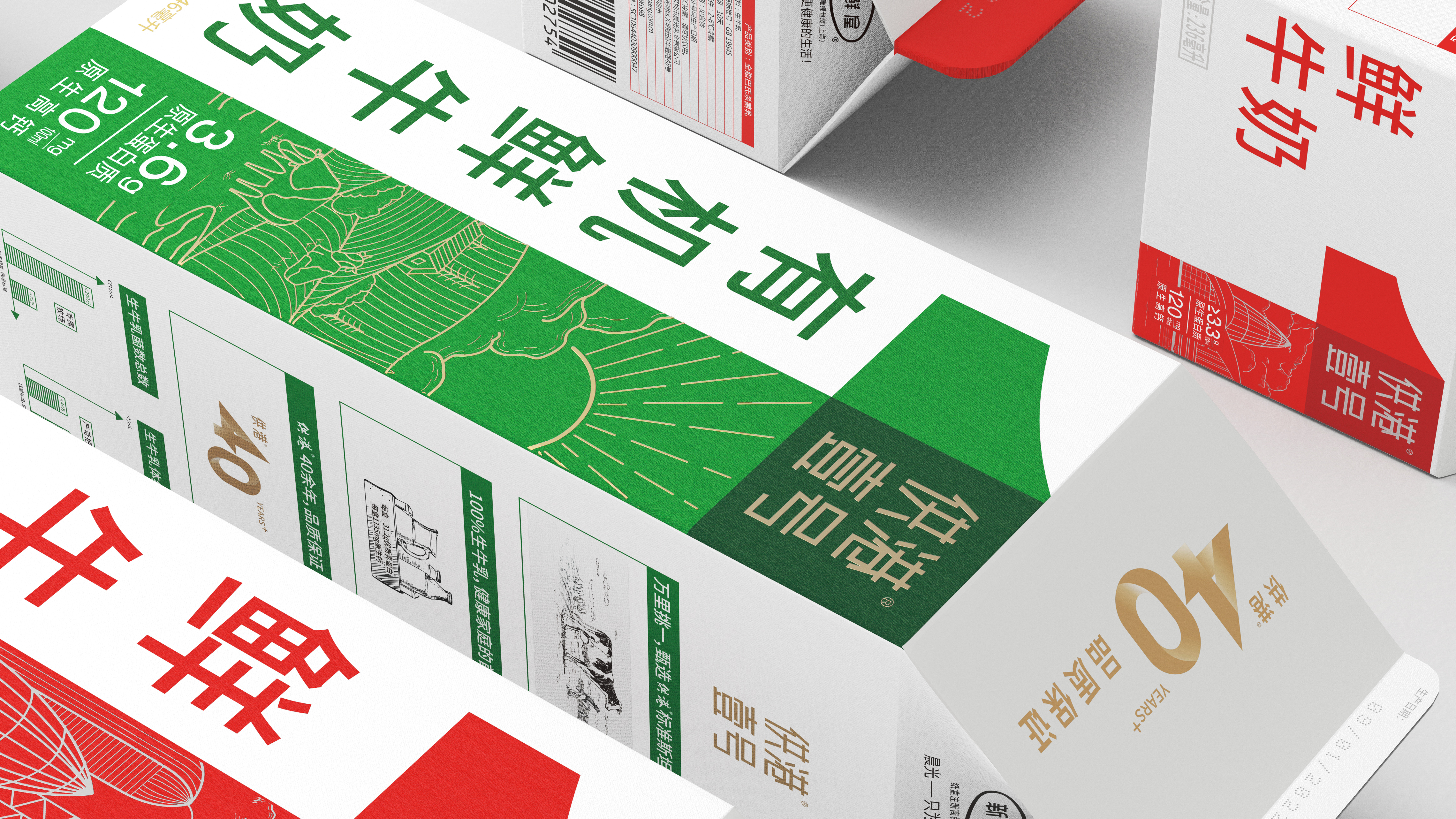
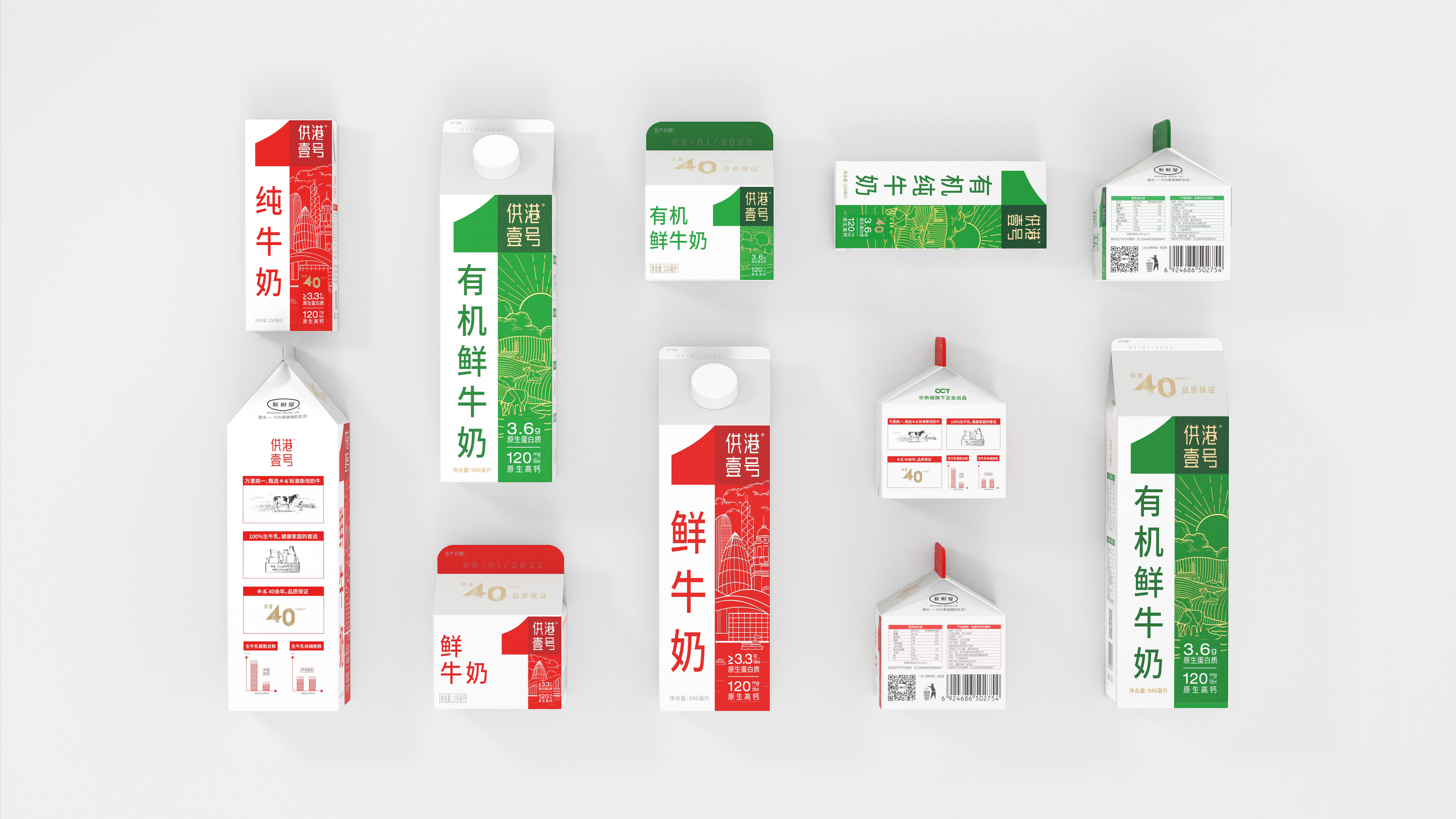
In the comprehensive series of No.1 for Hong Kong, we use "1" throughout, conveying the quality feeling and product differentiation through fine illustrations. Through the development of clear design composition specifications for various specifications of products supplied to Hong Kong No.1, it is convenient for management and use.
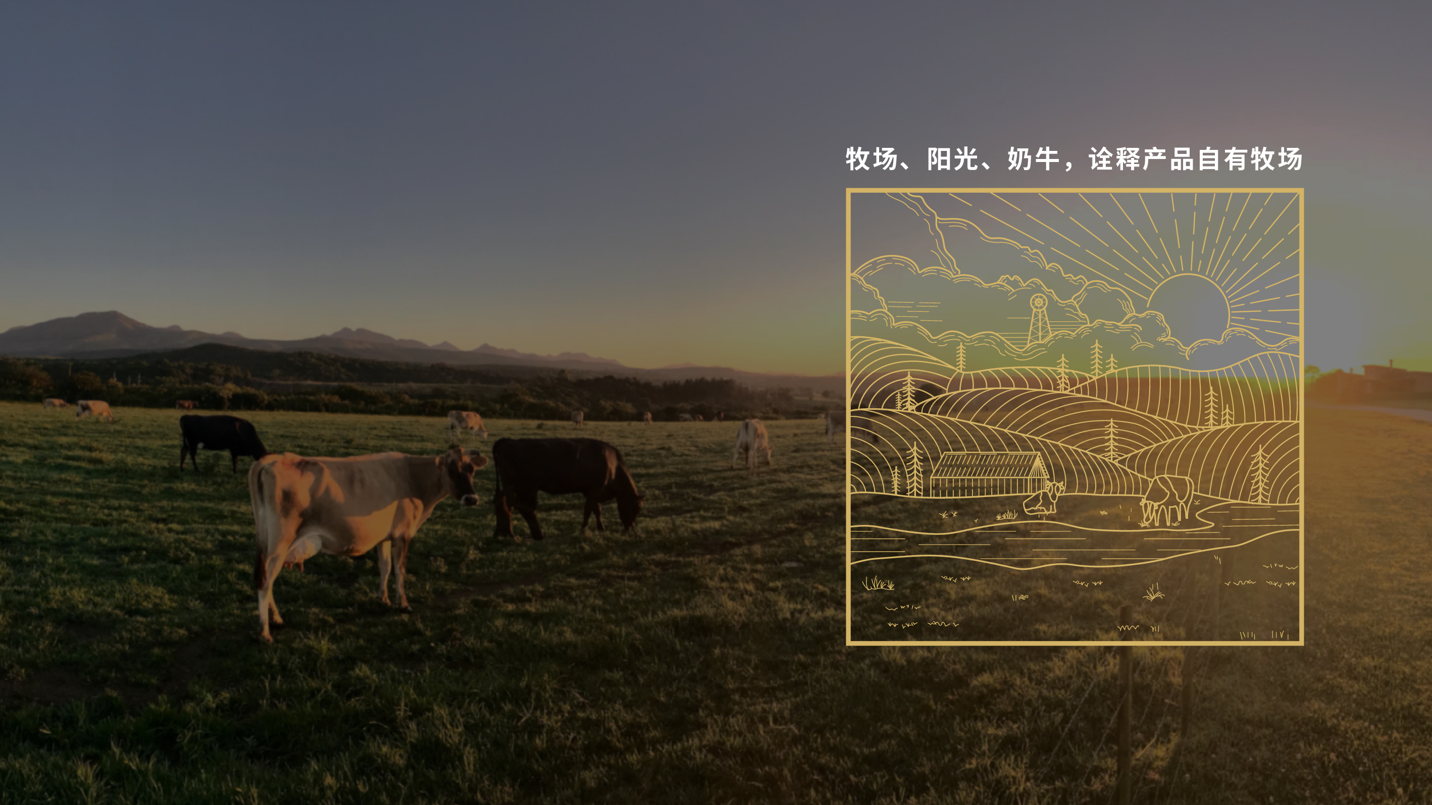
Hong Kong No.1 Organic Series
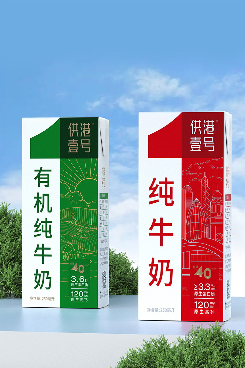
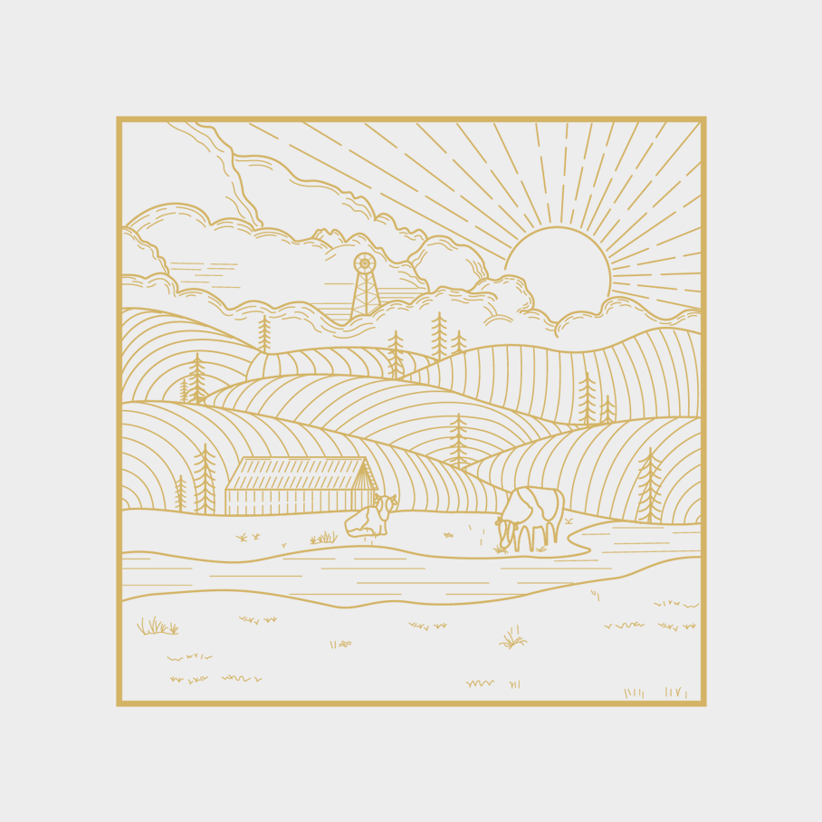
In the organic series, its illustration elements cover natural and healthy organic elements (forests, pastures, rivers, grasslands, cows, sunlight, etc.), giving the brand a very original visual communication.
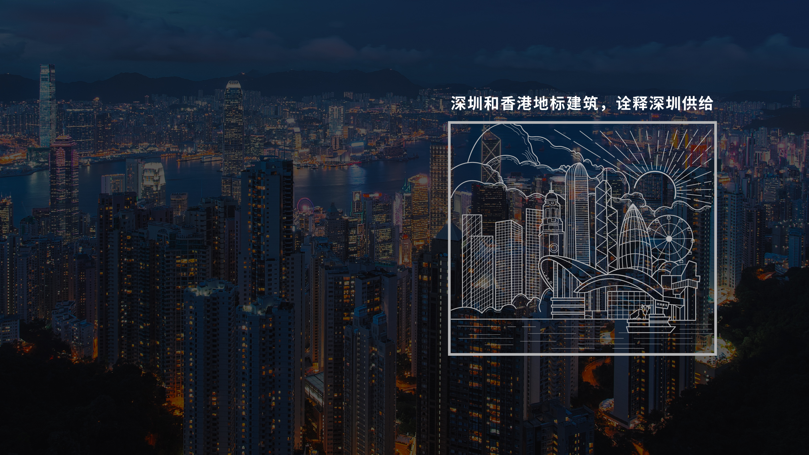
Hong Kong No.1 · Basic Series
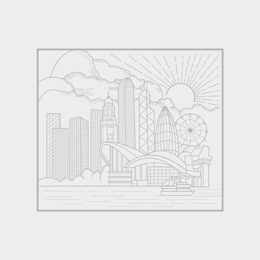
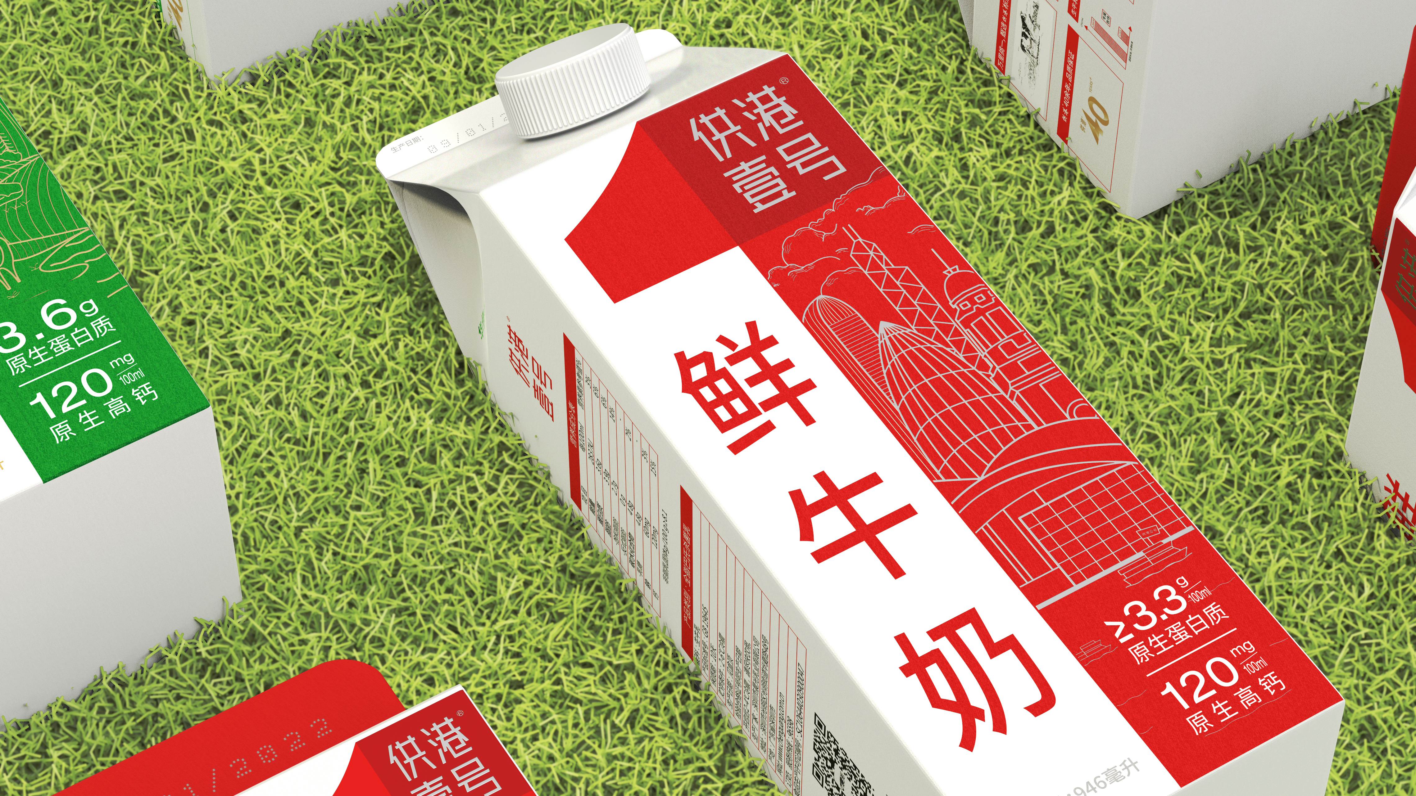
In the basic series, inspired by the landmark buildings of Shenzhen and Hong Kong, we integrate the light of the city into our products, presenting the endless natural light and superior quality of supply to Hong Kong.
In 2022, when the brand was renewed, the No. 1 Hong Kong was supplied to Hong Kong for 43 years and witnessed the legend. And every moment of legend comes from users' pursuit of a better life.
Here, OCD Jiagu Wen Creativity is committed to taking "higher standards, selecting the best among the best" as the core, endowing the core soul of the brand and creating a brand-new brand image of "legendary quality every moment.
The copyright of this work belongs to 甲古文設計. No use is allowed without explicit permission from owner.

New user?Create an account
Log In Reset your password.
Account existed?Log In
Read and agree to the User Agreement Terms of Use.

Please enter your email to reset your password
It feels like selling medicine
Not bad
At a glance
This package is really simple and atmospheric.