Clean black
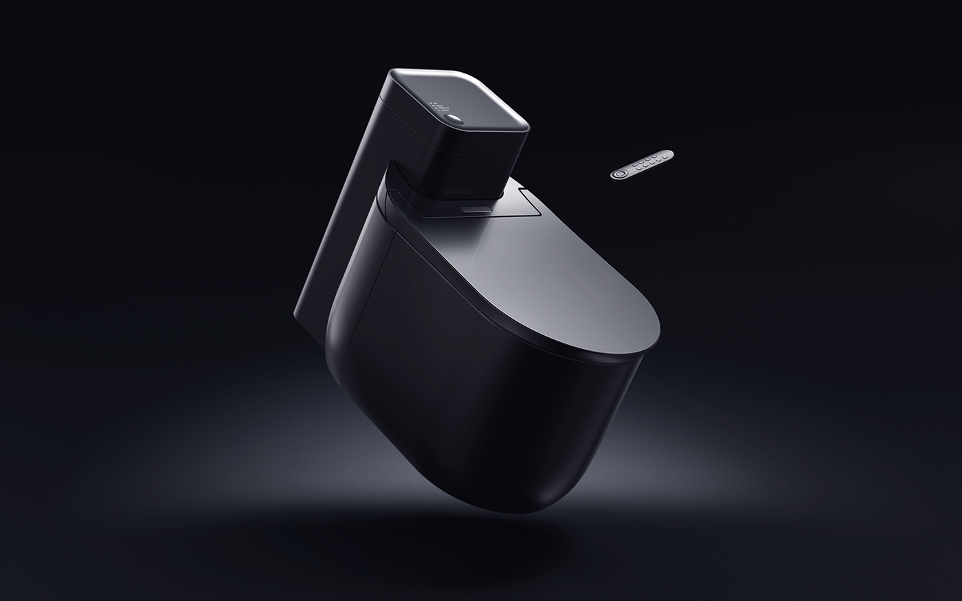
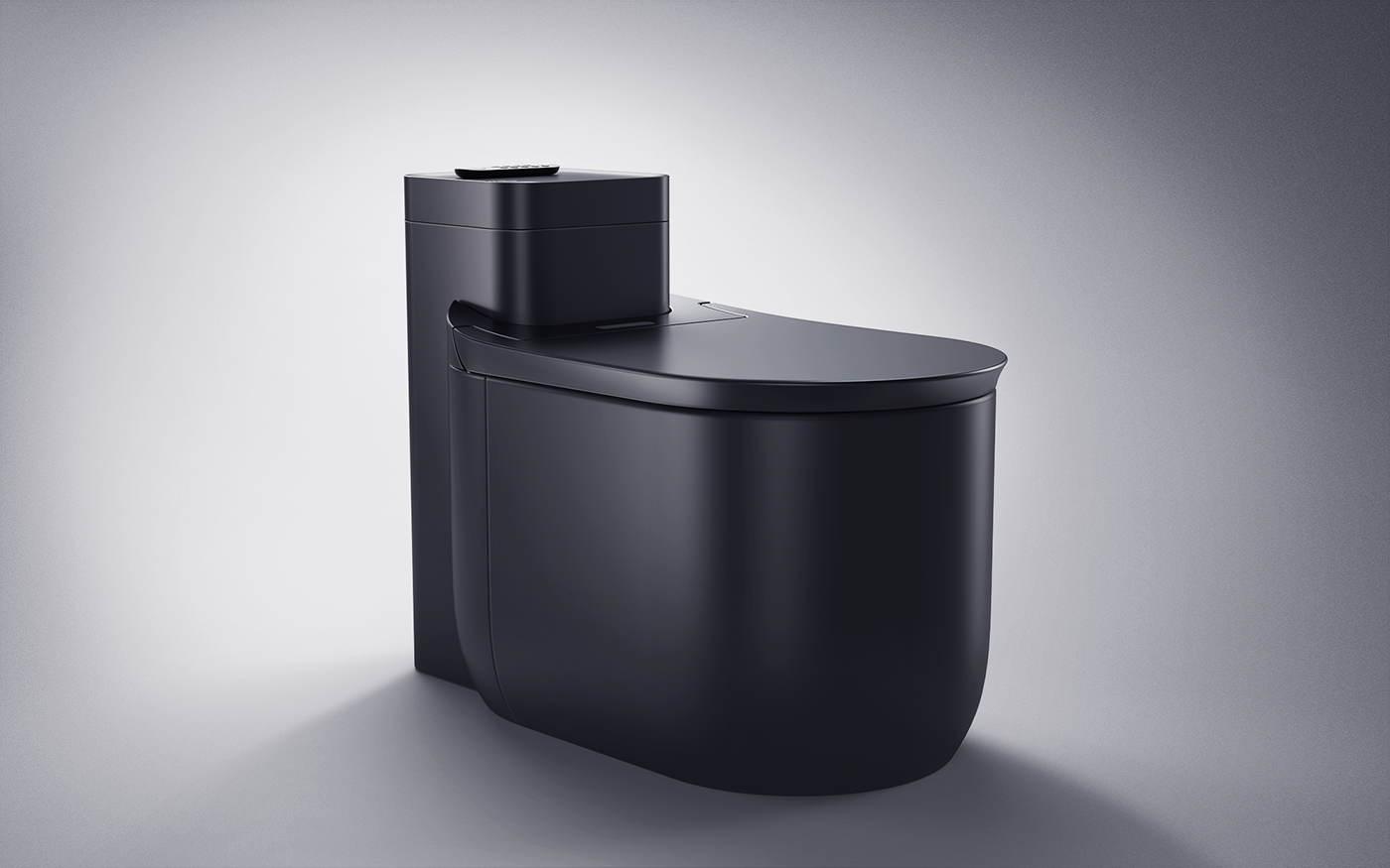
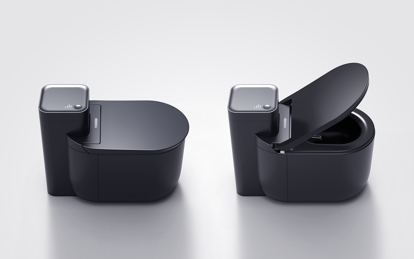
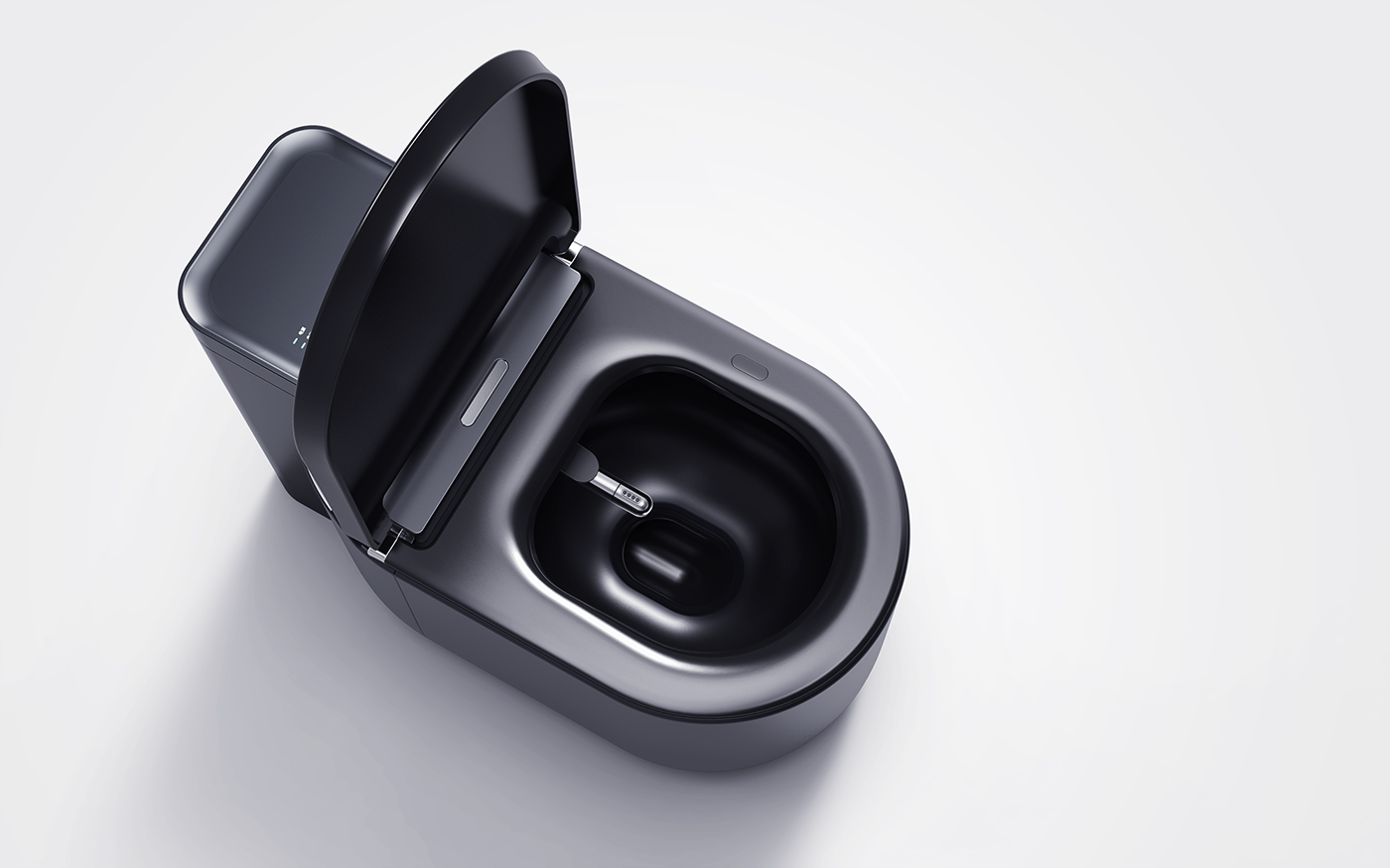
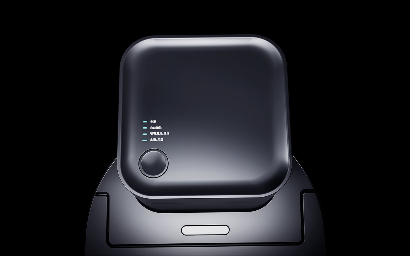
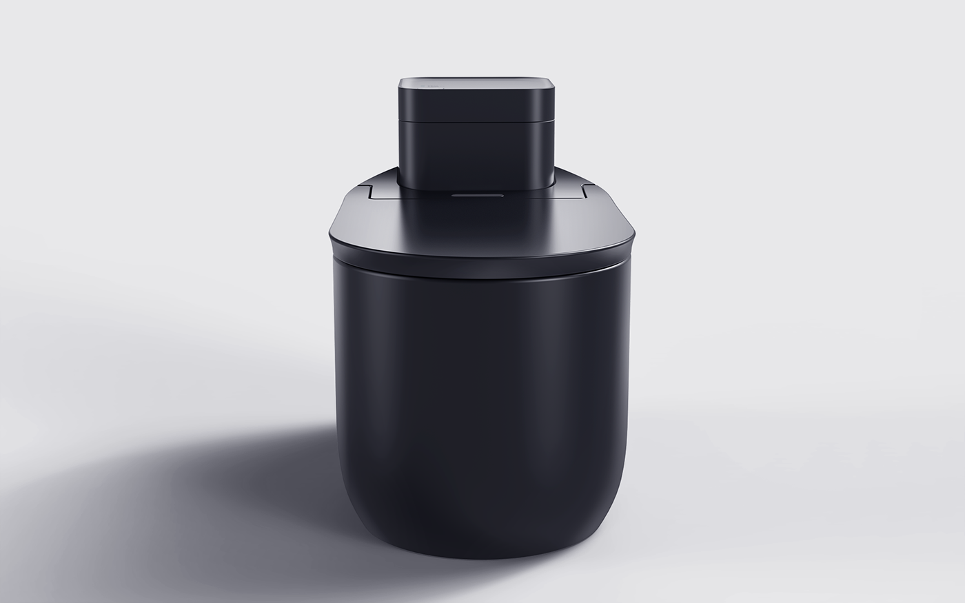
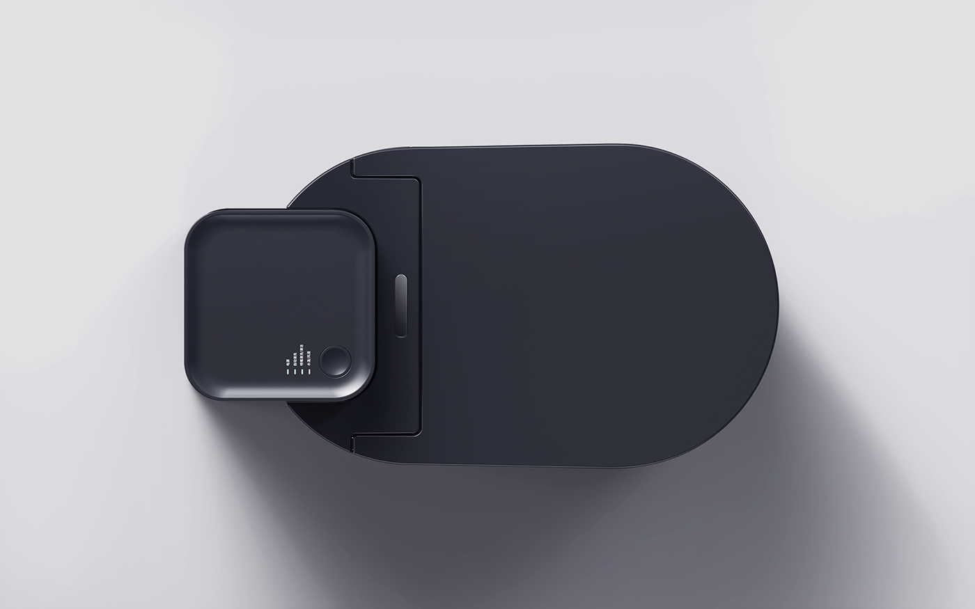
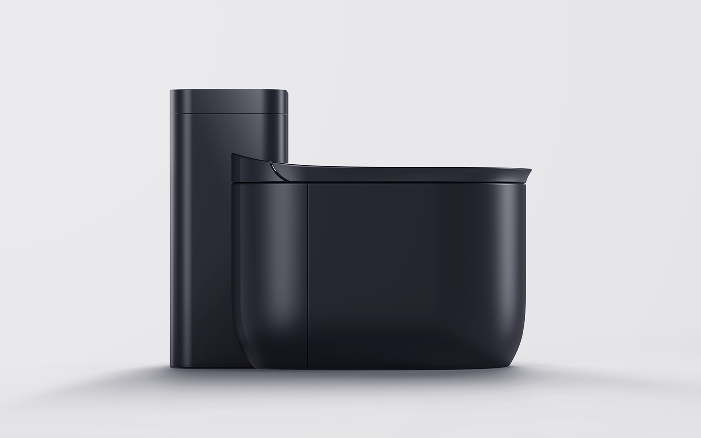
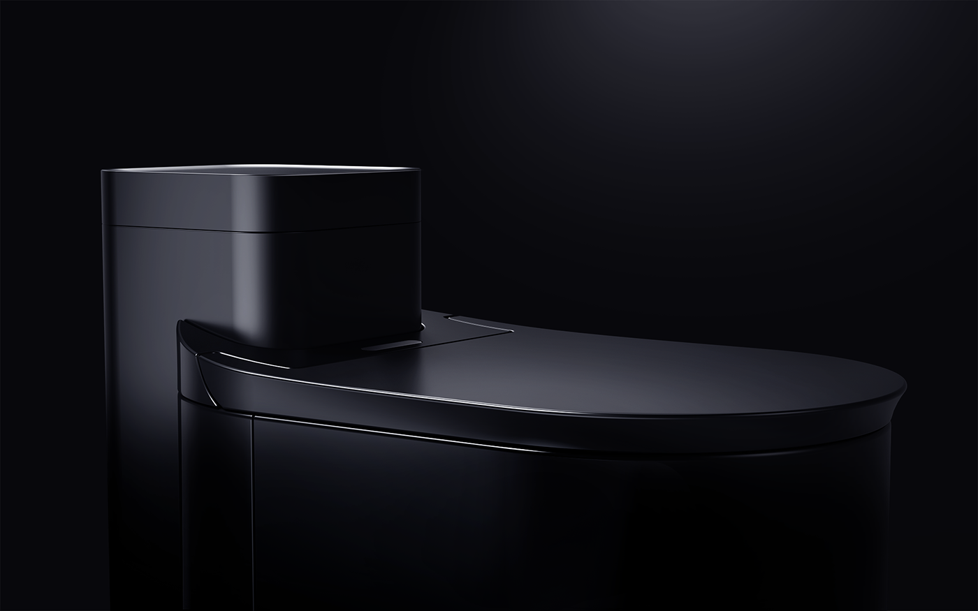
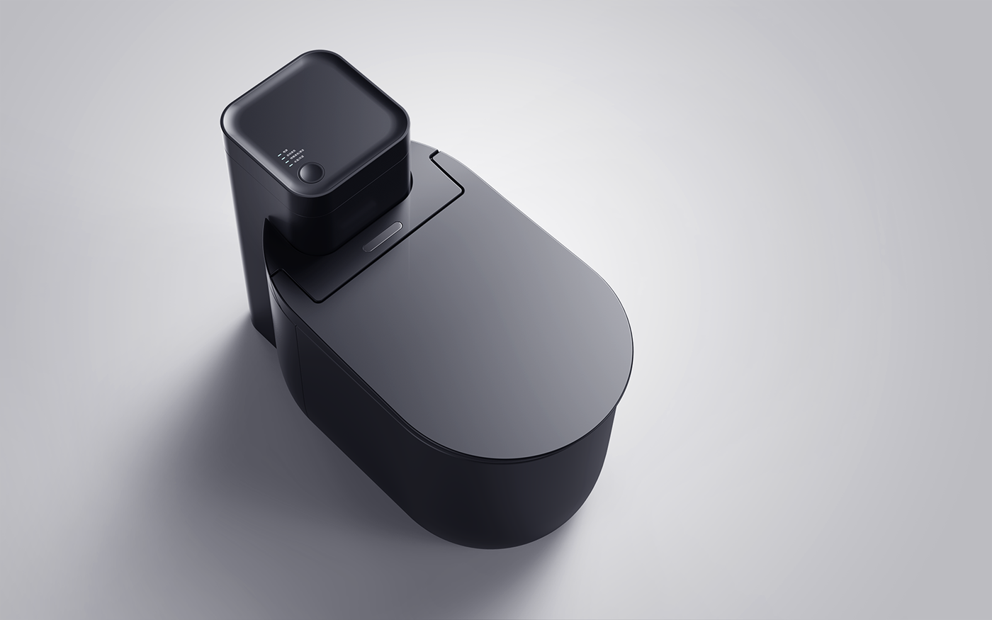
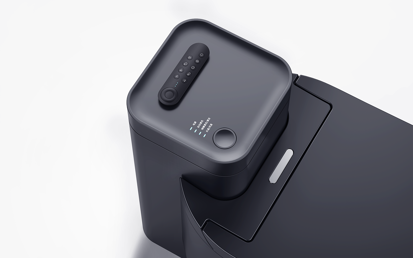
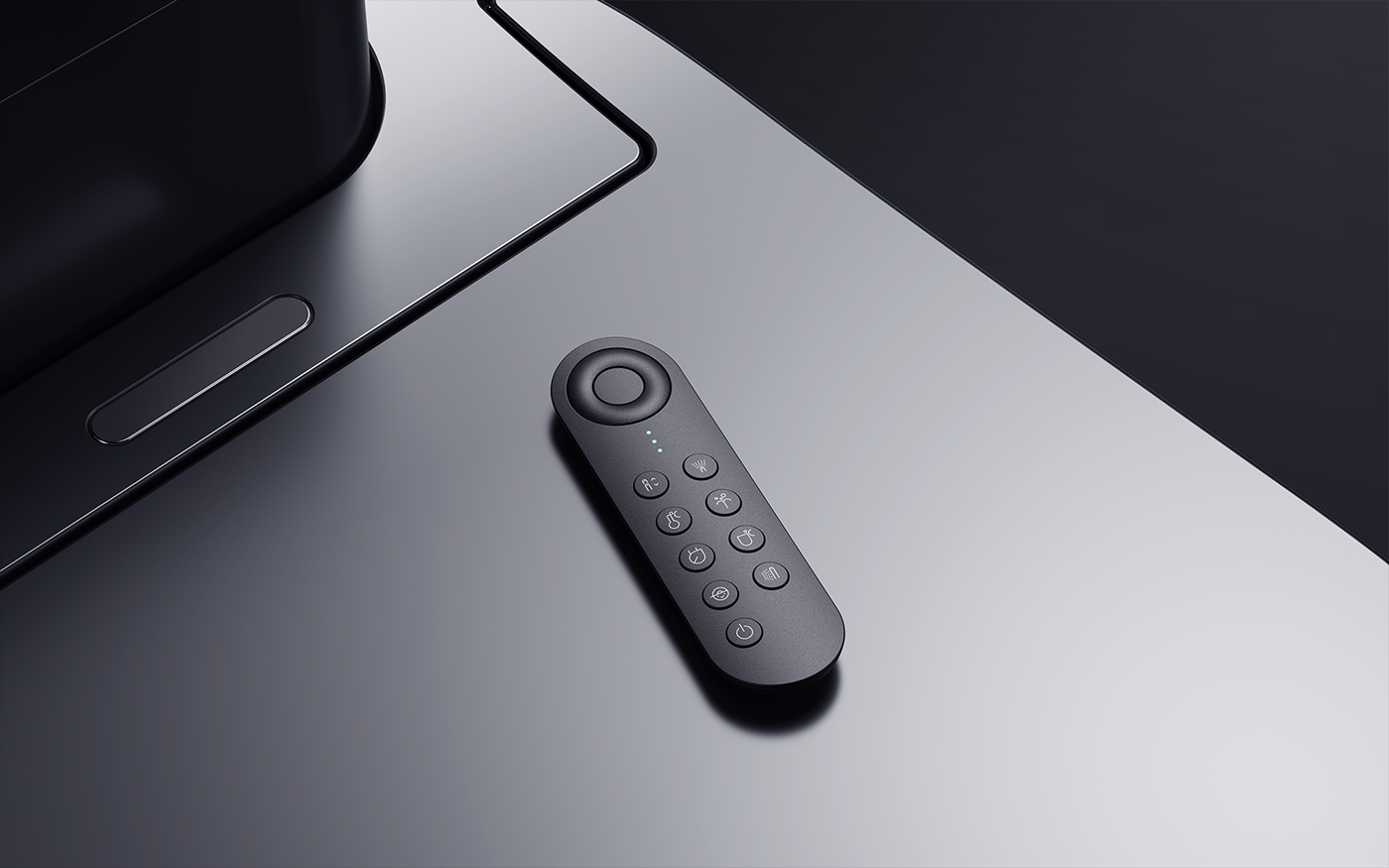
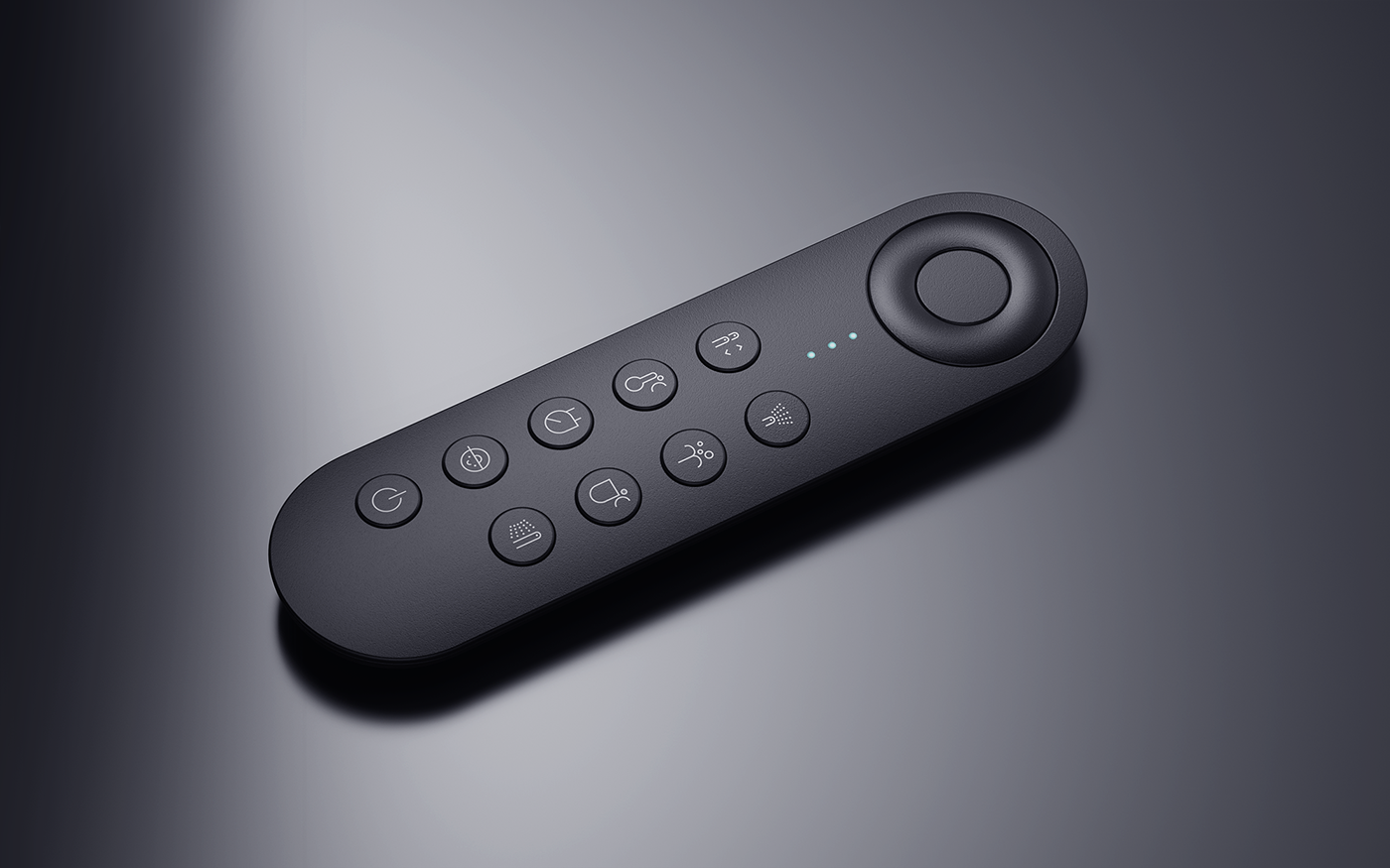
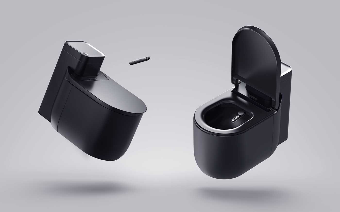
The design of the whole intelligent toilet uses the shift of the R angle to form "circle" and "square" elements. The appearance is simple, friendly and soft. The use experience integrates the functional features of the mainstream intelligent toilet, and the independent remote control handle operation improves the convenience of use. The edges are arranged in orderly and scattered lines,
It is for easy maintenance of components and the need for precise devices.
The most interesting challenge is that the whole ceramic material is treated in black, not deliberately appearing different, but more consideration is to let black convey clean information. Water stains, dust and other traces are easily exposed in the black interface in daily life, which promotes regular cleaning, keeping clean and tidy at all times and strict hygiene standards,
It is also to create a kind of reassuring psychological comfort.
The copyright of this work belongs to 方寸设计. No use is allowed without explicit permission from owner.

New user?Create an account
Log In Reset your password.
Account existed?Log In
Read and agree to the User Agreement Terms of Use.

Please enter your email to reset your password
Remote control toilet
TM is too advanced, brother stable
Where is the axis of this shaft.... How it feels is the axis that will change...
I think the idea of a fully transparent toilet is too explicit. It is better to make a frosted translucent toilet. It feels like an artistic effect.
Think about it, looking at your lump of gold through the frosted translucent toilet (with lights in it), wow, hazy beauty!
Another series of comments are more interesting than design. All kinds of ideas are bumping and bumping, interesting!
Some people say that this effect diagram is good-looking, I am also surprised.
There is a bold idea why there is no transparent toilet.
If only the so-called professionals can judge the quality of the design, then I think the industry is growing against the trend... I'm talking nonsense
This electric cooker is good.
I wrote a lot, ha ha, deleted. After reading all the comments, I found that the comments were meaningless......
I'll just ask this straight shape, where do I put my legs when I shit hard? I can't even get my legs. Brother Meng
The first eye looks like an electric rice cooker, and the second eye feels that the proportion is strange, mainly the lines, shapes and proportions of the toilet part and the second half can be optimized. Experience, practicality will not be evaluated, because it cannot be used
As a bathroom designer for more than 9 years, the proportion of this shape is really average, and the details are not reasonable. It is suggested to look at Kohler, TOTO's and Enshi's more.
How do you say that the overall design is excellent, rendering is also very outstanding basic skills, there are also remarkable details. The problem is that there are great defects in the understanding and observation of the products, such as whether the toilet lid should have shock-absorbing pads, what material is used for the toilet body, traditional ceramics and new materials, and why the lower part of the toilet body should be divided into front and rear ends, whether it is in line with production and whether it is easy to maintain. Therefore, I only think it is a general recognition of the appearance design when I give you a gold medal.
The first thing I felt when I saw this design was that the renderings were treated really well, but the doubts that followed were indeed the same as several colleagues said, why do you need to deal with the grooves, isn't it bringing water that is not resistant to dirt? Isn't it contrary to the original intention of cleanliness?
Why can this design occupy the list for so long? Paid users? Or is it at this level?