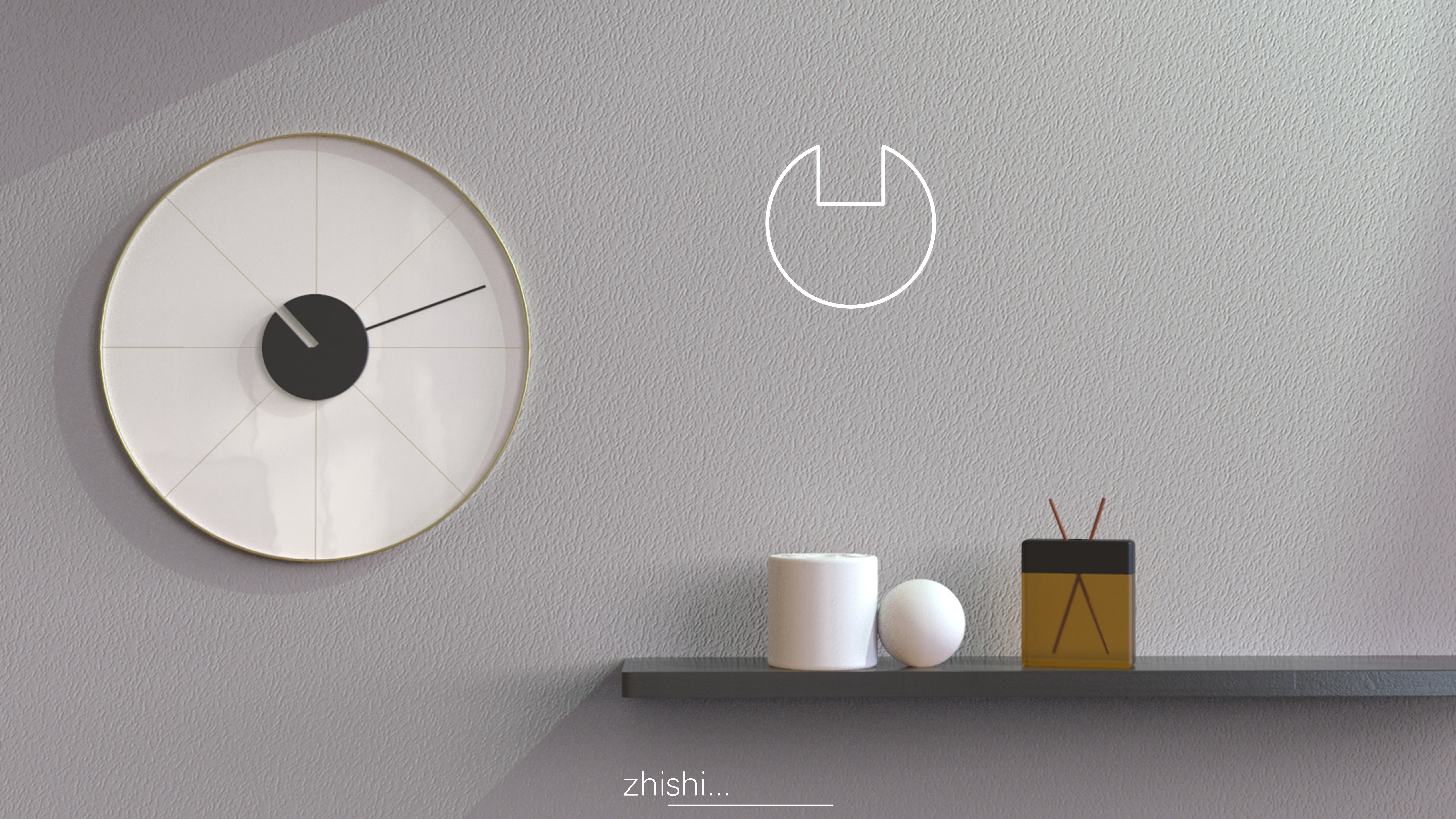
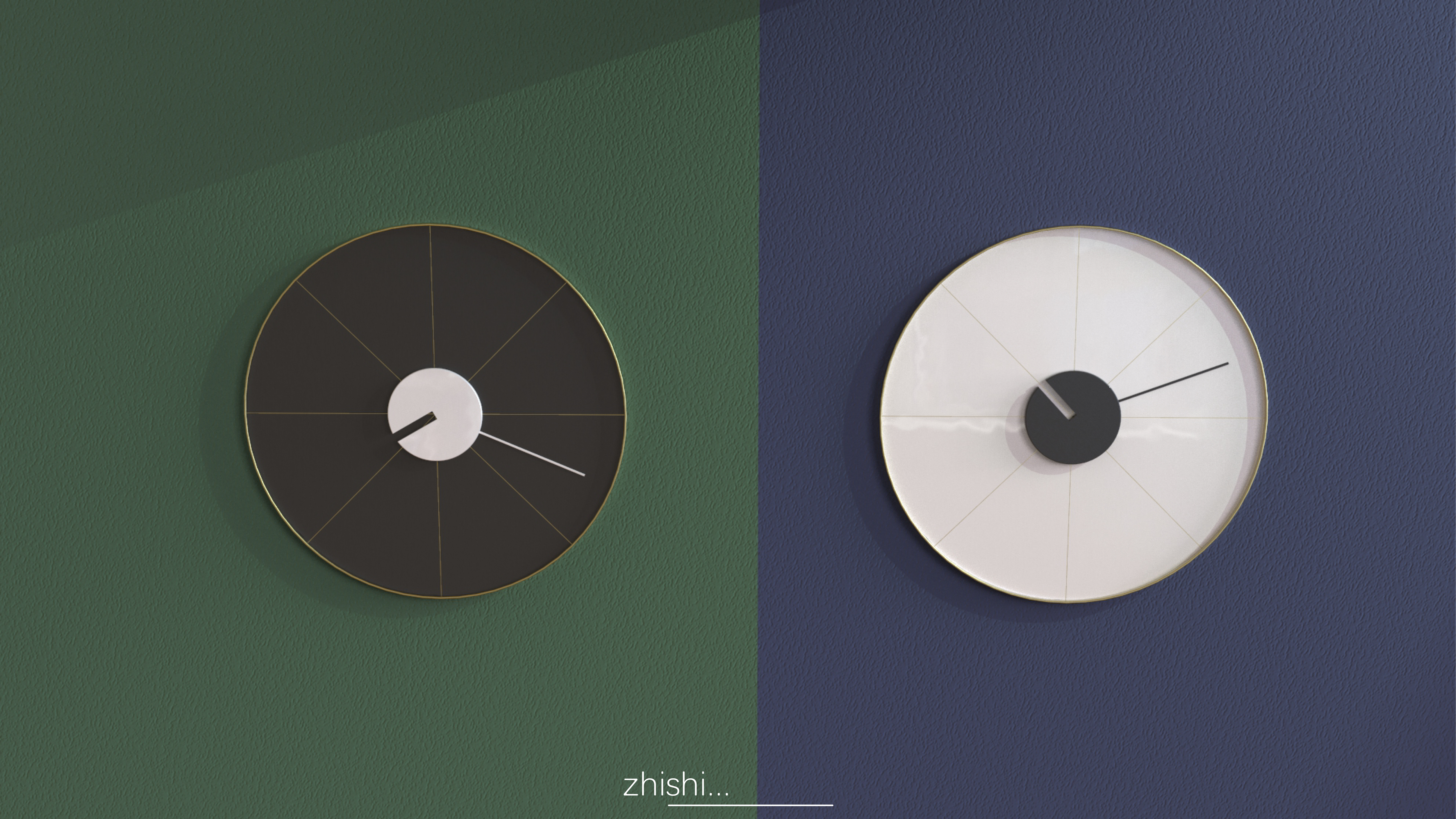
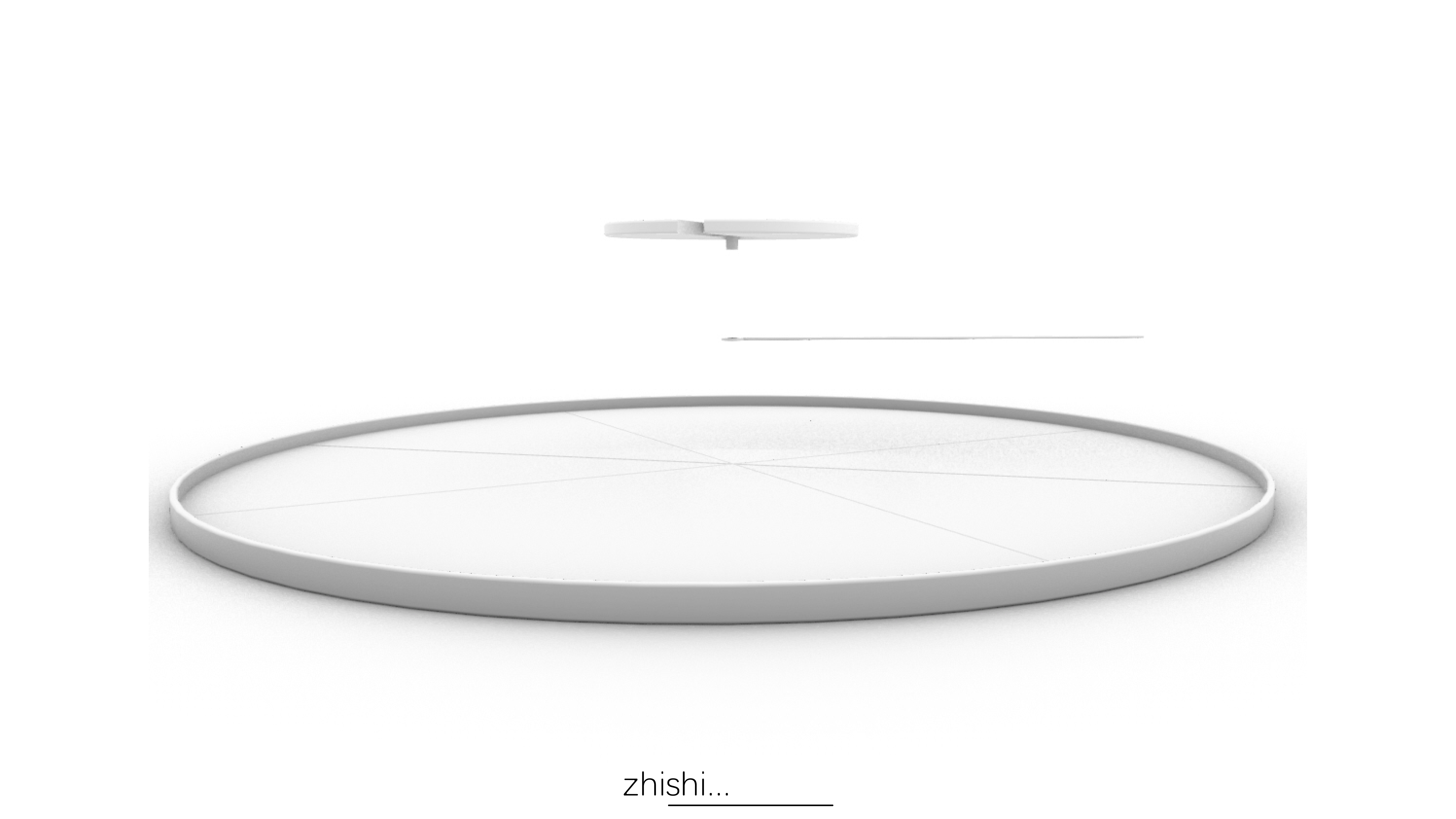
Regarding the design of decorations, I think that through the stacking of lines and geometric bodies, there is not so much explanation that only needs to do some "magic" of lines in appearance and make some clever changes in some subtle places to achieve the so-called "less is more". Turn the hour hand of the clock into a missing circle, cut the original smooth lines, and match the dial cut according to the whole point to make the whole clock more decorative and practical.


The traditional shape is combined with a divided clock plate and a sunken hour hand.


The copyright of this work belongs to 制师. No use is allowed without explicit permission from owner.

New user?Create an account
Log In Reset your password.
Account existed?Log In
Read and agree to the User Agreement Terms of Use.

Please enter your email to reset your password
The second color match looks good, porridge
In the whole industry, I admire you, because you are different from others. The things you design are just right, moist and smooth. As the saying goes, this is the highest level in the industry. You are the real god. I hope to see you completely new on the stage of the international design finals, okay? So, I will give you yes!
This design is great.
As a decorative clock, this appearance is necessary.
It's hard to recognize the time ~