The work of more than half a year ago is also the most significant work that I started to learn and design. From a material point of view, this work helped me win more than 10 design awards. From a spiritual point of view, as the second work in my career, it became a springboard for me to break out of the "comfort circle" of school. In the following projects, I can take this experience as a benchmark, and laid a solid foundation. With emotion, let's share this design.
Design description:
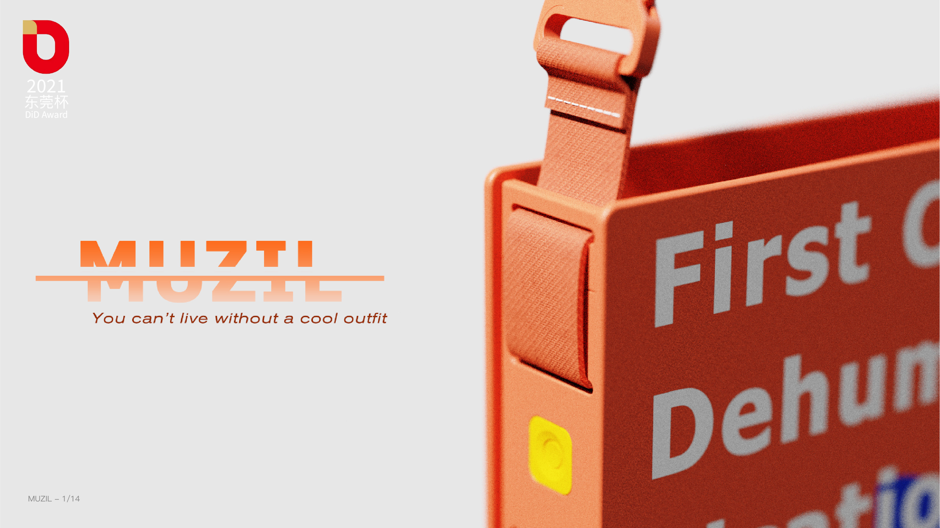
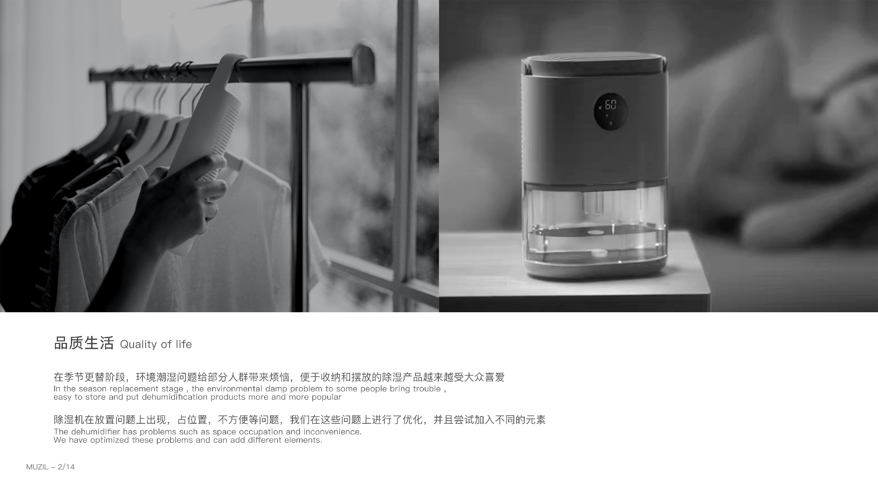
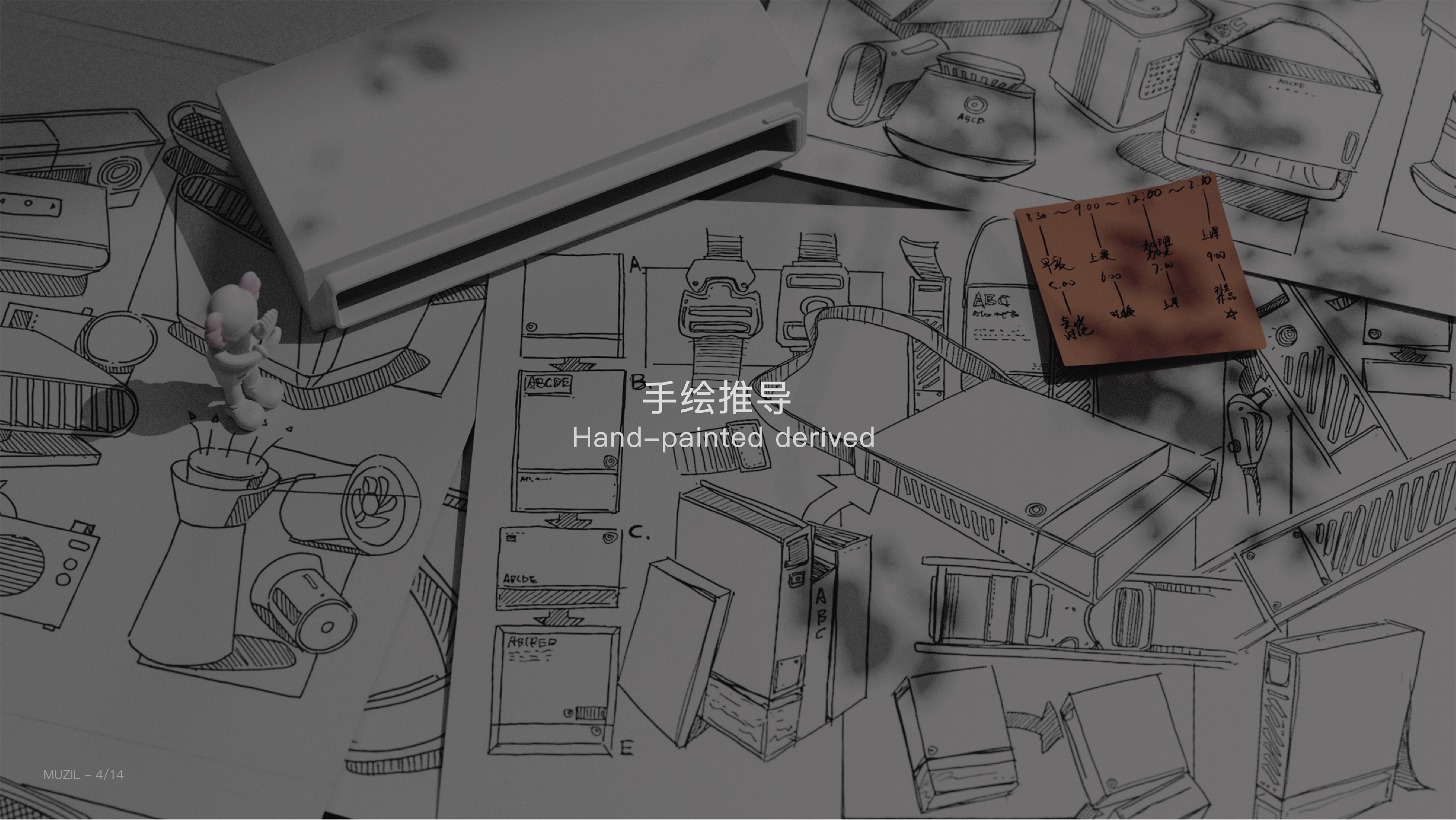
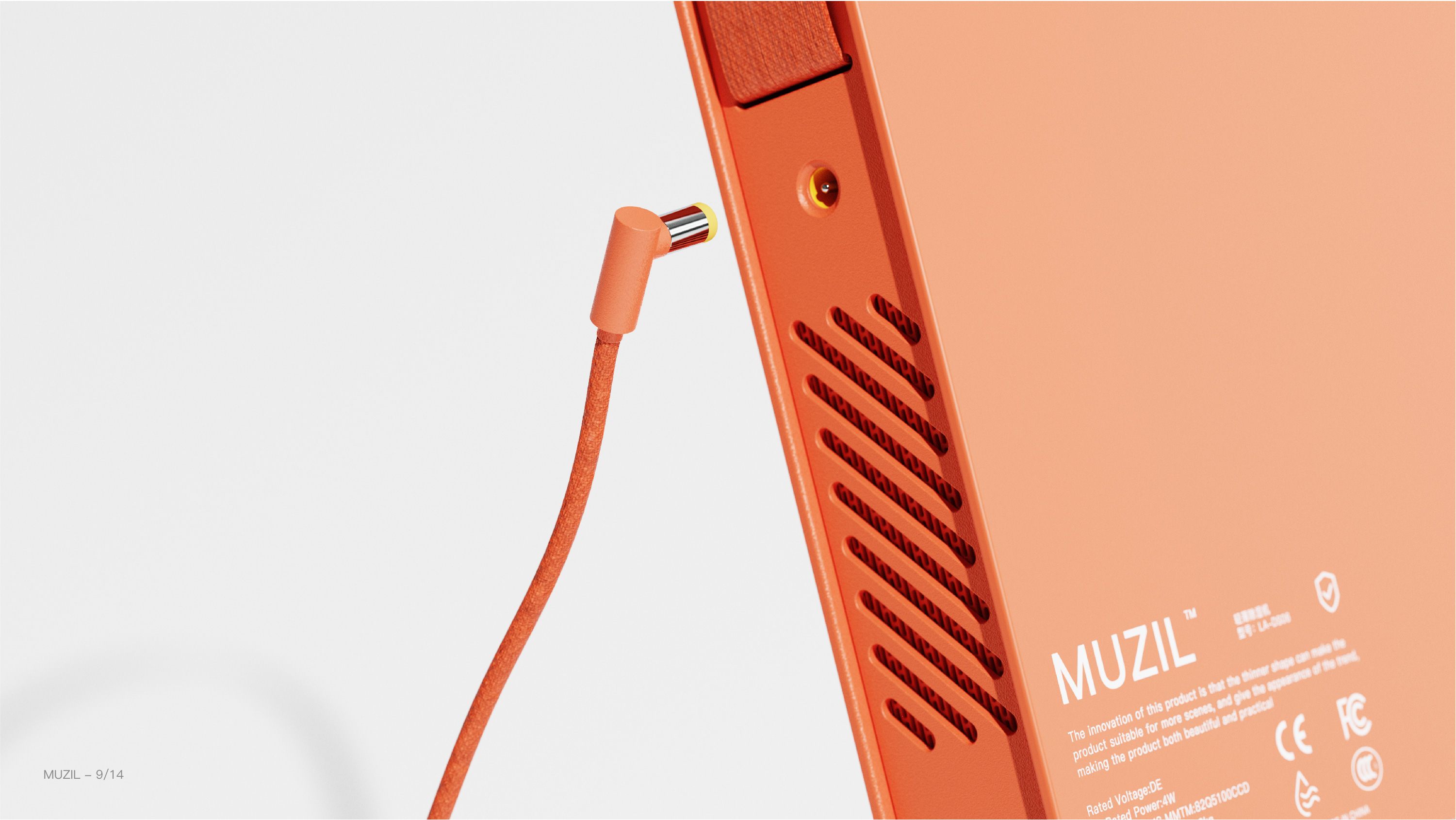
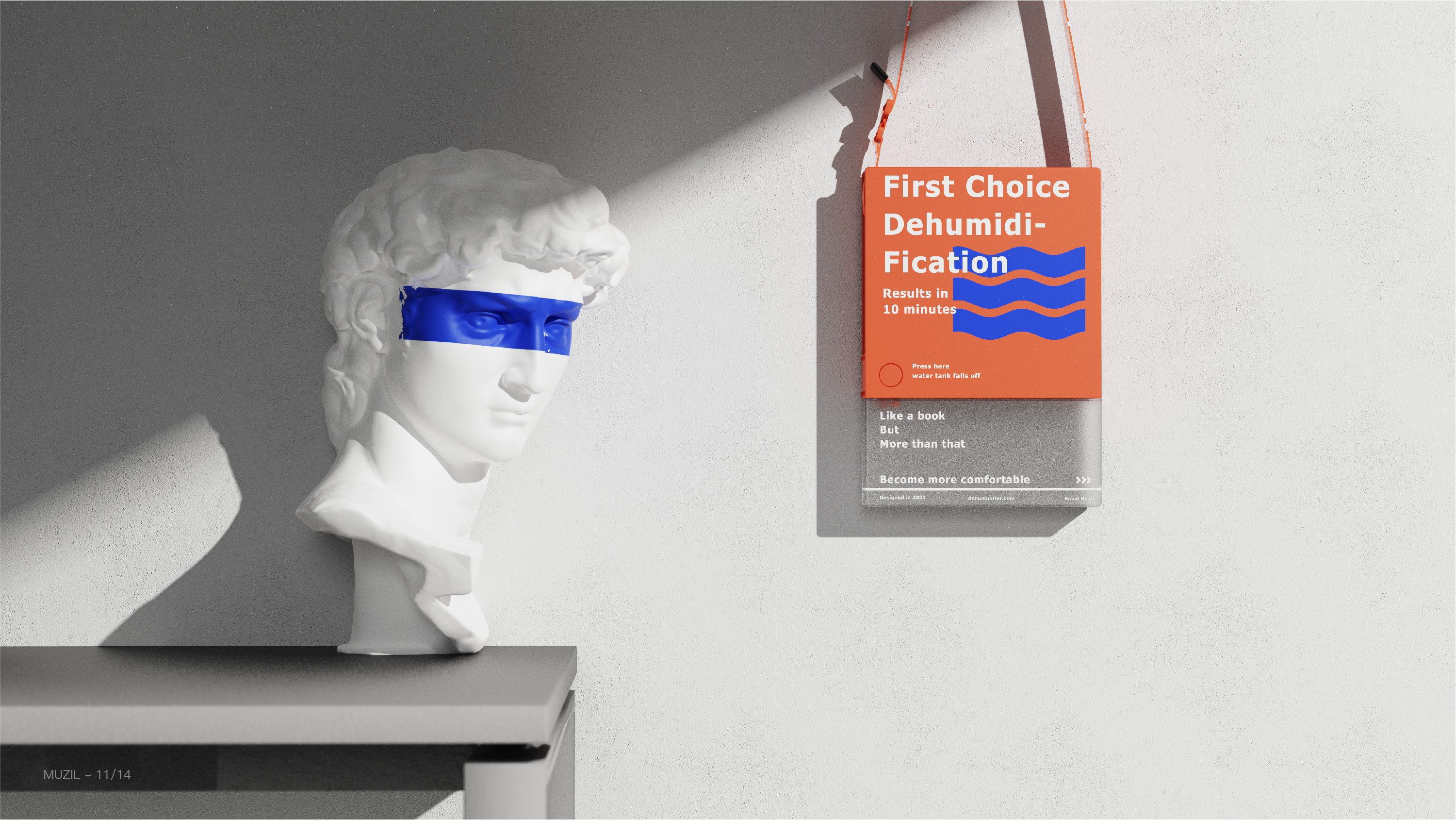
"Muzil" is a lightweight dehumidifier concept product. In view of the improvement of the current consumption level and people's attention to the quality of life, the overall style adopts the cool design to break the traditional simple appearance and meet the aesthetic needs of young people. Considering that the traditional dehumidifier has problems such as occupying position and inconvenience in placing problems, it is the first time to use a hidden air inlet design to make the product lighter and thinner. Incorporate the elements of the strap, so that it can adapt to more different use environments and meet people's diverse needs.
Core innovation points:
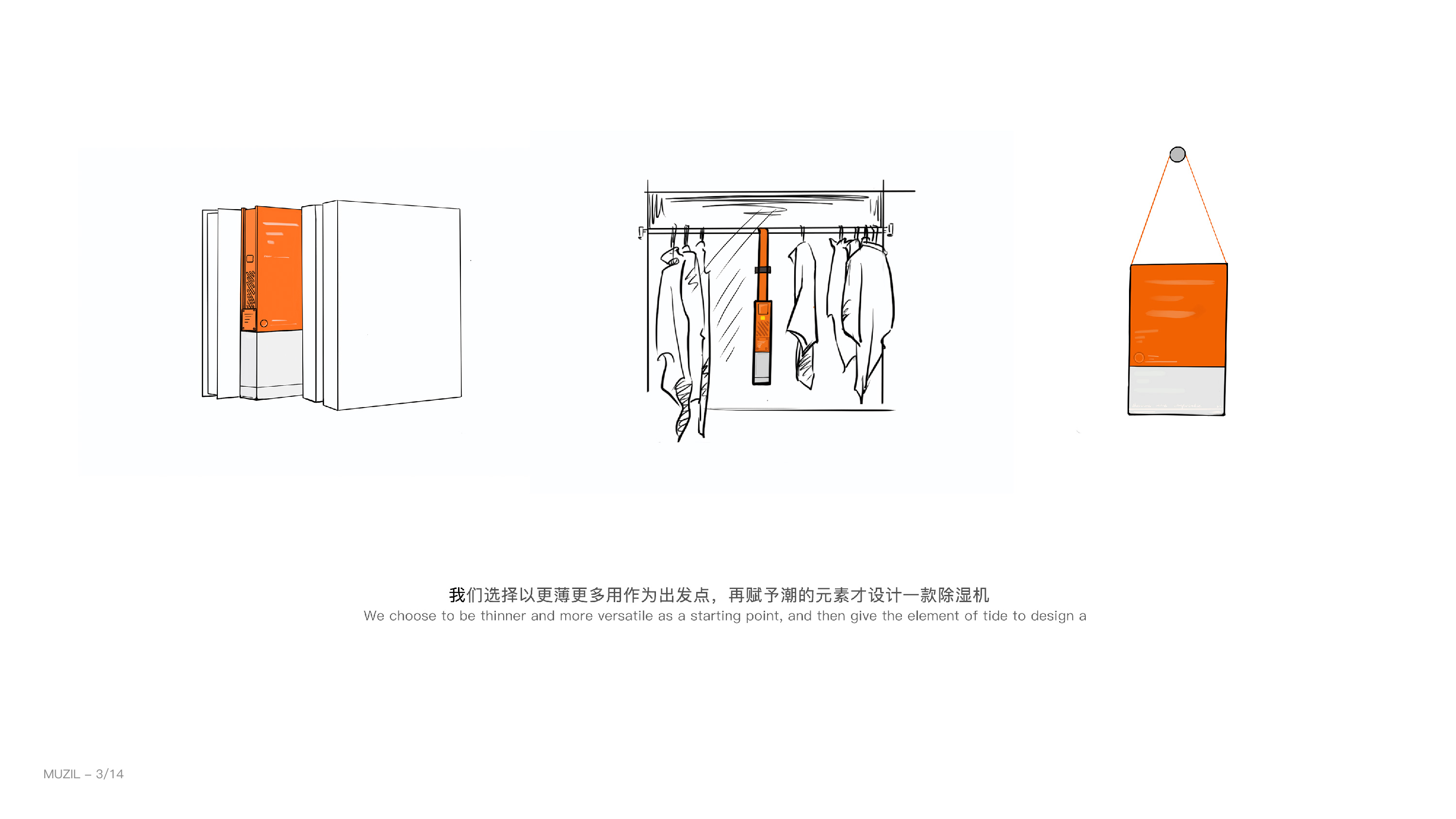
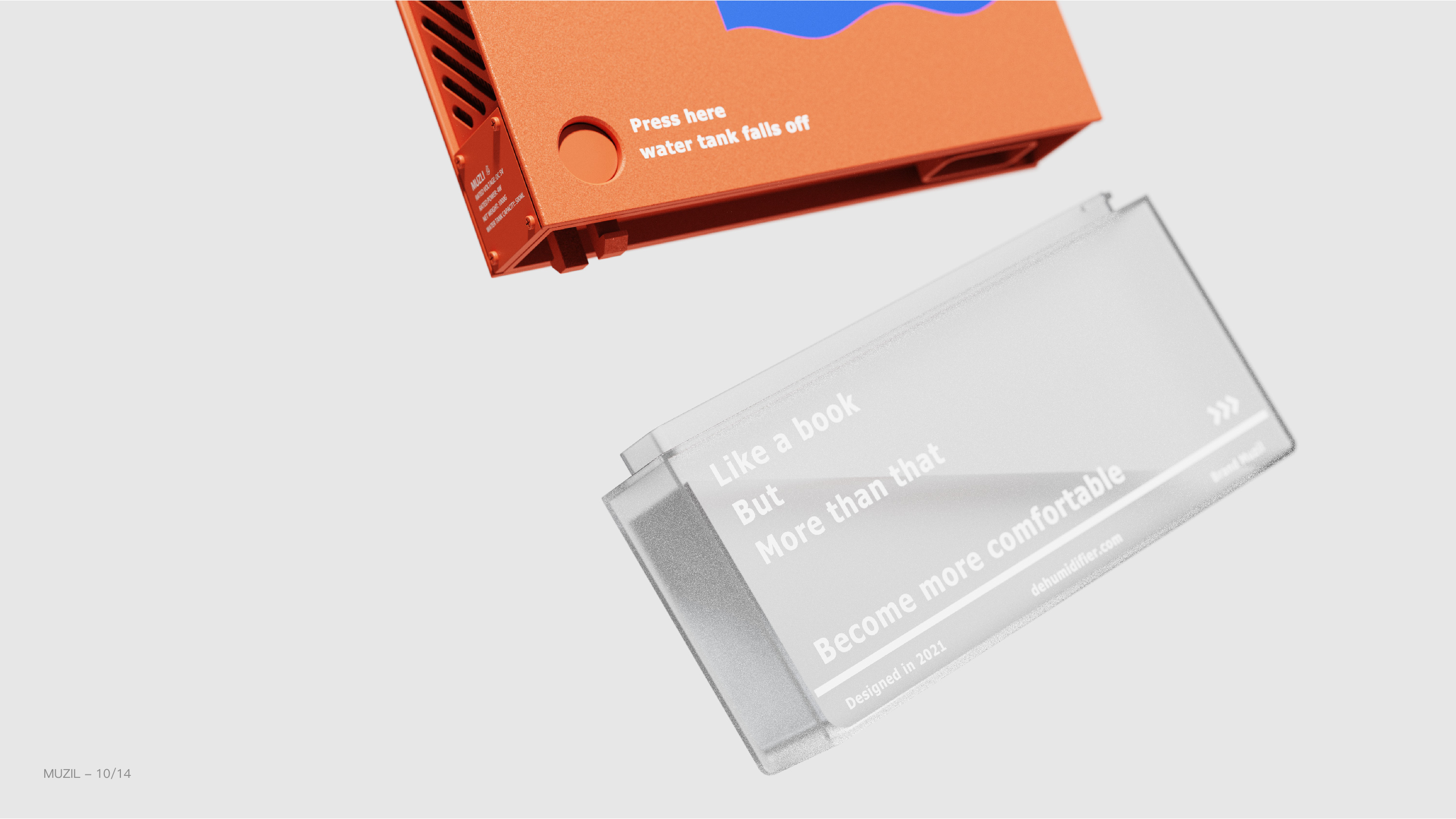
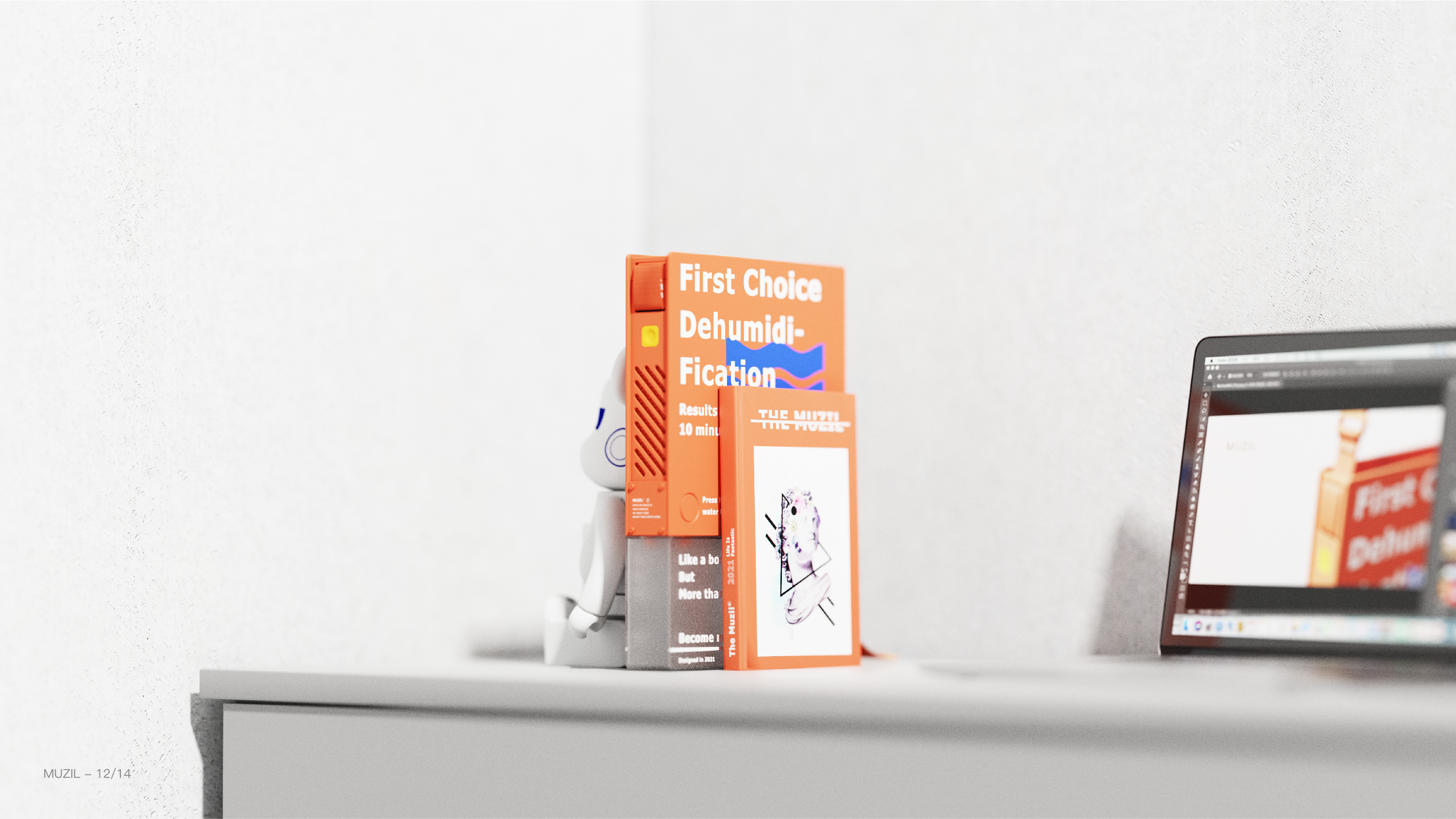
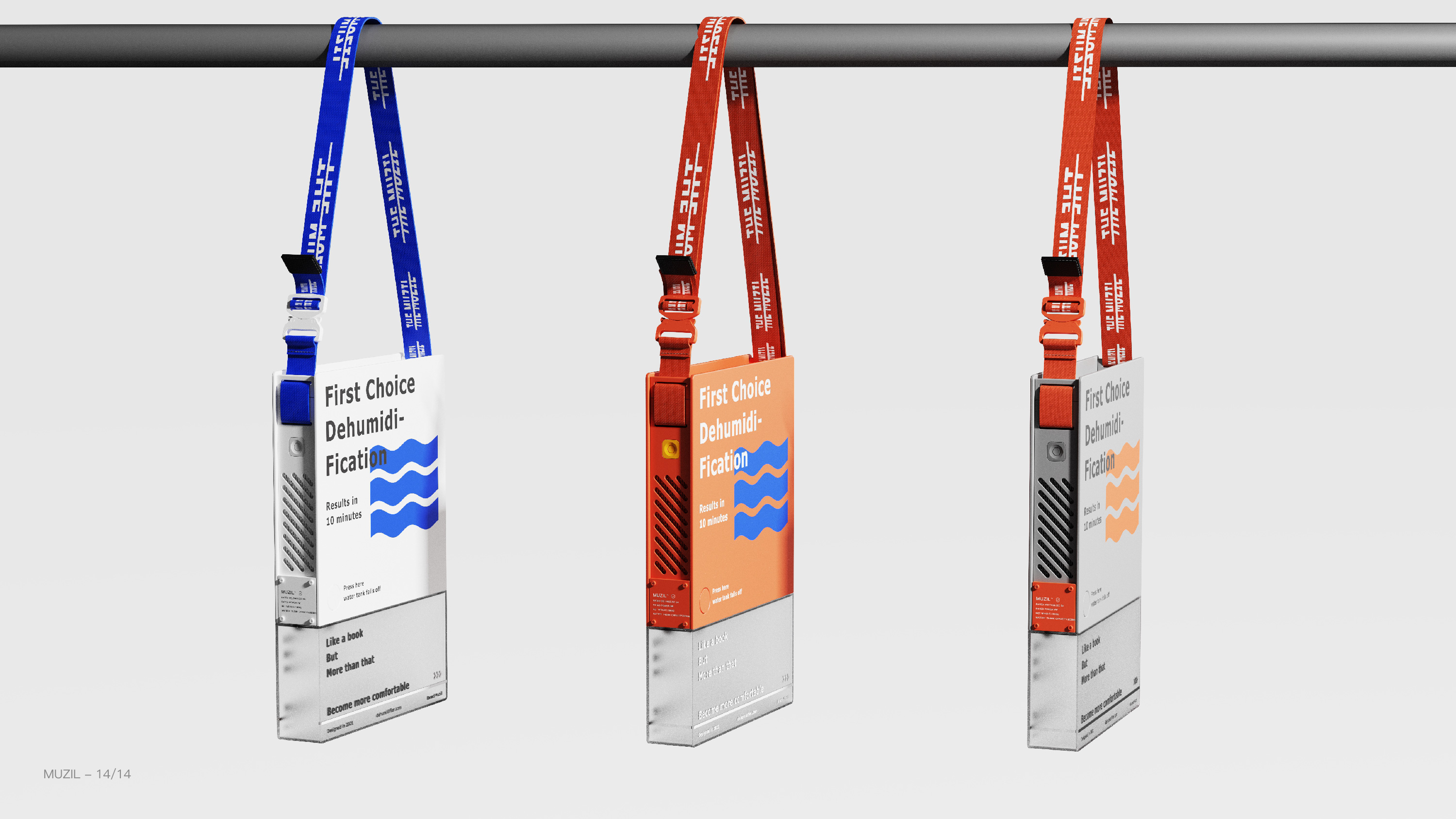
1. "Muzli" breaks through the usage and product structure of the traditional dehumidifier, giving the dehumidifier a new modeling language and structure. It can be a book at home or a small backpack. The two states meet different environments and needs, and innovate the user experience of the dehumidifier.
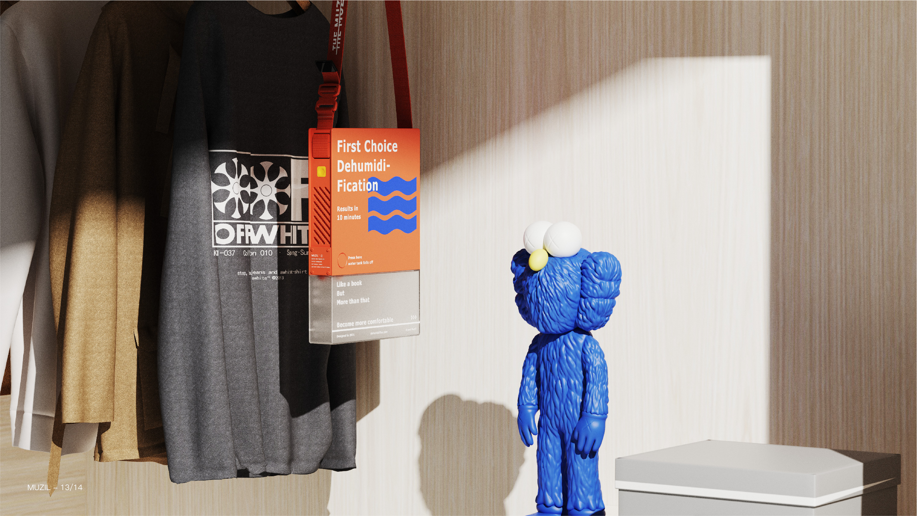
2. The light and thin shape and unique structure of "Muzil" make it stand on the desktop like a book, perfectly integrated into the home environment, and at the same time reduce the occupied area of the desktop, which is convenient for users to work and learn. "Muzil" can be hung on the wall or wardrobe through hidden straps, easily adapting to various environmental conditions requiring dehumidification.
3. Perfect combination of book and backpack usage and modeling language, the two states are independent and unified, giving products more placement methods. The new structural design of the top hidden air inlet and the side air outlet is adopted, which makes the product lighter and thinner and reduces the use area.
4. The overall style adopts the cool design, which breaks the traditional simple appearance and meets the aesthetic needs of young people.
It's just that when Mao Sai first opened, when he was spying on the sesame gate, there must be a lot of craft, landing or conceptual understudy. Welcome to learn, share and communicate.
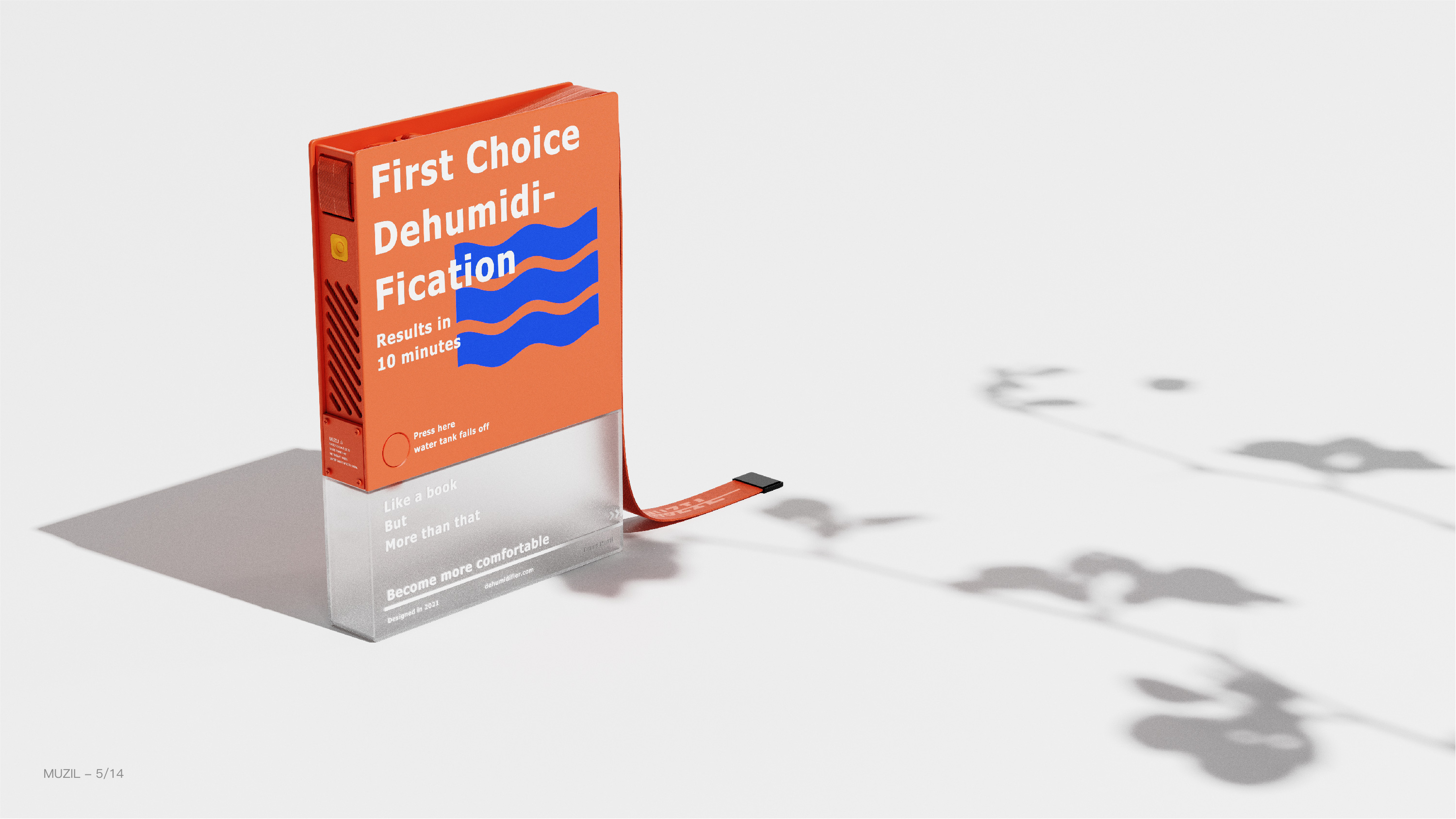
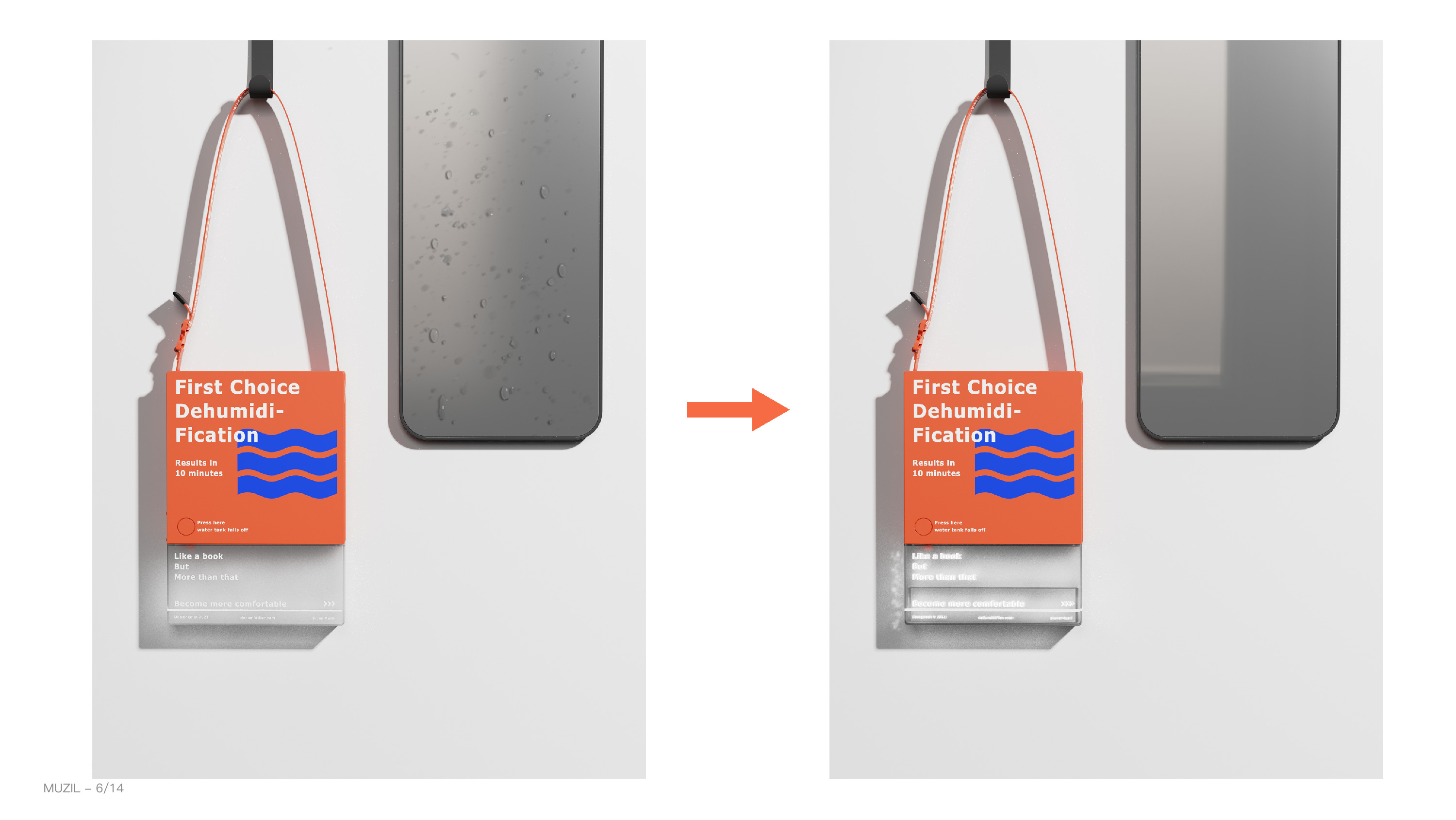
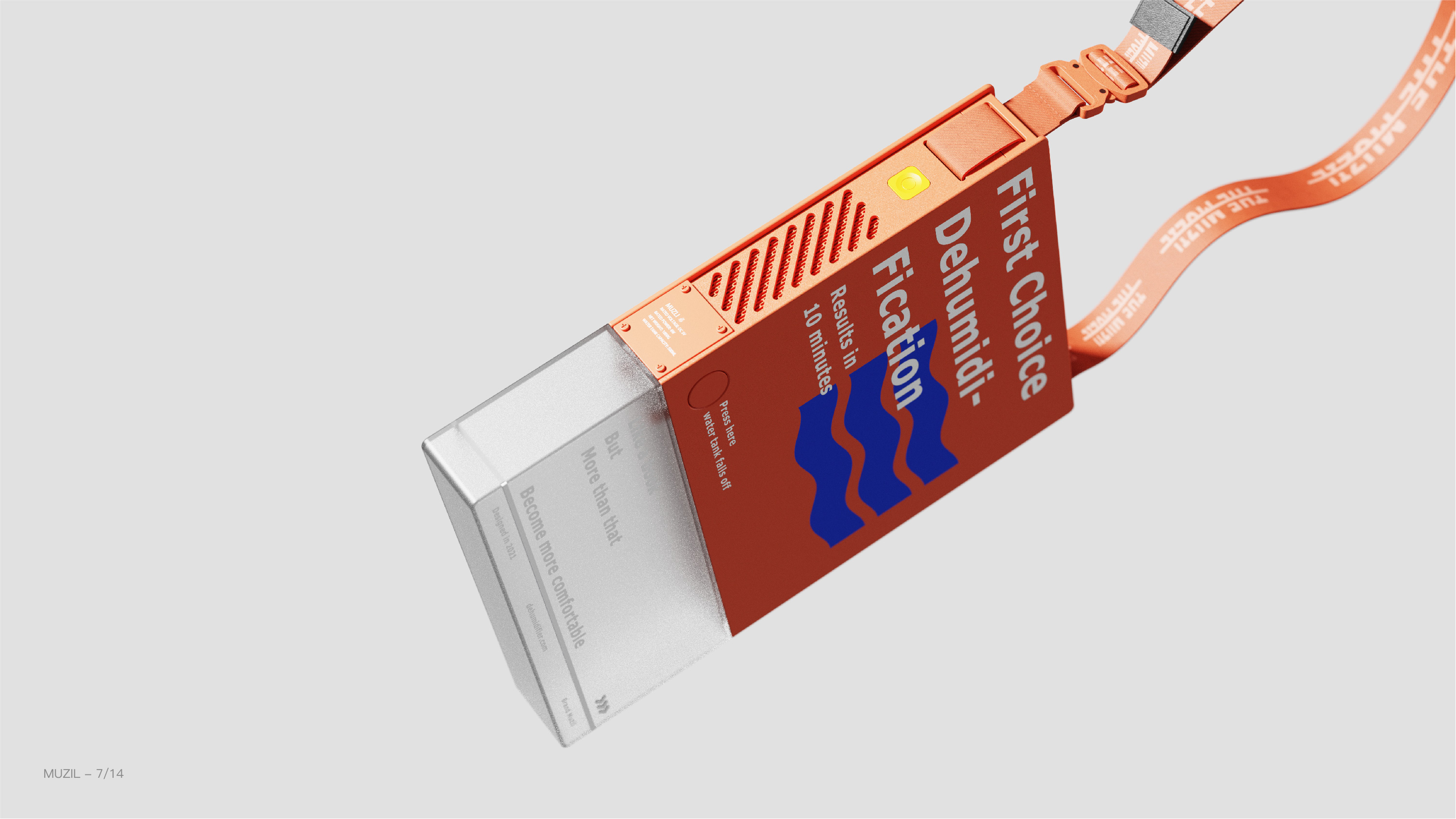
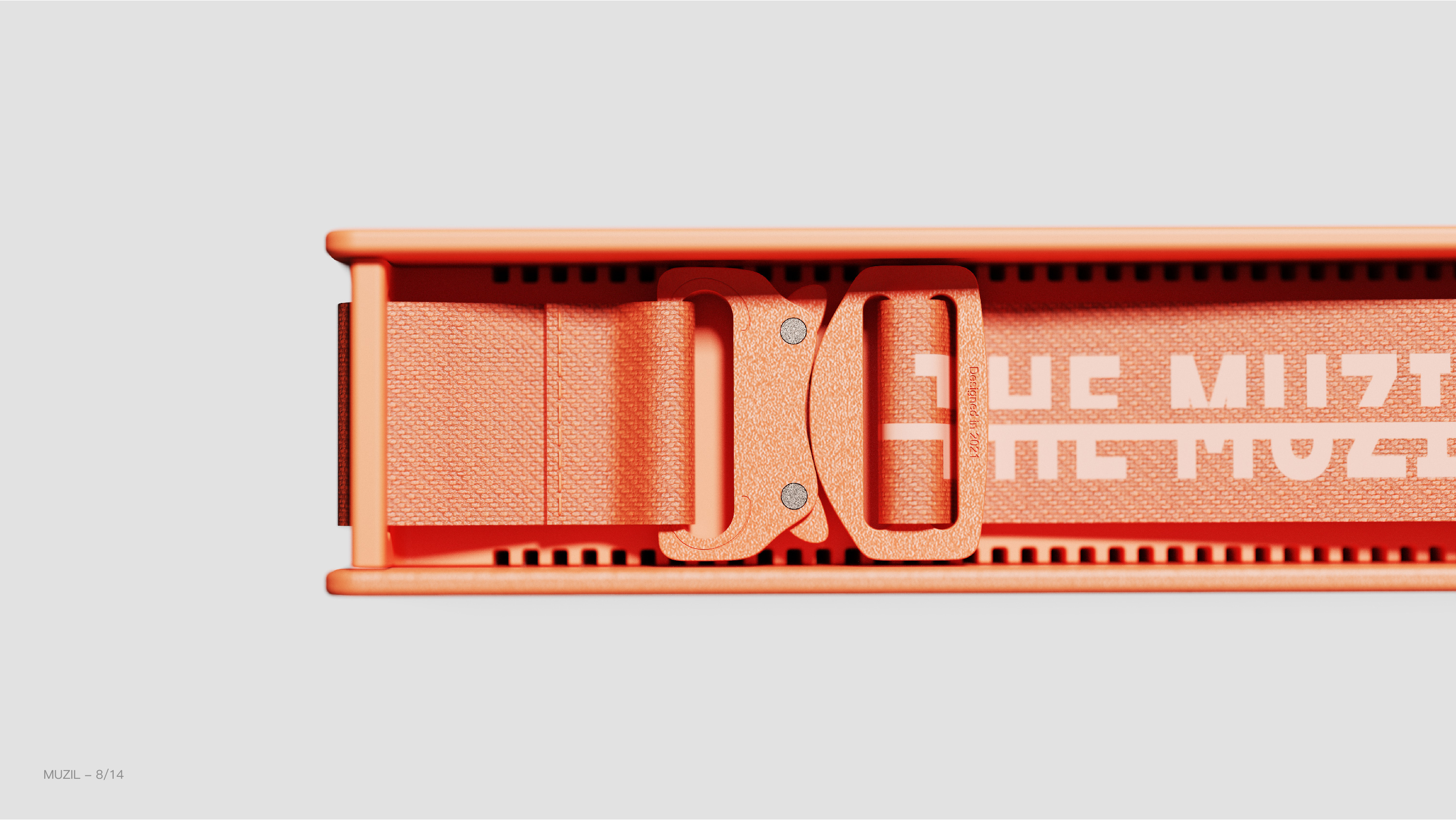
Hidden air inlet display (inspired by the neck fan)
Use scenario one
Use scenario 2
Use scenario 3
The copyright of this work belongs to AGUA. No use is allowed without explicit permission from owner.

New user?Create an account
Log In Reset your password.
Account existed?Log In
Read and agree to the User Agreement Terms of Use.

Please enter your email to reset your password
It looks like yifeeling did it
It is true that this product cannot fall to the ground. First of all, it shows that I have designed a dehumidifier myself. If you are not making a dehumidifier with a DC socket, you are just designing a product similar to a desiccant. I think it is still possible. Only the dehumidification effect is slow, but if you are referring to a large dehumidifier, the water tank of the condensing dehumidifier can probably hold 1L to 2L of water. There is no way to do that kind of modeling feature like yours. The first is component size and power. The second is the in-and-out wind effect. I can see it. These two points are completely below the standard.
Production costs should not be too high
Text description: In the clouds and fog, the breakthrough in the method of use??? I didn't see what kind of breakthrough in the method of use. The dehumidifier is either placed in the wardrobe or the large one in the living room. Where is the breakthrough in the method of use???
Only borrowing the outline of the book, there is no breakthrough in function. the breakthrough in product structure can be thrown to structural engineer .
The capacity of the water body that can be stored is small, and the appearance is also chicken ribs. It might be better to make a somewhat functional ordeal.
I don't think anyone should walk around their waists.
Can it be applied to production?
Good creativity ~
A moving typesetting is possible
This... student work too volume too volume
It's really biu.
To be honest, it's really good ~
Great design, it's great to have such a new generation of young designers in China.
This is not bad.
Look at this positioning, it's not Hu Mei's younger brother
Is this a battery or a plug-in?