Brand side: more interesting aesthetics
Award: 2022 Pentawards Award Products
Reporting Agency: One Point Design Consultation
Our service: award declaration | visual communication | booth construction | warehouse logistics
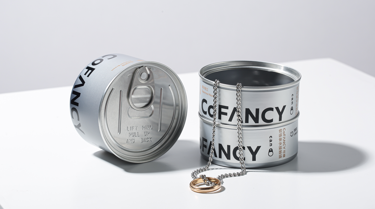
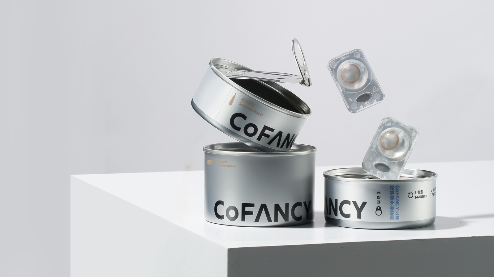
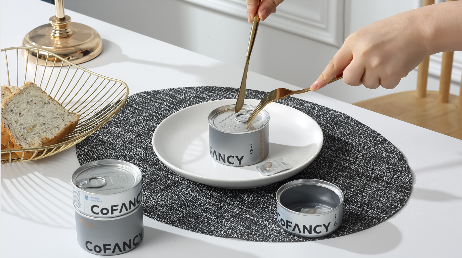
CAN is a can package designed for colored contact lenses. Compared with the carton packaging with serious homogenization on the market, CAN pioneered the use of metal can packaging, and "CAN" is a pun on "can" and "can. On the one hand, the jar symbolizes the tolerance of everything we see, and is also the interpretation of the brand's concept of "nothing can't" and encourages young people to pursue what they think freely and freely. On the other hand, the opening sound of the jar is similar to the CoFANCY pronunciation of the brand name, which can deepen users' love and value recognition of the brand and have more brand memory, thus improving users' stickiness and brand loyalty.


Huh? I mean, I don't understand
This packaging imagination is OK
very good
It's really good
beautiful