When doing brand vision, the most time-consuming thing is often not to generate the first picture, but to make the clothes, posters and videos behind look like they belong to the same brand. Even a single image looks fine on its own, but when put together they look like they were slapped together at the last minute: the logo’s size has changed, the primary color is off, and even the clothing on the figures doesn’t match the product shots against the white background.
This time I conducted a full test using DAZE. Enter only the brand Logo, slogan and three colors, and then complete the brand specification, Mockup around the clothing, vertical publicity screen, Campaign Storyboard and street skateboard video in turn. The real value lies not in how much content is generated at once, but in clearly defining upfront what must remain unchanged and what can be adapted, then advancing step by step.
1. First, secure the things that cannot change.
DAZE’s visual core is simple: a handwritten logo, an asterisk in the upper right corner, and the slogan “LOST ON PURPOSE.” There are only three colors, dark cyan# 0A2C2C, white# FFFFFF and black #000000. The further the project progresses, the more critical these elements become, as they will appear across apparel, bags, character outfits, and video footage.
I didn't let the system "do a street brand" as soon as I came up, but first set up a Merchandiser Agent. Its role isn’t just to produce generic visuals; it’s about expanding a brand into a comprehensive line of branded merchandise: first by understanding the brand’s identity, then creating white‑background product mockups, promotional imagery, and optional video content. As a result, each subsequent step uses the same context, eliminating the need to repeatedly explain who the brand is.
Once the responsibilities are clearly defined, constraints must also be specified. The key guidelines in this case are: all products must first use a pure white background; logos, color schemes, and the overall style must remain consistent across different products; the default aspect ratio is 3:4; static product and promotional visuals must be approved before moving on to the more costly video stage; any blurry text or elements that clearly fall outside the brand’s defined parameters must be reworked.
These rules may seem a bit trivial, but they are more effective than simply piling up a long string of stylistic adjectives. “Young, trendy, and edgy” can be left open to the model’s interpretation, but the logo’s structure, color codes, product background, and sequence of steps must be clearly specified. The former is responsible for temperament, while the latter is responsible for consistency.
In the official task, I uploaded the DAZE logo and directly provided the brand name along with its color values. There isn’t much information, but it’s enough to establish a clear minimum input: brand identity elements, a fixed color palette, and the product direction that needs to be expanded. There’s no need to cram the camera, actions, and all the products into the very first shot; let the system establish the brand baseline first, and it will be easier later to pinpoint where deviations lie.
2. Do the white-background products first, then the scenario images.
The static product serves as the calibration layer for the entire workflow. I’ll start with the dark teal hoodie: the handwritten outline of the logo, the placement of the asterisk, and the slogan have all been preserved, and the garment’s color falls within the predefined dark teal range. The white background makes the problem easily exposed. If the wordmark is deformed, the cuff structure is abnormal or the color is obviously blue and green, it will not be covered by the complex background.
The same rule continues to apply to tote bags. Here, we should not only look at "whether Logo is printed", but also compare the proportion and position of word marks on different carriers. The chest of the clothes can be more eye-catching, and the front of the bag can be enlarged, but the relationship between asterisks, glyphs and slogans cannot be redesigned. Consistency across categories doesn’t mean making everything the same size mechanically; rather, it means maintaining a consistent underlying logic.
After the white product is confirmed, let the system enter the character and publicity scene. In the vertical-format shot, the model wears the same dark teal hoodie; the logo on the chest matches that in the product image. The setting has been changed to an industrial interior with natural light, and the text “NEW COLLECTION” has been added. At this time, the changes are the characters, the environment and the composition, and the clothing color and brand identification are still fixed.
I usually do a manual check at this step: first zoom in to see if the Logo is deformed, then compare the colors of the hoodie in the product map and the figure map, and finally check the hat shape, pocket and body ratio. In some images, the dark cyan in this case may appear green, and depending on the lighting, it can also shift toward a blue-green hue. Therefore, before final delivery, it’s best to rely on color swatches rather than trusting text descriptions alone.
3. A storyboard is not a decorative illustration; it is a checklist for the video.
The workflow enters Campaign only after the static assets have been approved. Here, instead of directly throwing a product map into the video generation, it is first split into several clear narrative nodes: the characters enter the block, the skateboard action unfolds, and the brand and clothing are clearly seen. The three nodes solve the environment, action and product exposure respectively, and the connection is a usable short film.
These short videos don’t require complex plots, but they do need a logical connection between shots. The first shot establishes the characters and the neighborhood; the second shows a skateboarding move in motion; the third has the character stop or appear head-on, making it easy for viewers to see the logo on their chest. If all three shots are just standing poses from different angles, the storyboard may appear complete, but in reality, it fails to establish a rhythm.
In the production pipeline, I prefer to keep static verification separate from video generation. Product mockups, character designs, and storyboards are all inexpensive and easy to revise; only after these elements have been finalized should you bring in the video model. This isn’t about going the extra mile; it’s about avoiding wasting time on a piece that’s destined to be redone when the logo, colors, or characters are already wrong.
4. use the full canvas to check whether the upstream and downstream are really connected
The final canvas put the DAZE Brand Identity, Streetwear Merch Mockups, Campaign Storyboard, and Campaign Video Production in the same space. This view is ideal for a final review: check whether the brand guidelines on the left have been applied to the garments in the middle, whether the clothing appears in the storyboard on the right, and whether the characters in the storyboard are still wearing the same hoodie in the final video.
If you only download the results one by one, it is easy to ignore this upstream and downstream relationship. The connections on the canvas make the issue more intuitive: the brand baseline is the origin, products and promotional visuals are intermediate assets, and storyboards and videos are downstream outputs. When modifying the primary color or logo, you should also start from the initial base node rather than making separate fixes on each finished asset.
5. For completed projects, the question isn't whether "anything has moved," but whether the brand has declined.
In the final skateboarding short, the characters wear dark teal DAZE hoodies as they skate through a brick-walled neighborhood. The choreography, street setting, and overall aesthetic are cohesive, and the brand hasn’t been replaced with a completely different visual identity. However, the video stage remains the most prone to drift: chest logos may deform during motion, clothing colors can be affected by ambient lighting, and the contact between the skateboard and the feet may appear unnatural.
My review sequence is to first check whether the characters are continuous, then examine the clothing structure, followed by frame-by-frame verification of the logos, and only finally assess whether the camera movement looks good. If any of the first three issues are obvious, go back to the storyboard or reference art and fix them first; don’t rush to cover them up with editing, transitions, or music. You can always add a sense of advertising later, but once you lose your brand identity, the entire spot becomes ineffective.
6. What this process truly saves is rework.
From logo to finished video, the process for this case can be summarized in six steps: establishing brand identity; defining agent responsibilities; clearly articulating consistency guidelines; generating and approving products on a white background; expanding scenarios with character illustrations and storyboards; and finally producing the video. Every step produces a verifiable intermediate result; if something goes wrong, you can backtrack to the last correct point instead of restarting the entire process.
If you’re also creating clothing, accessories, or co-branded merchandise, you can directly adopt this approach. First, compile the logo, color palette, tagline, and non‑editable elements into a concise, standardized one‑page document. Then, select two or three representative products for calibration; only after approval should you expand the design to include posters and videos. AI can accelerate output speed, but what truly makes a piece of content look like a brand are still these specific, repetitive, and verifiable rules.



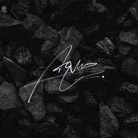
The copyright of this work belongs to Aqun. No use is allowed without explicit permission from owner.

New user?Create an account
Log In Reset your password.
Account existed?Log In
Read and agree to the User Agreement Terms of Use.
Please enter your email to reset your password


quite OK
Really good