
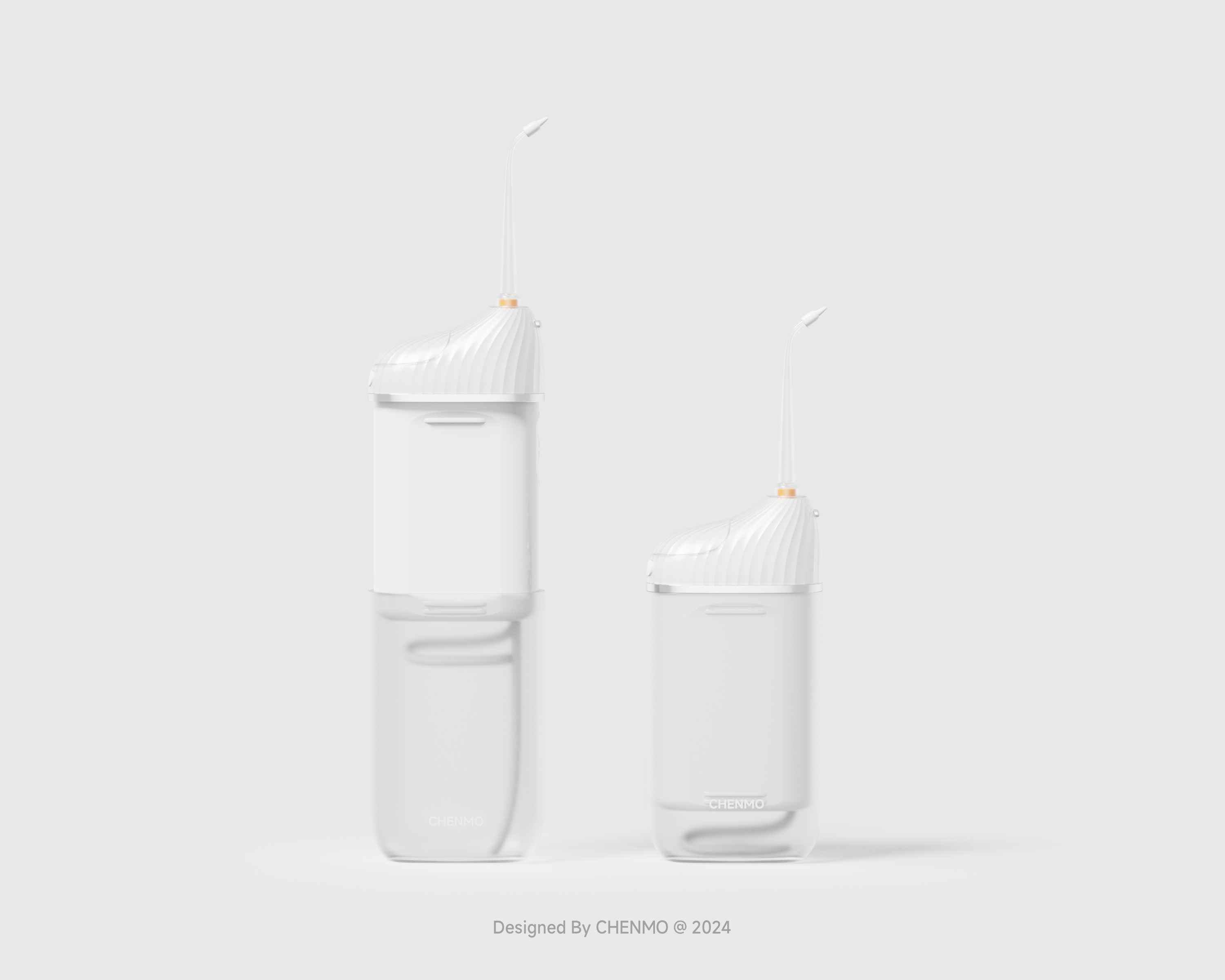
The original plan of this dental irrigator was designed for 21 years. It was done casually. At the end of the year, it was turned out and optimized and re-issued.
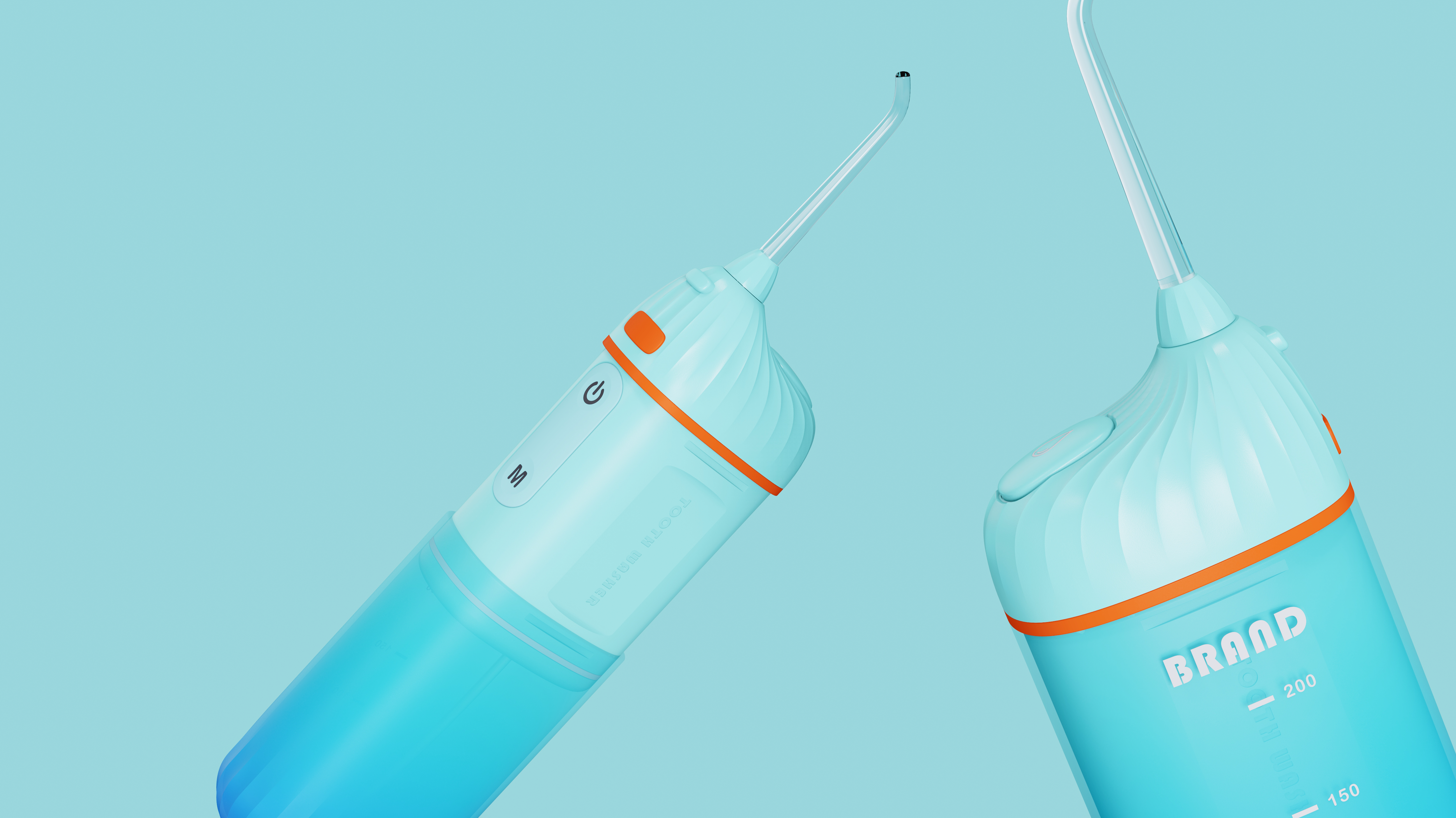
The main direction of optimization is CMF collocation and overall structural rationality. It retains the characteristics of the original scheme, expresses it in a more convergent way, cancels some unnecessary surface features, simplifies the modeling as much as possible, and emphasizes details. Although frosted surfaces are more difficult to clean than smooth surfaces, because it is a concept optimization project, I don't need to consider so much. I like it all.
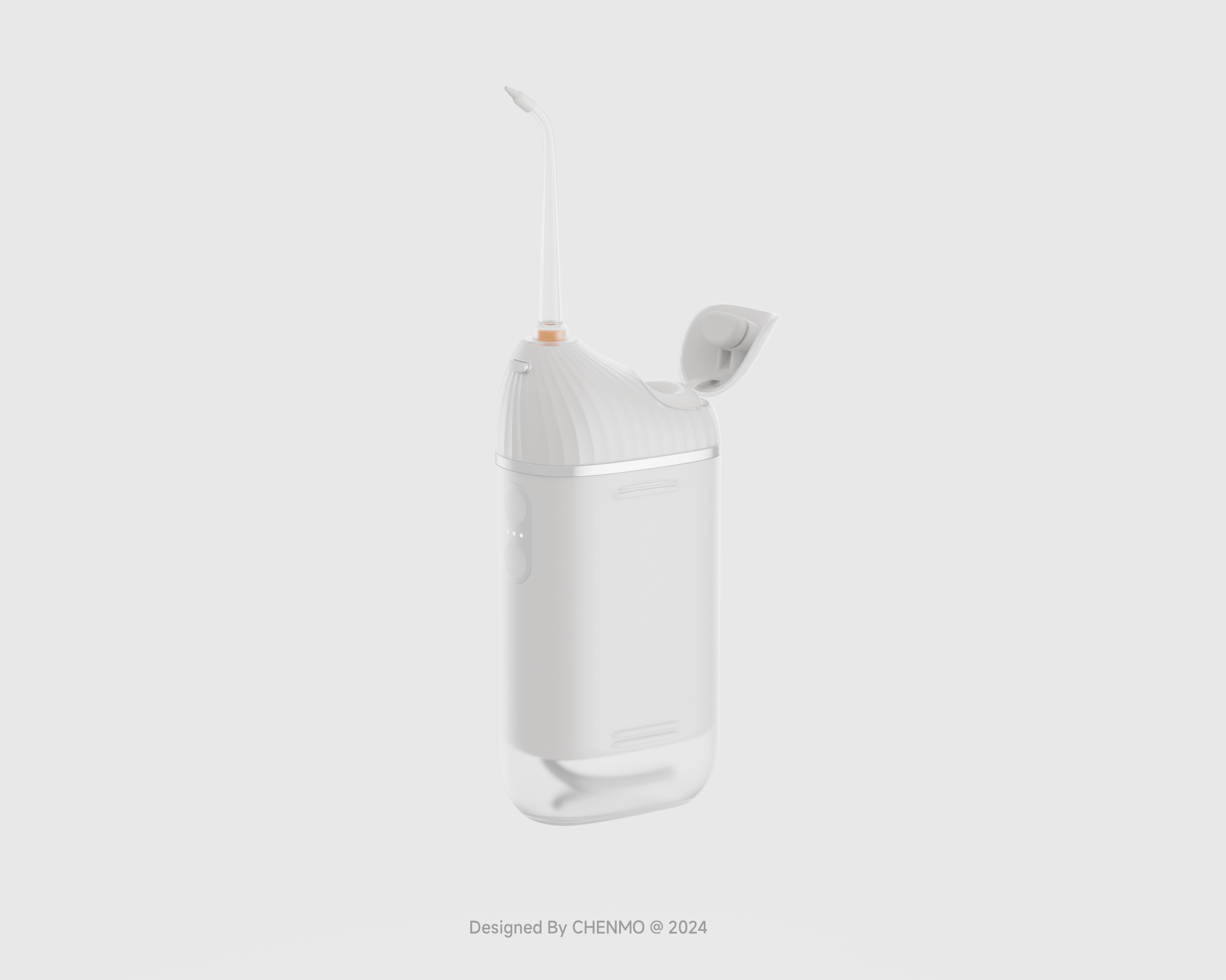
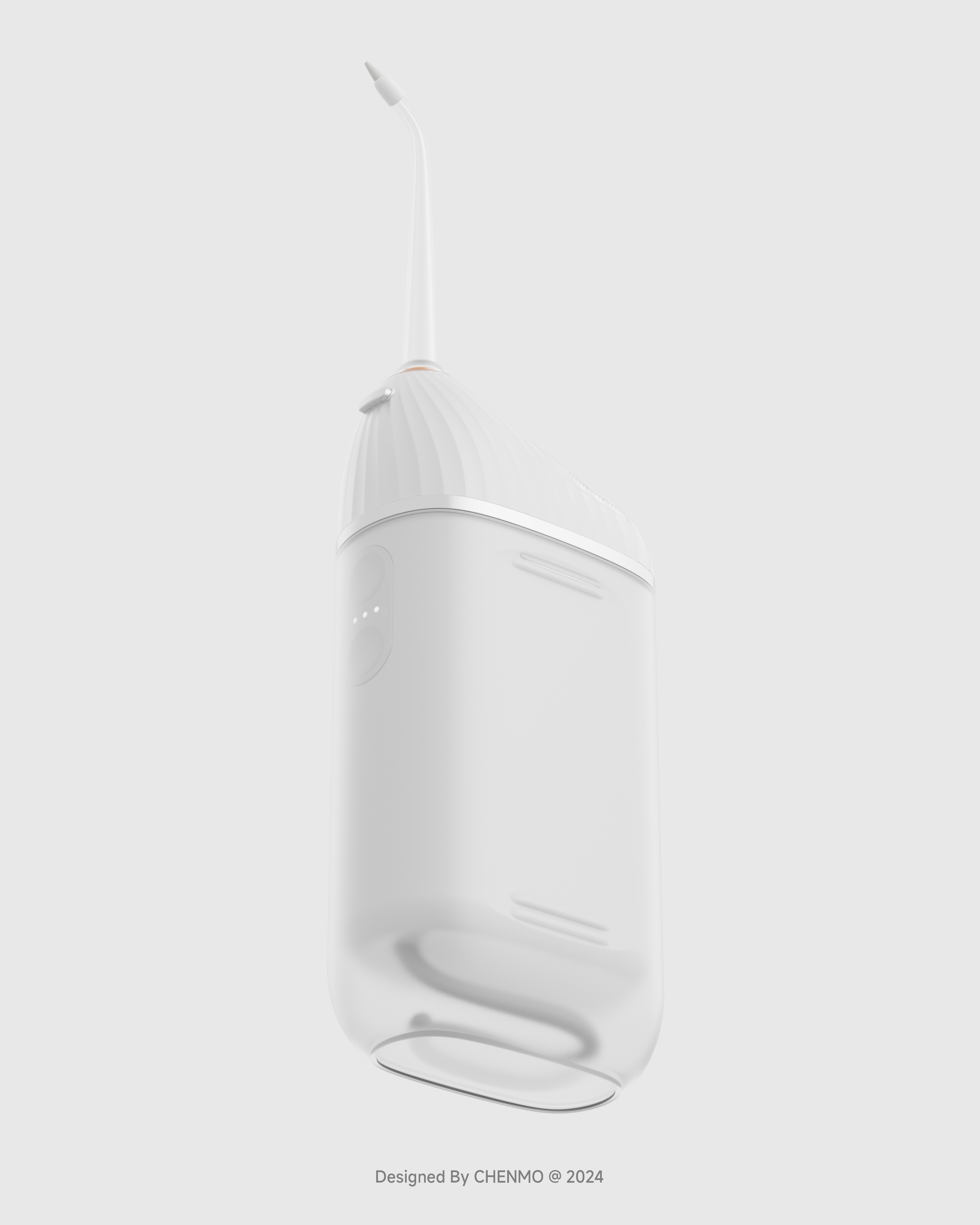
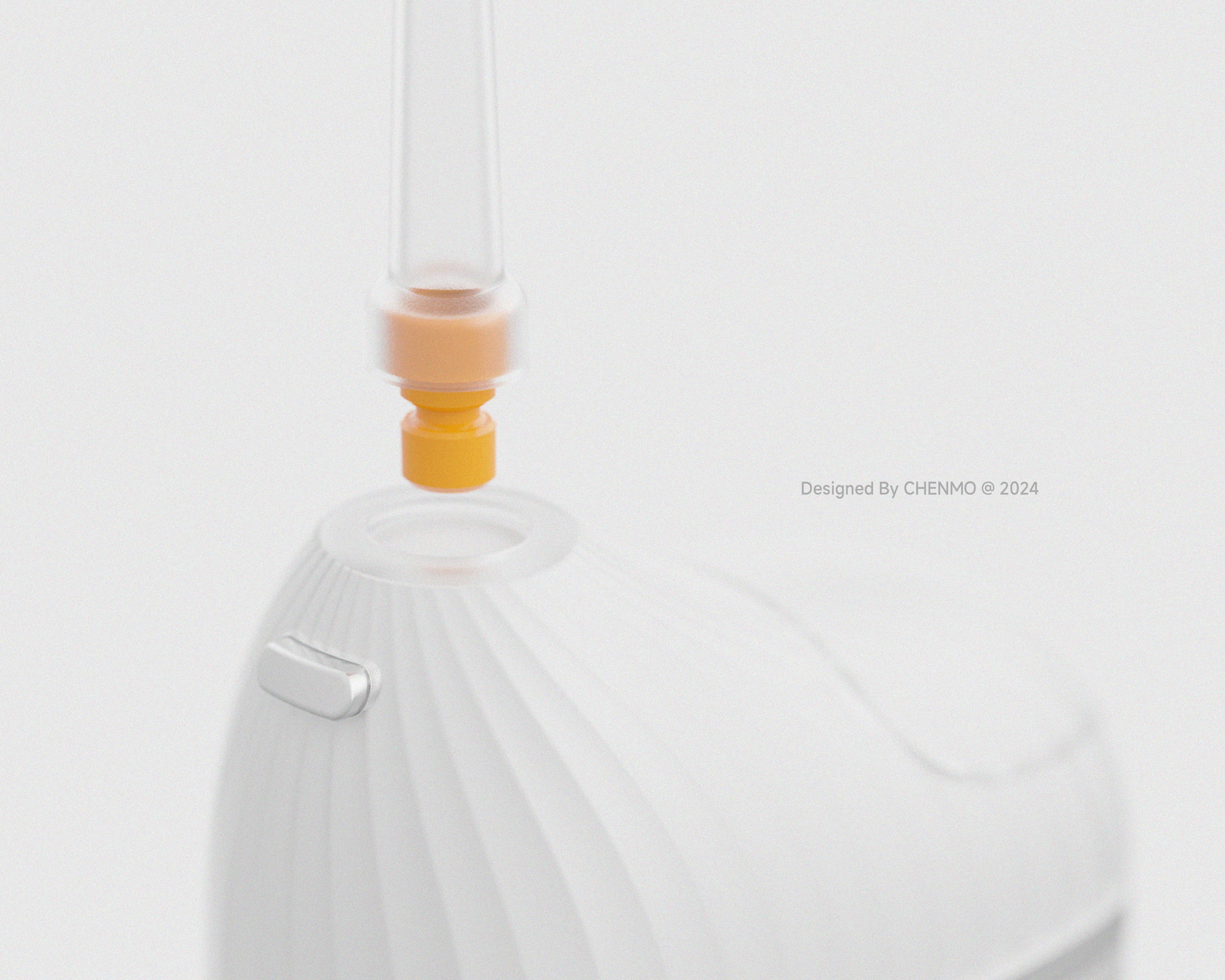
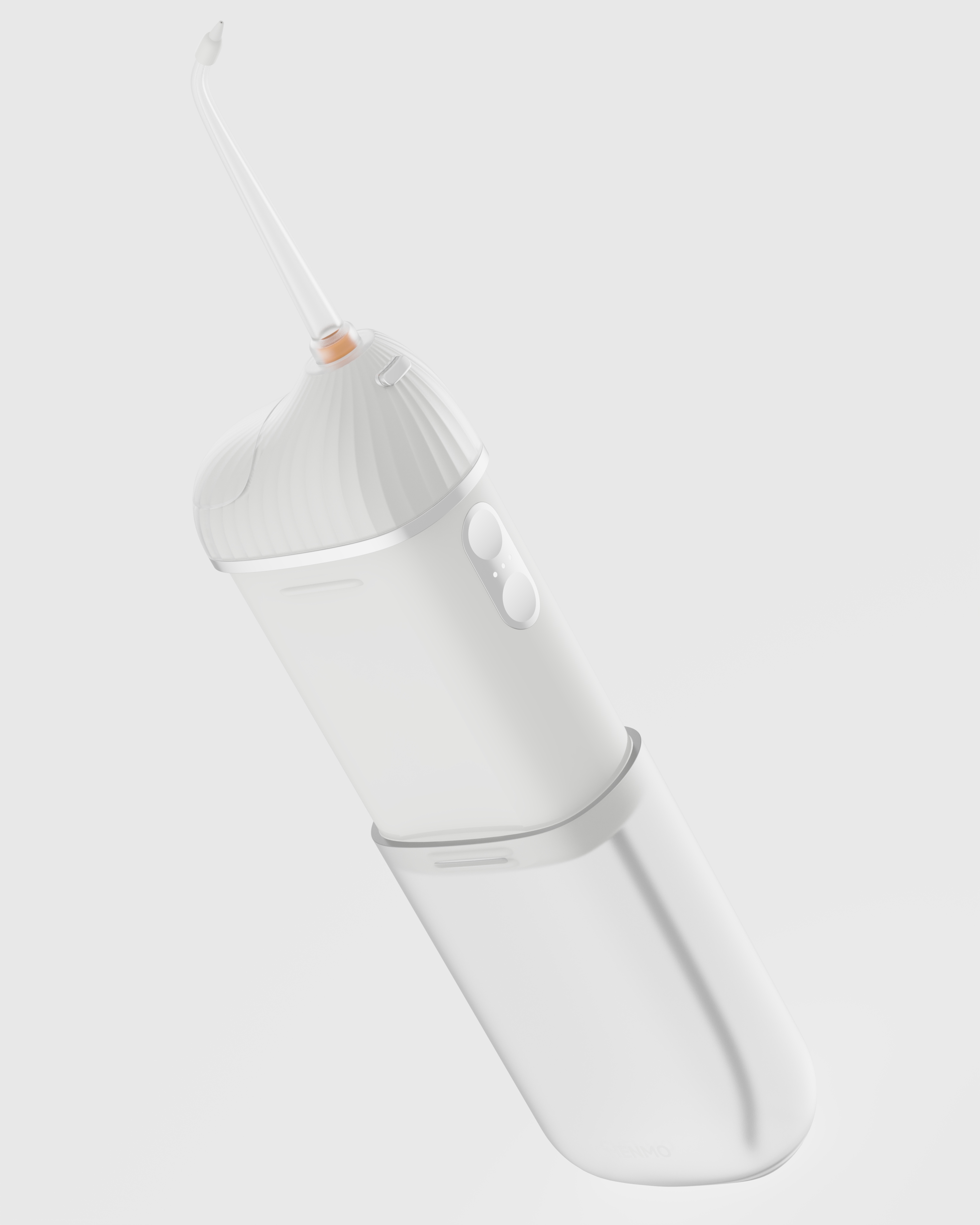
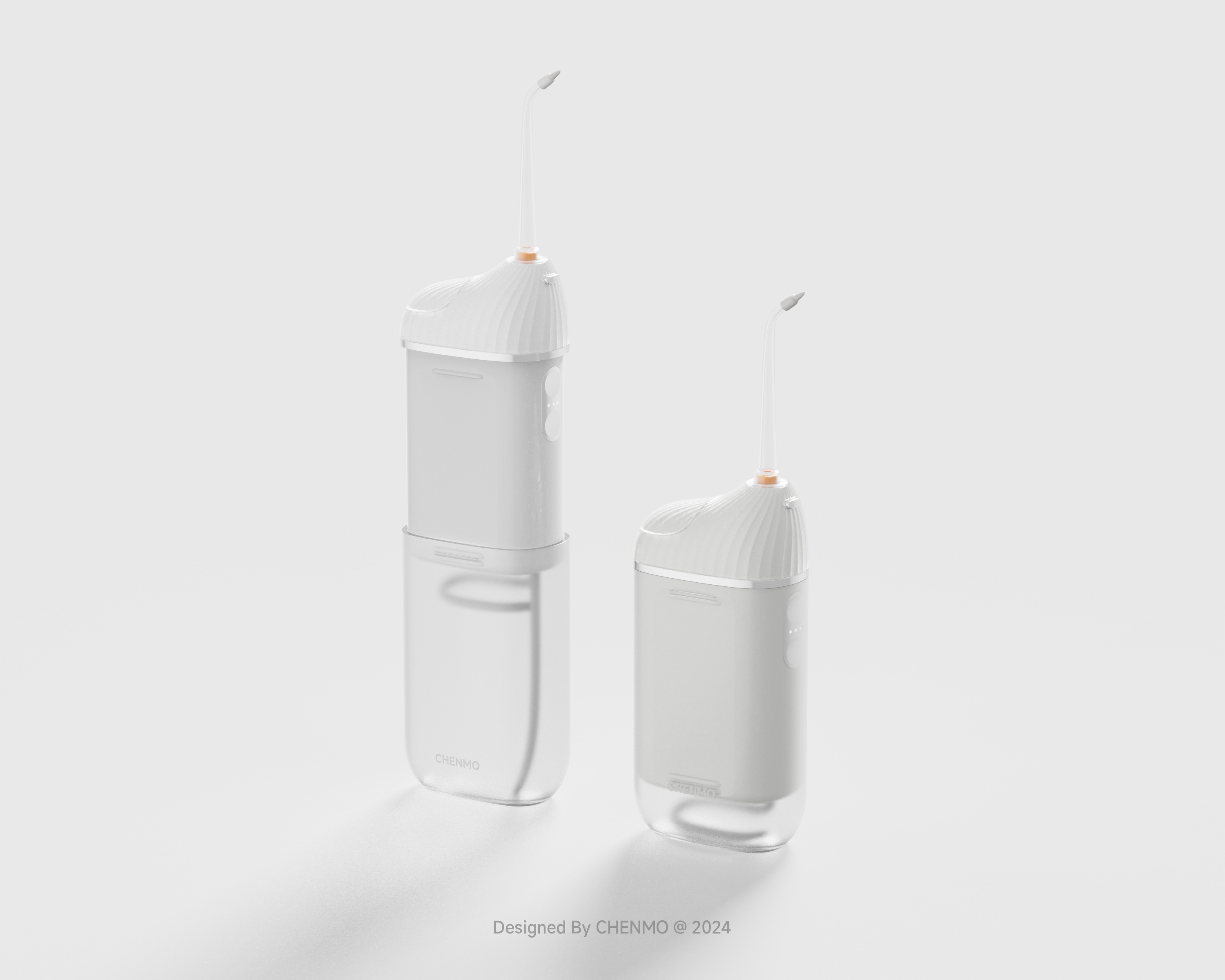
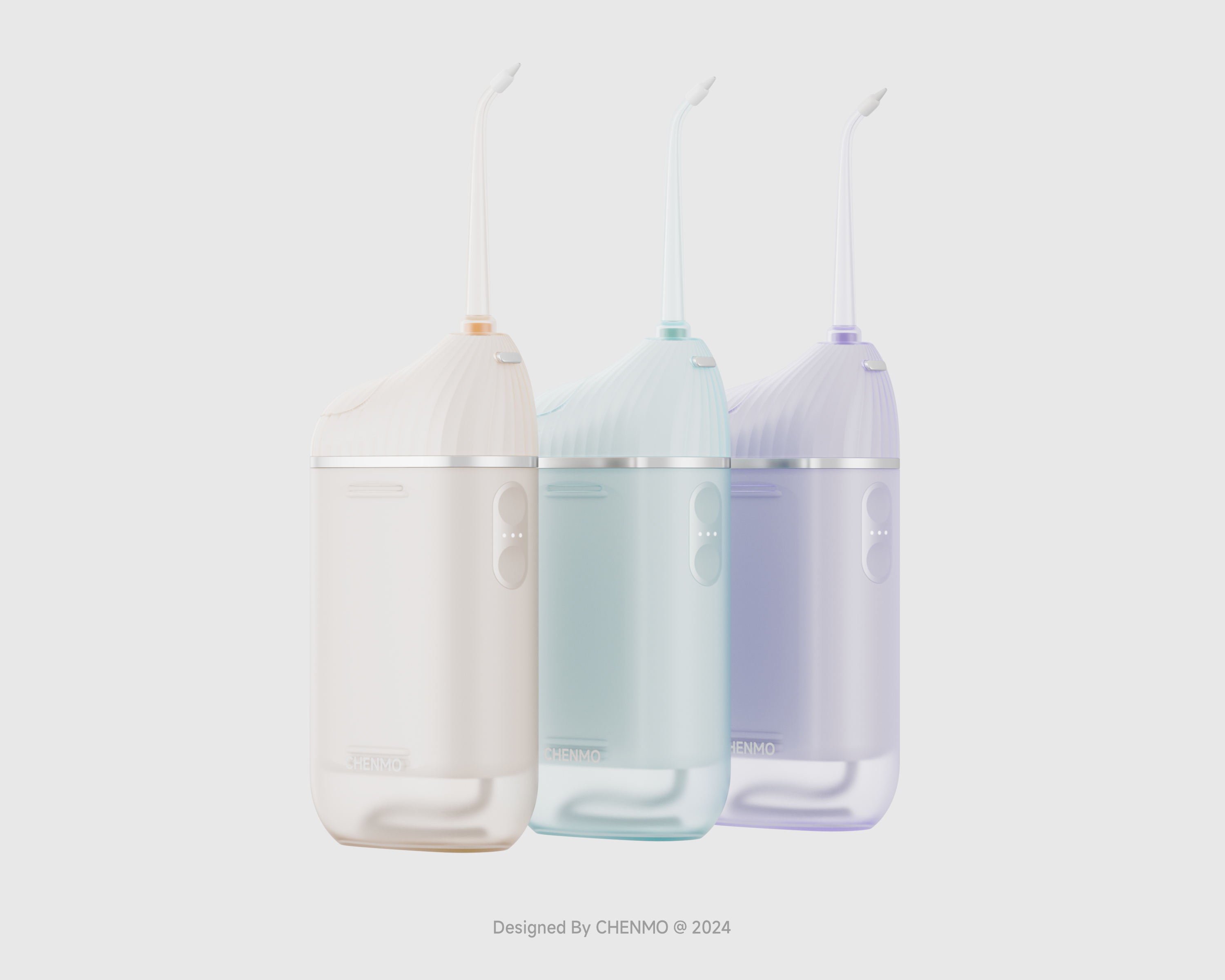
In the design, the all-plastic material of the original scheme was modified and changed to frosted transparent and bright plastic two-color injection molding. The stripes were hidden inside. The outer surface was still a whole and complete curved surface, which should actually be a faint texture. However, when this was discovered, the figure was already finished......
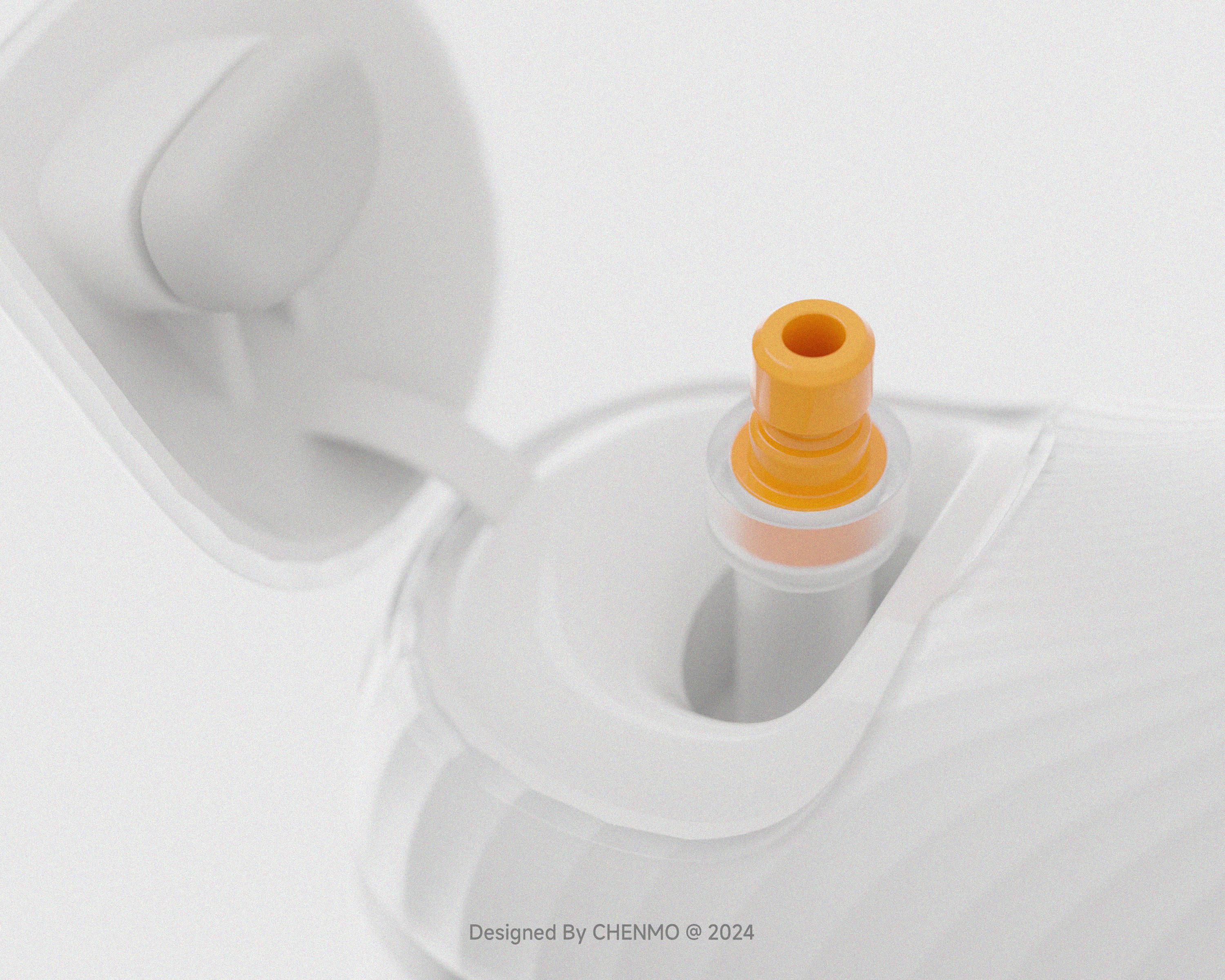
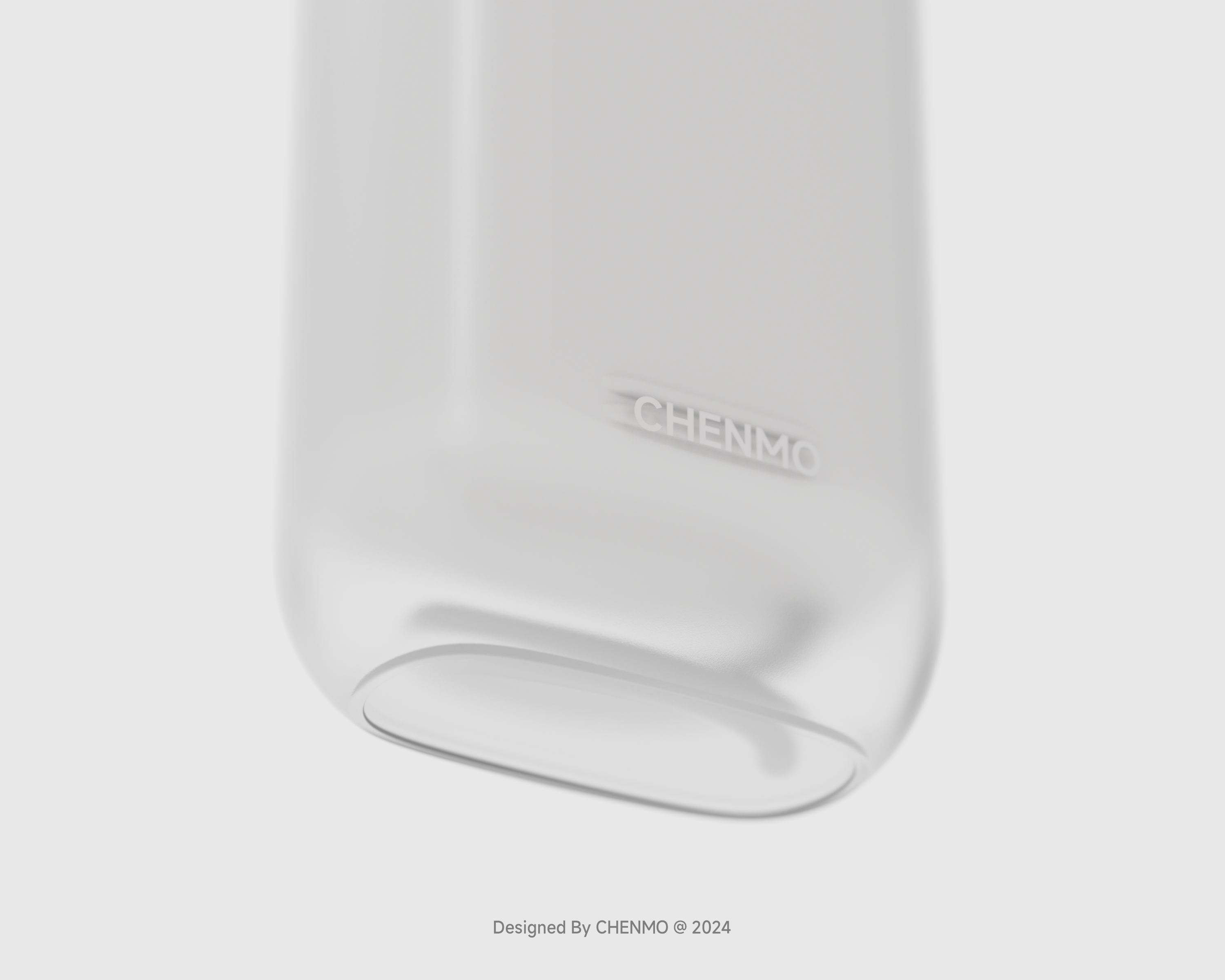
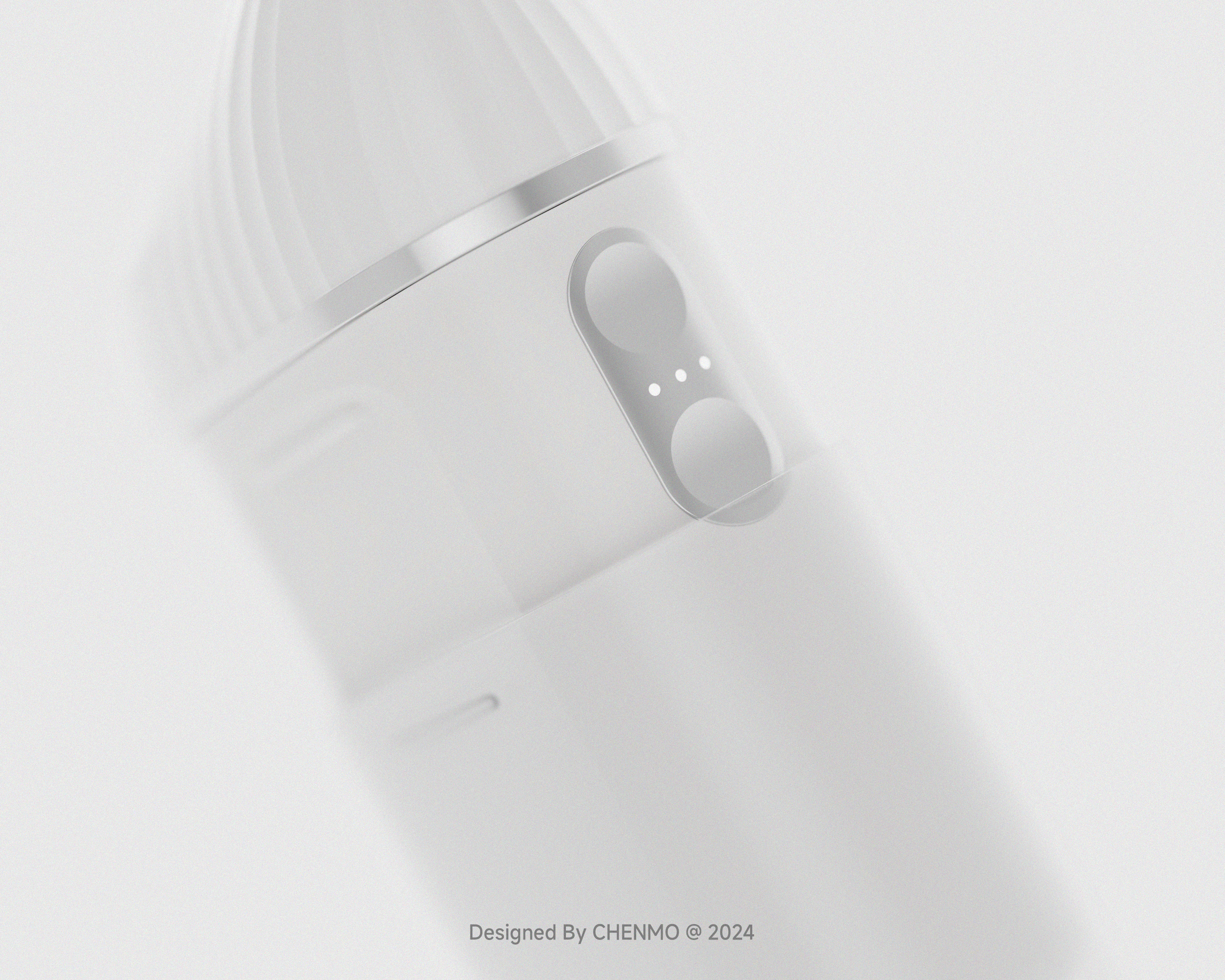
The contrast color matching adopted in the original scheme is modified, and a more mild color scheme is used. The whole machine is white with electroplating silver. Only an orange dot is used for the card, emphasizing the removability here.

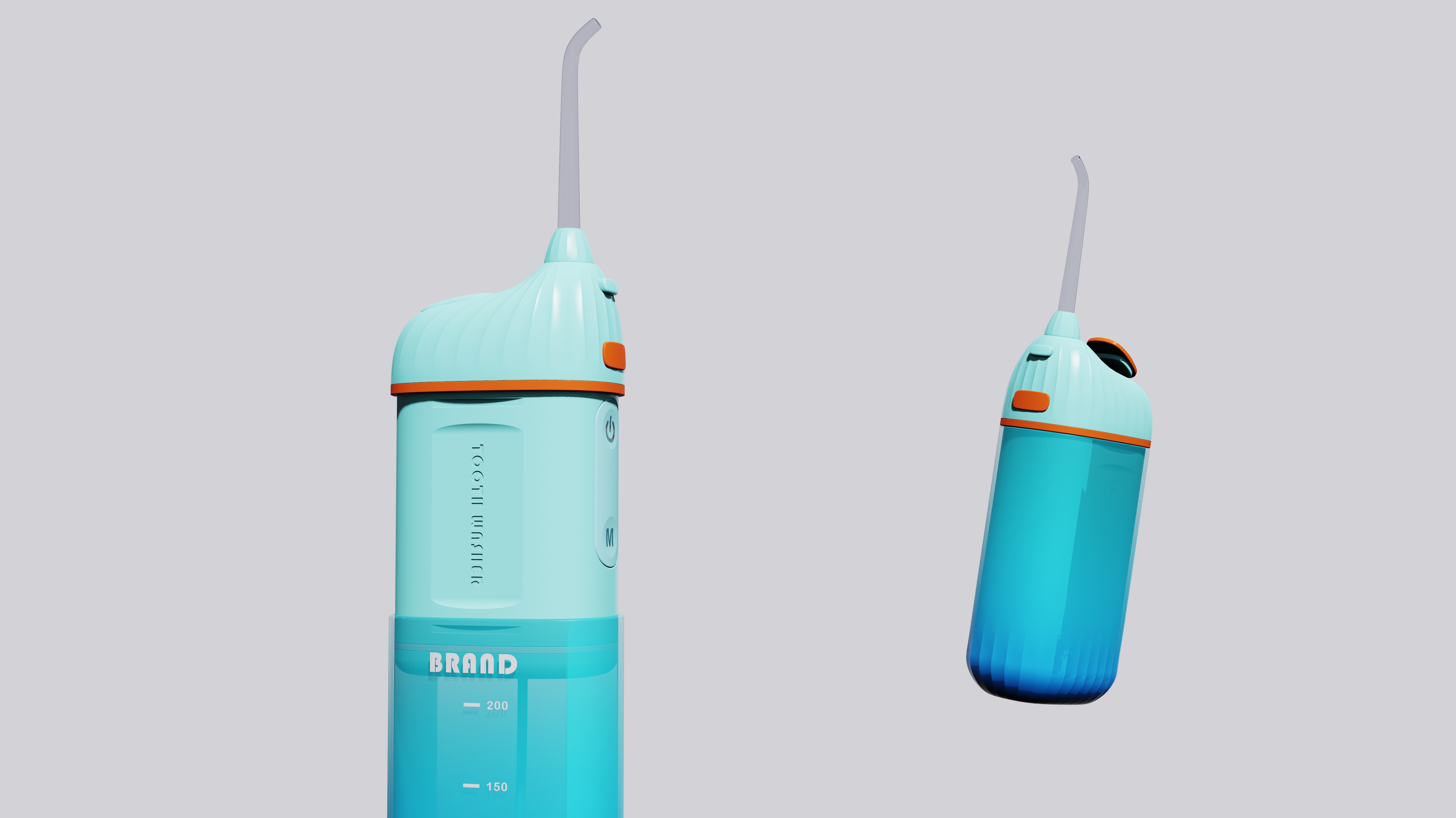
The following are the original plans.
The copyright of this work belongs to CHENMOooo. No use is allowed without explicit permission from owner.

New user?Create an account
Log In Reset your password.
Account existed?Log In
Read and agree to the User Agreement Terms of Use.
Please enter your email to reset your password


Do you have contact information?
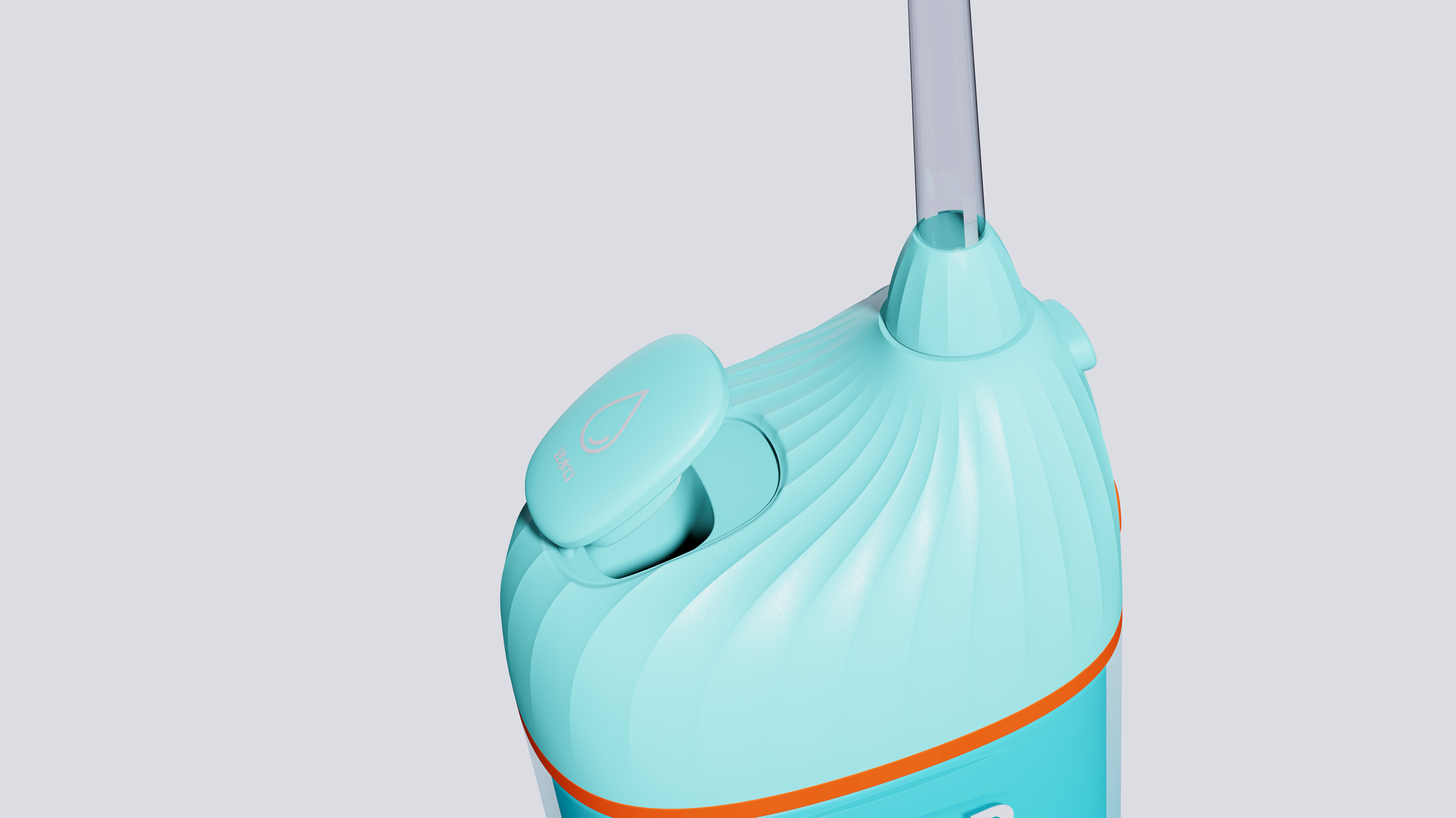
The above texture flows up on a curved surface
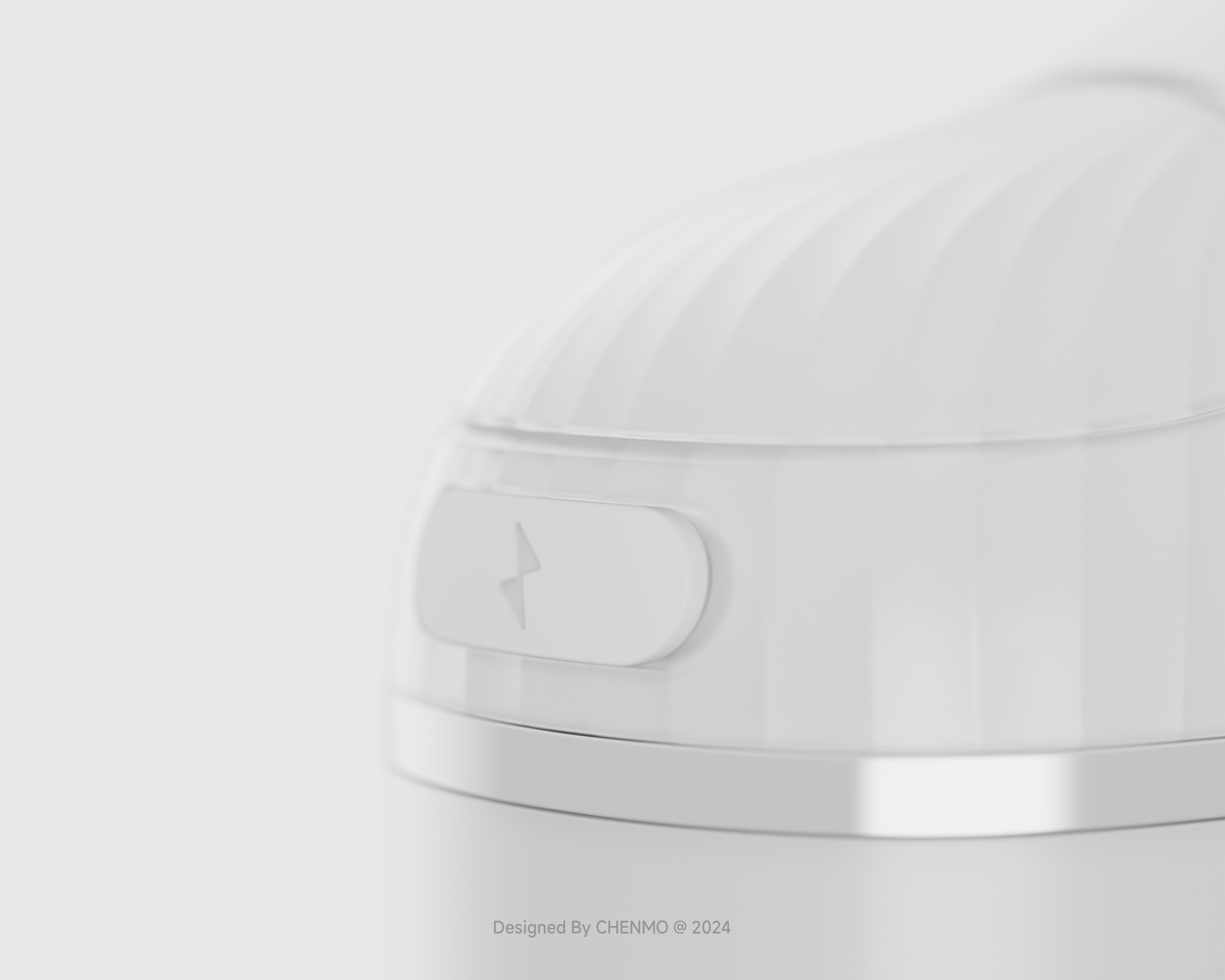
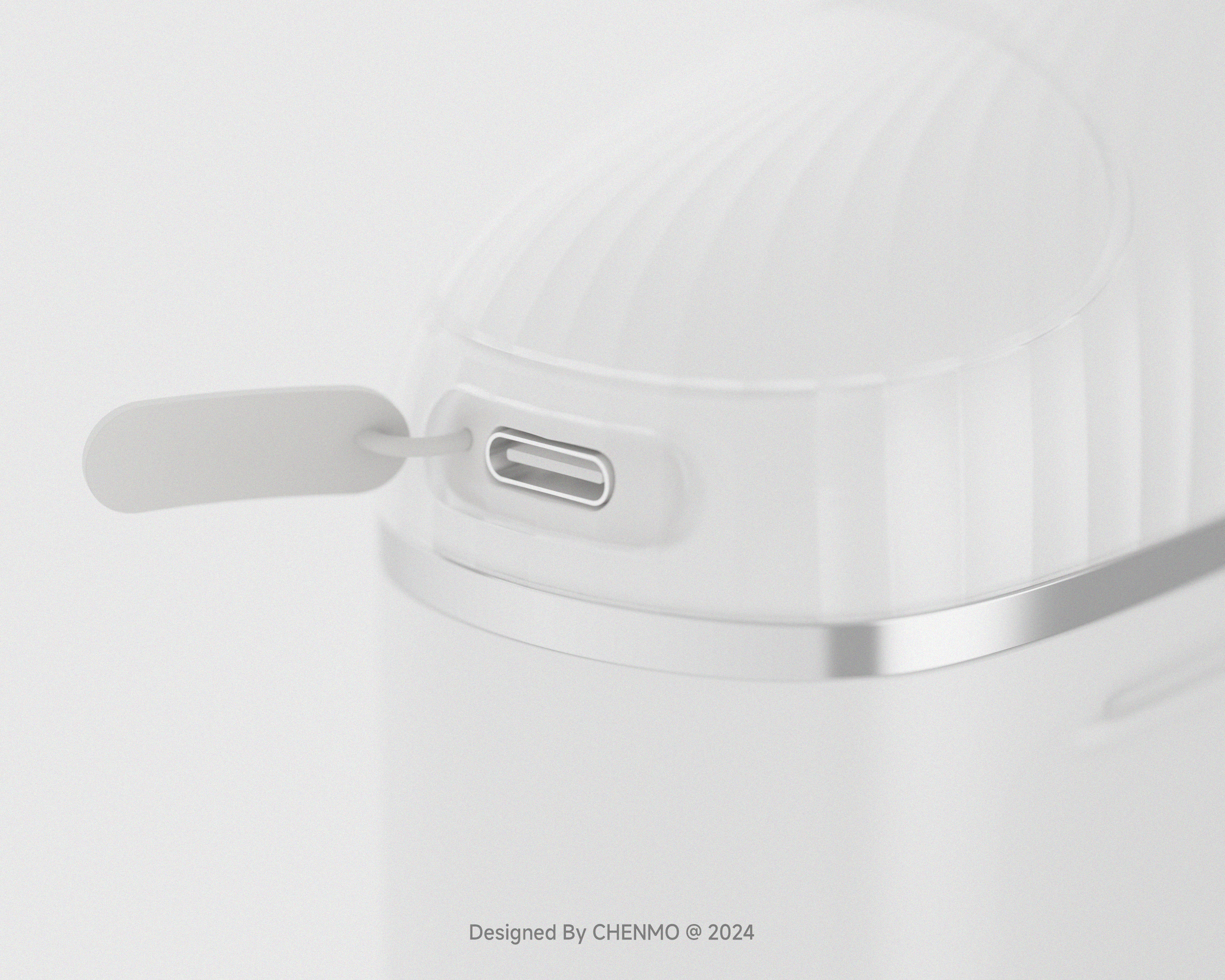
Product design is very beautiful. But the keys do the side. When the product is used up, it should be retracted. There will be water droplets left in the transparent cup. There is a risk of water ingress. And in the process of retraction, the button has the risk of false touch. To ensure that the design height of the button is lower than the side arc surface.
clean teeth is very useful
Green is also good
I like the last one.
look good
It's quite special