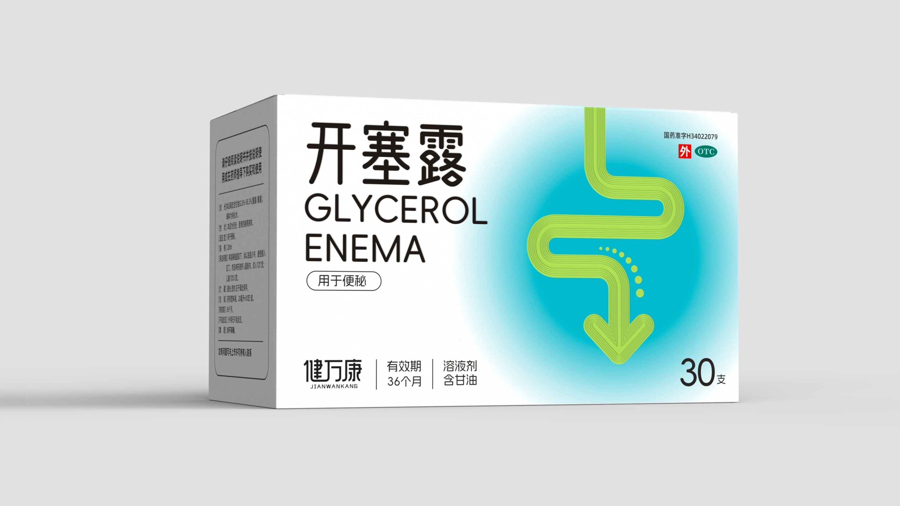
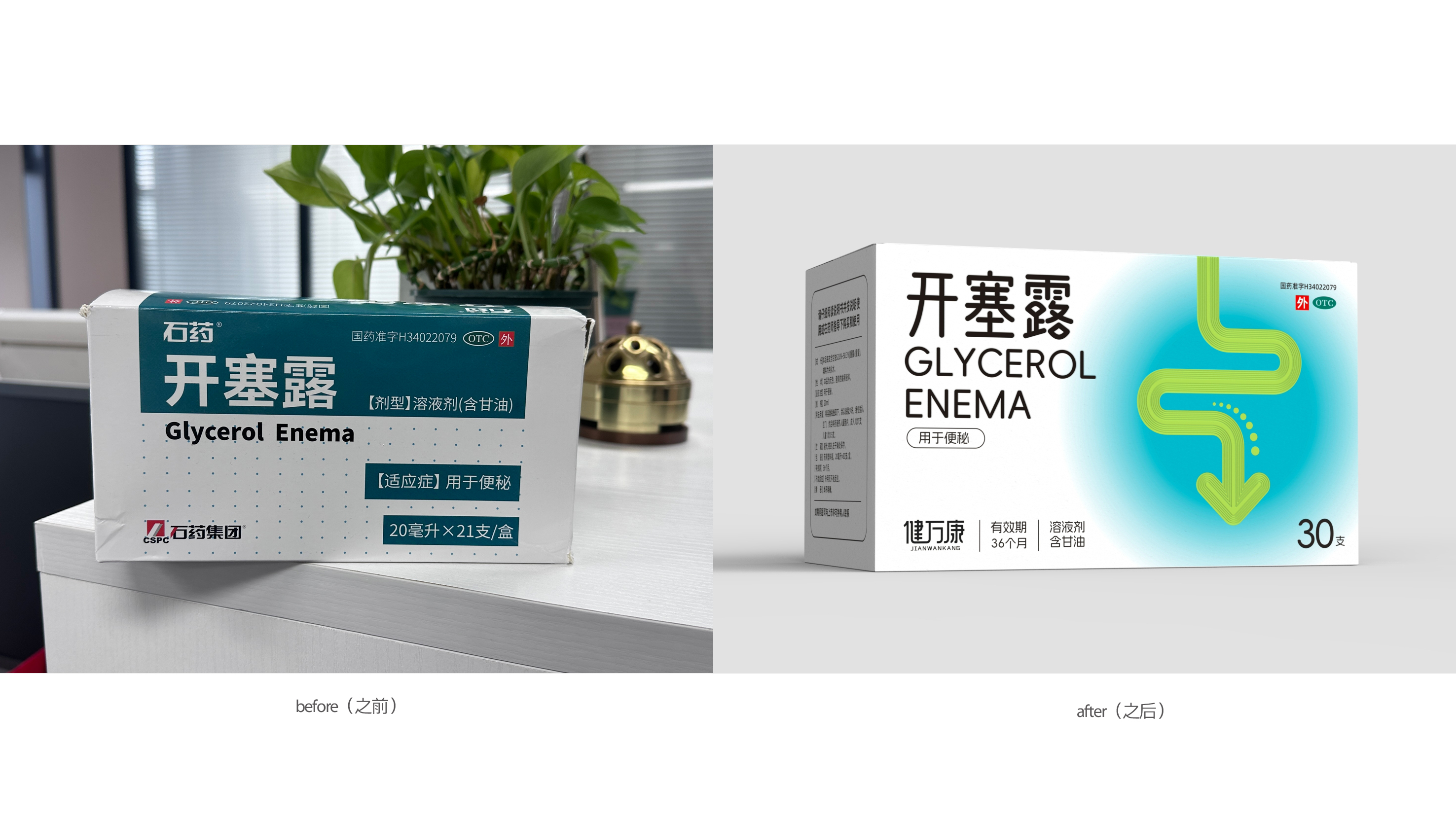
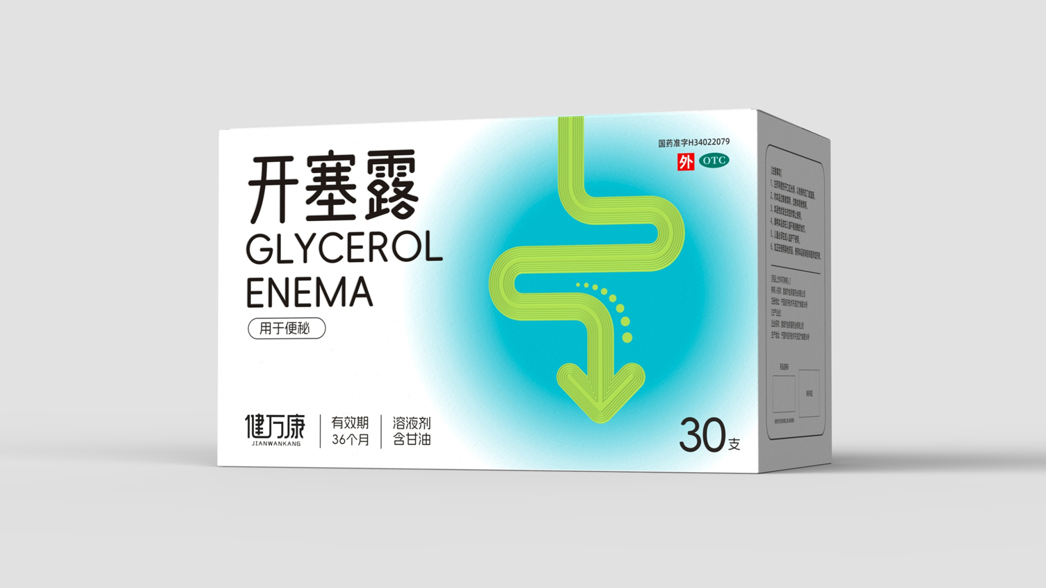
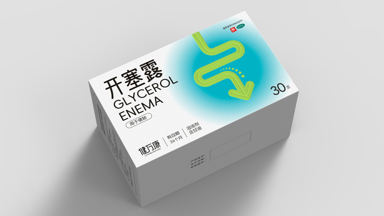
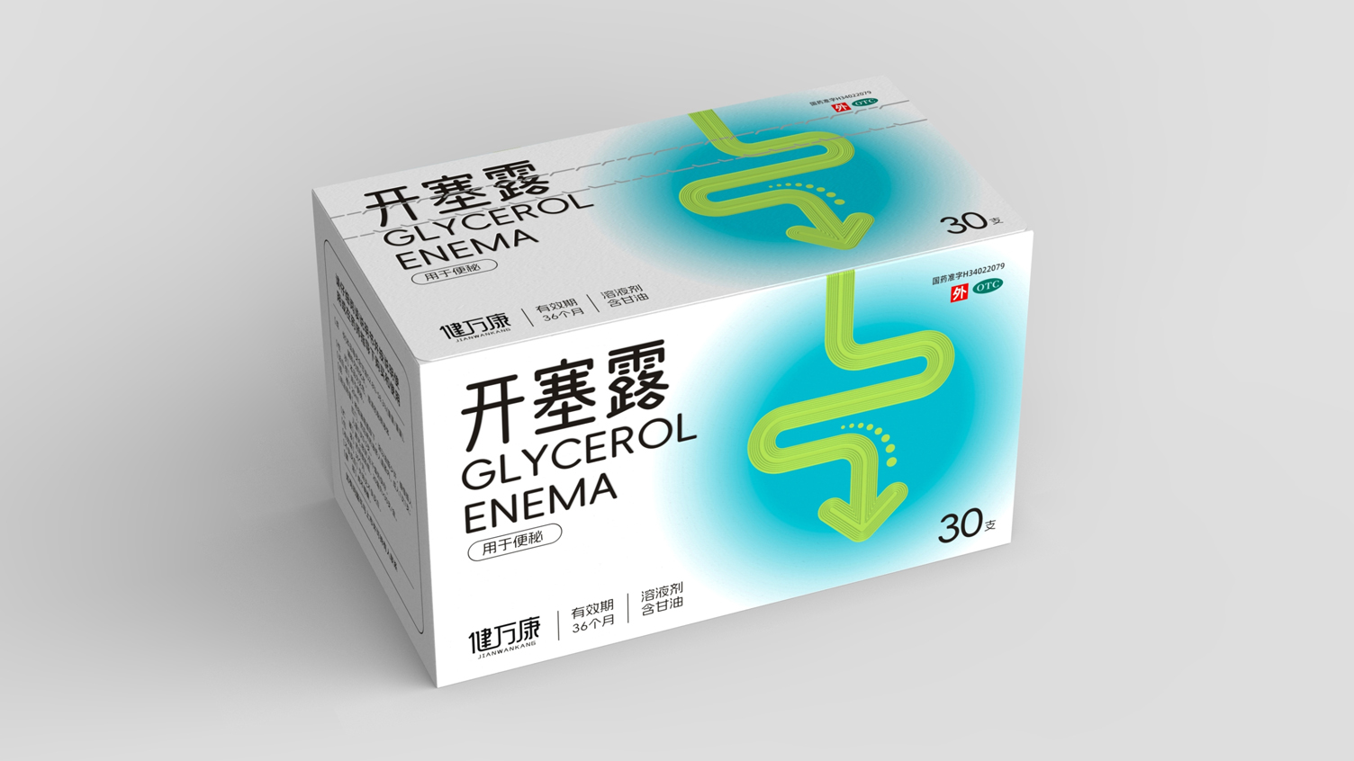
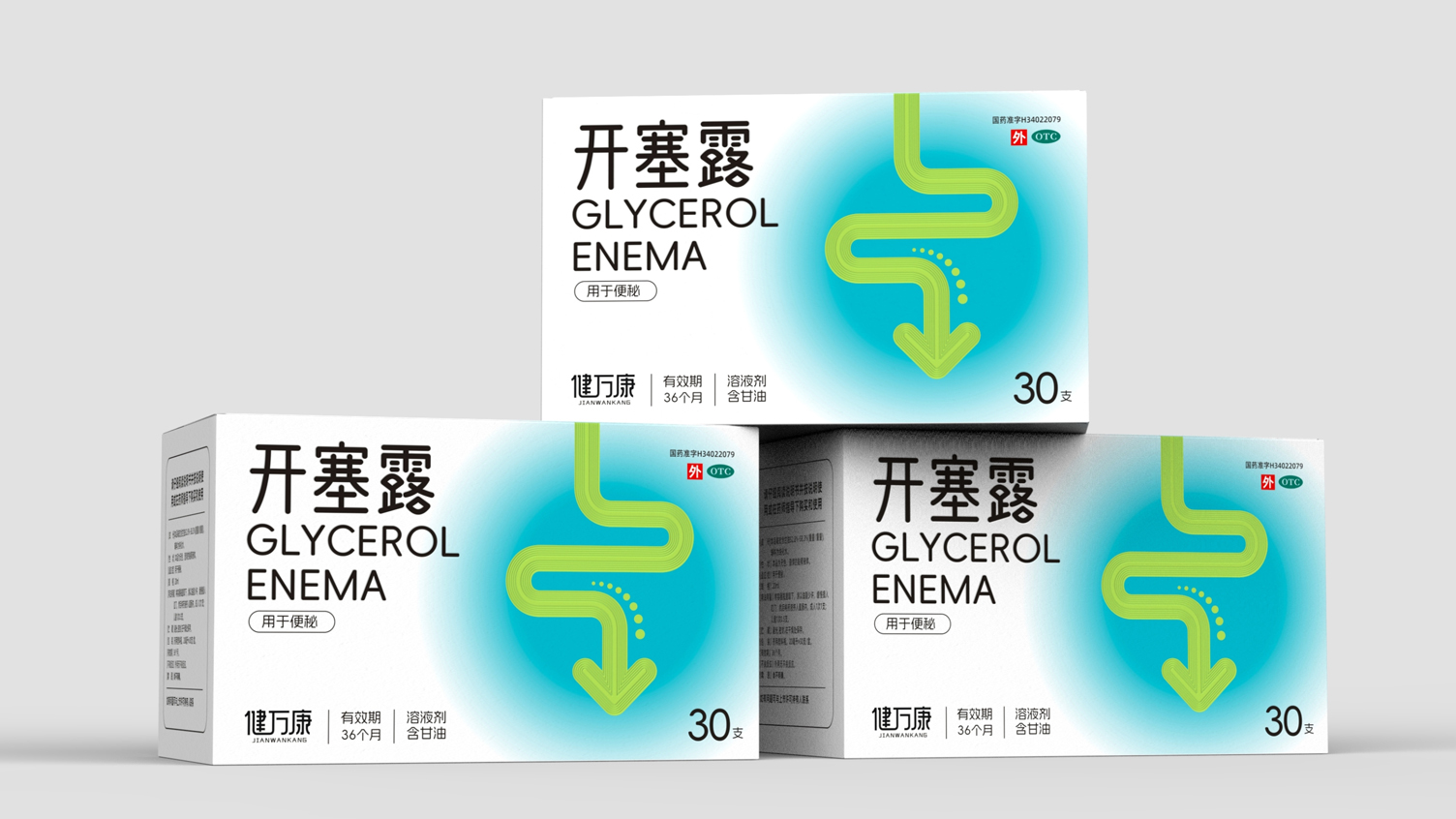
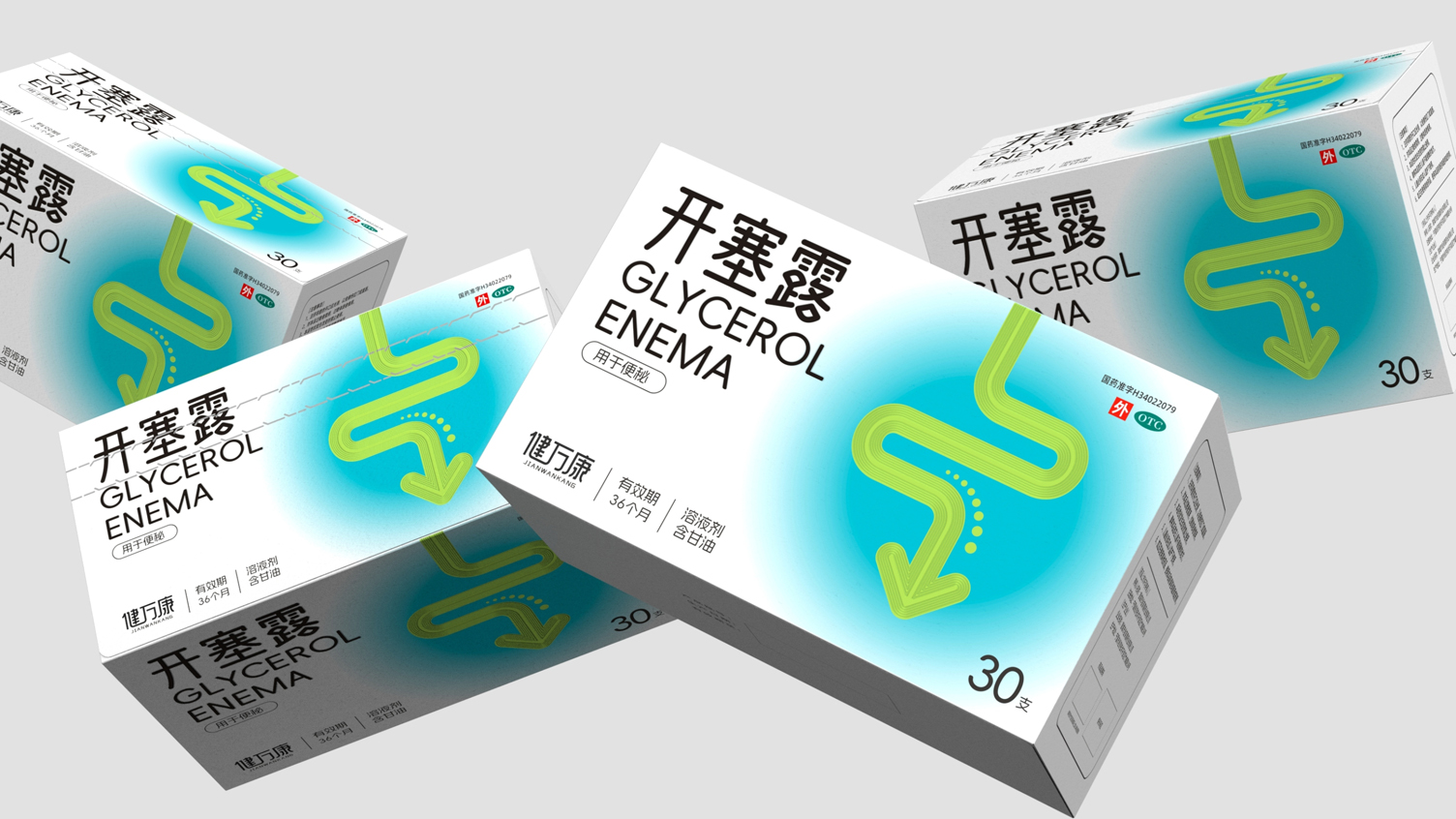
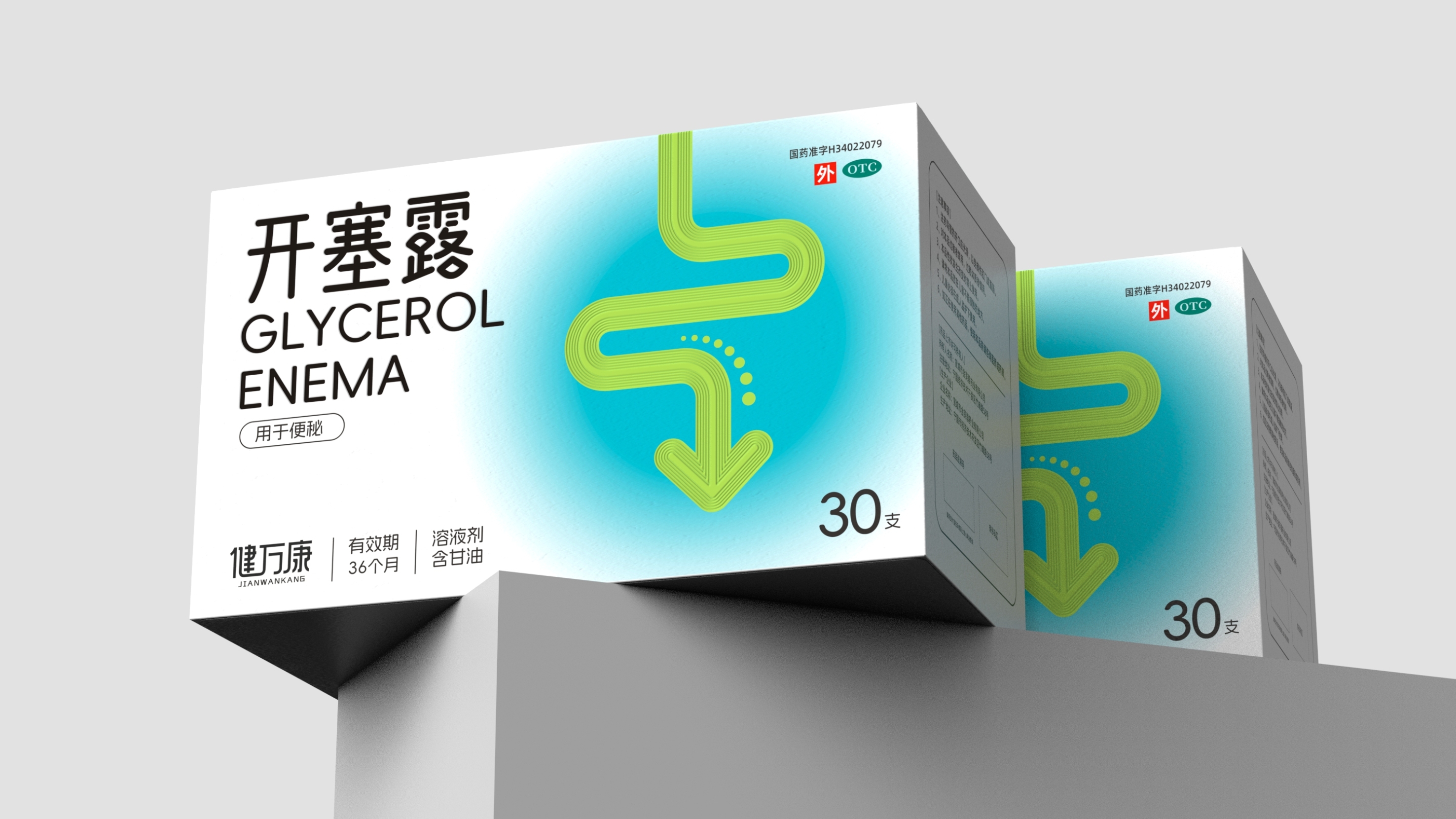
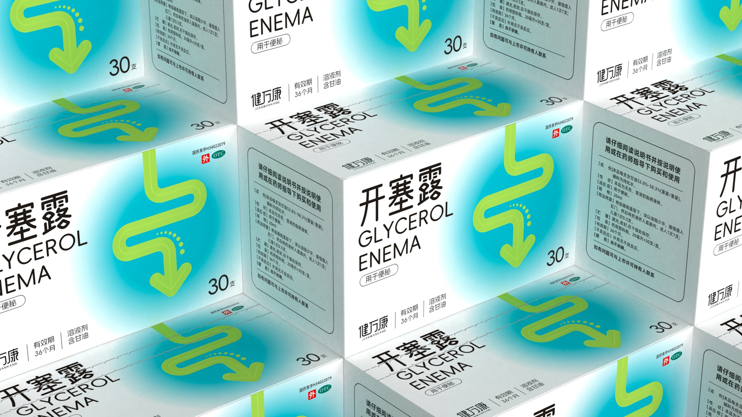
Both medical rigor and high identification of the laxative drug packaging. Zhiyuan Fang packaging design.
Health Wan Kang Kaiseru OTC Drug Packaging
Create professional medical rigor
Packaging of laxative drugs with high recognition
Deliver product efficacy in an intuitive, easy-to-understand visual language
Breaking the Stereotype of Traditional Kaiseru Packaging
At the same time strictly follow the OTC drug packaging specification
Strengthen the professional medical image of "Jian Wan Kang" brand
Adapt to the needs of families, pharmacies and other scenarios.
Gut outlined in green lines
Schematic diagram as the core visual symbol
With arrows and dots intuitive transfer products
The core efficacy of "laxation and promotion of intestinal peristalsis"
Let users understand the purpose of the product at a glance
Breaking the obscurity of traditional medicine packaging
The cyan-blue gradient background conveys a refreshing, soothing feeling
Ease user resistance to the product
Paper selection silver cardboard
Intestinal graphics, brand identity
Drug name can use local UV glazing
Enhance the sense of gloss and three-dimensional sense
Improve visual focus and shelf recognition
The copyright of this work belongs to 深圳智圆行方包装设计. No use is allowed without explicit permission from owner.
New user?Create an account
Log In Reset your password.
Account existed?Log In
Read and agree to the User Agreement Terms of Use.
Please enter your email to reset your password
100 points
Packaging is very special
full of personality