This is my freshman major course assignment. I hope someone can have a look and give me some advice and guidance.
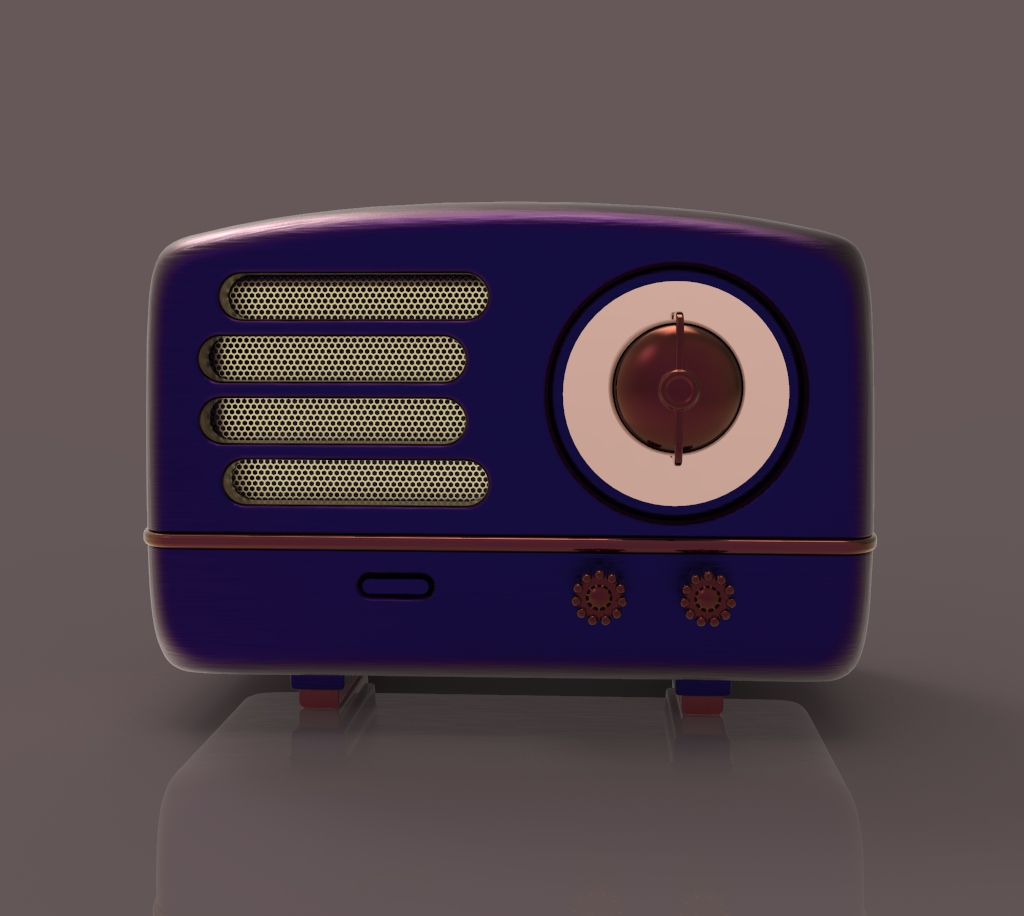
Elvis radio
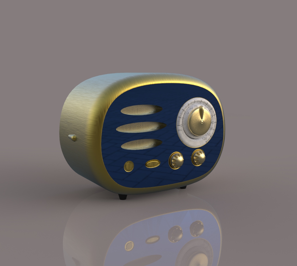
Radio 2

New user?Create an account
Log In Reset your password.
Account existed?Log In
Read and agree to the User Agreement Terms of Use.
Please enter your email to reset your password


OK, vegetable chicken to say two sentences. One is the rendering problem. The second map is not well used. The diamond-shaped pattern on the front panel looks like a floor tile. It can be used simpler. It is not a big problem to directly learn from Elvis Presley in color matching. Second, the first feeling angle of view can be adjusted again, and the thickness of the two buttons is not enough. Third, the punching and knob of the second paragraph feel large in proportion and very crowded. The outline of the three
The first one forgot to stick the scale.