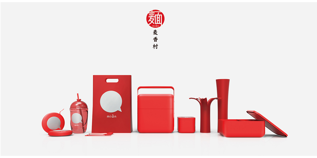
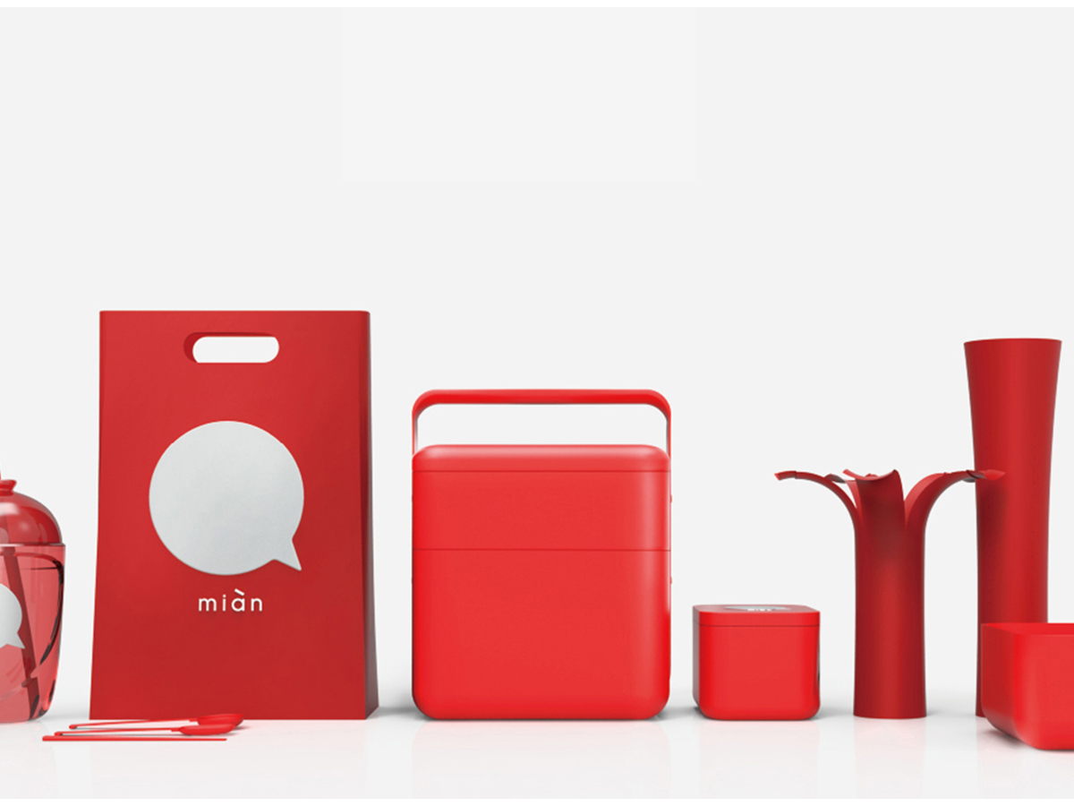
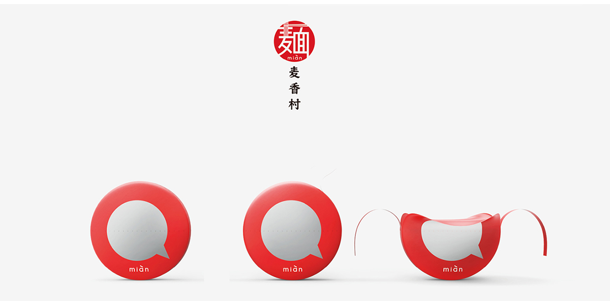
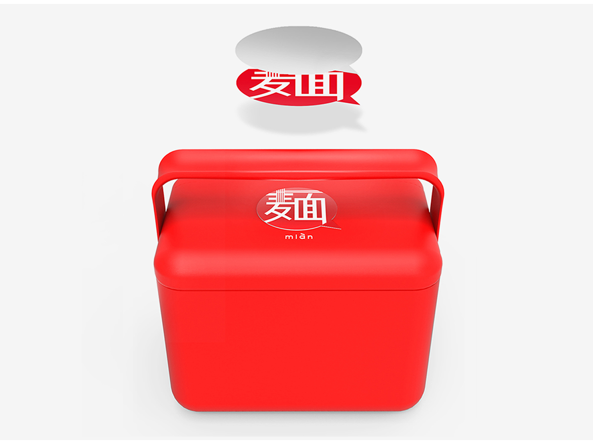
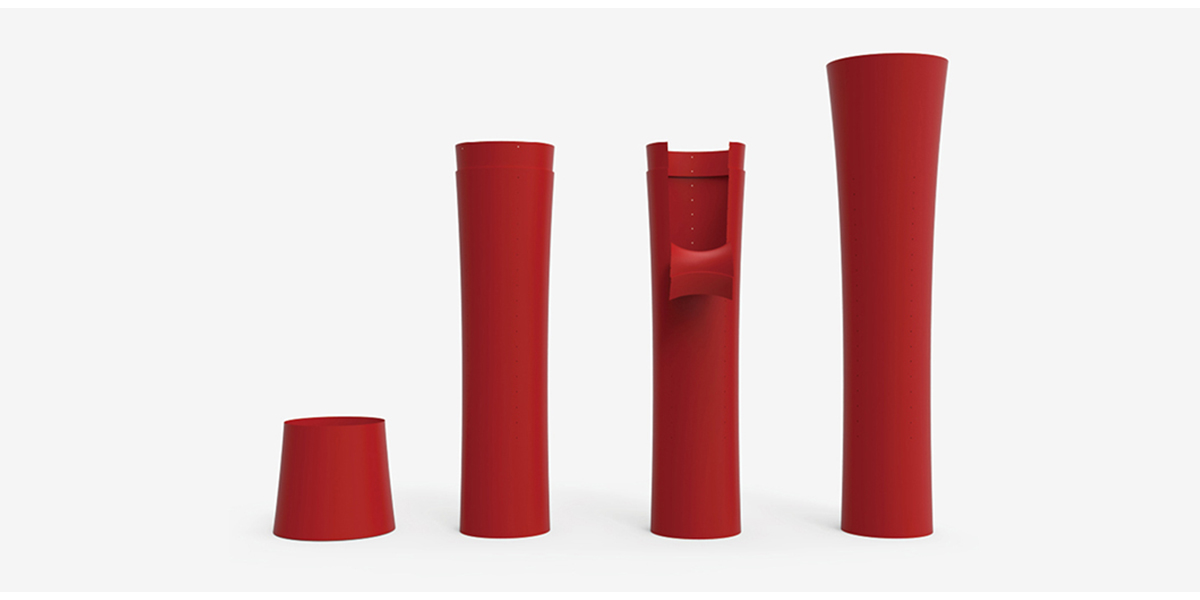
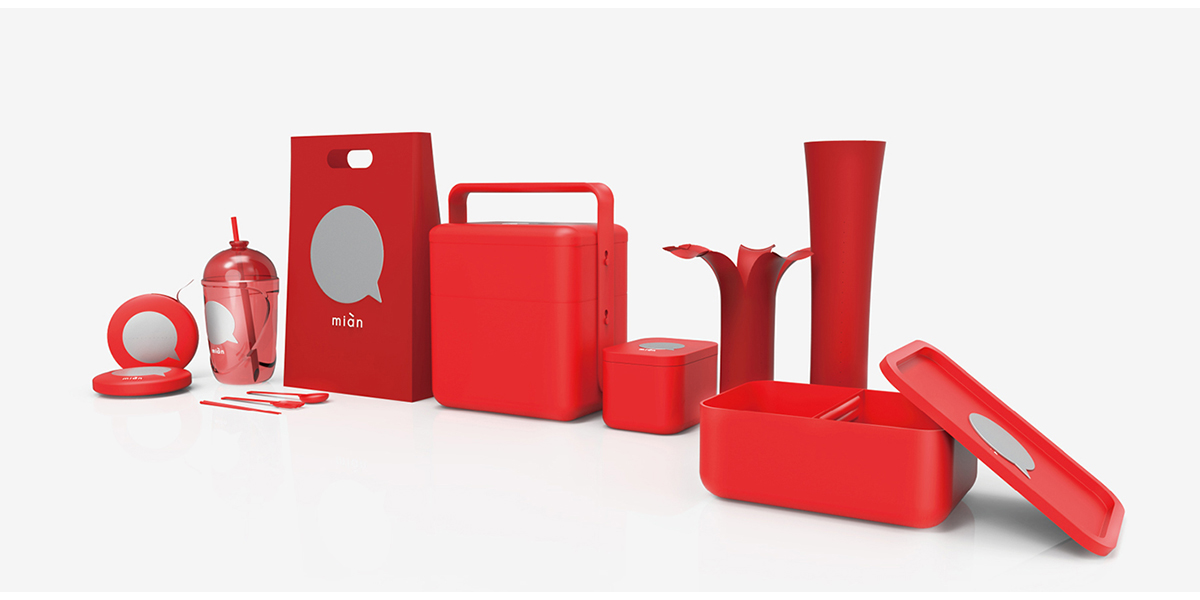
The design and appearance of Maixiang Village's take-out series are derived from modern elements of ancient food boxes. The red packaging design is consistent with the brand's main visual color. In terms of structural design, the designer adopts the design concept of separation of noodles in soup to minimize the cooking time and the waiting time of users, thus providing consumers with a convenient and comfortable eating process.
The product draws inspiration from ancient food boxes, emphasizes the feeling of de-cheapness, decontamination and de-complexity, comprehensively improves the delicacy of take-out packaging and the interactive experience of users, uses environmentally friendly materials to accelerate degradation, and protects the environment to the greatest extent. In terms of usage, our team observed the dining style in the store in real time, and optimized the design of take-out packaging as much as possible to minimize the cooking time and the waiting time of users. At the takeaway level,
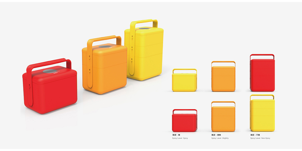
Through measuring the size of the distribution box on each platform, the optimal catering size and delivery mode are matched through modular design, so as to occupy the internal space of the distribution box as reasonably as possible, so that the food will not be indirectly polluted by other takeaways due to collision and stacking. This set of gift-grade takeaway packaging has also been highly praised and recognized by customers, and it has also created a brand-new dining delivery model.
The copyright of this work belongs to 木马设计总部. No use is allowed without explicit permission from owner.

New user?Create an account
Log In Reset your password.
Account existed?Log In
Read and agree to the User Agreement Terms of Use.

Please enter your email to reset your password
Good-looking
Red fire