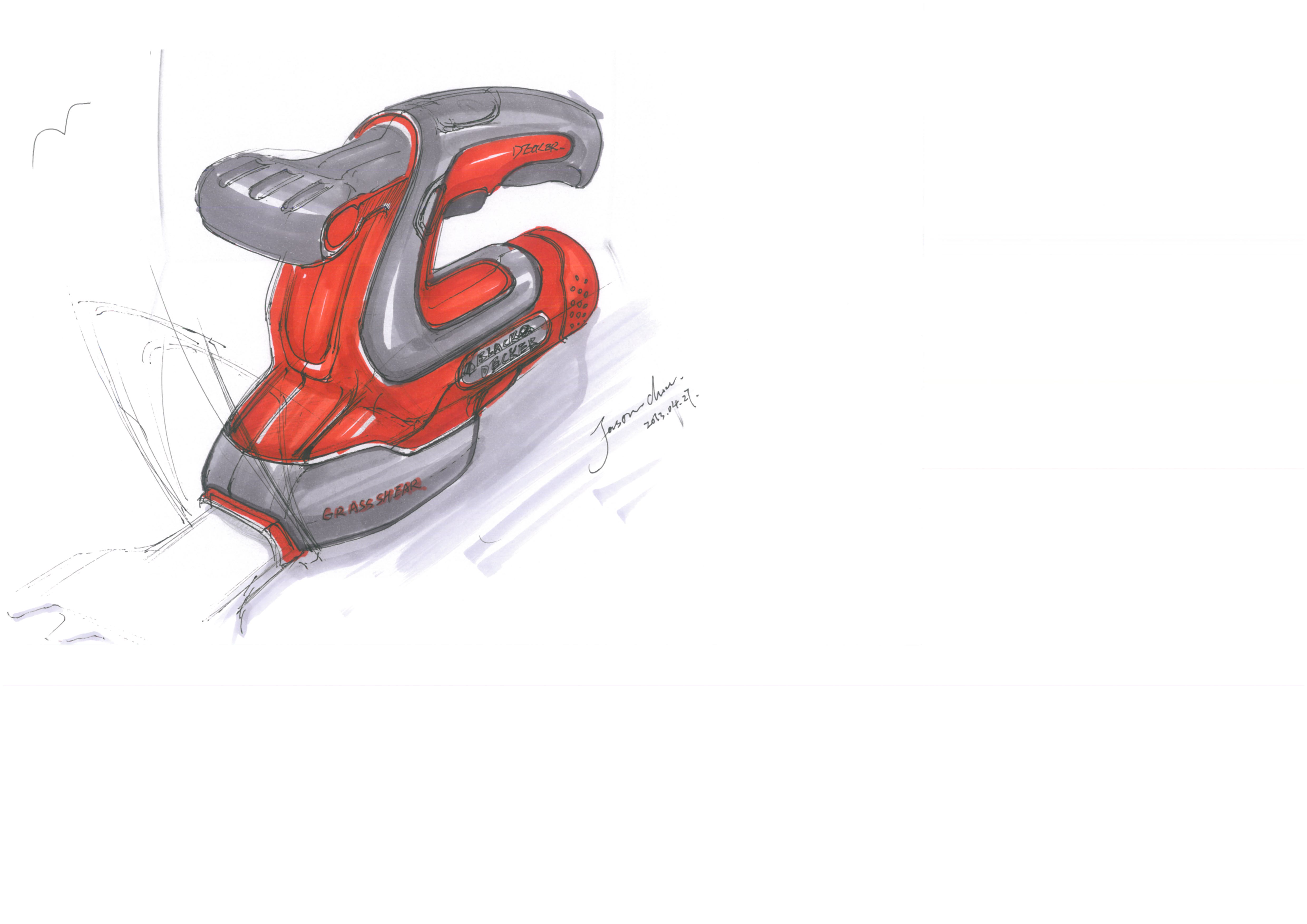
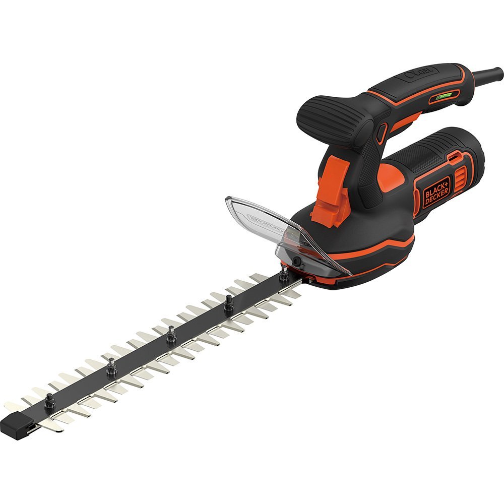
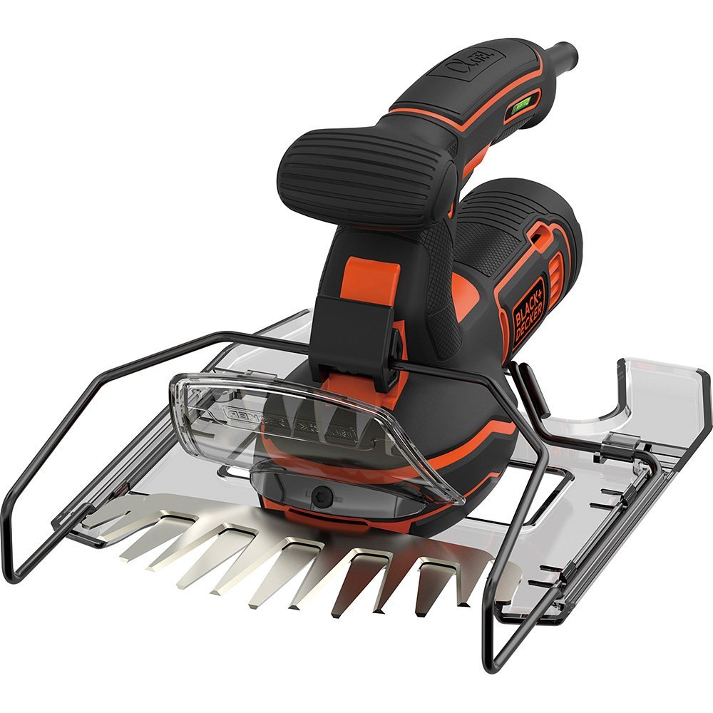
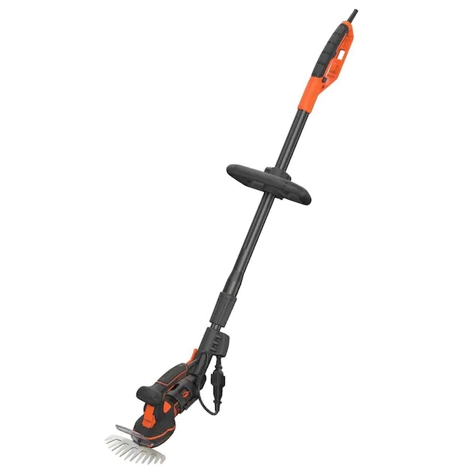
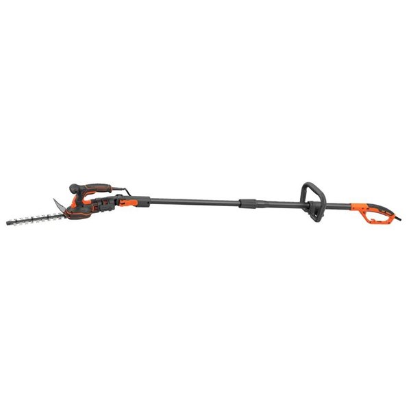
When the project first got the movement diagram provided by the structural engineer, it was found that the motor had been placed vertically (fig. 1) and the center of gravity was placed forward, so it was proposed to change from vertical to horizontal rear, which would help balance the center of gravity of the product and relieve the static fatigue of users when using it. Fortunately, the adoption of the plan also shows that improving interaction and designing to serve people are the most important. The final product is shown in Fig.
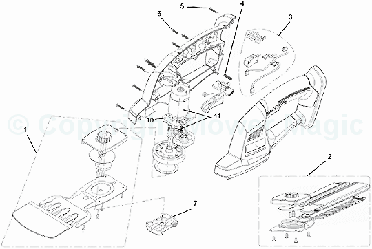
The original plan is to place the motor vertically on a similar figure.
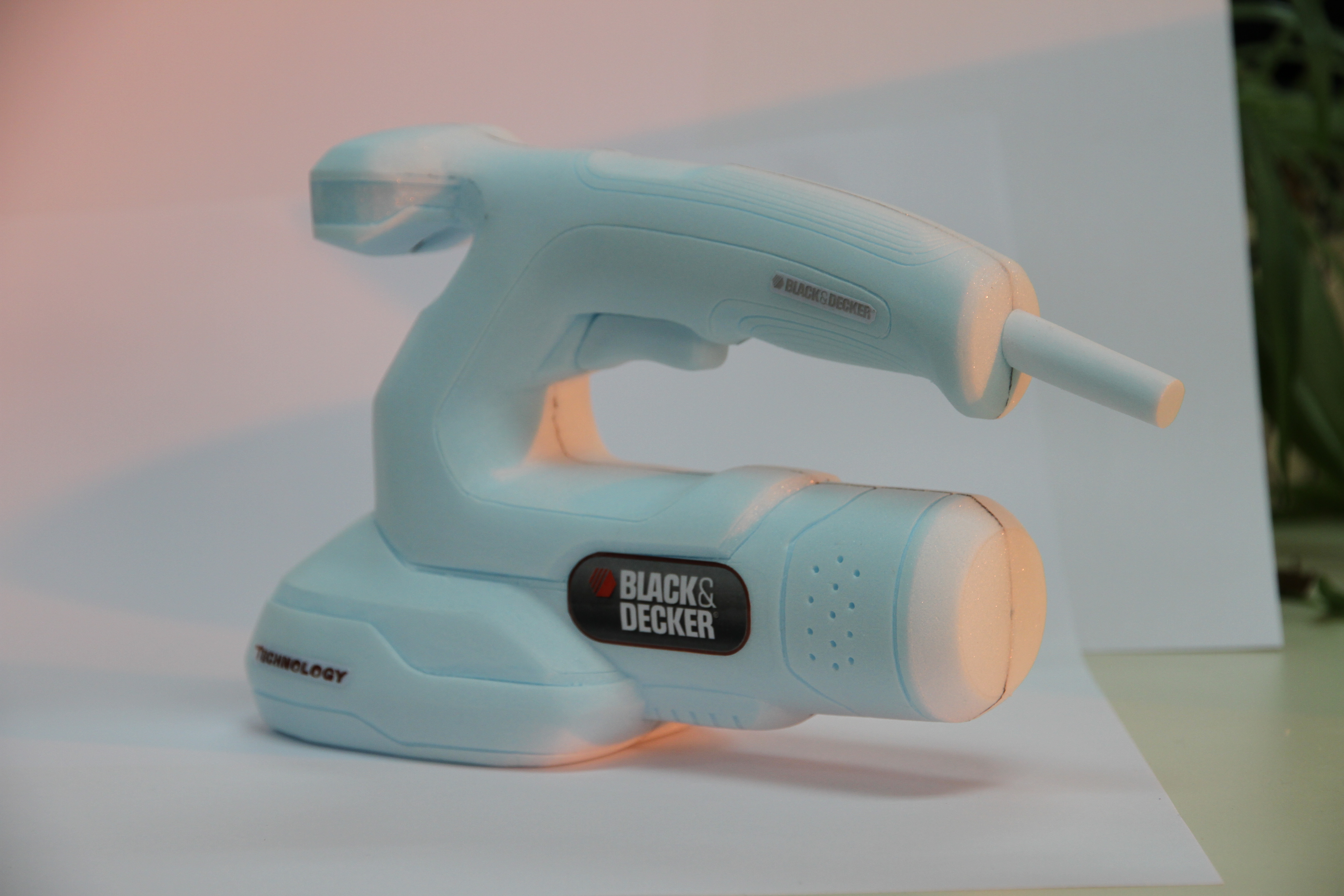
Hand-cut foam model
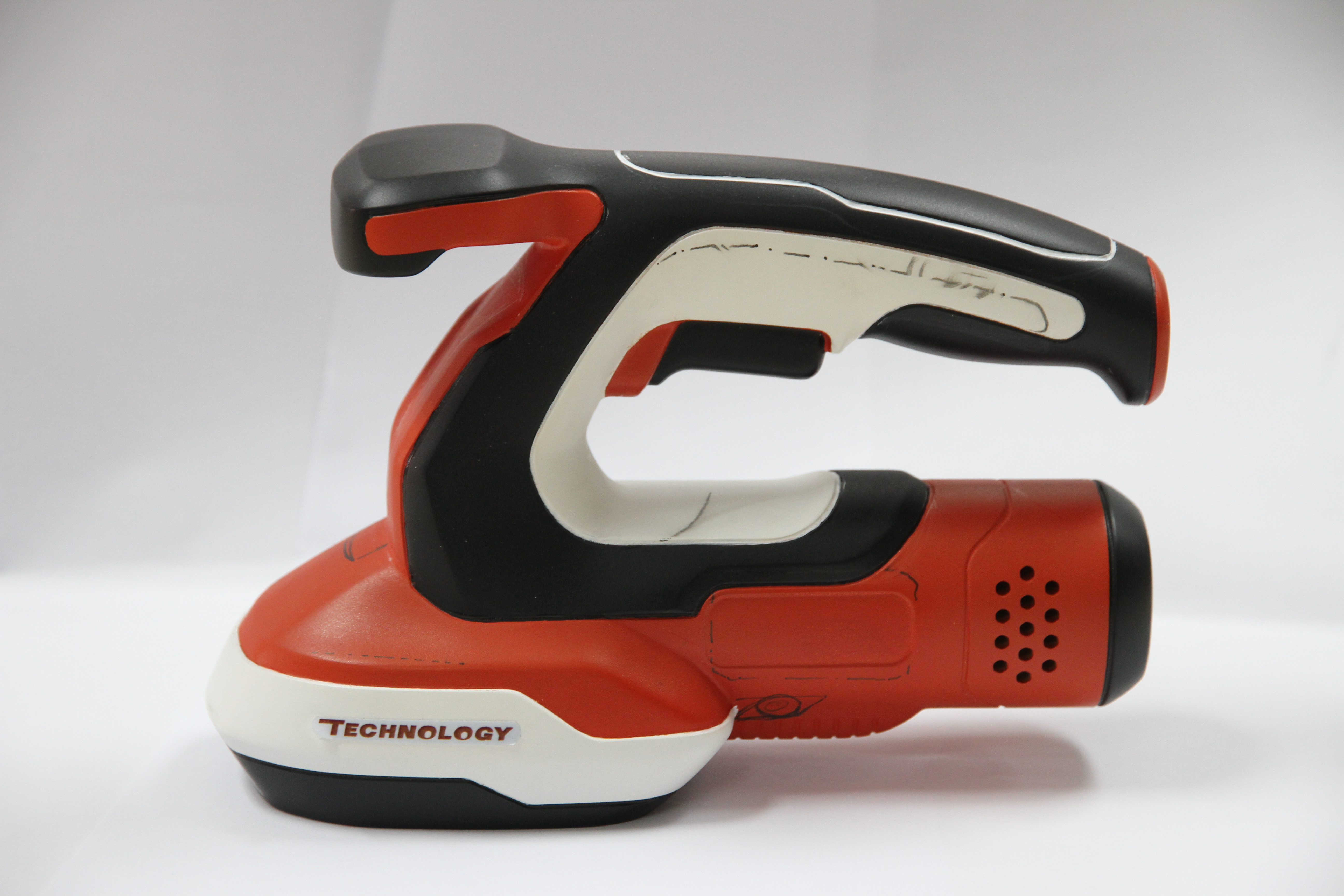
One of the color scheme models, take it out and whip the corpse.
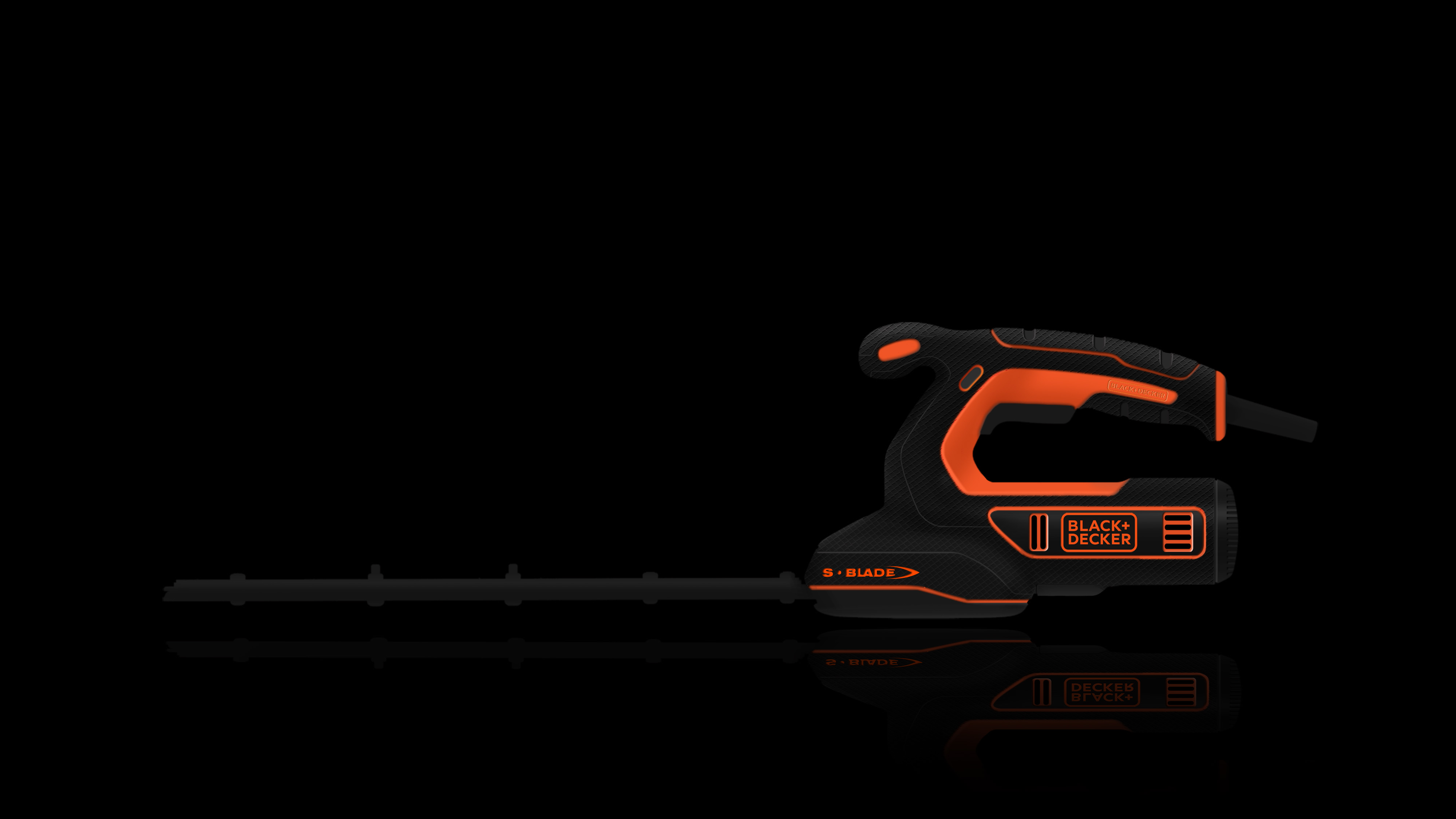
Different color schemes
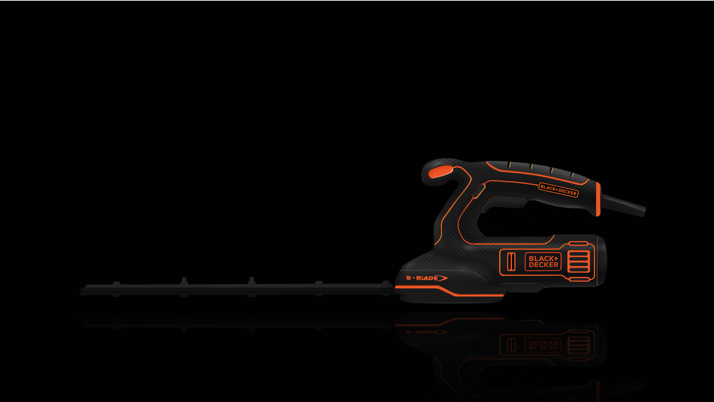
Abandoned version of color scheme
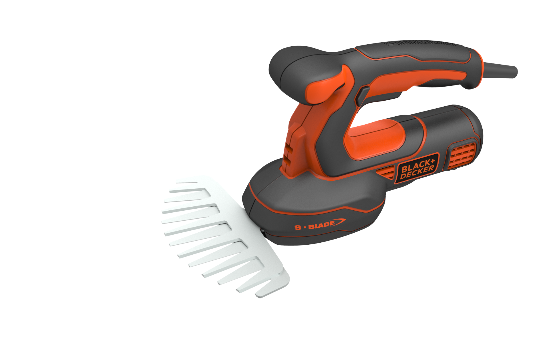
Abandonment 3

This is the final version, huh


The copyright of this work belongs to 火烈鸟工业设计. No use is allowed without explicit permission from owner.

New user?Create an account
Log In Reset your password.
Account existed?Log In
Read and agree to the User Agreement Terms of Use.

Please enter your email to reset your password
Several years ago, which one do you want to see? I'll look for another clear one.
It's a nice electric tool, but I always feel that the flow of electric tools is too small now.
This picture is cool, just a little burnt.