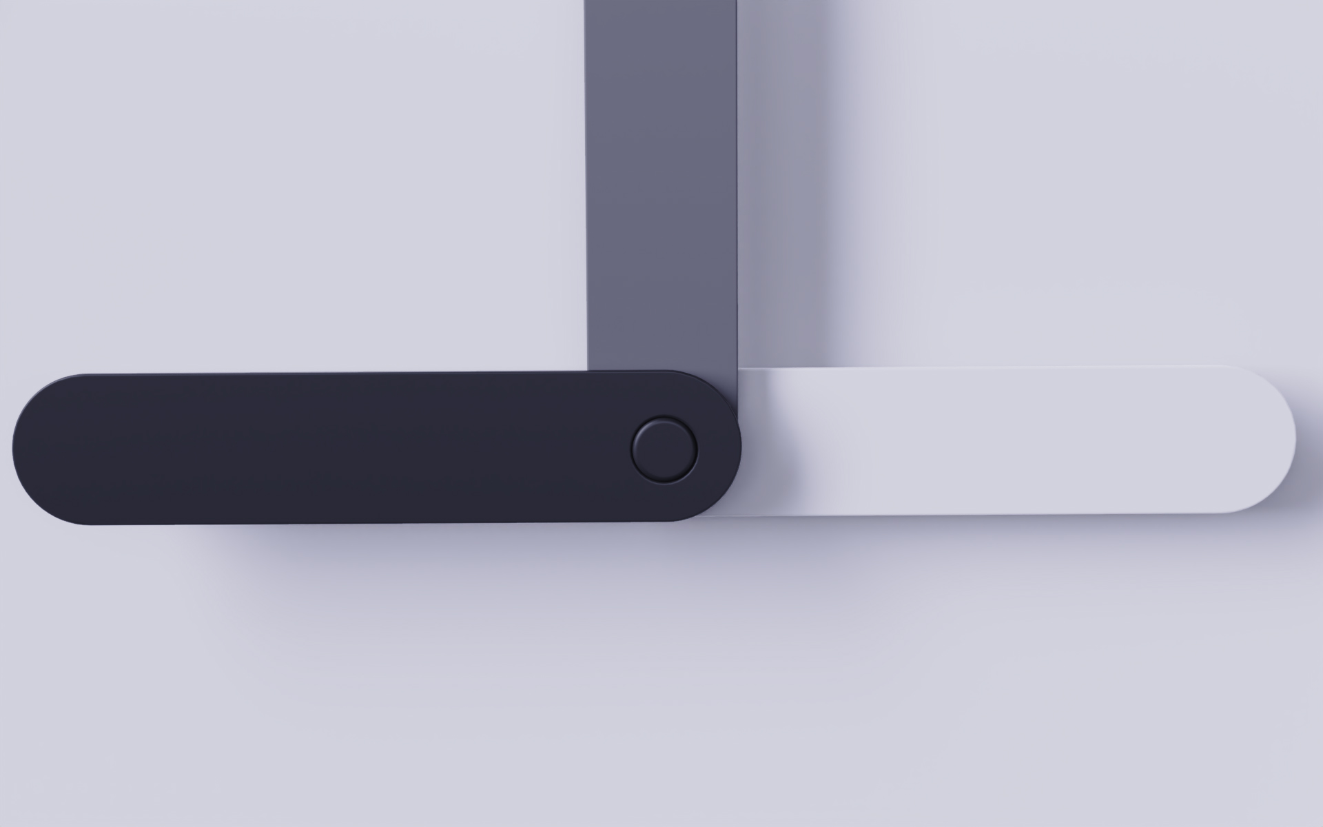
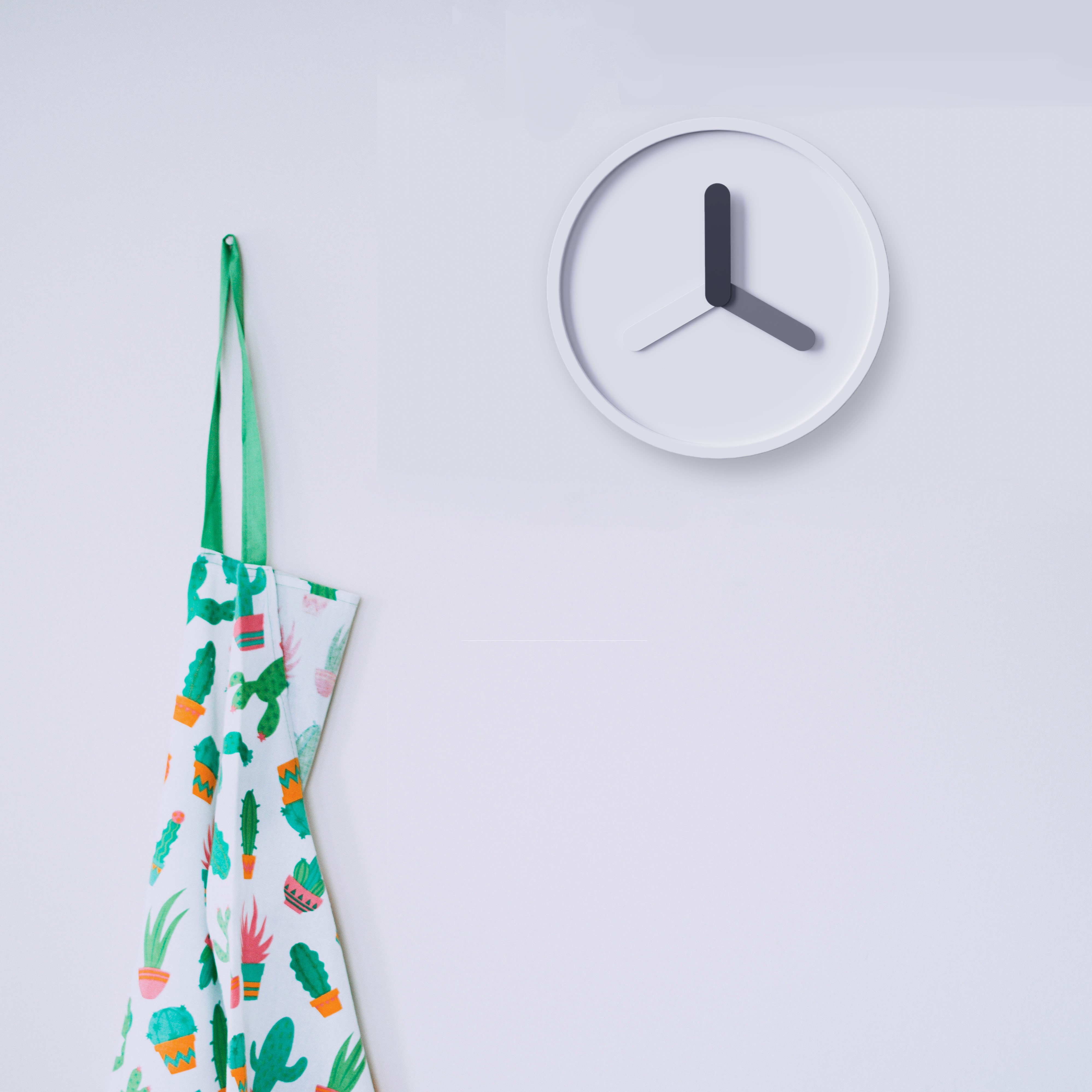
Is today's hour hand too complicated to design? Traditional clocks have three hands: hour hand-minute hand-second hand. These three pointers are independent of each other and each will have a different design, which is too complicated and ignores the connection between them. Therefore, we integrate the appearance elements of the pointer in a unified way, leaving only the color distinction: the depth of the color represents the importance of the three hour hands. The black hour hand is the most noticeable, the gray minute hand is the second, and the most interesting is the white second hand. White melts into the background, but it can still stand out from the background due to the rotation of the time. The "black and gray" clock expresses their relationship in an intuitive way.


The copyright of this work belongs to 薯条炸. No use is allowed without explicit permission from owner.

New user?Create an account
Log In Reset your password.
Account existed?Log In
Read and agree to the User Agreement Terms of Use.

Please enter your email to reset your password
Did you design this?
This function is not strong, it is an interesting decoration.
Is this an award-winning
OK
For users, it needs corresponding colors to clearly know whether the time is inconvenient or not.
Is it better to distinguish the size of hour hand, minute hand and second hand?
Micro signal: zhous5226
(If you have ideas, you can communicate together ~)
It would be perfect if there was a video display.
The minimalism is beautiful
I like simple style.
Your works have been collected among my good ideas and good things.