Second, I am looking for an internship. I still hope the bosses can give me some advice on the shortcomings.
2025-03-13
Home Appliance
6423
15
48
Follow
Message

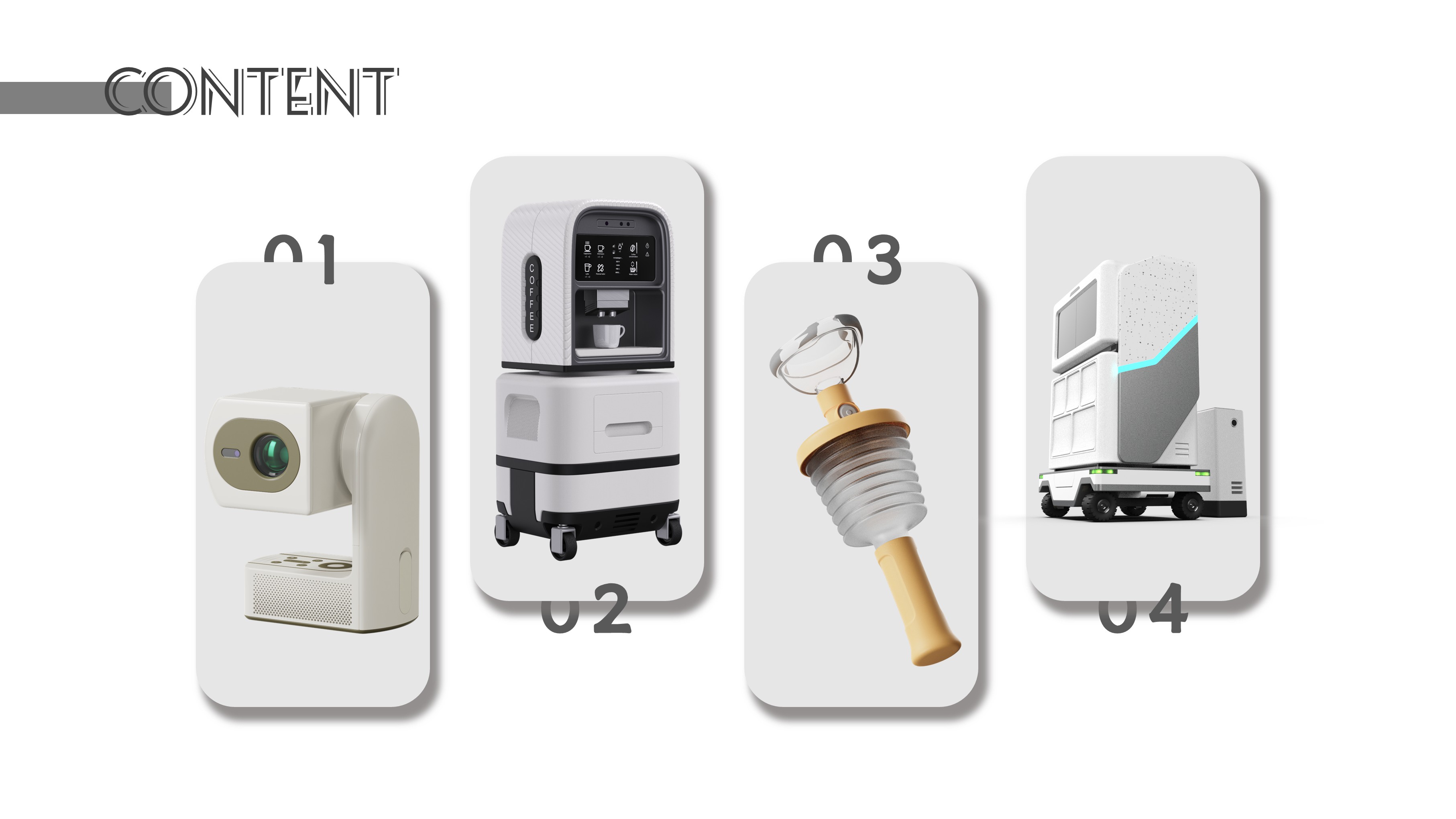
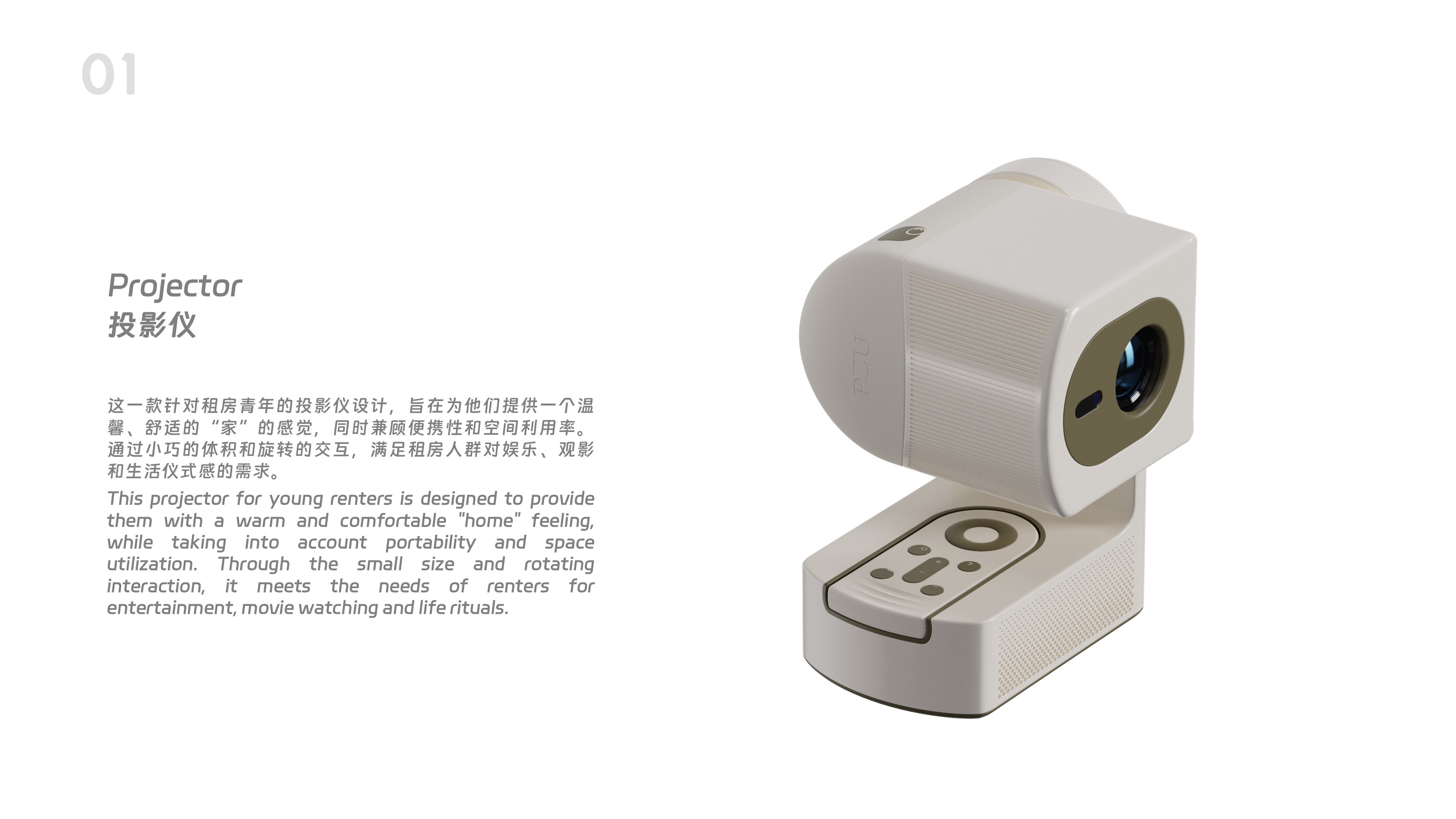


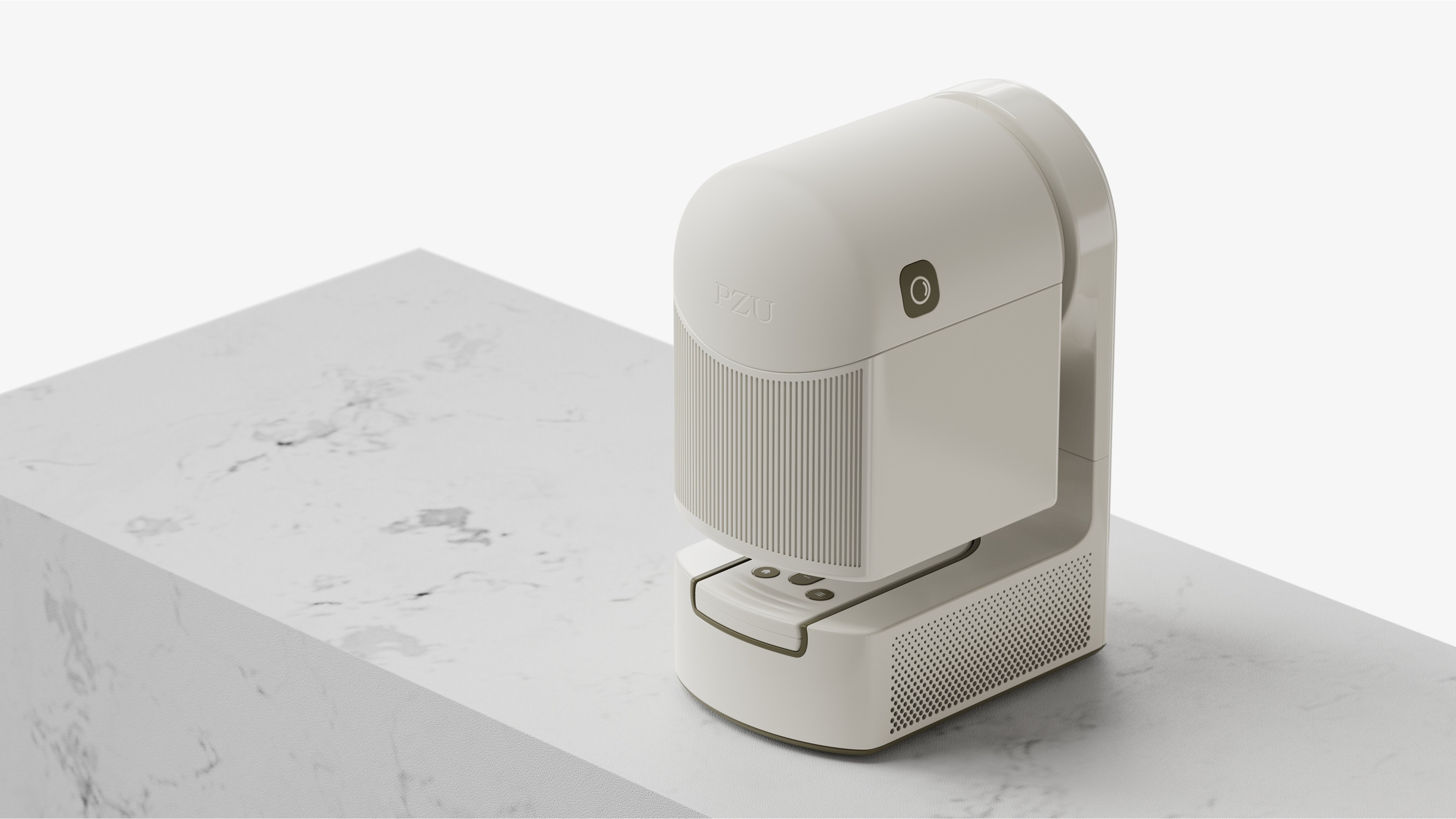
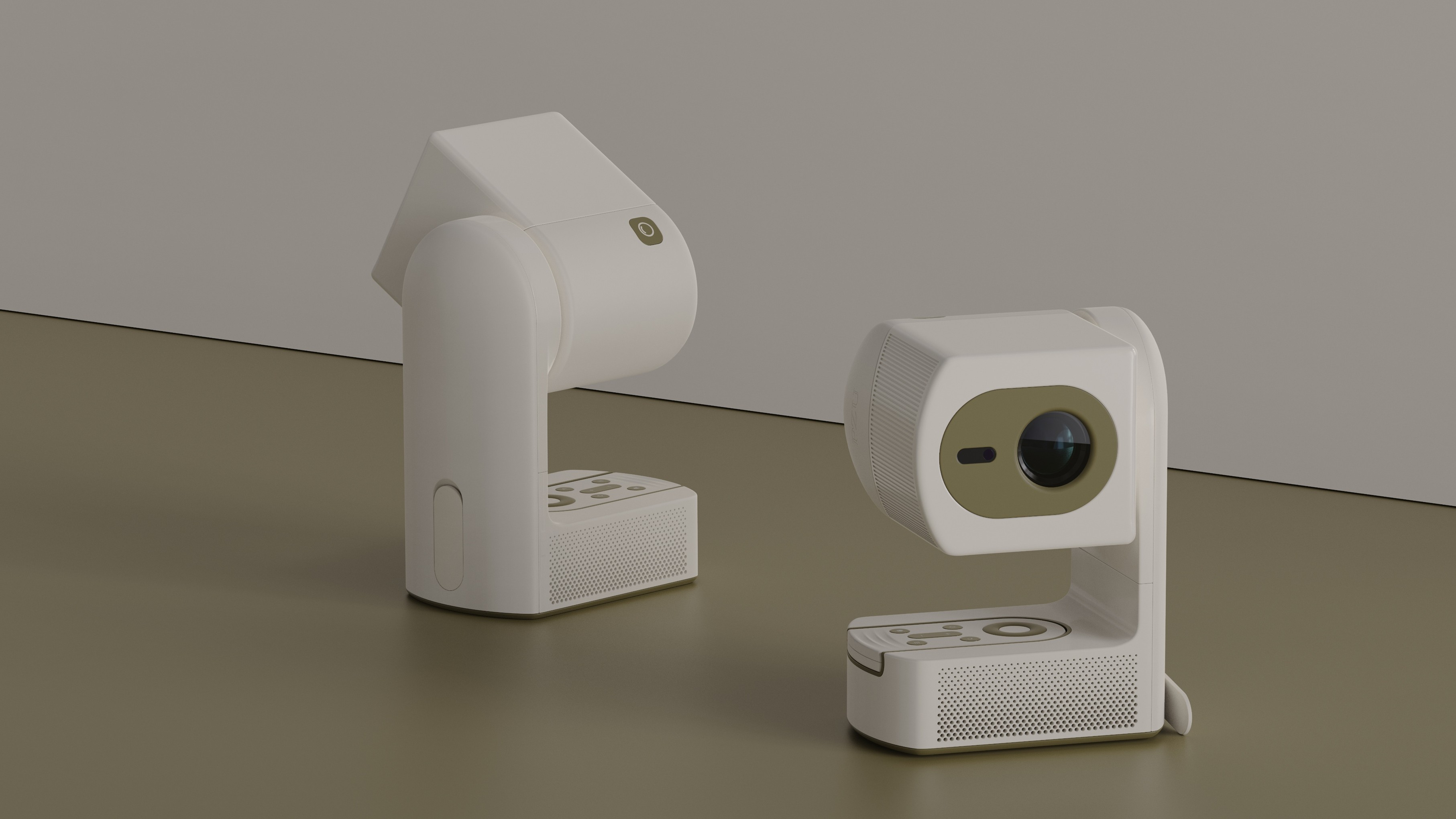


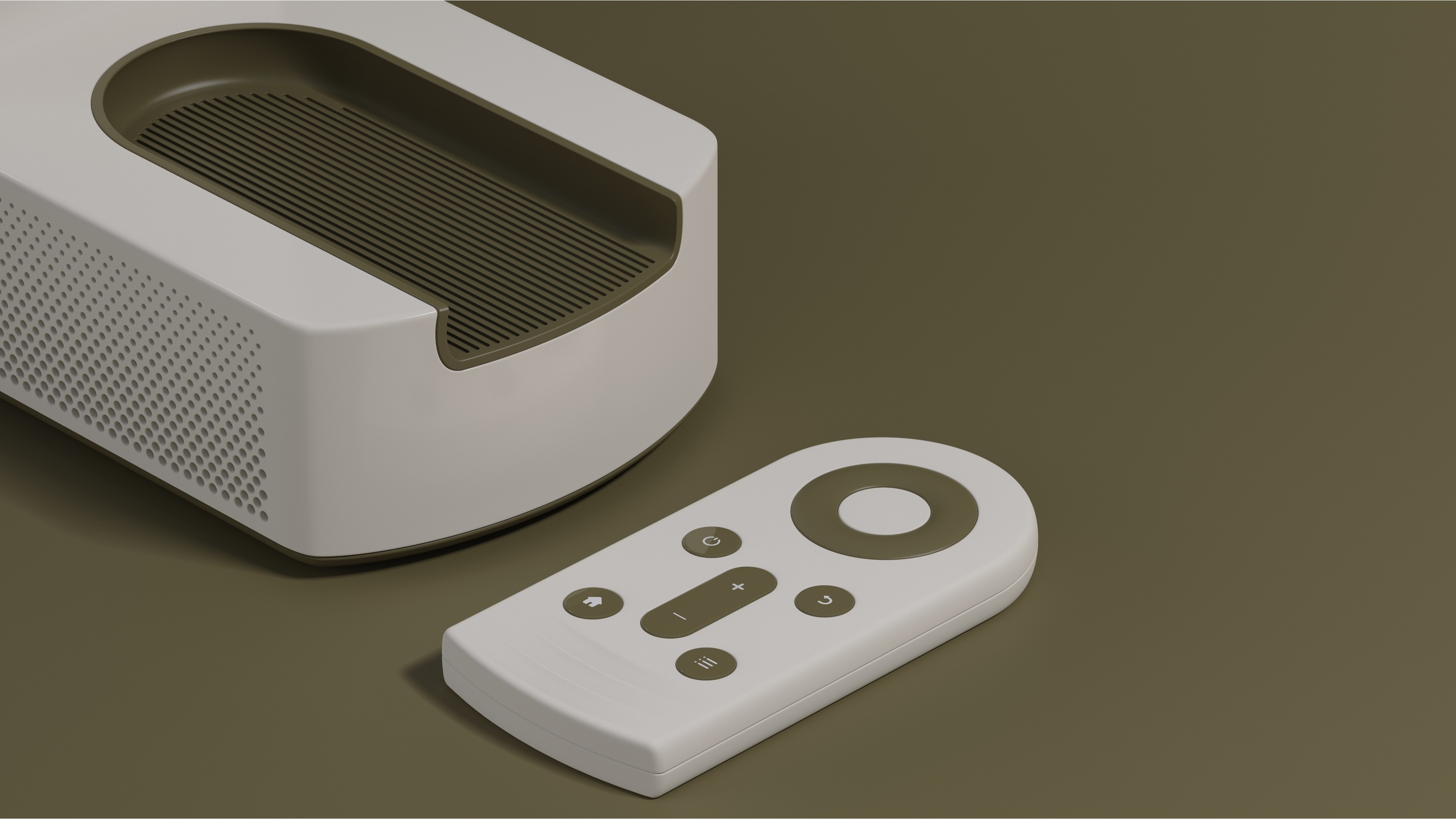

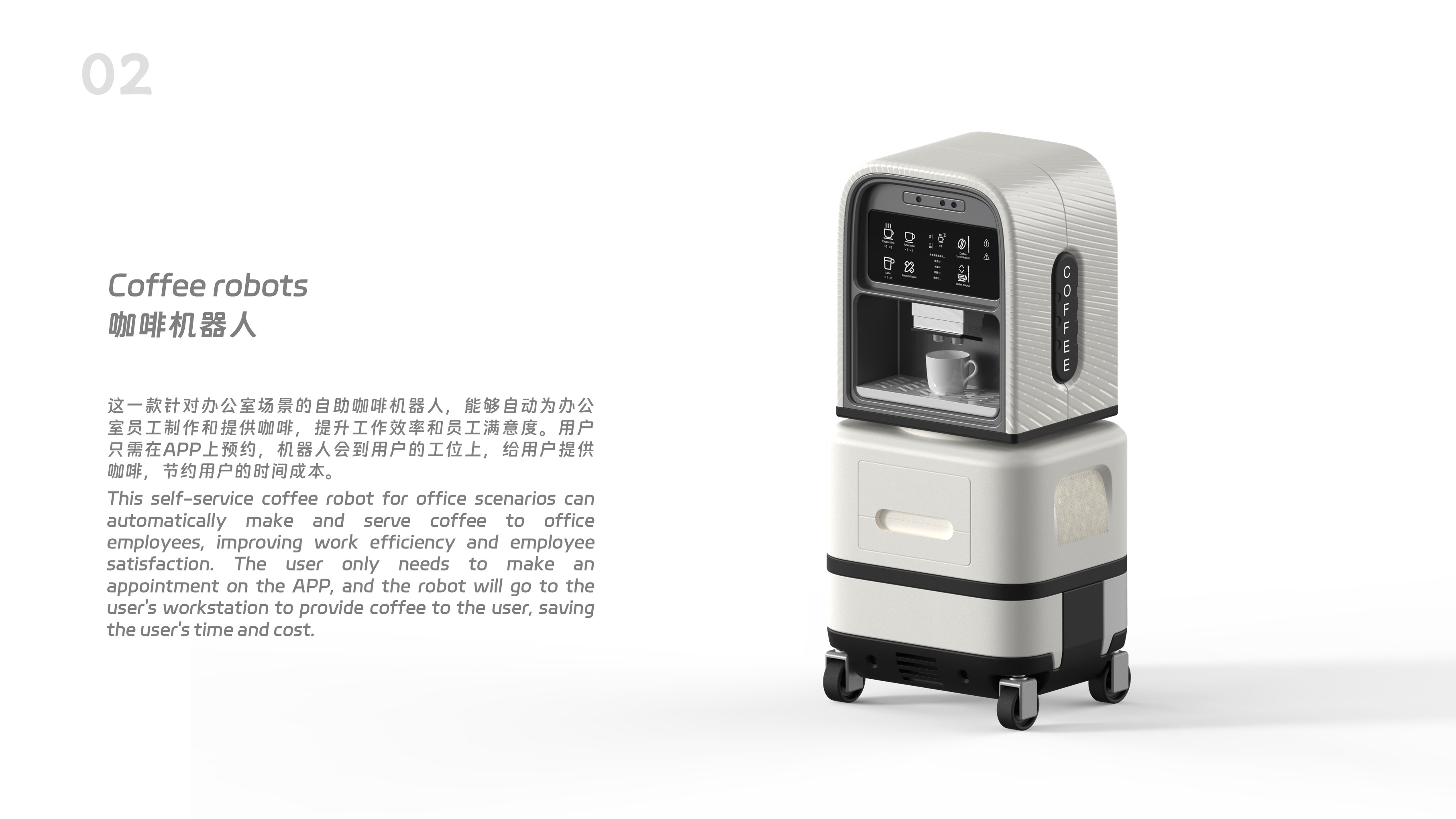

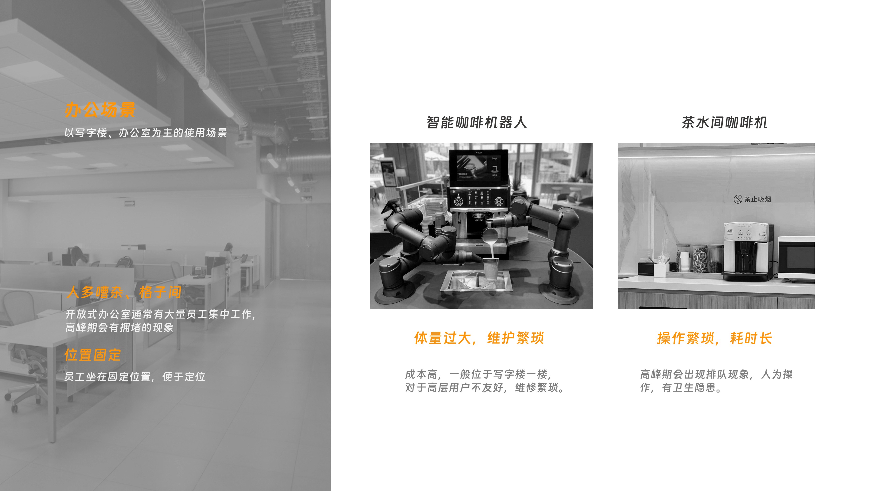
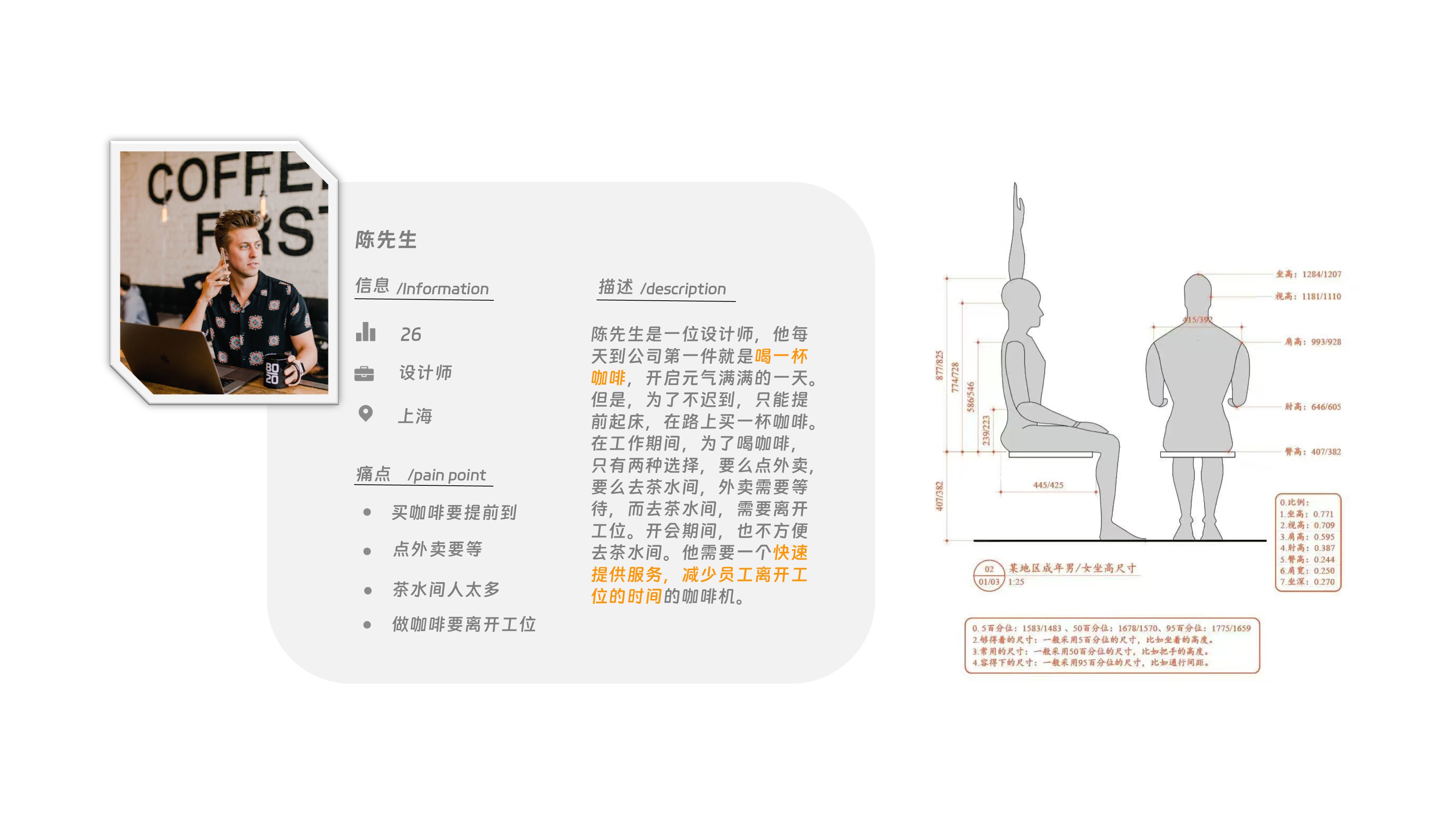
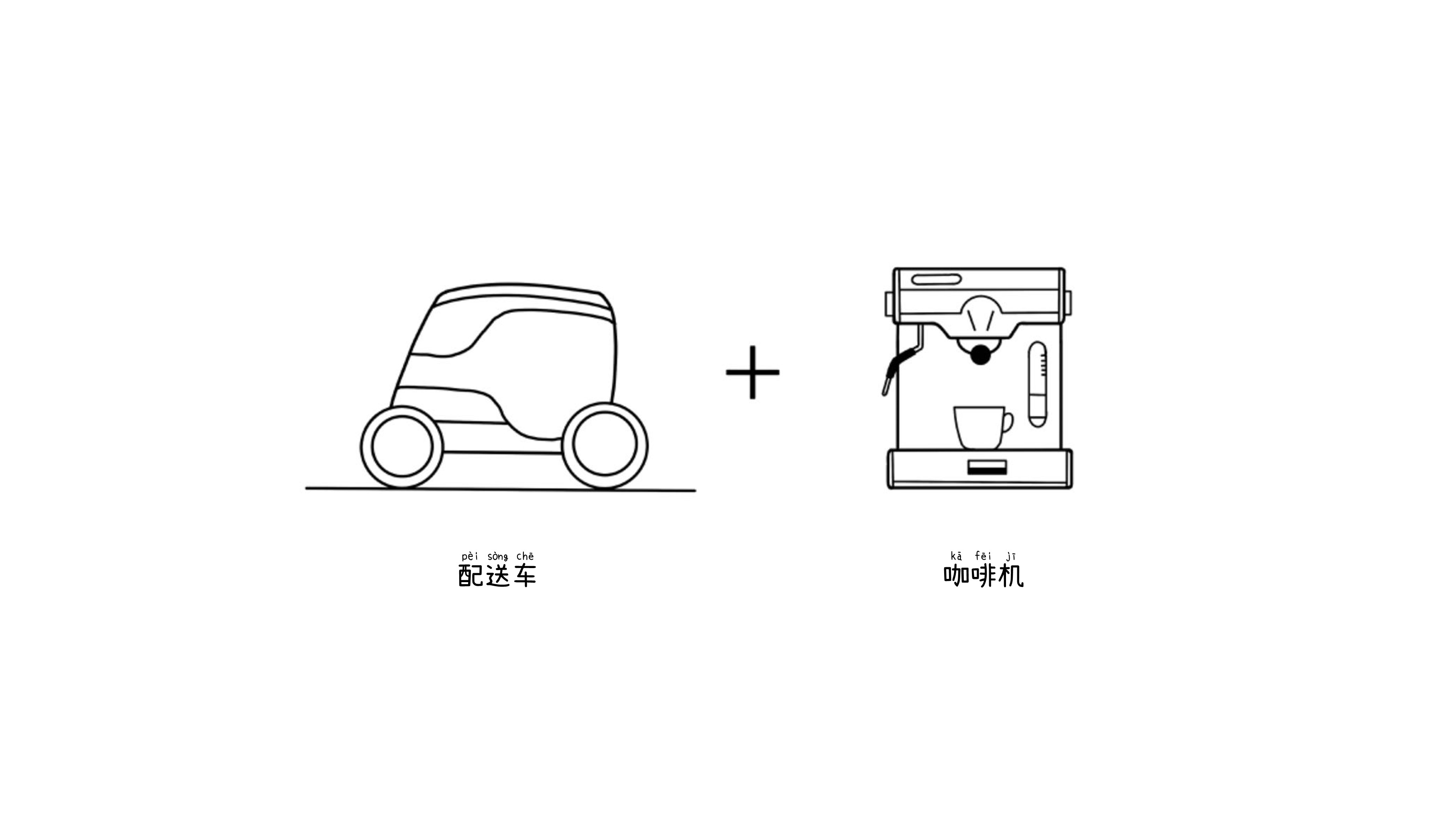

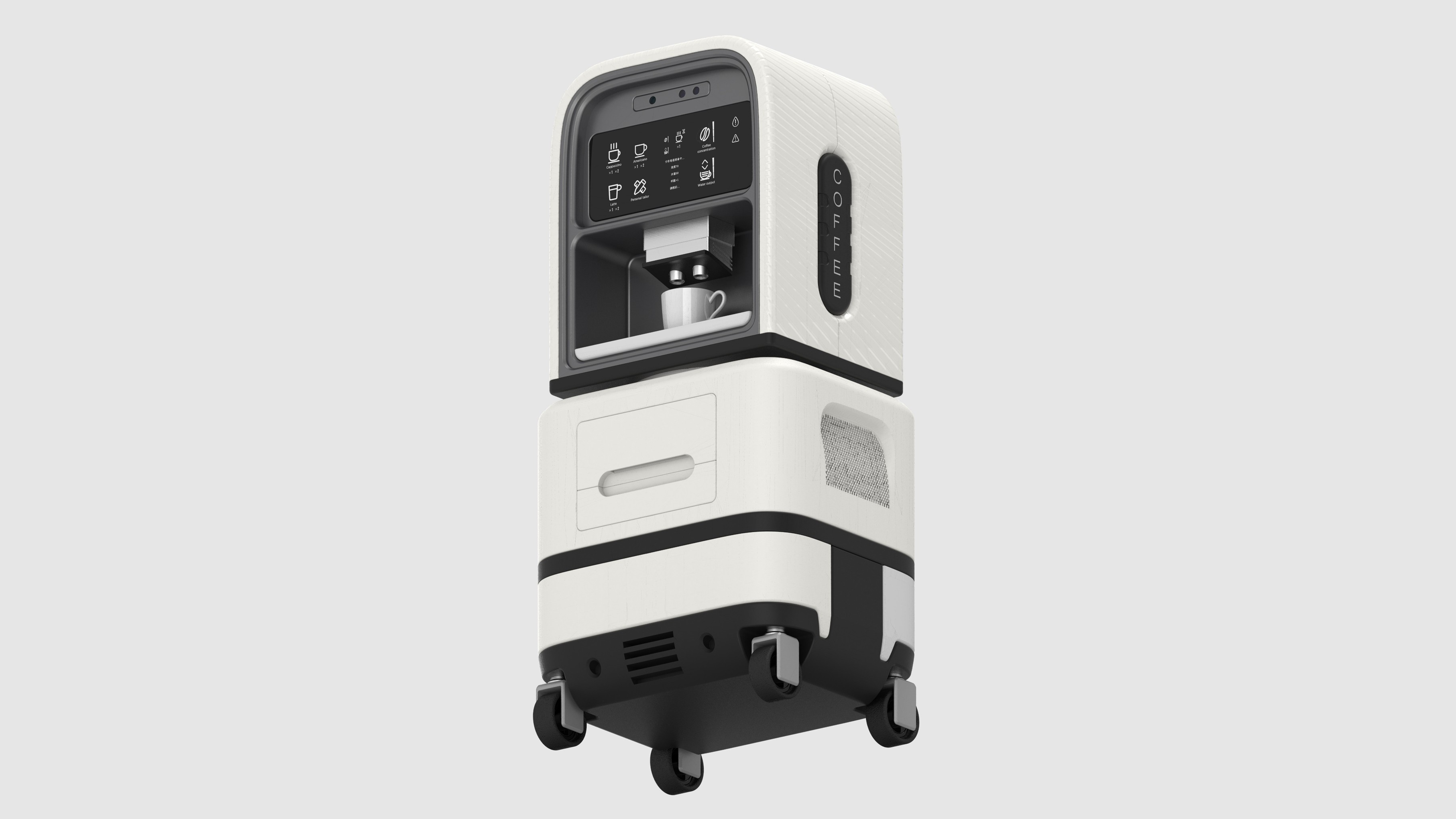
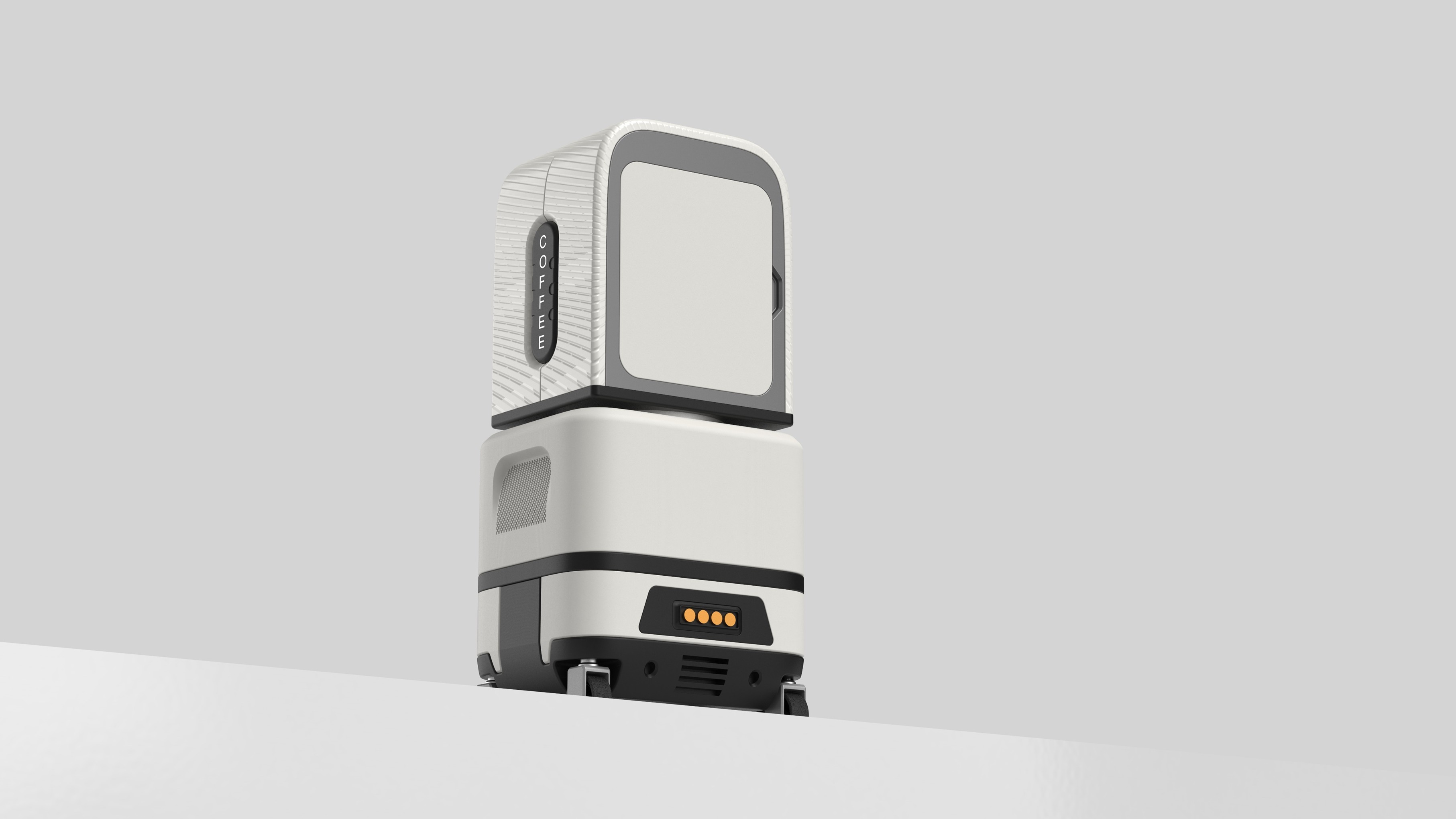

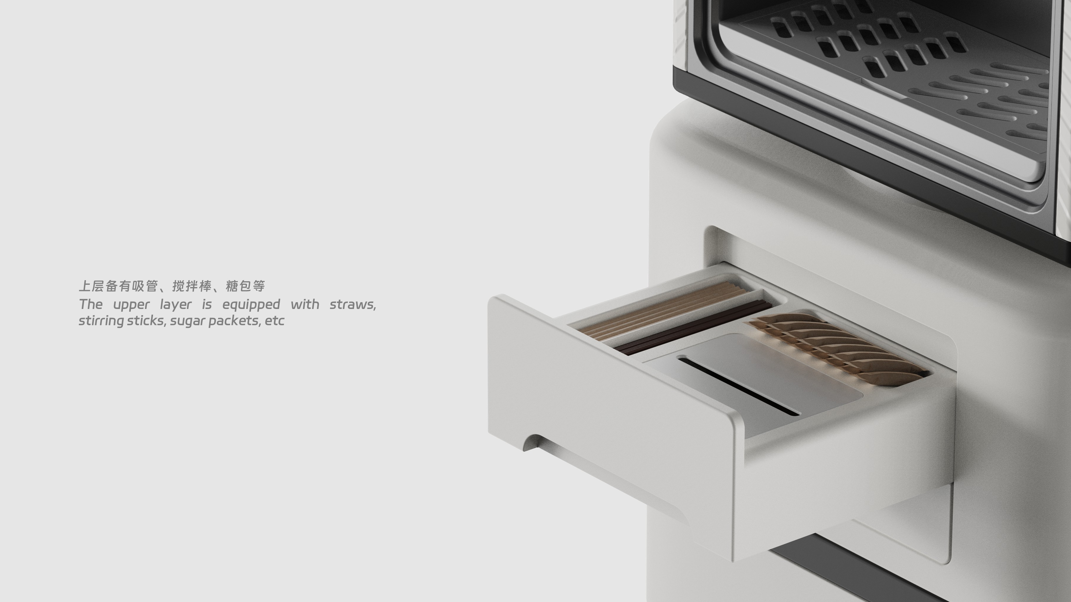

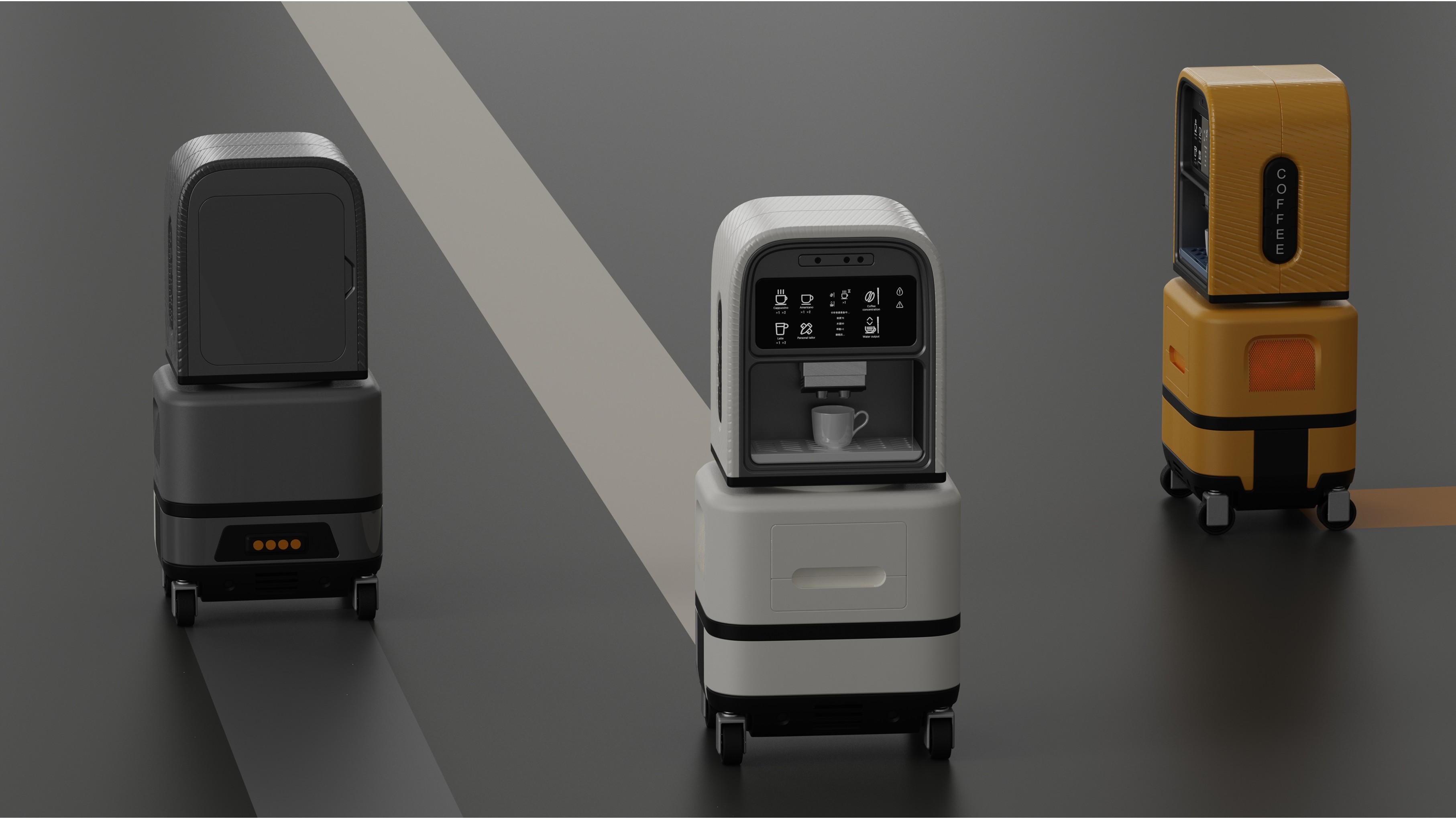

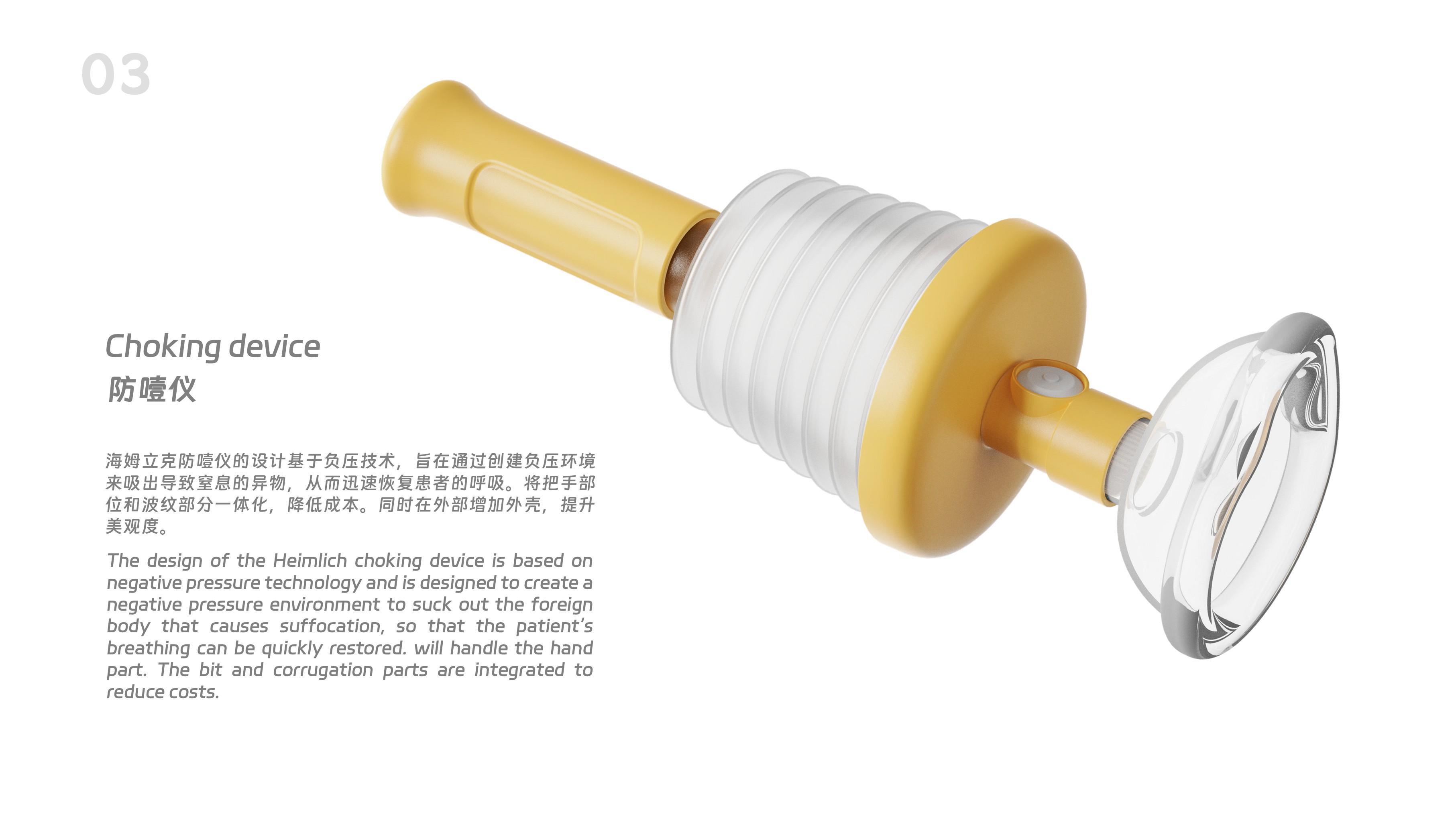

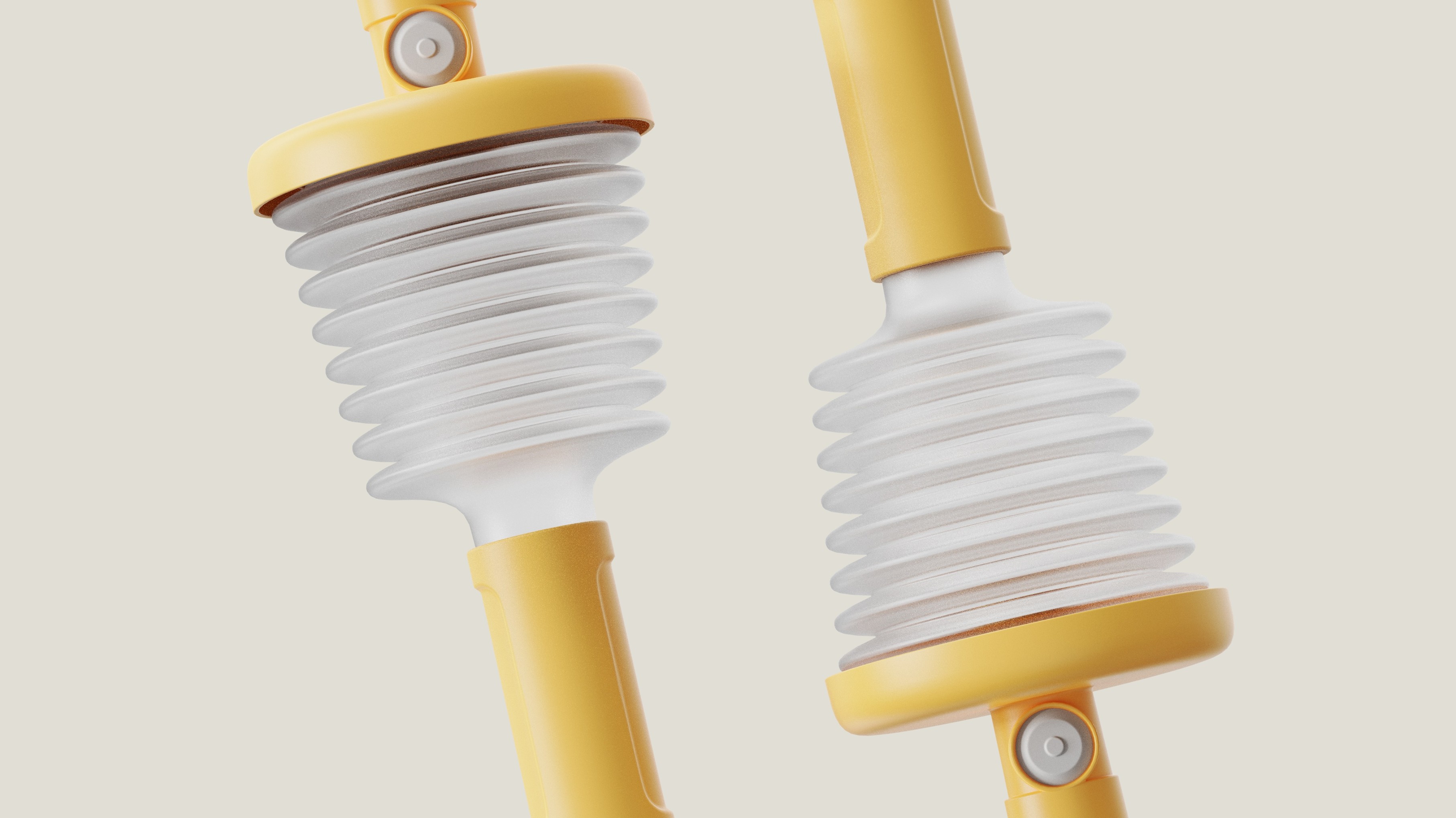


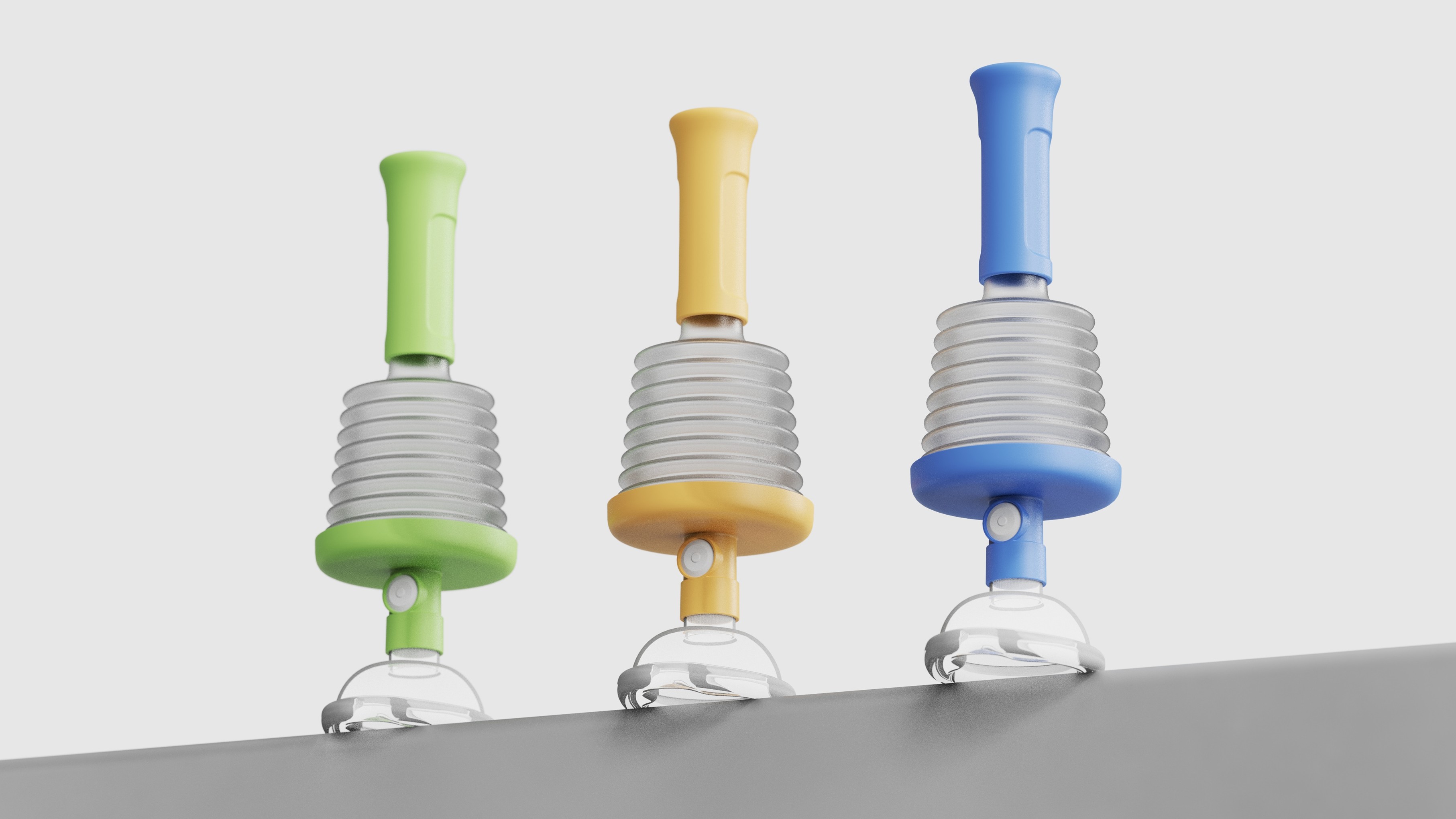
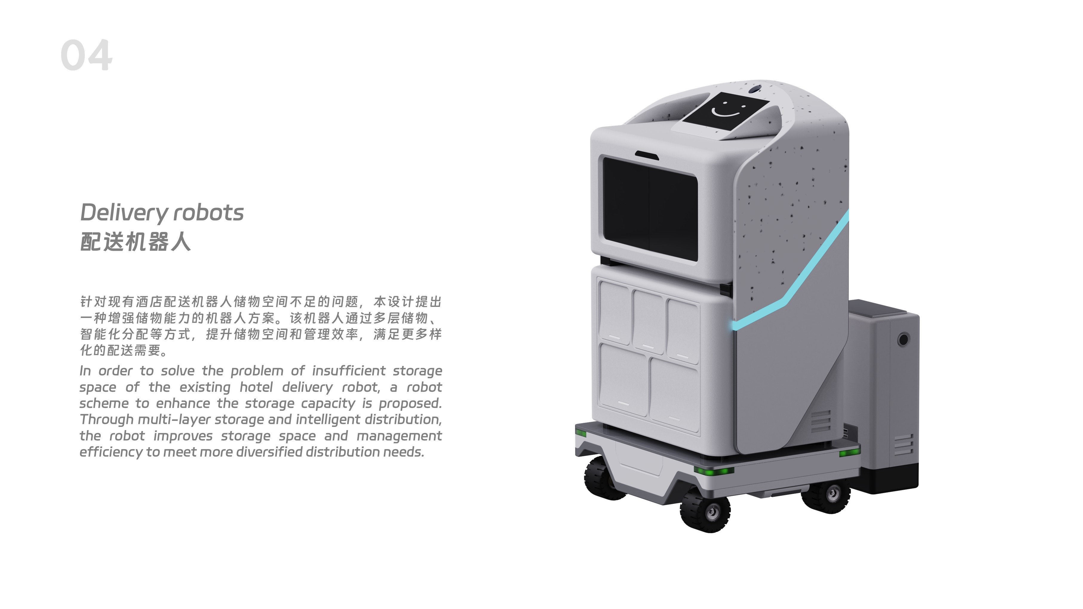
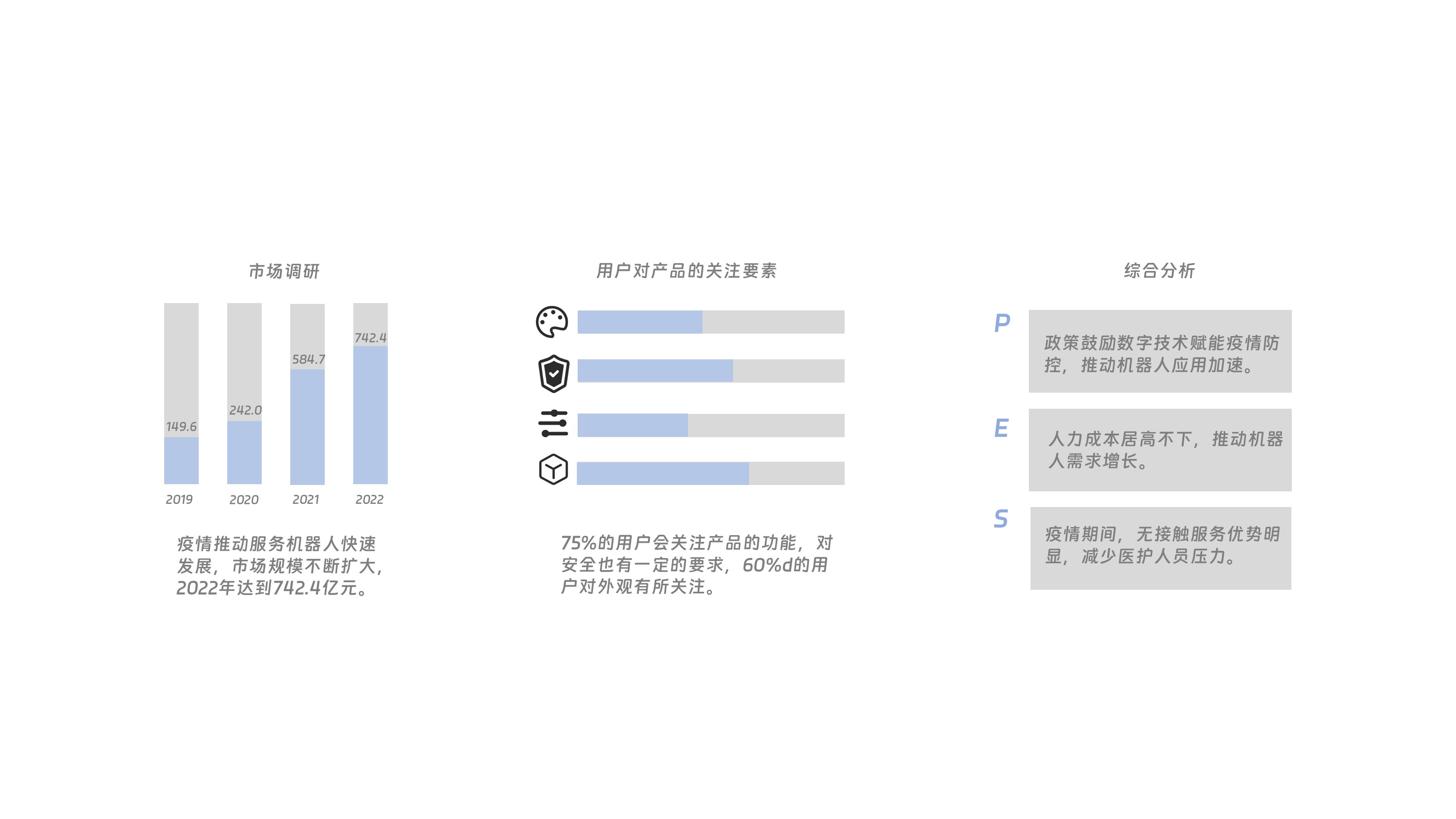
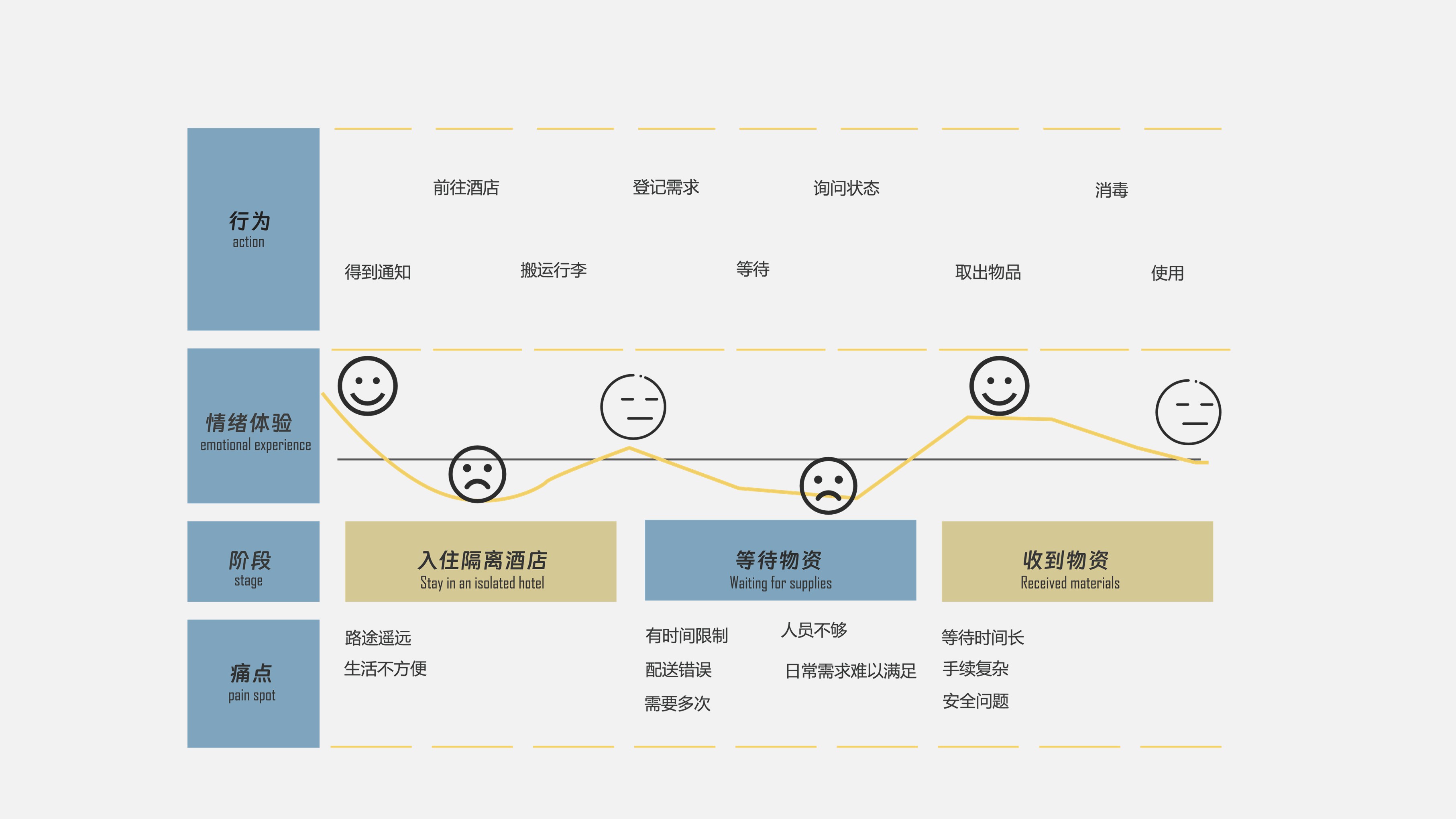
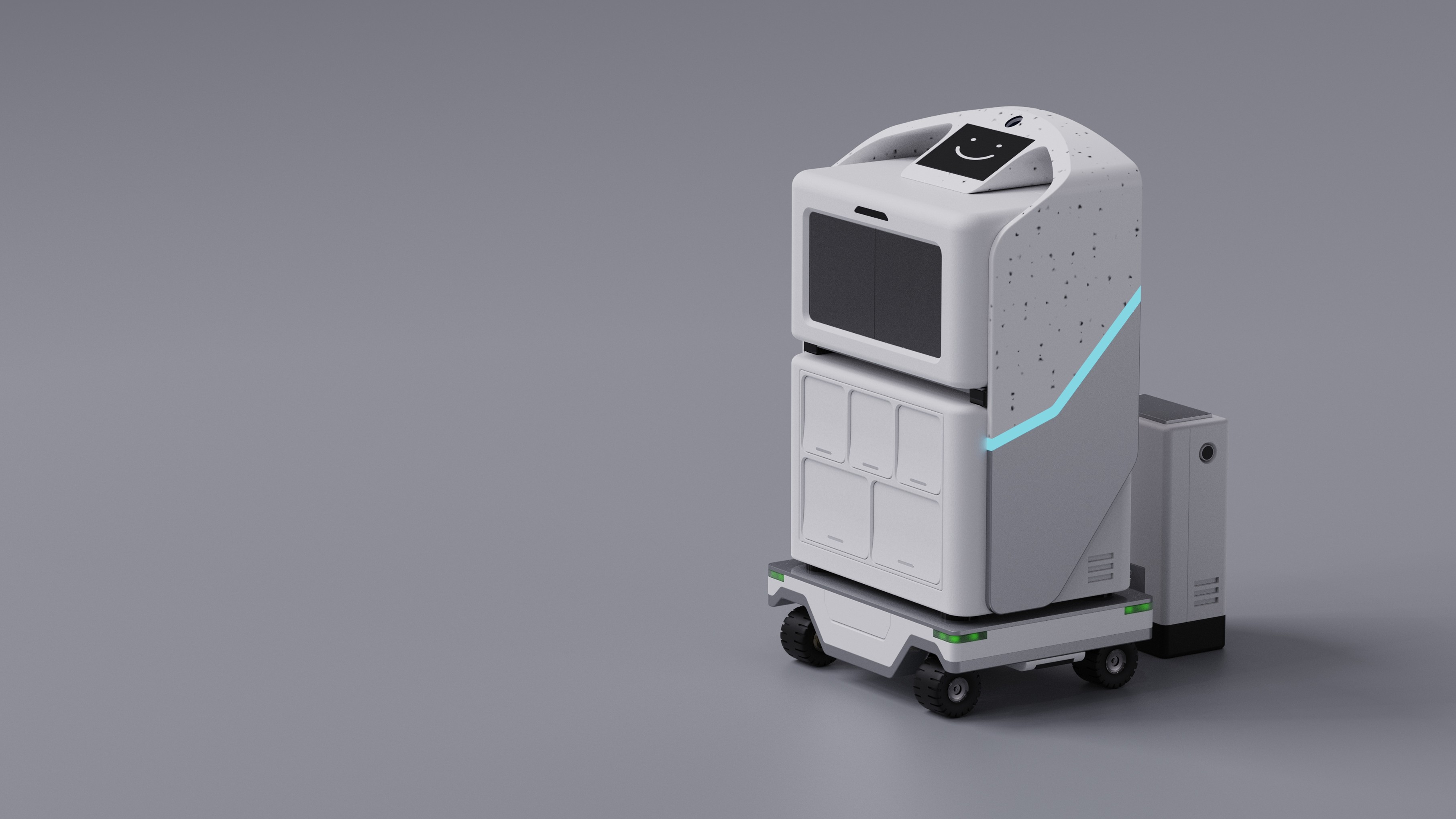
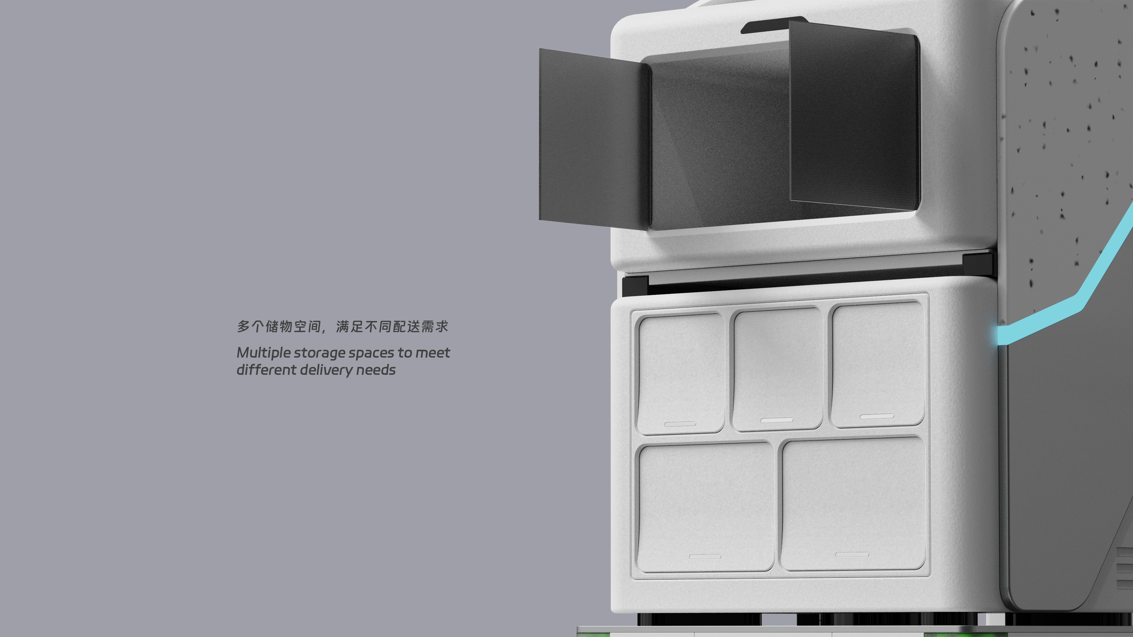

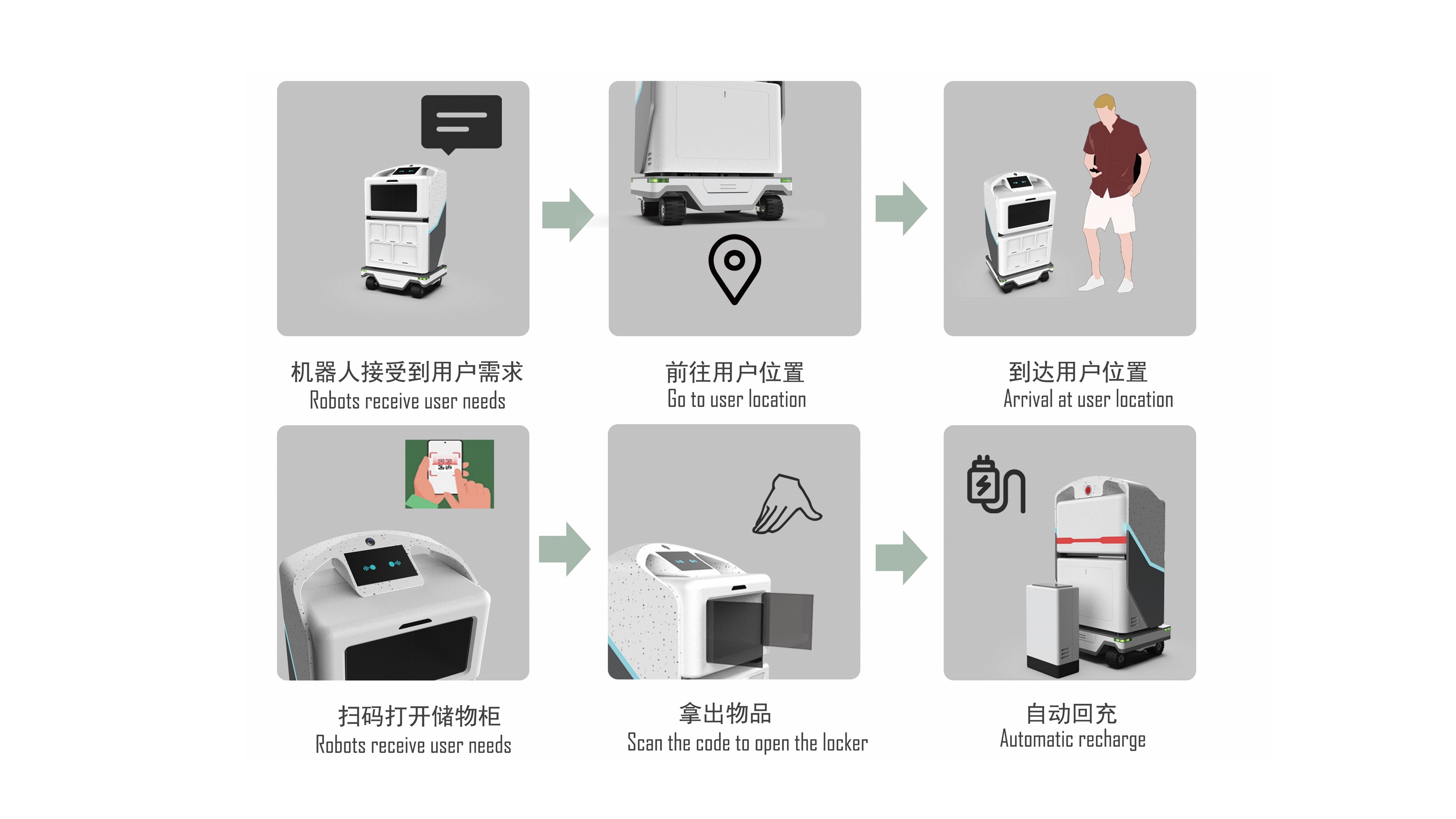
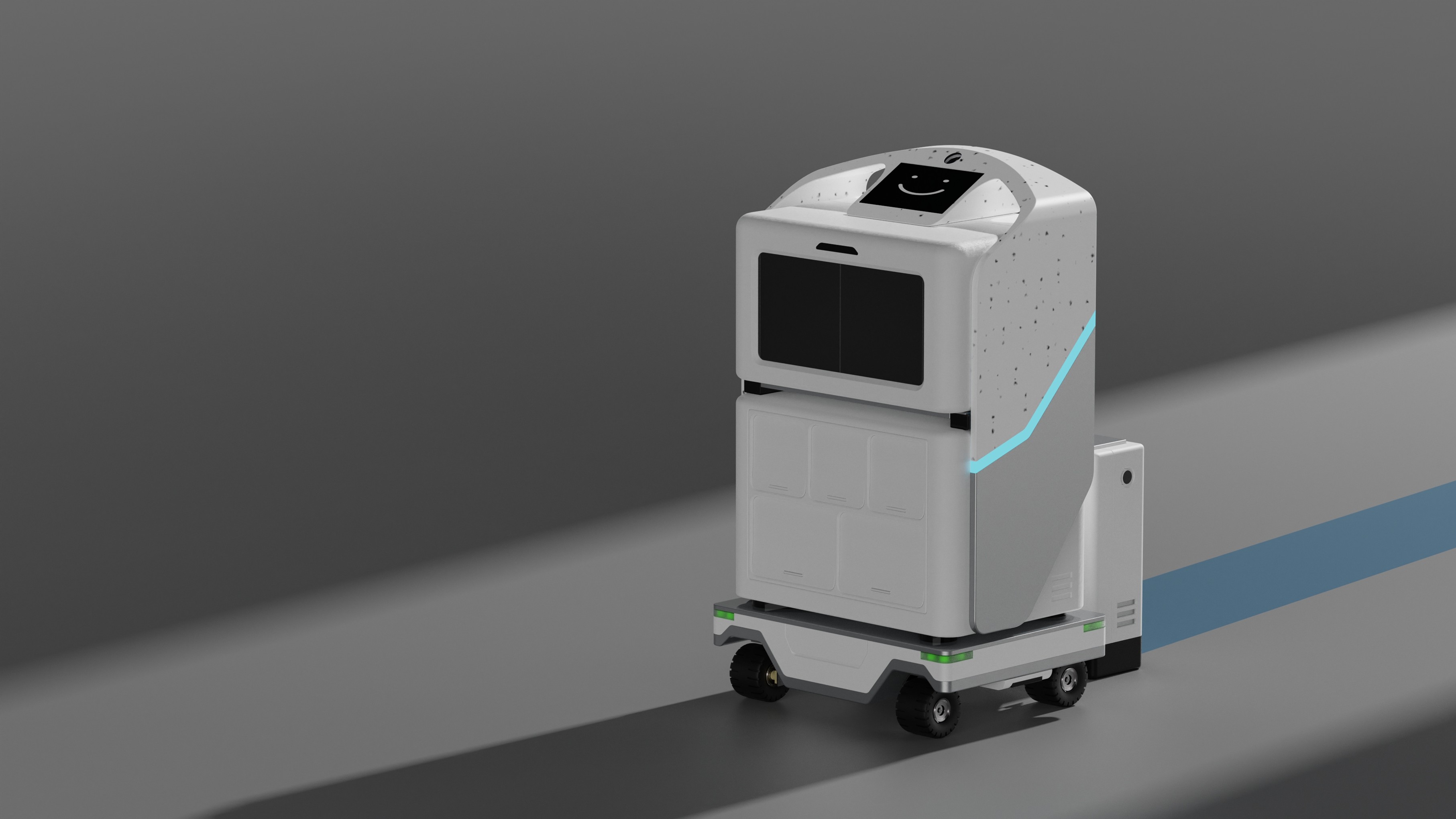
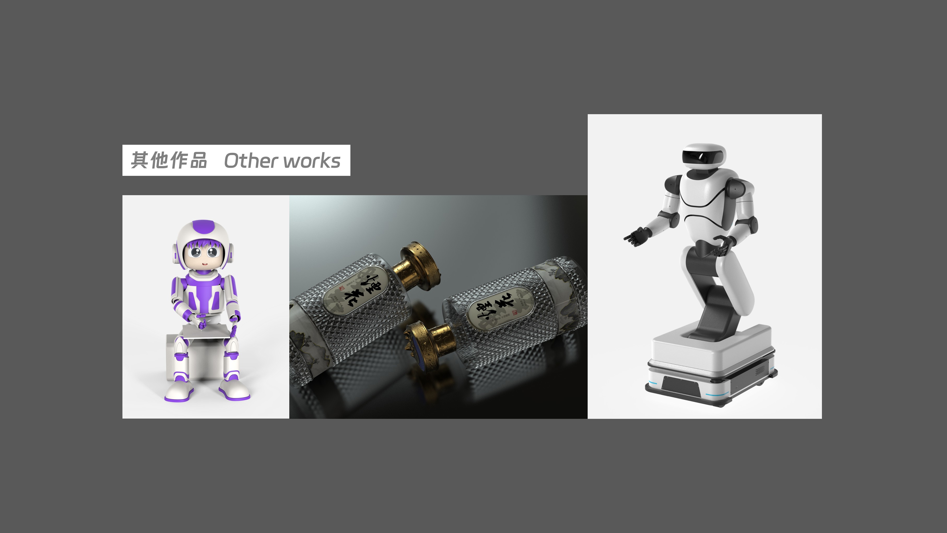

I can see that the foundation is very good, and the modeling and rendering skills are good, but the appearance lacks some recognition and novelty. I think I can spend more time to collect and think about how to make the appearance after the project is established.
With what renderer
Personally, I think the product id lacks aesthetic feeling, the typesetting rendering has no atmosphere, and it is too scientific and engineering. It is suggested to look at more works with aesthetic feeling and sufficient tension to improve one's horizon. Now the competition for id positions is very fierce.
Strengthen the expression of basic effects, otherwise it is too common.
Engineering, right?
The design can give a good reason. It is suggested to mix more elements and look at the control of the design style of the design language. For example, the coffee machine with hard wind, the coffee machine with scientific and technological wind, etc. Personally, I am more optimistic about the first work. The robot is a little confused, and it is not suggested not to put it on. It depends on what category you finally decide to do and do your favorite design ~ Come on
quite good
Come on.
good work