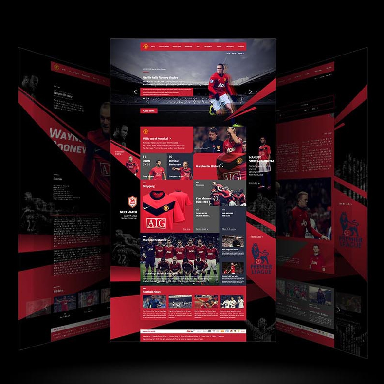
The Manchester United's website is renewed. Red is used to emphasize the team's identity. Also, the articles are organized in a more readable style. Overall, the newly designed website is sporty and dynamic.


Year
2014
Designer
Jang Su Young
The copyright of this work belongs to K-DESIGN AWARD. No use is allowed without explicit permission from owner.

New user?Create an account
Log In Reset your password.
Account existed?Log In
Read and agree to the User Agreement Terms of Use.

Please enter your email to reset your password
Comment Board (0)
Empty comment