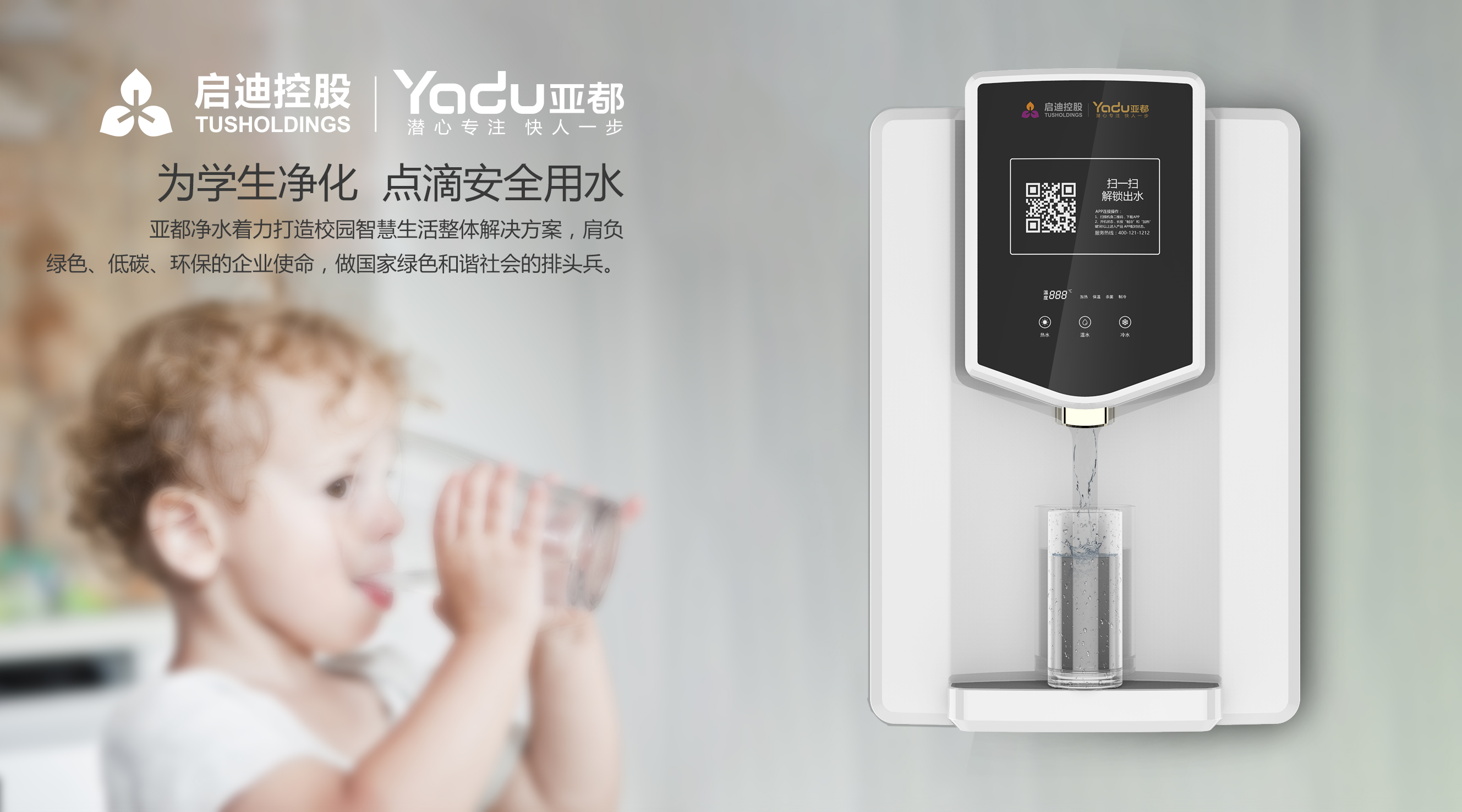
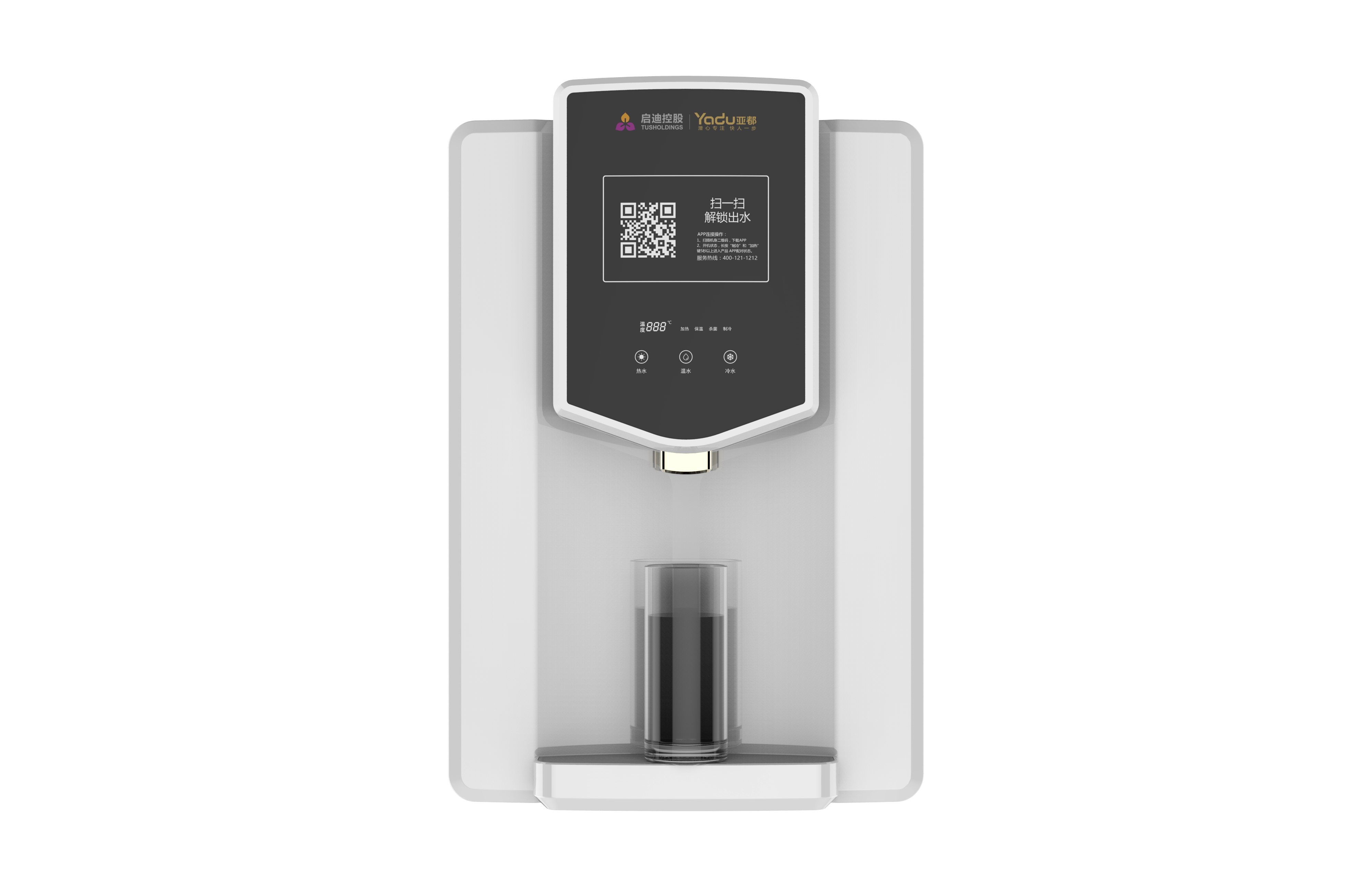
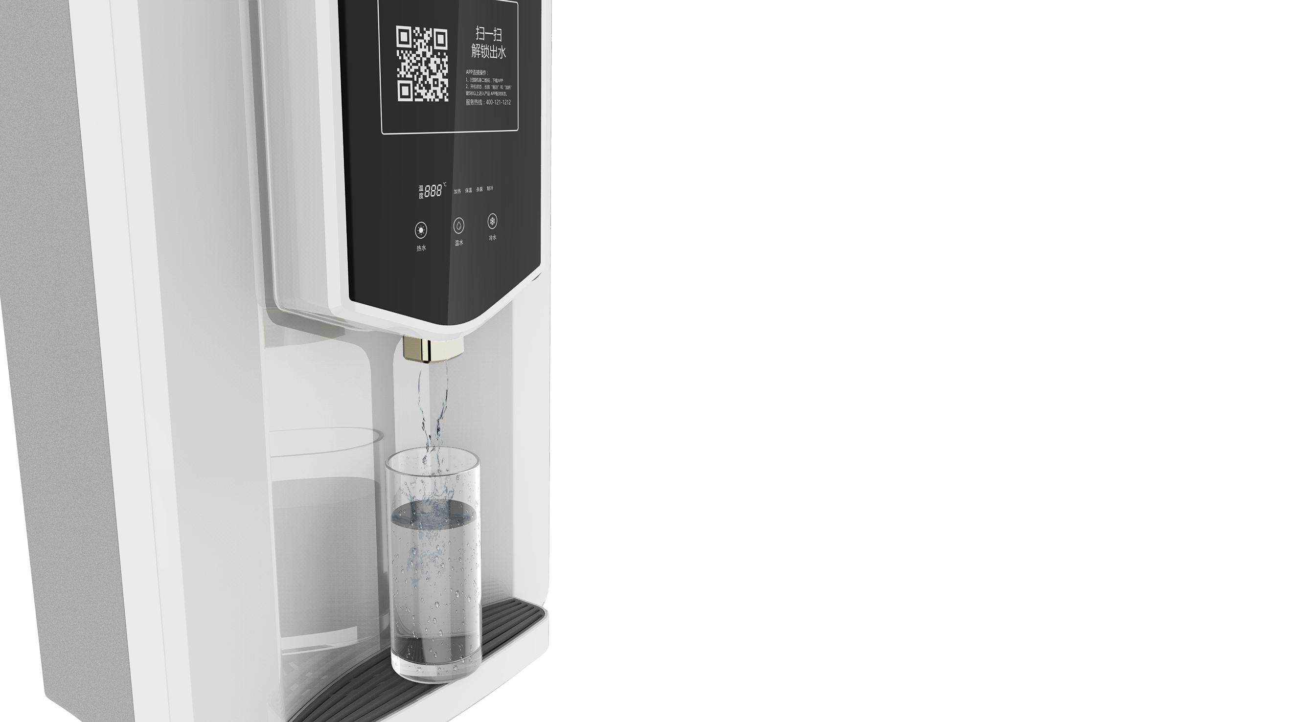
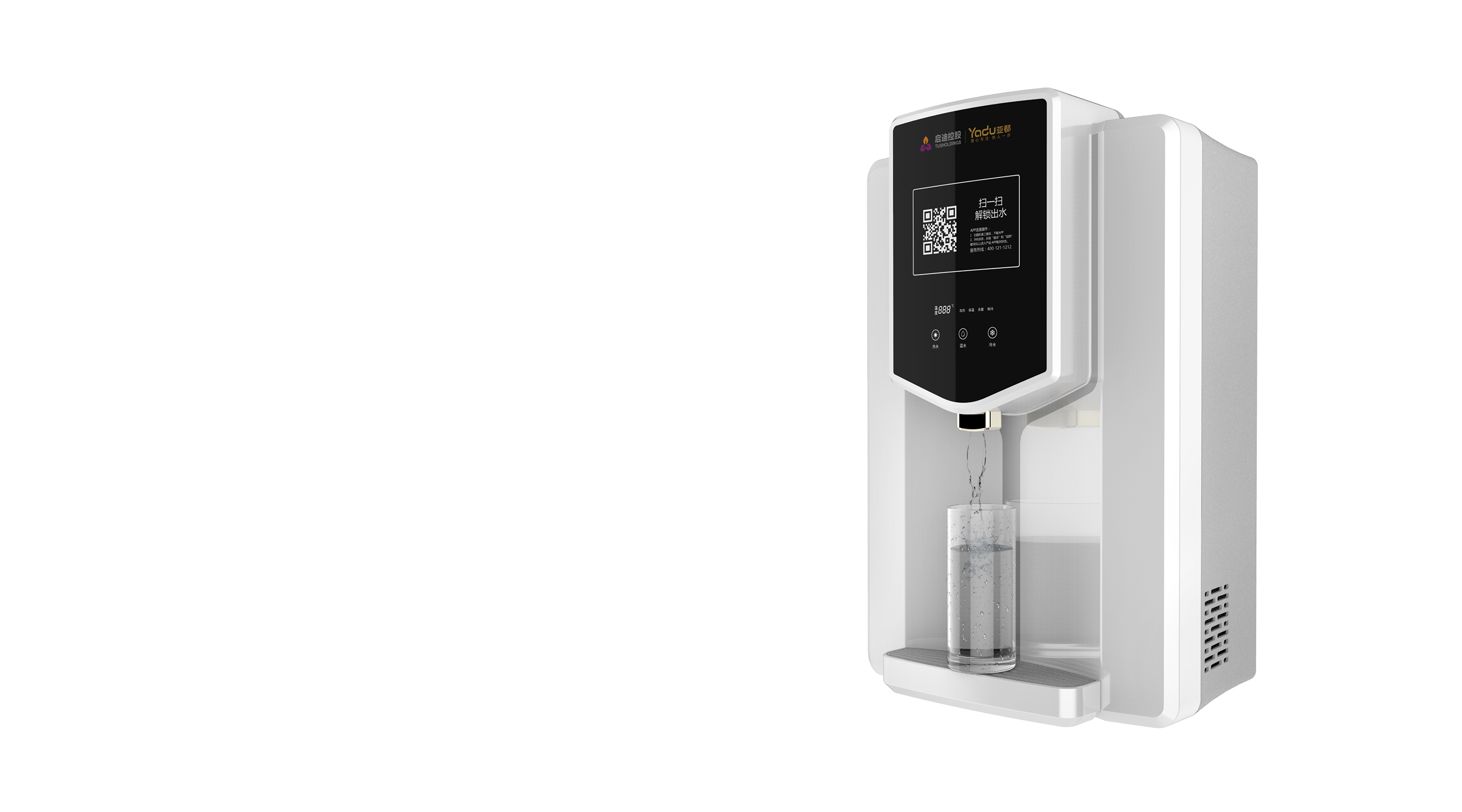
The design starts from the semantics of brand and shield, and both the overall shape and meaning bring users the feeling of safe drinking water. This also highlights the difference between products and products on the market, reflecting the style of the Asian capital.


The copyright of this work belongs to 设计新生. No use is allowed without explicit permission from owner.

New user?Create an account
Log In Reset your password.
Account existed?Log In
Read and agree to the User Agreement Terms of Use.

Please enter your email to reset your password
Did the school bring a cell phone, or did it mean only a university
Don't copy, embarrassed, secretly copy, don't send out, by the way, this original financing is bankrupt
In this era, even drinking water has to be swept, ha, ha, ha
The shape is quite simple, and the interface layout is also good.
Sweep the code and get out of the water?? Can't you get out without sweeping? Isn't that why you have to sweep the code every time you drink water?