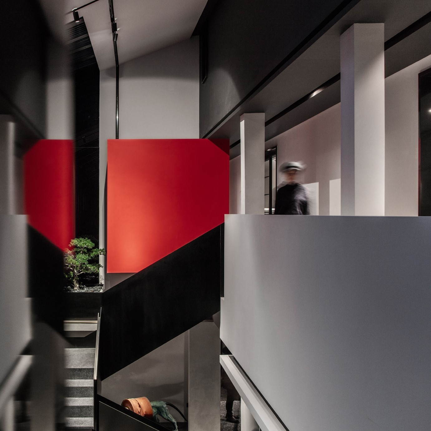
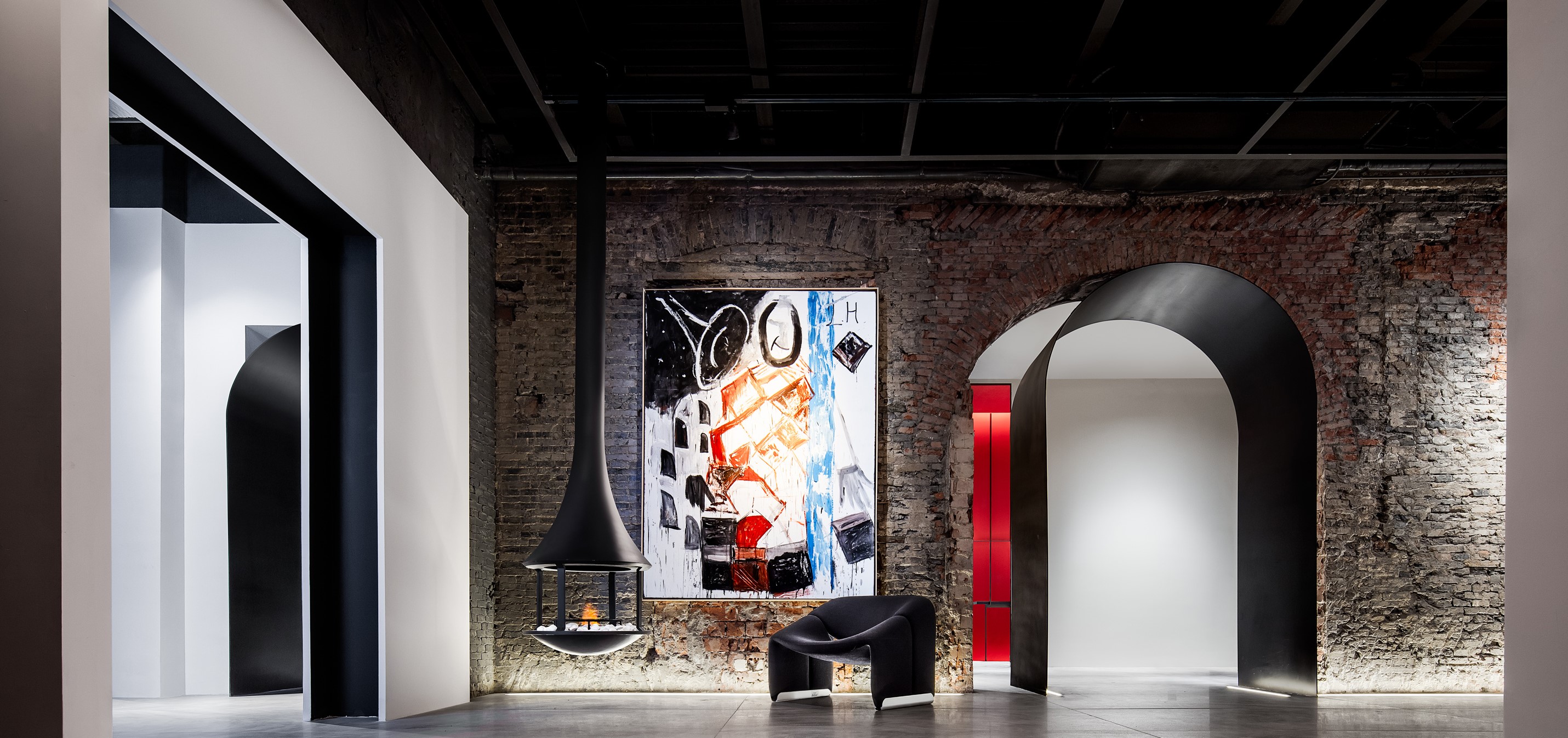
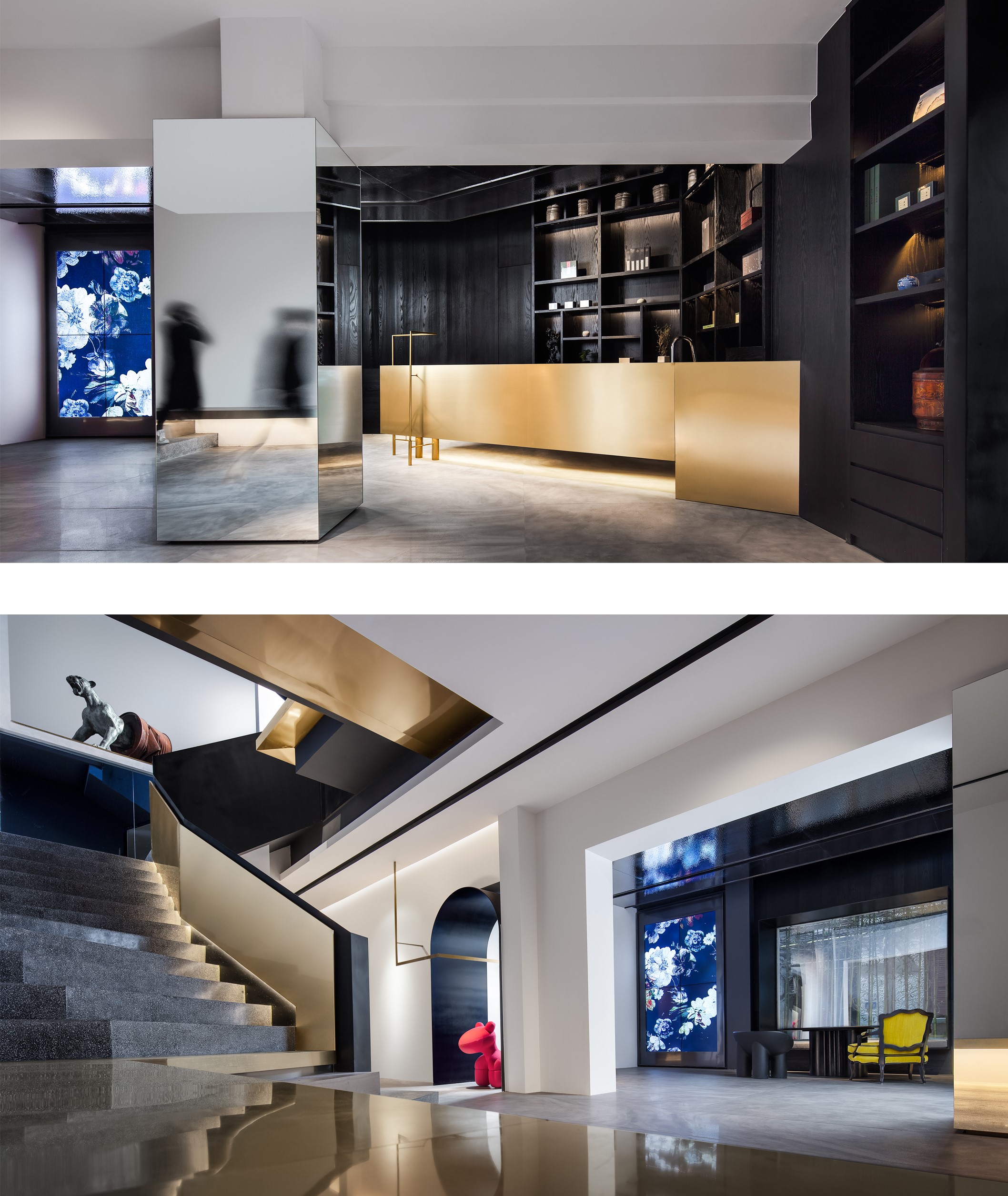
Because the house is a historical building, the original structure does not allow big movements, so the design is more difficult. Designers follow the construction relationship of space to give it new blocks and functions, reshaping the order and aesthetics of space. The first floor breaks the traditional office design form, is positioned as a small art museum & collection hall, and puts in art and original design products, which can be adjusted according to different needs in the later stage, with unlimited possibilities. At the same time, it also creates a quiet and comfortable indoor atmosphere, providing a shared space for people to relax and rest in a busy city. 2F is the employee office area. A suspended red box is designed between 2F and 3F as the end of the stairs, making the whole space interesting. The high-rise space near the gate is one of the highlights here. It opens up the floor on the second floor of the 1., which not only forms a spatial landscape point, but also improves the light on the first floor, which is transparent and interactive. This atrium landscape staircase is located in the elevator hall of the old house. The designer moved the elevator to the back of the house to free the space here, and the staircase became a landscape. Because of the limited area of the office, the designer superimposed many functions and integrated the functions such as reader and conference area. The original pain point became the highlight of the office. Designers hope to change people's perception of the office and make work a pleasure.


Country
China
Year
2019
Client
GID International Design
Affiliation
GID
Designer
Gary Zeng
The copyright of this work belongs to K-DESIGN AWARD. No use is allowed without explicit permission from owner.

New user?Create an account
Log In Reset your password.
Account existed?Log In
Read and agree to the User Agreement Terms of Use.

Please enter your email to reset your password
Comment Board (0)
Empty comment